
Categories
- 3d CGI
- Amusements
- Animation
- Anime & Manga
- Art Materials
- Art Videos
- Blogroll
- Cartoons
- Color
- Comics
- Concept & Visual Dev.
- Creativity
- Digital Art
- Digital Painting
- Displaying Art on the Web
- Drawing
- Eye Candy for Today
- Gallery and Museum Art
- High-res Art Images
- Illustration
- Motion Graphics & Flash
- Museums
- Online Museums
- Outsider Art
- Painting
- Painting a Day
- Paleo Art
- Pastel, Conté & Chalk
- Pen & Ink
- Prints and Printmaking
- Reviews
- Sc-fi and Fantasy
- Sculpture & Dimensional
- Site Comments
- Sketching
- Storyboards
- Tools and Techniques
- Uncategorized
- Vector Art
- Videos & Podcasts
- Vision and Optics
- Watercolor and Gouache
- Webcomics
Archives
- April 2026
- March 2026
- February 2026
- January 2026
- December 2025
- November 2025
- October 2025
- September 2025
- August 2025
- July 2025
- June 2025
- May 2025
- January 2025
- December 2024
- November 2024
- October 2024
- September 2024
- August 2024
- June 2024
- April 2024
- March 2024
- February 2024
- January 2024
- December 2023
- November 2023
- October 2023
- September 2023
- August 2023
- July 2023
- May 2023
- April 2023
- March 2023
- February 2023
- January 2023
- December 2022
- November 2022
- September 2022
- August 2022
- July 2022
- June 2022
- May 2022
- April 2022
- March 2022
- February 2022
- January 2022
- December 2021
- November 2021
- October 2021
- September 2021
- August 2021
- July 2021
- June 2021
- May 2021
- April 2021
- March 2021
- February 2021
- January 2021
- December 2020
- November 2020
- October 2020
- September 2020
- August 2020
- July 2020
- June 2020
- May 2020
- April 2020
- March 2020
- February 2020
- January 2020
- December 2019
- November 2019
- October 2019
- September 2019
- August 2019
- July 2019
- June 2019
- May 2019
- April 2019
- March 2019
- February 2019
- January 2019
- December 2018
- November 2018
- October 2018
- September 2018
- August 2018
- July 2018
- June 2018
- May 2018
- April 2018
- March 2018
- February 2018
- January 2018
- December 2017
- November 2017
- October 2017
- September 2017
- August 2017
- July 2017
- June 2017
- May 2017
- April 2017
- March 2017
- February 2017
- January 2017
- December 2016
- November 2016
- October 2016
- September 2016
- August 2016
- July 2016
- June 2016
- May 2016
- April 2016
- March 2016
- February 2016
- January 2016
- December 2015
- November 2015
- October 2015
- September 2015
- August 2015
- July 2015
- June 2015
- May 2015
- April 2015
- March 2015
- February 2015
- January 2015
- December 2014
- November 2014
- October 2014
- September 2014
- August 2014
- July 2014
- June 2014
- May 2014
- April 2014
- March 2014
- February 2014
- January 2014
- December 2013
- November 2013
- October 2013
- September 2013
- August 2013
- July 2013
- June 2013
- May 2013
- April 2013
- March 2013
- February 2013
- January 2013
- December 2012
- November 2012
- October 2012
- September 2012
- August 2012
- July 2012
- June 2012
- May 2012
- April 2012
- March 2012
- February 2012
- January 2012
- December 2011
- November 2011
- October 2011
- September 2011
- August 2011
- July 2011
- June 2011
- May 2011
- April 2011
- March 2011
- February 2011
- January 2011
- December 2010
- November 2010
- October 2010
- September 2010
- August 2010
- July 2010
- June 2010
- May 2010
- April 2010
- March 2010
- February 2010
- January 2010
- December 2009
- November 2009
- October 2009
- September 2009
- August 2009
- July 2009
- June 2009
- May 2009
- April 2009
- March 2009
- February 2009
- January 2009
- December 2008
- November 2008
- October 2008
- September 2008
- August 2008
- July 2008
- June 2008
- May 2008
- April 2008
- March 2008
- February 2008
- January 2008
- December 2007
- November 2007
- October 2007
- September 2007
- August 2007
- July 2007
- June 2007
- May 2007
- April 2007
- March 2007
- February 2007
- January 2007
- December 2006
- November 2006
- October 2006
- September 2006
- August 2006
- July 2006
- June 2006
- May 2006
- April 2006
- March 2006
- February 2006
- January 2006
- December 2005
- November 2005
- October 2005
- September 2005
- August 2005
Relevant Blogs
Art, Painting & Sketch
- Gurney Journey
- Underpaintings
- Art and Influence
- Painting Perceptions
- Oil Painters of America
- Vasari Paint POV
- Flying Fox
- Urban Sketchers
- Bento (Smithsonian)
- Art Inconnu
- The Hidden Place
- Still Life
- Making a Mark
- The Art of the Landscape
- Exploring Color & Creativity
- Art Contrarian
- Artist A Day
- beinArt Surreal Art Collective
- Eye Level
- David Dunlop
- p.i.g.m.e.n.t.i.u.m
- CultureGrrl
- Joaquín Sorolla blog
- Artists in Pastel
“Painting a Day”
- A Painting a Day (Keiser)
- On Painting (Keiser)
- Julian Merrow-Smith
- Karen Jurick
- Jeffrey Hayes
- Carol Marine
- Abbey Ryan
- Daily Paintworks
Other Painting Blogs
- Virtual Gouache Land
- Neil Hollingsworth
- Marc Hanson
- Kevin Menck
- Marc Dalessio
- Larry Seiler
- Stapleton Kearns
- Colin Page
- Roos Schuring
- Hans Versfelt
- Titus Meeuws
- Régis Pettinari
- René Plein Air
- Belinda Del Pesco
- Robin Weiss
- Nathan Fowkes (Land Sketch)
- William Wray
- Frank Serrano
- Stephen Magsig
- Michael Chesley Johnson
- Twice a Week
- Sarah Wimperis
- Rob Adams
- Michael Cole Manley
- The Dirty Palette Club
- Mike Manley’s Draw!
Gallery Art & Illustration mix
Illustration
- Howard Pyle
- 100 Years of Illustration
- BibliOdyssey
- Illustration Art
- Today’s Inspiration
- Illustration Mundo
- Little Chimp Society
- Danny Gregory
- R D (John Martz
- Illustration Friday blog
- Monster Brains
- Illustrators & Illustrations (RU)
- Elwood H. Smith
- DaniDraws.com
- Designers Who Blog
- iSpot Blog
Sci-Fi & Fantasy
Illustration & Comics
Comics & Cartoons
- Comics Beat
- Robot 6
- Newsarama Blog
- Comic Vine
- Comics Alliance
- Forbidden Planet Int.
- Paolo Rivera
- Bolt City
- Flight
- Scott McCloud
- The Comics Journal
- Comixpedia
- Funnybook Babylon
- James Baker
- Middleton’s Sketchbook
- Boneville
- The Hotel Fred
- Paul Rivoche
- Daily Cartoonist
- Mad About Cartoons (William Wray)
- Digital Strips
Illustration & Concept
Animation & Concept
- Cartoon Brew
- Animation Blog
- Cold Hard Flash
- Concept Art World
- The CAB
- FY Concept Art
- Concept Ships
- Concept Robots
- John Nevarez
- Armand Serrano
- Marcos Mateu-Mestre
- all kinds of stuff (Kricfalusi)
- Yacin the faun (Man Arenas)
- Kelsey Mann
- Cre8tivemarks Blog
- Ice-Cream Monster Toon Cafe
- AAU Character & Creature Design
- AAU Animation Notes
- Articles and Texticles
Paleo & Scientific
Tools & Techniques
Other
Lists of Art Blogs
Art Image Resource Links
Historic Art Images
- Wikimedia Commons: Paintings
- Wikimedia Commons: Drawings
- The Athenaeum
- WikiArt (WikiPaintings)
- Google Art Project: Artists
- Google Art Project: Collections (Museums)
- ArtCyclopedia
- Web Gallery of Art
- Art Renewal Center
- Web Gallery of Impressionism
Auction Consolidation sites
Auction sites
- Sotheby’s
- Bonham’s
- Christies
- Heritage Auctions: Fine Art
- Heritage Auctions: Illustration
- Freeman’s Auctions
- Bukowskis
- Shannon’s
Image Search
Reverse Image Search (search by image)
- Tin Eye
- RevImg
- Google Image Search (camera icon)
- Bing Image Search (camera icon)
Promoting some friends and some clients of my website design business
- Twin Willows T’ai Chi studio in Wilmington DE. Taiji classes with Bryan Davis.
- Ray Hayward, Inspired Teacher of T’ai Chi ( Taiji ) in Minneapolis, Founder of Mindful Motion Tai Chi Academy
- OldHead Tattoo studio and Art Gallery in Wilmington DE. Tattoos and paintings by Bruce Gulick
- Sharon Domenico Art, pet portrait oil paintings
- Platinum Paperhanging, wallpaper hanging, Main Line and Philadelphia, PA
- Lisa Stone Design, interior designer, Main Line and Philadelphia, PA
- Studio12KPT, original art, prints, calendars and other custom printed items by Van Sickle & Rolleri
-
Jeremy Lipking

Value is one one of the most overlooked and misunderstood properties in painting. No, I don’t mean $Dollar $Value, the only property that seems to matter to some art collectors, I mean the range of value from dark to light, which is often difficult to separate from hue (the particular color) and intensity (how much color).Jeremy Lipking is a California painter whose work is a study in the understanding and use of value.
He paints landscapes and figures. In both he employs careful control of value contrasts to move your eye and create focus within his images. His compositions are often created in a range of middle or even dark values punctuated by areas of white (or close to it). At other times he will do the reverse, place an almost silhouetted figure against a bright, almost white background.
Lipking shows a marked influence from John Singer Sargent (which is a Good Thing). He also acknowledges admiring the work of Joaquin Sorolla and Anders Zorn, but it is the Sargent influence that I find most interesting. Not that he is slavishly trying to copy any Sargentisms in his work, he has just absorbed elements that he likes and has put them in service of his own approach.
Lipking came from an artistic family and was formally trained at the California Art Institute. He has garnered a number of awards including Best of Show in the Portrait Society of America International Portrait Competition this year.
As you browse through his galleries try to think of the compositions in terms of value. What would they look like if all of the color were removed? In our quickness to be dazzled by color in painting, we often overlook the power of value. Jeremy Lipking does not.
Link via Karen Hollingsworth.
Categories:
-
Bob MacNeil

As mentioned last week on Drawn, Bob MacNeil is a multi-talented illustrator and concept artist with a wide variety of styles.An illustration of his was given a special spotlight in back of the new Flight 3 comics anthology, along with an inspirational story about dealing with tragedy and almost giving up on being an artist.
Fortunately for us, he didn’t give up and is creating illustrations and concept art for a number of projects for toy companies, gaming and TV development, including the new season of Venture Brothers from the Cartoon Network.
He is trained in traditional media. Having worked for a few years in acrylic and oil he made the leap to digital drawing and painting some years ago and finds the speed and flexibility of the digital mediums advantageous.
His approach ranges from highly rendered to simplified and cartoonlike, realistic to highly stylized, indicating an adventurous attitude toward exploring and growing as an artist.
MacNeil also has a blog (with the wonderfully simple name of Bob’s Log, which makes it seem like the term “blog” was invented just for him). The blog often features discussions and step-through demos of his working process.
In addition to the mention on Drawn, MacNeil was recently interviewed on Design Inspiration.
Categories:
-
Bermuda Shorts
 Bermuda Shorts is a UK animation firm that lists itself as the first animation company to represent individual animation directors in the commercial animation arena.
Their site is organized that way. In addition to showcasing new work, the reels are organized by director and designer. You can also browse them organized by type: commercials, broadcast, promos and short films.
Most of the animations are for broadcast commercial applications, with clients like Volkswagen, American Express, MTV, Nikelodeon, Kraft, Coke, Nestle and the BBC.
There are also a fair number of experimental animated shorts and fun self-promotional pieces, but most of the commercial work is just as fun.
There is a broad variety of approaches between the directors, and all of them seem to be very imaginative and demonstrate the ability to communicate and entertain in short bursts, often 15 or 30 seconds.
The animations are done in a variety of animation media, 2-D cell, Flash, 3-D CGI, stop-motion, photo-montage and altered live action.
Images at left: History of Animation Nicktoons short by Filipe Alcada, Save the Children spot by Ian Bird, Nite Nite Volkswagen ad by Will Barras and Paper Dinosaurs Nickelodeon spot by Model Robot.
Gate: bi-monthly animation contest
Bermuda Shorts is sponsoring a bi-monthly competition called Gate for animation freelancers who want to break into directing, designers looking to move into animation and animation school grads who want to break into the biz.
If you’re chosen, they will feature you on the site as a guest director, bring you into the studio (assuming you’re in reach of London, UK, or can travel there) and promote your work for two months. If you get a positive enough response from the industry they’ll back you with a production team and give you studio space to produce your first job. Details here.
Link via Articles and Texticles
Categories:
-
Stuart Immonen
 Stuart Immonen is a Canadian comics artist and cover illustrator with a crisp, confident style. His drawings can have a loose, stylized and modern feel, but are always based on an underpinning of solid draftsmanship.
Immonen has done work for mainstream comics companies like Marvel, DC, Dark Horse, Image Comics and the French publisher Les Humanoides Associés. Most of his work in recent years has been for Marvel, where he has worked on high-profile titles like The Hulk, Ultimate Fantastic Four and Ultimate X-Men.
I particularly enjoyed his run on the Ultimate X-Men last year, an 11-issue arc (#54-65) inked by Wade Von Grawbadger and colored by Justin Ponsor.
For those not familiar with the process, mainstream American comics are usually created by an artistic team, the art being broken down into pencil art, final ink drawings and then color, usually applied digitally. This allows for the creation of 22 page continuing stories on a monthly basis. (Personally, I think the old practice of crediting the color artist on a level with the letterer rather than equal to the inker is way out of date. Ponsor’s nice work on this series is a case in point.)
Immonen started in comics by self-publishing a series called Playground. He moved from there to small companies and then the major publishers. In addition to his mainstream comic work, he still produces his own work in the form of webcomics. He has two titles, Never as Bad as You Think and Misery Loves running on the subscription based Webcomics Nation comics portal.
In addition to Immonen’s own site, which is somewhat disappointing in the limited amount and scope of the artwork in the galleries, I’ll suggest the unofficial galleries on Comic Art Community, as well as some interviews from Top Two Three Films (re: their Adventures into Digital Comics film), Sequential Tart, and Newsarama, in which he discusses his 50 Reasons to Stop Sketching at Conventions, a painfully humorous insight into what comic artists sometimes put up with at comic conventions.
Categories:
-
Joan C. Gratz
 With the Mona Lisa as a starting point, Joan C. Gratz took paintings by 35 artists, rendered her versions of them in colored clay, animated parts of them and morphed them into one another in a fun, short (7 minute) animation set to music and sound effects called Mona Lisa Descending a Staircase.
Aside from Da Vinci’s enigmatic portrait, the majority of the works are from the 20th Century. Particularly fascinating are the sequences where she morphs a face or figure from one painting into a face or figure form another. It’s nicely done and fun just to try to identify as many of the artists and paintings as you can.
(Although Duchamp is in evidence in the image of his mustache and goatee’d postcard version of the Mona Lisa, seen here morphing into Magritte’s The False Mirror, I didn’t see the titular Nude Descending a Staircase.)
Gratz works in a fascinating animation technique (which I believe she pioneered) called “clay painting” in which colored clay is used as if it were paint. The advantage is that the clay can be repositioned and re-blended in a way the permits the creation of stop-motion animation, similar in principle to the the 3-D stop motion process used in popular films like Tim Burton’s The Nightmare Before Christmas, Nick Park’s The Curse of the Were-Rabbit and an entire school of Eastern European animation called Puppetfilm.
Mona Lisa Descending a Staircase won the 1002 Academy Award for Best Animated Film. Gratz also applies her clay painting animation technique to commercial work and you may have seen her spots for Coke, Wishbone and Microsoft. If not, they are beautifully done and well worth checking out.
Gratz is also the author of a new book of yoga humor (yes, yoga humor) called Downward Facing Frog (Amazon link, more details on her site).
Link via Nita Leland’s Exploring Color and Creativity. Leland’s own new book The New Creative Artist is also available from Amazon.
Categories:
-
Yves Tanguy
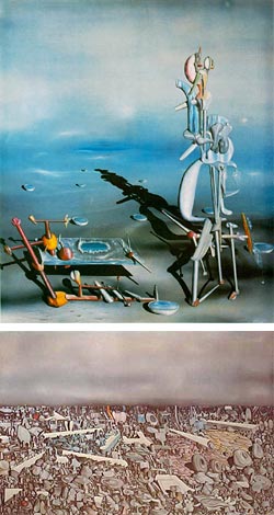 Imaginary landscape has long had a place in art, from the idealized classical landscapes of the Renaissance and Baroque eras to the imaginary worlds and alternate histories of modern fantasy and science fiction art.
Yves Tanguy painted landscapes from the world of impossible dreams.
Tanguy had no format artistic training. After leaving military service in 1922, he began sketching cafe scenes in his native Paris. He came across the work of Giorgio de Chirico, a painter who was also an inspiration for the Surrealists, and was so affected by it that he decided to dedicate himself to painting.
He encountered the Surrealists themselves not long after and became an official member of the group. (Surrealism wasn’t just a style, it was a movement, a “revolution”, led by poet Andre Breton.) His painting style matured rapidly and in a few years he was exhibiting with artists like Jean Arp, Joan Miro, Max Ernst and Pablo Picasso.
Tanguy’s hauntingly strange images depict landscapes (for lack of a better definition) populated with unreal objects, but painted with a realism that makes them tangbile. Like Max Ernst, Tanguy is often missed in the attention paid to the more recognizable stars of Surrealism like Dali and Magritte. Also like Ernst, he is one of my favorites, and I find his paintings have a fascinating ability to pull you in and immerse you in that state where the rational and irrational meet and mix.
His work was inspirational to the other Surrealists as well as subsequent painters, modern illustrators like Richard Powers (see my post from yesterday) and even your humble writer. (I did my little nod to Tanguy in this early page from my webcomic back in the mid-90’s.)
In some ways Tanguy was the purest of the Surrealist painters, adhering more consistently to the ideals of unconscious imagery as extolled in the Surrealist manifestos and periodicals (to which he contributed). Tanguy married painter Kay Sage and moved to the U.S. in 1940, eventually becoming a citizen.
Unfortunately, the best book I know of about Tanguy, Yves Tanguy and Surrealism is out of print and a bit expensive if you can find used copies.
Categories:


Charley’s Picks
Bookshop.org
(Bookshop.org affilliate links; sales benefit independent bookshop owners; I get a small percentage to help support my work on Lines and Colors)

John Singer Sargent: Watercolors


Urban Sketching: Understanding Perspective


Charley’s Picks
Amazon
(Amazon.com affiliate links; sales go to a larger yacht for Jeff Bezos; but I get a small percentage to help support my work on Lines and Colors)
John Singer Sargent: Watercolors
Urban Sketching: Understanding Perspective