
Categories
- 3d CGI
- Amusements
- Animation
- Anime & Manga
- Art Materials
- Art Videos
- Blogroll
- Cartoons
- Color
- Comics
- Concept & Visual Dev.
- Creativity
- Digital Art
- Digital Painting
- Displaying Art on the Web
- Drawing
- Eye Candy for Today
- Gallery and Museum Art
- High-res Art Images
- Illustration
- Motion Graphics & Flash
- Museums
- Online Museums
- Outsider Art
- Painting
- Painting a Day
- Paleo Art
- Pastel, Conté & Chalk
- Pen & Ink
- Prints and Printmaking
- Reviews
- Sc-fi and Fantasy
- Sculpture & Dimensional
- Site Comments
- Sketching
- Storyboards
- Tools and Techniques
- Uncategorized
- Vector Art
- Videos & Podcasts
- Vision and Optics
- Watercolor and Gouache
- Webcomics
Archives
- April 2026
- March 2026
- February 2026
- January 2026
- December 2025
- November 2025
- October 2025
- September 2025
- August 2025
- July 2025
- June 2025
- May 2025
- January 2025
- December 2024
- November 2024
- October 2024
- September 2024
- August 2024
- June 2024
- April 2024
- March 2024
- February 2024
- January 2024
- December 2023
- November 2023
- October 2023
- September 2023
- August 2023
- July 2023
- May 2023
- April 2023
- March 2023
- February 2023
- January 2023
- December 2022
- November 2022
- September 2022
- August 2022
- July 2022
- June 2022
- May 2022
- April 2022
- March 2022
- February 2022
- January 2022
- December 2021
- November 2021
- October 2021
- September 2021
- August 2021
- July 2021
- June 2021
- May 2021
- April 2021
- March 2021
- February 2021
- January 2021
- December 2020
- November 2020
- October 2020
- September 2020
- August 2020
- July 2020
- June 2020
- May 2020
- April 2020
- March 2020
- February 2020
- January 2020
- December 2019
- November 2019
- October 2019
- September 2019
- August 2019
- July 2019
- June 2019
- May 2019
- April 2019
- March 2019
- February 2019
- January 2019
- December 2018
- November 2018
- October 2018
- September 2018
- August 2018
- July 2018
- June 2018
- May 2018
- April 2018
- March 2018
- February 2018
- January 2018
- December 2017
- November 2017
- October 2017
- September 2017
- August 2017
- July 2017
- June 2017
- May 2017
- April 2017
- March 2017
- February 2017
- January 2017
- December 2016
- November 2016
- October 2016
- September 2016
- August 2016
- July 2016
- June 2016
- May 2016
- April 2016
- March 2016
- February 2016
- January 2016
- December 2015
- November 2015
- October 2015
- September 2015
- August 2015
- July 2015
- June 2015
- May 2015
- April 2015
- March 2015
- February 2015
- January 2015
- December 2014
- November 2014
- October 2014
- September 2014
- August 2014
- July 2014
- June 2014
- May 2014
- April 2014
- March 2014
- February 2014
- January 2014
- December 2013
- November 2013
- October 2013
- September 2013
- August 2013
- July 2013
- June 2013
- May 2013
- April 2013
- March 2013
- February 2013
- January 2013
- December 2012
- November 2012
- October 2012
- September 2012
- August 2012
- July 2012
- June 2012
- May 2012
- April 2012
- March 2012
- February 2012
- January 2012
- December 2011
- November 2011
- October 2011
- September 2011
- August 2011
- July 2011
- June 2011
- May 2011
- April 2011
- March 2011
- February 2011
- January 2011
- December 2010
- November 2010
- October 2010
- September 2010
- August 2010
- July 2010
- June 2010
- May 2010
- April 2010
- March 2010
- February 2010
- January 2010
- December 2009
- November 2009
- October 2009
- September 2009
- August 2009
- July 2009
- June 2009
- May 2009
- April 2009
- March 2009
- February 2009
- January 2009
- December 2008
- November 2008
- October 2008
- September 2008
- August 2008
- July 2008
- June 2008
- May 2008
- April 2008
- March 2008
- February 2008
- January 2008
- December 2007
- November 2007
- October 2007
- September 2007
- August 2007
- July 2007
- June 2007
- May 2007
- April 2007
- March 2007
- February 2007
- January 2007
- December 2006
- November 2006
- October 2006
- September 2006
- August 2006
- July 2006
- June 2006
- May 2006
- April 2006
- March 2006
- February 2006
- January 2006
- December 2005
- November 2005
- October 2005
- September 2005
- August 2005
Relevant Blogs
Art, Painting & Sketch
- Gurney Journey
- Underpaintings
- Art and Influence
- Painting Perceptions
- Oil Painters of America
- Vasari Paint POV
- Flying Fox
- Urban Sketchers
- Bento (Smithsonian)
- Art Inconnu
- The Hidden Place
- Still Life
- Making a Mark
- The Art of the Landscape
- Exploring Color & Creativity
- Art Contrarian
- Artist A Day
- beinArt Surreal Art Collective
- Eye Level
- David Dunlop
- p.i.g.m.e.n.t.i.u.m
- CultureGrrl
- Joaquín Sorolla blog
- Artists in Pastel
“Painting a Day”
- A Painting a Day (Keiser)
- On Painting (Keiser)
- Julian Merrow-Smith
- Karen Jurick
- Jeffrey Hayes
- Carol Marine
- Abbey Ryan
- Daily Paintworks
Other Painting Blogs
- Virtual Gouache Land
- Neil Hollingsworth
- Marc Hanson
- Kevin Menck
- Marc Dalessio
- Larry Seiler
- Stapleton Kearns
- Colin Page
- Roos Schuring
- Hans Versfelt
- Titus Meeuws
- Régis Pettinari
- René Plein Air
- Belinda Del Pesco
- Robin Weiss
- Nathan Fowkes (Land Sketch)
- William Wray
- Frank Serrano
- Stephen Magsig
- Michael Chesley Johnson
- Twice a Week
- Sarah Wimperis
- Rob Adams
- Michael Cole Manley
- The Dirty Palette Club
- Mike Manley’s Draw!
Gallery Art & Illustration mix
Illustration
- Howard Pyle
- 100 Years of Illustration
- BibliOdyssey
- Illustration Art
- Today’s Inspiration
- Illustration Mundo
- Little Chimp Society
- Danny Gregory
- R D (John Martz
- Illustration Friday blog
- Monster Brains
- Illustrators & Illustrations (RU)
- Elwood H. Smith
- DaniDraws.com
- Designers Who Blog
- iSpot Blog
Sci-Fi & Fantasy
Illustration & Comics
Comics & Cartoons
- Comics Beat
- Robot 6
- Newsarama Blog
- Comic Vine
- Comics Alliance
- Forbidden Planet Int.
- Paolo Rivera
- Bolt City
- Flight
- Scott McCloud
- The Comics Journal
- Comixpedia
- Funnybook Babylon
- James Baker
- Middleton’s Sketchbook
- Boneville
- The Hotel Fred
- Paul Rivoche
- Daily Cartoonist
- Mad About Cartoons (William Wray)
- Digital Strips
Illustration & Concept
Animation & Concept
- Cartoon Brew
- Animation Blog
- Cold Hard Flash
- Concept Art World
- The CAB
- FY Concept Art
- Concept Ships
- Concept Robots
- John Nevarez
- Armand Serrano
- Marcos Mateu-Mestre
- all kinds of stuff (Kricfalusi)
- Yacin the faun (Man Arenas)
- Kelsey Mann
- Cre8tivemarks Blog
- Ice-Cream Monster Toon Cafe
- AAU Character & Creature Design
- AAU Animation Notes
- Articles and Texticles
Paleo & Scientific
Tools & Techniques
Other
Lists of Art Blogs
Art Image Resource Links
Historic Art Images
- Wikimedia Commons: Paintings
- Wikimedia Commons: Drawings
- The Athenaeum
- WikiArt (WikiPaintings)
- Google Art Project: Artists
- Google Art Project: Collections (Museums)
- ArtCyclopedia
- Web Gallery of Art
- Art Renewal Center
- Web Gallery of Impressionism
Auction Consolidation sites
Auction sites
- Sotheby’s
- Bonham’s
- Christies
- Heritage Auctions: Fine Art
- Heritage Auctions: Illustration
- Freeman’s Auctions
- Bukowskis
- Shannon’s
Image Search
Reverse Image Search (search by image)
- Tin Eye
- RevImg
- Google Image Search (camera icon)
- Bing Image Search (camera icon)
Promoting some friends and some clients of my website design business
- Twin Willows T’ai Chi studio in Wilmington DE. Taiji classes with Bryan Davis.
- Ray Hayward, Inspired Teacher of T’ai Chi ( Taiji ) in Minneapolis, Founder of Mindful Motion Tai Chi Academy
- OldHead Tattoo studio and Art Gallery in Wilmington DE. Tattoos and paintings by Bruce Gulick
- Sharon Domenico Art, pet portrait oil paintings
- Platinum Paperhanging, wallpaper hanging, Main Line and Philadelphia, PA
- Lisa Stone Design, interior designer, Main Line and Philadelphia, PA
- Studio12KPT, original art, prints, calendars and other custom printed items by Van Sickle & Rolleri
-
Jack Ziegler
 Jack Ziegler is, of course, quite mad.
Some may say it’s toaster mania, some may suggest worst case wonkiness, but I know, because I have a treasured copy of the long out-of print classic cartoon collection of the same name, that it’s Hamburger Madness!
Jack Ziegler has been drawing cartoons for The New Yorker, and other publications since slightly after the invention of movable type. Do a search on the Cartoon Bank archive of New Yorker cartoons and you come up with over 900 Ziegler cartoons!
His deliriously loopy cartoons careen back and forth from Kliban-like lunacy to Steinberg style thought provoking drawings to traditional New Yorker style boardroom cartoons – with a twist. The twist is the point, of course, some of his “gags” bend logic in a way that would have made Ernst or Duchamp sit up and take notice.
Ziegler’s drawing is exactly what a cartoon drawing should be, hilarious in its own right, dead on with facial expressions and body language, always clear and sharp and delivers the gag like an exploding California roll in an uptown sushi bar.
Even though his classic collections like Hamburger Madness, Worst Case Scenario and Marital Blitz, and his one children’s book, Mr Knocky, are out of print, you may still be able to find used copies.
His newest collection, You Had Me at Bow Wow: A Book of Dog Cartoons by New Yorker Cartoonist Jack Ziegler has not yet been released but there are other Ziegler collections that are in print: How’s the Squid?: A Book of Food Cartoons, The Essential Jack Ziegler (The Essential Cartoonists Library) (edited by Lee Lorenz), and Olive or Twist?: A Book of Drinking Cartoons.
Categories:
-
Fourmi (Sylvie Lacroix)

Fourmi is the professional name (or simply the site name, I’m not sure) of Belgian visual development artist Sylvie Lacroix.Lacroix has done art direction, concept art and promotional illustration for a number of European TV projects and films. The Fourmi web site contains examples of work from various stages of the visual development process. You can view the work sorted by project or by process: Colorkeys, Illustration, Character Design, Sketches and Art Direction.
Lacroix has a charming, colorful style that at times is close to the look of cell animation (not surprisingly) and at other times has the look of children’s book illustrations.
I particularly like the illustrations and images in which there is a playful use of contrast in light, dappled light under trees or shafts and streaks of sunlight or moonlight streaming into rooms. Notice also the interesting use of white, or lightly colored, linework over top of darker colors.
Addendum: Fourmi writes to confirm that “Fourmi” (French for “ant”) is indeed her professional name. Also, I was remiss in not mentioning that I first learned of Fourmi’s work by way of Man Arenas (Dodecaden), a suberb production artist and designer that I profiled back in January.
Categories:
-
Scott Robertson
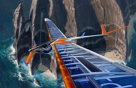
Specialization in art has a long history, from the Dutch genre painters of the 17th century who specialized in still lifes or interiors, or the artists who specialized in painting birds or other animals and would contribute their specialty to another, more recognized work (e.g. Frans Synders painting the eagle in Ruben’s Prometheus Bound), to the modern practice of Japanese manga artists who specialize in buildings or mecha.You’ll also find specialization among entertainment concept artists, who often contribute specialized concept design skills to the creation of films or games.
Long way around to point out that concept artist and designer Scott Robinson specializes in vehicles. He does paint environments and other types of concept art, but vehicles are his thing, and that includes all kinds of vehicles – cars, bikes, trucks, prop planes, jet planes, helicopters, sci-fi craft, boats and even retro-futuristic steam locomotives.
His web site, DrawThrough, has galleries of both his professional and personal work, a bio, information about workshops and instructional DVDs.
His work displays a masterful understanding of perspective and the geometry of objects, refined draughtsmanship and beautifully appropriate rendering technique. Don’t miss his wonderfully fanciful renderings of futuristic bicycles.
In addition to work on films like Minority Report, Robertson has also done a lot of product design for companies like Nissan, Volvo Yamaha, Raleigh Bicycles, Fiat and Nike. He teaches drawing at the Art Center College of Design and is an instructor with the Gnomon Workshop, which carries a number of his instructional DVDs.
Robertson founded the publishing company Design Studio Press which specializes in instructional art books, and publishes titles that feature several of the concept and sci-fi artists I’ve profiled on lines and colors.
Categories:
-
Rembrandt Drawings and Prints at the Met & Morgan
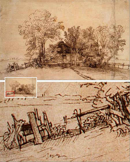
A friend just reminded me that the Metropolitan Museum of Art in New York is also honoring Rembrandt’s 400th birthday (see my post from last Saturday) with a special show drawn from their collection: Rembrandt and His Circle: Drawings and Prints (July 11 – Oct 15, 2006).If you’re in range of New York, this is a wonderful and rare opportunity to see 44 drawings and etchings by the master and 14 more by his students and apprentices.
It’s rare because drawings are so fragile that they can’t be on permanent exhibition, exposure to light damages them. I don’t mean to give the impression that they’ll dissolve into smoke on being exposed to light, like the Wicked Witch of the West’s Beautiful Wickedness melting under Dorothy’s bucket of water, it’s just a matter of light damage accrued over time.
In essence you can think of a given drawing of having a “half life” of exposure to light over time. Curators must calculate the value of exhibiting drawings against the longevity of the works. (What good is it to preserve them if no one gets to see them?) You’ll also notice that drawings are often exhibited in rooms with reduced lighting levels.
I also neglected to mention that there are two shows at the Morgan Library and Museum in New York: From Rembrandt to van Gogh: Dutch Drawings from the Morgan and Celebrating Rembrandt: Etchings from the Morgan (both July 15-Oct 1 2006). (As I mentioned in my previous post, there is also a major exhibit in the fall at the National Gallery in D.C.: Strokes of Genius: Rembrandt’s Prints and Drawings Nov 19, 2006 – March 18, 2007).
Don’t let the “drawn from their own collection” description put you off. The Morgan and the Met have some of Rembrandt’s finest drawings in their superb collections.
The Met’s collection includes Cottage among Trees (above), one of my personal favorites. There is a nice feature on the Met’s site that allows you to view this drawing in a zoomable window. Not as good as the Rijksmuseum’s posting of wonderfully large full size images, but the next best thing. You can zoom in and see details the you don’t usually see that well in book reproductions, like the wagon on the hill beside the cottage.
It’s the lines themselves that are so fascinating to me, you can get lost in them close up, marveling at their fluidity, seeming casualness and amazing variety, and then pull back and realize again that they are part of the larger whole. I’ve often thought that small sections of Rembrandt’s drawings and paintings, extracted and enlarged many times, would make more interesting non-representational art than most of the intentionally non-representational art produced in the latter half of the 20th Century.
I usually take a pocket magnifying glass to exhibits of old master drawings.
All the more remarkable is the knowledge that drawings like this one were not meant for sale or even as gifts to patrons. This is Rembrandt walking around the countryside and drawing for his own benefit. This is drawing at its purest and finest.
Categories:
-
Jeff Jones

In a style that was markedly influenced by his contemporaries Roy Krenkel and Frank Frazetta, Jeff Jones created fantasy and science fiction illustration through the 1960’s and 70’s that was distinguished by strong use of color and texture and a wonderful sense of line within his painterly delineation of form.Jones was also a comics artist and for a time shared a studio with Berni Wrightson, Michael Kaluta and Barry Windsor-Smith (see my previous post on Windsor-Smith). For a few years in the 1970’s Jones contributed a regular one page strip to the National Lampoon called Idyl, which never seemed to be about anything exactly, but was beautifully drawn in Jones’ distinctive pen and ink style that is somehow simultaneously spare and lush.
In addition to the fantasy artists who informed his early work, Jones has explored the territory carved out by illustrators like N.C. Wyeth as well as romantic painters like John William Waterhouse and James McNeil Whistler.
Over the years Jones moved away from illustration and began to paint directly for gallery exhibition. At the same time his style evolved, picking up colors and compositional elements from Expressionism. His more recent work is sometimes more fully realized, sometimes loose, but always filled with variety in color, texture and subject.
Categories:
-
Monster Allergy Animated Series

There is a new web site in support of the Monster Allergy animated series that has been developed out of the Italian comics created by Alessandro Barbucci and Barbara Canepa along with Iginio Straffi.I profiled Barbucci and Canepa and their Sky-Doll series in March and mentioned then again in June.
I’m not certain how involved they are in the development of the TV series, but it promises to be a cut above the usual fare just from the look of the previews and stills from the initial episode.
The protagonist is Zick, a boy who is able to see the invisible monsters in his home (and all around us) by virtue of his allergy to them. The site is still not filled out in many areas, but has some information on the characters and concept, and bears watching for future additions.
The development of the show for US audiences is a joint venture between Kids’ WB, Cartoon Network and Rainbow S.r.I., the Italian animation production company. Monster Allergy will be part of the Kids WB lineup in the fall.
Categories:


Charley’s Picks
Bookshop.org
(Bookshop.org affilliate links; sales benefit independent bookshop owners; I get a small percentage to help support my work on Lines and Colors)

John Singer Sargent: Watercolors


Urban Sketching: Understanding Perspective


Charley’s Picks
Amazon
(Amazon.com affiliate links; sales go to a larger yacht for Jeff Bezos; but I get a small percentage to help support my work on Lines and Colors)
John Singer Sargent: Watercolors
Urban Sketching: Understanding Perspective