
Categories
- 3d CGI
- Amusements
- Animation
- Anime & Manga
- Art Materials
- Art Videos
- Blogroll
- Cartoons
- Color
- Comics
- Concept & Visual Dev.
- Creativity
- Digital Art
- Digital Painting
- Displaying Art on the Web
- Drawing
- Eye Candy for Today
- Gallery and Museum Art
- High-res Art Images
- Illustration
- Motion Graphics & Flash
- Museums
- Online Museums
- Outsider Art
- Painting
- Painting a Day
- Paleo Art
- Pastel, Conté & Chalk
- Pen & Ink
- Prints and Printmaking
- Reviews
- Sc-fi and Fantasy
- Sculpture & Dimensional
- Site Comments
- Sketching
- Storyboards
- Tools and Techniques
- Uncategorized
- Vector Art
- Videos & Podcasts
- Vision and Optics
- Watercolor and Gouache
- Webcomics
Archives
- June 2026
- May 2026
- April 2026
- March 2026
- February 2026
- January 2026
- December 2025
- November 2025
- October 2025
- September 2025
- August 2025
- July 2025
- June 2025
- May 2025
- January 2025
- December 2024
- November 2024
- October 2024
- September 2024
- August 2024
- June 2024
- April 2024
- March 2024
- February 2024
- January 2024
- December 2023
- November 2023
- October 2023
- September 2023
- August 2023
- July 2023
- May 2023
- April 2023
- March 2023
- February 2023
- January 2023
- December 2022
- November 2022
- September 2022
- August 2022
- July 2022
- June 2022
- May 2022
- April 2022
- March 2022
- February 2022
- January 2022
- December 2021
- November 2021
- October 2021
- September 2021
- August 2021
- July 2021
- June 2021
- May 2021
- April 2021
- March 2021
- February 2021
- January 2021
- December 2020
- November 2020
- October 2020
- September 2020
- August 2020
- July 2020
- June 2020
- May 2020
- April 2020
- March 2020
- February 2020
- January 2020
- December 2019
- November 2019
- October 2019
- September 2019
- August 2019
- July 2019
- June 2019
- May 2019
- April 2019
- March 2019
- February 2019
- January 2019
- December 2018
- November 2018
- October 2018
- September 2018
- August 2018
- July 2018
- June 2018
- May 2018
- April 2018
- March 2018
- February 2018
- January 2018
- December 2017
- November 2017
- October 2017
- September 2017
- August 2017
- July 2017
- June 2017
- May 2017
- April 2017
- March 2017
- February 2017
- January 2017
- December 2016
- November 2016
- October 2016
- September 2016
- August 2016
- July 2016
- June 2016
- May 2016
- April 2016
- March 2016
- February 2016
- January 2016
- December 2015
- November 2015
- October 2015
- September 2015
- August 2015
- July 2015
- June 2015
- May 2015
- April 2015
- March 2015
- February 2015
- January 2015
- December 2014
- November 2014
- October 2014
- September 2014
- August 2014
- July 2014
- June 2014
- May 2014
- April 2014
- March 2014
- February 2014
- January 2014
- December 2013
- November 2013
- October 2013
- September 2013
- August 2013
- July 2013
- June 2013
- May 2013
- April 2013
- March 2013
- February 2013
- January 2013
- December 2012
- November 2012
- October 2012
- September 2012
- August 2012
- July 2012
- June 2012
- May 2012
- April 2012
- March 2012
- February 2012
- January 2012
- December 2011
- November 2011
- October 2011
- September 2011
- August 2011
- July 2011
- June 2011
- May 2011
- April 2011
- March 2011
- February 2011
- January 2011
- December 2010
- November 2010
- October 2010
- September 2010
- August 2010
- July 2010
- June 2010
- May 2010
- April 2010
- March 2010
- February 2010
- January 2010
- December 2009
- November 2009
- October 2009
- September 2009
- August 2009
- July 2009
- June 2009
- May 2009
- April 2009
- March 2009
- February 2009
- January 2009
- December 2008
- November 2008
- October 2008
- September 2008
- August 2008
- July 2008
- June 2008
- May 2008
- April 2008
- March 2008
- February 2008
- January 2008
- December 2007
- November 2007
- October 2007
- September 2007
- August 2007
- July 2007
- June 2007
- May 2007
- April 2007
- March 2007
- February 2007
- January 2007
- December 2006
- November 2006
- October 2006
- September 2006
- August 2006
- July 2006
- June 2006
- May 2006
- April 2006
- March 2006
- February 2006
- January 2006
- December 2005
- November 2005
- October 2005
- September 2005
- August 2005
Relevant Blogs
Art, Painting & Sketch
- Gurney Journey
- Underpaintings
- Art and Influence
- Painting Perceptions
- Oil Painters of America
- Vasari Paint POV
- Flying Fox
- Urban Sketchers
- Bento (Smithsonian)
- Art Inconnu
- The Hidden Place
- Still Life
- Making a Mark
- The Art of the Landscape
- Exploring Color & Creativity
- Art Contrarian
- Artist A Day
- beinArt Surreal Art Collective
- Eye Level
- David Dunlop
- p.i.g.m.e.n.t.i.u.m
- CultureGrrl
- Joaquín Sorolla blog
- Artists in Pastel
“Painting a Day”
- A Painting a Day (Keiser)
- On Painting (Keiser)
- Julian Merrow-Smith
- Karen Jurick
- Jeffrey Hayes
- Carol Marine
- Abbey Ryan
- Daily Paintworks
Other Painting Blogs
- Virtual Gouache Land
- Neil Hollingsworth
- Marc Hanson
- Kevin Menck
- Marc Dalessio
- Larry Seiler
- Stapleton Kearns
- Colin Page
- Roos Schuring
- Hans Versfelt
- Titus Meeuws
- Régis Pettinari
- René Plein Air
- Belinda Del Pesco
- Robin Weiss
- Nathan Fowkes (Land Sketch)
- William Wray
- Frank Serrano
- Stephen Magsig
- Michael Chesley Johnson
- Twice a Week
- Sarah Wimperis
- Rob Adams
- Michael Cole Manley
- The Dirty Palette Club
- Mike Manley’s Draw!
Gallery Art & Illustration mix
Illustration
- Howard Pyle
- 100 Years of Illustration
- BibliOdyssey
- Illustration Art
- Today’s Inspiration
- Illustration Mundo
- Little Chimp Society
- Danny Gregory
- R D (John Martz
- Illustration Friday blog
- Monster Brains
- Illustrators & Illustrations (RU)
- Elwood H. Smith
- DaniDraws.com
- Designers Who Blog
- iSpot Blog
Sci-Fi & Fantasy
Illustration & Comics
Comics & Cartoons
- Comics Beat
- Robot 6
- Newsarama Blog
- Comic Vine
- Comics Alliance
- Forbidden Planet Int.
- Paolo Rivera
- Bolt City
- Flight
- Scott McCloud
- The Comics Journal
- Comixpedia
- Funnybook Babylon
- James Baker
- Middleton’s Sketchbook
- Boneville
- The Hotel Fred
- Paul Rivoche
- Daily Cartoonist
- Mad About Cartoons (William Wray)
- Digital Strips
Illustration & Concept
Animation & Concept
- Cartoon Brew
- Animation Blog
- Cold Hard Flash
- Concept Art World
- The CAB
- FY Concept Art
- Concept Ships
- Concept Robots
- John Nevarez
- Armand Serrano
- Marcos Mateu-Mestre
- all kinds of stuff (Kricfalusi)
- Yacin the faun (Man Arenas)
- Kelsey Mann
- Cre8tivemarks Blog
- Ice-Cream Monster Toon Cafe
- AAU Character & Creature Design
- AAU Animation Notes
- Articles and Texticles
Paleo & Scientific
Tools & Techniques
Other
Lists of Art Blogs
Art Image Resource Links
Historic Art Images
- Wikimedia Commons: Paintings
- Wikimedia Commons: Drawings
- The Athenaeum
- WikiArt (WikiPaintings)
- Google Art Project: Artists
- Google Art Project: Collections (Museums)
- ArtCyclopedia
- Web Gallery of Art
- Art Renewal Center
- Web Gallery of Impressionism
Auction Consolidation sites
Auction sites
- Sotheby’s
- Bonham’s
- Christies
- Heritage Auctions: Fine Art
- Heritage Auctions: Illustration
- Freeman’s Auctions
- Bukowskis
- Shannon’s
Image Search
Reverse Image Search (search by image)
- Tin Eye
- RevImg
- Google Image Search (camera icon)
- Bing Image Search (camera icon)
Promoting some friends and some clients of my website design business
- Twin Willows T’ai Chi studio in Wilmington DE. Taiji classes with Bryan Davis.
- Ray Hayward, Inspired Teacher of T’ai Chi ( Taiji ) in Minneapolis, Founder of Mindful Motion Tai Chi Academy
- OldHead Tattoo studio and Art Gallery in Wilmington DE. Tattoos and paintings by Bruce Gulick
- Sharon Domenico Art, pet portrait oil paintings
- Platinum Paperhanging, wallpaper hanging, Main Line and Philadelphia, PA
- Lisa Stone Design, interior designer, Main Line and Philadelphia, PA
- Studio12KPT, original art, prints, calendars and other custom printed items by Van Sickle & Rolleri
-
Wikimedia Commons

No, it doesn’t have anything to do with WikiLeaks, but Wikimedia Commons is related to another familiar Wiki based phenomenon, Wikipedia, in that both are projects of the Wikimedia Foundation.(A wiki, by the way, is simply a kind of website, specifically, a potentially collaborative website created with wiki software, that allows for contribution, editing and administration by people with no knowledge of HTML.)
Wikimedia Commons is the Wikimedia Foundation’s online free-use media resource, containing over 7,000,000 media files — sound, video and of course, images.
Among the images are an increasingly large number of art related images — paintings, drawings, etchings, engravings and the like. It has become one of the larger art image repositories on the web (see my posts on The Athenaeum, ArtMagick, AllPaintings, The Web Gallery of Art and The Art Renewal Center). You may have noticed links to Wikimedia Commons among the links provided with a number of my articles about artists from history.
You can use the search feature at the top of every Wikimedia Commons page to look for a specific artist, of course, but one of the nice things about the arrangement of the material is that it enables a certain kind of browsing, one conducive to discovering artists and works that may be new to you.
An initial search for “paintings“, for example, brings up a page that provides access other category listings, such as Paintings by artist, Paintings by city, country, period, medium, subject, technique, and even Paintings by museum.
One of the most productive to my mind is the “Paintings by date” category, and from that landing, “Paintings by century“.
Here it’s easy to narrow down, for example into 19th century paintings. At this level, you’ll be presented with a number of thumbnails for a variety of paintings from the century, a sort of skim through some of that century’s artists, and a further breakdown into decades. Here is where I like to browse, by choosing a decade, for instance, 1880s paintings.
Though there are further breakdowns at that level, into individual years, the thumbnails for a given decade present a nicely varied selection of works to view by a variety of artists. Though hardly comprehensive, it makes for a fun way to explore and sample a selection of works by artists both familiar and not.
The images above, for example, all were represented on the 1880s paintings page as thumbnails, from the top: James Tissot, Henryk Hector Siemiradzki, Carl Spitzweg, Aleksandr Novoskoltsev, Vincent van Gogh, Willem de Zwart, John Singer Sargent, Jules-Eugé Lenepveu, Ilya Repin, Jean-Léon Gérôme, Edouard Manet and William Merritt Chase.
Once on the page for an individual work you can sometimes (though not always) click through a linked mention of the artist’s name into a page of works specifically by that artist, for example, William Merritt Chase.
The possibilities for discovering artists are extensive.
I’ll give my usual Major Timesink Warning for resources this large and potentially engrossing.
Enjoy!
Categories:
-
Interview with Jean-Baptiste Monge
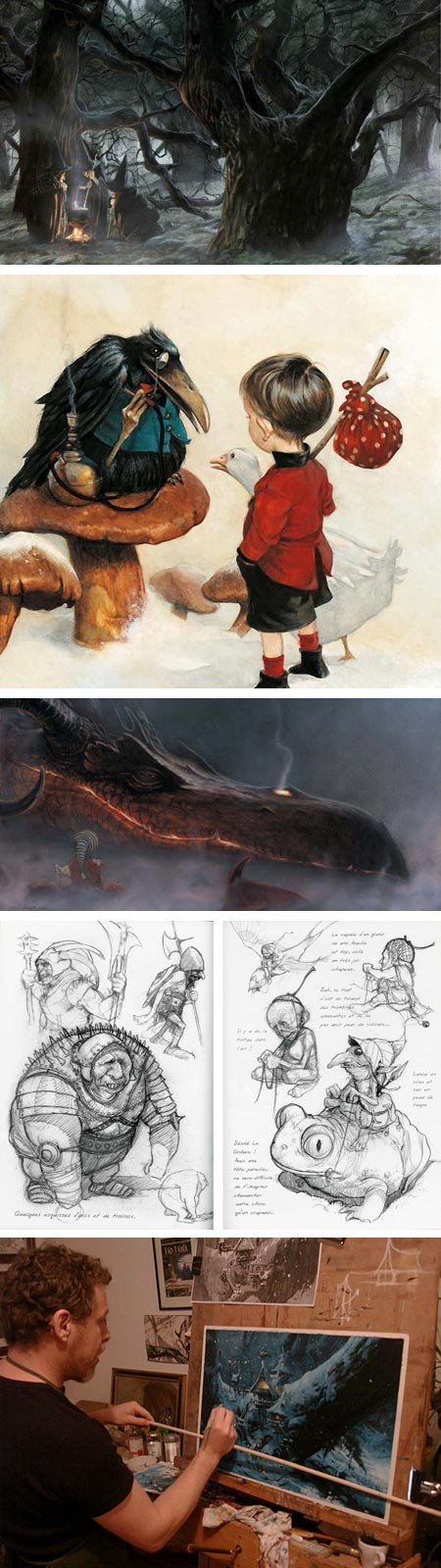
Jennifer Oliver was kind enough to write and let me know that she has posted a two-part interview with French fantasy illustrator and concept artist Jean-Baptiste Monge (who I profiled previously here) on her blog Academy of Art Character and Creature Design Notes.An Interview with Jean-Baptiste Monge, Part 1, and Part 2.
The blog is aimed at her students at Academy of Art University, but Oliver has generously shared the interview with the rest of us.
The interview, conducted in English, is profusely illustrated (how I love that phrase) with Monge’s beautiful, often detailed and wonderfully realized paintings, along with drawings, sketches and photographs of Monge at work (be sure to click on the images for larger versions).
Monge’s work is enchanting, in the fullest sense of that word, drawing you in with wonderfully stylized lines and forms and then charming the eye with beautiful touches and thoughtful details. He often reminds me of illustrators from the Golden Age of Illustration just before and after the turn of the 20th Century, so I found the list of influences he mentions in the interview of particular interest.
He mentions a number of painters and illustrators I would have associated with him from my impression of his style, and some I didn’t expect.
Many of the artists he mentions have been the subject of previous posts on Lines and Colors, including painters and clsssic illustrators like J. W. Waterhouse, Jean-Léon Gérôme, John Bauer, Edmund Dulac, Arthur Rackham, Alphonse Mucha, Norman Rockwell, J.C. Leyendecker and Haddon Sundblom, as well as contemporary illustrators like John Howe, PJ Lynch and James Gurney (links to my posts).
Oliver lists some resources for information on Monge, including his website, a portfolio on Creative Talent Network, his LinkedIn and Facebook pages and Mr. Dumblebee.
For more see my previous post on Jean-Baptiste Monge.
Categories:
-
Velázquez Portrait Restored, Literally and Figuratively

In 1973, for reasons still not clear to me, the Metropolitan Museum of Art in New York undertook a sweeping reassessment of many of its holdings, resulting in the downgrading of 300 old master paintings from attribution to the master to attribution to “workshop of”, “circle of” or “follower of”, removing them from the canon of those masters’ works and significantly depleting the value of the museum’s collection.Some of those pieces have been again reassessed, both in the light of continued scholarship and as the result of subsequent cleanings and restorations. Last year the Met cleaned and restored Velázquez’s Portrait of a Man, and in the process restored it to it’s original attribution — originating from the master’s hand an not that of a subordinate. This was particularly significant as the painting is likely a self-portrait (see my post, Velázquez (Self?) Portrait Rediscovered).
This process has been repeated with a painting that was once, and is now again, one of the museum’s most important paintings by the Spanish master, who is sometimes labeled the greatest of all painters.
The full-length portrait of Philip IV of Spain is one of three the court commissioned from Velázquez after he became court painter. The painting had suffered over the years from numerous applications of varnish and misguided repainting, and was in a condition that made definitive attribution difficult.
The New York Times has a nice set of interactives on their feature, The Restoration of a Velázquez, that allows you to move a slider across the images, comparing the before and after restoration state of the painting (click between the “Restoration” and “Two Paintings Compared” tabs at the top of the feature).
I don’t know how long the NYT feature will be available before it disappears behind a registration wall. The painting’s listing on the Met’s site has both a larger version and a Zoomable feature, and still bears the “This information may change as the result of ongoing research.” tag.
We can assume (or hope) that Velázquez hasn’t indulged in flattering his subject here. The young Philip, pale, droopy eyed and red lipped, looks more like the dweeb you sat next to in chemistry than the ruler of one of the great empires of the world. But his appearance is consistent throughout paintings by Velázquez and others, and the master’s hand, revealed on the removal years of accumulated abuse, holds a steady mirror to nature.
(Image above, images of the interactive from NYT on the left, images from the Met on the right)
Categories:
-
Ian McQue

Ian McQue is a concept artist, illustrator and art director for the gaming industry. He is currently working for Rockstar North, and gaming aficionados will recognize the several Grand Theft Auto titles to his credit, along with an number of other games.McQue works in both traditional and digital media, the latter including Photoshop, Illustrator and 3d Studio Max.
When not working, McQue likes to add to his flotilla of steampunk airships. Wonderfully realized, improbably heavy, they appear battered and patched, as though the aerial equivalent of the junks and salvaged ships one might find in an off the map Pacific port, trading in God-knows-what, plying the currents in the grey skies of another place or time.
You can find a nice big introductory batch of his flying ships on Concept Ships, where his work was chosen for the Monthly header this month.
You’ll find more of his on his blog, along with some of his nicely gestural sketches. There is also a gallery on CGHub.
[Via io9]
Categories:
-
Confident Color

This is one of those books for which the binding is key.Nita Leland’s Confident Color: An Artist’s Guide to Harmony, Contrast and Unity is published by venerable art instruction book publisher North Light Books.
Like Leland’s previous book, The New Creative Artist (which I reviewed here) and Bert Dodson’s Keys to Drawing with Imagination (my review here), North Light has published it in their hybrid hardback/spiral binding, giving the overt clue that this is a book meant to be used, rather then simply read.
The spiral binding allows for laying the book flat on your drawing table, the hardcover allows for rough and continued handling, and the combination allows for propping the book open upright on the rail of an easel.
The intention of the publisher clearly matches that of the writer, to get the most out of this book, it needs to be used, worked with over time; and will have shown its best service when ragged at the edges and spattered with paint.
Not that you couldn’t settle into the Comfy Chair and find lots of interest to read through and look at; Leland drills through a concise introduction to color theory, history and terminology and covers the basics of understanding palettes and pigments, all augmented with her selections of works from a variety of contemporary working artists and a few of her own. The real value, though, is in the exercises, trials, procedures and processes that form the core of the book.
If you’re lucky, you may have encountered a teacher like Leland in your formative years, one who will, however gently and politely, continue to poke and prod and push you to try something new, move out of your comfort zone, experiment, play and explore.
This isn’t random try-whatever experimentation, however; in Confident Color Leland provides you with guided exploration, designed to systematically familiarize you with the ranges of relationships presented by your color choices.
There is a “Look Inside” preview on the Amazon listing, though as is often the case, the pages represented don’t give the best indication of the actual content of the book. The index is actually better for that.
The book is aimed at beginners as well as more advanced artists, and though watercolor is Leland’s medium and some of the pigments mentioned are particular to watercolor, the general palettes are set up with colors that work well across most mediums that involve color.
In some ways this is an extension of and companion to Leland’s 1998 book Exploring Color, which has become something of a standard among books on working with color. That book, though without the advantage of the lay-flat binding, was also meant to be worked with.
Both volumes focus alternately on the split-primary process of color mixing and on the exploration of variations on the red/blue/yellow triads that serve as the basis for several of many possible color wheels.
She urges you to work with and understand the difference between palettes composed of muted, intense and earth-toned colors, as well as the “workhorse” colors that form the basis of most artist’s palettes.
In pursuing her exercises and explorations, you might work with colors and combinations that you would’t use in other circumstances, which may seem counter productive; but just as contour drawing is rarely used as the style for a finished work, knowing artists will work at it with dedication, letting the practice inform and strengthen their finished style.
This isn’t the kind of book that says “mix two parts Cad Yellow to one part Ultramarine to paint this foliage”; in Confident Color, Leland is suggesting if you experiment with these excursions into color harmony and contrast, work through the mixtures possible with variations of of the primary triad and really get the feeling for how colors act and react with one another, you’ll instinctively know what to mix when you want to paint something.
The book’s binding is the key. Confidence comes from doing.
Categories:
-
Waterhouse’s Miranda

Whatever the actual reception of the movie itself, I think it’s always good when a new popularly released move brings renewed attention to the works of Shakespeare, which had much more in common with the characteristics of contemporary popular entertainment than your high school English class might have led you to believe.The latest adaptation from the Bard’s cupboard of timeless tales, the 2010 version of The Tempest, features Helen Mirren as a female version of Prospero, and Felicity Jones as her sheltered daughter, Miranda.
Victorian painter John William Waterhouse, who, like his friends in the Pre-Raphaelite Brotherhood, often took scenes from Shakespeare for his subjects, apparently painted three different interpretations of Miranda.
One was painted in 1875, early in his career (images above, top). It shows a contemplative Miranda gazing out over a calm sea.
The other two, smaller and larger versions of essentially the same image, were both painted by Waterhouse in in 1916, the year before his death. They show Miranda as witness to the storm and shipwreck which which the play’s actions begin. The later and larger of these (image above, top) is probably the most familiar.
More Tempest trivia: one of the most interesting, if loose, adaptations from The Tempest was the spectacular (for its time) 1956 science fiction classic, Forbidden Planet (more here). The film, aside from the connection to The Tempest, was notable for a number of reasons: the “monster from the id” and the subterranean alien power station were rendered and animated by veteran Disney artist Joshua Meador; the action was filmed largely on a soundstage backed with an enormous painted cyclorama of the alien landscape; and the movie and its production design were credited by Gene Roddenberry as a primary influence on the creation of his television show Star Trek; it also featured Leslie Neilson as the dramatic lead and introduced Robbie the Robot, one of the most iconic and influential designs for a cinematic robot; but I digress… back to Waterhouse’s 19th Century interpretation of Shakespeare’s 17th Century play.
Scenes from The Tempest were also interpreted by other artists, notably Pre-Raphaelite painter John Everett Millais, William Maw Egley, William Hamilton, earlier by Swiss-born Henry Fuseli, and even earlier by Angelica Kauffmann and George Romney.
(See my posts on John Everett Millais, Henry Fuseli and John William Waterhouse.)
Categories:


Charley’s Picks
Bookshop.org
(Bookshop.org affilliate links; sales benefit independent bookshop owners; I get a small percentage to help support my work on Lines and Colors)

John Singer Sargent: Watercolors


Urban Sketching: Understanding Perspective


Charley’s Picks
Amazon
(Amazon.com affiliate links; sales go to a larger yacht for Jeff Bezos; but I get a small percentage to help support my work on Lines and Colors)
John Singer Sargent: Watercolors
Urban Sketching: Understanding Perspective