
Categories
- 3d CGI
- Amusements
- Animation
- Anime & Manga
- Art Materials
- Art Videos
- Blogroll
- Cartoons
- Color
- Comics
- Concept & Visual Dev.
- Creativity
- Digital Art
- Digital Painting
- Displaying Art on the Web
- Drawing
- Eye Candy for Today
- Gallery and Museum Art
- High-res Art Images
- Illustration
- Motion Graphics & Flash
- Museums
- Online Museums
- Outsider Art
- Painting
- Painting a Day
- Paleo Art
- Pastel, Conté & Chalk
- Pen & Ink
- Prints and Printmaking
- Reviews
- Sc-fi and Fantasy
- Sculpture & Dimensional
- Site Comments
- Sketching
- Storyboards
- Tools and Techniques
- Uncategorized
- Vector Art
- Videos & Podcasts
- Vision and Optics
- Watercolor and Gouache
- Webcomics
Archives
- May 2026
- April 2026
- March 2026
- February 2026
- January 2026
- December 2025
- November 2025
- October 2025
- September 2025
- August 2025
- July 2025
- June 2025
- May 2025
- January 2025
- December 2024
- November 2024
- October 2024
- September 2024
- August 2024
- June 2024
- April 2024
- March 2024
- February 2024
- January 2024
- December 2023
- November 2023
- October 2023
- September 2023
- August 2023
- July 2023
- May 2023
- April 2023
- March 2023
- February 2023
- January 2023
- December 2022
- November 2022
- September 2022
- August 2022
- July 2022
- June 2022
- May 2022
- April 2022
- March 2022
- February 2022
- January 2022
- December 2021
- November 2021
- October 2021
- September 2021
- August 2021
- July 2021
- June 2021
- May 2021
- April 2021
- March 2021
- February 2021
- January 2021
- December 2020
- November 2020
- October 2020
- September 2020
- August 2020
- July 2020
- June 2020
- May 2020
- April 2020
- March 2020
- February 2020
- January 2020
- December 2019
- November 2019
- October 2019
- September 2019
- August 2019
- July 2019
- June 2019
- May 2019
- April 2019
- March 2019
- February 2019
- January 2019
- December 2018
- November 2018
- October 2018
- September 2018
- August 2018
- July 2018
- June 2018
- May 2018
- April 2018
- March 2018
- February 2018
- January 2018
- December 2017
- November 2017
- October 2017
- September 2017
- August 2017
- July 2017
- June 2017
- May 2017
- April 2017
- March 2017
- February 2017
- January 2017
- December 2016
- November 2016
- October 2016
- September 2016
- August 2016
- July 2016
- June 2016
- May 2016
- April 2016
- March 2016
- February 2016
- January 2016
- December 2015
- November 2015
- October 2015
- September 2015
- August 2015
- July 2015
- June 2015
- May 2015
- April 2015
- March 2015
- February 2015
- January 2015
- December 2014
- November 2014
- October 2014
- September 2014
- August 2014
- July 2014
- June 2014
- May 2014
- April 2014
- March 2014
- February 2014
- January 2014
- December 2013
- November 2013
- October 2013
- September 2013
- August 2013
- July 2013
- June 2013
- May 2013
- April 2013
- March 2013
- February 2013
- January 2013
- December 2012
- November 2012
- October 2012
- September 2012
- August 2012
- July 2012
- June 2012
- May 2012
- April 2012
- March 2012
- February 2012
- January 2012
- December 2011
- November 2011
- October 2011
- September 2011
- August 2011
- July 2011
- June 2011
- May 2011
- April 2011
- March 2011
- February 2011
- January 2011
- December 2010
- November 2010
- October 2010
- September 2010
- August 2010
- July 2010
- June 2010
- May 2010
- April 2010
- March 2010
- February 2010
- January 2010
- December 2009
- November 2009
- October 2009
- September 2009
- August 2009
- July 2009
- June 2009
- May 2009
- April 2009
- March 2009
- February 2009
- January 2009
- December 2008
- November 2008
- October 2008
- September 2008
- August 2008
- July 2008
- June 2008
- May 2008
- April 2008
- March 2008
- February 2008
- January 2008
- December 2007
- November 2007
- October 2007
- September 2007
- August 2007
- July 2007
- June 2007
- May 2007
- April 2007
- March 2007
- February 2007
- January 2007
- December 2006
- November 2006
- October 2006
- September 2006
- August 2006
- July 2006
- June 2006
- May 2006
- April 2006
- March 2006
- February 2006
- January 2006
- December 2005
- November 2005
- October 2005
- September 2005
- August 2005
Relevant Blogs
Art, Painting & Sketch
- Gurney Journey
- Underpaintings
- Art and Influence
- Painting Perceptions
- Oil Painters of America
- Vasari Paint POV
- Flying Fox
- Urban Sketchers
- Bento (Smithsonian)
- Art Inconnu
- The Hidden Place
- Still Life
- Making a Mark
- The Art of the Landscape
- Exploring Color & Creativity
- Art Contrarian
- Artist A Day
- beinArt Surreal Art Collective
- Eye Level
- David Dunlop
- p.i.g.m.e.n.t.i.u.m
- CultureGrrl
- Joaquín Sorolla blog
- Artists in Pastel
“Painting a Day”
- A Painting a Day (Keiser)
- On Painting (Keiser)
- Julian Merrow-Smith
- Karen Jurick
- Jeffrey Hayes
- Carol Marine
- Abbey Ryan
- Daily Paintworks
Other Painting Blogs
- Virtual Gouache Land
- Neil Hollingsworth
- Marc Hanson
- Kevin Menck
- Marc Dalessio
- Larry Seiler
- Stapleton Kearns
- Colin Page
- Roos Schuring
- Hans Versfelt
- Titus Meeuws
- Régis Pettinari
- René Plein Air
- Belinda Del Pesco
- Robin Weiss
- Nathan Fowkes (Land Sketch)
- William Wray
- Frank Serrano
- Stephen Magsig
- Michael Chesley Johnson
- Twice a Week
- Sarah Wimperis
- Rob Adams
- Michael Cole Manley
- The Dirty Palette Club
- Mike Manley’s Draw!
Gallery Art & Illustration mix
Illustration
- Howard Pyle
- 100 Years of Illustration
- BibliOdyssey
- Illustration Art
- Today’s Inspiration
- Illustration Mundo
- Little Chimp Society
- Danny Gregory
- R D (John Martz
- Illustration Friday blog
- Monster Brains
- Illustrators & Illustrations (RU)
- Elwood H. Smith
- DaniDraws.com
- Designers Who Blog
- iSpot Blog
Sci-Fi & Fantasy
Illustration & Comics
Comics & Cartoons
- Comics Beat
- Robot 6
- Newsarama Blog
- Comic Vine
- Comics Alliance
- Forbidden Planet Int.
- Paolo Rivera
- Bolt City
- Flight
- Scott McCloud
- The Comics Journal
- Comixpedia
- Funnybook Babylon
- James Baker
- Middleton’s Sketchbook
- Boneville
- The Hotel Fred
- Paul Rivoche
- Daily Cartoonist
- Mad About Cartoons (William Wray)
- Digital Strips
Illustration & Concept
Animation & Concept
- Cartoon Brew
- Animation Blog
- Cold Hard Flash
- Concept Art World
- The CAB
- FY Concept Art
- Concept Ships
- Concept Robots
- John Nevarez
- Armand Serrano
- Marcos Mateu-Mestre
- all kinds of stuff (Kricfalusi)
- Yacin the faun (Man Arenas)
- Kelsey Mann
- Cre8tivemarks Blog
- Ice-Cream Monster Toon Cafe
- AAU Character & Creature Design
- AAU Animation Notes
- Articles and Texticles
Paleo & Scientific
Tools & Techniques
Other
Lists of Art Blogs
Art Image Resource Links
Historic Art Images
- Wikimedia Commons: Paintings
- Wikimedia Commons: Drawings
- The Athenaeum
- WikiArt (WikiPaintings)
- Google Art Project: Artists
- Google Art Project: Collections (Museums)
- ArtCyclopedia
- Web Gallery of Art
- Art Renewal Center
- Web Gallery of Impressionism
Auction Consolidation sites
Auction sites
- Sotheby’s
- Bonham’s
- Christies
- Heritage Auctions: Fine Art
- Heritage Auctions: Illustration
- Freeman’s Auctions
- Bukowskis
- Shannon’s
Image Search
Reverse Image Search (search by image)
- Tin Eye
- RevImg
- Google Image Search (camera icon)
- Bing Image Search (camera icon)
Promoting some friends and some clients of my website design business
- Twin Willows T’ai Chi studio in Wilmington DE. Taiji classes with Bryan Davis.
- Ray Hayward, Inspired Teacher of T’ai Chi ( Taiji ) in Minneapolis, Founder of Mindful Motion Tai Chi Academy
- OldHead Tattoo studio and Art Gallery in Wilmington DE. Tattoos and paintings by Bruce Gulick
- Sharon Domenico Art, pet portrait oil paintings
- Platinum Paperhanging, wallpaper hanging, Main Line and Philadelphia, PA
- Lisa Stone Design, interior designer, Main Line and Philadelphia, PA
- Studio12KPT, original art, prints, calendars and other custom printed items by Van Sickle & Rolleri
-
Spectrum 13
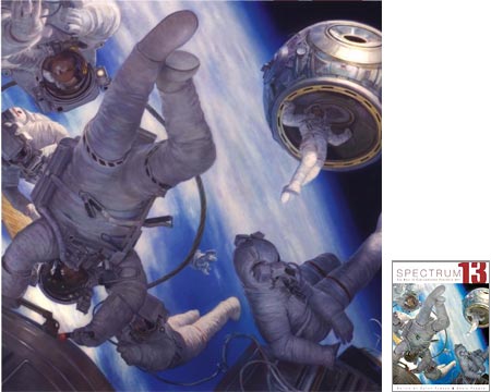
I should have written about this sooner, but I have such a long list of goodies to tell you about that it can take a while to get to a particular one.Spectrum 13 (Amazon link) came out a couple of months ago. This is the latest in the Spectrum yearly collections of contemporary fantastic art.
As you might expect, this includes fantasy and science fiction illustration, but it also includes comic book artists, dimensional artists (sculptors and modelers) and 3-D artists; and has expanded in recent years to include more fantastic themed art from mainstream editorial and book illustrators as well as entertainment industry production art.
The Spectrum collections are edited by Cathy and Arnie Fenner, (who also did a wonderful job on the new Jon Foster book), and never fail to be beautifully designed books showcasing some of the best contemporary representational illustration to be found.
Unfortunately, the Spectrum site doesn’t include any preview galleries, although there is an artist list, that lists the over 300 artists featured in this edition.
In glancing through Spectrum 13, I was struck by how many artists that I’ve featured over time on lines and colors are represented in this latest edition, so I’ll use the lines and colors archive to give you a taste for some of the artists (though not necessarily particular works) you’ll encounter.
I don’t know how many of you have noticed that I’ve been using the Snap Preview Anywhere feature for the last few weeks, but it allows you to hold your mouse over the links on lines and colors to see a small visual preview of the linked page.
Every year, the Spectrum collection features a Grand Master Award, a special acknowledgement of lifetime achievement. This year it goes to Jeffery Jones.
Other artists (in no particular order) include:
Donato Giancola (this year’s cover artist)
William Stout
Jon Foster
Stephan Martiniere
Robert Chang
Dan Dos Santos
James Jean
Brom
Todd Lockwood
John Howe
Douglas Klauba
Frank Cho
Peter De Séve
John Picacio
Matt Dixon
Michael Whelan
Dave Stevens
Stephen Hickman
Phillip Straub
Marc Gabbana
Brian Despain
Gregory Manchess
Christian Alzmann
Robh Ruppel
Michael Deas
Tony DiTerlizzi
Bob Eggleton
Craig Mullins
James GurneyFor those interested in submitting an entry for the next volume, Spectrum 14, the deadline is a rapidly approaching January 27, 2007.
Categories:
-
Sir Edward John Poynter
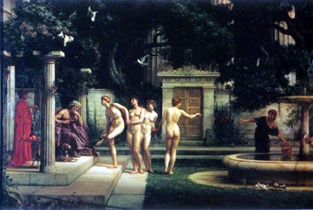
Edward Poynter was a Victorian painter, draughtsman and decorative designer. As a young student he was very impressed by the academic paintings of Frederic Leighton after meeting him in Italy.After returning from his trip to Italy, Poynter studied in London at Leigh’s Academy and the Royal Academy, but was eventually drawn to Paris, where he studied in the atelier of Charles Gleyre. Poynter and his fellow atelier students Thomas Armstrong, James McNeil Whistler and George Du Maurier became the subjects of Du Maurier’s novel Trilby.
Poynter made his reputation with his large scale historical paintings, but his real passion was the human figure. Even in his historical paintings he would go out of his way to paint partially or entirely unclothed figures so he could indulge in his passion for figure painting within the confines of what was considered proper by the Victorian art establishment, for example, working a male nude into his depiction of Romans readying a catapult for launch in The Catapult.
Poynter could also make popular works that provided a bit of titillation for the oh-so-proper Victorians clothed in the propriety of classical themes, as in A Visit to Aesclepius (image above) and The Cave of the Storm Nymphs.
He also shared Sir Lawrence Alma-Tedema’s love for exquisitely rendered figures in beautiful classical settings, and was almost his match in the rendering of marble and the other textures of classical imagery.
Poynter became a teacher and administrator, but never lost his love of drawing and painting from life models, and stressed the importance of studying the human figure in his teaching.
Categories:
-
Carson Van Osten’s Comic Strip Artist’s Kit

Most people think of comics as simply a series of illustrations, and of the skill involved as essentially one of drawing.What they don’t see is the art underneath, the art of visual storytelling, which in many ways is more important in comics than outright drawing skill. A person with good visual storytelling skills and modest drawing ability can make better comics than someone who is a dazzling artist, but lacks an understanding of visual storytelling principals.
An important part of that skill set is a subset dealing with the design and layout of comics panels. Here is a link to a great resource for anyone interested in comics storytelling, or its close relative, movie and animation storyboarding.
Mark Kennedy, on his blog devoted to storyboarding, Temple of the Seven Golden Camels, which is itself a great resource, has posted a wonderful 7-page feature called Comic Strip Artist’s Kit, by Disney comic book artist Carson Van Osten.
Van Osten went to the Philadelphia College of Art (now the University of the Arts) here in Philadelphia. He was also a musician and played bass in the legendary Philly 60’s bands Woody’s Truck Stop and The Nazz (Todd’s Rundgren’s original band).
He later went to work for Disney Studio’s comic book department, writing and drawing Mickey Mouse and Goofy comics for distribution in Europe. He then moved to their American comic strips department, worked with Floyd Gottfredson on the Mickey Mouse daily newspaper strip, became the art director of the department in the 80’s and 90’s and, as far as I know, continues to do work on various Disney comics.
In 1975, as part of a slide presentation for a Disney meeting in Frankfurt, he drew up some sheets on common problems in comics layout and staging. It was so well received that the company printed 2000 copies and distributed it to all Disney offices. The sketches also were used in the book The Illusion of Life: Disney Animation by Ollie Johnston and Frank Thomas.
Copies of the sheets, which are a terrific primer on the principles of staging and layout in comics and storyboarding, have generously been made available on the web. Carson saw a mention of the pages on Kennedy’s storyboarding blog and sent him large copies, which he has posted in versions at a high enough resolution to be really usable and printable.
Even if you’re not interested in creating comics or storyboards, take a look for a fascinating glimpse into some of the “hidden art” of visual storytelling.
Links via Metafilter and Drawn!
Categories:
-
James Skvarch
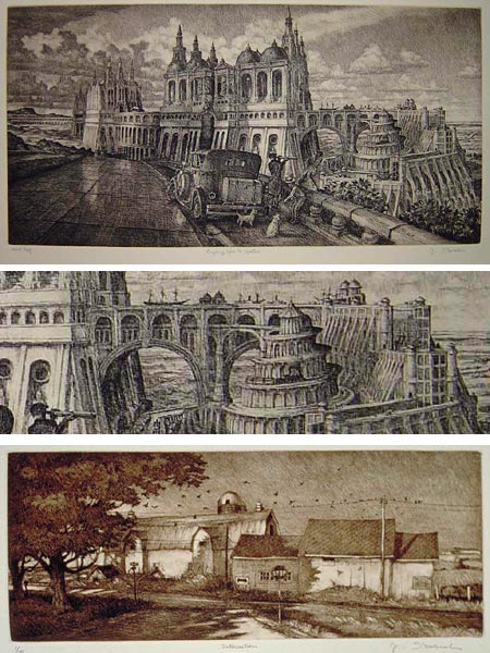
I really enjoy etchings. Etching a subtle art that seldom receives the attention it deserves in this day of jaded, color drenched and video saturated vision. Etchings seem quiet, but within their subtlety they can be as dramatic as a painting, and there is something about the quality of etched lines that is unlike any other medium. (See my post on Whistler’s etchings, which includes a brief description of the process.)I’m particularly pleased, then, when I find contemporary artists who are working in the grand tradition of classical etching. James Skvarch is an artist who trained at the Maryland Art Institute, the Rochester Institute of Technology and the International Academy for Art in Salzburg, Austria, and is now living in New York State.
Although he also does very nice paintings, Skvarch’s primary medium is etching. Within that, he covers a fascinating range of topics. Most striking are his “Caprices“, architectural inventions and fantasies inspired by Piranesi (see my post on Piranesi), and depicting fantastic, grand scale structures and landscapes from other times.
These are not only a treat in terms of visual fantasy, but often have a subtle sense of humor as well. In the image at top, and the detail, center, note both the “canal to nowhere”, showing ships sailing atop the great arches hundreds of feet above the waves, and the delightfully silly “train to nowhere”, working its way up the helical ramp of the nonsensical structure to the right. All of this, of course, is being viewed through a spyglass by a well-heeled 1920’s tourist couple, accompanied by their two dogs.
More fantastic inventions can be found among his section of “Ships and Trains“. His Landscapes, by contrast, are straightforward and beautifully rendered depictions of farms and rural houses.
In between his fantastic and realist sensibilities are his Interiors, which are primarily representational, but carry an enigmatic sense of light, and are at times slightly distorted as if viewed through a wide angle lens. There is also an interesting set of etchings depicting old Cars.
Many of the works in the main galleries are etchings for which there are still impressions available for sale. The two Archives of small prints, (landscapes and interiors) and large prints (Caprices), show etchings for which the run has sold out, but contain some wonderful images.
Link via BibliOdyssey
Categories:
-
Mick McGinty
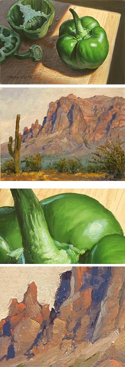 In my coverage of “painting a day” blogs, I’ve been remiss in not covering painters who are painting less frequently, but basically following the same paradigm — creating small paintings from life on a regular basis, posting them to a blog and offering them for sale through eBay or other means.
A nice case in point is Mick McGinty. McGinty has worked as an illustrator for many years, largely doing commercial illustration in a detailed and highly rendered manner. His main site includes galleries of both airbrush and hand painted illustration and digital illustration.
In his paintings from life, McGinty has made a deliberate choice to move toward a much looser, more immediate and painterly style. (For an interesting comparison, see my recent post on Bob Eggleton, a science fiction illustrator who has made a similar move.) In the past year or so, McGinty has been posting small paintings (about 5×7″, some at 8×10″), either from life or from his own photographs, of both still life subjects and landscapes, to his blog. The blog is titled, appropriately enough, Twice a Week.
While these paintings sometimes carry some of the feeling of paintings done for illustration, exhibiting a level of finish and control not often found among painting a day artists, particularly when viewed at a smaller size; clicking on the enlargements reveals them as quite painterly, refreshingly loose and beautifully confident. His regular web site includes a gallery of these small paintings as well as larger works, but I think the best of them is to be found on his blog, particularly if you browse back through the archives.
His still life subjects often include food items, dishware, jars and utensils, the kind of things painting a day artists often find their attention settling on when looking around them for small, immediate subjects. These are contrasted nicely by his landscapes, which are often of dramatic and colorful rock formations from Sedona, Monument Valley and other locations in the West. Some of my favorites, though are his less frequent subjects of rural houses and small creeks and streams.
[Note to other painting a day painters: McGinty’s choice of images sizes, and the immediate link from the posted blog image to the enlargement, with a separate link to the eBay auction, is in my opinion a good model for how to both entice prospective buyers and show them enough detail to give them some confidence about purchasing art over the web (just my opinion, of course).]
Categories:
-
Eric Grohe

In the image at top, the plants, low retaining walls, benches and sidewalk are real. Everything else, the stone structures with their carvings and decorative elements, the ironwork bridge and the entire city street and sky behind them, are an image painted on a flat wall.The decoration of walls with murals, both exterior and interior, is well thought of when considering the great muralists of the past, but often not appreciated in artistic circles when performed by contemporary artists.
Many cities have public mural programs, both to discourage grafitti and to beautify otherwise drab buildings and blank walls. (There is a prominent mural program here in Philadelphia.) Usually, however, these are conducted by teams of neighborhood volunteers under the guidance of artists who are often professionals, but seldom professional muralists.
Eric Grohe is a dedicated muralist, and paints murals of a different scope and intensity. In the course of a career as an illustrator and graphic designer, Grohe was asked to design graphics for Expo ’74 in Spokane, Washington. This and subsequent commissions led him to devote himself to the creation of large scale trompe l’oeil (“fool the eye”) murals on public buildings, corporate architecture and occasionally private residences.
His commissioned murals are often in, and simultaneously of, public spaces. Great American Crossroad (image above, top), depicts a historic view of the town and helped transform an empty parking lot and blank wall into a vital civic space in Bucyrus, Ohio. You can see the wall’s former state just below and to the right.
Under that is the wall of a shopping mall in Niagra, New York, transformed into a dramatic series of arches framing a trompe l’oeil view of the famous falls and river.
Grohe’s murals often include painted people within the architectural spaces he creates, and in photographs it’s sometimes difficult to tell them from real observers, like the two standing in front of the view of the Niagra river in the detail above, middle left. They are the ones casting shadows on the sidewalk. The kid sneaking a peak around the trompe l’oeil column, and the other “tourists” are painted. All of the figures in the long view at bottom are painted.
Somehow, when looking at these illusionary spaces painted at street level, I can’t help but think of those hilarious Chuck Jones Warner Brothers’ cartoons, in which the Road Runner would paint an image of a road or tunnel on a rock face and run into it, leaving the hapless Coyote with a hard lesson in trompe l’oeil painting and Newtonian physics.
Grohe has a firm now, specializing in the creation of large scale murals, and utilizes special type of paint developed in the 19th Century called Keim Mineral Paint (more info here), that changes its chemical structure in such a way that it will not fade or peel like ordinary paints.
There is a gallery of work on his site. Most of the projects feature several views so you can see the “before” state of the surface and also get a feeling for the scope and ingenious false perspective of the finished work.
There is also a post here with some of the views posted on a single page from which you can get a quick overview.
Link via Digg
Categories:


Charley’s Picks
Bookshop.org
(Bookshop.org affilliate links; sales benefit independent bookshop owners; I get a small percentage to help support my work on Lines and Colors)

John Singer Sargent: Watercolors


Urban Sketching: Understanding Perspective


Charley’s Picks
Amazon
(Amazon.com affiliate links; sales go to a larger yacht for Jeff Bezos; but I get a small percentage to help support my work on Lines and Colors)
John Singer Sargent: Watercolors
Urban Sketching: Understanding Perspective