
Categories
- 3d CGI
- Amusements
- Animation
- Anime & Manga
- Art Materials
- Art Videos
- Blogroll
- Cartoons
- Color
- Comics
- Concept & Visual Dev.
- Creativity
- Digital Art
- Digital Painting
- Displaying Art on the Web
- Drawing
- Eye Candy for Today
- Gallery and Museum Art
- High-res Art Images
- Illustration
- Motion Graphics & Flash
- Museums
- Online Museums
- Outsider Art
- Painting
- Painting a Day
- Paleo Art
- Pastel, Conté & Chalk
- Pen & Ink
- Prints and Printmaking
- Reviews
- Sc-fi and Fantasy
- Sculpture & Dimensional
- Site Comments
- Sketching
- Storyboards
- Tools and Techniques
- Uncategorized
- Vector Art
- Videos & Podcasts
- Vision and Optics
- Watercolor and Gouache
- Webcomics
Archives
- May 2026
- April 2026
- March 2026
- February 2026
- January 2026
- December 2025
- November 2025
- October 2025
- September 2025
- August 2025
- July 2025
- June 2025
- May 2025
- January 2025
- December 2024
- November 2024
- October 2024
- September 2024
- August 2024
- June 2024
- April 2024
- March 2024
- February 2024
- January 2024
- December 2023
- November 2023
- October 2023
- September 2023
- August 2023
- July 2023
- May 2023
- April 2023
- March 2023
- February 2023
- January 2023
- December 2022
- November 2022
- September 2022
- August 2022
- July 2022
- June 2022
- May 2022
- April 2022
- March 2022
- February 2022
- January 2022
- December 2021
- November 2021
- October 2021
- September 2021
- August 2021
- July 2021
- June 2021
- May 2021
- April 2021
- March 2021
- February 2021
- January 2021
- December 2020
- November 2020
- October 2020
- September 2020
- August 2020
- July 2020
- June 2020
- May 2020
- April 2020
- March 2020
- February 2020
- January 2020
- December 2019
- November 2019
- October 2019
- September 2019
- August 2019
- July 2019
- June 2019
- May 2019
- April 2019
- March 2019
- February 2019
- January 2019
- December 2018
- November 2018
- October 2018
- September 2018
- August 2018
- July 2018
- June 2018
- May 2018
- April 2018
- March 2018
- February 2018
- January 2018
- December 2017
- November 2017
- October 2017
- September 2017
- August 2017
- July 2017
- June 2017
- May 2017
- April 2017
- March 2017
- February 2017
- January 2017
- December 2016
- November 2016
- October 2016
- September 2016
- August 2016
- July 2016
- June 2016
- May 2016
- April 2016
- March 2016
- February 2016
- January 2016
- December 2015
- November 2015
- October 2015
- September 2015
- August 2015
- July 2015
- June 2015
- May 2015
- April 2015
- March 2015
- February 2015
- January 2015
- December 2014
- November 2014
- October 2014
- September 2014
- August 2014
- July 2014
- June 2014
- May 2014
- April 2014
- March 2014
- February 2014
- January 2014
- December 2013
- November 2013
- October 2013
- September 2013
- August 2013
- July 2013
- June 2013
- May 2013
- April 2013
- March 2013
- February 2013
- January 2013
- December 2012
- November 2012
- October 2012
- September 2012
- August 2012
- July 2012
- June 2012
- May 2012
- April 2012
- March 2012
- February 2012
- January 2012
- December 2011
- November 2011
- October 2011
- September 2011
- August 2011
- July 2011
- June 2011
- May 2011
- April 2011
- March 2011
- February 2011
- January 2011
- December 2010
- November 2010
- October 2010
- September 2010
- August 2010
- July 2010
- June 2010
- May 2010
- April 2010
- March 2010
- February 2010
- January 2010
- December 2009
- November 2009
- October 2009
- September 2009
- August 2009
- July 2009
- June 2009
- May 2009
- April 2009
- March 2009
- February 2009
- January 2009
- December 2008
- November 2008
- October 2008
- September 2008
- August 2008
- July 2008
- June 2008
- May 2008
- April 2008
- March 2008
- February 2008
- January 2008
- December 2007
- November 2007
- October 2007
- September 2007
- August 2007
- July 2007
- June 2007
- May 2007
- April 2007
- March 2007
- February 2007
- January 2007
- December 2006
- November 2006
- October 2006
- September 2006
- August 2006
- July 2006
- June 2006
- May 2006
- April 2006
- March 2006
- February 2006
- January 2006
- December 2005
- November 2005
- October 2005
- September 2005
- August 2005
Relevant Blogs
Art, Painting & Sketch
- Gurney Journey
- Underpaintings
- Art and Influence
- Painting Perceptions
- Oil Painters of America
- Vasari Paint POV
- Flying Fox
- Urban Sketchers
- Bento (Smithsonian)
- Art Inconnu
- The Hidden Place
- Still Life
- Making a Mark
- The Art of the Landscape
- Exploring Color & Creativity
- Art Contrarian
- Artist A Day
- beinArt Surreal Art Collective
- Eye Level
- David Dunlop
- p.i.g.m.e.n.t.i.u.m
- CultureGrrl
- Joaquín Sorolla blog
- Artists in Pastel
“Painting a Day”
- A Painting a Day (Keiser)
- On Painting (Keiser)
- Julian Merrow-Smith
- Karen Jurick
- Jeffrey Hayes
- Carol Marine
- Abbey Ryan
- Daily Paintworks
Other Painting Blogs
- Virtual Gouache Land
- Neil Hollingsworth
- Marc Hanson
- Kevin Menck
- Marc Dalessio
- Larry Seiler
- Stapleton Kearns
- Colin Page
- Roos Schuring
- Hans Versfelt
- Titus Meeuws
- Régis Pettinari
- René Plein Air
- Belinda Del Pesco
- Robin Weiss
- Nathan Fowkes (Land Sketch)
- William Wray
- Frank Serrano
- Stephen Magsig
- Michael Chesley Johnson
- Twice a Week
- Sarah Wimperis
- Rob Adams
- Michael Cole Manley
- The Dirty Palette Club
- Mike Manley’s Draw!
Gallery Art & Illustration mix
Illustration
- Howard Pyle
- 100 Years of Illustration
- BibliOdyssey
- Illustration Art
- Today’s Inspiration
- Illustration Mundo
- Little Chimp Society
- Danny Gregory
- R D (John Martz
- Illustration Friday blog
- Monster Brains
- Illustrators & Illustrations (RU)
- Elwood H. Smith
- DaniDraws.com
- Designers Who Blog
- iSpot Blog
Sci-Fi & Fantasy
Illustration & Comics
Comics & Cartoons
- Comics Beat
- Robot 6
- Newsarama Blog
- Comic Vine
- Comics Alliance
- Forbidden Planet Int.
- Paolo Rivera
- Bolt City
- Flight
- Scott McCloud
- The Comics Journal
- Comixpedia
- Funnybook Babylon
- James Baker
- Middleton’s Sketchbook
- Boneville
- The Hotel Fred
- Paul Rivoche
- Daily Cartoonist
- Mad About Cartoons (William Wray)
- Digital Strips
Illustration & Concept
Animation & Concept
- Cartoon Brew
- Animation Blog
- Cold Hard Flash
- Concept Art World
- The CAB
- FY Concept Art
- Concept Ships
- Concept Robots
- John Nevarez
- Armand Serrano
- Marcos Mateu-Mestre
- all kinds of stuff (Kricfalusi)
- Yacin the faun (Man Arenas)
- Kelsey Mann
- Cre8tivemarks Blog
- Ice-Cream Monster Toon Cafe
- AAU Character & Creature Design
- AAU Animation Notes
- Articles and Texticles
Paleo & Scientific
Tools & Techniques
Other
Lists of Art Blogs
Art Image Resource Links
Historic Art Images
- Wikimedia Commons: Paintings
- Wikimedia Commons: Drawings
- The Athenaeum
- WikiArt (WikiPaintings)
- Google Art Project: Artists
- Google Art Project: Collections (Museums)
- ArtCyclopedia
- Web Gallery of Art
- Art Renewal Center
- Web Gallery of Impressionism
Auction Consolidation sites
Auction sites
- Sotheby’s
- Bonham’s
- Christies
- Heritage Auctions: Fine Art
- Heritage Auctions: Illustration
- Freeman’s Auctions
- Bukowskis
- Shannon’s
Image Search
Reverse Image Search (search by image)
- Tin Eye
- RevImg
- Google Image Search (camera icon)
- Bing Image Search (camera icon)
Promoting some friends and some clients of my website design business
- Twin Willows T’ai Chi studio in Wilmington DE. Taiji classes with Bryan Davis.
- Ray Hayward, Inspired Teacher of T’ai Chi ( Taiji ) in Minneapolis, Founder of Mindful Motion Tai Chi Academy
- OldHead Tattoo studio and Art Gallery in Wilmington DE. Tattoos and paintings by Bruce Gulick
- Sharon Domenico Art, pet portrait oil paintings
- Platinum Paperhanging, wallpaper hanging, Main Line and Philadelphia, PA
- Lisa Stone Design, interior designer, Main Line and Philadelphia, PA
- Studio12KPT, original art, prints, calendars and other custom printed items by Van Sickle & Rolleri
-
Jean-Baptiste-Siméon Chardin
 If I were to say “Think of a great landscape painter.” or ” Think of a great portrait artist.”, you would probably have a few names spring immediately to mind. If I were to say “Think of a great still life painter.”, chances are better that you might draw a blank, or at least have to think for a bit to come up with a name.
Still life, though a respected form of painting, just isn’t very glamorous. It’s been a staple subject of artists for centuries and many artists today are doing wonderful work in the area; but historically, artists who paint still life and something else are usually remembered for the something else. Well, here’s a name for your list, even if it is a long hyphenated one: Jean-Baptiste-Siméon Chardin. (I think the French just loved long hyphenated names so they could outdo the British at something else.)
Chardin was one of the great painters of the 18th Century. His unsentimental portrayals of his subjects, strongly influenced by the Dutch masters, were in sharp contrast to the opulently decorative and playfully erotic canvasses of other Rococo masters like Boucher and Fragonard. He was renowned for his portraits and genre paintings (pictures of everyday life), but in his case it is the still life subjects that get the attention.
Though the subjects are humble, often pots, ladles, jars and simple kitchen utensils, Chardin paints them with a richness and tactile vibrancy that is outstanding among all still life painters. He was particularly a master of texture, whether of beaten and polished metal, scuffed wood or the rough surfaces of walls and tables. You can feel the objects in his paintings, pick them and hold them in your mind, even though the way he represents them is painterly and not photorealistic. He often laid in parts of his paintings with rough chunks of color, smudges and and scumbling, letting the surface of the paint itself provide some of the texture.
If you have the opportunity to look at a Chardin painting in a local museum (see the listing on Artcyclopedia), you may find that you’ve unknowingly walked by it several times. Like most still life paintings, Chardin’s don’t scream for attention, but they do reward it. Contemplation of a Chardin still life can be an almost Zen-like exercise in the appreciation of the humble and immediate as sublime.
Don’t ignore his portraits or domestic scenes, he was a superb painter in all areas, but it’s his magically tactile still life subjects that are most memorable. You may come away with at least one name for your mental list of great still life painters.
Categories:
-
Joshua Middleton

Joshua Middleton is a comics artist who works in mainstream American comics, but whose work feels outside of that world in many ways.Middleton draws in an open lined style, with few spotted blacks, that feels to me like it carries more influence from Japanese and European comics than major American comics. Nonetheless, after a stint on Crossgen’s Meridian and a short run on his own creator owned project, Sky between Branches (image above), he went to work for Marvel Comics, creating covers and sometimes interior art for titles like NYX, New Mutants and X-Men Unlimited. He did a bit of work for Udon and Dark Horse and then Moved to DC, where he has done a number of covers and the full mini-series Superman/Shazam: First Thunder (with writer Judd Winick). Middleton seems to have settled in there as a cover artist for Vertigo titles like American Virgin.
Middleton’s site features galleries of his work from various projects, arranged by covers, comics pages and sketches & character designs, including some concept designs for Serenity’s “Inara”. He started a blog this fall in which he posts unpublished work, sketches, news, notices of originals that are up for auction and sometimes some YouTube style vids of images as he works on them.
Middleton often does the complete artwork for the pieces he works on, pencils, inks and colors, again more in keeping with European and independent comics than the normal approach of major American comics companies, which is based on a team model (or assembly line if you want to be cynical).
His ink rendering style utilizes a fine outline, with little variation in line weight, also like the European ligne claire comics style or like inks for animation. His color feels almost like cartoon cell painting, with broad areas of relatively flat color laid against one another with few gradients or painted effects except in backgrounds.
He works with lots of subdued, neutralized colors, particularly blues that are pushed almost to gray. It’s an unusual approach for mainstream comics coloring, although it has some characteristics in common with coloring for some American comics that are very manga influenced. The difference is that Middleton does it with more aplomb and a firmer knowledge of anatomy and geometric form than the color artists for many of those titles.
Overall, though, Middleton’s aim seems always to be in service of the emotion of the story, whether in characters faces or the emotional effect of color and tone on the scene as a whole. I hope his success as a cover artist doesn’t keep him from applying that approach more sequential work; telling stories, after all, is what comics do best.
Categories:
-
John Howe

Fantasy artist John Howe is best known for his illustrations of J. R. R. Tolkien’s works, creating illustrations for editions of The Lord of the Rings trilogy, The Hobbit and related calendars in the early 90’s. Peter Jackson tapped him, along with Alan Lee, to be lead artists on his large scale movie adaptation.Howe also worked on the film The Lion the Witch and the Wardrobe, and is presumably involved in other movie projects. Howe was born in Canada, studied in France and is now living in Switzerland. He has illustrated numerous other books in several countries, primarily but not always in the fantasy and medieval genres.
Despite having a bio page, his site doesn’t have much in the way of a quick introduction, instead it seems to assume that you’re already aware of his work and are back for more news. Someone with more time/patience than I could probably find more background info by digging through the pages devoted to news, travels, FAQ and fan forums.
There are plenty of images, though. They are pulled from a database, so you can view them by various categories, like topic, most viewed, highest rated, newest, etc. Some, like “Elves & Dragons” (image above), have links to very large versions and even preliminary sketches.
There is a supplementary site here, apparently for an exhibition of his work in conjunction with a cultural event of some kind in 2007. (I haven’t had time to try to translate this for more details.)
Addendum: The site for this event, Saint-Ursanne, La Fantastique, has been updated and is now available in English, as well as French and German. The event takes place in a medieval city that was the inspiration for many of Howe’s paintings for The Lord of the Rings. A description for the site reads: an exclusive exhibition of John Howe paintings in the cloisters and cellar gallery, fantastical installations all around the city, classical and Celtic concerts, medieval festivities, encounters around J. R. R. Tolkien’s novels, documentaries and evening cinema in the reconverted factory “Fours à Chauxâ€.
Categories:
-
MUVA
 MUVA (Museo Virtual de Artes – El Pais) is a virtual art museum for contemporary art from Uruguay. It’s been on the web for a number of years. I’m not sure exactly when it debuted, but it predates the virtual spaces in virtual worlds like Second Life by a good bit.
The museum is an online gallery, with rotating shows of various artists, that is arranged in a 3-D virtual space that you can “walk though” using links in the interface. Hovering your mouse over parts of the interface, or on control buttons, allows you to navigate through the gallery spaces in which previews of the works are arranged like paintings hanging on the virtual walls of the museum. Clicking directly on a work allows you to view a larger image of the work in much the same way you would in a standard online gallery. A small map in the interface shows you your position and orientation within the museum’s floors and galleries.
There is a relatively new Flash version now to compliment the original HTML version (shown here). Try a little of both to see which you prefer, depending on the speed of your connection. Both versions are offered in either Spanish or English. When in doubt, there is a help feature at the bottom of the interface and if you become impatient, use the Site Map.
This arrangement is obviously not as efficient as regular thumbnail-and-enlargement online galleries, but sometimes, particularly when viewing art, efficiency is not the point. The 3-D environment is convincing and consistent enough to give you a feeling of taking some time to wander through a real museum, with it’s attendant “Let’s see what’s in this gallery.” sense of exploration.
Overall the effect is clever and entertaining in it own right, leading you to perhaps spend some time with some artists that you might not be familiar with or seek out under other circumstances.
Categories:
-
J. C. Leyendecker
 If you were to ask most people to name the most successful American illustrator of the first half of the 20th Century, who was a classically trained artist and master craftsman, who was in large part responsible for the popular image we have of Santa Claus, who created the notion of using a baby to represent the New Year in illustrations, whose productive career spanned 50 years, who basically invented the look of 20th Century magazine cover design, and who painted more Saturday Evening Post covers than any other artist — the answer would invariably be “Norman Rockwell”, an answer that would just as invariably be wrong.
In fact, this is a description of Joseph Christian Leyendecker, whose position of relative modern obscurity compared to Rockwell just boggles my mind. Leyendecker was a fantastic illustrator whose paintings are marvels of design, draughtsmanship and the beautifully controlled application of color.
At a time when illustrators of his stature were treated like current day rock stars, Leyendecker led a very private life, perhaps to keep his relationship with Charles Beach, his model, manager, assistant and companion, out of the public eye. His creations became stars in their own right, though.
Leyendecker’s most famous illustrations were the series he created for Arrow Shirts featuring the “Arrow Collar Man”, an elegantly dapper guy who received thousands of fan letters and marriage proposals from swooning women, and who set standards for what was considered a masculine ideal at the time (sort of a male version of the Gibson Girl). The campaign was notable as being one of the first to deliberately sell a “lifestyle” instead of just a product.
Leyendecker also set new standards for illustration art. He and his brother Frank X. Leyendecker, also a terrific and under-appreciated illustrator, studied in Paris at the famed Académie Julian when William Bouguereau, the Academician’s Academician and a superb painter, was its director. They attracted much attention even then as talented art students among the best in Europe, in sharp contrast to their current lack of attention. Frank receives even less attention than Joseph, apparently in his brother’s shadow in posterity as well as in life.
Norman Rockwell was a great admirer of Leyedecker, who he considered the ideal for which he aimed when he began doing Post covers. He eventually became friends with the Leyendecker brothers and a chapter in his autobiography is one of the few personal accounts that exist from those who knew them.
Leyendecker had a tremendous impact on other illustrators. His work is dazzling in its technical proficiency, beautifully composed and designed, and drawn with the kind of flair and refined skill that only comes to the best of the best. He would make the application of paint (supposedly with a secret proprietary oil painting medium) appear as part of the design, with strokes of color defining the form in his paintings the way hatching is used in drawings, and often allowing parts of the underpainting show through.
He was also a genius for finding “the straight within the curved”, and his figures have a sharp, crisp geometry that makes them really snap. Seemingly simple things like folds in cloth became wonders of painted design, zig-zagging valleys of carefully controlled color, highlighted with those amazing strokes of color hatching.
Leyendecker reportedly worked in stages, creating many small-scale studies from which he would then construct the whole using the traditional technique of “squaring up” to transfer to the larger canvas. The American Art Archives site has a great page of his studies that is not to be missed by anyone interested in the techniques of one of the great illustrators.
I mentioned Leyendecker in my post on Thanksgiving two days ago and Shane White left a comment about a current Leyendecker show I wasn’t aware of. For those fortunate enough to live within reach, there is a Leyendecker exhibit titled J. C. Leyendecker: America’s “Other” Illustrator, at The Haggin Museum in Stockton, California that continues through the end of December.
J.C Schau’s monograph J. C. Leyendecker (cover shown at left, bottom) is long out of print, as is The J. C. Leyendecker Collection: American Illustrators Poster Book by Frederic B. Taraba, though you may be able to find them with used book searches through Amazon and elsewhere. There is a good chapter on Leyendecker in Susan E. Meyer’s America’s Great Illustrators, a terrific book that can be found used for under $15. If nothing else, look for them in libraries so you can get a feeling for how great his work looks in print.
I’ve assembled what resources I can find for you below. American Art Archives is the best, but I would love to know of others I may have missed. Maybe if enough interest is generated from the show, and a little buzz gets going on the web, we might be able to convince a publisher to cough up a new book on this fantastic and amazingly underappreciated artist.
Categories:
-
Evgeny and Lydia Baranov
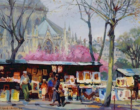
Many art forms can be collaborative, film production, musical performances, mainstream comics, animation and others can be the culmination the efforts of several artists working together in varying degrees.Collaboration in painting is usually more one-sided, as in a master being aided by an assistant, a master touching up the work of a pupil or a figure painter employing a specialist to paint animals into a composition (as Rubens did); all are examples of one dominant painter and one helping. True collaborative painting, in which the same painting is worked on by two artists working in tandem with equal input, is rare.
Husband and wife Evgeny and Lydia Baranov, who are originally from Russia but now live in California, seem to have achieved a balance that allows them to do just that. They work side by side on the same canvas, which might be started by either, sharing the application of paint and the advancement of the composition in an interplay they liken to improvisational jazz.
They seem to work and think alike enough that the intention and execution of the paintings feels of a whole, like the work of a single artist. They apparently travel extensively and their work includes landscapes and cityscapes from Paris (image above), Russia, Venice and other parts of the world, in addition to their adopted home of California.
Their online galleries also include intimate interiors and still lifes, occasionally combined with exteriors in the same composition as in their “Moscow Windows” series. Their work also includes portraits and figures in the context of interiors or landscapes. Their approach is painterly, with broad strokes of intense color laid down directly, space and form defined with areas of color and little evidence of line.
I don’t know if someone more familiar with their work than I could pick out the influences of one artist over the other. Their site sometimes arranges their work by date, and I see more variation in style over time than I do in a given year, indicating to me a pretty seamless synthesis of the vision of the two artists into a shared whole.
It’s interesting to compare this approach to that of two other artists I have featured who are husband and wife, Neil and Karen Hollingsworth, who obviously share influences, but retain separate artistic points of view. I think it’s rare enough to find couples who work in the same medium and general style; the Baraov’s joined expression is very unusual.
Categories:


Charley’s Picks
Bookshop.org
(Bookshop.org affilliate links; sales benefit independent bookshop owners; I get a small percentage to help support my work on Lines and Colors)

John Singer Sargent: Watercolors


Urban Sketching: Understanding Perspective


Charley’s Picks
Amazon
(Amazon.com affiliate links; sales go to a larger yacht for Jeff Bezos; but I get a small percentage to help support my work on Lines and Colors)
John Singer Sargent: Watercolors
Urban Sketching: Understanding Perspective