
Categories
- 3d CGI
- Amusements
- Animation
- Anime & Manga
- Art Materials
- Art Videos
- Blogroll
- Cartoons
- Color
- Comics
- Concept & Visual Dev.
- Creativity
- Digital Art
- Digital Painting
- Displaying Art on the Web
- Drawing
- Eye Candy for Today
- Gallery and Museum Art
- High-res Art Images
- Illustration
- Motion Graphics & Flash
- Museums
- Online Museums
- Outsider Art
- Painting
- Painting a Day
- Paleo Art
- Pastel, Conté & Chalk
- Pen & Ink
- Prints and Printmaking
- Reviews
- Sc-fi and Fantasy
- Sculpture & Dimensional
- Site Comments
- Sketching
- Storyboards
- Tools and Techniques
- Uncategorized
- Vector Art
- Videos & Podcasts
- Vision and Optics
- Watercolor and Gouache
- Webcomics
Archives
- June 2026
- May 2026
- April 2026
- March 2026
- February 2026
- January 2026
- December 2025
- November 2025
- October 2025
- September 2025
- August 2025
- July 2025
- June 2025
- May 2025
- January 2025
- December 2024
- November 2024
- October 2024
- September 2024
- August 2024
- June 2024
- April 2024
- March 2024
- February 2024
- January 2024
- December 2023
- November 2023
- October 2023
- September 2023
- August 2023
- July 2023
- May 2023
- April 2023
- March 2023
- February 2023
- January 2023
- December 2022
- November 2022
- September 2022
- August 2022
- July 2022
- June 2022
- May 2022
- April 2022
- March 2022
- February 2022
- January 2022
- December 2021
- November 2021
- October 2021
- September 2021
- August 2021
- July 2021
- June 2021
- May 2021
- April 2021
- March 2021
- February 2021
- January 2021
- December 2020
- November 2020
- October 2020
- September 2020
- August 2020
- July 2020
- June 2020
- May 2020
- April 2020
- March 2020
- February 2020
- January 2020
- December 2019
- November 2019
- October 2019
- September 2019
- August 2019
- July 2019
- June 2019
- May 2019
- April 2019
- March 2019
- February 2019
- January 2019
- December 2018
- November 2018
- October 2018
- September 2018
- August 2018
- July 2018
- June 2018
- May 2018
- April 2018
- March 2018
- February 2018
- January 2018
- December 2017
- November 2017
- October 2017
- September 2017
- August 2017
- July 2017
- June 2017
- May 2017
- April 2017
- March 2017
- February 2017
- January 2017
- December 2016
- November 2016
- October 2016
- September 2016
- August 2016
- July 2016
- June 2016
- May 2016
- April 2016
- March 2016
- February 2016
- January 2016
- December 2015
- November 2015
- October 2015
- September 2015
- August 2015
- July 2015
- June 2015
- May 2015
- April 2015
- March 2015
- February 2015
- January 2015
- December 2014
- November 2014
- October 2014
- September 2014
- August 2014
- July 2014
- June 2014
- May 2014
- April 2014
- March 2014
- February 2014
- January 2014
- December 2013
- November 2013
- October 2013
- September 2013
- August 2013
- July 2013
- June 2013
- May 2013
- April 2013
- March 2013
- February 2013
- January 2013
- December 2012
- November 2012
- October 2012
- September 2012
- August 2012
- July 2012
- June 2012
- May 2012
- April 2012
- March 2012
- February 2012
- January 2012
- December 2011
- November 2011
- October 2011
- September 2011
- August 2011
- July 2011
- June 2011
- May 2011
- April 2011
- March 2011
- February 2011
- January 2011
- December 2010
- November 2010
- October 2010
- September 2010
- August 2010
- July 2010
- June 2010
- May 2010
- April 2010
- March 2010
- February 2010
- January 2010
- December 2009
- November 2009
- October 2009
- September 2009
- August 2009
- July 2009
- June 2009
- May 2009
- April 2009
- March 2009
- February 2009
- January 2009
- December 2008
- November 2008
- October 2008
- September 2008
- August 2008
- July 2008
- June 2008
- May 2008
- April 2008
- March 2008
- February 2008
- January 2008
- December 2007
- November 2007
- October 2007
- September 2007
- August 2007
- July 2007
- June 2007
- May 2007
- April 2007
- March 2007
- February 2007
- January 2007
- December 2006
- November 2006
- October 2006
- September 2006
- August 2006
- July 2006
- June 2006
- May 2006
- April 2006
- March 2006
- February 2006
- January 2006
- December 2005
- November 2005
- October 2005
- September 2005
- August 2005
Relevant Blogs
Art, Painting & Sketch
- Gurney Journey
- Underpaintings
- Art and Influence
- Painting Perceptions
- Oil Painters of America
- Vasari Paint POV
- Flying Fox
- Urban Sketchers
- Bento (Smithsonian)
- Art Inconnu
- The Hidden Place
- Still Life
- Making a Mark
- The Art of the Landscape
- Exploring Color & Creativity
- Art Contrarian
- Artist A Day
- beinArt Surreal Art Collective
- Eye Level
- David Dunlop
- p.i.g.m.e.n.t.i.u.m
- CultureGrrl
- Joaquín Sorolla blog
- Artists in Pastel
“Painting a Day”
- A Painting a Day (Keiser)
- On Painting (Keiser)
- Julian Merrow-Smith
- Karen Jurick
- Jeffrey Hayes
- Carol Marine
- Abbey Ryan
- Daily Paintworks
Other Painting Blogs
- Virtual Gouache Land
- Neil Hollingsworth
- Marc Hanson
- Kevin Menck
- Marc Dalessio
- Larry Seiler
- Stapleton Kearns
- Colin Page
- Roos Schuring
- Hans Versfelt
- Titus Meeuws
- Régis Pettinari
- René Plein Air
- Belinda Del Pesco
- Robin Weiss
- Nathan Fowkes (Land Sketch)
- William Wray
- Frank Serrano
- Stephen Magsig
- Michael Chesley Johnson
- Twice a Week
- Sarah Wimperis
- Rob Adams
- Michael Cole Manley
- The Dirty Palette Club
- Mike Manley’s Draw!
Gallery Art & Illustration mix
Illustration
- Howard Pyle
- 100 Years of Illustration
- BibliOdyssey
- Illustration Art
- Today’s Inspiration
- Illustration Mundo
- Little Chimp Society
- Danny Gregory
- R D (John Martz
- Illustration Friday blog
- Monster Brains
- Illustrators & Illustrations (RU)
- Elwood H. Smith
- DaniDraws.com
- Designers Who Blog
- iSpot Blog
Sci-Fi & Fantasy
Illustration & Comics
Comics & Cartoons
- Comics Beat
- Robot 6
- Newsarama Blog
- Comic Vine
- Comics Alliance
- Forbidden Planet Int.
- Paolo Rivera
- Bolt City
- Flight
- Scott McCloud
- The Comics Journal
- Comixpedia
- Funnybook Babylon
- James Baker
- Middleton’s Sketchbook
- Boneville
- The Hotel Fred
- Paul Rivoche
- Daily Cartoonist
- Mad About Cartoons (William Wray)
- Digital Strips
Illustration & Concept
Animation & Concept
- Cartoon Brew
- Animation Blog
- Cold Hard Flash
- Concept Art World
- The CAB
- FY Concept Art
- Concept Ships
- Concept Robots
- John Nevarez
- Armand Serrano
- Marcos Mateu-Mestre
- all kinds of stuff (Kricfalusi)
- Yacin the faun (Man Arenas)
- Kelsey Mann
- Cre8tivemarks Blog
- Ice-Cream Monster Toon Cafe
- AAU Character & Creature Design
- AAU Animation Notes
- Articles and Texticles
Paleo & Scientific
Tools & Techniques
Other
Lists of Art Blogs
Art Image Resource Links
Historic Art Images
- Wikimedia Commons: Paintings
- Wikimedia Commons: Drawings
- The Athenaeum
- WikiArt (WikiPaintings)
- Google Art Project: Artists
- Google Art Project: Collections (Museums)
- ArtCyclopedia
- Web Gallery of Art
- Art Renewal Center
- Web Gallery of Impressionism
Auction Consolidation sites
Auction sites
- Sotheby’s
- Bonham’s
- Christies
- Heritage Auctions: Fine Art
- Heritage Auctions: Illustration
- Freeman’s Auctions
- Bukowskis
- Shannon’s
Image Search
Reverse Image Search (search by image)
- Tin Eye
- RevImg
- Google Image Search (camera icon)
- Bing Image Search (camera icon)
Promoting some friends and some clients of my website design business
- Twin Willows T’ai Chi studio in Wilmington DE. Taiji classes with Bryan Davis.
- Ray Hayward, Inspired Teacher of T’ai Chi ( Taiji ) in Minneapolis, Founder of Mindful Motion Tai Chi Academy
- OldHead Tattoo studio and Art Gallery in Wilmington DE. Tattoos and paintings by Bruce Gulick
- Sharon Domenico Art, pet portrait oil paintings
- Platinum Paperhanging, wallpaper hanging, Main Line and Philadelphia, PA
- Lisa Stone Design, interior designer, Main Line and Philadelphia, PA
- Studio12KPT, original art, prints, calendars and other custom printed items by Van Sickle & Rolleri
-
Calder and Abstraction
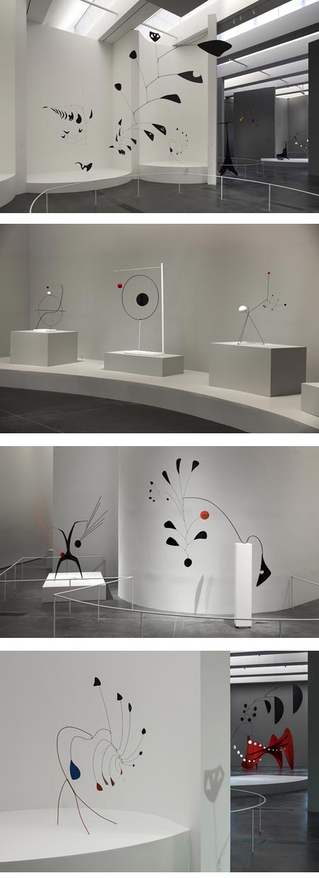
Long time readers of Lines and Colors will know that, with a few exceptions, I’m not particularly fond of modernism — especially post-war American modernism.Sculptor Alexander calder is certainly one of the exceptions. I’ve loved his work since I was introduced to it when I was in high-school, where we were encouraged to make our own “mobiles” in art class. This was reinforced by the fact that Calder and his family of sculptors (father and grandfather) were from here in Philadelphia, and there are examples all around, including the wonderful large mobile called Ghost in the great staircase hall of the Philadelphia Museum of Art.
Calder created his sculptures with wire and wonderful flat metal shapes that looked like the inspiration for the best 60’s modern design and the related styles of animation. And Calder’s sculptures are animated! They move, suspended from wires or balanced on pedestals, with an uncanny slow-motion dance of balance and grace, driven by the most subtle disturbances in the air around them.
Most sculptures are about form and space, and how one defines the other (see my post on Bernini). Calder’s sculptures were also about air and time and gravity.
Calder and Abstraction: From Avant-Garde to Iconic is a show now on display at the Los Angeles County Museum of Art that continues to July 27, 2014.
There is a photo set on Flickr (from which I have excerpted the photos above). Mark Frauenfelder has an article on Boing Boing in which he describes visiting the exhibit and coming home inspired.
For more, including a discussion of why I find Calder so fascinating, see my 2006 article on Alexander Calder.
Categories:
-
Harry Anderson Art

When I wrote about the terrific mid-20th century American illustrator Harry Anderson back in 2007, there were limited sources for images of his work on the web (though Leif Peng’s Flickr set is still going strong).Thanks, to Jim Pinkoski there is terrific site devoted to Anderson and his work called Harry Anderson Art.
The image archives on the site are largely divided by the publications for which he did most of his work, along with additional sections for advertising art, religious art and calendars (of which the automotive calendars are a particular treat).
The images include detail crops and accompanying photos of the magazine spreads, in which the illustration art was often incorporated into the layout of the text.
It’s interesting to note that much of Anderson’s work was done in casein, an opaque water-thinned paint based on a binder made from milk. Anderson developed an allergy to turpentine, and after trying egg tempera and working with watercolor to some extent, settled on casein as a water thinned medium with some of the characteristics of oil. There is a discussion of his technique on Leif Peng’s Today’s Inspiration.
[Via Gurney Journey]
Categories:
-
Edible art supplies

Ever think your paints looked yummy enough to eat? Bad idea, of course — but not with these chocolate confections in the form of paint tubes and pencils— created by Nendo Design, in cooperation with patissier Tsujiguchi Hironobu.[Via Neatorama]
Categories:
-
Eye Candy for Today: Caillebotte’s rooftops in snow

Rooftop View (Snow effect), Gustave CaillebotteOn the Google Art Project. Original is in the Musée d’Orsay. There is also a high res image (7.7mb) and short article on Wikipedia.
One of my favorite paintings. By anyone. Ever.
You’ll see versions of this image on the web, or even in print, in which the color has been exaggerated to the point where the chimneys are bright red — sorry, wrong.
Here’s a clue for the people who like to do that kind of thing (presumably to make the images “prettier”): the Impressionists weren’t deliberately seeking to use “bright color” for its own sake; their use of sometimes brilliant color was a result of their search for the fleeting effects of light and atmosphere.
Just as often, though less frequently highlighted in books and reproductions, their paintings were about fog, mist, atmosphere and subtle color. They were capturing the effects of light in the natural world, as affected by time of day, season and weather. Caillebotte gives you a clue right in the sub-title of his painting: Vue de toits (Effet de neige) — “(snow effect)“.
Categories:
-
Eugène Grasset
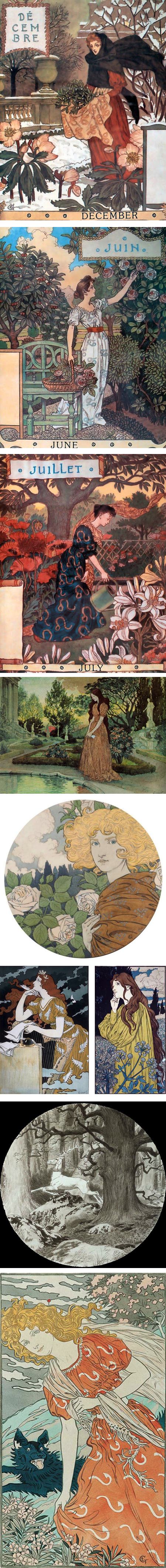
Eugène Grasset was a Swiss illustrator, poster artist, sculptor and designer who was instrumental in the creation of the Art Nouveau style.Though not well known in the U.S. today, his poster art, in particular, was was very popular here in the late 19th century.
In addition to his own work, Grasset was an influential design teacher in Paris.
There is a monograph on Grasset, but it doesn’t seem readily available. You can find his designs, however, in several sources on Art Nouveau.
Categories:
-
Self-portraits #6 ("maybe selfies")

Here are a few images that, for one or more reasons, have been suggested to be presumed, probable or possible self-portraits of artists for whom there is a shortage of definitive ones.To me, there is often a certain look in the eyes of a self-portrait — one that I think comes from the mental shift involved in drawing or painting — an odd combination of far-away and intensely focused, almost trance-like.
It’s only there in direct self-portraits, not in those involving more than one mirror. I see it in the pieces by Villers, Van Eyck, Botticelli and Da Vinci. The Vermeer is too dark to see. The Bruegel, if a self-portrait, is a two-mirror setup. The others just seem indeterminate. Not that my assessment means anything; I just find it an interesting thing to look for in possible self-portraits.
See my post on “The Face of Leonardo?“.
(Images above: Marie-Denise Villers, Jan van Eyck, Pieter Bruegel the Elder, Giorgione, Sandro Botticelli, Peter de Hooch, Johannes Vermeer, Leonardo da Vinci)
Categories:


Charley’s Picks
Bookshop.org
(Bookshop.org affilliate links; sales benefit independent bookshop owners; I get a small percentage to help support my work on Lines and Colors)

John Singer Sargent: Watercolors


Urban Sketching: Understanding Perspective


Charley’s Picks
Amazon
(Amazon.com affiliate links; sales go to a larger yacht for Jeff Bezos; but I get a small percentage to help support my work on Lines and Colors)
John Singer Sargent: Watercolors
Urban Sketching: Understanding Perspective