
Categories
- 3d CGI
- Amusements
- Animation
- Anime & Manga
- Art Materials
- Art Videos
- Blogroll
- Cartoons
- Color
- Comics
- Concept & Visual Dev.
- Creativity
- Digital Art
- Digital Painting
- Displaying Art on the Web
- Drawing
- Eye Candy for Today
- Gallery and Museum Art
- High-res Art Images
- Illustration
- Motion Graphics & Flash
- Museums
- Online Museums
- Outsider Art
- Painting
- Painting a Day
- Paleo Art
- Pastel, Conté & Chalk
- Pen & Ink
- Prints and Printmaking
- Reviews
- Sc-fi and Fantasy
- Sculpture & Dimensional
- Site Comments
- Sketching
- Storyboards
- Tools and Techniques
- Uncategorized
- Vector Art
- Videos & Podcasts
- Vision and Optics
- Watercolor and Gouache
- Webcomics
Archives
- May 2026
- April 2026
- March 2026
- February 2026
- January 2026
- December 2025
- November 2025
- October 2025
- September 2025
- August 2025
- July 2025
- June 2025
- May 2025
- January 2025
- December 2024
- November 2024
- October 2024
- September 2024
- August 2024
- June 2024
- April 2024
- March 2024
- February 2024
- January 2024
- December 2023
- November 2023
- October 2023
- September 2023
- August 2023
- July 2023
- May 2023
- April 2023
- March 2023
- February 2023
- January 2023
- December 2022
- November 2022
- September 2022
- August 2022
- July 2022
- June 2022
- May 2022
- April 2022
- March 2022
- February 2022
- January 2022
- December 2021
- November 2021
- October 2021
- September 2021
- August 2021
- July 2021
- June 2021
- May 2021
- April 2021
- March 2021
- February 2021
- January 2021
- December 2020
- November 2020
- October 2020
- September 2020
- August 2020
- July 2020
- June 2020
- May 2020
- April 2020
- March 2020
- February 2020
- January 2020
- December 2019
- November 2019
- October 2019
- September 2019
- August 2019
- July 2019
- June 2019
- May 2019
- April 2019
- March 2019
- February 2019
- January 2019
- December 2018
- November 2018
- October 2018
- September 2018
- August 2018
- July 2018
- June 2018
- May 2018
- April 2018
- March 2018
- February 2018
- January 2018
- December 2017
- November 2017
- October 2017
- September 2017
- August 2017
- July 2017
- June 2017
- May 2017
- April 2017
- March 2017
- February 2017
- January 2017
- December 2016
- November 2016
- October 2016
- September 2016
- August 2016
- July 2016
- June 2016
- May 2016
- April 2016
- March 2016
- February 2016
- January 2016
- December 2015
- November 2015
- October 2015
- September 2015
- August 2015
- July 2015
- June 2015
- May 2015
- April 2015
- March 2015
- February 2015
- January 2015
- December 2014
- November 2014
- October 2014
- September 2014
- August 2014
- July 2014
- June 2014
- May 2014
- April 2014
- March 2014
- February 2014
- January 2014
- December 2013
- November 2013
- October 2013
- September 2013
- August 2013
- July 2013
- June 2013
- May 2013
- April 2013
- March 2013
- February 2013
- January 2013
- December 2012
- November 2012
- October 2012
- September 2012
- August 2012
- July 2012
- June 2012
- May 2012
- April 2012
- March 2012
- February 2012
- January 2012
- December 2011
- November 2011
- October 2011
- September 2011
- August 2011
- July 2011
- June 2011
- May 2011
- April 2011
- March 2011
- February 2011
- January 2011
- December 2010
- November 2010
- October 2010
- September 2010
- August 2010
- July 2010
- June 2010
- May 2010
- April 2010
- March 2010
- February 2010
- January 2010
- December 2009
- November 2009
- October 2009
- September 2009
- August 2009
- July 2009
- June 2009
- May 2009
- April 2009
- March 2009
- February 2009
- January 2009
- December 2008
- November 2008
- October 2008
- September 2008
- August 2008
- July 2008
- June 2008
- May 2008
- April 2008
- March 2008
- February 2008
- January 2008
- December 2007
- November 2007
- October 2007
- September 2007
- August 2007
- July 2007
- June 2007
- May 2007
- April 2007
- March 2007
- February 2007
- January 2007
- December 2006
- November 2006
- October 2006
- September 2006
- August 2006
- July 2006
- June 2006
- May 2006
- April 2006
- March 2006
- February 2006
- January 2006
- December 2005
- November 2005
- October 2005
- September 2005
- August 2005
Relevant Blogs
Art, Painting & Sketch
- Gurney Journey
- Underpaintings
- Art and Influence
- Painting Perceptions
- Oil Painters of America
- Vasari Paint POV
- Flying Fox
- Urban Sketchers
- Bento (Smithsonian)
- Art Inconnu
- The Hidden Place
- Still Life
- Making a Mark
- The Art of the Landscape
- Exploring Color & Creativity
- Art Contrarian
- Artist A Day
- beinArt Surreal Art Collective
- Eye Level
- David Dunlop
- p.i.g.m.e.n.t.i.u.m
- CultureGrrl
- Joaquín Sorolla blog
- Artists in Pastel
“Painting a Day”
- A Painting a Day (Keiser)
- On Painting (Keiser)
- Julian Merrow-Smith
- Karen Jurick
- Jeffrey Hayes
- Carol Marine
- Abbey Ryan
- Daily Paintworks
Other Painting Blogs
- Virtual Gouache Land
- Neil Hollingsworth
- Marc Hanson
- Kevin Menck
- Marc Dalessio
- Larry Seiler
- Stapleton Kearns
- Colin Page
- Roos Schuring
- Hans Versfelt
- Titus Meeuws
- Régis Pettinari
- René Plein Air
- Belinda Del Pesco
- Robin Weiss
- Nathan Fowkes (Land Sketch)
- William Wray
- Frank Serrano
- Stephen Magsig
- Michael Chesley Johnson
- Twice a Week
- Sarah Wimperis
- Rob Adams
- Michael Cole Manley
- The Dirty Palette Club
- Mike Manley’s Draw!
Gallery Art & Illustration mix
Illustration
- Howard Pyle
- 100 Years of Illustration
- BibliOdyssey
- Illustration Art
- Today’s Inspiration
- Illustration Mundo
- Little Chimp Society
- Danny Gregory
- R D (John Martz
- Illustration Friday blog
- Monster Brains
- Illustrators & Illustrations (RU)
- Elwood H. Smith
- DaniDraws.com
- Designers Who Blog
- iSpot Blog
Sci-Fi & Fantasy
Illustration & Comics
Comics & Cartoons
- Comics Beat
- Robot 6
- Newsarama Blog
- Comic Vine
- Comics Alliance
- Forbidden Planet Int.
- Paolo Rivera
- Bolt City
- Flight
- Scott McCloud
- The Comics Journal
- Comixpedia
- Funnybook Babylon
- James Baker
- Middleton’s Sketchbook
- Boneville
- The Hotel Fred
- Paul Rivoche
- Daily Cartoonist
- Mad About Cartoons (William Wray)
- Digital Strips
Illustration & Concept
Animation & Concept
- Cartoon Brew
- Animation Blog
- Cold Hard Flash
- Concept Art World
- The CAB
- FY Concept Art
- Concept Ships
- Concept Robots
- John Nevarez
- Armand Serrano
- Marcos Mateu-Mestre
- all kinds of stuff (Kricfalusi)
- Yacin the faun (Man Arenas)
- Kelsey Mann
- Cre8tivemarks Blog
- Ice-Cream Monster Toon Cafe
- AAU Character & Creature Design
- AAU Animation Notes
- Articles and Texticles
Paleo & Scientific
Tools & Techniques
Other
Lists of Art Blogs
Art Image Resource Links
Historic Art Images
- Wikimedia Commons: Paintings
- Wikimedia Commons: Drawings
- The Athenaeum
- WikiArt (WikiPaintings)
- Google Art Project: Artists
- Google Art Project: Collections (Museums)
- ArtCyclopedia
- Web Gallery of Art
- Art Renewal Center
- Web Gallery of Impressionism
Auction Consolidation sites
Auction sites
- Sotheby’s
- Bonham’s
- Christies
- Heritage Auctions: Fine Art
- Heritage Auctions: Illustration
- Freeman’s Auctions
- Bukowskis
- Shannon’s
Image Search
Reverse Image Search (search by image)
- Tin Eye
- RevImg
- Google Image Search (camera icon)
- Bing Image Search (camera icon)
Promoting some friends and some clients of my website design business
- Twin Willows T’ai Chi studio in Wilmington DE. Taiji classes with Bryan Davis.
- Ray Hayward, Inspired Teacher of T’ai Chi ( Taiji ) in Minneapolis, Founder of Mindful Motion Tai Chi Academy
- OldHead Tattoo studio and Art Gallery in Wilmington DE. Tattoos and paintings by Bruce Gulick
- Sharon Domenico Art, pet portrait oil paintings
- Platinum Paperhanging, wallpaper hanging, Main Line and Philadelphia, PA
- Lisa Stone Design, interior designer, Main Line and Philadelphia, PA
- Studio12KPT, original art, prints, calendars and other custom printed items by Van Sickle & Rolleri
-
Gustaf Tenggren

Swedish illustrator Gustaf Adolf Tenggren had his roots (and judging from his illustrations, wonderfully gnarled and knotted roots they were) deeply into the rich soil of Scandinavian myth, and the fertile influence of other great illustrators, most notably the terrific and underappreciated John Bauer, who Teggren succeeded as the primary illustrator for Bland Tomtar och Troll (Among Elves and Trolls), a famous fairy tale themed children’s annual in Sweden.Tenggren also inherited stylistic elements from other great illustrators who influenced, and were influenced by, Bauer, in particular Kay Neilsen, Edmund Dulac and the amazing Arthur Rackham. Teggren moved to America (though he continued to illustrate Bland Tomtar och Troll from here for six years) and worked illustrating books in a lush, Rackhamish style full of dark, art-nouveau forests, marvelously grotesque trolls, stunning princesses, and wonderfully stylized characters of all kinds.
After a stint at Milton Bradley, the game company, he went to work for The Walt Disney Company and was one of the main concept artists on Disney’s groundbreaking Snow White and the Seven Dwarfs, and contributed significantly to Pinocchio and Bambi.
The amazing Animation Archive has come through again and has posted high-res images from Tenggren’s beautiful Grimms Fairy Tales. Here are part one and part two. They also have a post of his illustrations for Small Fry and the Winged Horse. Click on the images for larger versions. The American Art Archives has also posted some of his commercial illustrations, some of which show Howard Pyle’s influence.
Teggren was an amazing illustrator, but for reasons I haven’t been able to divine, abandoned his beautiful Bauer/Rackham/Neilsen style after leaving Disney and adopted a more prosaic style (to put it politely) for illustrating children’s books. His new style, though dull and lifeless to me in comparison to his former work, was quite successful commercially and he published a series of books with his name in the title, in addition to working on such famous Little Golden Books at The Poky Little Puppy.
He never returned to his previous style after leaving Disney and reportedly destroyed much of his older work (AKKK!). Perhaps he ran into some real trolls at Disney?
Categories:
-
Brian Taylor

When I first encountered Brian Taylor’s work in 2001 it was in the form of a fascinating project called Rustboy (images above, top row), a web site created to chronicle the progress of his desire to create a CGI animated movie on his own, from concept sketches to final renderings, using only home computer level software.I have checked back over the years to see little advanced or changed on the site, other than the addition of some spin-off merchandise and a book collecting the concept work for the project, and I was afraid the the movie project itself was, well,… rusting.
It turns out that Brian has turned the notoriety gained from that project (the site was/is beautifully designed and got a fair bit of notice around the web in the early ’00s), along with a fevered imagination, strong design skills and a savvy sense of internet marketing, into a successful line of products and projects; and has handed the Rustboy project off to professionals, giving himself the luxury of overseeing it without having to do the work five people in order to try to bring the character to the screen.
Taylor’s most visible current project is called Candykiller (image above, bottom), and is a series of self-published books offered directly through the Candykiller.com site, and a line of Candykiller figures in the works through Wheaty Wheat Studios. (I can’t give you direct links to the products because the site is in a single Flash file.)
The Candykiller site has a gallery the illustrations from the books, in a style that’s sort of 1930’s animal character cartoons meet Tim Burton by way of Basil Wolverton on a bad acid trip kind of character design that fits into the general area called “Pop Surrealism”. There are other influences, of course. You can see flashes of Rick Griffin, Robert Crumb and other 60’s underground comix artists, and I love his Tales of the Candy Killer mock comic cover homage to the EC Mad comics (see my posts on on Wally Wood and Will Elder), not to mention his hilarious drawing of Godzilla with a Viewmaster for a head. Some of the images are 3D renderings of unreal toys, some are the real figures in production.
There is a nice illustrated interview with Taylor in the new issue of Illo. You can see more of Taylor’s professional work on his XL5 Design site.
Categories:
-
Christophe Vacher
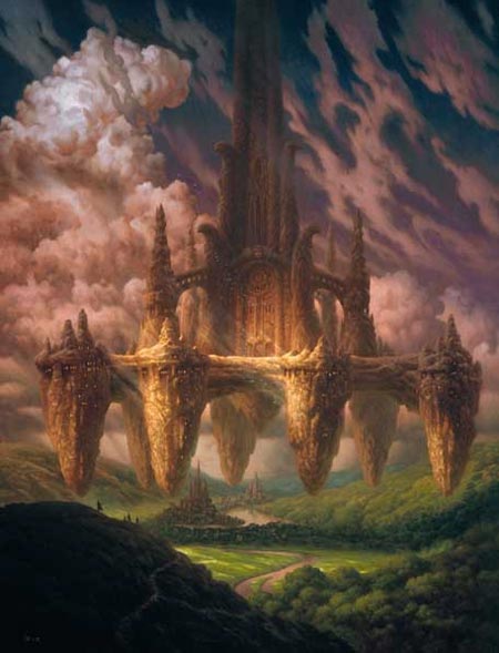
Before relocating to California in 1996, French artist Christophe Vacher worked for Disney’s Paris-based animation studio, painting backgrounds for features like The Hunchback of Notre Dame. (I want to know how the pitch meeting went for that movie. “Hey, I’ve got a great idea, let’s make a cheerful animated feature about… The Hunchback of Notre Dame! Sure! It’ll be a musical, with singing gargoyles…)Anyway, it wasn’t Vacher’s job to figure out how absurd the idea was, just to make the backgrounds look great; that he did, and continued to do for movies like Hercules, Tarzan, Dinosaur and Treasure Planet.
He left the studio in 2000 to devote more time to gallery paintings, but has continued to freelance for film studios as well as illustrating covers for books, CD’s and video games, with clients like Dreamworks SKG, Harper Collins, Wizards of the Coast and Data Becker Videogames. He returned to Disney to art direct an animated segment for the upcoming live action film Enchanted, and is slated to art direct a new 3D CGI movie produced by Tim Burton.
The galleries on his personal site are divided between movie backgrounds, personal work and covers, though I can’t give you direct links because the site is in frames. The “Personal” gallery also includes some pencil sketches.
Vacher’s personal work tends to be fantasy oriented and often deals with beautifully rendered images of monumental objects, fortresses, walls or cliff-like chunks of rock, floating in defiance of gravity, much in the vein of Magritte’s Castle of the Pyrenees, but on a more dramatic scale. He also favors dramatic large scale landscapes, fantastic cloudscapes and graceful angel-like figures.
Vacher paints in oils alkyds and acrylic. He list among his influences the painters of the Hudson River School (see my post on Frederic Edwin Church), the Romantics and the Symbolists (see my posts on Caspar David Friedrich and Arnold Böcklin), who he admires for their grand scale theatrically displayed scenery.
Vacher’s work has been featured in the Spectrum collections of contemporary fantastic art, including being chosen for the cover of Spectrum 10, and is included in The New Masters of Fantasy disk-based collections.
There is a step-by-step process of one of his paintings on GFXArtist, and a nice additional gallery of his work on the TenDreams site.
Categories:
-
J.J. Grandville (Jean Ignace Isidore Gèrard)

How cool would it be if we could actually see the whole intricate pattern of the influences of one artist on another that make up the brilliant, if ragged, cloth of art history. The best any one individual can hope for is glimmers and flashes of interconnectedness where the pattern reveals a small portion of itself, a brief hint at how the whole is tied together.Occasionally we see threads that seem connected behind the surface in some way, an indication of a nexus of influence under the cloth, where parts of the pattern are pulled together and rewoven, an indication that some artists are seen more through their influence on other artists than in the wide recognition of their own work.
The more I investigate the work of engraver and illustrator Jean Ignace Isidore Gèrard, more commonly known by his pen name J.J. Grandville, the more I see his influence on other artists. Though he was tremendously influential on artists in his own time and on generations to follow, his own work and name have undeservedly faded almost into obscurity.
Grandville’s brilliantly imaginative pen and ink style engravings from the early 1800’s were one of the seminal sources of modern cartooning, comics and fantastic illustration, as well as numerous styles of fantastic art.
If you’re familiar with the Dadaists and Surrealists, who were quick to extol the virtues of artists they saw as precursors of Surrealism, it’s easy to see how Grandville’s fantastical drawings of griffin-like animal mash-ups, which he called “metamorphoses” and to which he devoted an entire book titled Les Animaux (The Animals), would be enough to put him high on their list; but his fantastic visions of anthropomorphic plants, audiences of opera goers whose heads have been replaced with single eyes, fancies of drawing instruments come alive, mechanical musicians and people with overlarge or tiny heads and otherwise distorted figures made him a shoo-in for the Surrealist hall of predecessors.
Max Ernst, in particular, demonstrates tremendous influence by Grandville in his Surrealist collage-novel (or graphic novel, if you will) Un Semaine du Bonté (A Week of Kindness).
The next thing I discovered about Grandville’s influence on other artists is how dramatically his work informed Sir John Tenniel’s wonderful and definitive illustrations for Alice’s Adventures in Wonderland. Not only was Grandville’s style, treatment and subject matter inspirational to Tenniel in his interpretations of the Alice stories (to the point where Tenniel might be accused of “borrowing” some elements of Grandville’s drawings), I later realized that Grandville’s animal “metamorphoses”, his bizarre characters, anthropomorphic insects, plants and animals, and his visions of fantastic scenes like his tableau of playing cards come to life, were direct inspiration for Charles (“Lewis Carroll”) Dodson himself in writing the stories.
Grandville entertained us with dancing teapots and cavorting flowers a century and a half ahead of Disney. His city dwellers wiith distorted body shapes, often with heads disproportionate to the body, or with exaggeratedly tall and thin juxtaposed with squat and short, showed up both in Mutt n’ Jeff in the early 20th Century and Yellow Submarine in the 1960’s and his steam-powered musicians presaged steampunk by two centuries.
Thomas Nast and the generations of political cartoonists that were to follow, owe more than a nod to Grandville (along with Hogarth and many others). All modern cartoons involving social commentary can trace a thread back to Grandville, and the influence is certainly evident in the underground comix artists of the 1960’s, undoubtedly through the availability of a wonderful Dover book that I’ll recommend to you at the end of the article.
You can certainly see Grandville in the marvelously imaginative and wonderfully drawn fantasies of Heinrich Kley, the sketches of Jan Faust, the fantastic etchings of M.C. Escher and many others.
Some of Grandville’s illustrations can seem tame and ordinary, depending on the phases of his career, but many are wonderful flights of fancy.
Wild-eyed demons in top hats invite angels to dance, celestial garden keepers water both flowers and pedestrians with umbrellas, anthropomorphic lightning rods prepare one another to catch bolts, stage hands raise the curtains of night and use a gas lamp igniter to light the morning sun, an eclipse is revealed to be the result of a passionate embrace of the sun and moon, watched voyeuristically by astrolabes and other celestial mapping instruments, characters ares shown walking across celestial bridges or juggling planets.
Some of his drawings were playful explorations of perspective, many are fantasies of anthropromorphicised drawing instruments, and in fact mechanical devices in general; Grandville was active when the industrial revolution was just getting up steam (sorry, couldn’t resist).
Some are simply incomprehensibly bizarre, others are marvelous images that I can’t fathom the origin of, like the one in which dice, dominos, war medals and Egyptian obelisks grow like rock crystals.
Many of these drawings would be even more powerful if we understood the social context in which they were presented and the follies of which they were meant to satirize. He was engaged in social commentary, and was in that respect essentially a cartoonist, though his drawings are realized with a wonderfully controlled, richly detailed but clearly stated pen and ink like engraving style that would be worth study by anyone interested in creating prints or applying ink to paper (or drawing with the digital equivalent).
Fortunately, Grandville’s terrific drawings are available to modern audiences in several books, most notably an excellent and inexpensive Dover book, out of print but available used, Fantastic Illustrations of Grandville (Dover Pictorial Archives), which I believe is a repackaging of an earlier Dover book, Bizarreries and Fantasies of Grandville, my copy of which is dog-eared with years of delighted use. It collects his two most influential works, Les Animaux, and Un Autre Monde (Another World), which was a story loosely woven to tie together many of his existing illustrations so they could be issued as a book.
The best online source I’ve found for Grandville is on Visipix. Once you get past a pop-up ad and some other annoyances, there is a thumbnail gallery and click-through for 179 of Grandville’s drawings, many of the from scans of his two most famous books, the editions of which, apparently, had hand-applied color on some plates. While clicking through the drawings with the convenient “Next, Previous, Thumbnails” style navigation, you can choose at any time to view them in one of several resolutions, allowing you to breeze through them and then view your favorites in glorious detail. Wonderful!
It’s interesting to note, as this article in Time Magazine points out, that Grandville’s influence extends to the fact that, even though he has been dead since 1847, he has been, along with David Levine, one of the two major illustrators for The New York Review of Books in the 20th Century.
Categories:
-
Dr. Sketchy’s Anti-Art School

Hey all you non-artists: want to know a secret? Shhhhh! Don’t let this get out, and I hate to spoil any idyllic illusions you may have, or that your artist friends have encouraged you to have, but… drawing nude models isn’t particularly sexy.There, I said it. Don’t look at me that way! It’s true. Hey, I promise you I’m a healthy, red-blooded, heterosexual male, and some of the models I’ve drawn over my years of attending life drawing session have been astonishingly beautiful women; but when I’m drawing them, sexy is not the operative word. Not that you can’t make sexuality, and the physical appeal of an attractive model, part of a drawing, but you actually have to work at it.
I discovered this, much to my amazement, as a teenager (talk about healthy and red-blooded), when I first started to attend life drawing classes in art school. My fellow male freshmen and I were looking forward to the first life drawing class, our tongues prepared to hang out of our mouths in leering anticipation, as much as the freshmen girls were undoubtedly prepared to look down their noses at us at the first sign of impropriety; but the school cooled our jets with somewhat unattractive (but actually quite good) models for the first few sessions.
Eventually, though, the session came when we were presented with a very attractive young woman to draw; but, after about 6 seconds of leering, we found ourselves caught up in the process of drawing, as we had been in the previous sessions, and only realized at break time that we had been drawing a beautiful young woman for half an hour and it didn’t matter!
Part of it is the setting, of course; art schools and professional artist organizations that sponsor life drawing sessions know how to keep things professional and straightforward, and so do experienced models and most artists with any life drawing experience. It’s more than that, though, it’s the fact that the act of drawing involves a different way of seeing.
I found, even as an easily, um… excitable teenage boy, that once you start drawing a person, even a very attractive naked person, you are no longer seeing in the same way. Though you know intellectually that you are drawing a woman, and can be cognizant of the fact that it’s an attractive woman, that’s not what you’re seeing. When you’re drawing, you’re not seeing a shoulder or a breast, as much as your seeing shapes, angles, curves, lines, juncture points, shadows, intersecting forms and complex spatial relationships. All of these things go together to make a drawing of a person, but you’re not looking at that person the same way when you’re drawing as you would be under other circumstances.
I would venture to say that the same applies to women drawing attractive men, or people who are attracted to those of their own gender; the principle is the same. (I’ve found in my years of drawing, though, that male models are scarcer then female, and tend not to be as good at it. It may be that women are more conscious of how to exert subtle control over their bodies in holding a pose, or it may simply be that fewer men are willing to deal with the fact that life modeling is much harder work than it seems, and the pay is usually terrible.)
Yes, as I mentioned, you can inject sensuality and sexuality into the drawing, but it’s actually hard work. You have to consciously shift slightly out of your drawing mode of seeing/thinking far enough to see the model as an attractive person, but not so far as to lose that precious seeing state in which you can draw effectively. Some think of this mental adjustment in and out of a drawing mode of seeing as a left-brain, right-brain shift (see my post on Drawing on the Right Side of the Brain), which may or may not be scientifically correct, but it’s basically a move from the usually dominant verbal/logical mode to the harder-to-access visual/spacial mode that lets you see what’s in front of you without interference from verbal-brain chatter.
I eventually learned, though, when drawing a woman I was involved with, in private, it was, of course, much easier to put the sexual component back in (though drawings would often go unfinished…); and the professional art school or artist organization setting actually does have a lot to do with keeping it dry and unsexy.
So the question arises, why not something in between? Why not have an occasional setting in which the professionalism of art school is tinted with a bit of naughtyness to put the “sexy” back in drawing sessions?
That’s the idea behind Dr. Sketchy’s Anti-Art School, brainchild of illustrator Molly Crabapple (seen above sketching with “helper art-monkey” Steve Walker, along with her sketch of the session, inset). Crabapple “draws saucy Victoriana for magazines” and used to work as a life model when she was in art school. Her boredom with posing for those classes prompted the creation of Dr. Skecthy’s as a series of sessions that combine drawing with a bit of burlesque and theatre.
As models, she searches out, in her words, “the most beautiful burlesque dancers, the most bizarre circus freaks, and the most rippling hunks of man”, and hosts drawing sessions on every other Saturday in Brooklyn. The sessions are often punctuated with a bit of theater, silly drawing contests (best incorporation of a woodland animal, best left-handed drawing), prizes and drinking. The Brooklyn Dr. Sketchy’s sessions take place in a bar/restaurant called the Lucky Cat Lounge
The sessions are three hours, like many life drawing sessions; but, though the stated goal is to answer the question “Why can’t drawing naked people be sexy?”, the models in this case are actually not nude. This is due to the fact that New York has an ordinance prohibiting nudity and drinking in the same room. The models pose in sexy costume and are selected on the basis of “being heart-stoppingly gorgeous, possessing a unique talent (trapeze, contortion, sword-swallowing, burlesque), or extraordinary costumes”. The models are also paid better than in normal life drawing sessions and, very much unlike art school sessions, can receive tips. You’re beginning to get the picture, and Dr. Sketchy’s Anti-Art School bills itself as “what happens when cabaret meets art school”.
The brooklyn sessions apparently fill up fast and the seating is limited. You can reserve a table early for an extra fee. The schedule is here. The Dr. Sketchy’s sessions have been so successful that they have expanded to other cities and there are now over 20 locations. The Dr. Sketchy’s site has even posted a “How to start a Dr. Sketchy’s” page. There is a board where participants can discuss the sessions and post their work. There is also a photoblog, and a few short videos, including a “trailer” done up the scratchy black and white style of Reefer Madness, about “depraved students driven mad by art”. There is also a Rainy Day Coloring Book available, and Dr. Sketchy’s is accepting submissions for their first annual Anti-Art Show.
Obviously, this is not the venue for serious minded study of figure drawing, and is different from regular figure drawing sessions in other respects (no easels, no oil-based or other “messy” media, though watercolor is OK), but it looks like a fun alternative to the usual unsexy life drawing sessions most artists are used to. Plus you’re allowed to leer at the models. Too bad they didn’t have Dr. Sketchy’s when I was a teenager.
Note: the Dr. Sketchy’s site should be considered NSFW (depending, of course, on where you work).
Categories:
-
Women in Art, a morphing history of women’s faces in paintings
 OK, I’ll admit it, I’m a sucker for well done “morphing”, in which one image is gradually changed until it blends with and evolves into another. I also love the intersection of classical art and modern computer tech (as in these animations of da Vinci’s drawings), and as both as both an artist and a male human being, I love to look at the faces of beautiful women, so I really enjoy this beautifully done morphing excursion through a history of women’s faces in paintings.
From Medieval frescos to Picasso, numerous painted images of women’s faces, most of them strikingly beautiful both as women’s faces and as paintings, blend into one another in a dreamy, if disconcerting, dance of liquid pixels. Face after face, style after style, artist after artist swirl and morph into one another like one of Dali’s hallucinogenic soft constructions.
It makes you want to grab your art books and start looking up the original paintings to see them in their original setting as you watch the ingenious comparisons and relationships the filmmaker has found to connect them to one another.
The film is from a YouTube based director identified only as “eggman913”, whose other videos can be found here. I don’t see any easy link to more information about this individual, but he is obviously knowledgeable about art history, and has good taste in paintings.
You can have fun playing “name that painting” or even “name that artist” with your friends, or just think about how women have been represented over the history of art, the differing standards of what was considered “beautiful”, the evolution of painting materials and the development of artistic techniques and styles.
Repeated watching also leaves you with a renewed fascination with the relationship of facial features and how they define an individual, the art of portraiture and the amazing ability human beings have to see vast differences in the subtle arrangement of the shapes, distances, colors and spatial relationships that make up a face.
The blending of styles is sometimes harmonious and sometimes a jarring juxtaposition, which makes the mention of the vid on Juxtapoz all the more appropriate. The original is on YouTube.
I originally heard about this both from BoingBoing and from Karl Kofoed
Categories:


Charley’s Picks
Bookshop.org
(Bookshop.org affilliate links; sales benefit independent bookshop owners; I get a small percentage to help support my work on Lines and Colors)

John Singer Sargent: Watercolors


Urban Sketching: Understanding Perspective


Charley’s Picks
Amazon
(Amazon.com affiliate links; sales go to a larger yacht for Jeff Bezos; but I get a small percentage to help support my work on Lines and Colors)
John Singer Sargent: Watercolors
Urban Sketching: Understanding Perspective