
Categories
- 3d CGI
- Amusements
- Animation
- Anime & Manga
- Art Materials
- Art Videos
- Blogroll
- Cartoons
- Color
- Comics
- Concept & Visual Dev.
- Creativity
- Digital Art
- Digital Painting
- Displaying Art on the Web
- Drawing
- Eye Candy for Today
- Gallery and Museum Art
- High-res Art Images
- Illustration
- Motion Graphics & Flash
- Museums
- Online Museums
- Outsider Art
- Painting
- Painting a Day
- Paleo Art
- Pastel, Conté & Chalk
- Pen & Ink
- Prints and Printmaking
- Reviews
- Sc-fi and Fantasy
- Sculpture & Dimensional
- Site Comments
- Sketching
- Storyboards
- Tools and Techniques
- Uncategorized
- Vector Art
- Videos & Podcasts
- Vision and Optics
- Watercolor and Gouache
- Webcomics
Archives
- March 2026
- February 2026
- January 2026
- December 2025
- November 2025
- October 2025
- September 2025
- August 2025
- July 2025
- June 2025
- May 2025
- January 2025
- December 2024
- November 2024
- October 2024
- September 2024
- August 2024
- June 2024
- April 2024
- March 2024
- February 2024
- January 2024
- December 2023
- November 2023
- October 2023
- September 2023
- August 2023
- July 2023
- May 2023
- April 2023
- March 2023
- February 2023
- January 2023
- December 2022
- November 2022
- September 2022
- August 2022
- July 2022
- June 2022
- May 2022
- April 2022
- March 2022
- February 2022
- January 2022
- December 2021
- November 2021
- October 2021
- September 2021
- August 2021
- July 2021
- June 2021
- May 2021
- April 2021
- March 2021
- February 2021
- January 2021
- December 2020
- November 2020
- October 2020
- September 2020
- August 2020
- July 2020
- June 2020
- May 2020
- April 2020
- March 2020
- February 2020
- January 2020
- December 2019
- November 2019
- October 2019
- September 2019
- August 2019
- July 2019
- June 2019
- May 2019
- April 2019
- March 2019
- February 2019
- January 2019
- December 2018
- November 2018
- October 2018
- September 2018
- August 2018
- July 2018
- June 2018
- May 2018
- April 2018
- March 2018
- February 2018
- January 2018
- December 2017
- November 2017
- October 2017
- September 2017
- August 2017
- July 2017
- June 2017
- May 2017
- April 2017
- March 2017
- February 2017
- January 2017
- December 2016
- November 2016
- October 2016
- September 2016
- August 2016
- July 2016
- June 2016
- May 2016
- April 2016
- March 2016
- February 2016
- January 2016
- December 2015
- November 2015
- October 2015
- September 2015
- August 2015
- July 2015
- June 2015
- May 2015
- April 2015
- March 2015
- February 2015
- January 2015
- December 2014
- November 2014
- October 2014
- September 2014
- August 2014
- July 2014
- June 2014
- May 2014
- April 2014
- March 2014
- February 2014
- January 2014
- December 2013
- November 2013
- October 2013
- September 2013
- August 2013
- July 2013
- June 2013
- May 2013
- April 2013
- March 2013
- February 2013
- January 2013
- December 2012
- November 2012
- October 2012
- September 2012
- August 2012
- July 2012
- June 2012
- May 2012
- April 2012
- March 2012
- February 2012
- January 2012
- December 2011
- November 2011
- October 2011
- September 2011
- August 2011
- July 2011
- June 2011
- May 2011
- April 2011
- March 2011
- February 2011
- January 2011
- December 2010
- November 2010
- October 2010
- September 2010
- August 2010
- July 2010
- June 2010
- May 2010
- April 2010
- March 2010
- February 2010
- January 2010
- December 2009
- November 2009
- October 2009
- September 2009
- August 2009
- July 2009
- June 2009
- May 2009
- April 2009
- March 2009
- February 2009
- January 2009
- December 2008
- November 2008
- October 2008
- September 2008
- August 2008
- July 2008
- June 2008
- May 2008
- April 2008
- March 2008
- February 2008
- January 2008
- December 2007
- November 2007
- October 2007
- September 2007
- August 2007
- July 2007
- June 2007
- May 2007
- April 2007
- March 2007
- February 2007
- January 2007
- December 2006
- November 2006
- October 2006
- September 2006
- August 2006
- July 2006
- June 2006
- May 2006
- April 2006
- March 2006
- February 2006
- January 2006
- December 2005
- November 2005
- October 2005
- September 2005
- August 2005
Relevant Blogs
Art, Painting & Sketch
- Gurney Journey
- Underpaintings
- Art and Influence
- Painting Perceptions
- Oil Painters of America
- Vasari Paint POV
- Flying Fox
- Urban Sketchers
- Bento (Smithsonian)
- Art Inconnu
- The Hidden Place
- Still Life
- Making a Mark
- The Art of the Landscape
- Exploring Color & Creativity
- Art Contrarian
- Artist A Day
- beinArt Surreal Art Collective
- Eye Level
- David Dunlop
- p.i.g.m.e.n.t.i.u.m
- CultureGrrl
- Joaquín Sorolla blog
- Artists in Pastel
“Painting a Day”
- A Painting a Day (Keiser)
- On Painting (Keiser)
- Julian Merrow-Smith
- Karen Jurick
- Jeffrey Hayes
- Carol Marine
- Abbey Ryan
- Daily Paintworks
Other Painting Blogs
- Virtual Gouache Land
- Neil Hollingsworth
- Marc Hanson
- Kevin Menck
- Marc Dalessio
- Larry Seiler
- Stapleton Kearns
- Colin Page
- Roos Schuring
- Hans Versfelt
- Titus Meeuws
- Régis Pettinari
- René Plein Air
- Belinda Del Pesco
- Robin Weiss
- Nathan Fowkes (Land Sketch)
- William Wray
- Frank Serrano
- Stephen Magsig
- Michael Chesley Johnson
- Twice a Week
- Sarah Wimperis
- Rob Adams
- Michael Cole Manley
- The Dirty Palette Club
- Mike Manley’s Draw!
Gallery Art & Illustration mix
Illustration
- Howard Pyle
- 100 Years of Illustration
- BibliOdyssey
- Illustration Art
- Today’s Inspiration
- Illustration Mundo
- Little Chimp Society
- Danny Gregory
- R D (John Martz
- Illustration Friday blog
- Monster Brains
- Illustrators & Illustrations (RU)
- Elwood H. Smith
- DaniDraws.com
- Designers Who Blog
- iSpot Blog
Sci-Fi & Fantasy
Illustration & Comics
Comics & Cartoons
- Comics Beat
- Robot 6
- Newsarama Blog
- Comic Vine
- Comics Alliance
- Forbidden Planet Int.
- Paolo Rivera
- Bolt City
- Flight
- Scott McCloud
- The Comics Journal
- Comixpedia
- Funnybook Babylon
- James Baker
- Middleton’s Sketchbook
- Boneville
- The Hotel Fred
- Paul Rivoche
- Daily Cartoonist
- Mad About Cartoons (William Wray)
- Digital Strips
Illustration & Concept
Animation & Concept
- Cartoon Brew
- Animation Blog
- Cold Hard Flash
- Concept Art World
- The CAB
- FY Concept Art
- Concept Ships
- Concept Robots
- John Nevarez
- Armand Serrano
- Marcos Mateu-Mestre
- all kinds of stuff (Kricfalusi)
- Yacin the faun (Man Arenas)
- Kelsey Mann
- Cre8tivemarks Blog
- Ice-Cream Monster Toon Cafe
- AAU Character & Creature Design
- AAU Animation Notes
- Articles and Texticles
Paleo & Scientific
Tools & Techniques
Other
Lists of Art Blogs
Art Image Resource Links
Historic Art Images
- Wikimedia Commons: Paintings
- Wikimedia Commons: Drawings
- The Athenaeum
- WikiArt (WikiPaintings)
- Google Art Project: Artists
- Google Art Project: Collections (Museums)
- ArtCyclopedia
- Web Gallery of Art
- Art Renewal Center
- Web Gallery of Impressionism
Auction Consolidation sites
Auction sites
- Sotheby’s
- Bonham’s
- Christies
- Heritage Auctions: Fine Art
- Heritage Auctions: Illustration
- Freeman’s Auctions
- Bukowskis
- Shannon’s
Image Search
Reverse Image Search (search by image)
- Tin Eye
- RevImg
- Google Image Search (camera icon)
- Bing Image Search (camera icon)
Promoting some friends and some clients of my website design business
- Twin Willows T’ai Chi studio in Wilmington DE. Taiji classes with Bryan Davis.
- OldHead Tattoo studio and Art Gallery in Wilmington DE. Tattoos and paintings by Bruce Gulick
- Sharon Domenico Art, pet portrait oil paintings
- Platinum Paperhanging, wallpaper hanging, Main Line and Philadelphia, PA
- Lisa Stone Design, interior designer, Main Line and Philadelphia, PA
- Studio12KPT, original art, prints, calendars and other custom printed items by Van Sickle & Rolleri
-
Fernando Botero
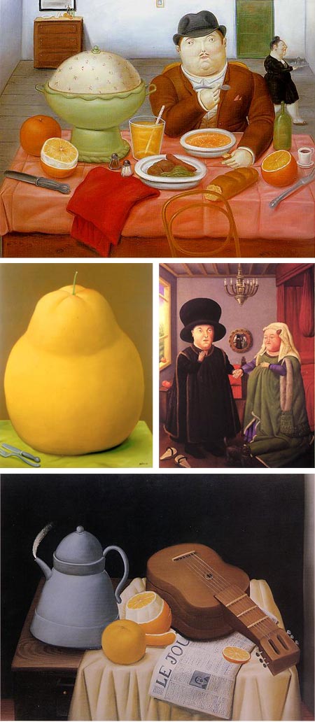
Fernando Botero Angulo, often known simply as “Botero” is a Colombian artist known for his exaggeratedly rotund figures and still life subjects.Botero started his artistic career as an illustrator, before that attending an matador school for two years. He also worked as a set designer.
In 1953 at the age of 21, he moved to Paris. Reportedly, he spent much of his time there in the Louvre, studying in particular the masters of the Baroque period, and becoming fascinated with the work of Rubens. Botero counts Rubens, an artist also known for his filled out figures, as a major influence.
Botero also studied in Madrid and Florence, and spent time in mexico studying the murals of Rivera and Orozco.
Botero’s work has received wide recognition and is popular in many circles.
The distortions evident in his rounded figures are there in his still life paintings as well, which also use exaggerated scale (note the utensils in the still life of the single pear in the image above, middle left).
Botero is also a sculptor (see this gallery on Wikimedia), and his sculptures carry the rounded masses of his figures to monumentality in large scale bronzes.
His subjects can be topical and serious, as in his Abu Ghraib series from 2005; or whimsical and humorous, as in his delightful parodies of works from art history, like his version of Jan Van Eyck’s Portrait of Giovanni Arnolfini and his Wife (image above, middle right, larger here).
One aspect of Botero’s work not evident in reproduction is the scale of his paintings. Many of them are quite large, and the effect of seeing them in person is much more dramatic than seeing them in reproductions.
The Baroque World of Fernando Botero is a traveling exhibition that I caught last year at the Delaware Art Museum. It is currently on display at the Museum of Fine Arts in St. Petersburg, Florida until April 4, 2010.
Categories:
-
Florian Satzinger

Austrian production and character designer Florian Satzinger has a drawing style with a snap and verve that harken back to the best of classic Disney and mid 20th Century Warner Brothers animation.The lines with which he delineates his characters zing, bounce and swoop so delightfully that they suggest lively motion even before they’re animated.
Satzinger is the co-founder of Satzinger & Hardenberg Features, and the creator of Star Ducks and Toby Skybuckle.
He studied with Ken Southworth, a well regarded animator and animation director who worked with Disney, Haanna-Barberra, Warner Brothers, MGM Walter Lance and Filmation. Southworth’s credits include Disney’s original Alice in Wonderland and The Legend of Sleepy Hollow and Hanna Barbara’s The Flintstones and Space Ghost.
Satzinger credits Southworth as his major influence, and his work in the style of great classic hand-drawn animation shows his continuation of that tradition.
There is an interview with Satzinger on the Character Design Blog.
In addition to his character design and production work, Satzinger teaches character design, animation and animation history at the University of the Applied Sciences in Salzburg.
Categories:
-
Dinotopia: The Art of James Gurney

It’s always a pleasure when you get to see artworks in person that you’ve become familiar with over time in reproduction; so I was delighted to have the opportunity to see some of my favorite fantasy illustration from James Gurney, author/artist of the terrific Dinotopia series of illustrated books, in a new exhibition at the Delaware Art Museum.Dinotopia: The Art of James Gurney opened February 6 and runs to May 16, 2010. The show is an excellent cross section of the work Gurney has done on the series. While thematically unified by the storyline of the books, and the richly imagined world in which they take place, the paintings show a broad range of Gurney’s influences.
Gurney is an artist who is constantly investigating the works of other artists from various points in history, delving into their techniques and approaches, and playfully applying those elements he finds most interesting to his own work.
Gurney chronicles many of these investigations of great artists and their process in his always fascinating blog, Gurney Journey, and has begun to codify much of what he has learned into books like the recently released Imaginative Realism, and the still-in-progress Color and Light.
The result of his experimentation is a fascinating variety within the overall whole of the Dinotopia series, where you can see the neo-classical beauty of Victorian painters like Alma-Tadema and Frederick Leighton, and Orientalists like Jean-Léon Gérôme, along with the robust color and drama of the great adventure illustrators like Howard Pyle and N.C. Wyeth. All of these influences, and of course, Gurney’s own unique style, are set in service of great fantasy scenes in exotic locations; populated by Victorian humans; clever steampunkery, vehicles and gadgets; and those wonderful dinosaurs.
As is often the case when first seeing originals for paintings that are already familiar from reproductions, I found a few surprises in scale; some smaller than I might have thought, some larger; as well as many details and textural aspects in the handling of paint that aren’t evident in print.
In particular, I found myself looking past the subjects of many of the paintings and into the backgrounds, where Gurney’s other passion, plein air landscape painting, is wonderfully evident. In some cases, like the image above, top, the floral and landscape elements could easily be the subject of a painting in themselves. In many others, the confidently simplified landscapes are marvels of suggestion, as in the image above, middle with detail at bottom.
There is even a plein air painting in the show of Niagra Falls and Goat Island, a nod both to the Dinotopia setting of Waterfall City an another great 19th Century artist, Frederic Edwin Church. The large dramatic paintings of Waterfall City are notable for their compositional use of light and shadow as a means of leading the eye through a complex scene. (Waterfall City, by the way, was an uncredited inspiration for the cities of the Planet Naboo in Star Wars Episode I. I’ve heard that production artists who worked on the film have tacitly acknowledged its influence. Gurney really should have gotten credit.)
The Delaware Art Museum, with it’s great collections of Howard Pyle and American Illustration, 19th and 20th Century American art and British Pre-Raphaelite painters is an ideal venue for Gurney’s work.
If you decide to travel to see the show, not only are the museum’s own holdings a nice compliment, but the Brandywine River Museum, with it’s own superb collections of Pyle, N.C. Wyeth and American illustration, is just 20 minutes away.
Categories:
-
Edward Matthew Hale

Edward Matthew Hale is one of those 19th Century artists about whom it’s not easy to find information, but whose few available images hint at a terrific body of work.Hale studied in Paris with Alexander Cabanel, whose students included Pierre Auguste Cot and Jules Bastien Lepage; and then with Emile Auguste Carolus-Duran, noted as the teacher of John Singer Sargent.
Considered primarily a genre painter, his subjects leaned to mythology and the sea, as well as military subjects from his time as a war correspondent for the Illustrated London News.
The resources I can find are limited, and some (but not all) tend to repeat the same paintings, but if anyone knows of sources for additional images by Hale, let me know and I’ll post them.
Categories:
-
Emmanuel Malin
Line, color and texture combine and interact in the painting/drawings of Emmanuel Malin, at times interwoven, as other times working in contrast.Mixtures of detailed linework and decorative pattern are set off against open areas filled with texture, often the rough texture of papers and other surfaces. Color can appear or disappear, at the artist’s whim, leaving some passages to stand as line drawings, others to appear more fully rendered.
Malin lets loose, gestural areas of color define large areas of his compositions, with more detailed areas of line serving as a focus for his subjects.
Malin is an illustrator and gallery artist living in Paris. His illustration clients include Folio, La Recherche, Brandweek, ImagineFX and Gallimard Editions. His work has appeared in several of the Spectrum collections of contemporary fantastic art.
Categories:
-
Edward Redfield

With snow still on the ground throughout most of the Mid-Atlantic United States, and more on the way, I thought it appropriate to look at an American artist renowned for his scenes of snow and winter.Edward Willis Redfield was one of the major figures among the artists who gathered in an artists colony in and around New Hope, Pennsylvania in the late 19th Century. Generally called the Pennsylvania Impressionists, this group included a number of artists who had absorbed some influence from the French Impressionists, but, like most painters called “American Impressionists”, took that influence and went their own individualistic way. (See my posts on Daniel Garber, Fern Coppedge and Art and the River.)
Redfield is often credited with co-founding the colony along with William Lathrop. Actually Lathrop was the driving force in establishing the colony, but Redfield, who was first to move to the area, was the star and seed around which the colony formed.
Born in Bridgeville, Delaware, Redfield studied with at the Pennsylvania Academy of the Fine Arts with Thomas Anshutz, James Kelly and Thomas Hovendon. Anshutz and Kelly were carrying on the traditions of their teacher, Thomas Eakins, who had left the school shortly before Redfield arrived.
While at the Academy, Redfield struck up a friendship with Robert Henri that was to continue through the artist’s lifetimes.
After his time at the Academy, Redfield went to Paris with the intention of studying portraiture at the Académe Julian and the École des Beaux-Arts. At the latter, he studied with William Bouguereau and other classically trained painters. On his time off, however, he joined Henri and other young artists who were engaged in the newly popular practice of painting “en plein air“, and was exposed to the work of the young Impressionist painters.
Redfield frequented the Musée du Luxembourg in Paris, fascinated with the work of Monet, Pissarro, and Norwegian painter Frits Thaulow. Redfield became increasingly interested in the effects of light on snow, and had his first snow scene accepted in the Paris Salon of 1891.
On his return to the U.S., Redfield and his French bride settled in Center Bridge, Pennsylvania, on the Delaware River near New Hope.
Redfield took to painting the Pennsylvania landscape with bravura and abandon. His paintings are three dimensional marvels of spattered, heaped and piled on paint; with ridges and gullies in place of more genteel brushstrokes. It’s hard to see how remarkably tactile his canvasses are in reproduction. There is a zoomable image of Overlooking the Valley (image above, middle, with detail, bottom) on the Metropolitan Museum of Art’s site that gives you a hint, but only a hint.
By all accounts, Redfield was just as physical in the act of painting, often forgetting to eat his lunch as he blazed through large canvases in one sitting. Redfield painted in all kinds of weather; not only in the cold in search of his famous snow scenes, but in wind, strapping his canvas to a tree where easels would be blown away.
He was a harsh critic of his own work, on more than one occasion burning canvasses he thought were not up to his standards.
Redfield was the most recognized and awarded of the new Hope painters, garnering more awards than any American painter except John Singer Sargent, and his work is in a number of major museums including the Metropolitan Museum of Art and the Smithsonian American Art Museum.
There is an in-print collection of his work, Just Values and Fine Seeing (Google Books extract here), and you can find many fine examples in Brian Peterson’s excellent book Pennsylvania Impressionism.
Categories:


Charley’s Picks
Bookshop.org
(Bookshop.org affilliate links; sales benefit independent bookshop owners; I get a small percentage to help support my work on Lines and Colors)

John Singer Sargent: Watercolors


Urban Sketching: Understanding Perspective


Charley’s Picks
Amazon
(Amazon.com affiliate links; sales go to a larger yacht for Jeff Bezos; but I get a small percentage to help support my work on Lines and Colors)
John Singer Sargent: Watercolors
Urban Sketching: Understanding Perspective