
Categories
- 3d CGI
- Amusements
- Animation
- Anime & Manga
- Art Materials
- Art Videos
- Blogroll
- Cartoons
- Color
- Comics
- Concept & Visual Dev.
- Creativity
- Digital Art
- Digital Painting
- Displaying Art on the Web
- Drawing
- Eye Candy for Today
- Gallery and Museum Art
- High-res Art Images
- Illustration
- Motion Graphics & Flash
- Museums
- Online Museums
- Outsider Art
- Painting
- Painting a Day
- Paleo Art
- Pastel, Conté & Chalk
- Pen & Ink
- Prints and Printmaking
- Reviews
- Sc-fi and Fantasy
- Sculpture & Dimensional
- Site Comments
- Sketching
- Storyboards
- Tools and Techniques
- Uncategorized
- Vector Art
- Videos & Podcasts
- Vision and Optics
- Watercolor and Gouache
- Webcomics
Archives
- June 2026
- May 2026
- April 2026
- March 2026
- February 2026
- January 2026
- December 2025
- November 2025
- October 2025
- September 2025
- August 2025
- July 2025
- June 2025
- May 2025
- January 2025
- December 2024
- November 2024
- October 2024
- September 2024
- August 2024
- June 2024
- April 2024
- March 2024
- February 2024
- January 2024
- December 2023
- November 2023
- October 2023
- September 2023
- August 2023
- July 2023
- May 2023
- April 2023
- March 2023
- February 2023
- January 2023
- December 2022
- November 2022
- September 2022
- August 2022
- July 2022
- June 2022
- May 2022
- April 2022
- March 2022
- February 2022
- January 2022
- December 2021
- November 2021
- October 2021
- September 2021
- August 2021
- July 2021
- June 2021
- May 2021
- April 2021
- March 2021
- February 2021
- January 2021
- December 2020
- November 2020
- October 2020
- September 2020
- August 2020
- July 2020
- June 2020
- May 2020
- April 2020
- March 2020
- February 2020
- January 2020
- December 2019
- November 2019
- October 2019
- September 2019
- August 2019
- July 2019
- June 2019
- May 2019
- April 2019
- March 2019
- February 2019
- January 2019
- December 2018
- November 2018
- October 2018
- September 2018
- August 2018
- July 2018
- June 2018
- May 2018
- April 2018
- March 2018
- February 2018
- January 2018
- December 2017
- November 2017
- October 2017
- September 2017
- August 2017
- July 2017
- June 2017
- May 2017
- April 2017
- March 2017
- February 2017
- January 2017
- December 2016
- November 2016
- October 2016
- September 2016
- August 2016
- July 2016
- June 2016
- May 2016
- April 2016
- March 2016
- February 2016
- January 2016
- December 2015
- November 2015
- October 2015
- September 2015
- August 2015
- July 2015
- June 2015
- May 2015
- April 2015
- March 2015
- February 2015
- January 2015
- December 2014
- November 2014
- October 2014
- September 2014
- August 2014
- July 2014
- June 2014
- May 2014
- April 2014
- March 2014
- February 2014
- January 2014
- December 2013
- November 2013
- October 2013
- September 2013
- August 2013
- July 2013
- June 2013
- May 2013
- April 2013
- March 2013
- February 2013
- January 2013
- December 2012
- November 2012
- October 2012
- September 2012
- August 2012
- July 2012
- June 2012
- May 2012
- April 2012
- March 2012
- February 2012
- January 2012
- December 2011
- November 2011
- October 2011
- September 2011
- August 2011
- July 2011
- June 2011
- May 2011
- April 2011
- March 2011
- February 2011
- January 2011
- December 2010
- November 2010
- October 2010
- September 2010
- August 2010
- July 2010
- June 2010
- May 2010
- April 2010
- March 2010
- February 2010
- January 2010
- December 2009
- November 2009
- October 2009
- September 2009
- August 2009
- July 2009
- June 2009
- May 2009
- April 2009
- March 2009
- February 2009
- January 2009
- December 2008
- November 2008
- October 2008
- September 2008
- August 2008
- July 2008
- June 2008
- May 2008
- April 2008
- March 2008
- February 2008
- January 2008
- December 2007
- November 2007
- October 2007
- September 2007
- August 2007
- July 2007
- June 2007
- May 2007
- April 2007
- March 2007
- February 2007
- January 2007
- December 2006
- November 2006
- October 2006
- September 2006
- August 2006
- July 2006
- June 2006
- May 2006
- April 2006
- March 2006
- February 2006
- January 2006
- December 2005
- November 2005
- October 2005
- September 2005
- August 2005
Relevant Blogs
Art, Painting & Sketch
- Gurney Journey
- Underpaintings
- Art and Influence
- Painting Perceptions
- Oil Painters of America
- Vasari Paint POV
- Flying Fox
- Urban Sketchers
- Bento (Smithsonian)
- Art Inconnu
- The Hidden Place
- Still Life
- Making a Mark
- The Art of the Landscape
- Exploring Color & Creativity
- Art Contrarian
- Artist A Day
- beinArt Surreal Art Collective
- Eye Level
- David Dunlop
- p.i.g.m.e.n.t.i.u.m
- CultureGrrl
- Joaquín Sorolla blog
- Artists in Pastel
“Painting a Day”
- A Painting a Day (Keiser)
- On Painting (Keiser)
- Julian Merrow-Smith
- Karen Jurick
- Jeffrey Hayes
- Carol Marine
- Abbey Ryan
- Daily Paintworks
Other Painting Blogs
- Virtual Gouache Land
- Neil Hollingsworth
- Marc Hanson
- Kevin Menck
- Marc Dalessio
- Larry Seiler
- Stapleton Kearns
- Colin Page
- Roos Schuring
- Hans Versfelt
- Titus Meeuws
- Régis Pettinari
- René Plein Air
- Belinda Del Pesco
- Robin Weiss
- Nathan Fowkes (Land Sketch)
- William Wray
- Frank Serrano
- Stephen Magsig
- Michael Chesley Johnson
- Twice a Week
- Sarah Wimperis
- Rob Adams
- Michael Cole Manley
- The Dirty Palette Club
- Mike Manley’s Draw!
Gallery Art & Illustration mix
Illustration
- Howard Pyle
- 100 Years of Illustration
- BibliOdyssey
- Illustration Art
- Today’s Inspiration
- Illustration Mundo
- Little Chimp Society
- Danny Gregory
- R D (John Martz
- Illustration Friday blog
- Monster Brains
- Illustrators & Illustrations (RU)
- Elwood H. Smith
- DaniDraws.com
- Designers Who Blog
- iSpot Blog
Sci-Fi & Fantasy
Illustration & Comics
Comics & Cartoons
- Comics Beat
- Robot 6
- Newsarama Blog
- Comic Vine
- Comics Alliance
- Forbidden Planet Int.
- Paolo Rivera
- Bolt City
- Flight
- Scott McCloud
- The Comics Journal
- Comixpedia
- Funnybook Babylon
- James Baker
- Middleton’s Sketchbook
- Boneville
- The Hotel Fred
- Paul Rivoche
- Daily Cartoonist
- Mad About Cartoons (William Wray)
- Digital Strips
Illustration & Concept
Animation & Concept
- Cartoon Brew
- Animation Blog
- Cold Hard Flash
- Concept Art World
- The CAB
- FY Concept Art
- Concept Ships
- Concept Robots
- John Nevarez
- Armand Serrano
- Marcos Mateu-Mestre
- all kinds of stuff (Kricfalusi)
- Yacin the faun (Man Arenas)
- Kelsey Mann
- Cre8tivemarks Blog
- Ice-Cream Monster Toon Cafe
- AAU Character & Creature Design
- AAU Animation Notes
- Articles and Texticles
Paleo & Scientific
Tools & Techniques
Other
Lists of Art Blogs
Art Image Resource Links
Historic Art Images
- Wikimedia Commons: Paintings
- Wikimedia Commons: Drawings
- The Athenaeum
- WikiArt (WikiPaintings)
- Google Art Project: Artists
- Google Art Project: Collections (Museums)
- ArtCyclopedia
- Web Gallery of Art
- Art Renewal Center
- Web Gallery of Impressionism
Auction Consolidation sites
Auction sites
- Sotheby’s
- Bonham’s
- Christies
- Heritage Auctions: Fine Art
- Heritage Auctions: Illustration
- Freeman’s Auctions
- Bukowskis
- Shannon’s
Image Search
Reverse Image Search (search by image)
- Tin Eye
- RevImg
- Google Image Search (camera icon)
- Bing Image Search (camera icon)
Promoting some friends and some clients of my website design business
- Twin Willows T’ai Chi studio in Wilmington DE. Taiji classes with Bryan Davis.
- Ray Hayward, Inspired Teacher of T’ai Chi ( Taiji ) in Minneapolis, Founder of Mindful Motion Tai Chi Academy
- OldHead Tattoo studio and Art Gallery in Wilmington DE. Tattoos and paintings by Bruce Gulick
- Sharon Domenico Art, pet portrait oil paintings
- Platinum Paperhanging, wallpaper hanging, Main Line and Philadelphia, PA
- Lisa Stone Design, interior designer, Main Line and Philadelphia, PA
- Studio12KPT, original art, prints, calendars and other custom printed items by Van Sickle & Rolleri
-
Joe Kubert (1926-2012)

Joe Kubert was an American comic book artist and a major figure in the history of American comics.Kubert is best known for his work for DC Comics that included definitive versions of characters like Sgt. Rock and Hawkman, as well as an interpretation of Tarzan for Dark Horse. He also created his own characters and titles, including Tor, Son of Sinbad and The Viking Prince.
In addition to the impact of Kubert’s work, which was influential on generations of comics artists, he helped directly nurture the talent of numerous young comics professionals through the establishment The Kubert School, originally the Joe Kubert School of Cartoon and Graphic Art, in New Jersey.
The Kubert school was the first accredited school dedicated to cartooning and comic art. It’s a testament to the school that in sharp contrast to some “diploma mill” art schools, the Kubert School has a high drop out rate; young students who think they can cruise through doing pin-ups of Wolverine and big-eyed manga girls soon find they are expected to complete a rigorous program. The school’s graduates include numerous well known figures in the comic book industry.
Kubert’s own style was remarkable for its combination of fluidity and solid draftsmanship. He had a way of using gestural lines and hatching, giving his figures solidity and movement in the same rendering. He also knew how to anchor his page compositions with spotted blacks in a way that allowed his suggestions of movement to play out with a sensation of realism often missing from the work of many mainstream comics artists.
Joe Kubert left a lasting legacy when he died this weekend at the age of 85.
Kubert’s two sons, Adam and Andy Kubert are also well known and respected comics artists, as well as graduates of the Kubert School.
There is a biography, Man of Rock, and a collection, The Art of Joe Kubert, available from Fantagraphics.
[Notice courtesy of Gregory Frost]
[Addendum: The Comics Journal has posted their extensive interview with Joe Kubert from 1994. Gutters has posted a Neal Adams tribute drawing of Kubert and some of the well known graduates of the Kubert School.]
Categories:
-
Julian Onderdonk
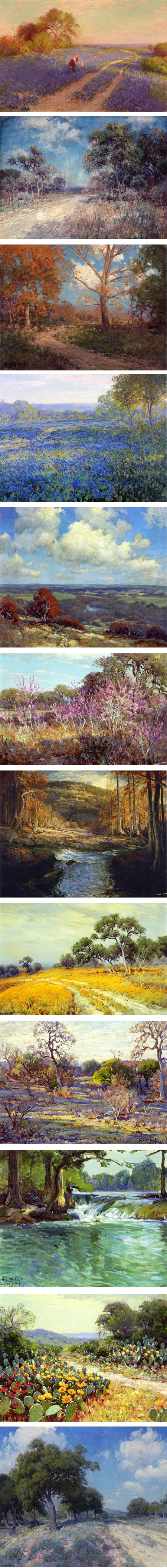
The influence of French Impressionism spread out in waves from the original movement’s epicenter in Paris. Some of the waves beached in various parts of the U.S., where artists who later came to be known as American Impressionists began adopting elements of the style — first in the northeast, then somewhat later in California.There were more isolated ripples in other areas as well. In Texas, painter and teacher Robert Jenkins Onderdonk traveled to New York in the mid 19th century to study with American painter William Merritt Chase.
His son, Robert Julian Onderdonk, also studied with Chase later in the New York painter’s career, and took his Impressionist influences much more completely into his own style and ran with them, going on to produce vibrantly colorful paintings of the Texas landscape.
While his father’s interest had been in Chase’s reputation as a portrait painter, Julian Onderdonk more enthusiastically adopted Chase’s alla prima approach and practice of plein air landscape painting, capturing the light of the day directly onto his canvas.
After painting in New York for a time, he returned to Texas and established himself as a painter and teacher, to some extent in his father’s footsteps.
Julian Onderdonk particularly became known for his landscapes of fields of Texas bluebonnets in bloom, and is considered one of Texas’ most important artists.
My impression (if you’ll excuse the word) is that his reputation as a painter of bluebonnets has distracted from his general work as a landscape painter.
He is sometimes mentioned with Granville Redmond, a California Impressionist who made a more dedicated practice of painting fields of wildflowers, and Onderdonk’s fame as “The Bluebonnet Painter” (which he hated), has been reinforced by generations of lesser painters who have devoted their careers to painting fields of the Texas state flower.
I also think that Onderdonk has been unfairly overlooked in discussions of American Impressionism, which tend to focus on the art colonies on the two coasts.
There is a collection of his work, Julian Onderdonk: American Impressionist, that I believe is out of print but available used.
Categories:
-
Moebius drawing videos
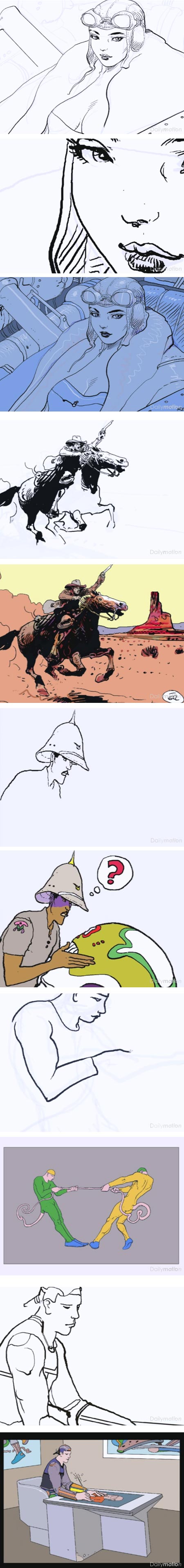
In preparation for the exposition Moebius Trans-Forme at the Cartier Foundation for Contemporary Art in Paris in 2010-2011, illustrator, comics artist and concept artist extraordinaire Jean Giraud, AKA Moebius, was filmed doing series of short drawings using digital painting software and a graphics tablet.The videos, along with other related videos, are available on DailyMotion, but the folks at Muddy Colors have gathered the drawing videos together on one page.
It’s wonderful to have these available, short though they may be; it makes me wish more extensive records had been made before the artist’s untimely death in March of this year.
Though you can see that Giraud has drawn his rough sketch on an underlayer and is drawing his finish over that, I’ve had the pleasure of watching Giraud draw in traditional media without a preliminary sketch, and he went about it in much the same way — drawing very quickly and making parts of the drawing fairly complete as he expanded out from his starting point (see the convention sketch he did for my wife that accompanies my article on Giraud from March).
[Via Artw on MetaFilter]
Categories:
-
Frederic Edwin Church on Google Art Project

The dramatic and often spectacularly large paintings of 19th century American painter Frederic Edwin Church are rich with fascinating details and beautiful handling of his subjects.In addition to painting his sweeping vistas in enough detail that you could easily take multiple sections of them as individual compositions, Church often placed small figures within a grand landscape to emphasize the scale as well as to provide a focal point of human interest.
The painting above, at the top, Pichincha, depicts a particular volcano in Ecuador, but was, like most of Church’s grand landscapes, made up of combined or invented views. These paintings were composed in his studio, working from location sketches made on his trips to Central and South America, often years later.
Church took liberties to combine and invent views, as well as inserting palm trees and other exotic vegetation not native to the area. Geographic accuracy was not his intention, but rather stunning the viewer with the exotic location, scale and detail in his images and his mastery of theatrical light and atmospheric perspective.
Pichincha is in the collection of the Philadelphia Museum of Art, so I’ve had the pleasure of viewing it in person on numerous occasions. While it is large, it’s not one of Church’s largest canvasses.
His largest paintings were sometimes displayed in theatrical settings, and people paid for admission to see them. A case in point is his remarkable painting Heart of the Andes, which I wrote about last year.
I’ve also seen some of his work up close on other occasions in other museums, and I’ll suggest that short of seeing his work in person, the next best way of viewing work as large and rich in detail as Church’s landscapes is in high resolution images, such as those presented on the website of the Metropolitan Museum of Art (as in the case of Heart of the Andes).
However, for a trove of multiple high resolution zoomable images of Church gems in an interface that lets you get right down into the fascinating details, you can’t beat the Google Art Project.
As if their selection of spectacular large scale landscapes wasn’t enough, the GAP section on Church includes a selection of rarely seen location drawings and painted sketches from an extensive collection of his notebooks in the Cooper-Hewitt National Design Museum.
So if you could use a little visual vacation to South America or Niagra Falls, here you go — but before you travel, I’ll issue my customary Time Sink Warning.
[Suggestion courtesy of Tim Matteson]
Categories:
-
Mato Celestin Medović

Croatian artist Mato Celestin Medović was best known as a history painter, creating large, elaborately detailed tableaux of coronations and other events from recent or ancient history. In these he excelled in capturing the kind of subtly rich color and sensitive attention to surfaces and materials for which his contemporary Victorian English painters and French Academic artists were noted.Though his early education at a Fransciscan monastery near his home eventually led to his early artistic training in Italy, it was later study at the Academy of Arts In Munich that was more in keeping with his initial artistic direction.
In his later career, he left the Franciscan order and lived in Zagreb, where he began to infuse his work with more vibrant color.
In the latter part of his career he returned to his native area on the Pelješac peninsula, where he lived alone and painted subjects uncharacteristic of his earlier work, and of Croatian artists in general at the time — still life, seascapes and landscapes, many of which were smaller and directly from nature.
In these later works Medović experimented with Pointillism and explored the impasto brushwork, short strokes and intense color associated with Impressionism.
Unfortunately, I have not been able to find many sources of images by Medović. I learned of his work from the excellent blog of contemporary Croation artist Valentino Radman where I came across his article about a Medović retrospective earlier this year, and found another mention of Medović here. There is also an article mentioning Croatian masters on Radman’s blog with additional images on Underpaintings.
There are few images on Wikimedia Commons and a Wikipedia bio.
I also found this site, which is set in a little frame so small it’s bizarre; I’ve broken out the individual pages for the gallery and bio.
Categories:
-
Eye Candy for Today: Brullov’s Pompeii
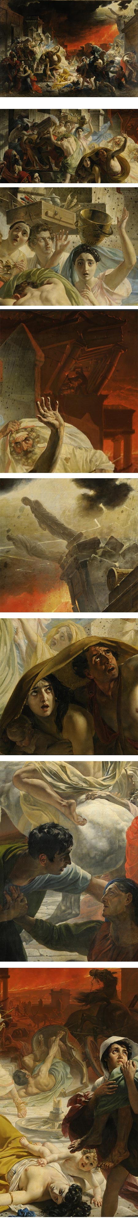
The Last Day of Pompeii by Karl Brullov.From the State Russian Museum, St. Petersburg, on Google Art Project. Click in lower right of image for zoom controls.
Categories:


Charley’s Picks
Bookshop.org
(Bookshop.org affilliate links; sales benefit independent bookshop owners; I get a small percentage to help support my work on Lines and Colors)

John Singer Sargent: Watercolors


Urban Sketching: Understanding Perspective


Charley’s Picks
Amazon
(Amazon.com affiliate links; sales go to a larger yacht for Jeff Bezos; but I get a small percentage to help support my work on Lines and Colors)
John Singer Sargent: Watercolors
Urban Sketching: Understanding Perspective