
Categories
- 3d CGI
- Amusements
- Animation
- Anime & Manga
- Art Materials
- Art Videos
- Blogroll
- Cartoons
- Color
- Comics
- Concept & Visual Dev.
- Creativity
- Digital Art
- Digital Painting
- Displaying Art on the Web
- Drawing
- Eye Candy for Today
- Gallery and Museum Art
- High-res Art Images
- Illustration
- Motion Graphics & Flash
- Museums
- Online Museums
- Outsider Art
- Painting
- Painting a Day
- Paleo Art
- Pastel, Conté & Chalk
- Pen & Ink
- Prints and Printmaking
- Reviews
- Sc-fi and Fantasy
- Sculpture & Dimensional
- Site Comments
- Sketching
- Storyboards
- Tools and Techniques
- Uncategorized
- Vector Art
- Videos & Podcasts
- Vision and Optics
- Watercolor and Gouache
- Webcomics
Archives
- July 2026
- June 2026
- May 2026
- April 2026
- March 2026
- February 2026
- January 2026
- December 2025
- November 2025
- October 2025
- September 2025
- August 2025
- July 2025
- June 2025
- May 2025
- January 2025
- December 2024
- November 2024
- October 2024
- September 2024
- August 2024
- June 2024
- April 2024
- March 2024
- February 2024
- January 2024
- December 2023
- November 2023
- October 2023
- September 2023
- August 2023
- July 2023
- May 2023
- April 2023
- March 2023
- February 2023
- January 2023
- December 2022
- November 2022
- September 2022
- August 2022
- July 2022
- June 2022
- May 2022
- April 2022
- March 2022
- February 2022
- January 2022
- December 2021
- November 2021
- October 2021
- September 2021
- August 2021
- July 2021
- June 2021
- May 2021
- April 2021
- March 2021
- February 2021
- January 2021
- December 2020
- November 2020
- October 2020
- September 2020
- August 2020
- July 2020
- June 2020
- May 2020
- April 2020
- March 2020
- February 2020
- January 2020
- December 2019
- November 2019
- October 2019
- September 2019
- August 2019
- July 2019
- June 2019
- May 2019
- April 2019
- March 2019
- February 2019
- January 2019
- December 2018
- November 2018
- October 2018
- September 2018
- August 2018
- July 2018
- June 2018
- May 2018
- April 2018
- March 2018
- February 2018
- January 2018
- December 2017
- November 2017
- October 2017
- September 2017
- August 2017
- July 2017
- June 2017
- May 2017
- April 2017
- March 2017
- February 2017
- January 2017
- December 2016
- November 2016
- October 2016
- September 2016
- August 2016
- July 2016
- June 2016
- May 2016
- April 2016
- March 2016
- February 2016
- January 2016
- December 2015
- November 2015
- October 2015
- September 2015
- August 2015
- July 2015
- June 2015
- May 2015
- April 2015
- March 2015
- February 2015
- January 2015
- December 2014
- November 2014
- October 2014
- September 2014
- August 2014
- July 2014
- June 2014
- May 2014
- April 2014
- March 2014
- February 2014
- January 2014
- December 2013
- November 2013
- October 2013
- September 2013
- August 2013
- July 2013
- June 2013
- May 2013
- April 2013
- March 2013
- February 2013
- January 2013
- December 2012
- November 2012
- October 2012
- September 2012
- August 2012
- July 2012
- June 2012
- May 2012
- April 2012
- March 2012
- February 2012
- January 2012
- December 2011
- November 2011
- October 2011
- September 2011
- August 2011
- July 2011
- June 2011
- May 2011
- April 2011
- March 2011
- February 2011
- January 2011
- December 2010
- November 2010
- October 2010
- September 2010
- August 2010
- July 2010
- June 2010
- May 2010
- April 2010
- March 2010
- February 2010
- January 2010
- December 2009
- November 2009
- October 2009
- September 2009
- August 2009
- July 2009
- June 2009
- May 2009
- April 2009
- March 2009
- February 2009
- January 2009
- December 2008
- November 2008
- October 2008
- September 2008
- August 2008
- July 2008
- June 2008
- May 2008
- April 2008
- March 2008
- February 2008
- January 2008
- December 2007
- November 2007
- October 2007
- September 2007
- August 2007
- July 2007
- June 2007
- May 2007
- April 2007
- March 2007
- February 2007
- January 2007
- December 2006
- November 2006
- October 2006
- September 2006
- August 2006
- July 2006
- June 2006
- May 2006
- April 2006
- March 2006
- February 2006
- January 2006
- December 2005
- November 2005
- October 2005
- September 2005
- August 2005
Relevant Blogs
Art, Painting & Sketch
- Gurney Journey
- Underpaintings
- Art and Influence
- Painting Perceptions
- Oil Painters of America
- Vasari Paint POV
- Flying Fox
- Urban Sketchers
- Bento (Smithsonian)
- Art Inconnu
- The Hidden Place
- Still Life
- Making a Mark
- The Art of the Landscape
- Exploring Color & Creativity
- Art Contrarian
- Artist A Day
- beinArt Surreal Art Collective
- Eye Level
- David Dunlop
- p.i.g.m.e.n.t.i.u.m
- CultureGrrl
- Joaquín Sorolla blog
- Artists in Pastel
“Painting a Day”
- A Painting a Day (Keiser)
- On Painting (Keiser)
- Julian Merrow-Smith
- Karen Jurick
- Jeffrey Hayes
- Carol Marine
- Abbey Ryan
- Daily Paintworks
Other Painting Blogs
- Virtual Gouache Land
- Neil Hollingsworth
- Marc Hanson
- Kevin Menck
- Marc Dalessio
- Larry Seiler
- Stapleton Kearns
- Colin Page
- Roos Schuring
- Hans Versfelt
- Titus Meeuws
- Régis Pettinari
- René Plein Air
- Belinda Del Pesco
- Robin Weiss
- Nathan Fowkes (Land Sketch)
- William Wray
- Frank Serrano
- Stephen Magsig
- Michael Chesley Johnson
- Twice a Week
- Sarah Wimperis
- Rob Adams
- Michael Cole Manley
- The Dirty Palette Club
- Mike Manley’s Draw!
Gallery Art & Illustration mix
Illustration
- Howard Pyle
- 100 Years of Illustration
- BibliOdyssey
- Illustration Art
- Today’s Inspiration
- Illustration Mundo
- Little Chimp Society
- Danny Gregory
- R D (John Martz
- Illustration Friday blog
- Monster Brains
- Illustrators & Illustrations (RU)
- Elwood H. Smith
- DaniDraws.com
- Designers Who Blog
- iSpot Blog
Sci-Fi & Fantasy
Illustration & Comics
Comics & Cartoons
- Comics Beat
- Robot 6
- Newsarama Blog
- Comic Vine
- Comics Alliance
- Forbidden Planet Int.
- Paolo Rivera
- Bolt City
- Flight
- Scott McCloud
- The Comics Journal
- Comixpedia
- Funnybook Babylon
- James Baker
- Middleton’s Sketchbook
- Boneville
- The Hotel Fred
- Paul Rivoche
- Daily Cartoonist
- Mad About Cartoons (William Wray)
- Digital Strips
Illustration & Concept
Animation & Concept
- Cartoon Brew
- Animation Blog
- Cold Hard Flash
- Concept Art World
- The CAB
- FY Concept Art
- Concept Ships
- Concept Robots
- John Nevarez
- Armand Serrano
- Marcos Mateu-Mestre
- all kinds of stuff (Kricfalusi)
- Yacin the faun (Man Arenas)
- Kelsey Mann
- Cre8tivemarks Blog
- Ice-Cream Monster Toon Cafe
- AAU Character & Creature Design
- AAU Animation Notes
- Articles and Texticles
Paleo & Scientific
Tools & Techniques
Other
Lists of Art Blogs
Art Image Resource Links
Historic Art Images
- Wikimedia Commons: Paintings
- Wikimedia Commons: Drawings
- The Athenaeum
- WikiArt (WikiPaintings)
- Google Art Project: Artists
- Google Art Project: Collections (Museums)
- ArtCyclopedia
- Web Gallery of Art
- Art Renewal Center
- Web Gallery of Impressionism
Auction Consolidation sites
Auction sites
- Sotheby’s
- Bonham’s
- Christies
- Heritage Auctions: Fine Art
- Heritage Auctions: Illustration
- Freeman’s Auctions
- Bukowskis
- Shannon’s
Image Search
Reverse Image Search (search by image)
- Tin Eye
- RevImg
- Google Image Search (camera icon)
- Bing Image Search (camera icon)
Promoting some friends and some clients of my website design business
- Twin Willows T’ai Chi studio in Wilmington DE. Taiji classes with Bryan Davis.
- Ray Hayward, Inspired Teacher of T’ai Chi ( Taiji ) in Minneapolis, Founder of Mindful Motion Tai Chi Academy
- OldHead Tattoo studio and Art Gallery in Wilmington DE. Tattoos and paintings by Bruce Gulick
- Sharon Domenico Art, pet portrait oil paintings
- Platinum Paperhanging, wallpaper hanging, Main Line and Philadelphia, PA
- Lisa Stone Design, interior designer, Main Line and Philadelphia, PA
- Studio12KPT, original art, prints, calendars and other custom printed items by Van Sickle & Rolleri
-
B. Kliban

B. Kliban is quite possibly my favorite cartoonist, which is saying a lot, frankly. His ideosynchratic “drawings” (he didn’t always call them cartoons, perhaps rightly so) are not everyone’s idea of funny ha-ha cartoons.Occasionally his work is immensely funny and hits you like a lightning bolt. At other times you will look at a Kliban drawing in complete bemusement… there’s something there, something you can’t put your finger on that’s tickling you at the base of your brain, but it’s not a “gag cartoon” in the usual sense. Some of his cartoons are obvious and just overtly silly, he loved to stoop to outrageously dumb puns (which I’ll admit I’m a sucker for); but some of them are subtle and wonderful to the point of being sublime.
Like Saul Steinberg, who he apparently admired greatly, Kliban explored ideas in his drawings that make you stop and think and perhaps come away looking at the world just a little bit differently. Some of them are crass; Kliban was a regular contributor to Playboy for many years (and elevated the magazine’s level of cartooning considerably) and was unafraid to “draw what he thought”. He was also somewhat compelled by the marketplace to make sex a topic more often than he might have in another magazine.
Kliban achieved commercial success and recognition with the publication of his first book of cartoons, Cat. This is the Kliban that most people know, and cat lovers and cat haters everywhere think of him as a cat cartoonist. The book is actually quite good and contains some of Kliban’s more whimsical work, intermixed with actual drawings of his own cats. His cat drawings are clever and amusing but never “cute” in the cloying, saccharine Garfield sense. Kliban’s real genius, though, is in a series of “cartoon” books published after that, filled with his marvels of weird, “out of left field”, “pick your brain up and give it a twist” cartoon drawings.
Kliban is essentially responsible for the non-sequiter absurdist style of cartooning that most people think Gary Larson invented with his newspaper panel The Far Side. (I think Larson would be the first to say so and point to Kliban as a big influence.) Even more absurd and surreal than Larson, and at times even funnier that Larson at his best (which is pretty damn good), Kliban was a true original and some kind of bizarre artistic genius.
Unfortunately, inexplicably, unforgivably, most of his wonderful books are out of print and have remained out of print for years, even though his Cat calendars continue to be posthumously produced and marketed (right there that says something about America). However, you may still be able to acquire the books through eBay, aLibris, Amazon or other book search services.
Tiny Footprints, Never Eat Anything Bigger Than Your Head & Other Drawings, Whack Your Porcupine, and Other Drawings, The Biggest Tongue in Tunisia and Other Drawings, Advanced Cartooning and Other Drawings, Luminous animals and other drawings are out of print.
A couple of them remain in print: Two Guys Fooling Around with the Moon is the only one in print of the collections I’m talking about, CatDreams is a collection of his calendar drawings, and of course, Cat (Seventeenth Anniversary Edition) is still available (and certainly worthwhile).
And don’t get me wrong about the Cat calendars, they’re pretty cool, just not Kilban at his best and most bizarre. Here is the official Kliban Cats site (rather annoyingly done in Flash) which has a gallery of his postcard and calendar Cat drawings, and the Kliban.com merchandise site. Hopefully, his family is getting proceeds from these. Here is the Kliban Klubhouse fan site with links.
The site I’m linking to below is a fan tribute site with some of Kliban’s drawings (unfortunately not hi-res images) that may give you a taste of his work and links to articles.
Categories:
-
Christian Alzmann

Concept artist Christian Alzmann graduated with distinction from Art Center College of Design and went straight from an on-campus interview to a job with with Industrial Light and magic. He has worked as digital artist, visual effects art director or concept artist on films like Munich, War of the Worlds, The Village, Terminator 3, Star Wars II: Attack of the Clones, Men in Black II and Harry Potter and the Sorcerer’s Stone.Alzmann’s images are occasionally whimsical, but often dark or horrific. He uses careful control of texture, color and light to dark relationships to give his work and extra feeling of eerie power.
His work has appeared in several concept art collections including Star Wars Mythmaking: Behind the Scenes of Attack of the Clones, Van Helsing: The Making of the Legend, Inside Men in Black II, and several of the Spectrum Collections: Spectrum 9, Spectrum 10 and Spectrum 11.
Categories:
-
Max Fleischer
 Max Fleischer was a pioneering animator responsible for some of the all-time classic animated cartoons. Together with his brothers Dave and Joe he founded Fleischer Studios, one of the first animation studios. It was Fleischer, not Disney, who produced the first sound cartoons. The studio was responsible for the Betty Boop cartoons, KoKo the Clown, Gullivers Travels, the original (and best) Popeye animated cartoons, and a wonderful series of Superman cartoons that are treasures of classic animation.
Fleischer was working as the art editor of Popular Science in 1925 when he came up with the idea for what would eventually become the process of rotoscoping – using live action as the basis of drawn animation. The studio was also using Fleischer’s rotograph, to blend animated characters with live backgrounds on film 70 years before Who Framed Roger Rabbit. The studio was the first to introduce the practice of in-betweening, using junior artists to fill in between key frames drawn by the main animator to expedite the production of cartoons.
Despite their innovations and excellent work, when the era of full-length animated cartoons arrived they couldn’t keep pace with Disney and the studio went bankrupt trying to compete.
Fleischer’s Superman cartoons, with their art-deco design, beautiful drawing, film noir “cinematography” and artful use of shadows, lighting and color are still marvels of cartoon animation and, no offense to Christopher Reeve, still the best version of that character ever brought to film. You can see their influence not only in the modern run of Warner Brothers Batman and Superman cartoons (see my post on Bruce Timm), but also in films like Sky Captain and the World of Tomorrow, where the first half hour is basically a homage to the Fleischer Supermans.
There is a treasure trove of freely downloadable Max Fleischer cartoons as part of the Internet Archive.
Try some classics like Electric Earthquake or Bulleteers.
Or you may want the convenience and image quality of the versions available on DVD: “The Superman Cartoons of Max and Dave Fleischer”, “The Animated World of Max & Dave Fleischer: Superman / Popeye” (and others).
Categories:
-
Russian Art Gallery
Museum of Russian Art
I had the good fortune to be in Florence last summer. My wife and I were in a restaurant one rainy evening and the couple sitting next to us turned out to be a Russian art professor from St. Petersburg and his wife.While we were having fun trying to carry on a conversation about art with gestures, nods, sketchbooks and the help of his wife’s limited English (certainly better than our non-grasp of Russian), the question came up about how much Russian art I was familiar with. I realized to my surprise that the answer was almost none. For some reason, even in the post-cold war climate of the last several years, Americans have some familiarity with Russian music and literature but almost no exposure to Russian visual art.
Even when I thought about it later, the only Russian painters I could think of were Chagall and Kandinski and I tend to think that’s because they both achieved notice in Paris. Russian painters who lived and worked in Russia were a blank to me. So I made a point of looking up some Russian Art on the web.
For many years of Communist (and particularly Stalinist) rule, the only art style that wasn’t actively discouraged in Soviet Russia was Socialist Realism, so there are lots of images depicting the nobility of toil and smiling workers carrying the revolutionary ideals forward, etc. Even within those oppressive limitations, Russian artists achieved great beauty and there was a surprising flowering of Russian Impressionism. That’s mostly what I’m showing here: clockwise from top left: Victor Koshevoi, Sergei A. Kolyada, Vladimir Sosnovsky and Konstantin Lomykin. I’ve become particularly impressed with the work of Vladimir Sosnovsky whose simple and direct version of impressionism reminds me of my favorite under-appreciated Impressionist, Alfred Sisley.
These images were found in the two main resources I came across on the web. The Russian Art Gallery has nice online images of work they have for sale from Russian artists working in various styles.
The Museum of Russian Art is a museum in Minnesota devoted to promoting awareness of Russian art in this country. They recently provided the art for a well-received exhibition at the Guggenheim Museum’s Sackler Center. There is a good online gallery associated with the museum’s own exhibit, Perspectives on Russian Art.
In addition, I found that Rollins College has an online section on 20th Century Russian Art and Auburn University has a good selection from several centuries.
Categories:
-
Masamune Shirow
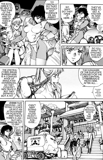
Masamune Shirow (pen name for Masanori Ota) is one of the most popular and influential creators of manga (Japanese comics). He is best known as the creator of Ghost in the Shell, which most Westerners know more from the 2 Anime movies (directed by Mamoru Oshii) and TV show than from the original manga they were adapted from. His other well-known manga include Appleseed and Dominion.Ghost in the Shell is essentially a cyberpunk (computer oriented science fiction) story and the anime adaptation of it was very influential on popular films like The Matrix. The story is that the Wachowski brothers were running into resistance from the studio when pitching the idea for the original Matrix movie. The Brothers W couldn’t seem to get across to the studio execs what kind of a movie they were trying to make until they sat them down for a showing of Ghost in the Shell and said “We want to make a live action version of something like this.”
 In addition to manga stories, Shirow also creates highly-rendered “calendar art” specifically designed to appeal to the prurient interests of young men. It usually features scantily-clad or semi-naked women with exaggerated sexual characteristics, (who may or may not be robots or androids), wielding large high-tech weapons amid gleaming sci-fi trappings and futuristic settings.
Many of his images will be unappealing or downright offensive to some women. Ironically, strong women are the central characters in his comic stories. They are the heroes, the movers and shakers, the ones who make things happen. The men are either supporting characters or the villains.
Shirow’s drawings, even his highly rendered calendar images, have that “anime” cartoon-style look to the faces that many western viewers have trouble accepting: large doll-like eyes, tiny pointed noses and exaggeratedly small mouths and chins. His comics storytelling, however, can be fairly straightforward for Westerners when it has been translated and the images have been “flopped” so the panels read left to right instead of right-to left.
I don’t know of an official Masamune Shirow website, although there is an official Ghost in the Shell site. Here is a Masamune Shirow fan site with information and links, and another Masamune Shirow Hyperpage with info, articles, reviews and fan forums.
Here is a Shirow Gallery of his highly rendered calendar art as part of this French Web magazine Black Hole (see my notice at the end of the post).
Here is an About Shirow page on a British site, and another informational British site on The Art of Shirow.
To read Shirow’s actual manga, start with Ghost In The Shell Volume 1. The recent Ghost In The Shell 2: Man-Machine Interface is also good, but quite different from the original and his other work.
Note: The sites linked here contain sexually oriented material and nudity. Avoid them if you’re likely to be offended.
Categories:
-
Arthur Rackham

British book illustrator Arthur Rackham, who was active from the late 1800’s to the 1930’s, was one of the all time great illustrators and one of my favorites. He was particularly noted for his illustrations of children’s books. Whatever he tackled, Fairy Tales of the Brothers Grimm, Rip van Winkle, The Wind in the Willows, Peter Pan in Kensington Gardens…, Rackham would own it. His unique vision and amazingly strong images became an integral part of the experience of reading the story.Of the many artists who have tried to illustrate Alice in Wonderland in the footsteps of the amazing Sir John Tenniel, Rackham is the only artist I can think who doesn’t disappear into Tenniel’s shadow like a Cheshire Cat fading into the gloom.
Rackham’s fairy tale worlds are sometimes steeped in gloom and mystery. His misty forests are inhabited by elves and goblins peering about twisted roots, massive gnarled trees, mushrooms, ferns and sinuous, tangled undergrowth. I think his fairy tale illustrations were one of the main starting points for modern fantasy illustration, influencing artists like Frank Frazetta and Roy Krenkel and the generations of fantasy artists behind them.
Rackham was a deft pen and ink artist and most of his paintings started as pen and ink drawings into which he worked layer after layer of transparent watercolor glaze, a painstaking method associated more with classical painting than modern illustration.
The Arthur Rackham Society site has a good selection of links to Rackham’s illustrations online (pop-up warning: Angelfire hosted site).
There is a nice selection of images from J.M. Barrie’s Peter Pan in Kensington Gardens here.
There are complete facsimiles of his illustrated versions of Aesop’s Fables and English Fairy Tales available online as part of Project Gutenberg. (For the quickest view of the material, go to the “Format” section, choose “HTML”, Compression: “None” and look to the index of illustrations.)
Here is a beautiful set of Rackham’s Alice in Wonderland illustrations courtesy of good ol’ Doc Ozone.
The link I’m suggesting below is to a nice broad cross-section of Rackham’s work on the Art Passions site.
Categories:


Charley’s Picks
Bookshop.org
(Bookshop.org affilliate links; sales benefit independent bookshop owners; I get a small percentage to help support my work on Lines and Colors)

John Singer Sargent: Watercolors


Urban Sketching: Understanding Perspective


Charley’s Picks
Amazon
(Amazon.com affiliate links; sales go to a larger yacht for Jeff Bezos; but I get a small percentage to help support my work on Lines and Colors)
John Singer Sargent: Watercolors
Urban Sketching: Understanding Perspective