
Categories
- 3d CGI
- Amusements
- Animation
- Anime & Manga
- Art Materials
- Art Videos
- Blogroll
- Cartoons
- Color
- Comics
- Concept & Visual Dev.
- Creativity
- Digital Art
- Digital Painting
- Displaying Art on the Web
- Drawing
- Eye Candy for Today
- Gallery and Museum Art
- High-res Art Images
- Illustration
- Motion Graphics & Flash
- Museums
- Online Museums
- Outsider Art
- Painting
- Painting a Day
- Paleo Art
- Pastel, Conté & Chalk
- Pen & Ink
- Prints and Printmaking
- Reviews
- Sc-fi and Fantasy
- Sculpture & Dimensional
- Site Comments
- Sketching
- Storyboards
- Tools and Techniques
- Uncategorized
- Vector Art
- Videos & Podcasts
- Vision and Optics
- Watercolor and Gouache
- Webcomics
Archives
- May 2026
- April 2026
- March 2026
- February 2026
- January 2026
- December 2025
- November 2025
- October 2025
- September 2025
- August 2025
- July 2025
- June 2025
- May 2025
- January 2025
- December 2024
- November 2024
- October 2024
- September 2024
- August 2024
- June 2024
- April 2024
- March 2024
- February 2024
- January 2024
- December 2023
- November 2023
- October 2023
- September 2023
- August 2023
- July 2023
- May 2023
- April 2023
- March 2023
- February 2023
- January 2023
- December 2022
- November 2022
- September 2022
- August 2022
- July 2022
- June 2022
- May 2022
- April 2022
- March 2022
- February 2022
- January 2022
- December 2021
- November 2021
- October 2021
- September 2021
- August 2021
- July 2021
- June 2021
- May 2021
- April 2021
- March 2021
- February 2021
- January 2021
- December 2020
- November 2020
- October 2020
- September 2020
- August 2020
- July 2020
- June 2020
- May 2020
- April 2020
- March 2020
- February 2020
- January 2020
- December 2019
- November 2019
- October 2019
- September 2019
- August 2019
- July 2019
- June 2019
- May 2019
- April 2019
- March 2019
- February 2019
- January 2019
- December 2018
- November 2018
- October 2018
- September 2018
- August 2018
- July 2018
- June 2018
- May 2018
- April 2018
- March 2018
- February 2018
- January 2018
- December 2017
- November 2017
- October 2017
- September 2017
- August 2017
- July 2017
- June 2017
- May 2017
- April 2017
- March 2017
- February 2017
- January 2017
- December 2016
- November 2016
- October 2016
- September 2016
- August 2016
- July 2016
- June 2016
- May 2016
- April 2016
- March 2016
- February 2016
- January 2016
- December 2015
- November 2015
- October 2015
- September 2015
- August 2015
- July 2015
- June 2015
- May 2015
- April 2015
- March 2015
- February 2015
- January 2015
- December 2014
- November 2014
- October 2014
- September 2014
- August 2014
- July 2014
- June 2014
- May 2014
- April 2014
- March 2014
- February 2014
- January 2014
- December 2013
- November 2013
- October 2013
- September 2013
- August 2013
- July 2013
- June 2013
- May 2013
- April 2013
- March 2013
- February 2013
- January 2013
- December 2012
- November 2012
- October 2012
- September 2012
- August 2012
- July 2012
- June 2012
- May 2012
- April 2012
- March 2012
- February 2012
- January 2012
- December 2011
- November 2011
- October 2011
- September 2011
- August 2011
- July 2011
- June 2011
- May 2011
- April 2011
- March 2011
- February 2011
- January 2011
- December 2010
- November 2010
- October 2010
- September 2010
- August 2010
- July 2010
- June 2010
- May 2010
- April 2010
- March 2010
- February 2010
- January 2010
- December 2009
- November 2009
- October 2009
- September 2009
- August 2009
- July 2009
- June 2009
- May 2009
- April 2009
- March 2009
- February 2009
- January 2009
- December 2008
- November 2008
- October 2008
- September 2008
- August 2008
- July 2008
- June 2008
- May 2008
- April 2008
- March 2008
- February 2008
- January 2008
- December 2007
- November 2007
- October 2007
- September 2007
- August 2007
- July 2007
- June 2007
- May 2007
- April 2007
- March 2007
- February 2007
- January 2007
- December 2006
- November 2006
- October 2006
- September 2006
- August 2006
- July 2006
- June 2006
- May 2006
- April 2006
- March 2006
- February 2006
- January 2006
- December 2005
- November 2005
- October 2005
- September 2005
- August 2005
Relevant Blogs
Art, Painting & Sketch
- Gurney Journey
- Underpaintings
- Art and Influence
- Painting Perceptions
- Oil Painters of America
- Vasari Paint POV
- Flying Fox
- Urban Sketchers
- Bento (Smithsonian)
- Art Inconnu
- The Hidden Place
- Still Life
- Making a Mark
- The Art of the Landscape
- Exploring Color & Creativity
- Art Contrarian
- Artist A Day
- beinArt Surreal Art Collective
- Eye Level
- David Dunlop
- p.i.g.m.e.n.t.i.u.m
- CultureGrrl
- Joaquín Sorolla blog
- Artists in Pastel
“Painting a Day”
- A Painting a Day (Keiser)
- On Painting (Keiser)
- Julian Merrow-Smith
- Karen Jurick
- Jeffrey Hayes
- Carol Marine
- Abbey Ryan
- Daily Paintworks
Other Painting Blogs
- Virtual Gouache Land
- Neil Hollingsworth
- Marc Hanson
- Kevin Menck
- Marc Dalessio
- Larry Seiler
- Stapleton Kearns
- Colin Page
- Roos Schuring
- Hans Versfelt
- Titus Meeuws
- Régis Pettinari
- René Plein Air
- Belinda Del Pesco
- Robin Weiss
- Nathan Fowkes (Land Sketch)
- William Wray
- Frank Serrano
- Stephen Magsig
- Michael Chesley Johnson
- Twice a Week
- Sarah Wimperis
- Rob Adams
- Michael Cole Manley
- The Dirty Palette Club
- Mike Manley’s Draw!
Gallery Art & Illustration mix
Illustration
- Howard Pyle
- 100 Years of Illustration
- BibliOdyssey
- Illustration Art
- Today’s Inspiration
- Illustration Mundo
- Little Chimp Society
- Danny Gregory
- R D (John Martz
- Illustration Friday blog
- Monster Brains
- Illustrators & Illustrations (RU)
- Elwood H. Smith
- DaniDraws.com
- Designers Who Blog
- iSpot Blog
Sci-Fi & Fantasy
Illustration & Comics
Comics & Cartoons
- Comics Beat
- Robot 6
- Newsarama Blog
- Comic Vine
- Comics Alliance
- Forbidden Planet Int.
- Paolo Rivera
- Bolt City
- Flight
- Scott McCloud
- The Comics Journal
- Comixpedia
- Funnybook Babylon
- James Baker
- Middleton’s Sketchbook
- Boneville
- The Hotel Fred
- Paul Rivoche
- Daily Cartoonist
- Mad About Cartoons (William Wray)
- Digital Strips
Illustration & Concept
Animation & Concept
- Cartoon Brew
- Animation Blog
- Cold Hard Flash
- Concept Art World
- The CAB
- FY Concept Art
- Concept Ships
- Concept Robots
- John Nevarez
- Armand Serrano
- Marcos Mateu-Mestre
- all kinds of stuff (Kricfalusi)
- Yacin the faun (Man Arenas)
- Kelsey Mann
- Cre8tivemarks Blog
- Ice-Cream Monster Toon Cafe
- AAU Character & Creature Design
- AAU Animation Notes
- Articles and Texticles
Paleo & Scientific
Tools & Techniques
Other
Lists of Art Blogs
Art Image Resource Links
Historic Art Images
- Wikimedia Commons: Paintings
- Wikimedia Commons: Drawings
- The Athenaeum
- WikiArt (WikiPaintings)
- Google Art Project: Artists
- Google Art Project: Collections (Museums)
- ArtCyclopedia
- Web Gallery of Art
- Art Renewal Center
- Web Gallery of Impressionism
Auction Consolidation sites
Auction sites
- Sotheby’s
- Bonham’s
- Christies
- Heritage Auctions: Fine Art
- Heritage Auctions: Illustration
- Freeman’s Auctions
- Bukowskis
- Shannon’s
Image Search
Reverse Image Search (search by image)
- Tin Eye
- RevImg
- Google Image Search (camera icon)
- Bing Image Search (camera icon)
Promoting some friends and some clients of my website design business
- Twin Willows T’ai Chi studio in Wilmington DE. Taiji classes with Bryan Davis.
- Ray Hayward, Inspired Teacher of T’ai Chi ( Taiji ) in Minneapolis, Founder of Mindful Motion Tai Chi Academy
- OldHead Tattoo studio and Art Gallery in Wilmington DE. Tattoos and paintings by Bruce Gulick
- Sharon Domenico Art, pet portrait oil paintings
- Platinum Paperhanging, wallpaper hanging, Main Line and Philadelphia, PA
- Lisa Stone Design, interior designer, Main Line and Philadelphia, PA
- Studio12KPT, original art, prints, calendars and other custom printed items by Van Sickle & Rolleri
-
Coraline Concept Art
 Ever since I received my remarkable Coraline Mystery Box, I’ve been simultaneously looking forward to the movie and lamenting the absence of a substantial cache of Coraline concept and production art.
I finally got a chance to see the movie; which I’m happy to say lives up to my high expectations; and my wish for access to Coraline production art has been at least half answered. There is a book of production art; that is apparently disappointing in its limited scope; but a good deal of Coraline concept and production art has begun to appear on the web now that the film is in theaters.
The Coraline movie is wonderful, in the semantic roots sense of that word. In particular I was delighted that it delivered on my expectations for beautifully realized visual texture. The level of detail, and the attention paid to the design and feel of the environments in this hand-animated gem is astonishing; and a refreshing antidote to the CGI slickness of much of Hollywood’s parade of computer animated features.
After watching Meet the Robinsons through clunky 3-D glasses and getting tired of the effect about half way through, I was reluctant to watch Coraline that way, but I’m glad I did. The tasteful artistic approach applied throughout the movie has been carried over into the use of 3-D. After a few obligatory “poke you in the eye” (literally) demonstrations of the effect, it settled in as a way to add feeling and depth (in more ways than one) to the atmosphere of the story rather than being repeatedly intrusive as a gee-whiz gimmick.
The story, animation skills, direction, voice characterization and overall realization of Coraline are superb, making it one of my favorite films (animated or otherwise) in recent years.
The crew at LIAKA really delivered on the anticipation they generated with their remarkably creative promotional campaign of the Coraline Mystery Boxes.
On the other hand, my hope for a great book of Coraline production art has apparently not been answered, at least not yet. I haven’t seen it myself, but according to reviews, Stephen Jones’ Coraline: A Visual Companion is disappointing both in its limited scope and the poor quality of the images it does feature.
However, concept and production art images from the film have begun to appear on the web. Ward Jenkins, a regular contributor to Drawn! (see my previous posts on Drawn!), has compiled an excellent article on some of the great concept artists who worked on the film, The Art of Coraline (from which I’ve taken many of the links provided below).
In particular I was delighted with the evocative settings by Chris Appelhans (image at left, top; see my previous posts about Chris Appelhans) and the wonderful designs for plant life by Chris Turnham (image at left, second from top; see my previous post on Chris Turnham).
Chris Turnham was apparently responsible for many of the beautiful plant designs in the amazing Coraline Production Art Scrapbook (click for larger images) that was the star item in my Coraline Mystery Box.
(Images at left: Chris Appelhans, Chris Turnham, Jon Klassen, Dan Krall, Stef Choi, Shane Prigmore, Shannon Tindle, Katy Wu)
Categories:
-
Christian Faur
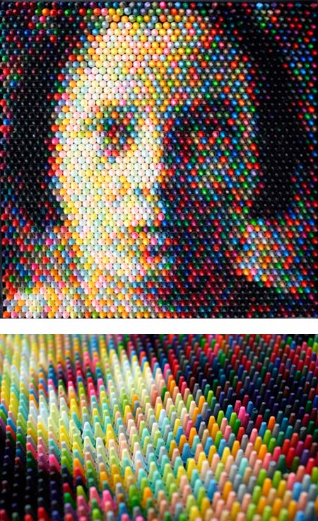
In the wake of two other posts on crayons as an art medium, I came across the work of artist Christian Faur who, among his other work in oil, encaustics, fabric and fiber, uses wax crayons as a medium in a completely different way.Using hand cast encaustic crayons (that are still essentially similar to Crayola Crayons), Faur sets them into position, on end, in arrangements of the crayons themselves that, based on the value and hue of the individual crayons, forms an image when seen from a sufficient distance.
This still recaptures some of the innocence and playfulness of childhood crayons and other toys (remember “Lite Brite”?), but uses the crayons as a combination assemblage and image creation medium.
There are several experimental variations in which Faur explores the idea, many of them almost monochromatic except for sharp punctuations of brighter colors, others are full color like the image above, Experiment 5 (shown with a detail of the surface).
One of his other artistic experiments involve assigning colored crayons as letters in a “Color Aalphabet” and then using them to interpret literary passages, for instance from Hamlet. He goes into detail here about how the colors were chosen.
[Via Gizmodo, thanks also to Bram Meehan]
Categories:
-
Tiona Marco

Minnesota artist Tiona Marco does landscapes, cityscapes, portraits, still life, wildlife and botanical drawings, all in her medium of choice, Crayola Crayons.That’s right, good ol’ big yellow box of ’em, wax in paper wrappers, wears down to a nub in your hands, drew with ’em when you were five, Crayola Crayons. She doesn’t add other mediums, melt the wax or otherwise manipulate them, she has simply become very adept at handling wax crayons as a medium.
It was an email from Tiona, letting me know about her work, that prompted my post yesterday about Crayola Crayons as an art medium.
Marco earned a degree from the Minneapolis College of Art and Design, and was teaching art to elementary school children in Mexico, where she had few resources for her own artistic endeavors, but access to plenty of crayons. She began to experiment with the potential of crayons to create art and on returning to the U.S. had a fortuitous encounter with Don Marco, an artist who had already mastered the use of Crayola Crayons as a medium.
Don Marco took on Tiona as an apprentice and Tiona, on establishing herself as an artist, took on her mentor’s last name as her own professional name.
Tiona Marco’s web site has galleries of her work in several categories, along with a brief bio. Most of the works have links indicating if the original is available for purchase, and often offering prints as well.
Many of the pieces are accompanied by comments. The image above, left, for example, is both part of a series of drawings of women in hats, and a nod to her fondness for the work of Vermeer.
Marco also has a blog, in which she discusses how she got into wax crayons as a medium, and offers several videos in which she explains some of her techniques, as well as giving advice on how to care for an original done in wax crayons.
Categories:
-
Crayola Crayons

Ahhh, think about Crayola Crayons, those wonderful waxy knobs of color, wrapped in shreds of peeled paper, that for so may of us are integral to our first experiences in making art.Wax crayons are a fond symbol of childhood (and/or or child rearing) for many of us. That wonderful smell (is there a sweeter perfume?) can instantly transport us back in time; but how soon we leave our crayons behind, forgotten in the dusty toy boxes of our early youth.
The thought of children’s wax crayons as a serious artistic medium would strike most artists as absurd. It’s simply “not done”; but, like many other mediums that are considered “inappropriate” by the arts establishment (ball-point pen for instance), they are the subject of narrow classification. Anything that makes marks on a surface can be a tool for visual art. Contemporary artists Don Marco and Tiona Marco (not related, but teacher and student) use Crayola Crayons as their primary medium.
Though there are other manufacturers of wax crayons, like Rose Art and Dixon Ticonderoga (Prang), Crayola dominates both the market and the history of modern wax crayons.
Wax crayons are not dissimilar to other colored drawing media — a pigment suspended in a binder; in this case, paraffin wax, a petroleum derivative.
They are perhaps not intended to be as long lasting as other mediums (though wax has been useful as a binder for art materials for hundreds, if not thousands, of years), or to have as expensive or “pure” a pigment content; but as with any medium the important factor is the result achieved.
The word “crayon” has other connotations in art, sometimes simply referring to a stick of almost any drawing material, but usually referring to chalks (“craie” is the French word for chalk).
Chalk crayons were famously used by Baroque and Rococo artists like Peter Paul Rubens and Antione Watteau in the “aux trois crayons” method of drawing with black, red (sanguine) and white chalks on toned paper; a method particularly effective in figure drawing and portraiture (see my post on Sanguine Drawing).
In particular we associate the term crayon with the chalks and graphite sticks in a gum binder created around the turn of the 18th Century by Nicholas Conté, and known as “Conté Crayons” (see my post on Pencils).
Wax crayons may actually be more similar in their application to mediums like oil pastels, also called wax oil crayons, that are a combination of pigment, non-drying oil (as opposed to the drying oils used in oil paint) and a wax binder.
Unlike oil pastels, which get a modicum of respect, wax crayons seem firmly relegated to the toy box instead of the paint box; but perhaps that’s an advantage.
Maybe it’s a plus that they carry that connotation with them, and that picking one up immediately connects with that part of our past in which we were unrestricted by artistic convention, free to indulge in the playful whims that we lose touch with all too easily as adults. Did we ever feel “creatively blocked” as children playing with crayons? Hardly.
Maybe we would all benefit from working, however briefly, with a medium that comes with a built in connection to the wide-eyed innocence and playful explorations of childhood.
A box of eight is a little over a dollar and you can buy them just about anywhere (worth the price just for that wonderful smell).
Categories:
-
Zdzisław Beksiński

Zdzisław Beksiński was a Polish painter, sculptor and photographer known for his darkly dystopian fantastic realism.His intricately rendered images of other worldly or post-apocalyptic landscapes, often populated with deathly or skeletal figures, are heavily atmospheric, as if filled with a mist of miasma and corruption.
He has a sequence of images of cathedrals dissolving into lattices of stone, disintegrating or floating into the air.
Scenes of desolation and darkness, however, are sometimes punctuated with light and color, hints that perhaps all is not consumed by the dark, perhaps most dramatically so in the image above.
The artist’s own life was marked by the darkness of personal tragedy. His wife died in 1998, when he was 69; a year later his son committed suicide and Beksiński was the one who came upon his body. The artist himself was murdered a few years later; stabbed to death by the teenaged son of his long time caretaker, to whom he had apparently refused a loan at one point.
Beksiński studied architecture in Kraków, went to work as a site supervisor and outside of his job began to experiment with sculpture and photomontage. His initial efforts as a painter were in non-representational works, but he eventually moved into the vein for which he is best known, showing the influence of the Surrealists and Dadaists, as well as fantastic realists like Ernst Fuchs and H.R. Giger.
In his later career, Beksiński became interested in digital photomontage, and you will often find examples of that work mixed in with his paintings.
Beksiński’s art is still represented by his agent through the Belvedere Gallery and the official web site they maintain for his work.
Categories:
-
Alphonse Mucha (Alfons Mucha) (update)

In my previous post about Czech artist Alphonse Mucha (Alfons Mucha), I pointed out that I think his place in art history has been drastically undervalued.Partly because we think of his work, and the Art Noveau movement with which he was inextricably linked, as “decorative”, “pretty” and basically lightweight, his influence and achievements, and the range of his work, go largely ignored.
Though his elegantly beautiful posters, perhaps the finest blending of artwork and graphic design ever achieved, are tremendously popular; his other work, notably the 20 dramatic and large scale paintings of The Slav Epic, which Mucha considered his greatest artistic achievement, are not widely known.
A new large scale European exhibition of Mucha’s work, from all phases of his artistic career, promises to correct that and bring more of his range and stature as an artist into light. There is a detailed description of the exhibition on Art Knowledge News.
The exhibition is currently at the Belvedere in Vienna, Austria until June 1, 2009. From there a slightly modified version travels to the Musée Fabre in Montpellier, France, where it will be on display from June to September 2009, and then will be on view in Munich from September 2009 to January 2010.
For more see my previous post on Alphonse Mucha. I didn’t include many resources in that post, so I’ve listed some here.
Categories:


Charley’s Picks
Bookshop.org
(Bookshop.org affilliate links; sales benefit independent bookshop owners; I get a small percentage to help support my work on Lines and Colors)

John Singer Sargent: Watercolors


Urban Sketching: Understanding Perspective


Charley’s Picks
Amazon
(Amazon.com affiliate links; sales go to a larger yacht for Jeff Bezos; but I get a small percentage to help support my work on Lines and Colors)
John Singer Sargent: Watercolors
Urban Sketching: Understanding Perspective