
Categories
- 3d CGI
- Amusements
- Animation
- Anime & Manga
- Art Materials
- Art Videos
- Blogroll
- Cartoons
- Color
- Comics
- Concept & Visual Dev.
- Creativity
- Digital Art
- Digital Painting
- Displaying Art on the Web
- Drawing
- Eye Candy for Today
- Gallery and Museum Art
- High-res Art Images
- Illustration
- Motion Graphics & Flash
- Museums
- Online Museums
- Outsider Art
- Painting
- Painting a Day
- Paleo Art
- Pastel, Conté & Chalk
- Pen & Ink
- Prints and Printmaking
- Reviews
- Sc-fi and Fantasy
- Sculpture & Dimensional
- Site Comments
- Sketching
- Storyboards
- Tools and Techniques
- Uncategorized
- Vector Art
- Videos & Podcasts
- Vision and Optics
- Watercolor and Gouache
- Webcomics
Archives
- May 2026
- April 2026
- March 2026
- February 2026
- January 2026
- December 2025
- November 2025
- October 2025
- September 2025
- August 2025
- July 2025
- June 2025
- May 2025
- January 2025
- December 2024
- November 2024
- October 2024
- September 2024
- August 2024
- June 2024
- April 2024
- March 2024
- February 2024
- January 2024
- December 2023
- November 2023
- October 2023
- September 2023
- August 2023
- July 2023
- May 2023
- April 2023
- March 2023
- February 2023
- January 2023
- December 2022
- November 2022
- September 2022
- August 2022
- July 2022
- June 2022
- May 2022
- April 2022
- March 2022
- February 2022
- January 2022
- December 2021
- November 2021
- October 2021
- September 2021
- August 2021
- July 2021
- June 2021
- May 2021
- April 2021
- March 2021
- February 2021
- January 2021
- December 2020
- November 2020
- October 2020
- September 2020
- August 2020
- July 2020
- June 2020
- May 2020
- April 2020
- March 2020
- February 2020
- January 2020
- December 2019
- November 2019
- October 2019
- September 2019
- August 2019
- July 2019
- June 2019
- May 2019
- April 2019
- March 2019
- February 2019
- January 2019
- December 2018
- November 2018
- October 2018
- September 2018
- August 2018
- July 2018
- June 2018
- May 2018
- April 2018
- March 2018
- February 2018
- January 2018
- December 2017
- November 2017
- October 2017
- September 2017
- August 2017
- July 2017
- June 2017
- May 2017
- April 2017
- March 2017
- February 2017
- January 2017
- December 2016
- November 2016
- October 2016
- September 2016
- August 2016
- July 2016
- June 2016
- May 2016
- April 2016
- March 2016
- February 2016
- January 2016
- December 2015
- November 2015
- October 2015
- September 2015
- August 2015
- July 2015
- June 2015
- May 2015
- April 2015
- March 2015
- February 2015
- January 2015
- December 2014
- November 2014
- October 2014
- September 2014
- August 2014
- July 2014
- June 2014
- May 2014
- April 2014
- March 2014
- February 2014
- January 2014
- December 2013
- November 2013
- October 2013
- September 2013
- August 2013
- July 2013
- June 2013
- May 2013
- April 2013
- March 2013
- February 2013
- January 2013
- December 2012
- November 2012
- October 2012
- September 2012
- August 2012
- July 2012
- June 2012
- May 2012
- April 2012
- March 2012
- February 2012
- January 2012
- December 2011
- November 2011
- October 2011
- September 2011
- August 2011
- July 2011
- June 2011
- May 2011
- April 2011
- March 2011
- February 2011
- January 2011
- December 2010
- November 2010
- October 2010
- September 2010
- August 2010
- July 2010
- June 2010
- May 2010
- April 2010
- March 2010
- February 2010
- January 2010
- December 2009
- November 2009
- October 2009
- September 2009
- August 2009
- July 2009
- June 2009
- May 2009
- April 2009
- March 2009
- February 2009
- January 2009
- December 2008
- November 2008
- October 2008
- September 2008
- August 2008
- July 2008
- June 2008
- May 2008
- April 2008
- March 2008
- February 2008
- January 2008
- December 2007
- November 2007
- October 2007
- September 2007
- August 2007
- July 2007
- June 2007
- May 2007
- April 2007
- March 2007
- February 2007
- January 2007
- December 2006
- November 2006
- October 2006
- September 2006
- August 2006
- July 2006
- June 2006
- May 2006
- April 2006
- March 2006
- February 2006
- January 2006
- December 2005
- November 2005
- October 2005
- September 2005
- August 2005
Relevant Blogs
Art, Painting & Sketch
- Gurney Journey
- Underpaintings
- Art and Influence
- Painting Perceptions
- Oil Painters of America
- Vasari Paint POV
- Flying Fox
- Urban Sketchers
- Bento (Smithsonian)
- Art Inconnu
- The Hidden Place
- Still Life
- Making a Mark
- The Art of the Landscape
- Exploring Color & Creativity
- Art Contrarian
- Artist A Day
- beinArt Surreal Art Collective
- Eye Level
- David Dunlop
- p.i.g.m.e.n.t.i.u.m
- CultureGrrl
- Joaquín Sorolla blog
- Artists in Pastel
“Painting a Day”
- A Painting a Day (Keiser)
- On Painting (Keiser)
- Julian Merrow-Smith
- Karen Jurick
- Jeffrey Hayes
- Carol Marine
- Abbey Ryan
- Daily Paintworks
Other Painting Blogs
- Virtual Gouache Land
- Neil Hollingsworth
- Marc Hanson
- Kevin Menck
- Marc Dalessio
- Larry Seiler
- Stapleton Kearns
- Colin Page
- Roos Schuring
- Hans Versfelt
- Titus Meeuws
- Régis Pettinari
- René Plein Air
- Belinda Del Pesco
- Robin Weiss
- Nathan Fowkes (Land Sketch)
- William Wray
- Frank Serrano
- Stephen Magsig
- Michael Chesley Johnson
- Twice a Week
- Sarah Wimperis
- Rob Adams
- Michael Cole Manley
- The Dirty Palette Club
- Mike Manley’s Draw!
Gallery Art & Illustration mix
Illustration
- Howard Pyle
- 100 Years of Illustration
- BibliOdyssey
- Illustration Art
- Today’s Inspiration
- Illustration Mundo
- Little Chimp Society
- Danny Gregory
- R D (John Martz
- Illustration Friday blog
- Monster Brains
- Illustrators & Illustrations (RU)
- Elwood H. Smith
- DaniDraws.com
- Designers Who Blog
- iSpot Blog
Sci-Fi & Fantasy
Illustration & Comics
Comics & Cartoons
- Comics Beat
- Robot 6
- Newsarama Blog
- Comic Vine
- Comics Alliance
- Forbidden Planet Int.
- Paolo Rivera
- Bolt City
- Flight
- Scott McCloud
- The Comics Journal
- Comixpedia
- Funnybook Babylon
- James Baker
- Middleton’s Sketchbook
- Boneville
- The Hotel Fred
- Paul Rivoche
- Daily Cartoonist
- Mad About Cartoons (William Wray)
- Digital Strips
Illustration & Concept
Animation & Concept
- Cartoon Brew
- Animation Blog
- Cold Hard Flash
- Concept Art World
- The CAB
- FY Concept Art
- Concept Ships
- Concept Robots
- John Nevarez
- Armand Serrano
- Marcos Mateu-Mestre
- all kinds of stuff (Kricfalusi)
- Yacin the faun (Man Arenas)
- Kelsey Mann
- Cre8tivemarks Blog
- Ice-Cream Monster Toon Cafe
- AAU Character & Creature Design
- AAU Animation Notes
- Articles and Texticles
Paleo & Scientific
Tools & Techniques
Other
Lists of Art Blogs
Art Image Resource Links
Historic Art Images
- Wikimedia Commons: Paintings
- Wikimedia Commons: Drawings
- The Athenaeum
- WikiArt (WikiPaintings)
- Google Art Project: Artists
- Google Art Project: Collections (Museums)
- ArtCyclopedia
- Web Gallery of Art
- Art Renewal Center
- Web Gallery of Impressionism
Auction Consolidation sites
Auction sites
- Sotheby’s
- Bonham’s
- Christies
- Heritage Auctions: Fine Art
- Heritage Auctions: Illustration
- Freeman’s Auctions
- Bukowskis
- Shannon’s
Image Search
Reverse Image Search (search by image)
- Tin Eye
- RevImg
- Google Image Search (camera icon)
- Bing Image Search (camera icon)
Promoting some friends and some clients of my website design business
- Twin Willows T’ai Chi studio in Wilmington DE. Taiji classes with Bryan Davis.
- Ray Hayward, Inspired Teacher of T’ai Chi ( Taiji ) in Minneapolis, Founder of Mindful Motion Tai Chi Academy
- OldHead Tattoo studio and Art Gallery in Wilmington DE. Tattoos and paintings by Bruce Gulick
- Sharon Domenico Art, pet portrait oil paintings
- Platinum Paperhanging, wallpaper hanging, Main Line and Philadelphia, PA
- Lisa Stone Design, interior designer, Main Line and Philadelphia, PA
- Studio12KPT, original art, prints, calendars and other custom printed items by Van Sickle & Rolleri
-
Peter Gric

Born in the Czech Republic, Peter Gric emigrated to Austria at the age of 12, and studied at the Academy of Arts in Vienna.His paintings are representational, but they largely depict imaginary objects or landscapes, that can at times seem architectural, at times organic and at other times, a combination of the two.
Gric paints in acrylic and sometimes oil, and uses computer graphics and 3D software to help visualize and work out perspective and compositional problems before, or even while painting.
His structural imaginings can take curvilinear forms that seem to be obeying some hidden geometry, as if some stone-like material was assembling itself along invisible lines of force.
Other images show the apparent dissolution of structures or material formations, with walls or cliffs dissolving into a gravity defying shower of stone blocks. His paintings sometimes include female forms that are apparently made of stone and either dissolving or gathering themselves together from inorganic elements.
Gric’s website has his paintings arranged by year, so you can browse back through some of his previous explorations of similar and disparate themes.
There is also a shop with prints of images from various times. Gric has also illustrated a number of book covers, largely in the science fiction genre, and you can see some of them in the “Other Projects” section of his site.
There is a gallery for Gric’s paintings on the beinArt Surreal Art Collective, which is where I encountered his work, as well as an interview with the artist. He is also featured in the first volume of the Collective’s Metamorphosis collections (see my post on Metamorphosis, Volume I).
Categories:
-
J.W. Waterhouse: The Modern Pre-Raphaelite
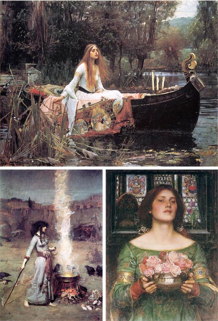
For those familiar with the English Pre-Raphaelite painters, the phrase “modern Pre-Raphaelite” may sound as much an oxymoron as the Surrealist phrase “Soluble Fish”, in that the Pre-Raphaelites named their group after their desire to return to the “pre-Raphael” purity of the early Renaissance.John William Waterhouse was never a member of the Pre-Raphaelite Brotherhood, he wasn’t born until the year of their first exhibition, but he was very much influenced by them, took on many of the same literary themes in his paintings and is often associated with them from the perspective of a century and a half into the future.
Unlike the Pre-Raphaelites, who made a point of breaking away from the Royal Academy and deriding it’s leadership, Waterhouse was completely comfortable with the Academy and was active as a member.
For all of his classical training and Pre-Raphaelite leanings, Waterhouse was indeed modern in his time, particularly in his later work, when he moved away from his more tightly controlled early style, somewhat in the vein of Sir Lawrence Alma-Tadema and other romantic history painters, toward a more open and lively handling of paint.
Influenced though he was by the Pre-Raphaelite painters in subject matter and emotional tone, Waterhouse differed in his approach to painting, specifically eschewing the detailed techniques that Millais at one point complained took a whole day painting an area “no larger than a five shilling piece”, and embracing instead the painterly, open brushstrokes of the French Impressionists and the English painters who had taken up their style. Not that Waterhouse painted in an Impressionist manner, but more of a lively synthesis of Academic and Impressionist inspired techniques, a sort of painterly and richly colored academic classicism.
If Academic painting, plus Pre-Raphaelite literary romanticism plus Impressionist color and brushstrokes sounds like an improbable combination to you, the images above, and many others, will attest to its success. Waterhouse is not only a favorite of mine, but of millions. His images are among the most popular and frequently reproduced in the canon of Western art.
J.W. Waterhouse: The Modern Pre-Raphaelite is an exhibition organized by the Groninger Museum, the Netherlands in cooperation with the Royal Academy of Arts and the Montreal Museum of Fine Art. It is the first major international exhibition of his work, and includes eighty painting and numerous drawings.
J.W. Waterhouse: The Modern Pre-Raphaelite is at the Royal Academy of Arts from June 27 to September 13, 2009, and will be at the Montreal Museum of Fine Arts from October 1, 2009 to February 2, 2010.
There are numerous books on Waterhouse, including a new one that accompanies this exhibition. I haven’t seen that one, but I can recommend J.W. Waterhouse by Peter Trippi. The latter volume, while perhaps not the most luxurious with illustrations, shows a curator’s keen eye in their selection and accompanies them with well thought out text that gives them a depth and artistic history many art books lack.
I don’t know if the images I’ve chosen above have any relation to the exhibition, I’ve just picked them to be representative of Waterhouse, both in his most familiar and somewhat lesser known forms.
For more, see my previous posts about John William Waterhouse and The Pre-Raphaelites.
[Via Art Knowledge News]
Categories:
-
Mattias Adolfsson

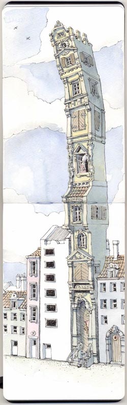 Mattias Adolfsson is a 3D artist living outside of Stockholm, Sweeden and currently working for gaming developer Simbin Development Studios.
Having apparently put aside traditional drawing for a while, Adolfsson returned to regular drawing when he started his sketchblog Mattias Inks, in 2006. Since then he has populated it with a wonderful and fast growing assortment of whimsical drawings on a variety of subjects and themes.
Usually drawing with a Namiki Falcon fountain pen and Noodler’s American Eel ink, and often in the pages of Moleskine sketchbooks, Adolfsson draws charmingly offbeat characters, animals, robots and architectural fantasies, as well as more straightforward sketches of his surroundings.
He often fills out his drawings with watercolor to varying degrees, usually with light touches that leave the feeling of the ink drawing intact.
For someone who has only been drawing recently for a couple of years, Adolfsson has been prolific; his Flickr galleries go on for dozens of pages.
He also has a web site with galleries of his drawings, doodles and sketch books; as well as an Etsy shop in which he sells original art.
One of his excursions into fanciful imaginings is his interpretation of “Star Wars, the baroque version” (expanded page version here), with a curly-wig helmeted Darth Vader, blunderbuss and balloon-pak equipped Bobba Fett, and Han Solo being harassed by the puritan police at the base of his eminently baroque Millennium Falcon (top, left).
I particularly enjoy Adolfsson’s architectural imaginings, like his houseflowers (top, right) and ornate, leaning, single-room-stacked “skyscraper prototypes” (left).
Mattias Adolfsson is giving a workshop in drawing this July 29-31 (more information here, in Swedish); and is currently working on a children’s book titled Till mitt barnbarn.
[Via ‘skine art]
Categories:
-
Clark Hulings

In addition to receiving a degree in physics from Haverford College in 1944, and an appointment to work on the Manhattan Project in Los Alamos, Clark Hulings studied art with George Bridgeman (whose books on anatomy are among my favorites) and influential teacher Frank Reilly (see my post on Frank Reilly) at the Art Student’s League in New York.Health issues prevented Hulings from joining the atomic bomb project and he turned to his love of art for his career.
He started in portraiture, but the demands of sitters made him more inclined to a career in illustration. Even as he established a successful career as an illustrator, his desire to pursue easel painting, particularly landscape, led him to study in Florence, Italy for three years, and on his return to the U.S. he pursued landscape painting while continuing his illustration career.
Hulings eventually transitioned from illustration to gallery painting full time. He became an accomplished and well respected painter. His careful observations and tonally complex compositions make for evocative images from his travels across the globe, but particularly shine in his portrayals of rural Mexican village life, from colorful markets to humble shelters to quiet domestic scenes.
Hulings’ paintings interweave patterns of light, often brilliant white against walls and the sides of buildings, with areas of more subdued contrast that are rich with visual texture.
The intricate interplay of light and texture, and his attention to visual detail, can make his paintings seem tighter than they actually are when seen in reproduction, an impression that is unfortunately not dispelled by the small images on his own site and elsewhere on the web. However, if you take a look at the zoomable image of this painting on the Sotheby’s auction site, you can see the actual loose and painterly quality of his work.
Also unfortunate is the fact the the Flash slideshow on the Painting Gallery section of his web site doesn’t function properly (image sections overlap and cover other sections); however there is an older Image Gallery still linked from the Contact page, that is more straightforward.
There also images on the Store page. In addition, there are books and DVDs available directly from his web site; and others, some out of print, available from sources like Amazon.
There are a few videos on YouTube and Hulings’ Facebook page that are audio excerpts of his lectures at the Art Students League, as well as an additional gallery on Facebook.
[Suggestion and links courtesy of James Gurney]
Categories:
-
Which Art Student Are You?
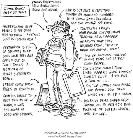
Cartoonist and illustrator Chuck Dillon, who teaches at the Hussian School of Art here in Philadelphia, has condensed some of his observations about students over his 10 years of teaching, and produced cartoon drawings/infographics of 20 student “types”.Inspired in part by Daniel Clowes Art School Confidentaial, a graphic story (made into a movie by Terry Zwigoff) that did a bit of similar classification of art students, Dillon came up with 20 classifications, like Student 1.0, the Anime Student, the Snob/Fine Art Student, the Mom Student, the Comic Book/Geek Student, etc.
Dillon posted them on his blog, 30×30, asking “Which Student are You?“.
You may be disinclined to identify, as most of his characterizations are negative and drawn from the inevitable frustrations of a teacher who is trying to communicate something through the barriers people often erect in the name of identity, but it’s amusing to see his take on them.
Personally, I found it difficult to identify for another reason. Enough years have passed since I was in art school that many of his types don’t resonate with me, largely because the social/pop culture phenomena to which they’re tied (anime, metal, gaming) didn’t exist at the time. Other types with which I might have identified (60’s counterculture types) no longer apply. Also I went to a different kind of art school, Hussian is a small commercial art school, a sharp contrast in some ways to the medium sized fine arts academy that I attended.
Still some things are universal, and even though we all know it’s not a Good Thing to classify people by their appearance, it’s fun to sort into “types”.
It’s also fun to compare Dillon’s categorization of student types with his assessment of himself over time in a two part series called “Through the years…” and “Through the Years (part2)“, which preceded his student types, and was inspired by the Draw yourself as a teen meme started by webcomics artist Dave Valeza (see my post about Draw yourself as a teen).
The rest of Dillon’s blog varies from posts about his process to train sketches to various finished and unfinished projects, like his Philadelphia Zoo Annual Report Comic Strip. Dillon also has a web site which showcases some of his other work.
[Via Drawn!]
Categories:
-
Zdeněk Burian
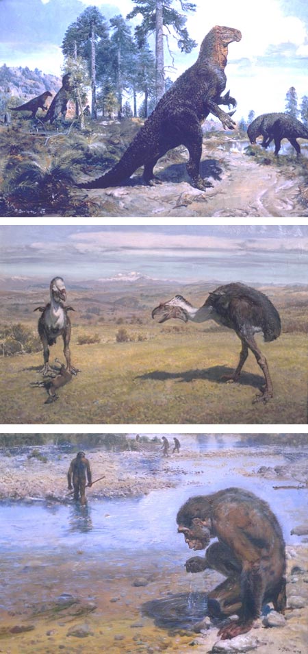
Yesterday’s more or less paleontology art themed post (DinoMixer: on creating art for an iPhone app) reminded me that I have been wanting for some time to write a post about Chezk artist Zdeněk Burian, a pioneering paleontological reconstruction artist, natural history painter and book and magazine illustrator.Zdeněk Burian (pronounced, according to William Stout via Jim Vadeboncoeur: “Zeh-DEN-yeck BURR-ee-yahn”), was, along with Charles R. Knight and Rudolph Zallinger, one of the most influential paleontological artists in the history of the field.
His detailed compositions showed prehistoric landscapes populated by fantastical animals that were simultaneously dramatic and, given the scientific knowledge at the time, painstakingly accurate. In spite of their attention to scientific detail, his paintings are lively, colorful and painterly, often with dramatic skies alive with roiling clouds.
Many of his dinosaur paintings have become iconic, well known even beyond the paleo art community; and he created images of many other periods of prehistoric life, including prehistoric mammals, extinct giant birds, ancient seas, early humans and human ancestors.
Burian studied at the Academy of Graphic Arts in Prague and begain selling illustrations while still in his second year, though not successfully enough to support himself or to prevent dropping out of school. Taking up odd jobs to support himself, he continued his own study, working on “adventure illustrations’ and eventually getting work illustrating western adventure fiction.
He was apparently not only prolific, but quite fast, a fact that was exploited by unscrupulous publishers, who demanded much and paid little.
Burian’s early interest in prehistoric life and paleontology, fueled in part by an admiration for Charles R. Knight’s paintings, bloomed when he partnered with paleontologist Josef Augusta to do prehistoric life reconstructions that provided art for numerous books, articles and museum exhibits.
It’s estimated that Burian created over 15,000 works — drawings in various media, paintings and illustrations, including illustrations for over 500 books.
Burian’s work was not widely seen outside Czechoslovakia until the 1960’s, when a series of books, many of them aimed at a popular audience, were published in the U.S. A number of his books are still available in various states of new or used.
Those who are mostly familiar with modern images of prehistoric animals, particularly dinosaurs, will find his images of upright iguanodons, tail-dragging tyrannosaurs and and giant sauropods with languorously curved necks and ground-hugging tails oddly quaint, but they were rigorously correct according to the best paleontological reconstructions of the day (interpretations of the appearance of long-extinct animals based on fragmentary fossilized bones, trackways and bone fragments is a constantly shifting landscape, new evidence is literally being uncovered daily).
What doesn’t get outdated, however, is Burian’s command of painting technique, his dramatic compositions, evocative landscapes and viscerally tactile suggestions of the textures of prehistoric life.
William Stout, himself a paleo artist of note (see my posts on William Stout) has published a Zdenek Burian Sketchbook – Volume One: Prehistoric Life, a nice companion to his Charles R. Knight Sketchbooks (here’s a mention of both on Paleoblog).
Categories:


Charley’s Picks
Bookshop.org
(Bookshop.org affilliate links; sales benefit independent bookshop owners; I get a small percentage to help support my work on Lines and Colors)

John Singer Sargent: Watercolors


Urban Sketching: Understanding Perspective


Charley’s Picks
Amazon
(Amazon.com affiliate links; sales go to a larger yacht for Jeff Bezos; but I get a small percentage to help support my work on Lines and Colors)
John Singer Sargent: Watercolors
Urban Sketching: Understanding Perspective