
Categories
- 3d CGI
- Amusements
- Animation
- Anime & Manga
- Art Materials
- Art Videos
- Blogroll
- Cartoons
- Color
- Comics
- Concept & Visual Dev.
- Creativity
- Digital Art
- Digital Painting
- Displaying Art on the Web
- Drawing
- Eye Candy for Today
- Gallery and Museum Art
- High-res Art Images
- Illustration
- Motion Graphics & Flash
- Museums
- Online Museums
- Outsider Art
- Painting
- Painting a Day
- Paleo Art
- Pastel, Conté & Chalk
- Pen & Ink
- Prints and Printmaking
- Reviews
- Sc-fi and Fantasy
- Sculpture & Dimensional
- Site Comments
- Sketching
- Storyboards
- Tools and Techniques
- Uncategorized
- Vector Art
- Videos & Podcasts
- Vision and Optics
- Watercolor and Gouache
- Webcomics
Archives
- May 2026
- April 2026
- March 2026
- February 2026
- January 2026
- December 2025
- November 2025
- October 2025
- September 2025
- August 2025
- July 2025
- June 2025
- May 2025
- January 2025
- December 2024
- November 2024
- October 2024
- September 2024
- August 2024
- June 2024
- April 2024
- March 2024
- February 2024
- January 2024
- December 2023
- November 2023
- October 2023
- September 2023
- August 2023
- July 2023
- May 2023
- April 2023
- March 2023
- February 2023
- January 2023
- December 2022
- November 2022
- September 2022
- August 2022
- July 2022
- June 2022
- May 2022
- April 2022
- March 2022
- February 2022
- January 2022
- December 2021
- November 2021
- October 2021
- September 2021
- August 2021
- July 2021
- June 2021
- May 2021
- April 2021
- March 2021
- February 2021
- January 2021
- December 2020
- November 2020
- October 2020
- September 2020
- August 2020
- July 2020
- June 2020
- May 2020
- April 2020
- March 2020
- February 2020
- January 2020
- December 2019
- November 2019
- October 2019
- September 2019
- August 2019
- July 2019
- June 2019
- May 2019
- April 2019
- March 2019
- February 2019
- January 2019
- December 2018
- November 2018
- October 2018
- September 2018
- August 2018
- July 2018
- June 2018
- May 2018
- April 2018
- March 2018
- February 2018
- January 2018
- December 2017
- November 2017
- October 2017
- September 2017
- August 2017
- July 2017
- June 2017
- May 2017
- April 2017
- March 2017
- February 2017
- January 2017
- December 2016
- November 2016
- October 2016
- September 2016
- August 2016
- July 2016
- June 2016
- May 2016
- April 2016
- March 2016
- February 2016
- January 2016
- December 2015
- November 2015
- October 2015
- September 2015
- August 2015
- July 2015
- June 2015
- May 2015
- April 2015
- March 2015
- February 2015
- January 2015
- December 2014
- November 2014
- October 2014
- September 2014
- August 2014
- July 2014
- June 2014
- May 2014
- April 2014
- March 2014
- February 2014
- January 2014
- December 2013
- November 2013
- October 2013
- September 2013
- August 2013
- July 2013
- June 2013
- May 2013
- April 2013
- March 2013
- February 2013
- January 2013
- December 2012
- November 2012
- October 2012
- September 2012
- August 2012
- July 2012
- June 2012
- May 2012
- April 2012
- March 2012
- February 2012
- January 2012
- December 2011
- November 2011
- October 2011
- September 2011
- August 2011
- July 2011
- June 2011
- May 2011
- April 2011
- March 2011
- February 2011
- January 2011
- December 2010
- November 2010
- October 2010
- September 2010
- August 2010
- July 2010
- June 2010
- May 2010
- April 2010
- March 2010
- February 2010
- January 2010
- December 2009
- November 2009
- October 2009
- September 2009
- August 2009
- July 2009
- June 2009
- May 2009
- April 2009
- March 2009
- February 2009
- January 2009
- December 2008
- November 2008
- October 2008
- September 2008
- August 2008
- July 2008
- June 2008
- May 2008
- April 2008
- March 2008
- February 2008
- January 2008
- December 2007
- November 2007
- October 2007
- September 2007
- August 2007
- July 2007
- June 2007
- May 2007
- April 2007
- March 2007
- February 2007
- January 2007
- December 2006
- November 2006
- October 2006
- September 2006
- August 2006
- July 2006
- June 2006
- May 2006
- April 2006
- March 2006
- February 2006
- January 2006
- December 2005
- November 2005
- October 2005
- September 2005
- August 2005
Relevant Blogs
Art, Painting & Sketch
- Gurney Journey
- Underpaintings
- Art and Influence
- Painting Perceptions
- Oil Painters of America
- Vasari Paint POV
- Flying Fox
- Urban Sketchers
- Bento (Smithsonian)
- Art Inconnu
- The Hidden Place
- Still Life
- Making a Mark
- The Art of the Landscape
- Exploring Color & Creativity
- Art Contrarian
- Artist A Day
- beinArt Surreal Art Collective
- Eye Level
- David Dunlop
- p.i.g.m.e.n.t.i.u.m
- CultureGrrl
- Joaquín Sorolla blog
- Artists in Pastel
“Painting a Day”
- A Painting a Day (Keiser)
- On Painting (Keiser)
- Julian Merrow-Smith
- Karen Jurick
- Jeffrey Hayes
- Carol Marine
- Abbey Ryan
- Daily Paintworks
Other Painting Blogs
- Virtual Gouache Land
- Neil Hollingsworth
- Marc Hanson
- Kevin Menck
- Marc Dalessio
- Larry Seiler
- Stapleton Kearns
- Colin Page
- Roos Schuring
- Hans Versfelt
- Titus Meeuws
- Régis Pettinari
- René Plein Air
- Belinda Del Pesco
- Robin Weiss
- Nathan Fowkes (Land Sketch)
- William Wray
- Frank Serrano
- Stephen Magsig
- Michael Chesley Johnson
- Twice a Week
- Sarah Wimperis
- Rob Adams
- Michael Cole Manley
- The Dirty Palette Club
- Mike Manley’s Draw!
Gallery Art & Illustration mix
Illustration
- Howard Pyle
- 100 Years of Illustration
- BibliOdyssey
- Illustration Art
- Today’s Inspiration
- Illustration Mundo
- Little Chimp Society
- Danny Gregory
- R D (John Martz
- Illustration Friday blog
- Monster Brains
- Illustrators & Illustrations (RU)
- Elwood H. Smith
- DaniDraws.com
- Designers Who Blog
- iSpot Blog
Sci-Fi & Fantasy
Illustration & Comics
Comics & Cartoons
- Comics Beat
- Robot 6
- Newsarama Blog
- Comic Vine
- Comics Alliance
- Forbidden Planet Int.
- Paolo Rivera
- Bolt City
- Flight
- Scott McCloud
- The Comics Journal
- Comixpedia
- Funnybook Babylon
- James Baker
- Middleton’s Sketchbook
- Boneville
- The Hotel Fred
- Paul Rivoche
- Daily Cartoonist
- Mad About Cartoons (William Wray)
- Digital Strips
Illustration & Concept
Animation & Concept
- Cartoon Brew
- Animation Blog
- Cold Hard Flash
- Concept Art World
- The CAB
- FY Concept Art
- Concept Ships
- Concept Robots
- John Nevarez
- Armand Serrano
- Marcos Mateu-Mestre
- all kinds of stuff (Kricfalusi)
- Yacin the faun (Man Arenas)
- Kelsey Mann
- Cre8tivemarks Blog
- Ice-Cream Monster Toon Cafe
- AAU Character & Creature Design
- AAU Animation Notes
- Articles and Texticles
Paleo & Scientific
Tools & Techniques
Other
Lists of Art Blogs
Art Image Resource Links
Historic Art Images
- Wikimedia Commons: Paintings
- Wikimedia Commons: Drawings
- The Athenaeum
- WikiArt (WikiPaintings)
- Google Art Project: Artists
- Google Art Project: Collections (Museums)
- ArtCyclopedia
- Web Gallery of Art
- Art Renewal Center
- Web Gallery of Impressionism
Auction Consolidation sites
Auction sites
- Sotheby’s
- Bonham’s
- Christies
- Heritage Auctions: Fine Art
- Heritage Auctions: Illustration
- Freeman’s Auctions
- Bukowskis
- Shannon’s
Image Search
Reverse Image Search (search by image)
- Tin Eye
- RevImg
- Google Image Search (camera icon)
- Bing Image Search (camera icon)
Promoting some friends and some clients of my website design business
- Twin Willows T’ai Chi studio in Wilmington DE. Taiji classes with Bryan Davis.
- Ray Hayward, Inspired Teacher of T’ai Chi ( Taiji ) in Minneapolis, Founder of Mindful Motion Tai Chi Academy
- OldHead Tattoo studio and Art Gallery in Wilmington DE. Tattoos and paintings by Bruce Gulick
- Sharon Domenico Art, pet portrait oil paintings
- Platinum Paperhanging, wallpaper hanging, Main Line and Philadelphia, PA
- Lisa Stone Design, interior designer, Main Line and Philadelphia, PA
- Studio12KPT, original art, prints, calendars and other custom printed items by Van Sickle & Rolleri
-
Charles Leickert
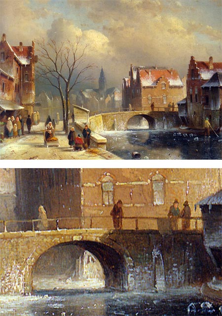
Charles Henri Joseph Leickert was a painter who would have been well suited to painting scenes of the freezing weather we’re currently experiencing in much of the United States.Leickert was a Belgian born painter who lived and worked most of his life in the Netherlands. He specialized in winter landscapes, often with a “street scene” kind of view down a frozen river, lake or canal (image above with detail, larger version here). Most of his frozen river or lake paintings portrayed bustling activity, in which the citizenry would be out skating, ice fishing, pushing sleds filled with goods, and otherwise utilizing the frozen surface as a street.
He romanticized his scenes, frequently with towering dark clouds or brilliant dramatic lighting. He reveled in the eye candy of architectural details and the textures of brick, tile and stone.
He did balance out his oeuvre with images of summer, painting similar river or street scenes teeming with warm weather activity, and framing them with similarly dramatic skies filled with billowing clouds.
Leickert moved the Hague at a young age, and studied there under several Dutch landscape painters, including Andreas Schelfhout, who had a similar speciality in winter scenes, which had proved to be more popular than his other subjects.
The 19th Century Dutch art market seemed to have an appetite for winter scenes in which life appeared to go blithely on in spite of the cold.
Get the skates out.
Categories:
-
Andrew Wyeth, 1917 – 2009

Andrew Wyeth, an American realist painter who in some ways epitomized the conflict between late 20th Century Modernism and the Realist tradition, died today in his sleep in his home in Chadds Ford, Pennsylvania at the age of 91.Wyeth was the son of the great American illustrator N.C. Wyeth. Those familiar with the elder Wyeth’s work will know that he cast a mighty big shadow. Son Andrew, one of five children, differentiated himself from his father by working in watercolor and tempera instead of oil, replacing his father’s bold colors with a subdued, almost suppressed palette, and emphasizing texture in place of color.
His quiet depictions of the Brandywine Valley countryside and the area around the family’s summer home in Maine, along with his often melancholy portrayals of residents of those areas, made him prominent as one of the public’s most admired American artists in the 20th Century.
Of course that very popularity, and the simple matter of his realist (though sometimes surreal) subject matter, and traditionalist technique, made him a target for derision among modernist critics, who denigrated classical traditions with a vengeance during their time of dominating the art world. Though his early watercolors were well received, and Christina’s World was purchased by the Museum of Modern Art, the modernists eventually felt the need to tear him down. They hurled at Wyeth the intended insult of calling him a “mere illustrator”, as though there were no more vehement way to say “not an artist”, and in the process, of course, belittling his father’s accomplishments.
Wyeth quietly persisted in the face of the post-war Modernist tides, and continued his pursuit of contemplative scenes, keen observation and command of the somewhat arcane techniques of egg tempera, a demanding and difficult to master medium that predates oil painting by centuries.
It didn’t hurt, of course, that Wyeth’s paintings were in demand and sold for high figures during the artist’s lifetime (a relatively rare thing in the history of art); and he became one of the best known American artists ever, eclipsing his father’s fame from previous generations. Wyeth eventually had the last laugh, as a good deal critical attention eventually came into line the popular acclaim after the Modernist wave had crashed and the fab foam began receding under the currents of the return of traditional artistic values.
I personally run hot and cold on Andrew Wyeth’s work, finding less appeal in his major tempera paintings than in his intimate and informal watercolors and drawings, particularly those of the Brandywine Valley, near where I grew up. Wyeth at his best was a keen eye and a careful observer, letting nature guide his hand. His figure paintings and drawings almost always included something of the countryside, or the rustic buildings and interiors associated with it, as an integral co-subject, more than simply a backdrop.
The painting above, Dryad, painted in 2000 (more detail and info here), reverses that situation; in a way sublimating the figure and nominal subject of the painting, model Senna Moore, to Wyeth’s intensely focused rendering of a great oak on his Chadds Ford property that had been split open by lightning.
Admittedly, I have trouble viewing Andrew Wyeth without making comparisons with his father. Because of the high regard I have for his work, N.C. Wyeth is my favorite illustrator and one of my favorite painters in general, it’s a difficult and probably unfair comparison.
If you want to see Andrew Wyeth’s work in the context of his artistic family, the Brandywine River Museum, near his home in Chadds Ford, Pennsylvania, has a terrific collection of work by Andrew, his artistically inclined sisters, his son, Jamie, also a noted artist, and, of course, his father, N.C. Wyeth. (If anyone puts the lie to the phrase “mere illustration”, it’s N.C. Wyeth, who was to my mind one of the finest American painters, period.)
There is also a nice, and inexpensive, book that puts the three generations of Wyeth’s, N.C., Andrew and Jamie, in one volume, An American Vision: Three Generations of Wyeth Art: N.C. Wyeth, Andrew Wyeth, James Wyeth.
For more, see my post on Andrew Wyeth from 2006.
Addendum: Katherine Tyrrell has an extensive Squidoo Lens of information and resources relating to Andrew Wyeth.
Categories:
-
Frank E. Schoonover

Frank Earle Schoonover as one of the notable students of the great American illustrator Howard Pyle.Though not the equal of Pyle’s most accomplished student, N. C. Wyeth (who was?), Schoonover was nonetheless one of the most prominent and successful American illustrators from the “Golden Age” of American illustration; and left a legacy of more than 2,500 illustrations in over 100 books and many of the most popular magazines of his time.
Schoonover, who was born in New Jersey, grew up admiring Pyle’s dramatic illustrations, often copying them as he learned to draw and paint. When he found that Pyle was teaching classes at Drexel Institute in Philadelphia (primarily because the Pennsylvania Academy of the Fine Arts, in a demonstration of the stupidity of artistic snobbery, had declined Pyle’s offer to teach there, not wanting to lower their standards to include a “mere illustrator”), Schoonover jumped at the chance so study with the man who had revolutionized American illustration and he abandoned his plans to become a minister.
Schoonover was largely self taught when he started among Pyle’s early students at Drexel, where his classmates included such eventual luminaries as Maxfield Parrish, Jessie Wilcox Smith, and Violet Oakley; but Pyle, with his keen eye for talent, picked Schoonover out as one of the ten extraordinary students awarded scholarships to Pyle’s Summer classes in nearby Chadds Ford in 1898 and 1899, and Pyle’s confidence in him resulted in assignments for the young artist soon after.
Pyle stressed “You must experience, you must put yourself into the painting, or it’s not believable.”; and, when one of Schoonover’s early commissions involved a setting in Canada’s Hudson Bay wilderness, Pyle encouraged Schoonover’s desire to travel there as part of his research.
Schoonover spent several months hiking and dogsledding through the wilderness, gathering experiences that would inform a lifetime of illustration, and sparking a lifelong love for the outdoors. He also came away with an abiding respect for Native American culture, and scenes of bark canoes were among his favorite themes.
Schoonover’s travels extended to other parts of Canada, the American West, the Louisiana Bayou and Europe.
He kept a studio at Pyle’s school in Wilmington, Delaware (my home town, perhaps one of the reasons I love the artists of the Brandywine School so much), where Pyle had set up classes near his own studio after leaving Drexel. Schoonover’s studio mates included Henry Jarvis Peck, Harvey Dunn and N. C. Wyeth.
Schoonover himself became a noted teacher, contributed by correspondence to a school of illustration in Indianapolis, Indiana, and eventually started his own school in his studios on North Rodney Street in Wilmington. Schoonover Studios are still working artist studios, as well as including an art gallery and a tribute to Schoonover, maintained by Schoonover’s grandson, John Schoonover.
Frank Schoonover was noted for his scenes of wilderness adventure, for which he certainly had accomplished Pyle’s maxim of putting his own experience into the work, as well as a wide range of other topics. His illlustrations for classics included Kidnapped, Robinson Crusoe, Swiss Family Robinson, and Ivanhoe and his western illustrations enlivened the covers of Zane Grey’s extremely popular novels and serials.
His work always showed the admiration he had for his mentor, though he developed his own style and notable characteristic techniques. Illustrators will often speak of “Schoonover red” a particular application of Cadmium red with careful varnishing to bring out the drama of the color.
In the later years of his long career (he lived to be 95), Schoonover devoted himself to landscape painting, focusing on the Brandywine and Delaware River areas. Schoonover was also a watercolorist, muralist, cartographer, photographer and designer of stained glass windows. Sixteen of his windows were created for Immanuel Church in Wilmington.
There is a new two volume, 840 page Frank E. Schoonover Catalogue Raissonné due to be released in March. The book set is $195 and can be ordered from the Delaware Art Museum or Oak Knoll Press. The Oak Knoll Press site includes a Flash slideshow of images from the set, as well as PDFs of the Table of Contents and an except.
There is a Raissonné database at www.schoonoverfund.org, which can be accessed by simply applying for a password.
If you want something more immediate and less costly than the full Catalogue Raissonné, try Visions of Adventure: N. C. Wyeth and the Brandywine Artists by Walt Reed, which features several pieces by Schoonover with biographical information, as well as art by and information on many of the most important Brandywine School illustrators. You may also have some luck finding other books about Schoonover from used book sources.
There is currently a show of Schoonover’s work at the Delaware Art Museum, Frank E. Schoonover: An Artist for All Seasons.
Though the show is intimate rather than grand, the 25 or so works, many of which are from private collections and not usually on display, give a nice cross section of his career, including some impressionistic landscapes from the Delaware River Valley and Bushkill, PA, where he spent time as a child and as an adult.
The exhibition runs until February 1, 2009.
It’s particularly nice to see his work in the context of the museum’s collection of Howard Pyle, which he was instrumental in in creating through his chairmanship of the fundraising committee. The collection, along with the Bancroft collection of Pre- Raphaelite Art (see my post on the Delaware Art Museum’s Pre-Raphaelite collection), formed the core of the Wilmington Society of the Fine Arts, which grew into the current Delaware Art Museum.
Categories:
-
Jen Stark

Many artists are fascinated with paper, it’s many forms, characteristics, tones, surfaces and colors; and the way it provides a platform and co-meduim for various kinds of drawing and painting.Jen Stark has chosen to make paper itself her primary medium, creating vibrant, intensely hued sculptures out of hand cut stacks of colored paper.
Her sculptures often drawing on the visual vibrations of complimentary colors and the appeal of hues in the order of the spectrum to give her cut paper arrangements a visual snap that is immediately arresting.
In looking through her gallery in photographs, you can see the dimensionality of some pieces easily, but others lend themselves less well to photographic reproduction (as is often the case with sculpture) and you need to project a bit to get an idea of what they might be like in person.
Her online galleries also include a selection of colorful drawings, which sometimes follow the sculpture into themes of repeated patterns and bands of brilliant color.
There are also a couple animations, or “papermations”, with animated arrangements of cut paper.
Stark studied at the Maryland Institute College of Art, where she received a BA in Fibers and also studied animation, and at the Center for Art and Culture in Aix-en-Provence, France.
In addition to her web site, Stark maintains a blog, with news and information about her projects and exhibitions.
Both the web site and the blog currently feature a video interview with the artist (also on YouTube), in which she talks about her process. The moving camera also allows you to get a better idea of the dimensionality of some of the pieces.
Categories:
-
Different Strokes from Different Folks Portrait Swap

I wrote previously about Karin Jurick’s Different Strokes from Different Folks cooperative painting blog, in which participants all paint their interpretation of a given photographic subject.In a fascinating variation for the Year End Challenge, participating painters were asked to submit a photograph of themselves from the shoulders up. These were then swapped, distributed out to different artists in the the artistic equivalent of an office gift swap (sometimes called a “pollyanna”), and each artist painted another artist’s portrait.
The resultant paintings are a fascinating array of portraits, in different styles, approaches, mediums and degrees of accomplishment.
I find the idea of artists painting artists particularly fascinating.
(Please see the Different Strokes article for artist credits for the images above.)
Categories:
-
S. Clay Wilson
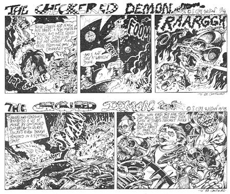
Taking a page from yesterday’s post about the first issue of Juxtapoz, which featured an article on Zap Comix 13, I wanted to make a hopefully timely post about underground comix artist S. Clay Wilson.Wilson is a cartoonist and comics artist whose work is rude, crude and full of atti-tude to the point where words like “offensive, politically incorrect, objectionable, demeaning to women, violent, sexually explicit, not safe for work, over the top, graphic, intense, obscene, dangerous, bloody, and shocking” have always seemed a bit tame and inadequate to the descriptive task. Of course, that’s exactly why some people, myself included, hold it in high regard.
Wilson was a regular contributor to Robert Crumb’s ground breaking Zap Comix in the late 1960’s. His characters like the Checkered Demon, Ruby the Dyke, Star-Eyed Stella, and others whose very names were offensive, romped, gamboled, swilled Tree-Frog beer and fought and sliced their way across panoramas of unbelievable carnage, comically exaggerated sexual violence and dementedly bloodthirsty absurdity in the pages of the independently distributed counter cultural comix. (My favorite was the Checkered Demon “…nice day for somethin’…”)
Wilson himself rampaged slashing and burning through the conventions of decency where others only tiptoed, and opened eyes and minds to the examination of those conventions in the process.
Robert Crumb said the it was S. Clay Wilson who opened his eyes to the notion that absolutely nothing was off limits, and made way for unthought of possibilities of expression and the defiance of taboos.
In the process Wilson could be wildly, dementedly funny. If you weren’t the type to take offense to his deliberate offensiveness, and could see the absurdity underlying it, his very degree of excess, and the apparent glee with which his pen wallowed in it, were agonizingly hilarious.
Of course, in our uptight, politically correct, oh-so-ready-to-take-offense society people have actually been arrested for selling material containing his work. He is exactly the kind of cultural buccaneer that keeps thing shook up, something society desperately needs at times.
I can’t point you to a repository of Wilson’s work, I had trouble finding images I could show in polite company (image above via P.J. Donovan), but I’ll try to provide a few links.
There are some collections of his work, like The Art of S. Clay Wilson and Collected Checkered Demon and he has illustrated books of fairy tales (notably Grimm’s, couldn’t find a link) in his own inimitable style. You can also find his work in back issues of Zap Comix and other underground comix if you’re lucky enough to come across copies.
I mention that I hope this post it timely because Wilson recently suffered a grave injury, and as an independent outsider cartoonist, is in need of assistance to pay large medical bills. Some friends, family and supporters are putting on some benefits to help raise the needed funds.
S. Clay Wilson Noise Benefit, January 11, 2009 Hemlock Tavern in SanFrancisco, CA.
Mojo Lounge Benefit, January 24th, 2009 at Mojo Lounge in Fremont, CA.
There is also an address where donations can be sent directly:
P.O. Box 14854
San Francisco, CA 94114There are columns in the Oregonian in which Steve Duin is covering the story.
[Via BoingBoing]
Note: links here, and all references to and material by S. Clay Wilson should be considered NSFW and not suitable for children; as well as not suitable for adults who take offense easily, Concerned Citizens for Decency, and all others not inclined to celebrate the destruction of the fabric of mainstream society.
Categories:


Charley’s Picks
Bookshop.org
(Bookshop.org affilliate links; sales benefit independent bookshop owners; I get a small percentage to help support my work on Lines and Colors)

John Singer Sargent: Watercolors


Urban Sketching: Understanding Perspective


Charley’s Picks
Amazon
(Amazon.com affiliate links; sales go to a larger yacht for Jeff Bezos; but I get a small percentage to help support my work on Lines and Colors)
John Singer Sargent: Watercolors
Urban Sketching: Understanding Perspective