
Categories
- 3d CGI
- Amusements
- Animation
- Anime & Manga
- Art Materials
- Art Videos
- Blogroll
- Cartoons
- Color
- Comics
- Concept & Visual Dev.
- Creativity
- Digital Art
- Digital Painting
- Displaying Art on the Web
- Drawing
- Eye Candy for Today
- Gallery and Museum Art
- High-res Art Images
- Illustration
- Motion Graphics & Flash
- Museums
- Online Museums
- Outsider Art
- Painting
- Painting a Day
- Paleo Art
- Pastel, Conté & Chalk
- Pen & Ink
- Prints and Printmaking
- Reviews
- Sc-fi and Fantasy
- Sculpture & Dimensional
- Site Comments
- Sketching
- Storyboards
- Tools and Techniques
- Uncategorized
- Vector Art
- Videos & Podcasts
- Vision and Optics
- Watercolor and Gouache
- Webcomics
Archives
- May 2026
- April 2026
- March 2026
- February 2026
- January 2026
- December 2025
- November 2025
- October 2025
- September 2025
- August 2025
- July 2025
- June 2025
- May 2025
- January 2025
- December 2024
- November 2024
- October 2024
- September 2024
- August 2024
- June 2024
- April 2024
- March 2024
- February 2024
- January 2024
- December 2023
- November 2023
- October 2023
- September 2023
- August 2023
- July 2023
- May 2023
- April 2023
- March 2023
- February 2023
- January 2023
- December 2022
- November 2022
- September 2022
- August 2022
- July 2022
- June 2022
- May 2022
- April 2022
- March 2022
- February 2022
- January 2022
- December 2021
- November 2021
- October 2021
- September 2021
- August 2021
- July 2021
- June 2021
- May 2021
- April 2021
- March 2021
- February 2021
- January 2021
- December 2020
- November 2020
- October 2020
- September 2020
- August 2020
- July 2020
- June 2020
- May 2020
- April 2020
- March 2020
- February 2020
- January 2020
- December 2019
- November 2019
- October 2019
- September 2019
- August 2019
- July 2019
- June 2019
- May 2019
- April 2019
- March 2019
- February 2019
- January 2019
- December 2018
- November 2018
- October 2018
- September 2018
- August 2018
- July 2018
- June 2018
- May 2018
- April 2018
- March 2018
- February 2018
- January 2018
- December 2017
- November 2017
- October 2017
- September 2017
- August 2017
- July 2017
- June 2017
- May 2017
- April 2017
- March 2017
- February 2017
- January 2017
- December 2016
- November 2016
- October 2016
- September 2016
- August 2016
- July 2016
- June 2016
- May 2016
- April 2016
- March 2016
- February 2016
- January 2016
- December 2015
- November 2015
- October 2015
- September 2015
- August 2015
- July 2015
- June 2015
- May 2015
- April 2015
- March 2015
- February 2015
- January 2015
- December 2014
- November 2014
- October 2014
- September 2014
- August 2014
- July 2014
- June 2014
- May 2014
- April 2014
- March 2014
- February 2014
- January 2014
- December 2013
- November 2013
- October 2013
- September 2013
- August 2013
- July 2013
- June 2013
- May 2013
- April 2013
- March 2013
- February 2013
- January 2013
- December 2012
- November 2012
- October 2012
- September 2012
- August 2012
- July 2012
- June 2012
- May 2012
- April 2012
- March 2012
- February 2012
- January 2012
- December 2011
- November 2011
- October 2011
- September 2011
- August 2011
- July 2011
- June 2011
- May 2011
- April 2011
- March 2011
- February 2011
- January 2011
- December 2010
- November 2010
- October 2010
- September 2010
- August 2010
- July 2010
- June 2010
- May 2010
- April 2010
- March 2010
- February 2010
- January 2010
- December 2009
- November 2009
- October 2009
- September 2009
- August 2009
- July 2009
- June 2009
- May 2009
- April 2009
- March 2009
- February 2009
- January 2009
- December 2008
- November 2008
- October 2008
- September 2008
- August 2008
- July 2008
- June 2008
- May 2008
- April 2008
- March 2008
- February 2008
- January 2008
- December 2007
- November 2007
- October 2007
- September 2007
- August 2007
- July 2007
- June 2007
- May 2007
- April 2007
- March 2007
- February 2007
- January 2007
- December 2006
- November 2006
- October 2006
- September 2006
- August 2006
- July 2006
- June 2006
- May 2006
- April 2006
- March 2006
- February 2006
- January 2006
- December 2005
- November 2005
- October 2005
- September 2005
- August 2005
Relevant Blogs
Art, Painting & Sketch
- Gurney Journey
- Underpaintings
- Art and Influence
- Painting Perceptions
- Oil Painters of America
- Vasari Paint POV
- Flying Fox
- Urban Sketchers
- Bento (Smithsonian)
- Art Inconnu
- The Hidden Place
- Still Life
- Making a Mark
- The Art of the Landscape
- Exploring Color & Creativity
- Art Contrarian
- Artist A Day
- beinArt Surreal Art Collective
- Eye Level
- David Dunlop
- p.i.g.m.e.n.t.i.u.m
- CultureGrrl
- Joaquín Sorolla blog
- Artists in Pastel
“Painting a Day”
- A Painting a Day (Keiser)
- On Painting (Keiser)
- Julian Merrow-Smith
- Karen Jurick
- Jeffrey Hayes
- Carol Marine
- Abbey Ryan
- Daily Paintworks
Other Painting Blogs
- Virtual Gouache Land
- Neil Hollingsworth
- Marc Hanson
- Kevin Menck
- Marc Dalessio
- Larry Seiler
- Stapleton Kearns
- Colin Page
- Roos Schuring
- Hans Versfelt
- Titus Meeuws
- Régis Pettinari
- René Plein Air
- Belinda Del Pesco
- Robin Weiss
- Nathan Fowkes (Land Sketch)
- William Wray
- Frank Serrano
- Stephen Magsig
- Michael Chesley Johnson
- Twice a Week
- Sarah Wimperis
- Rob Adams
- Michael Cole Manley
- The Dirty Palette Club
- Mike Manley’s Draw!
Gallery Art & Illustration mix
Illustration
- Howard Pyle
- 100 Years of Illustration
- BibliOdyssey
- Illustration Art
- Today’s Inspiration
- Illustration Mundo
- Little Chimp Society
- Danny Gregory
- R D (John Martz
- Illustration Friday blog
- Monster Brains
- Illustrators & Illustrations (RU)
- Elwood H. Smith
- DaniDraws.com
- Designers Who Blog
- iSpot Blog
Sci-Fi & Fantasy
Illustration & Comics
Comics & Cartoons
- Comics Beat
- Robot 6
- Newsarama Blog
- Comic Vine
- Comics Alliance
- Forbidden Planet Int.
- Paolo Rivera
- Bolt City
- Flight
- Scott McCloud
- The Comics Journal
- Comixpedia
- Funnybook Babylon
- James Baker
- Middleton’s Sketchbook
- Boneville
- The Hotel Fred
- Paul Rivoche
- Daily Cartoonist
- Mad About Cartoons (William Wray)
- Digital Strips
Illustration & Concept
Animation & Concept
- Cartoon Brew
- Animation Blog
- Cold Hard Flash
- Concept Art World
- The CAB
- FY Concept Art
- Concept Ships
- Concept Robots
- John Nevarez
- Armand Serrano
- Marcos Mateu-Mestre
- all kinds of stuff (Kricfalusi)
- Yacin the faun (Man Arenas)
- Kelsey Mann
- Cre8tivemarks Blog
- Ice-Cream Monster Toon Cafe
- AAU Character & Creature Design
- AAU Animation Notes
- Articles and Texticles
Paleo & Scientific
Tools & Techniques
Other
Lists of Art Blogs
Art Image Resource Links
Historic Art Images
- Wikimedia Commons: Paintings
- Wikimedia Commons: Drawings
- The Athenaeum
- WikiArt (WikiPaintings)
- Google Art Project: Artists
- Google Art Project: Collections (Museums)
- ArtCyclopedia
- Web Gallery of Art
- Art Renewal Center
- Web Gallery of Impressionism
Auction Consolidation sites
Auction sites
- Sotheby’s
- Bonham’s
- Christies
- Heritage Auctions: Fine Art
- Heritage Auctions: Illustration
- Freeman’s Auctions
- Bukowskis
- Shannon’s
Image Search
Reverse Image Search (search by image)
- Tin Eye
- RevImg
- Google Image Search (camera icon)
- Bing Image Search (camera icon)
Promoting some friends and some clients of my website design business
- Twin Willows T’ai Chi studio in Wilmington DE. Taiji classes with Bryan Davis.
- Ray Hayward, Inspired Teacher of T’ai Chi ( Taiji ) in Minneapolis, Founder of Mindful Motion Tai Chi Academy
- OldHead Tattoo studio and Art Gallery in Wilmington DE. Tattoos and paintings by Bruce Gulick
- Sharon Domenico Art, pet portrait oil paintings
- Platinum Paperhanging, wallpaper hanging, Main Line and Philadelphia, PA
- Lisa Stone Design, interior designer, Main Line and Philadelphia, PA
- Studio12KPT, original art, prints, calendars and other custom printed items by Van Sickle & Rolleri
-
Jack Unruh
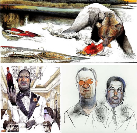
Interestingly, Kansas illustrator Jack Unruh divides his online portfolio into two enigmatically defined sections, What is real and What is not real.Presumably, the latter has more conceptual and imagination based illustrations, although in both you will find his wonderfully drawn portrait/caricatures of well known figures, images of fish, bears and other wildlife, and scenes of a variety of things and places.
Unruh has a passion for the outdoors, and fishing in particular, judging by the many illustrations of specific species of game fish in his Prints and Stock sections. His illustrations have appeared in Field and Stream, Sports Afield and Sports Illustrated, as well as a roster of major periodicals like Atlantic Monthly, Rolling Stone, Time, National Geographic and New York Magazine.
He also has done illustrations for numerous corporate and advertising clients. His illustrations have had a continuing presence in graphic arts magazines like Communication Arts, American Illustration, Graphis, AIGA and Print, and he also has a well deserved list of awards from the Society of Illustrators and others.
(An interesting side note for readers that have been following my series of articles about displaying your art on the web: all of the galleries on Unruh’s site have what I think is an excellent navigation system for online galleries (one that I’ve used myself), in which a convenient vertical (note: vertical not horizontal) scrolling frame on the right gives immediate access to images that appear in a large area to the left. The scroll bar is thus in the natural position for a scrolling web page, where the user expects it to be. Also the frames in this case are in their own page that can be bookmarked, at least for the major sections.)
Unruh’s approach looks like a combination of pen and ink and watercolor. His pen and ink underdrawing often has stippling and texture not often present in drawings that are intended for the application of color, and he will frequently leave parts of the pen and ink drawing uncolored, leading to a really interesting blend of the two types of image.
Your eye goes back an forth from islands of color to pen and ink textures in a visual smorgasbord that amuses with its variety, but never sidetracks or detracts from the intent of the illustration.
Unruh makes the color and black and white areas flow together in a coherent whole, as if the lines, hatching, spatters, squiggles and dots of pen and ink are just additional “colors” in his palette.
There is an online article about him from the Sep/Oct 2002 issue of Graphis, and an interview on Illustration is Easy.
Categories:
-
Doug Braithwaite

First, a little bit of Wikipedia-style disambiguation. Since I’m likely to write here about either topic, I’ll point out that this article is about the gallery artist named Doug Braithwaite, as opposed to the comic book artist that some readers might associate the name.Doug Braithwaite is a painter who works primarily en plein air, or on studio works that are based on plein air studies. His subject matter comes from his surrounding Utah countryside, mountains or town scenes.
He says in his artist’s statement: “I often worry that it will be hard to continue to be a landscape painter in a place where you have lived and worked all your life. But I have found that what used to seem a limited resource is, in fact, quite limitless. The more I paint, the more options for paintings are opened up.”
Braithwaite approaches his subjects with a fresh, painterly style that comes from the brevity of notation necessary for successful plein air painting.
“Painterly” is a term frequently used to describe paintings in which brush strokes or the surface of the paint itself are a visible characteristic of the image. Though it’s not always easy to tell because the images of his paintings are not reproduced as large on the web as they might be, Braithwaite seems to have the ability to capture many of the major shapes or “color notes” in his paintings with single brushstrokes.
It might be a fence post, a tree trunk, the side of a distant house or the plane of a face of rock, Braithwaite captures it with a quick confidence that leaves the impression that the painting was executed without hesitation or doubt.
His color notes are so accurate that the images can at times appear “photographic”, but I think that is again a limitation of the size at which they’re reproduced, and closer examination gives a suggestion of their geometric lattice of visible brush strokes.
In keeping with the geometry of his strokes, Braithwaite’s compositions have a strong underlying geometry as well. In this regard, viewing the even smaller versions of the thumbnail images lets you see the large, bold shapes of color areas that form the foundation of his paintings.
[Suggestion courtesy of Karin Jurick, (see my post on Karin Jurick)]
Categories:
-
BibliOdyssey (the book)
Ephemera is defined as printed or written material that isn’t intended to be preserved. Magazines and newspapers, for example, are meant to be transitory, disposed of once read (the pile of National Geographics in your grandfather’s attic notwithstanding.)Even many books are meant to be ephemeral; computer instruction manuals, for example, are out of date the instant the ink is dry because the next version of whatever it is has jut gone into beta.
Ephemera has a long history (ironically enough), as one person’s transient junk is another’s lasting treasure (witness baseball cards and comic books).
For literally hundreds of years, printed matter has been produced that was quickly made irrelevant by new events. Often this material is accompanied by illustrations, images that are as varied, weird and bizarre as anything intentionally created by fantasy artists.
It used to be that this material was relegated to dusty libraries and second hand book shops, where diligent curiosity seekers would occasionally turn up forgotten gems of oddness and wonder. But everything, it seems, whether ephemeral or significant, is being scanned and put online at some point, as our entire civilization is squeezed through the digital cheesecloth of the internet and filtered into archival bits.
“PK” (or “peacay”) is an individual who has a knack for finding particularly fascinating bits of treasure amid the cultural detritus as it settles into the great Sargasso Sea of internet archives. He collects the most bizarre and interesting pieces of visual ephemera and displays then for our delight on his long running blog, BibliOddysey, which I’ve written about before.
Now, in some kind of poetic circle of weirdness, some of this material has been collected and printed as a book, BibliOdyssey: Amazing Archival Images from the Internet, in which some of the best and strangest of PK’s finds are collected and annotated by PK for our edification, amusement and delighted bewilderment.
The book is part of a nascent publishing venture by the Fuel design group, a well known design firm in the U.K. In his description, PK points out that “With pre-production topping out at somewhere over 500 years, BibliOdyssey might well be the slowest book ever published.”
You can read about the book on the Fuel site, or on the BibliOdyssey site, where you can also, of course, get lost in the online display of ephemera. There’s something special and different, though, about the way images appear in print; and in this case the bits of ephemera are being re-released back into their natural element, at home once again in the sea of printed pages.
Let me see if I’ve got this right now, this is a book about visual material from the web that was archived from books, but I’m telling you about it on the web, and pointing you to online sources from which you could order the book…
Categories:
-
Cosmé (Cosimo) Tura

Active in the mid-15th Century, Cosmé Tura (AKA Cosimo Tura, AKA Cosimo di Domenico di Bonaventura) was an Italian painter of the early Renaissance.Tura was born in Ferrara, in north-central Italy, on the road between Venice and Florence. Though not as commonly mentioned as the other major centers of the Renaissance, Ferrara was home at one time or another to such notable artists as Andrea Mantegna, Giovanni Bellini, Pisanello and Titian.
Of them, Tura was certainly possessed of one of the most unique visions and styles of painting. His figures are cut with precise edges into high relief, glowing with with bold, high-chroma colors, intensified by the use of adjacent compliments (e.g. greens and reds), and are frequently set within wildly stylized architectural elements and deep, sometimes forced, perspective.
Plus the guy was just downright weird at times. I mean check out those copper “dolphins” adorning he throne of our muse above; where did those come from?
The painting above (large version here), was painted around 1460 and has been alternately called “Spring”, “The Muse”, “Erato”, and “Calliope”. (Often the original titles of old master paintings, if indeed they had titles, are lost to us; and scholars and collectors provide their own names over the years.)
The original is currently in the National Gallery in London, which has an image (unfortunately watermarked) with a zoom feature.
This piece was probably part of a richly decorated room, no longer in existence, created for the d’Este family; which is assumed to have had several paintings of these “muses”. Tura also did murals and other works with mythological and secular themes, as well as religious works including a painting of the Annunciation, complete with nesting doves and an attendant squirrel, on the organ doors for the Duomo.
There are some books available about Tura and his milieu, like Cosme Tura: The Life and Art of a Painter in Estense Ferrara by Joseph Manca and Cosme Tura of Ferrara: Style, Politics, and the Renaissance City, 1450-1495 by Stephen Campbell, though they are on the expensive side and I haven’t personally seen them.
Like many artists of his time, Tura painted in both egg tempera and the exciting new medium of oil paint, which had been introduced to Italy by northern painters like Rogier van der Weyden. In this case Tura has painted this work in oil over top of a previous, somewhat different image in tempera on the same wooden panel.
Some of his religious works are just as striking as this one. Look at his painting of the Madonna Enthroned, with it’s trompe l’oeil arch, wild architectural constructions, punched up colors and oddly languorous figures (larger but color shifted version here). Take a look at the intricately carved figures and weird details on the alcove/pedestal/throne or whatever it is behind the Madonna, including hanging grapes, winged lions, urns with faces and that bird-thing at the top with a human-looking head. Say what?
Categories:
-
Michael Phipps (update)

When I wrote about Utah illustrator Michael Phipps back in February I mentioned that I was hoping to see more of his work. Phipps has just launched a completely revised web site with additional illustrations.His site, which I believe he designed himself, is a rare example of a “clever” concept site that still manages to function as a navigable portfolio site.
The news section include links to an interview with Phipps on the MySpace blog of the rock group Advent, for whom he recently illustrated a CD cover.
Phipps’ illustrations, pained largely in acrylic, have a fascinating sense of dimensionality and texture, with nicely visceral textures on surfaces like tree bark, stone and carved wood. He also has an interesting approach to rendering atmosphere, at times condensing vaporous elements into apparent solids.
Phipps’ new site includes several images I hadn’t seen before, but I’m still looking forward to more.
Categories:
-
Birgit Amadori
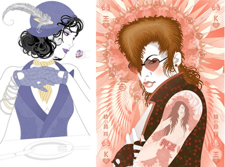
Birgit Amadori is an illustrator and designer living in California. She was born near Frankfurt, Gremany and her influences seem to reach from Europe and the Art Nouveau artists to the woodblock artist of Japan, leaving her geographic location as a nice metaphor.Amadori weaves design and figurative elements together, often incorporating richly detailed pattern. My assumption is that she works digitally in vector illustration. She simplifies forms, particularly faces, and then often fills areas like clothing that are both representational objects and design elements, with patterns, sometimes intricately detailed. The images are unified with very controlled palettes, bordering on monochromatic.
Amadori’s clients include Virgin Atlantic, Lufthansa Cargo, Virgin Atlantic, Volkswagen, Suzuki, Yahoo and Montblanc.
Her portfolio site has sections for professional and personal work, “Work hard” and “Play Hard”. Once your in either of them there is no link back to the other without backtracking.
I found the pieces the Play Hard: Posters section most interesting, as well as the ones in the Work Hard: Fashion and Deco/Food section.
You can also find a differently aranged portfolio of her work on the iSpot.
[Suggestion courtesy of Jack Harris]
Categories:


Charley’s Picks
Bookshop.org
(Bookshop.org affilliate links; sales benefit independent bookshop owners; I get a small percentage to help support my work on Lines and Colors)

John Singer Sargent: Watercolors


Urban Sketching: Understanding Perspective


Charley’s Picks
Amazon
(Amazon.com affiliate links; sales go to a larger yacht for Jeff Bezos; but I get a small percentage to help support my work on Lines and Colors)
John Singer Sargent: Watercolors
Urban Sketching: Understanding Perspective