
Categories
- 3d CGI
- Amusements
- Animation
- Anime & Manga
- Art Materials
- Art Videos
- Blogroll
- Cartoons
- Color
- Comics
- Concept & Visual Dev.
- Creativity
- Digital Art
- Digital Painting
- Displaying Art on the Web
- Drawing
- Eye Candy for Today
- Gallery and Museum Art
- High-res Art Images
- Illustration
- Motion Graphics & Flash
- Museums
- Online Museums
- Outsider Art
- Painting
- Painting a Day
- Paleo Art
- Pastel, Conté & Chalk
- Pen & Ink
- Prints and Printmaking
- Reviews
- Sc-fi and Fantasy
- Sculpture & Dimensional
- Site Comments
- Sketching
- Storyboards
- Tools and Techniques
- Uncategorized
- Vector Art
- Videos & Podcasts
- Vision and Optics
- Watercolor and Gouache
- Webcomics
Archives
- May 2026
- April 2026
- March 2026
- February 2026
- January 2026
- December 2025
- November 2025
- October 2025
- September 2025
- August 2025
- July 2025
- June 2025
- May 2025
- January 2025
- December 2024
- November 2024
- October 2024
- September 2024
- August 2024
- June 2024
- April 2024
- March 2024
- February 2024
- January 2024
- December 2023
- November 2023
- October 2023
- September 2023
- August 2023
- July 2023
- May 2023
- April 2023
- March 2023
- February 2023
- January 2023
- December 2022
- November 2022
- September 2022
- August 2022
- July 2022
- June 2022
- May 2022
- April 2022
- March 2022
- February 2022
- January 2022
- December 2021
- November 2021
- October 2021
- September 2021
- August 2021
- July 2021
- June 2021
- May 2021
- April 2021
- March 2021
- February 2021
- January 2021
- December 2020
- November 2020
- October 2020
- September 2020
- August 2020
- July 2020
- June 2020
- May 2020
- April 2020
- March 2020
- February 2020
- January 2020
- December 2019
- November 2019
- October 2019
- September 2019
- August 2019
- July 2019
- June 2019
- May 2019
- April 2019
- March 2019
- February 2019
- January 2019
- December 2018
- November 2018
- October 2018
- September 2018
- August 2018
- July 2018
- June 2018
- May 2018
- April 2018
- March 2018
- February 2018
- January 2018
- December 2017
- November 2017
- October 2017
- September 2017
- August 2017
- July 2017
- June 2017
- May 2017
- April 2017
- March 2017
- February 2017
- January 2017
- December 2016
- November 2016
- October 2016
- September 2016
- August 2016
- July 2016
- June 2016
- May 2016
- April 2016
- March 2016
- February 2016
- January 2016
- December 2015
- November 2015
- October 2015
- September 2015
- August 2015
- July 2015
- June 2015
- May 2015
- April 2015
- March 2015
- February 2015
- January 2015
- December 2014
- November 2014
- October 2014
- September 2014
- August 2014
- July 2014
- June 2014
- May 2014
- April 2014
- March 2014
- February 2014
- January 2014
- December 2013
- November 2013
- October 2013
- September 2013
- August 2013
- July 2013
- June 2013
- May 2013
- April 2013
- March 2013
- February 2013
- January 2013
- December 2012
- November 2012
- October 2012
- September 2012
- August 2012
- July 2012
- June 2012
- May 2012
- April 2012
- March 2012
- February 2012
- January 2012
- December 2011
- November 2011
- October 2011
- September 2011
- August 2011
- July 2011
- June 2011
- May 2011
- April 2011
- March 2011
- February 2011
- January 2011
- December 2010
- November 2010
- October 2010
- September 2010
- August 2010
- July 2010
- June 2010
- May 2010
- April 2010
- March 2010
- February 2010
- January 2010
- December 2009
- November 2009
- October 2009
- September 2009
- August 2009
- July 2009
- June 2009
- May 2009
- April 2009
- March 2009
- February 2009
- January 2009
- December 2008
- November 2008
- October 2008
- September 2008
- August 2008
- July 2008
- June 2008
- May 2008
- April 2008
- March 2008
- February 2008
- January 2008
- December 2007
- November 2007
- October 2007
- September 2007
- August 2007
- July 2007
- June 2007
- May 2007
- April 2007
- March 2007
- February 2007
- January 2007
- December 2006
- November 2006
- October 2006
- September 2006
- August 2006
- July 2006
- June 2006
- May 2006
- April 2006
- March 2006
- February 2006
- January 2006
- December 2005
- November 2005
- October 2005
- September 2005
- August 2005
Relevant Blogs
Art, Painting & Sketch
- Gurney Journey
- Underpaintings
- Art and Influence
- Painting Perceptions
- Oil Painters of America
- Vasari Paint POV
- Flying Fox
- Urban Sketchers
- Bento (Smithsonian)
- Art Inconnu
- The Hidden Place
- Still Life
- Making a Mark
- The Art of the Landscape
- Exploring Color & Creativity
- Art Contrarian
- Artist A Day
- beinArt Surreal Art Collective
- Eye Level
- David Dunlop
- p.i.g.m.e.n.t.i.u.m
- CultureGrrl
- Joaquín Sorolla blog
- Artists in Pastel
“Painting a Day”
- A Painting a Day (Keiser)
- On Painting (Keiser)
- Julian Merrow-Smith
- Karen Jurick
- Jeffrey Hayes
- Carol Marine
- Abbey Ryan
- Daily Paintworks
Other Painting Blogs
- Virtual Gouache Land
- Neil Hollingsworth
- Marc Hanson
- Kevin Menck
- Marc Dalessio
- Larry Seiler
- Stapleton Kearns
- Colin Page
- Roos Schuring
- Hans Versfelt
- Titus Meeuws
- Régis Pettinari
- René Plein Air
- Belinda Del Pesco
- Robin Weiss
- Nathan Fowkes (Land Sketch)
- William Wray
- Frank Serrano
- Stephen Magsig
- Michael Chesley Johnson
- Twice a Week
- Sarah Wimperis
- Rob Adams
- Michael Cole Manley
- The Dirty Palette Club
- Mike Manley’s Draw!
Gallery Art & Illustration mix
Illustration
- Howard Pyle
- 100 Years of Illustration
- BibliOdyssey
- Illustration Art
- Today’s Inspiration
- Illustration Mundo
- Little Chimp Society
- Danny Gregory
- R D (John Martz
- Illustration Friday blog
- Monster Brains
- Illustrators & Illustrations (RU)
- Elwood H. Smith
- DaniDraws.com
- Designers Who Blog
- iSpot Blog
Sci-Fi & Fantasy
Illustration & Comics
Comics & Cartoons
- Comics Beat
- Robot 6
- Newsarama Blog
- Comic Vine
- Comics Alliance
- Forbidden Planet Int.
- Paolo Rivera
- Bolt City
- Flight
- Scott McCloud
- The Comics Journal
- Comixpedia
- Funnybook Babylon
- James Baker
- Middleton’s Sketchbook
- Boneville
- The Hotel Fred
- Paul Rivoche
- Daily Cartoonist
- Mad About Cartoons (William Wray)
- Digital Strips
Illustration & Concept
Animation & Concept
- Cartoon Brew
- Animation Blog
- Cold Hard Flash
- Concept Art World
- The CAB
- FY Concept Art
- Concept Ships
- Concept Robots
- John Nevarez
- Armand Serrano
- Marcos Mateu-Mestre
- all kinds of stuff (Kricfalusi)
- Yacin the faun (Man Arenas)
- Kelsey Mann
- Cre8tivemarks Blog
- Ice-Cream Monster Toon Cafe
- AAU Character & Creature Design
- AAU Animation Notes
- Articles and Texticles
Paleo & Scientific
Tools & Techniques
Other
Lists of Art Blogs
Art Image Resource Links
Historic Art Images
- Wikimedia Commons: Paintings
- Wikimedia Commons: Drawings
- The Athenaeum
- WikiArt (WikiPaintings)
- Google Art Project: Artists
- Google Art Project: Collections (Museums)
- ArtCyclopedia
- Web Gallery of Art
- Art Renewal Center
- Web Gallery of Impressionism
Auction Consolidation sites
Auction sites
- Sotheby’s
- Bonham’s
- Christies
- Heritage Auctions: Fine Art
- Heritage Auctions: Illustration
- Freeman’s Auctions
- Bukowskis
- Shannon’s
Image Search
Reverse Image Search (search by image)
- Tin Eye
- RevImg
- Google Image Search (camera icon)
- Bing Image Search (camera icon)
Promoting some friends and some clients of my website design business
- Twin Willows T’ai Chi studio in Wilmington DE. Taiji classes with Bryan Davis.
- Ray Hayward, Inspired Teacher of T’ai Chi ( Taiji ) in Minneapolis, Founder of Mindful Motion Tai Chi Academy
- OldHead Tattoo studio and Art Gallery in Wilmington DE. Tattoos and paintings by Bruce Gulick
- Sharon Domenico Art, pet portrait oil paintings
- Platinum Paperhanging, wallpaper hanging, Main Line and Philadelphia, PA
- Lisa Stone Design, interior designer, Main Line and Philadelphia, PA
- Studio12KPT, original art, prints, calendars and other custom printed items by Van Sickle & Rolleri
-
Jamie Caliri
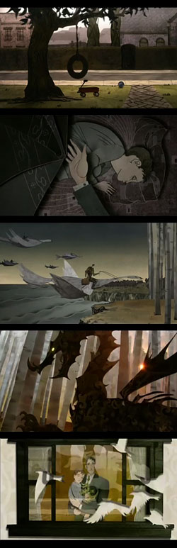 Jamie Caliri isn’t an illustrator, animator or graphic artist, he’s the director of two of my favorite recent short animations.
If you haven’t seen Dragon, the wonderful, essentially wordless, animated ad for United Airlines in which a father tucks his son in bed and flies off on the back of a bird to meet with knights at a round table, defeat a fire-breathing dragon and bring home the rewards, you’ve missed the most beautiful 64 seconds of animated television in recent memory.
You can see the ad here on the United Airlines site, along with a fascinating “making of” video that shows how Caliri and his talented crew of artists, animators and artisans created animated magic out of stage sets and puppets that were essentially paper cut-outs.
There is a larger format version of the ad (worth it) here on Caliri’s site, as well as a comprehensive list of the creative team and some large production stills.
Caliri is also responsible for the end titles for Lemony Snicket’s A Series of Unfortunate Events, which was certainly the best part of that movie and one of the best short pieces of animation in several years.
I didn’t care that much for the movie (although the production design is nice), but I’ll pick up that DVD just for Caliri & company’s beautiful end titles.
Link via Drawn!
Categories:
-
Henry Fuseli

A Swiss-born artist who lived and worked in Berlin, Rome and London, Fuseli is generally thought of as English. While in Rome he became fascinated with the work of Michelangelo and changed his name from Johann Heinrich Füssli to the Italian sounding “Fuseli”.Like the Pre-Raphaelites (see my post on William Holman-Hunt), who he pre-dated by some years, Fuseli often painted literary subjects; depicting scenes from Shakespeare and John Milton.
He also often painted mythological or fantastic subjects and the edges of his paintings are frequently populated with tiny details of elves and fairies. He created works infused with horror, wild imaginings and eroticism.
He seemed to want drama above all things in his canvases and often contorted and exaggerated his figures to achieve a dramatic effect. Men were overly muscled and women melodramatically sexual. You might think of him as a precursor to modern fantasy illustrators in that regard.
The picture shown here, The Nightmare, made his reputation and is by far his most famous and recognizable work.
Fuseli’s working methods were reputedly unorthodox and he was said to have often used his paints as a dry powder, spread and worked with a pencil dipped in oil or turpentine.
He was at one point romantically involved with Mary Wollstonecroft, whose daughter, Mary Shelly, wrote Frankenstein.
There is an exhibition at the Tate Gallery in London: Gothic Nightmares: Fuseli, Blake and the Romantic Imagination that runs until May 1, 2006.
Categories:
-
Ree (Cherie) Treweek
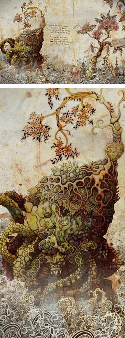 Ree (pen name for Cherie) Treweek is a South African artist and illustrator. Her fascinatingly detailed illustrations and drawings usually start as an ink drawing that she brings into Photoshop to be fully developed, occasionally in collaboration with Jannes Hendrikz.
The images look anything but digital and modern, however. They seem to be from another era; or even from another, perhaps mythical, culture.
Treweek’s images often use large areas of intricate patterns and decorative linework, to my eye showing influences of Indian and Chinese art as well as Art Nouveau and illustrators like Arthur Rackham, Kay Neilsen and perhaps Aubrey Beardsly.
Treweek and Hendrikz are part of “The Blackheart Gang”, who created an animated music video for Marcus Wormstorm. (I haven’t been able to find a post of the video.)
The image shown here is from a story called The Tale of How that is part of a larger work called The Household. The group is apparently working on an animation based on the thirteen prints in this series with animator Brian Goodwin. There is a tantalizing bit of teaser animation on Goodwin’s site.
I’ve found one book available illustrated under the name Cherie Treweek: Tales Of The Tokoloshe, a book of fantasy stories based on South African folktales, by Pieter Scholtz.
Treweek’s work is also included in the Expose 3 digital art collection, in which she is an award winner for the “Abstract & Design 2D” category.
The link below is to her section and gallery on the South African Cartoonists & Illustrators site. Here are a couple of additional links to posts on the CGSociety: Otto The Monster, Terrors and Typhoons
and Thief in the Night.
Categories:
-
Chris Beatrice

Chris Beatrice worked his way from an illustrator for computer games to art director, creative director and then general manager for a computer gaming company. He moved on from there to found his own game company, Tilted Mill Entertainment, whose latest release is Immortal Cities: Children of the Nile.Beatrices’ formal art training was in sculpture. He was drawn from that into 3D graphics as he established a career in computer game character design. Over time he has become more interested in 2D computer graphics and now does mostly digital painting in Painter and Photoshop.
His site contains galleries of his work, divided into Paintings, Sculpture, Drawings and Wallpapers. (Wallpapers are also linked from “Downloads”.) Many of the painted images are accompanied by several hi-res details of different sections of the image. His digital paintings can be richly detailed an still retain an open and painterly feel.
There is also a section devoted to Tutorials, in which Beatrice walks you through the process of creating his digital paintings step by step. Two of the tutorials are on the Chris Beatrice site and two are how-to articles on the CGSociety site.
There is also a new and extensive tutorial on the CGSociety site (that is not currently linked from his own site) for the image shown above, his interpretation of Alice receiving “Advice from a Caterpillar”.
It starts out with thumbnails and preliminary sketches for the character designs, moves into the pencil drawing, then goes through the steps of establishing tonal values in an undepainting, laying in the local colors, refining and modeling the forms and developing the final details of the finished image.
The tutorials page also includes a link for downloading the custom Painter brushes used in several of the tutorials.
Beatrice’s work appears in the digital painting collections Expose 3 and Painter from Ballistic Publishing.
Categories:
-
Jamie Hewlett
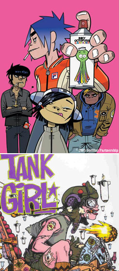 English comics artist Jamie Hewlett made a name for himself as the co-creator of the early 90’s irreverent, over-the-top, punk-camp comic series Tank Girl, (which was made into an unbearably campy movie in 1995).
In 1998, Hewlett teamed up with former flat-mate Damon Albarn of the british band Blur to create Gorillaz, a virtual “zombie hip-hop” band in which the band members exist only as cartoon characters drawn by Hewlett. Gorillaz has gone on to be by far the most successful virtual band ever, selling millions of records.
In the years since Tank Girl, Hewlett’s loose, slapdash drawing style has matured a bit, but still retains much of the energy and looseness of his earlier approach. The result is a pleasingly energetic but more refined drawing and coloring style that makes the Gorillaz art a lot of fun.
There’s no official Jamie Hewlett site that I know of, so here’s an assortment of links:
Unofficial Tank Girl site.
Gorillaz official fan site, that has a “Press Photos” gallery of cartoon images of the band.
Post of Hewlett’s “Common People” strip.
Overview of the Gorillaz phenomenon from the Guardian and Wikipedia.
Wikipedia entry on Jamie Hewlett.
The Tank Girl 1 and Tank Girl 2 graphic novels are still available.
The link I’ll point you to below is the official Gorillaz site, which takes a little effort to get around, but can be fun in itself as an entertaining Flash interface and series of games. (Hint: there’s a “Map Monkey” and “Quick Links” in the navigation at bottom.)
Categories:
-
Dorothy Lathrop
 At the same time it’s showcasing one of the most famous artists in America (see my previous post on Andrew Wyeth, below), the Brandywine River Museum in Pennsylvania is focusing attention on an artist who has gone largely ignored for the last 40 years.
Children’s book illustrator Dorothy Lathrop was well recognized during the prime years of her career, which extended from the end of the “Golden Age” of American illustration, in the beginning of the 1900’s, well into the middle of the century.
Lathrop was the first winner of the Caldecott Medal, given each year since 1938 for the artist of the “most distinguished American picture book for children”. She also won the Newberry Medal and a Library of Congress prize.
Her style varied significantly over the years, showing influences from divers sources like Art Nouveau and illustrators Jessie Wilcox Smith, Maxfield Parrish, Edmund Dulac, Arthur Rackham and Kay Nielsen.
Her choice of materials varied widely as well, from soft pencil drawings of children and animals, to brilliant watercolors of fairy princesses, oil for larger works and pen and ink for much of her black and white work. Many of her pen and ink illustrations used large areas of black with objects or lines in white, often looking like scratchboard, although it wasn’t as far as I can tell.
In the mid-30’s printing processes changed in a way that allowed her to switch her primary medium from pen and ink to lithographic pencil, which became a signature of her mature style. When used on a textured surface like coquille board, litho pencil (or litho crayon) can produce a pattern of small black marks almost like pen and ink stipple (see my post on Virgil Finlay). Most importantly, the pattern of black and white marks can be reproduced in print without the use of halftone screens. The lithographic pencil also allowed her to achieve delicate effects and a broad range of tone, as well as eye-pleasing textures.
Here is the press release about the exhibit from the museum (not illustrated), and some illustrated articles on Lathrop: A nice illustrated Lathrop bio from Bud Plant Illustrated Books and an illustrated Lathrop bio from Ortakales.com’s excellent gallery of Women Children’s Book Illustrators
Categories:


Charley’s Picks
Bookshop.org
(Bookshop.org affilliate links; sales benefit independent bookshop owners; I get a small percentage to help support my work on Lines and Colors)

John Singer Sargent: Watercolors


Urban Sketching: Understanding Perspective


Charley’s Picks
Amazon
(Amazon.com affiliate links; sales go to a larger yacht for Jeff Bezos; but I get a small percentage to help support my work on Lines and Colors)
John Singer Sargent: Watercolors
Urban Sketching: Understanding Perspective