
Categories
- 3d CGI
- Amusements
- Animation
- Anime & Manga
- Art Materials
- Art Videos
- Blogroll
- Cartoons
- Color
- Comics
- Concept & Visual Dev.
- Creativity
- Digital Art
- Digital Painting
- Displaying Art on the Web
- Drawing
- Eye Candy for Today
- Gallery and Museum Art
- High-res Art Images
- Illustration
- Motion Graphics & Flash
- Museums
- Online Museums
- Outsider Art
- Painting
- Painting a Day
- Paleo Art
- Pastel, Conté & Chalk
- Pen & Ink
- Prints and Printmaking
- Reviews
- Sc-fi and Fantasy
- Sculpture & Dimensional
- Site Comments
- Sketching
- Storyboards
- Tools and Techniques
- Uncategorized
- Vector Art
- Videos & Podcasts
- Vision and Optics
- Watercolor and Gouache
- Webcomics
Archives
- May 2026
- April 2026
- March 2026
- February 2026
- January 2026
- December 2025
- November 2025
- October 2025
- September 2025
- August 2025
- July 2025
- June 2025
- May 2025
- January 2025
- December 2024
- November 2024
- October 2024
- September 2024
- August 2024
- June 2024
- April 2024
- March 2024
- February 2024
- January 2024
- December 2023
- November 2023
- October 2023
- September 2023
- August 2023
- July 2023
- May 2023
- April 2023
- March 2023
- February 2023
- January 2023
- December 2022
- November 2022
- September 2022
- August 2022
- July 2022
- June 2022
- May 2022
- April 2022
- March 2022
- February 2022
- January 2022
- December 2021
- November 2021
- October 2021
- September 2021
- August 2021
- July 2021
- June 2021
- May 2021
- April 2021
- March 2021
- February 2021
- January 2021
- December 2020
- November 2020
- October 2020
- September 2020
- August 2020
- July 2020
- June 2020
- May 2020
- April 2020
- March 2020
- February 2020
- January 2020
- December 2019
- November 2019
- October 2019
- September 2019
- August 2019
- July 2019
- June 2019
- May 2019
- April 2019
- March 2019
- February 2019
- January 2019
- December 2018
- November 2018
- October 2018
- September 2018
- August 2018
- July 2018
- June 2018
- May 2018
- April 2018
- March 2018
- February 2018
- January 2018
- December 2017
- November 2017
- October 2017
- September 2017
- August 2017
- July 2017
- June 2017
- May 2017
- April 2017
- March 2017
- February 2017
- January 2017
- December 2016
- November 2016
- October 2016
- September 2016
- August 2016
- July 2016
- June 2016
- May 2016
- April 2016
- March 2016
- February 2016
- January 2016
- December 2015
- November 2015
- October 2015
- September 2015
- August 2015
- July 2015
- June 2015
- May 2015
- April 2015
- March 2015
- February 2015
- January 2015
- December 2014
- November 2014
- October 2014
- September 2014
- August 2014
- July 2014
- June 2014
- May 2014
- April 2014
- March 2014
- February 2014
- January 2014
- December 2013
- November 2013
- October 2013
- September 2013
- August 2013
- July 2013
- June 2013
- May 2013
- April 2013
- March 2013
- February 2013
- January 2013
- December 2012
- November 2012
- October 2012
- September 2012
- August 2012
- July 2012
- June 2012
- May 2012
- April 2012
- March 2012
- February 2012
- January 2012
- December 2011
- November 2011
- October 2011
- September 2011
- August 2011
- July 2011
- June 2011
- May 2011
- April 2011
- March 2011
- February 2011
- January 2011
- December 2010
- November 2010
- October 2010
- September 2010
- August 2010
- July 2010
- June 2010
- May 2010
- April 2010
- March 2010
- February 2010
- January 2010
- December 2009
- November 2009
- October 2009
- September 2009
- August 2009
- July 2009
- June 2009
- May 2009
- April 2009
- March 2009
- February 2009
- January 2009
- December 2008
- November 2008
- October 2008
- September 2008
- August 2008
- July 2008
- June 2008
- May 2008
- April 2008
- March 2008
- February 2008
- January 2008
- December 2007
- November 2007
- October 2007
- September 2007
- August 2007
- July 2007
- June 2007
- May 2007
- April 2007
- March 2007
- February 2007
- January 2007
- December 2006
- November 2006
- October 2006
- September 2006
- August 2006
- July 2006
- June 2006
- May 2006
- April 2006
- March 2006
- February 2006
- January 2006
- December 2005
- November 2005
- October 2005
- September 2005
- August 2005
Relevant Blogs
Art, Painting & Sketch
- Gurney Journey
- Underpaintings
- Art and Influence
- Painting Perceptions
- Oil Painters of America
- Vasari Paint POV
- Flying Fox
- Urban Sketchers
- Bento (Smithsonian)
- Art Inconnu
- The Hidden Place
- Still Life
- Making a Mark
- The Art of the Landscape
- Exploring Color & Creativity
- Art Contrarian
- Artist A Day
- beinArt Surreal Art Collective
- Eye Level
- David Dunlop
- p.i.g.m.e.n.t.i.u.m
- CultureGrrl
- Joaquín Sorolla blog
- Artists in Pastel
“Painting a Day”
- A Painting a Day (Keiser)
- On Painting (Keiser)
- Julian Merrow-Smith
- Karen Jurick
- Jeffrey Hayes
- Carol Marine
- Abbey Ryan
- Daily Paintworks
Other Painting Blogs
- Virtual Gouache Land
- Neil Hollingsworth
- Marc Hanson
- Kevin Menck
- Marc Dalessio
- Larry Seiler
- Stapleton Kearns
- Colin Page
- Roos Schuring
- Hans Versfelt
- Titus Meeuws
- Régis Pettinari
- René Plein Air
- Belinda Del Pesco
- Robin Weiss
- Nathan Fowkes (Land Sketch)
- William Wray
- Frank Serrano
- Stephen Magsig
- Michael Chesley Johnson
- Twice a Week
- Sarah Wimperis
- Rob Adams
- Michael Cole Manley
- The Dirty Palette Club
- Mike Manley’s Draw!
Gallery Art & Illustration mix
Illustration
- Howard Pyle
- 100 Years of Illustration
- BibliOdyssey
- Illustration Art
- Today’s Inspiration
- Illustration Mundo
- Little Chimp Society
- Danny Gregory
- R D (John Martz
- Illustration Friday blog
- Monster Brains
- Illustrators & Illustrations (RU)
- Elwood H. Smith
- DaniDraws.com
- Designers Who Blog
- iSpot Blog
Sci-Fi & Fantasy
Illustration & Comics
Comics & Cartoons
- Comics Beat
- Robot 6
- Newsarama Blog
- Comic Vine
- Comics Alliance
- Forbidden Planet Int.
- Paolo Rivera
- Bolt City
- Flight
- Scott McCloud
- The Comics Journal
- Comixpedia
- Funnybook Babylon
- James Baker
- Middleton’s Sketchbook
- Boneville
- The Hotel Fred
- Paul Rivoche
- Daily Cartoonist
- Mad About Cartoons (William Wray)
- Digital Strips
Illustration & Concept
Animation & Concept
- Cartoon Brew
- Animation Blog
- Cold Hard Flash
- Concept Art World
- The CAB
- FY Concept Art
- Concept Ships
- Concept Robots
- John Nevarez
- Armand Serrano
- Marcos Mateu-Mestre
- all kinds of stuff (Kricfalusi)
- Yacin the faun (Man Arenas)
- Kelsey Mann
- Cre8tivemarks Blog
- Ice-Cream Monster Toon Cafe
- AAU Character & Creature Design
- AAU Animation Notes
- Articles and Texticles
Paleo & Scientific
Tools & Techniques
Other
Lists of Art Blogs
Art Image Resource Links
Historic Art Images
- Wikimedia Commons: Paintings
- Wikimedia Commons: Drawings
- The Athenaeum
- WikiArt (WikiPaintings)
- Google Art Project: Artists
- Google Art Project: Collections (Museums)
- ArtCyclopedia
- Web Gallery of Art
- Art Renewal Center
- Web Gallery of Impressionism
Auction Consolidation sites
Auction sites
- Sotheby’s
- Bonham’s
- Christies
- Heritage Auctions: Fine Art
- Heritage Auctions: Illustration
- Freeman’s Auctions
- Bukowskis
- Shannon’s
Image Search
Reverse Image Search (search by image)
- Tin Eye
- RevImg
- Google Image Search (camera icon)
- Bing Image Search (camera icon)
Promoting some friends and some clients of my website design business
- Twin Willows T’ai Chi studio in Wilmington DE. Taiji classes with Bryan Davis.
- Ray Hayward, Inspired Teacher of T’ai Chi ( Taiji ) in Minneapolis, Founder of Mindful Motion Tai Chi Academy
- OldHead Tattoo studio and Art Gallery in Wilmington DE. Tattoos and paintings by Bruce Gulick
- Sharon Domenico Art, pet portrait oil paintings
- Platinum Paperhanging, wallpaper hanging, Main Line and Philadelphia, PA
- Lisa Stone Design, interior designer, Main Line and Philadelphia, PA
- Studio12KPT, original art, prints, calendars and other custom printed items by Van Sickle & Rolleri
-
Olga Dugina & Andrej Dugin
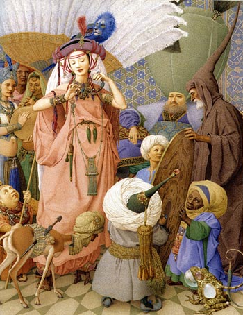
Olga Dugina and Andrej Dugin paint lavishly detailed, richly textured and enthrallingly odd illustrations for children’s books.Their intricately detailed paintings can, in turn, carry the feeling of Medieval tempera paintings, the grotesque fantasies of Bosch and Breugel, the carefully arranged tableaus of renaissance tapestries and, in the their collaboration with Madonna (yes, that Madonna) for the fourth in her series of children’s books, a kind of decorative Persian surrealism.
They say in an interview about their work on that book, The Adventures of Abdi, that they work collaboratively out of necessity, can take anywhere from one and a half to four months to complete an image and tackle a project like Abdi by going straight through, first picture to the last, finishing the cover at the end.
I haven’t been able to find much information on them or their working methods, but I suspect they are working in opaque watercolor or tempera.
They are also the authors and illustrators of a retelling of the classic The Brave Little Tailor and The Dragon’s Feathers.
I can’t find an official site for Dugina and Dugin. There is a small selection of their work on illustrators-online.com and an unofficial archive of the illustrations for The Adventures of Abdi, with nice large images of the paintings.
Link via Monster Brains.
Addendum: Reader Tat has found two additional links to excelent resources for their work, here and here. Tat also added a resource to my current post on Russian illustrator Gennady Spirin, who I suggest may have been a influence on Dugina and Dugin. – Charley, 17 November, 2009
Categories:
-
Georges de la Tour
 Somewhere between the emotional drama of Caravaggio and the crystalline stillness of Vermeer lie the intimate, candlelit paintings of Georges de la Tour, a French master whose work was all but forgotten between his death in 1652 and its rediscovery in the early 20th Century.
I doubt that la Tour was directly influenced by Vermeer (or vice versa), but there is an assumption that Caravaggio’s revelation of form through the use of intense chiaroscuro was a distinct influence on the French painter, particularly in the sharply defined forms in the candlelight scenes of his later career. la Tour painted religious and genre subjects, scenes of everyday life, in his case largely images of the poor arranged as morality tales for amusement of his well-to-do patrons. He refused to indulge in the condescending caricature of his subjects, as was common at the time, and represents them as directly as a portrait.
The striking characteristic of his later work is the light source, often a single candle or lamp, sometimes with the flame in view but more often with the light source itself hidden by a hand or object in the painting, and the subjects and foreground objects revealed in sharp relief by the simple direct focus of the light.
Focus seems to be the intent of la Tour’s compositions, most of them have nothing of a background other than the suggestion of shadowed walls and areas of darkness. Just as Vermeer revealed his subjects by capturing a golden moment in the sunlight from a single window, so la Tour grasps a moment of time between the flickers of a candle’s flame, producing a similar feeling of contemplative stillness and of something waiting to be revealed by quiet inspection of the scene.
Categories:
-
BibliOdyssey
 Well, it happened again.
I was trying once again to bring you this post and I got lost.
You see, I fell down a rabbit hole, found myself among the very large and the very small, and as everything became curiouser and curiouser, lost myself wandering in wide eyed fascination through a seemingly endless wonderland of the bizarre and beautiful.
Actually, the rabbit hole, into which I have fallen before on occasion, is BibliOdyssey, a fascinating cornucopia of oddities, obscurities, and delightful discoveries from books (you remember books, that other way of organizing and transmitting information…) and the web.
BibliOdyssey is a tour-de-force collection of, among other things, bookplates, illustrations, etchings, engravings, color wheels, cloud diagrams, astronomical charts, monsters, angels, flowers, castles, catastrophies, calliopes, cantelopes, velocipedes, gyrocopters, Renaissance fortifications, pop-up books, Persian calligraphy, Art Nouveau posters, Babylonian towers, Japanese woodblock prints, designs for bizarre inventions, medical diagrams, maps, constructions, instructions, deconstructions, all manner of drawings of the strange and wonderful, curiosities and curios, shoes, ships, sealing wax, cabbages and kings.
peacay (as the author names himself) has an uncanny talent for digging up things, either from books or the Net, that shine out like unexpected and amazing treasures found hidden at the bottom of a forgotten shelf in a labyrinthian antique store (the back door of which possibly opens into another century).
With a little digging, you will find artists old and new, and often undeservedly obscure, leading to that wonderful, “Wow, I didn’t know about this one!” reaction that I try, when I can, to provide here on lines and colors.
There is unfortunately (or fortunately, depending on how much time you can afford to spend being fascinated and distracted) no direct way to browse through previous posts by date. There is a link cloud at the bottom of the pages that leads to del.icio.us categories, and peacay has provided a tantalizing row of image links to various and sundry posts on the sidebar.
As if that weren’t enough, the BibliOdyssey sidebar also provides a fascinating array of links to other internet rabbit holes where you can disappear for hours on end.
You’ve been warned.
Addendum: peacay has reminded me that there is, in fact, a collapsible menu of the weekly archive on the sidebar, in the middle of the visual links.
Categories:
-
Mark Reep

Color, particularly in this era of hyper-kinetic, cathode ray, plasma and LCD display multi-media dazzle, can sometimes make us jaded about our appreciation for the subtle charm of monochromatic works. Like city dwellers taking the time to get away to the country, we might find it worth the trouble to slow down and look for quieter pleasures.Mark Reep creates black and white tone drawings of imaginary landscapes. He has repeated themes of stratified cliffs, punctuated with rocky outcroppings or freestanding pillars of rock jutting up through valleys of mist and cloud, often with a lone tree managing to cling to life in the otherwise barren stone formations. The scenes sometimes depict waterfalls and often include stone bridges, arches, stairs or other signs of human structures.
His works are a combination of ink, graphite and charcoal. Reep works on sheets of acid-free smooth Bristol board, eschewing textured drawing surfaces for the freedom to create his own textures. Ink tones are created with the painstaking process of stipple (see my post on Virgil Finlay). The graphite and charcoal are sometimes applied in their powdered form, allowing the artist to work with them almost like a wash in paint.
There is a page on his site reprinting a gallery talk in which Reep describes his process, techniques and tools (including those terrific Pigma Micron pens that many pen and ink artists, myself included, swear by). There is also a tutorial by Reep on the WetCanvas site, and notes on altering inked passages and drawing from the imagination on his site.
Reep also has a blog, Dreams in Black and White, in which he posts recent drawings and discusses process.
Some of the images on his main site are frustratingly small. (Even though the originals are sometimes small, details are lost in the low-resolution environment of a computer monitor.) The ones on the blog often have larger versions.
Categories:
-
Gary Locke
There is a style in illustration, particularly advertising illustration, in which exaggerated, cartoon-like drawings are rendered in detailed style usually applied to more realistic images. It’s a nice idea that is harder than it looks and consequently rarely done well.Gary Locke is one of the few illustrators who gets it right. His wonderfully exaggerated figures, usually in comically theatrical poses, have just the right degree of distortion, rendering and draftsmanship to gel into a whole that works. He even gets me to enjoy the big head/small body caricature style, a form I usually dislike.
If you read mainstream comic books, you’ve probably seen his Coke ads, often portraying sports figures grinning their way through impossible situations, distorted Coke bottles in hand.
His site features several ways to view his images by category, including advertising, editorial, animals, character development, caricature and sports. Some of these overlap; character development, for example, features many of his wonderful cartoony animal characters.
There is also a sketchbook section, with more quickly rendered drawings that let you see the draftsmanship that underpins his more rendered images. The more finished images are created in watercolor and “mixed media” (I suspect gouache among other things).
His advertising clients include 7-UP, Pepsi, Warner Bros., Coca-Cola, RadioShack and Fisher-Price and he has done editorial illustration for publications like Time, Sports Illustrated, Sporting News and U.S. News and World Report.
Note: After being off-line for several days from, ironically, the morning of the post, Locke’s site is up and running again.
Categories:
-
Mark Zug
 Early in his career illustrator Mark Zug got what he considered a dream job, illustrating Harlan Ellison’s I, Robot: The Illustrated Screenplay (out of print but can still be found). Since then he has illustrated numerous science fiction and fantasy novels, done editorial illustration for magazines like Popular Science, Amazing Stories, TSR’s Dragon and Dungeon and other gaming magazines.
Beyond that he has focused on paintings for fantasy game products, creating memorable illustrations for Magic: The Gathering in particular. He received the Jack Gaughan Award for Best Emerging Artist in 2001, and a Chesley Award for Best Gaming Related Illustration in 2005.
His paintings have a muscular feeling to them, both in the physical characteristics of the heroes, demons monsters and mages he portrays, and in the handling of the paint. His combination of tactile textures and color contrasts give his images a bold physical presence that makes them pop and seems particularly suited to the subject matter.
You’ll find both newer and older work in his online galleries, including his interpretation of Frank Herbert’s classic Dune. My favorites are in the Magic and Zbooks sections (image at left Claidi’s Journal).
Categories:


Charley’s Picks
Bookshop.org
(Bookshop.org affilliate links; sales benefit independent bookshop owners; I get a small percentage to help support my work on Lines and Colors)

John Singer Sargent: Watercolors


Urban Sketching: Understanding Perspective


Charley’s Picks
Amazon
(Amazon.com affiliate links; sales go to a larger yacht for Jeff Bezos; but I get a small percentage to help support my work on Lines and Colors)
John Singer Sargent: Watercolors
Urban Sketching: Understanding Perspective