
Categories
- 3d CGI
- Amusements
- Animation
- Anime & Manga
- Art Materials
- Art Videos
- Blogroll
- Cartoons
- Color
- Comics
- Concept & Visual Dev.
- Creativity
- Digital Art
- Digital Painting
- Displaying Art on the Web
- Drawing
- Eye Candy for Today
- Gallery and Museum Art
- High-res Art Images
- Illustration
- Motion Graphics & Flash
- Museums
- Online Museums
- Outsider Art
- Painting
- Painting a Day
- Paleo Art
- Pastel, Conté & Chalk
- Pen & Ink
- Prints and Printmaking
- Reviews
- Sc-fi and Fantasy
- Sculpture & Dimensional
- Site Comments
- Sketching
- Storyboards
- Tools and Techniques
- Uncategorized
- Vector Art
- Videos & Podcasts
- Vision and Optics
- Watercolor and Gouache
- Webcomics
Archives
- May 2026
- April 2026
- March 2026
- February 2026
- January 2026
- December 2025
- November 2025
- October 2025
- September 2025
- August 2025
- July 2025
- June 2025
- May 2025
- January 2025
- December 2024
- November 2024
- October 2024
- September 2024
- August 2024
- June 2024
- April 2024
- March 2024
- February 2024
- January 2024
- December 2023
- November 2023
- October 2023
- September 2023
- August 2023
- July 2023
- May 2023
- April 2023
- March 2023
- February 2023
- January 2023
- December 2022
- November 2022
- September 2022
- August 2022
- July 2022
- June 2022
- May 2022
- April 2022
- March 2022
- February 2022
- January 2022
- December 2021
- November 2021
- October 2021
- September 2021
- August 2021
- July 2021
- June 2021
- May 2021
- April 2021
- March 2021
- February 2021
- January 2021
- December 2020
- November 2020
- October 2020
- September 2020
- August 2020
- July 2020
- June 2020
- May 2020
- April 2020
- March 2020
- February 2020
- January 2020
- December 2019
- November 2019
- October 2019
- September 2019
- August 2019
- July 2019
- June 2019
- May 2019
- April 2019
- March 2019
- February 2019
- January 2019
- December 2018
- November 2018
- October 2018
- September 2018
- August 2018
- July 2018
- June 2018
- May 2018
- April 2018
- March 2018
- February 2018
- January 2018
- December 2017
- November 2017
- October 2017
- September 2017
- August 2017
- July 2017
- June 2017
- May 2017
- April 2017
- March 2017
- February 2017
- January 2017
- December 2016
- November 2016
- October 2016
- September 2016
- August 2016
- July 2016
- June 2016
- May 2016
- April 2016
- March 2016
- February 2016
- January 2016
- December 2015
- November 2015
- October 2015
- September 2015
- August 2015
- July 2015
- June 2015
- May 2015
- April 2015
- March 2015
- February 2015
- January 2015
- December 2014
- November 2014
- October 2014
- September 2014
- August 2014
- July 2014
- June 2014
- May 2014
- April 2014
- March 2014
- February 2014
- January 2014
- December 2013
- November 2013
- October 2013
- September 2013
- August 2013
- July 2013
- June 2013
- May 2013
- April 2013
- March 2013
- February 2013
- January 2013
- December 2012
- November 2012
- October 2012
- September 2012
- August 2012
- July 2012
- June 2012
- May 2012
- April 2012
- March 2012
- February 2012
- January 2012
- December 2011
- November 2011
- October 2011
- September 2011
- August 2011
- July 2011
- June 2011
- May 2011
- April 2011
- March 2011
- February 2011
- January 2011
- December 2010
- November 2010
- October 2010
- September 2010
- August 2010
- July 2010
- June 2010
- May 2010
- April 2010
- March 2010
- February 2010
- January 2010
- December 2009
- November 2009
- October 2009
- September 2009
- August 2009
- July 2009
- June 2009
- May 2009
- April 2009
- March 2009
- February 2009
- January 2009
- December 2008
- November 2008
- October 2008
- September 2008
- August 2008
- July 2008
- June 2008
- May 2008
- April 2008
- March 2008
- February 2008
- January 2008
- December 2007
- November 2007
- October 2007
- September 2007
- August 2007
- July 2007
- June 2007
- May 2007
- April 2007
- March 2007
- February 2007
- January 2007
- December 2006
- November 2006
- October 2006
- September 2006
- August 2006
- July 2006
- June 2006
- May 2006
- April 2006
- March 2006
- February 2006
- January 2006
- December 2005
- November 2005
- October 2005
- September 2005
- August 2005
Relevant Blogs
Art, Painting & Sketch
- Gurney Journey
- Underpaintings
- Art and Influence
- Painting Perceptions
- Oil Painters of America
- Vasari Paint POV
- Flying Fox
- Urban Sketchers
- Bento (Smithsonian)
- Art Inconnu
- The Hidden Place
- Still Life
- Making a Mark
- The Art of the Landscape
- Exploring Color & Creativity
- Art Contrarian
- Artist A Day
- beinArt Surreal Art Collective
- Eye Level
- David Dunlop
- p.i.g.m.e.n.t.i.u.m
- CultureGrrl
- Joaquín Sorolla blog
- Artists in Pastel
“Painting a Day”
- A Painting a Day (Keiser)
- On Painting (Keiser)
- Julian Merrow-Smith
- Karen Jurick
- Jeffrey Hayes
- Carol Marine
- Abbey Ryan
- Daily Paintworks
Other Painting Blogs
- Virtual Gouache Land
- Neil Hollingsworth
- Marc Hanson
- Kevin Menck
- Marc Dalessio
- Larry Seiler
- Stapleton Kearns
- Colin Page
- Roos Schuring
- Hans Versfelt
- Titus Meeuws
- Régis Pettinari
- René Plein Air
- Belinda Del Pesco
- Robin Weiss
- Nathan Fowkes (Land Sketch)
- William Wray
- Frank Serrano
- Stephen Magsig
- Michael Chesley Johnson
- Twice a Week
- Sarah Wimperis
- Rob Adams
- Michael Cole Manley
- The Dirty Palette Club
- Mike Manley’s Draw!
Gallery Art & Illustration mix
Illustration
- Howard Pyle
- 100 Years of Illustration
- BibliOdyssey
- Illustration Art
- Today’s Inspiration
- Illustration Mundo
- Little Chimp Society
- Danny Gregory
- R D (John Martz
- Illustration Friday blog
- Monster Brains
- Illustrators & Illustrations (RU)
- Elwood H. Smith
- DaniDraws.com
- Designers Who Blog
- iSpot Blog
Sci-Fi & Fantasy
Illustration & Comics
Comics & Cartoons
- Comics Beat
- Robot 6
- Newsarama Blog
- Comic Vine
- Comics Alliance
- Forbidden Planet Int.
- Paolo Rivera
- Bolt City
- Flight
- Scott McCloud
- The Comics Journal
- Comixpedia
- Funnybook Babylon
- James Baker
- Middleton’s Sketchbook
- Boneville
- The Hotel Fred
- Paul Rivoche
- Daily Cartoonist
- Mad About Cartoons (William Wray)
- Digital Strips
Illustration & Concept
Animation & Concept
- Cartoon Brew
- Animation Blog
- Cold Hard Flash
- Concept Art World
- The CAB
- FY Concept Art
- Concept Ships
- Concept Robots
- John Nevarez
- Armand Serrano
- Marcos Mateu-Mestre
- all kinds of stuff (Kricfalusi)
- Yacin the faun (Man Arenas)
- Kelsey Mann
- Cre8tivemarks Blog
- Ice-Cream Monster Toon Cafe
- AAU Character & Creature Design
- AAU Animation Notes
- Articles and Texticles
Paleo & Scientific
Tools & Techniques
Other
Lists of Art Blogs
Art Image Resource Links
Historic Art Images
- Wikimedia Commons: Paintings
- Wikimedia Commons: Drawings
- The Athenaeum
- WikiArt (WikiPaintings)
- Google Art Project: Artists
- Google Art Project: Collections (Museums)
- ArtCyclopedia
- Web Gallery of Art
- Art Renewal Center
- Web Gallery of Impressionism
Auction Consolidation sites
Auction sites
- Sotheby’s
- Bonham’s
- Christies
- Heritage Auctions: Fine Art
- Heritage Auctions: Illustration
- Freeman’s Auctions
- Bukowskis
- Shannon’s
Image Search
Reverse Image Search (search by image)
- Tin Eye
- RevImg
- Google Image Search (camera icon)
- Bing Image Search (camera icon)
Promoting some friends and some clients of my website design business
- Twin Willows T’ai Chi studio in Wilmington DE. Taiji classes with Bryan Davis.
- Ray Hayward, Inspired Teacher of T’ai Chi ( Taiji ) in Minneapolis, Founder of Mindful Motion Tai Chi Academy
- OldHead Tattoo studio and Art Gallery in Wilmington DE. Tattoos and paintings by Bruce Gulick
- Sharon Domenico Art, pet portrait oil paintings
- Platinum Paperhanging, wallpaper hanging, Main Line and Philadelphia, PA
- Lisa Stone Design, interior designer, Main Line and Philadelphia, PA
- Studio12KPT, original art, prints, calendars and other custom printed items by Van Sickle & Rolleri
-
Secrets of Corel Painter Experts
![Secrets of Corel Painter Experts: Andreas Rocha [main cover image], Waheed Nasir, Wonman Kim, Brian Haberlin, Benjamin, Thorston Wolber [2 images], Chet Phillips, Mike Thompson, Dwane Vance, John Derry, Pete Revonkorpi](http://www.linesandcolors.com/images/2011-12/painter_experts_450.jpg)
Among artists who work in the medium of digital painting, most notably visual development artists, comic book artists and illustrators, the two most popular applications for painting and drawing directly on the computer with a ressure-sensitive stylus and tablet are Adobe Photoshop and Corel Painter.Photoshop, because of it’s much broader range of use in photo manipulation, compositing and prepress, is the subject of far more instructional material than Painter, which is much more focused on the direct creation of digital art. Those of us who love to work in Painter are always interested to see books on the subject, and are always hoping for a greater range of instructional topics and approaches.
Secrets of Corel Painter Experts by Daryl Wise and Linda Hellfritsch is a welcome addition to that list.
The book is subtitled “Tips, Techniques, and Insights for Users of All Abilities”, but I think it’s best suited for those who already have a grasp of Painter basics and are looking to take their skills to a more advanced level.
The book calls on a range of digital artists who are working in Painter and are recognized for their expertise in their field. Each chapter in the book is devoted to one of the 17 artists and focuses on an aspect of Painter techniques in which they are proficient.
Each artist is profiled, with background on their work and influences and a brief question and answer, as well as relevant links. The main feature is a step by step instruction on the technique or process that particular artist has been called on to demonstrate, along with a gallery of the artist’s work.
In addition, the artists also frequently contribute more general tips about their Painter working process.
Many of the artists included are familiar names in digital painting circles, drawn from the fields of comic art, illustration and concept art, as well as fine art and photography, and include John Derry, one of the original team that worked to develop Painter in its early stages at Fractal Design.
The accompanying DVD is a bit less that I might have hoped for, with mostly mid-resolution and a few high resolution images of the artists’ work, but not conveniently arranged for browsing. It is nice, however, that the DVD sections for each artist include clickable versions of their “Favorite websites” links from the book.
Corel Painter is a very powerful and flexible application, and can also be complex and somewhat daunting, with over 900 brushes by someone’s count and numerous other tools and settings. Secrets of Corel Painter Experts is not meant to be a comprehensive manual, but a focused series of instructions on specific techniques from working professionals.
(Images above, Andreas Rocha [main cover image], Waheed Nasir, Wonman Kim, Brian Haberlin, Benjamin, Thorston Wolber [2 images], Chet Phillips, Mike Thompson, Dwane Vance, John Derry, Pete Revonkorpi)
Categories:
-
Heart of the Andes, Frederic Edwin Church

I’ve suggested on several occasions that prior to the invention of movies as we know them, painters were the special effects wizards of their day, wowing the faithful (and cowing the doubtful) in church altarpieces and murals, and, in the 19th Century, displaying their detailed large scale works in theatrical settings, in some ways anticipating the appeal of images on a big movie screen.A prime example of the latter is a painting by American painter Frederic Edwin Church that is in the collection of the Metropolitan Museum of Art titled Heart of the Andes.
Church created these large compositions not of a specific place, but as an aggregation of scenes he encountered and studied in his travels, in this case his second trip to South America.
The large scale painting, 66 x 119 inches (160 x 302cm), or almost 6ft x 10ft, was originally displayed in a dark gallery where it was reportedly lit by theatrical gas jet and reflector lighting and displayed in an elaborate frame, decked with curtains to create the impression of a view from a window. The room was supposedly further arranged with palm fronds and visitors were provided with opera glasses to view the painting’s details.
Patrons waited in line, over 12,000 of them, and paid twenty-five cents (probably the equivalent of $6 or $7 today) to view the painting.
Heart of the Andes was sold for $10,000.00, at the time the highest price for any work by a living American artist, and eventually donated to the Metropolitan Museum of Art. The museum devoted a special exhibition to the painting in 1993 in which there was an attempt to replicate the setting of the original exhibit.
The Met’s pages for the painting includes one of its wonderful new high-resolution image files, that can be viewed or downloaded by clicking on the “Fullscreen” option under the small image. My detail crops above were taken from the high resolution image.
Categories:
-
TIJI Colour, Akama Studio

Colour (Vimeo link) is a beautifully realized short animation (2:30) in which a moving brush brings color to a black and white jungle landscape and its inhabitants — save one.The commercial short was done for TIJI, which I believe is a French children’s channel. It was created by Akama Studio, working with the production company Wanda Productions.
[Via DesignSwan by way of MetaFilter]
Categories:
-
The Linosaurus

The Linosaurus is a fascinating blog devoted to “…the lesser Gods and Goddesses of linoleum and woodblock printing”.In it, the author, a blogger in the Netherlands (who I identifed as “Gerrie Caspers”, inferred from the URL of the blog and his email address) selects printmakers both old and contemporary, known and unknown, and features their prints as well as paintings and drawings.
He does a fair bit of research on his finds, often in an initial quest to identify the creator of a work he has found (for which he occasionally asks for input from readers) as well as background information on those artists who are known, and references to related artists.
You can search a bit by clicking on labels assigned to various posts to find similar topics, or, as I did, simply browse back through the older posts to see what discoveries await.
(Images above: Edward Pellens, George Soper, Carl Kunst, Jean Jacques Midderigh, unknown, Karl Johne, unknown)
[Via BibliOdyssey]
Categories:
-
Did Van Gogh have protanomal color deficiency?

About 8 percent of male human beings, and a much smaller 0.5 percent of females, have some form of color vision deficiency, commonly called “color blindness”, in which the perception of colors is limited or altered in some way compared to the general population.It has been suggested at times that Vincent van Gogh’s unusual use of some colors, particularly yellows and greens, was related to a visual problem, perhaps brought on by lead poisoning from paint, or treatment for temporal lobe epilepsy with a drug known as digitalis, both of which can cause visual alterations.
Kazunori Asada, who has degrees in both medical science and media design and is the developer of the Chromatic Vision Simulator software that allows those with normal color vision to explore various kinds of color vision deficiencies, has written an article on his blog entitled The Day I Saw Van Gogh’s Genius in a New Light, that explores the possibility that Van Gogh may have had a particular type of mildly limited color vision called protanomal color vision.
Asada was inspired to explore this possibility by a visit to the “Color Vision Experience Room” at and event at the Hokkaido Color Universal Design Organization. In the exhibit, objects on display under filtered light designed to simulate color deficiencies included reproductions of some of Van Gogh’s paintings.
He then attempted to use his software to examine some similar reproductions and was unsatisfied with the result, but after some adjustment, he arrived at a new version in which a more limited degree of color deficiency was possible to simulate.
In images accompanying his article, which I have referenced above, he first shows some of Van Gogh’s paintings as they normally appear (above, top and left) side by side with a simulation of their appearance to someone with protanomal color vision.
He emphasizes that Van Gogh may or may not have had these limitations, but the theory is an interesting one, and Asada says that it reinvigorated his already deep appreciation for Van Gogh’s work.
[Via MetaFilter]
Categories:
-
John Bonner
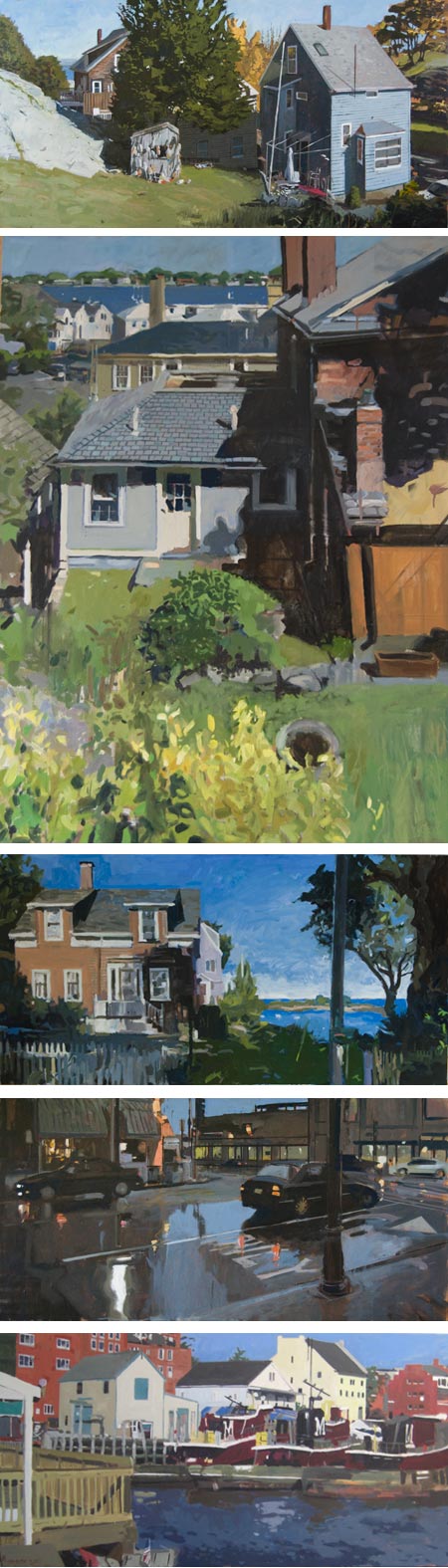
I came across the work of John Bonner through his Comic Crits — book reviews in the form of comic strips (see my previous post on Comic Crits).Unfortunately the images of his work in his online gallery are frustratingly small, given the relatively large scale of his work. You can find somewhat larger images on the blog portion of the site, which serves as the home page.
His site gives no information on medium or size of the works. At first I thought he might be working at small scale in gouache, given his use of areas of relatively flat color. It was only through the website of a gallery in which he is represented, McGowan Fine Art in Concord , NH, that I found he is working in oil, commonly at sizes of 24×48′ (60x121cm) or 31×60″ (79x152cm), though he does work in smaller sizes as well.
There is also little biographical information on Bonner’s own site, I found from an article in the Concord Monitor (pop-up ad warning) that he was born in England and has been living in New England, specifically Massachusetts, since the 1980’s. There is also an article in Yankee Magazine (pop-over ad).
In addition to images of work in various stages, there is a series of short videos on his site that show a bit of his working process.
Bonner’s paintings frequently are of townscapes or buildings in landscapes, in which the architectural forms, as well as the forms of their shadows and negative shape sky elements, are arranged in strongly geometric compositions.
Categories:


Charley’s Picks
Bookshop.org
(Bookshop.org affilliate links; sales benefit independent bookshop owners; I get a small percentage to help support my work on Lines and Colors)

John Singer Sargent: Watercolors


Urban Sketching: Understanding Perspective


Charley’s Picks
Amazon
(Amazon.com affiliate links; sales go to a larger yacht for Jeff Bezos; but I get a small percentage to help support my work on Lines and Colors)
John Singer Sargent: Watercolors
Urban Sketching: Understanding Perspective