
Categories
- 3d CGI
- Amusements
- Animation
- Anime & Manga
- Art Materials
- Art Videos
- Blogroll
- Cartoons
- Color
- Comics
- Concept & Visual Dev.
- Creativity
- Digital Art
- Digital Painting
- Displaying Art on the Web
- Drawing
- Eye Candy for Today
- Gallery and Museum Art
- High-res Art Images
- Illustration
- Motion Graphics & Flash
- Museums
- Online Museums
- Outsider Art
- Painting
- Painting a Day
- Paleo Art
- Pastel, Conté & Chalk
- Pen & Ink
- Prints and Printmaking
- Reviews
- Sc-fi and Fantasy
- Sculpture & Dimensional
- Site Comments
- Sketching
- Storyboards
- Tools and Techniques
- Uncategorized
- Vector Art
- Videos & Podcasts
- Vision and Optics
- Watercolor and Gouache
- Webcomics
Archives
- May 2026
- April 2026
- March 2026
- February 2026
- January 2026
- December 2025
- November 2025
- October 2025
- September 2025
- August 2025
- July 2025
- June 2025
- May 2025
- January 2025
- December 2024
- November 2024
- October 2024
- September 2024
- August 2024
- June 2024
- April 2024
- March 2024
- February 2024
- January 2024
- December 2023
- November 2023
- October 2023
- September 2023
- August 2023
- July 2023
- May 2023
- April 2023
- March 2023
- February 2023
- January 2023
- December 2022
- November 2022
- September 2022
- August 2022
- July 2022
- June 2022
- May 2022
- April 2022
- March 2022
- February 2022
- January 2022
- December 2021
- November 2021
- October 2021
- September 2021
- August 2021
- July 2021
- June 2021
- May 2021
- April 2021
- March 2021
- February 2021
- January 2021
- December 2020
- November 2020
- October 2020
- September 2020
- August 2020
- July 2020
- June 2020
- May 2020
- April 2020
- March 2020
- February 2020
- January 2020
- December 2019
- November 2019
- October 2019
- September 2019
- August 2019
- July 2019
- June 2019
- May 2019
- April 2019
- March 2019
- February 2019
- January 2019
- December 2018
- November 2018
- October 2018
- September 2018
- August 2018
- July 2018
- June 2018
- May 2018
- April 2018
- March 2018
- February 2018
- January 2018
- December 2017
- November 2017
- October 2017
- September 2017
- August 2017
- July 2017
- June 2017
- May 2017
- April 2017
- March 2017
- February 2017
- January 2017
- December 2016
- November 2016
- October 2016
- September 2016
- August 2016
- July 2016
- June 2016
- May 2016
- April 2016
- March 2016
- February 2016
- January 2016
- December 2015
- November 2015
- October 2015
- September 2015
- August 2015
- July 2015
- June 2015
- May 2015
- April 2015
- March 2015
- February 2015
- January 2015
- December 2014
- November 2014
- October 2014
- September 2014
- August 2014
- July 2014
- June 2014
- May 2014
- April 2014
- March 2014
- February 2014
- January 2014
- December 2013
- November 2013
- October 2013
- September 2013
- August 2013
- July 2013
- June 2013
- May 2013
- April 2013
- March 2013
- February 2013
- January 2013
- December 2012
- November 2012
- October 2012
- September 2012
- August 2012
- July 2012
- June 2012
- May 2012
- April 2012
- March 2012
- February 2012
- January 2012
- December 2011
- November 2011
- October 2011
- September 2011
- August 2011
- July 2011
- June 2011
- May 2011
- April 2011
- March 2011
- February 2011
- January 2011
- December 2010
- November 2010
- October 2010
- September 2010
- August 2010
- July 2010
- June 2010
- May 2010
- April 2010
- March 2010
- February 2010
- January 2010
- December 2009
- November 2009
- October 2009
- September 2009
- August 2009
- July 2009
- June 2009
- May 2009
- April 2009
- March 2009
- February 2009
- January 2009
- December 2008
- November 2008
- October 2008
- September 2008
- August 2008
- July 2008
- June 2008
- May 2008
- April 2008
- March 2008
- February 2008
- January 2008
- December 2007
- November 2007
- October 2007
- September 2007
- August 2007
- July 2007
- June 2007
- May 2007
- April 2007
- March 2007
- February 2007
- January 2007
- December 2006
- November 2006
- October 2006
- September 2006
- August 2006
- July 2006
- June 2006
- May 2006
- April 2006
- March 2006
- February 2006
- January 2006
- December 2005
- November 2005
- October 2005
- September 2005
- August 2005
Relevant Blogs
Art, Painting & Sketch
- Gurney Journey
- Underpaintings
- Art and Influence
- Painting Perceptions
- Oil Painters of America
- Vasari Paint POV
- Flying Fox
- Urban Sketchers
- Bento (Smithsonian)
- Art Inconnu
- The Hidden Place
- Still Life
- Making a Mark
- The Art of the Landscape
- Exploring Color & Creativity
- Art Contrarian
- Artist A Day
- beinArt Surreal Art Collective
- Eye Level
- David Dunlop
- p.i.g.m.e.n.t.i.u.m
- CultureGrrl
- Joaquín Sorolla blog
- Artists in Pastel
“Painting a Day”
- A Painting a Day (Keiser)
- On Painting (Keiser)
- Julian Merrow-Smith
- Karen Jurick
- Jeffrey Hayes
- Carol Marine
- Abbey Ryan
- Daily Paintworks
Other Painting Blogs
- Virtual Gouache Land
- Neil Hollingsworth
- Marc Hanson
- Kevin Menck
- Marc Dalessio
- Larry Seiler
- Stapleton Kearns
- Colin Page
- Roos Schuring
- Hans Versfelt
- Titus Meeuws
- Régis Pettinari
- René Plein Air
- Belinda Del Pesco
- Robin Weiss
- Nathan Fowkes (Land Sketch)
- William Wray
- Frank Serrano
- Stephen Magsig
- Michael Chesley Johnson
- Twice a Week
- Sarah Wimperis
- Rob Adams
- Michael Cole Manley
- The Dirty Palette Club
- Mike Manley’s Draw!
Gallery Art & Illustration mix
Illustration
- Howard Pyle
- 100 Years of Illustration
- BibliOdyssey
- Illustration Art
- Today’s Inspiration
- Illustration Mundo
- Little Chimp Society
- Danny Gregory
- R D (John Martz
- Illustration Friday blog
- Monster Brains
- Illustrators & Illustrations (RU)
- Elwood H. Smith
- DaniDraws.com
- Designers Who Blog
- iSpot Blog
Sci-Fi & Fantasy
Illustration & Comics
Comics & Cartoons
- Comics Beat
- Robot 6
- Newsarama Blog
- Comic Vine
- Comics Alliance
- Forbidden Planet Int.
- Paolo Rivera
- Bolt City
- Flight
- Scott McCloud
- The Comics Journal
- Comixpedia
- Funnybook Babylon
- James Baker
- Middleton’s Sketchbook
- Boneville
- The Hotel Fred
- Paul Rivoche
- Daily Cartoonist
- Mad About Cartoons (William Wray)
- Digital Strips
Illustration & Concept
Animation & Concept
- Cartoon Brew
- Animation Blog
- Cold Hard Flash
- Concept Art World
- The CAB
- FY Concept Art
- Concept Ships
- Concept Robots
- John Nevarez
- Armand Serrano
- Marcos Mateu-Mestre
- all kinds of stuff (Kricfalusi)
- Yacin the faun (Man Arenas)
- Kelsey Mann
- Cre8tivemarks Blog
- Ice-Cream Monster Toon Cafe
- AAU Character & Creature Design
- AAU Animation Notes
- Articles and Texticles
Paleo & Scientific
Tools & Techniques
Other
Lists of Art Blogs
Art Image Resource Links
Historic Art Images
- Wikimedia Commons: Paintings
- Wikimedia Commons: Drawings
- The Athenaeum
- WikiArt (WikiPaintings)
- Google Art Project: Artists
- Google Art Project: Collections (Museums)
- ArtCyclopedia
- Web Gallery of Art
- Art Renewal Center
- Web Gallery of Impressionism
Auction Consolidation sites
Auction sites
- Sotheby’s
- Bonham’s
- Christies
- Heritage Auctions: Fine Art
- Heritage Auctions: Illustration
- Freeman’s Auctions
- Bukowskis
- Shannon’s
Image Search
Reverse Image Search (search by image)
- Tin Eye
- RevImg
- Google Image Search (camera icon)
- Bing Image Search (camera icon)
Promoting some friends and some clients of my website design business
- Twin Willows T’ai Chi studio in Wilmington DE. Taiji classes with Bryan Davis.
- Ray Hayward, Inspired Teacher of T’ai Chi ( Taiji ) in Minneapolis, Founder of Mindful Motion Tai Chi Academy
- OldHead Tattoo studio and Art Gallery in Wilmington DE. Tattoos and paintings by Bruce Gulick
- Sharon Domenico Art, pet portrait oil paintings
- Platinum Paperhanging, wallpaper hanging, Main Line and Philadelphia, PA
- Lisa Stone Design, interior designer, Main Line and Philadelphia, PA
- Studio12KPT, original art, prints, calendars and other custom printed items by Van Sickle & Rolleri
-
Comic Crits, John Bonner

Comic Crits are book reviews done by artist John Bonner in the form of one page comic strips.The reviews are often (though certainly not always) of books in the science fiction or fantasy genres, such as Neal Stephenson’s Reamde (above top), and The year’s Best Science Fiction 28, edited by Gardner Dozois (above, bottom).
The reviews can be read either on Bonner’s Comic Crits blog, or on the Tor.com site, which is where I encountered them.
On researching John Bonner, who I had assumed was an illustrator and cartoonist, I learned he is a painter. I’ll make his paintings the subject of a separate post.
Categories:
-
Rajesh Sawant

Rajesh Sawant is a painter based in the city of Nasik, near the western coast of India.His work is known to Americans primarily through art competitions from RayMar Art and Canvoo, and exposure in magazines like International Artist.
Sawant works in acrylic and watercolor. His primary subjects are portraits and townscapes. In both, he works in a muted palette, rich in earth colors and accented with brighter hues. In his townscapes he often depicts scenes in overcast light, with wet or puddled streets that evoke the mood of rainy days and also allow the artist to play with light and color.
His website opens in a pop-up window, and unfortunately suffers from broken links for the Drawings section of the gallery and the Videos page. However, don’t miss the “Soloshow” link, as it leads to additional galleries of work.
Categories:
-
Tomasz Maronski
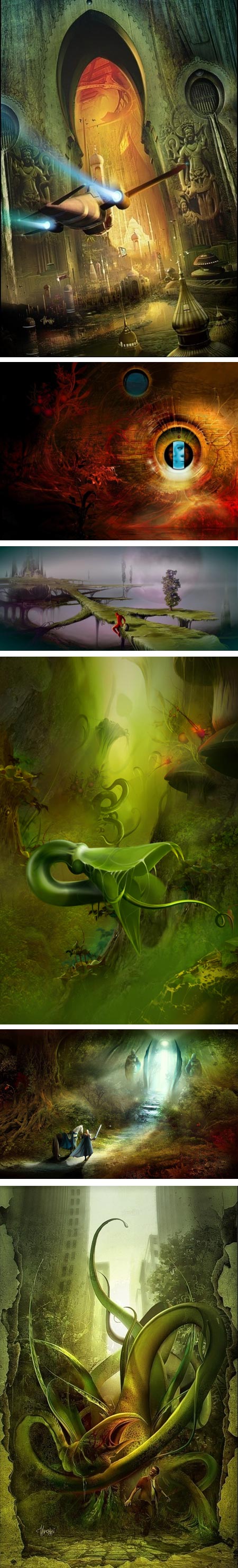
Tomasz Maronski is a Polish fantasy artist who started in traditional media, primarily oil, but after 10 years decided to move to digital painting.Working primarily in Corel Photo-paint, Maronski creates richly textured fantasy landscapes, lush with fantastical forms that seem to take inspiration partly from biological sources and partly from Surrealist masters of textural suggestion like Max Ernst and Yves Tanguy.
Maronski often works with a restricted palette, casting the majority of the composition in a small color range, accented with sharply contrasting hues from the other side of the color wheel.
He also likes to play with light and shadow, often with dramatic shafts and beams of light giving his subjects a theatrical focus.
It seems Maronski no longer has a dedicated website, instead relying on galleries on sites like CG Society and deviantART as a substitute.
I can’t find an actual bio or working credits; so I’m unsure of the range of his clients or work, though he apparently had illustrated a number of book covers.
His work is featured in Masters of Science Fiction and Fantasy Art: A Collection of the Most Inspiring Science Fiction, Fantasy, and Gaming Illustrators in the World by Karen Haber.
Categories:
-
Howard Pyle: American Master Rediscovered

In a letter to his brother Theo in 1882, Vincent van Gogh wrote:“Do you know an American periodical called Harper’s Monthly Magazine? – there are marvellous sketches in it. I don’t know it very well, I’ve only seen six months of it and have only 3 issues myself, but there are things in it I find astounding. Among them a glass-blower’s and an iron foundry, all kinds of scenes of factory work. As well as sketches of a Quaker town in the old days by Howard Pyle.”
Van Gogh also referenced Pyle in a number of other letters to his brother and to Anthon van Rappard. He is known to have clipped and collected reproductions of Pyle’s illustrations from the magazines.
Active from the mid 1800’s to the early 20th Century, Howard Pyle was one of the great American artists. Those familiar with his work will note that I’ve chosen my words carefully, and I did not limit the scope of my comment to “Howard Pyle was one of the great American illustrators”, though he certainly was that as well.
Often rightly called the “father of American Illustration” (though F.O.C. Darley may have claim to part of that title simply from his position in time), Pyle was one of the most brilliant, important and influential illustrators in the history of that medium of artistic expression.
The long, intentional denigration of “illustration” as “less than art” by those with a vested interest creating and maintaining that artificial distinction (essentially another way to set the “cultured elite” apart from the “uncultured masses”, i.e another reason the rich give themselves to feel superior to those “below” them), has clouded the appreciation of illustration as art and assessment of those classified as illustrators as artists.
Pyle’s innovations in color, composition, value contrast and emotional drama extended far beyond his impact on the illustrators who studied with him (many of whom are among the greatest names in American illustration, like N.C. Wyeth and Harvey Dunn), and their artistic descendants (e.g. Frank Frazetta and his followers). Not just Van Gogh, but many artists around the world saw Pyle’s drawings and paintings reproduced, had access to them in books and periodicals, and carried his ideas into their own work.
The Delaware Art Museum, which was itself founded on a core collection of Pyle’s work as the Wilmington Fine Arts Society in 1912, a year after the artist’s death in 1911, is marking the centennial of both events with an exhibition of Pyle’s work that extends from November 12th of 2011 to March 4th of 2012.
The exhibition, titled Howard Pyle: American Master Rediscovered, displays the highlights of the museum’s superb collection of Pyle’s works alongside work by other artists who influenced, or were influenced by, the American master. It rightly seeks to put Pyle in context with the larger art world of his time, and the flow of art history, in the course of which he was more than a ripple.
Pyle, working at a time prior to widespread reproduction of photographs and many years before film or television — a time when major illustrators were popular figures akin to modern rock stars or movie actors, was an illustrator’s illustrator, tremendously admired by his peers as well as the story reading public.
Works by Pyle and others illustrators of his day shaped the visions of popular culture, much as movies and television were to do in the latter part of the 20th Century. Illustrated stories in books and periodicals were the distributed popular culture of the day in the late 1800’s, and many of Pyle’s visual inventions from the time carry over into modern day popular culture.
 Our modern picture of colorful pirates, as portrayed by everyone from Erroll Flynn to Johnny Depp, was a concept essentially made up out of whole cloth by Pyle. He realized that realistic pirates, who wouldn’t have looked much different than other hard working seamen of the time, were much better portrayed for stories as idiosyncratic characters, with colorful sashes and bandannas, decorative swords and sheathes, and gloriously detailed ships.
Pyle just made them up – the entire idea of colorful photogenic pirates wouldn’t exist without his illustrations. Likewise his portrayal of medieval heros, knights and damsels, fantastic castles and the appearance of legendary characters like Robin Hood was tremendously influential. Our modern picture of them, and much of fantasy art in general, can be traced back to Pyle and artists influenced by him.
Pyle was also a tremendously influential teacher and attracted the most talented illustration students of his time from around the country.
Pyle taught first at Drexel in Philadelphia, when the Pennsylvania Academy of the Fine Arts foolishly turned up their noses at the idea of a “mere illustrator” teaching at the prestigious art school (the willful blindness of fine art snobbery is nothing new), and he later opened his own school in nearby Wilmington, Delaware.
His influence on his students, and in turn their students and subsequent followers, is well established. Less is known, however, about Pyle’s relationship with other artists of the time who were not illustrators (at least not primarily — more 19th Century “fine” artists also did illustration than most people realize).
Pyle belonged to prestigious arts clubs in Philadelphia and New York, and socialized with influential American artists like William Merritt Chase, Winslow Homer and Augustus Saint-Gaudens. Pyle’s work was seen by European illustrators (just as he surely saw theirs as books and prints made their way across the Atlantic in both directions), and by other artists as well.
Pyle was active at a time when advances in printing processes were dramatically changing what could be done with reproductions of artwork in books and magazines. He not only ran with the new technology, adapting his painting style to take advantage of the capabilities it presented, he also reinvented and reinvigorated illustration in a number of other ways, moving away from the theatrical staging common at the time into more naturalistic and dramatic compositions and use of color. (I was tempted to say “more cinematic”, but of course, movies didn’t exist at the time.)
Note in particular his dramatic use of shadowed foreground figures and objects, silhouetted against bright backgrounds, a compositional tactic subsequently followed by other artists and illustrators (notably his brilliant student, N.C. Wyeth) as well as later pioneers of the cinema.
Pyle was also a history painter, carrying forward the European traditions of painting scenes from history, but in his case it was American history that was the subject of his dramatic and often gritty scenes. At the time of the first Centennial Exhibition, held here in Philadelphia in 1876, for which he was influential in the organization of the American art exhibit, Pyle felt that the work of American artists were coming into their own, taking their place on the world stage and worthy of the term “American Renaissance”.
 Pyle should also be counted among history’s great pen and ink artists, taking inspiration in particular from his strong admiration for the drawings and graphics of Albrecht Durer, as well as from pen and ink drawings by the Pre-Raphaelite painters and others working at the time.
The Delaware Art Museum’s exhibition presents works from several aspects of Pyle’s career; he was astonishingly prolific, particularly given the detail he often put into his pictures. These include unusual works not often seen and pen and ink drawings which can’t be frequently displayed because of potential damage from exposure to light. The exhibition frames them amid works by other, relevant artists who influenced or were influenced by Pyle.
These include Pre-Raphaelite painter William Holman-Hunt, French society artist James Tissot, Japanese printmaker Katsushika Hokusai, famed orientalist and teacher Jean-Léon Gérôme, pen and ink iconoclast Aubrey Beardsley and other influential illustrators like Edwin Austin Abbey (the Abbey painting on loan from Yale is a gem).
If you get a chance to see the show in person, note that while the exhibition is in the changing exhibits galleries, the gallery in which Pyle’s most famous works are normally displayed has been used to expand the display of the museum’s collection of American Illustration, and the adjoining galleries, which normally display additional Pyle work, continue to do so, with many additional pieces that are not always on view. There is much to be discovered and enjoyed. (I’ve seen the show once, but will likely revisit several times before it ends its run.)
For those who can’t get to the museum in person, there is a newly published catalog accompanying the exhibition, that includes essays by art historians and Pyle experts, as well as an essay by contemporary illustrator and landscape artist James Gurney, who delves into Pyle’s working methods and compositions.
The museum has also made available an online gallery of Pyle’s work (note the second page), as well as online essays on his life and work.
For more, see my previous posts on Howard Pyle. I also recommend Ian Schoenherr’s Howard Pyle blog.
Pyle’s influence probably reaches deeper than we can see, both in the history of popular culture and the history of art. The Delaware Art Museum’s Howard Pyle: American Master Rediscovered lifts the edges of the traditional map of art history, and gives us a glimpse of the workings underneath and of the lines of influence leading to and from this remarkable artist.
Categories:
-
Drawing the Head and Hands, Andrew Loomis

in the 1940’s well known illustrator and art instructor Andrew Loomis wrote a series of drawing books that have become standards in the field of art instruction, prized by generations of illustrators, comic book artists, concept artists, character designers and others, particularly those who must “invent” the human form without constant recourse to a model.Ironically, these tremendously valuable and influential texts were long out of print, leaving artists to discover them by word of mouth and prowl used bookstores, and later the internet, hoping used copies would turn up for a reasonable price. Copies of them in good condition would often sell for $250.00 to $300.00, sometimes more.
We all scratched our heads, wondering why these obviously popular books hadn’t been reprinted, until this summer, when Titan books finally reprinted the most prominent title, Figure Drawing for all it’s Worth (see my review here).
Much to the delight of myself and countless other artists, Titan did a superb job, bringing to life the character and appearance of the book in a facsimile hardback edition that actually surpassed the printing quality of the original.
The edition has been a tremendous success, and Titan has followed up with what is considered the second most important and sought after title in the series, Drawing the Head and Hands, and they provided me with a review copy.
As I expected, Titan has once again done Loomis justice with a superb job of reproducing the book. I can say without hesitation that the original book and its content are of tremendous value, and the beautiful reproduction makes it a joy to follow the instruction.
Here, Loomis expands on demonstrating how to draw the human figure in correct proportion by constructing it from a knowledge of its basic forms, and goes into the details of the head and hands with subtle, yet clear and strong drawings and diagrams.
In addition to building his approach on the fundamentals of human anatomy, he gives construction methods based on the underlying geometry, allowing you to turn and move the head and hands in your mind and position them in space when drawing. By marking off spatial divisions related to the major features, Loomis guides the reader through an understanding their basic proportions, and how those of the face in particular can vary from individual to individual.
He also demonstrates the correct proportions of the face relative to the head (solving one of the most common problems of those learning to draw people — making the face too large), and shows how to construct the head not only from different angles, but in perspective.
The book goes into better detail than I have seen anywhere else on understanding the change in proportions that the human face and head undergo as we move from infancy through childhood into adulthood.
His section on hands brings similar focus to the proportions of the various parts of the hand, an understanding of the hand’s underlying geometry, and the distinction between the hands of the young and old, male and female.
In case I haven’t gotten it across, I can’t recommend these books highly enough for those learning to draw the human form without reference to a model. For those who are drawing from a model, you might be surprised how much a study of the Loomis construction methods can inform your drawings with an underlying strength and dimensionality.
Priced at under $40.00 US, the book is a bargain. Don’t allow yourself be put off by the fashions and hair styles in the drawings, which reveal the book’s origins in the 1940’s (I rather like them myself); the drawings and instruction are as relevant as if the book had been written today.
In addition, I think the drawings are beautiful, and the book serves as an art book as well as an instructional text.
The great news is the series has been so successful that Titan is extending it; the next title, Successful Drawing, is due to be released in May of next year.
For more, see my review from earlier this year of Figure Drawing for All it’s Worth.
[Important note: with the exception of the cover image, the sample pages above, with which I’ve tried to give you a taste of the content, are taken from poor scans of the previous editions and do not do justice to the quality of the images in the new book. Those, in fact, are superbly printed on a lightly off-white paper, bringing out the beautifully subtle quality of the drawings.]
Categories:
-
Claude Verlinde

Claude Verlinde is a French painter who works in the vein of “fantastic realism”, sometimes called “magic realism”, and his work shows the lineage of fantastical art from Bruegel and Bosch to the Surrealists and contemporary magic realists.I would also suspect that a number of the Surrealists, and certainly contemporary magic realists, were influenced by his work (not to mention the production designers of the Harry Potter movies).
Verlinde’s website, which is in French, has works divided into thematic galleries. (Note that the link I give is direct to the gallery categories, the main page for “La Galerie” produces a looping JavaScript error, at least in my browser.) There is also a section for drawings and watercolors.
His often darkly themed works employ the dark earth tones of the early Renaissance, as well as some of the visual staging and precise rendering characteristic of that period. He sometimes uses a brighter palette, but his work always has a feeling of referencing another time, if not another world.
The images on his site are sometimes a bit larger than they appear (click for larger versions), but usually not as large as one might like, though a few of them are accompanied by detail crops.
There is a trove of larger versions on the Russian Blog Beyond time, beyond space. There are also galleries on beinArt Surreal Art Collective and Ten Dreams.
There is a French collection of his work, Claude Verlinde: Peintures et dessins (Visions), that is out of print, but may be found through used book sources.
[Via adamvasco on MetaFilter]
[Note: some images should be considered NSFW]
Categories:


Charley’s Picks
Bookshop.org
(Bookshop.org affilliate links; sales benefit independent bookshop owners; I get a small percentage to help support my work on Lines and Colors)

John Singer Sargent: Watercolors


Urban Sketching: Understanding Perspective


Charley’s Picks
Amazon
(Amazon.com affiliate links; sales go to a larger yacht for Jeff Bezos; but I get a small percentage to help support my work on Lines and Colors)
John Singer Sargent: Watercolors
Urban Sketching: Understanding Perspective