
Categories
- 3d CGI
- Amusements
- Animation
- Anime & Manga
- Art Materials
- Art Videos
- Blogroll
- Cartoons
- Color
- Comics
- Concept & Visual Dev.
- Creativity
- Digital Art
- Digital Painting
- Displaying Art on the Web
- Drawing
- Eye Candy for Today
- Gallery and Museum Art
- High-res Art Images
- Illustration
- Motion Graphics & Flash
- Museums
- Online Museums
- Outsider Art
- Painting
- Painting a Day
- Paleo Art
- Pastel, Conté & Chalk
- Pen & Ink
- Prints and Printmaking
- Reviews
- Sc-fi and Fantasy
- Sculpture & Dimensional
- Site Comments
- Sketching
- Storyboards
- Tools and Techniques
- Uncategorized
- Vector Art
- Videos & Podcasts
- Vision and Optics
- Watercolor and Gouache
- Webcomics
Archives
- May 2026
- April 2026
- March 2026
- February 2026
- January 2026
- December 2025
- November 2025
- October 2025
- September 2025
- August 2025
- July 2025
- June 2025
- May 2025
- January 2025
- December 2024
- November 2024
- October 2024
- September 2024
- August 2024
- June 2024
- April 2024
- March 2024
- February 2024
- January 2024
- December 2023
- November 2023
- October 2023
- September 2023
- August 2023
- July 2023
- May 2023
- April 2023
- March 2023
- February 2023
- January 2023
- December 2022
- November 2022
- September 2022
- August 2022
- July 2022
- June 2022
- May 2022
- April 2022
- March 2022
- February 2022
- January 2022
- December 2021
- November 2021
- October 2021
- September 2021
- August 2021
- July 2021
- June 2021
- May 2021
- April 2021
- March 2021
- February 2021
- January 2021
- December 2020
- November 2020
- October 2020
- September 2020
- August 2020
- July 2020
- June 2020
- May 2020
- April 2020
- March 2020
- February 2020
- January 2020
- December 2019
- November 2019
- October 2019
- September 2019
- August 2019
- July 2019
- June 2019
- May 2019
- April 2019
- March 2019
- February 2019
- January 2019
- December 2018
- November 2018
- October 2018
- September 2018
- August 2018
- July 2018
- June 2018
- May 2018
- April 2018
- March 2018
- February 2018
- January 2018
- December 2017
- November 2017
- October 2017
- September 2017
- August 2017
- July 2017
- June 2017
- May 2017
- April 2017
- March 2017
- February 2017
- January 2017
- December 2016
- November 2016
- October 2016
- September 2016
- August 2016
- July 2016
- June 2016
- May 2016
- April 2016
- March 2016
- February 2016
- January 2016
- December 2015
- November 2015
- October 2015
- September 2015
- August 2015
- July 2015
- June 2015
- May 2015
- April 2015
- March 2015
- February 2015
- January 2015
- December 2014
- November 2014
- October 2014
- September 2014
- August 2014
- July 2014
- June 2014
- May 2014
- April 2014
- March 2014
- February 2014
- January 2014
- December 2013
- November 2013
- October 2013
- September 2013
- August 2013
- July 2013
- June 2013
- May 2013
- April 2013
- March 2013
- February 2013
- January 2013
- December 2012
- November 2012
- October 2012
- September 2012
- August 2012
- July 2012
- June 2012
- May 2012
- April 2012
- March 2012
- February 2012
- January 2012
- December 2011
- November 2011
- October 2011
- September 2011
- August 2011
- July 2011
- June 2011
- May 2011
- April 2011
- March 2011
- February 2011
- January 2011
- December 2010
- November 2010
- October 2010
- September 2010
- August 2010
- July 2010
- June 2010
- May 2010
- April 2010
- March 2010
- February 2010
- January 2010
- December 2009
- November 2009
- October 2009
- September 2009
- August 2009
- July 2009
- June 2009
- May 2009
- April 2009
- March 2009
- February 2009
- January 2009
- December 2008
- November 2008
- October 2008
- September 2008
- August 2008
- July 2008
- June 2008
- May 2008
- April 2008
- March 2008
- February 2008
- January 2008
- December 2007
- November 2007
- October 2007
- September 2007
- August 2007
- July 2007
- June 2007
- May 2007
- April 2007
- March 2007
- February 2007
- January 2007
- December 2006
- November 2006
- October 2006
- September 2006
- August 2006
- July 2006
- June 2006
- May 2006
- April 2006
- March 2006
- February 2006
- January 2006
- December 2005
- November 2005
- October 2005
- September 2005
- August 2005
Relevant Blogs
Art, Painting & Sketch
- Gurney Journey
- Underpaintings
- Art and Influence
- Painting Perceptions
- Oil Painters of America
- Vasari Paint POV
- Flying Fox
- Urban Sketchers
- Bento (Smithsonian)
- Art Inconnu
- The Hidden Place
- Still Life
- Making a Mark
- The Art of the Landscape
- Exploring Color & Creativity
- Art Contrarian
- Artist A Day
- beinArt Surreal Art Collective
- Eye Level
- David Dunlop
- p.i.g.m.e.n.t.i.u.m
- CultureGrrl
- Joaquín Sorolla blog
- Artists in Pastel
“Painting a Day”
- A Painting a Day (Keiser)
- On Painting (Keiser)
- Julian Merrow-Smith
- Karen Jurick
- Jeffrey Hayes
- Carol Marine
- Abbey Ryan
- Daily Paintworks
Other Painting Blogs
- Virtual Gouache Land
- Neil Hollingsworth
- Marc Hanson
- Kevin Menck
- Marc Dalessio
- Larry Seiler
- Stapleton Kearns
- Colin Page
- Roos Schuring
- Hans Versfelt
- Titus Meeuws
- Régis Pettinari
- René Plein Air
- Belinda Del Pesco
- Robin Weiss
- Nathan Fowkes (Land Sketch)
- William Wray
- Frank Serrano
- Stephen Magsig
- Michael Chesley Johnson
- Twice a Week
- Sarah Wimperis
- Rob Adams
- Michael Cole Manley
- The Dirty Palette Club
- Mike Manley’s Draw!
Gallery Art & Illustration mix
Illustration
- Howard Pyle
- 100 Years of Illustration
- BibliOdyssey
- Illustration Art
- Today’s Inspiration
- Illustration Mundo
- Little Chimp Society
- Danny Gregory
- R D (John Martz
- Illustration Friday blog
- Monster Brains
- Illustrators & Illustrations (RU)
- Elwood H. Smith
- DaniDraws.com
- Designers Who Blog
- iSpot Blog
Sci-Fi & Fantasy
Illustration & Comics
Comics & Cartoons
- Comics Beat
- Robot 6
- Newsarama Blog
- Comic Vine
- Comics Alliance
- Forbidden Planet Int.
- Paolo Rivera
- Bolt City
- Flight
- Scott McCloud
- The Comics Journal
- Comixpedia
- Funnybook Babylon
- James Baker
- Middleton’s Sketchbook
- Boneville
- The Hotel Fred
- Paul Rivoche
- Daily Cartoonist
- Mad About Cartoons (William Wray)
- Digital Strips
Illustration & Concept
Animation & Concept
- Cartoon Brew
- Animation Blog
- Cold Hard Flash
- Concept Art World
- The CAB
- FY Concept Art
- Concept Ships
- Concept Robots
- John Nevarez
- Armand Serrano
- Marcos Mateu-Mestre
- all kinds of stuff (Kricfalusi)
- Yacin the faun (Man Arenas)
- Kelsey Mann
- Cre8tivemarks Blog
- Ice-Cream Monster Toon Cafe
- AAU Character & Creature Design
- AAU Animation Notes
- Articles and Texticles
Paleo & Scientific
Tools & Techniques
Other
Lists of Art Blogs
Art Image Resource Links
Historic Art Images
- Wikimedia Commons: Paintings
- Wikimedia Commons: Drawings
- The Athenaeum
- WikiArt (WikiPaintings)
- Google Art Project: Artists
- Google Art Project: Collections (Museums)
- ArtCyclopedia
- Web Gallery of Art
- Art Renewal Center
- Web Gallery of Impressionism
Auction Consolidation sites
Auction sites
- Sotheby’s
- Bonham’s
- Christies
- Heritage Auctions: Fine Art
- Heritage Auctions: Illustration
- Freeman’s Auctions
- Bukowskis
- Shannon’s
Image Search
Reverse Image Search (search by image)
- Tin Eye
- RevImg
- Google Image Search (camera icon)
- Bing Image Search (camera icon)
Promoting some friends and some clients of my website design business
- Twin Willows T’ai Chi studio in Wilmington DE. Taiji classes with Bryan Davis.
- Ray Hayward, Inspired Teacher of T’ai Chi ( Taiji ) in Minneapolis, Founder of Mindful Motion Tai Chi Academy
- OldHead Tattoo studio and Art Gallery in Wilmington DE. Tattoos and paintings by Bruce Gulick
- Sharon Domenico Art, pet portrait oil paintings
- Platinum Paperhanging, wallpaper hanging, Main Line and Philadelphia, PA
- Lisa Stone Design, interior designer, Main Line and Philadelphia, PA
- Studio12KPT, original art, prints, calendars and other custom printed items by Van Sickle & Rolleri
-
Ian McQue

Ian McQue is a concept artist, illustrator and art director for the gaming industry. He is currently working for Rockstar North, and gaming aficionados will recognize the several Grand Theft Auto titles to his credit, along with an number of other games.McQue works in both traditional and digital media, the latter including Photoshop, Illustrator and 3d Studio Max.
When not working, McQue likes to add to his flotilla of steampunk airships. Wonderfully realized, improbably heavy, they appear battered and patched, as though the aerial equivalent of the junks and salvaged ships one might find in an off the map Pacific port, trading in God-knows-what, plying the currents in the grey skies of another place or time.
You can find a nice big introductory batch of his flying ships on Concept Ships, where his work was chosen for the Monthly header this month.
You’ll find more of his on his blog, along with some of his nicely gestural sketches. There is also a gallery on CGHub.
[Via io9]
Categories:
-
Confident Color

This is one of those books for which the binding is key.Nita Leland’s Confident Color: An Artist’s Guide to Harmony, Contrast and Unity is published by venerable art instruction book publisher North Light Books.
Like Leland’s previous book, The New Creative Artist (which I reviewed here) and Bert Dodson’s Keys to Drawing with Imagination (my review here), North Light has published it in their hybrid hardback/spiral binding, giving the overt clue that this is a book meant to be used, rather then simply read.
The spiral binding allows for laying the book flat on your drawing table, the hardcover allows for rough and continued handling, and the combination allows for propping the book open upright on the rail of an easel.
The intention of the publisher clearly matches that of the writer, to get the most out of this book, it needs to be used, worked with over time; and will have shown its best service when ragged at the edges and spattered with paint.
Not that you couldn’t settle into the Comfy Chair and find lots of interest to read through and look at; Leland drills through a concise introduction to color theory, history and terminology and covers the basics of understanding palettes and pigments, all augmented with her selections of works from a variety of contemporary working artists and a few of her own. The real value, though, is in the exercises, trials, procedures and processes that form the core of the book.
If you’re lucky, you may have encountered a teacher like Leland in your formative years, one who will, however gently and politely, continue to poke and prod and push you to try something new, move out of your comfort zone, experiment, play and explore.
This isn’t random try-whatever experimentation, however; in Confident Color Leland provides you with guided exploration, designed to systematically familiarize you with the ranges of relationships presented by your color choices.
There is a “Look Inside” preview on the Amazon listing, though as is often the case, the pages represented don’t give the best indication of the actual content of the book. The index is actually better for that.
The book is aimed at beginners as well as more advanced artists, and though watercolor is Leland’s medium and some of the pigments mentioned are particular to watercolor, the general palettes are set up with colors that work well across most mediums that involve color.
In some ways this is an extension of and companion to Leland’s 1998 book Exploring Color, which has become something of a standard among books on working with color. That book, though without the advantage of the lay-flat binding, was also meant to be worked with.
Both volumes focus alternately on the split-primary process of color mixing and on the exploration of variations on the red/blue/yellow triads that serve as the basis for several of many possible color wheels.
She urges you to work with and understand the difference between palettes composed of muted, intense and earth-toned colors, as well as the “workhorse” colors that form the basis of most artist’s palettes.
In pursuing her exercises and explorations, you might work with colors and combinations that you would’t use in other circumstances, which may seem counter productive; but just as contour drawing is rarely used as the style for a finished work, knowing artists will work at it with dedication, letting the practice inform and strengthen their finished style.
This isn’t the kind of book that says “mix two parts Cad Yellow to one part Ultramarine to paint this foliage”; in Confident Color, Leland is suggesting if you experiment with these excursions into color harmony and contrast, work through the mixtures possible with variations of of the primary triad and really get the feeling for how colors act and react with one another, you’ll instinctively know what to mix when you want to paint something.
The book’s binding is the key. Confidence comes from doing.
Categories:
-
Waterhouse’s Miranda

Whatever the actual reception of the movie itself, I think it’s always good when a new popularly released move brings renewed attention to the works of Shakespeare, which had much more in common with the characteristics of contemporary popular entertainment than your high school English class might have led you to believe.The latest adaptation from the Bard’s cupboard of timeless tales, the 2010 version of The Tempest, features Helen Mirren as a female version of Prospero, and Felicity Jones as her sheltered daughter, Miranda.
Victorian painter John William Waterhouse, who, like his friends in the Pre-Raphaelite Brotherhood, often took scenes from Shakespeare for his subjects, apparently painted three different interpretations of Miranda.
One was painted in 1875, early in his career (images above, top). It shows a contemplative Miranda gazing out over a calm sea.
The other two, smaller and larger versions of essentially the same image, were both painted by Waterhouse in in 1916, the year before his death. They show Miranda as witness to the storm and shipwreck which which the play’s actions begin. The later and larger of these (image above, top) is probably the most familiar.
More Tempest trivia: one of the most interesting, if loose, adaptations from The Tempest was the spectacular (for its time) 1956 science fiction classic, Forbidden Planet (more here). The film, aside from the connection to The Tempest, was notable for a number of reasons: the “monster from the id” and the subterranean alien power station were rendered and animated by veteran Disney artist Joshua Meador; the action was filmed largely on a soundstage backed with an enormous painted cyclorama of the alien landscape; and the movie and its production design were credited by Gene Roddenberry as a primary influence on the creation of his television show Star Trek; it also featured Leslie Neilson as the dramatic lead and introduced Robbie the Robot, one of the most iconic and influential designs for a cinematic robot; but I digress… back to Waterhouse’s 19th Century interpretation of Shakespeare’s 17th Century play.
Scenes from The Tempest were also interpreted by other artists, notably Pre-Raphaelite painter John Everett Millais, William Maw Egley, William Hamilton, earlier by Swiss-born Henry Fuseli, and even earlier by Angelica Kauffmann and George Romney.
(See my posts on John Everett Millais, Henry Fuseli and John William Waterhouse.)
Categories:
-
Xenozoic
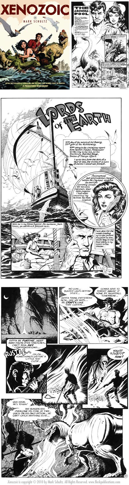
Long time readers of Lines and Colors will know of my fascination with dinosaurs and paleo art, my fondness for science fiction and adventure stories and their accompanying illustrations, my admiration for the beautiful ink drawings of classic illustrators, the inspired adventure comic strips from the 1930’s and 1940’s that carried their traditions forward, and the wonderfully lurid E.C. Comics comic books of the 1950’s that, in turn, evolved out of them.Together, those leanings make me a prime candidate to love the work of comics artist, writer and illustrator Mark Schultz, whose long running series Xenozoic Tales, also known as Cadillacs and Dinosaurs, has been delighting similarly minded readers since its surprise appearance in the comics anthology Death Rattle in the mid 1980’s.
Like his predecessors, Schultz has been taking the influence of the comics and illustration greats that inspired him, weaving it into his own always progressing style and applying it to telling the kind of stories that fired his enthusiasm for the comics medium when he was younger.
Schultz is now inspiring a new generation of comics artists and illustrators, who recognize that the very best in a given medium or genre is often slightly outside the mainstream, where those with eccentric visions can create the work that is unrestrained by the latest corporate sponsored “fads” and based instead on the artist’s love of the medium and subject matter.
Which brings me to Xenozoic, the new collection of Schultz’s Xenozoic Tales stories published by Flesk Publications. Flesk sent me a review copy, but I have to say that even though I have much of the material already in other formats, I would have picked this volume up anyway because it’s such a satisfying way to enjoy these stories and art.
Xenozoic collects the range of the stories, from early ones that lay out the groundwork for Szhultz’s fantastic world, to the latest and best, where his artwork, already striking in its intricate detail and deep chiaroscuro, develops to its peak of sweeping vistas and extraordinarily realized characters, animals and settings.
Did I mention that the comics are in black and white (with beautiful touches of tone)? Did I mention that this is a Good Thing? In the same way that classic black and white films have a feeling, mood and atmosphere that can’t be matched in color, so black and white comics and illustration can evoke mood and utilize visual texture in a way that the addition of color would only diminish.
In Schultz’s hands, areas of rock, foliage or background skies that otherwise might be simple areas of color become intricate marvels of ink line, texture and pattern, drawing you deeper into the scene and slowing down the pace with which you read, a technique that most contemporary comics artists have not learned to use effectively.
Many contemporary comics artists indulge in detail for its own sake, Schultz is one of the rare few who understands how to use it effectively to control how a story proceeds.
I won’t go into detail here about the history of Xenozoic Tales or the work of Mark Schultz, but will instead point you to my previous post on Mark Schultz, where I’ve already done that.
 Fans of Schultz’s work should also be aware of the books collecting his drawings also published by Flesk, the latest of which, Mark Schultz; Various Drawings Volume 4, is still available in paperback though sold out in hardcover.
These, unlike the toss-off sketchbook drawings sometimes compiled into collections by other comics artists, are more often fully realized, finished drawings. Volume 4 includes a wonderful 2 page fold-out of a John Carter of Mars illustration, along Schultz’s preliminary drawings for it, along with an assortment of other terrific drawings and even a one page comic strip, Paleonauts, in which he pays tribute to another Schultz.
Xenozoic is a big, heaping helping of fantasy adventure comics at their best, transporting the reader into pulp-inspired tales of high adventure in a mildly dystopian eco-disaster future (making it possible to have dinosaurs, people and, of course, Cadillacs within the same fantastic landscapes).
This is the kind of “plop down in the Comfy Chair with the big adventure book” experience that not enough pop culture fans have encountered. If you know someone who loves the modern takes on classic adventure movies, like the Indiana Jones movies, Jurassic Park, Peter Jackson’s King Kong remake, or even Pirates of the Caribbean, but for some reason thinks they don’t enjoy comics, here is a possible bridge into that world (and a treat of a present).
There is a preview of Xenozoic on the Flesk site, where you can click to see a few images from the book. Even though Flesk is getting better about this, showing somewhat larger preview images, the previews still don’t do the pages justice. If you’re not already familiar with Schultz’s work, look for the book in a bookstore so you can see how these pages look printed full size.
There is also an additional Mark Schultz gallery on the Flesk site (Schultz doesn’t have a dedicated site or blog of his own as far as I know).
Xenozoic and Mark Schultz; Various Drawings Volume 4 can be purchased directly from the Flesk Publications online store.
Categories:
-
The Frick Collection
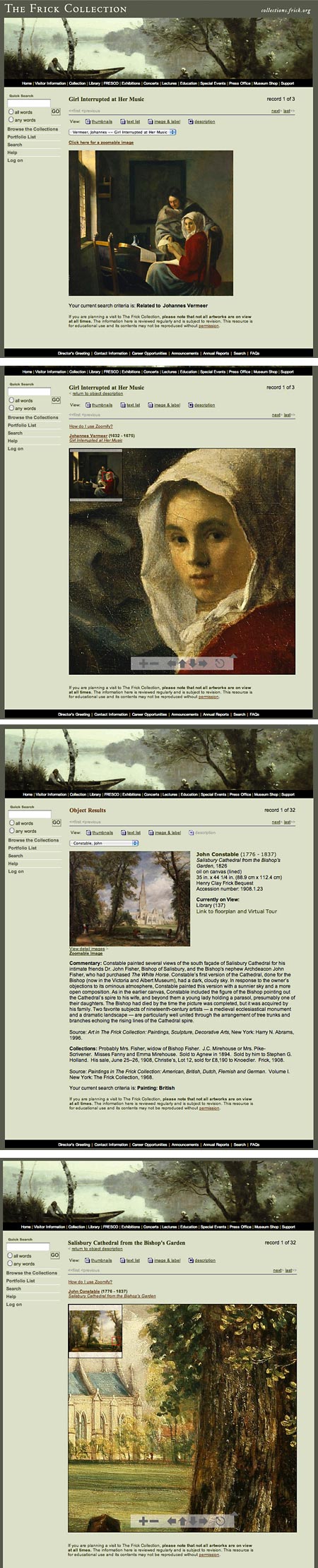
The Frick Collection is a relatively small museum in New York, housed in the former mansion of Henry Clay Frick, and displaying the artworks collected by him and his daughter, Helen Clay Frick.The collection, though not as extensive as those of larger museums, has the density of an expensive fruitcake, with so many yummy masterpieces in such a small space that it’s mind-boggling. It includes major works by Vermeer, Rembrandt, Holbein, Whistler, Constable, Corot, David, Goya, Hals, Ingres, Renoir, Titian, Turner, Velázquez, Whistler and Van Eyck, among others.
For those who can’t get to the collection physically, the museum has databased much of the collection online, with Zoomable images of most works.
Their collections database search feature, though poorly organized and something of a drag to wade through, is usable once you understand how it works.
Choose Browse the Collections, then focus on a subject, like Paintings, focus on a region, say, Dutch, Flemish, German and Swiss, narrow down further, let’s say to Dutch, and then you’ll finally see some thumbnails of works.
In the initial display of a limited number of works, it’s easy to miss the tiny “next” button at the top of the interface (and not at the bottom of the list where you might expect it), but you may find it easier to select a particular work from the drop down menu.
If you click on an artist’s name instead of a specific work, you’re dropped on a page with a description of the artist, but no thumbnails of works. Just when you’re tempted to think that your search has returned no visible results, look for the linked (though not underlined) text saying “View objects by this artist”.
Then you will see thumbnails of viewable works. Click on the thumbnail or title of the work to view the main image, and then look for the link to the Zoomable image (and sometimes a selection of detail images).
The Zoomable image, like those of so many museums, is restrained in a box and partially obscured by the zooming thumbnail (wouldn’t want you to get away with a high res image, you naughty image thief, you), but the box is large enough to see detail in enough of an area to make the effort worthwhile.
Upkeep on the site has apparently been a low priority, as some items are missing or unviewable. (Hans Holbein’s portrait of Sir Thomas Moore is among them, alas. See my post on Hans Holbein the Younger.)
What is there, however, reflects the Frick’s superb collection. Many of the works are among the finest examples by the artists represented.
That includes three (count ’em three) Vermeers, not far from the five in the nearby Metropolitan Museum (see my most recent post on Vermeer, with links to others).
For those who can get to the the collection in person, it’s worth noting that the usual $18 entry fee will be waived tomorrow, Thursday, December 17, 2010, in celebration of the 75th anniversary of the day the collection first opened its doors to the public.
In addition to the usual gems, there is currently an exhibition of 17th and 18th Century drawings, The Spanish Manner: Drawings from Ribera to Goya, on display until January 9, 2011.
Categories:
-
Pete Scully

One of the things that art does best it to make the ordinary extraordinary. By focusing attention on commonplace objects artists can reveal them in ways that make us see them anew.I was amused and delighted by Pete Scully’s series of 50 drawings of fire hydrants, standpipes, water tanks, meters and even a water tower, in which he finds great variety of form, color and texture.
The drawings, which he has also put together as a single, poster-like image (above, top, larger image here) were done as Scully’s participation in the Flickr pool NaNoDrawMo challenge. (Inspired by National Novel Writing Month, or NoNoWriMo, NaNoDrawMo was a challenge to produce 50 individual drawings during the Month of November.)
Scully posted the individual drawings on his blog over the past month. You’ll also find other series of drawings accessible from the menus at the top of the pages, with drawings from places like San Francisco and London.
Scully is originally from the U.K. and now lives in California. He is a contributor the Urban Sketchers Blog. (See my previous post about Urban Sketchers, and note that they have changed the address of the blog from .com to .org).
Categories:


Charley’s Picks
Bookshop.org
(Bookshop.org affilliate links; sales benefit independent bookshop owners; I get a small percentage to help support my work on Lines and Colors)

John Singer Sargent: Watercolors


Urban Sketching: Understanding Perspective


Charley’s Picks
Amazon
(Amazon.com affiliate links; sales go to a larger yacht for Jeff Bezos; but I get a small percentage to help support my work on Lines and Colors)
John Singer Sargent: Watercolors
Urban Sketching: Understanding Perspective