
Categories
- 3d CGI
- Amusements
- Animation
- Anime & Manga
- Art Materials
- Art Videos
- Blogroll
- Cartoons
- Color
- Comics
- Concept & Visual Dev.
- Creativity
- Digital Art
- Digital Painting
- Displaying Art on the Web
- Drawing
- Eye Candy for Today
- Gallery and Museum Art
- High-res Art Images
- Illustration
- Motion Graphics & Flash
- Museums
- Online Museums
- Outsider Art
- Painting
- Painting a Day
- Paleo Art
- Pastel, Conté & Chalk
- Pen & Ink
- Prints and Printmaking
- Reviews
- Sc-fi and Fantasy
- Sculpture & Dimensional
- Site Comments
- Sketching
- Storyboards
- Tools and Techniques
- Uncategorized
- Vector Art
- Videos & Podcasts
- Vision and Optics
- Watercolor and Gouache
- Webcomics
Archives
- April 2026
- March 2026
- February 2026
- January 2026
- December 2025
- November 2025
- October 2025
- September 2025
- August 2025
- July 2025
- June 2025
- May 2025
- January 2025
- December 2024
- November 2024
- October 2024
- September 2024
- August 2024
- June 2024
- April 2024
- March 2024
- February 2024
- January 2024
- December 2023
- November 2023
- October 2023
- September 2023
- August 2023
- July 2023
- May 2023
- April 2023
- March 2023
- February 2023
- January 2023
- December 2022
- November 2022
- September 2022
- August 2022
- July 2022
- June 2022
- May 2022
- April 2022
- March 2022
- February 2022
- January 2022
- December 2021
- November 2021
- October 2021
- September 2021
- August 2021
- July 2021
- June 2021
- May 2021
- April 2021
- March 2021
- February 2021
- January 2021
- December 2020
- November 2020
- October 2020
- September 2020
- August 2020
- July 2020
- June 2020
- May 2020
- April 2020
- March 2020
- February 2020
- January 2020
- December 2019
- November 2019
- October 2019
- September 2019
- August 2019
- July 2019
- June 2019
- May 2019
- April 2019
- March 2019
- February 2019
- January 2019
- December 2018
- November 2018
- October 2018
- September 2018
- August 2018
- July 2018
- June 2018
- May 2018
- April 2018
- March 2018
- February 2018
- January 2018
- December 2017
- November 2017
- October 2017
- September 2017
- August 2017
- July 2017
- June 2017
- May 2017
- April 2017
- March 2017
- February 2017
- January 2017
- December 2016
- November 2016
- October 2016
- September 2016
- August 2016
- July 2016
- June 2016
- May 2016
- April 2016
- March 2016
- February 2016
- January 2016
- December 2015
- November 2015
- October 2015
- September 2015
- August 2015
- July 2015
- June 2015
- May 2015
- April 2015
- March 2015
- February 2015
- January 2015
- December 2014
- November 2014
- October 2014
- September 2014
- August 2014
- July 2014
- June 2014
- May 2014
- April 2014
- March 2014
- February 2014
- January 2014
- December 2013
- November 2013
- October 2013
- September 2013
- August 2013
- July 2013
- June 2013
- May 2013
- April 2013
- March 2013
- February 2013
- January 2013
- December 2012
- November 2012
- October 2012
- September 2012
- August 2012
- July 2012
- June 2012
- May 2012
- April 2012
- March 2012
- February 2012
- January 2012
- December 2011
- November 2011
- October 2011
- September 2011
- August 2011
- July 2011
- June 2011
- May 2011
- April 2011
- March 2011
- February 2011
- January 2011
- December 2010
- November 2010
- October 2010
- September 2010
- August 2010
- July 2010
- June 2010
- May 2010
- April 2010
- March 2010
- February 2010
- January 2010
- December 2009
- November 2009
- October 2009
- September 2009
- August 2009
- July 2009
- June 2009
- May 2009
- April 2009
- March 2009
- February 2009
- January 2009
- December 2008
- November 2008
- October 2008
- September 2008
- August 2008
- July 2008
- June 2008
- May 2008
- April 2008
- March 2008
- February 2008
- January 2008
- December 2007
- November 2007
- October 2007
- September 2007
- August 2007
- July 2007
- June 2007
- May 2007
- April 2007
- March 2007
- February 2007
- January 2007
- December 2006
- November 2006
- October 2006
- September 2006
- August 2006
- July 2006
- June 2006
- May 2006
- April 2006
- March 2006
- February 2006
- January 2006
- December 2005
- November 2005
- October 2005
- September 2005
- August 2005
Relevant Blogs
Art, Painting & Sketch
- Gurney Journey
- Underpaintings
- Art and Influence
- Painting Perceptions
- Oil Painters of America
- Vasari Paint POV
- Flying Fox
- Urban Sketchers
- Bento (Smithsonian)
- Art Inconnu
- The Hidden Place
- Still Life
- Making a Mark
- The Art of the Landscape
- Exploring Color & Creativity
- Art Contrarian
- Artist A Day
- beinArt Surreal Art Collective
- Eye Level
- David Dunlop
- p.i.g.m.e.n.t.i.u.m
- CultureGrrl
- Joaquín Sorolla blog
- Artists in Pastel
“Painting a Day”
- A Painting a Day (Keiser)
- On Painting (Keiser)
- Julian Merrow-Smith
- Karen Jurick
- Jeffrey Hayes
- Carol Marine
- Abbey Ryan
- Daily Paintworks
Other Painting Blogs
- Virtual Gouache Land
- Neil Hollingsworth
- Marc Hanson
- Kevin Menck
- Marc Dalessio
- Larry Seiler
- Stapleton Kearns
- Colin Page
- Roos Schuring
- Hans Versfelt
- Titus Meeuws
- Régis Pettinari
- René Plein Air
- Belinda Del Pesco
- Robin Weiss
- Nathan Fowkes (Land Sketch)
- William Wray
- Frank Serrano
- Stephen Magsig
- Michael Chesley Johnson
- Twice a Week
- Sarah Wimperis
- Rob Adams
- Michael Cole Manley
- The Dirty Palette Club
- Mike Manley’s Draw!
Gallery Art & Illustration mix
Illustration
- Howard Pyle
- 100 Years of Illustration
- BibliOdyssey
- Illustration Art
- Today’s Inspiration
- Illustration Mundo
- Little Chimp Society
- Danny Gregory
- R D (John Martz
- Illustration Friday blog
- Monster Brains
- Illustrators & Illustrations (RU)
- Elwood H. Smith
- DaniDraws.com
- Designers Who Blog
- iSpot Blog
Sci-Fi & Fantasy
Illustration & Comics
Comics & Cartoons
- Comics Beat
- Robot 6
- Newsarama Blog
- Comic Vine
- Comics Alliance
- Forbidden Planet Int.
- Paolo Rivera
- Bolt City
- Flight
- Scott McCloud
- The Comics Journal
- Comixpedia
- Funnybook Babylon
- James Baker
- Middleton’s Sketchbook
- Boneville
- The Hotel Fred
- Paul Rivoche
- Daily Cartoonist
- Mad About Cartoons (William Wray)
- Digital Strips
Illustration & Concept
Animation & Concept
- Cartoon Brew
- Animation Blog
- Cold Hard Flash
- Concept Art World
- The CAB
- FY Concept Art
- Concept Ships
- Concept Robots
- John Nevarez
- Armand Serrano
- Marcos Mateu-Mestre
- all kinds of stuff (Kricfalusi)
- Yacin the faun (Man Arenas)
- Kelsey Mann
- Cre8tivemarks Blog
- Ice-Cream Monster Toon Cafe
- AAU Character & Creature Design
- AAU Animation Notes
- Articles and Texticles
Paleo & Scientific
Tools & Techniques
Other
Lists of Art Blogs
Art Image Resource Links
Historic Art Images
- Wikimedia Commons: Paintings
- Wikimedia Commons: Drawings
- The Athenaeum
- WikiArt (WikiPaintings)
- Google Art Project: Artists
- Google Art Project: Collections (Museums)
- ArtCyclopedia
- Web Gallery of Art
- Art Renewal Center
- Web Gallery of Impressionism
Auction Consolidation sites
Auction sites
- Sotheby’s
- Bonham’s
- Christies
- Heritage Auctions: Fine Art
- Heritage Auctions: Illustration
- Freeman’s Auctions
- Bukowskis
- Shannon’s
Image Search
Reverse Image Search (search by image)
- Tin Eye
- RevImg
- Google Image Search (camera icon)
- Bing Image Search (camera icon)
Promoting some friends and some clients of my website design business
- Twin Willows T’ai Chi studio in Wilmington DE. Taiji classes with Bryan Davis.
- Ray Hayward, Inspired Teacher of T’ai Chi ( Taiji ) in Minneapolis, Founder of Mindful Motion Tai Chi Academy
- OldHead Tattoo studio and Art Gallery in Wilmington DE. Tattoos and paintings by Bruce Gulick
- Sharon Domenico Art, pet portrait oil paintings
- Platinum Paperhanging, wallpaper hanging, Main Line and Philadelphia, PA
- Lisa Stone Design, interior designer, Main Line and Philadelphia, PA
- Studio12KPT, original art, prints, calendars and other custom printed items by Van Sickle & Rolleri
-
Shy the Sun (Ree Treweek and Jannes Hendrikz)
I was watching last night’s dazzling opening ceremonies for the Beijing Olympics on television, alternating between being stunned by the artistic vision and choreographic scope of the event, and appalled by the contrast between that and the jarringly interspersed commercials for dreary consumer products and an apparent attempt by the network to display its most insipid excuses for TV shows; when I was struck by a new animated ad for United Airlines.United, despite (or perhaps because of) being under Chapter 11 bankruptcy protection since 2002, has been unusually understated and imaginative in their television advertising, notably in the form of a brilliant animated ad called Dragon, directed by Jamie Caliri and created from artfully designed papercraft cut-outs; which I profiled in my 2006 post on Jamie Caliri.
The airline has also had some other, nicely understated, ads using illustrations and animations over that time.
There is a new series of animated ads on United’s site, including a new papercraft ad by Caliri called Heart. Unfortunately, the site navigation for viewing the ads is terrible and I can’t give you direct links. From the main page of ads, choose “Commercials”. You then have to roll over the thumbnail at right to even see the other choices. There are also text links below to archived commercials, including Dragon.
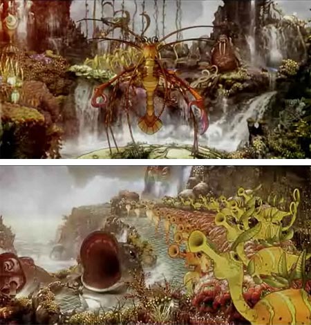
Fortunately, the first choice is the commercial that stood out last night, Sea Orchestra (images above), which I immediately recognized as the visionary style of South African artist Ree Treweek and her collaborator Jannes Hendrikz, whose work I have been following with interest since early 2006.
Their association, along with musician Marcus Smit (A.K.A. Wormstorm), is known as The Blackheart Gang, and the piece that brought them to my (and lots of other folks’) attention is an animated short called The Tale of How, which I wrote about here.
The Tale of How is a wonderfully idiosyncratic and uniquely realized animation, with a combination of Treweek’s beautifully bizarre drawings and character designs and Hendrikz’ imaginative compositing and art direction. It received a special mention at this year’s Annecy Animated Film Festival (see my post on the Annecy opening shorts from Gobelins).
Treweek and Hendrikz have created a production company called Shy the Sun, and applied the same range of imagination and unique vision, as well as some of the Tale of How’s sea-creature theme, to the new ad for United called Sea Orchestra, much to United’s credit for once again stepping out of the narrow vision of mainstream television ads and into the realm of art.
The Sea Orchestra ad, like United’s other animated ads, is set to George Gershwin’s Rhapsody in Blue, which the airline has adopted as their theme music. In a scene similar to the Tale of How short, it shows an island raising from the sea, densely populated by all manner of bizarre sea creatures, who are gleefully playing music (presumably the version of Rhapsody in Blue you are hearing). A whale-like shadow leads to the tie-in with the airline.
You can see the ad on United’s site; or, if that link doesn’t work, on YouTube (the version on United’s site is better quality).
The other ads in the new series are nicely done, and certainly worth watching as animated shorts, particularly Caliri’s Heart, but they are outshone by the sparkling imagination and bizarre inhabitants of Sea Orchestra.
Now if only someone with imagination could get the bizarre and icky creatures of the TSA out of our airports, so we could fly with dignity again.
Categories:
-
Wang Meng
 On the first day of the Beijing Olympics, I thought I might visit some of the Olympian heights reached, and painted, by a great Chinese artist from the past.
Wang Meng was a Chinese painter who is considered one of the four great masters of the Late Yuan Dynasty (mid-14th Century in European terms).
The grandson of renowned painter Chao Meng-fu, Wang was trained in painting and calligraphy from an early age. He put his training to use in the portrayal of beautifully dramatic landscapes, often of deeply furrowed mountainsides feathered with delicate traceries of treetops; and craggy valleys cradling winding rivers.
His work embodies much of the visual poetry I often associate with Chinese ink painting, an art that, much like literary poetry, demands more than casual attention before relinquishing its ethereal treasures.
Wang’s landscapes depict poetic ideals of the essence of the land, rather than a particular place; though as has been pointed out to me in the past, many of these seemingly fantastical landscapes are less fanciful, and more reflective of actual geological formations in China, than Western viewers might assume.
Wang’s paintings are alive with vibrant calligraphic brushstrokes. Varied gray tones, often referred to as “colors” in Chinese ink painting, are highlighted with areas of colored pigment from mineral sources.
Human beings have a place, and are often a focus of the work, but they are presented in scale to the landscape, tiny figures that both define, and are defined by, their relative size
The painting at left, Simple Retreat is in the collection of the Metropolitan Museum of Art in New York (which has a very nice collection of Chinese ink paintings and painted scrolls). It shows scholars in their retreats, enjoying a quiet simplicity for which artists like Wang may have longed in their day.
Wang and his fellow painter/scholars refused to take part in the governmental offices of the time that would have been normal for individuals of their station, partly out of protest of a government run by Mongol conquerors.
Many of their paintings are said to include subtle protests and political statements, visible to other, like-minded individuals, but hidden from the oppressive government.
Perhaps some contemporary Chinese paintings would reveal similar secrets to those who can read them.
Categories:
-
Austin Briggs
 I mentioned in my recent article on Giovanni Bellini that our perception of artists is often altered by the gravitational lens of closely associated artists, the more well known artists often eclipsing those who are less familiar.
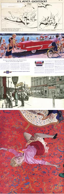
When I first encountered Austin Briggs, it was in collections of his work on the Flash Gordon newspaper comic strip from the mid-20th Century. In that context, my encounters with his work elicited disappointment because I was looking for work by the strip’s creator, Alex Raymond, who I was dazzled by (and remain dazzled by, more on Raymond in a future post). I thought Briggs was “OK”, but few comics artists can stand up to Alex Raymond without being somewhat dimmed in comparison.
It wasn’t until some years later that I discovered some of Briggs’ magazine illustration art, for which he is actually better known than his comics work, and I had that “Woah! Wait a minute!” reaction and reassessed my opinion of Briggs out of Raymond’s shadow.
Briggs had worked as Raymond’s assistant on Flash Gordon, took over for him on another of his strips, Secret Agent Corrigan, and eventually succeeded him on the daily and then the Sunday Flash Gordon strips.
In the mid-1940’s Briggs moved from comics into magazine illustration. This was a time, up through the 1950’s, that was in many ways a sort of second Golden Age of American illustration (or a “Silver Age” if you will), in which artists like Al Parker were taking illustration into a post-photographic style, the representational aspect of illustration was de-emphasized and concept and design came to the fore.
Briggs straddled that transitional period and worked in both a straightforward style, that might be considered part of the Leyendecker/Rockwell tradition (and puts me in mind of Harry Anderson), and a more modern design oriented style, more akin to Al Parker.
My knowledge of illustration from that period is pretty weak, and there are not many resources for Briggs on the web. However what those resources lack in number, one of them makes up for in depth.
Leif Peng, who has become a web champion for many unsung heros of mid-20th Century illustration, has some terrific resources for Austin Briggs, including an extensive Flickr set and blog posts (and here), as well as a shorter sampler set on his site.
In the Flickr set in particular you can get a feeling for the range of Briggs’ style, from his polished renderings of a 1950’s (1956?) Chevrolet, or post-war air travel, to his striking line and color illustrations for The Dollmaker, his wonderfully energetic pen and tone drawings, this steamy scene from Good Housekeeping, and the stunning blend of illustration and design in this illustration for the Saturday Evening Post, shown in the image above, bottom.
Briggs was one of the founding members of the Famous Artists School and was elected to the Society of Illustrators Hall of Fame in 1969.
Categories:
-
Katherine Tyrrell
 There is a fascinatingly fuzzy line, if you’ll excuse the expression, between “drawing” and “painting” when working with mediums like pastel and colored pencil. Both can obviously be used as drawing media, and can also be applied to renderings that have many of the characteristics of paintings.
UK artist Katherine Tyrrell calls them “dry media” and is adept at both, as well as working in pen and ink and pencil. On her site Pastels and Pencils you’ll find galleries of her work arranged into subject categories, from detailed observations of flowers and other plants to still life subjects and varied landscapes.
Landscapes are further broken down into sub-categories. I particularly enjoy her painting/drawings in the Houses and Gardens and Trees and Leaves sections.
I like the range of colors she finds in surfaces that are ostensibly white, whether in the walls of buildings or simple still life subjects like eggs in a bowl or fruit on a white surface. Both pastel and colored pencil are particularly suited to creating “broken color” in which streaks of varied colors mix optically to make an overall tone.
The nature of dry media obviates the need for liquid mediums and thinners, and they lend themselves to sketching and “painting” on location; which fits in well with Tyrrell’s penchant for traveling and recording her travels in colorful sketches. She has a section of her site devoted to Travels with a sketchbook, as well as a more recent (I think) dedicated blog, Travels with a Sketchbook in…. The latter often includes photographs taken in the area she was sketching.
Tyrrell is a prolific blogger, and has several blogs, web sites and site sections devoted both to her own work and to an increasing set of resources for artists. Among these are several Squidoo “lenses”, web pages dedicated to a particular subject, with relevant link to articles, blog posts, books and other resources. Tyrrell’s entries include several that are among the most popular subject lenses on Squidoo, Botanical Art, Pastels, Colored Pencils and general Drawing and Sketching Resources for Artists.
She has so many points of presence on the web that I frankly have a little trouble sorting them out, and I don’t know how she manages to keep track of them all, let alone maintain them. Maintain them she does however, adding constantly to the resources and articles and listing and linking to a multitude of fascinating and useful web destinations.
Tyrrell’s main presence on the web is her primary blog, Making a Mark in which she posts about a wide variety of art related topics, including a weekly account of “Who’s made a mark this week” which is an overview of useful and interesting links to art blogs, articles, and information about all manner of subjects including art business and marketing news, that she’s encountered in her own browsing.
She also has a Making a Mark website which seems to serve mainly as a jumping off point for other blogs, site sections and resources, including a list of general Artist Resources. In addition there is a Who is Making a Mark Squidoo lens that catalogues and links to many of her other reference and resource pages, sites sections and blogs, as well as her gallery sites.
As I have found in my own experiences with teaching and blogging, there is a blurred line between teaching and learning, just as there is between painting and drawing. In addition to her own artistic endeavors, and her exploration of “dry media”, Tyrrell embodies some of the best characteristics of community oriented artists, a desire to learn from others coupled with a willingness to share, and the savvy to use the web to advantage to do both.
Categories:
-
DUSSO (Yanick Dusseault – update)
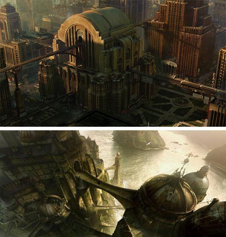
Many of the images that we accept, almost without question, as the backgrounds for scenes in motion pictures, are in part or in total the creation of matte painters.These image can make us believe the action is taking place in a fantastic other world, or in a slightly modified version of this one.
DUSSO is the professional handle of Yanick Dusseault, a matte painter and production artist working in the film and, to a lesser extent, television industries. I wrote a short post on his work back in 2005.
Dusseault has worked for major special effects houses like WETA Digital, where he was Senior Matte Painter for Lord of the Rings the Fellowship of the Ring and Lord of the Rings: The Two Towers.
Since 2003 he has been working with ILM (Lucas Digital), for whom he is a Lead Matte Painter and was responsible for many of the striking background images for Star Wars: Episode III, Revenge of the Sith.
Other film credits include The Island, War of the Worlds, Peter Pan, Pirates of the Caribbean and Terminator III.
His web site includes galleries of his matte painting, production art and personal work. Many of the images in the Matte Painting section include photographs that were the basis of altered backgrounds, along with the finished matte painting.
There is a special gallery for his work on Star Wars: Episode III, in which you can see large images of his wide aspect, sometimes 360° panoramic background paintings for that film.
Dussseault works digitally and the level of detail in his images is striking, as is the mastery with which he creates imaginary landscapes and cityscapes, and imbues them with the realistic feeling of sunlight, dusk or the scattered light of cloudy skies.
I love the luxurious detail he has lavished on the image above, top (I don’t know what film is was for), and the wonderful building that takes its design cues from a 1930’s radio. In looking at the large version in his Production Art section, I was also impressed with the way the sunlight plays across the tops and edges of the building’s form, and the rather daring darkness in which he casts the shadowed areas of the building and the streets and plaza below.
In order to achieve the effect of a projection of physical reality, matte painters must exert precise control over tonal values and subtleties of color, any deviation wide enough to be noticeable can “break the spell” and remind you that you are seeing a mock environment, rather than a believable setting for the story.
Dusseault is at that top level of matte painting artistry that can make you believe the unreal is real, and transport you to other worlds, times and places.
Categories:
-
Michael Koelsch

My previous post about Art Nouveau posters reminded me that there was another era of poster design with very different intent and aesthetics.Contemporary California illustrator Michael Koelsch has an affinity for the wonderful pulp illustrations and B-movie posters from the 1940’s, 50’s and 60’s.
He affectionately applies his study of those styles to modern editorial, book and advertising illustrations, as well as working in a more contemporary style. He also has a cartoon style variation, with nicely exaggerated lines and more freely applied colors, notably used for the Strange Kid Chronicles book series..
In his homages to the pulp and poster illustrators of the past, he even adds touches to make his “posters” look as though they have been folded and creased and perhaps torn at the edges and crinkled at the corners, as though they had recently been pulled from a dusty trunk in the attic.
Beneath the fun touches is an underlying admiration for the command these artists had of the figure and face, and their use of emotionally charged color and value contrasts.
I was unable to find a dedicated web site for Koelsch, but there is a fairly extensive portfolio of his work on the Shannon Associates site (click on the images for enlarged versions in pop-ups).
You can also selection of books he has illustrated on Amazon.
Categories:


Charley’s Picks
Bookshop.org
(Bookshop.org affilliate links; sales benefit independent bookshop owners; I get a small percentage to help support my work on Lines and Colors)

John Singer Sargent: Watercolors


Urban Sketching: Understanding Perspective


Charley’s Picks
Amazon
(Amazon.com affiliate links; sales go to a larger yacht for Jeff Bezos; but I get a small percentage to help support my work on Lines and Colors)
John Singer Sargent: Watercolors
Urban Sketching: Understanding Perspective