
Categories
- 3d CGI
- Amusements
- Animation
- Anime & Manga
- Art Materials
- Art Videos
- Blogroll
- Cartoons
- Color
- Comics
- Concept & Visual Dev.
- Creativity
- Digital Art
- Digital Painting
- Displaying Art on the Web
- Drawing
- Eye Candy for Today
- Gallery and Museum Art
- High-res Art Images
- Illustration
- Motion Graphics & Flash
- Museums
- Online Museums
- Outsider Art
- Painting
- Painting a Day
- Paleo Art
- Pastel, Conté & Chalk
- Pen & Ink
- Prints and Printmaking
- Reviews
- Sc-fi and Fantasy
- Sculpture & Dimensional
- Site Comments
- Sketching
- Storyboards
- Tools and Techniques
- Uncategorized
- Vector Art
- Vision and Optics
- Watercolor and Gouache
- Webcomics
Archives
- November 2025
- October 2025
- September 2025
- August 2025
- July 2025
- June 2025
- May 2025
- January 2025
- December 2024
- November 2024
- October 2024
- September 2024
- August 2024
- June 2024
- April 2024
- March 2024
- February 2024
- January 2024
- December 2023
- November 2023
- October 2023
- September 2023
- August 2023
- July 2023
- May 2023
- April 2023
- March 2023
- February 2023
- January 2023
- December 2022
- November 2022
- September 2022
- August 2022
- July 2022
- June 2022
- May 2022
- April 2022
- March 2022
- February 2022
- January 2022
- December 2021
- November 2021
- October 2021
- September 2021
- August 2021
- July 2021
- June 2021
- May 2021
- April 2021
- March 2021
- February 2021
- January 2021
- December 2020
- November 2020
- October 2020
- September 2020
- August 2020
- July 2020
- June 2020
- May 2020
- April 2020
- March 2020
- February 2020
- January 2020
- December 2019
- November 2019
- October 2019
- September 2019
- August 2019
- July 2019
- June 2019
- May 2019
- April 2019
- March 2019
- February 2019
- January 2019
- December 2018
- November 2018
- October 2018
- September 2018
- August 2018
- July 2018
- June 2018
- May 2018
- April 2018
- March 2018
- February 2018
- January 2018
- December 2017
- November 2017
- October 2017
- September 2017
- August 2017
- July 2017
- June 2017
- May 2017
- April 2017
- March 2017
- February 2017
- January 2017
- December 2016
- November 2016
- October 2016
- September 2016
- August 2016
- July 2016
- June 2016
- May 2016
- April 2016
- March 2016
- February 2016
- January 2016
- December 2015
- November 2015
- October 2015
- September 2015
- August 2015
- July 2015
- June 2015
- May 2015
- April 2015
- March 2015
- February 2015
- January 2015
- December 2014
- November 2014
- October 2014
- September 2014
- August 2014
- July 2014
- June 2014
- May 2014
- April 2014
- March 2014
- February 2014
- January 2014
- December 2013
- November 2013
- October 2013
- September 2013
- August 2013
- July 2013
- June 2013
- May 2013
- April 2013
- March 2013
- February 2013
- January 2013
- December 2012
- November 2012
- October 2012
- September 2012
- August 2012
- July 2012
- June 2012
- May 2012
- April 2012
- March 2012
- February 2012
- January 2012
- December 2011
- November 2011
- October 2011
- September 2011
- August 2011
- July 2011
- June 2011
- May 2011
- April 2011
- March 2011
- February 2011
- January 2011
- December 2010
- November 2010
- October 2010
- September 2010
- August 2010
- July 2010
- June 2010
- May 2010
- April 2010
- March 2010
- February 2010
- January 2010
- December 2009
- November 2009
- October 2009
- September 2009
- August 2009
- July 2009
- June 2009
- May 2009
- April 2009
- March 2009
- February 2009
- January 2009
- December 2008
- November 2008
- October 2008
- September 2008
- August 2008
- July 2008
- June 2008
- May 2008
- April 2008
- March 2008
- February 2008
- January 2008
- December 2007
- November 2007
- October 2007
- September 2007
- August 2007
- July 2007
- June 2007
- May 2007
- April 2007
- March 2007
- February 2007
- January 2007
- December 2006
- November 2006
- October 2006
- September 2006
- August 2006
- July 2006
- June 2006
- May 2006
- April 2006
- March 2006
- February 2006
- January 2006
- December 2005
- November 2005
- October 2005
- September 2005
- August 2005
-
Eye Candy for Today: Francis Hopkinson Smith’s In the Woods

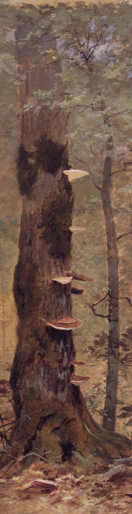
In the Woods, Francis Hopkinson Smith, watercolor and gouache on board, roughly 26 x 16″ ( 67 x 41 cm); in the collection of the Brooklyn Museum.
Smith was an American painter, author and engineer, whose accomplishments included the design and engineering for the base of the Statue of Liberty in New York Harbor.
In this 1877 painting he does an intimate study of two trees, one large, textural and dotted with fungus, the other a sapling with lacy foliage. I love how lightly suggested the background of the forest appears.
In the Woods, Brooklyn Museum
Categories:
-
The Artist’s Guide to Sketching


Most of us, artists or not, have some idea of what sketching is.
Sketching is a term associated with quickly realized, often rough and “unfinished” drawings (or paintings) that are meant to catch the essence of something without any unnecessary frills.
That simplistic explanation, however, doesn’t convey the unexpected effects of a regular sketching practice: a connection with nature and the visual world that can open our eyes and enrich our lives.
People who are not already inclined to sketch or draw may not realize that the experience of connecting to your surroundings through sketching is available to anyone, regardless of a lack of training or experience. In fact, if you can relax and not fret about your current level of skill (or lack thereof), sketching can be one of the most enjoyable ways to learn to draw.
For those who are inclined to explore sketching, or develop and refine their current skills, I would be hard pressed to think of a better guide than The Artist’s Guide to Sketching by James Gurney and Thomas Kinkade.
Those who are familiar with Gurney and Kinkade — and the disparate styles of work for which they are individually best known — might have little reason to connect them. When they were young, however, they were colleagues, roommates and friends.
Kinkade, in his later career, developed a somewhat controversial but highly successful painting style and gallery business model, before he died in 2012.
Gurney went on to a successful career as a writer, illustrator, paleo artist and instructor, noted for his fantastical Dinotopia series, and numerous instructional books and videos, many now considered foundational .(See, in particular, my review of his book Color and Light.)
The two artists, though still early in their careers, had achieved a fairly high level of proficiency, accumulated through hard work and study, and grounded in traditional artistic training and a seemingly unbounded enthusiasm for the practice. They pooled their knowledge and collaborated on the book that became The Artist’s Guide to Sketching.
There is also a fascinating story involved, of the two young artists encountering a friendly and informative hobo, and setting off on a cross country adventure hopping freight trains, sketchbooks in hand.
This book has long been out of print, and is often sought after by followers of both artists. The original was published by Watson-Guptill (and has the wonderful feeling of their classic art instruction books); the new edition is published by Andrews McMeel.
Some of the topics covered include: sketching materials, drawing basics, sketching under various conditions, dealing with spectators and being inconspicuous, how to use linear perspective on location (when you can’t draw vanishing points), sketching people, various ways of capturing motion, studying nature, buildings and man-made objects, and sketching from imagination.
There are any number of sketching books out there, but many of them are themselves “sketchy”, brief, breezy and somewhat unsatisfying. The Artist’s Guide to Sketching feels less like a run of the mill sketching book, and more like one written with the kind of depth and care more often found in a treatise on painting.
The book is in many ways what you would hope for in an instructional art book, but to me there is an element here that goes beyond the ordinary. I don’t think I’ve encountered an instructional book on sketching, drawing or any other aspect of art, that better conveyed the enthusiasm and love of the subject expressed here.
The book is available directly from Gurney’s website for only $30, including free shipping, and can be signed and personalized by Gurney if desired.
Categories:
-
Eye Candy for today: Virgil Finlay illustration for Lovecraft

\
Illustration for H.P. Lovecraft’s At the Mountains of Madness, Virgil Finlay.
The image is sourced from the MonsterBrains blog. It’s part of an extensive article with many more images. Though not currently being updated, MonsterBrains is a treasure trove for lovers of fantasy, science fiction, horror and related illustration and artwork.
American illustrator Virgil Finlay was a master of the ink drawing techniques of hatching, cross-hatching, stipple and scratchboard. He used them separately and, more often, in combination to crate his fantastical illustrations. The techniques gave him a broad range of ways to create tone and texture. Amazing how time-consuming these must have been, given the tight schedules of the pulp science fiction magazines for which he was working.
I’ve written about Finlay’s remarkable illustrations previously in Lines and Colors, so I’ll refer you to the links below for more information and sources of images.
Categories:
-
Eye Candy for Today: early paleo illustration by Henry De la Beche


Duria Antiquior by Henry De la Beche, watercolor. Link is to Wikimedia Commons page from which you can access a larger image.
Very often, scientists have had a secondary role as illustrators, enabling them to visualize the subjects of their investigations.
In this watercolor, early 19th century geologist Henry De la Beche paints his interpretations of fossils, then recently discovered by pioneering paleontologist Mary Anning in the region of Dorset in southwest England.
Though likely somewhat misinterpreted and odd looking by modern scientific standards, these creatures are surely no more bizarre then our more modern approximations of their appearance.
I don’t know the size or location of the original. When I ask Google for a translation of the title, it treats is as a person’s name. Antiquior by itself translates as “more ancient” so I assume that means “prehistoric” Perhaps Duria refers to Dorset; I don’t know.
Duria Antiquior, Wikimedia Commons
Categories:
-
Ferdinand Keller


When I first came across the work of German painter Fredinand Keller, who was active in the late 19th and early 20th centuries, I was immediately struck by the obvious influence of Swiss Symbolist Arnold Böcklin.
Oddly, in what scant biographical information I can find on Keller, there is rarely mention of his overt admiration for Böcklin. The influence is not only glaring for me, but one of Kellers most commonly reproduced paintings is titled Böcklin’s Tomb (images above, top).
Though there are certainly stand out exceptions, the majority of Keller’s paintings that I can find on the internet share that brooding haunted feeling, almost to a surreal extent.
I particularly enjoy the textural qualities of stone in his paintings.
Categories:
-
Eye Candy for Today: Stanistaw Mastowski watercolor landscape


Marsh Landscape by Stanisław Mastowski, watercolor, roughly 6 x 18″ (15 x 46 cm), in the collection of the National Museum in Cracow, Poland.
The link is to the image page on Wikimedia Commons, from which you can access the large version of the image. I recommend it; the crops I’ve shown here don’t give an adequate feeling for the scope of the painting.
In the large version of the image, we can also see the artist has used two pieces of paper put together to accomplish the desired proportion.
In this seemingly simple scene of a flat march landscape, Mastowski has extended the normal range of composition into a immersive panorama, enlivened with contrasting bands of light and dark value, and subtle color shifts pulling us back into the distant row of trees. Notice how simple and direct his shapes are.
The feeling of light on the water is just wonderful.
Marsh Landscape, Wikimedia Commons
Categories:


Relevant Blogs
Art, Painting & Sketch
- Gurney Journey
- Underpaintings
- Art and Influence
- Painting Perceptions
- Oil Painters of America
- Vasari Paint POV
- Flying Fox
- Urban Sketchers
- Bento (Smithsonian)
- Art Inconnu
- The Hidden Place
- Still Life
- Making a Mark
- The Art of the Landscape
- Exploring Color & Creativity
- Art Contrarian
- Artist A Day
- beinArt Surreal Art Collective
- Eye Level
- David Dunlop
- p.i.g.m.e.n.t.i.u.m
- CultureGrrl
- Joaquín Sorolla blog
- Artists in Pastel
“Painting a Day”
- A Painting a Day (Keiser)
- On Painting (Keiser)
- Julian Merrow-Smith
- Karen Jurick
- Jeffrey Hayes
- Carol Marine
- Abbey Ryan
- Daily Paintworks
Other Painting Blogs
- Virtual Gouache Land
- Neil Hollingsworth
- Marc Hanson
- Kevin Menck
- Marc Dalessio
- Larry Seiler
- Stapleton Kearns
- Colin Page
- Roos Schuring
- Hans Versfelt
- Titus Meeuws
- Régis Pettinari
- René Plein Air
- Belinda Del Pesco
- Robin Weiss
- Nathan Fowkes (Land Sketch)
- William Wray
- Frank Serrano
- Stephen Magsig
- Michael Chesley Johnson
- Twice a Week
- Sarah Wimperis
- Rob Adams
- Michael Cole Manley
- The Dirty Palette Club
- Mike Manley’s Draw!
Gallery Art & Illustration mix
Illustration
- Howard Pyle
- 100 Years of Illustration
- BibliOdyssey
- Illustration Art
- Today’s Inspiration
- Illustration Mundo
- Little Chimp Society
- Danny Gregory
- R D (John Martz
- Illustration Friday blog
- Monster Brains
- Illustrators & Illustrations (RU)
- Elwood H. Smith
- DaniDraws.com
- Designers Who Blog
- iSpot Blog
Sci-Fi & Fantasy
Illustration & Comics
Comics & Cartoons
- Comics Beat
- Robot 6
- Newsarama Blog
- Comic Vine
- Comics Alliance
- Forbidden Planet Int.
- Paolo Rivera
- Bolt City
- Flight
- Scott McCloud
- The Comics Journal
- Comixpedia
- Funnybook Babylon
- James Baker
- Middleton’s Sketchbook
- Boneville
- The Hotel Fred
- Paul Rivoche
- Daily Cartoonist
- Mad About Cartoons (William Wray)
- Digital Strips
Illustration & Concept
Animation & Concept
- Cartoon Brew
- Animation Blog
- Cold Hard Flash
- Concept Art World
- The CAB
- FY Concept Art
- Concept Ships
- Concept Robots
- John Nevarez
- Armand Serrano
- Marcos Mateu-Mestre
- all kinds of stuff (Kricfalusi)
- Yacin the faun (Man Arenas)
- Kelsey Mann
- Cre8tivemarks Blog
- Ice-Cream Monster Toon Cafe
- AAU Character & Creature Design
- AAU Animation Notes
- Articles and Texticles
Paleo & Scientific
Tools & Techniques
Other
Lists of Art Blogs
- Top 50 (Visual News)
- Top 100 (Contemporary Art Blogs)
- Top 100 (Art Scene Today)
- Top 100 (Feedspot)
- Top 45 (Creative Boom)
Promoting some friends and clients of my website design business
Art Image Resource Links
Historic Art Images
- Wikimedia Commons: Paintings
- Wikimedia Commons: Drawings
- The Athenaeum
- WikiArt (WikiPaintings)
- Google Art Project: Artists
- Google Art Project: Collections (Museums)
- ArtCyclopedia
- Web Gallery of Art
- Art Renewal Center
- Web Gallery of Impressionism
Auction Consolidation sites
Auction sites
- Sotheby’s
- Bonham’s
- Christies
- Heritage Auctions: Fine Art
- Heritage Auctions: Illustration
- Freeman’s Auctions
- Bukowskis
- Shannon’s
Image Search
Reverse Image Search (search by image)
- Tin Eye
- RevImg
- Google Image Search (camera icon)
- Bing Image Search (camera icon)