
Categories
- 3d CGI
- Amusements
- Animation
- Anime & Manga
- Art Materials
- Art Videos
- Blogroll
- Cartoons
- Color
- Comics
- Concept & Visual Dev.
- Creativity
- Digital Art
- Digital Painting
- Displaying Art on the Web
- Drawing
- Eye Candy for Today
- Gallery and Museum Art
- High-res Art Images
- Illustration
- Motion Graphics & Flash
- Museums
- Online Museums
- Outsider Art
- Painting
- Painting a Day
- Paleo Art
- Pastel, Conté & Chalk
- Pen & Ink
- Prints and Printmaking
- Reviews
- Sc-fi and Fantasy
- Sculpture & Dimensional
- Site Comments
- Sketching
- Storyboards
- Tools and Techniques
- Uncategorized
- Vector Art
- Videos & Podcasts
- Vision and Optics
- Watercolor and Gouache
- Webcomics
Archives
- May 2026
- April 2026
- March 2026
- February 2026
- January 2026
- December 2025
- November 2025
- October 2025
- September 2025
- August 2025
- July 2025
- June 2025
- May 2025
- January 2025
- December 2024
- November 2024
- October 2024
- September 2024
- August 2024
- June 2024
- April 2024
- March 2024
- February 2024
- January 2024
- December 2023
- November 2023
- October 2023
- September 2023
- August 2023
- July 2023
- May 2023
- April 2023
- March 2023
- February 2023
- January 2023
- December 2022
- November 2022
- September 2022
- August 2022
- July 2022
- June 2022
- May 2022
- April 2022
- March 2022
- February 2022
- January 2022
- December 2021
- November 2021
- October 2021
- September 2021
- August 2021
- July 2021
- June 2021
- May 2021
- April 2021
- March 2021
- February 2021
- January 2021
- December 2020
- November 2020
- October 2020
- September 2020
- August 2020
- July 2020
- June 2020
- May 2020
- April 2020
- March 2020
- February 2020
- January 2020
- December 2019
- November 2019
- October 2019
- September 2019
- August 2019
- July 2019
- June 2019
- May 2019
- April 2019
- March 2019
- February 2019
- January 2019
- December 2018
- November 2018
- October 2018
- September 2018
- August 2018
- July 2018
- June 2018
- May 2018
- April 2018
- March 2018
- February 2018
- January 2018
- December 2017
- November 2017
- October 2017
- September 2017
- August 2017
- July 2017
- June 2017
- May 2017
- April 2017
- March 2017
- February 2017
- January 2017
- December 2016
- November 2016
- October 2016
- September 2016
- August 2016
- July 2016
- June 2016
- May 2016
- April 2016
- March 2016
- February 2016
- January 2016
- December 2015
- November 2015
- October 2015
- September 2015
- August 2015
- July 2015
- June 2015
- May 2015
- April 2015
- March 2015
- February 2015
- January 2015
- December 2014
- November 2014
- October 2014
- September 2014
- August 2014
- July 2014
- June 2014
- May 2014
- April 2014
- March 2014
- February 2014
- January 2014
- December 2013
- November 2013
- October 2013
- September 2013
- August 2013
- July 2013
- June 2013
- May 2013
- April 2013
- March 2013
- February 2013
- January 2013
- December 2012
- November 2012
- October 2012
- September 2012
- August 2012
- July 2012
- June 2012
- May 2012
- April 2012
- March 2012
- February 2012
- January 2012
- December 2011
- November 2011
- October 2011
- September 2011
- August 2011
- July 2011
- June 2011
- May 2011
- April 2011
- March 2011
- February 2011
- January 2011
- December 2010
- November 2010
- October 2010
- September 2010
- August 2010
- July 2010
- June 2010
- May 2010
- April 2010
- March 2010
- February 2010
- January 2010
- December 2009
- November 2009
- October 2009
- September 2009
- August 2009
- July 2009
- June 2009
- May 2009
- April 2009
- March 2009
- February 2009
- January 2009
- December 2008
- November 2008
- October 2008
- September 2008
- August 2008
- July 2008
- June 2008
- May 2008
- April 2008
- March 2008
- February 2008
- January 2008
- December 2007
- November 2007
- October 2007
- September 2007
- August 2007
- July 2007
- June 2007
- May 2007
- April 2007
- March 2007
- February 2007
- January 2007
- December 2006
- November 2006
- October 2006
- September 2006
- August 2006
- July 2006
- June 2006
- May 2006
- April 2006
- March 2006
- February 2006
- January 2006
- December 2005
- November 2005
- October 2005
- September 2005
- August 2005
Relevant Blogs
Art, Painting & Sketch
- Gurney Journey
- Underpaintings
- Art and Influence
- Painting Perceptions
- Oil Painters of America
- Vasari Paint POV
- Flying Fox
- Urban Sketchers
- Bento (Smithsonian)
- Art Inconnu
- The Hidden Place
- Still Life
- Making a Mark
- The Art of the Landscape
- Exploring Color & Creativity
- Art Contrarian
- Artist A Day
- beinArt Surreal Art Collective
- Eye Level
- David Dunlop
- p.i.g.m.e.n.t.i.u.m
- CultureGrrl
- Joaquín Sorolla blog
- Artists in Pastel
“Painting a Day”
- A Painting a Day (Keiser)
- On Painting (Keiser)
- Julian Merrow-Smith
- Karen Jurick
- Jeffrey Hayes
- Carol Marine
- Abbey Ryan
- Daily Paintworks
Other Painting Blogs
- Virtual Gouache Land
- Neil Hollingsworth
- Marc Hanson
- Kevin Menck
- Marc Dalessio
- Larry Seiler
- Stapleton Kearns
- Colin Page
- Roos Schuring
- Hans Versfelt
- Titus Meeuws
- Régis Pettinari
- René Plein Air
- Belinda Del Pesco
- Robin Weiss
- Nathan Fowkes (Land Sketch)
- William Wray
- Frank Serrano
- Stephen Magsig
- Michael Chesley Johnson
- Twice a Week
- Sarah Wimperis
- Rob Adams
- Michael Cole Manley
- The Dirty Palette Club
- Mike Manley’s Draw!
Gallery Art & Illustration mix
Illustration
- Howard Pyle
- 100 Years of Illustration
- BibliOdyssey
- Illustration Art
- Today’s Inspiration
- Illustration Mundo
- Little Chimp Society
- Danny Gregory
- R D (John Martz
- Illustration Friday blog
- Monster Brains
- Illustrators & Illustrations (RU)
- Elwood H. Smith
- DaniDraws.com
- Designers Who Blog
- iSpot Blog
Sci-Fi & Fantasy
Illustration & Comics
Comics & Cartoons
- Comics Beat
- Robot 6
- Newsarama Blog
- Comic Vine
- Comics Alliance
- Forbidden Planet Int.
- Paolo Rivera
- Bolt City
- Flight
- Scott McCloud
- The Comics Journal
- Comixpedia
- Funnybook Babylon
- James Baker
- Middleton’s Sketchbook
- Boneville
- The Hotel Fred
- Paul Rivoche
- Daily Cartoonist
- Mad About Cartoons (William Wray)
- Digital Strips
Illustration & Concept
Animation & Concept
- Cartoon Brew
- Animation Blog
- Cold Hard Flash
- Concept Art World
- The CAB
- FY Concept Art
- Concept Ships
- Concept Robots
- John Nevarez
- Armand Serrano
- Marcos Mateu-Mestre
- all kinds of stuff (Kricfalusi)
- Yacin the faun (Man Arenas)
- Kelsey Mann
- Cre8tivemarks Blog
- Ice-Cream Monster Toon Cafe
- AAU Character & Creature Design
- AAU Animation Notes
- Articles and Texticles
Paleo & Scientific
Tools & Techniques
Other
Lists of Art Blogs
Art Image Resource Links
Historic Art Images
- Wikimedia Commons: Paintings
- Wikimedia Commons: Drawings
- The Athenaeum
- WikiArt (WikiPaintings)
- Google Art Project: Artists
- Google Art Project: Collections (Museums)
- ArtCyclopedia
- Web Gallery of Art
- Art Renewal Center
- Web Gallery of Impressionism
Auction Consolidation sites
Auction sites
- Sotheby’s
- Bonham’s
- Christies
- Heritage Auctions: Fine Art
- Heritage Auctions: Illustration
- Freeman’s Auctions
- Bukowskis
- Shannon’s
Image Search
Reverse Image Search (search by image)
- Tin Eye
- RevImg
- Google Image Search (camera icon)
- Bing Image Search (camera icon)
Promoting some friends and some clients of my website design business
- Twin Willows T’ai Chi studio in Wilmington DE. Taiji classes with Bryan Davis.
- Ray Hayward, Inspired Teacher of T’ai Chi ( Taiji ) in Minneapolis, Founder of Mindful Motion Tai Chi Academy
- OldHead Tattoo studio and Art Gallery in Wilmington DE. Tattoos and paintings by Bruce Gulick
- Sharon Domenico Art, pet portrait oil paintings
- Platinum Paperhanging, wallpaper hanging, Main Line and Philadelphia, PA
- Lisa Stone Design, interior designer, Main Line and Philadelphia, PA
- Studio12KPT, original art, prints, calendars and other custom printed items by Van Sickle & Rolleri
-
Master Artists’ Palettes

Writing in her blog on the Telegraph in an article titled Why preserve Van Gogh’s palette?, Lucy Davies points to some of the considerations for artists learning from the palettes of the masters, both in choice and arrangement of colors.Those fascinated by the techniques of the great painters would benefit from understanding their palettes. Even when learning from contemporary artists, the palette plays a greater part than is often acknowledged.
I always find instructional videos exasperating when they ignore color mixing and act as though the brush is always magically loaded with the the proper color, with little thought or work on the part of the artist. This seems to apply to a great majority of the instructional videos one encounters on the web, though those that are professionally prepared often address color mixing more thoroughly (as in the instructional videos of Richard Schmid).
There has, of course, been an effort to preserve the palettes of master artists when possible, even if only as historic artifacts. Davies’ article shows several, including those of Eugene Delacroix (image above, top), Gustave Moreau, Auguste Renoir, Georges Seurat and Edgar Degas (image above, bottom) .
If you look around, you can find other photos of famous artists’ palettes, as well as much verbal discussion and listing of the colors used by individual artists, including those of Delacroix, Whistler, Vermeer, Degas and Monet. Often these discussions will make a point of mentioning modern equivalents to fugitive colors used in the originals.
In general, the range of colors available to artists has increased over time, with significant additions in the 18th, 19th and 20th centuries as the range of materials increased and artificial pigments became widely explored, importantly reducing reliance on pigments that are not lightfast.
Davies also links to selections by art supplier Natural Pigments which sells sets of colors matched to Titian’s Palette and Goya’s Palette.
The article is peppered with links and is a nice jumping off point on the subject, including links to discussion of color theory, another aspect of artists’ practice that has changed over time (see my post on the History of the Color Wheel).
[Via Neatorama]
Categories:
-
Alexander Creswell

Alexander Creswell is a well known English watercolorist, carrying on in the traditions of the country in which watercolor first reached acceptance as a major art medium.He is noted for his association with British royalty, painting the Windsor Castle Royal Collection fire and restoration in a book Out of the Ashes and traveling as official artist with the Prince of Wales.
The images on his website are found in the sales gallery. He places emphasis on his watercolors and drawings of sailing yachts, showing them first in the gallery. Though these are beautifully done, they are not subjects I find personally compelling.
I much prefer his urban landscapes of Venice, Florence and other places in Italy, as well as France, the UK and locations in the Middle East. These owe much to John Singer Sargent’s luminous watercolors of Venice, but of course this is a Good Thing.
You can skip ahead to the landscapes by going to page 10 in the numbered navigation at the bottom of the pages. It reverts to sailing subjects again after a while, and picks back up in Italy around 21 and again around 27 (this may change as new images are added to the galleries).
You can also see a smaller selection of his urban landscapes on the Portland Gallery site.
His watercolors capture that wonderful brilliant sunlight associated with the Mediterranean basin, whether in the intricate buildings of Venice or the rough stones of ancient ruins in Oman, rich with shimmering colors and light-filled compositions.
Unfortunately, most of the images on his site are watermarked, though not so egregiously as to make them unsuitable for viewing.
Creswell also does large scale banners and hangings of his watercolor images that are used like murals. The gallery for these is accessed through an alternate entry from his site’s home page.
Categories:
-
Animation Backgrounds
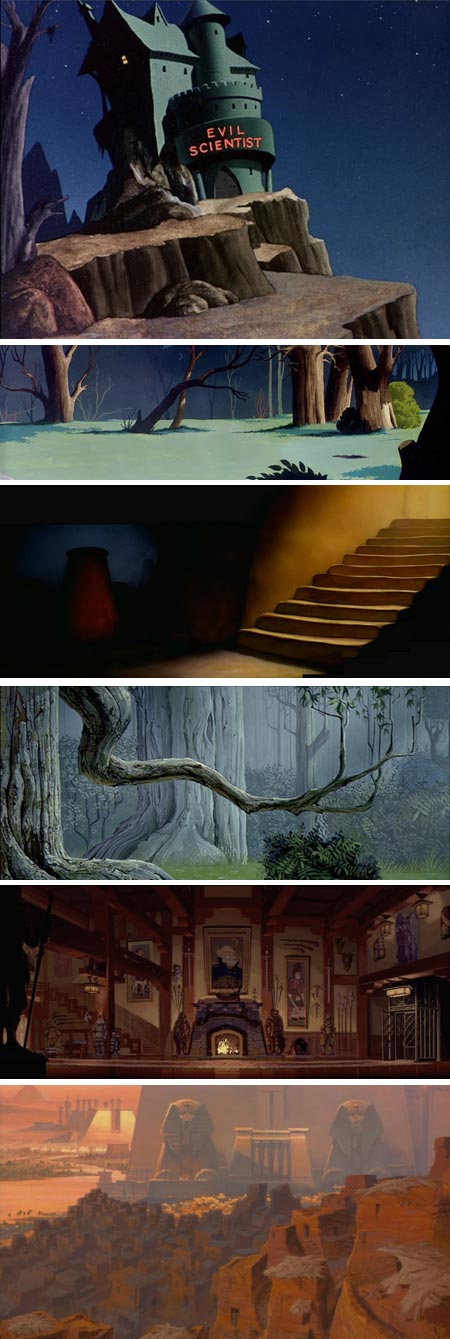
Quite often, the best part of an animated short or feature is the backgrounds.Since background images are onscreen for extended periods, and don’t need to change rapidly as do the characters, they are frequently the subject of intense design work and beautiful rendering.
For a demonstration of how wonderful animation backgrounds can be when isolated from the movie and empty of characters, visit the Animation Backgrounds blog.
Maintained by Rob Richards, this is a treasure trove of stills from animated shorts and full length features that showcase the background artist’s work.
There are lots of terrific scenes from animated gems, like the great Warner Brothers classic Hare-Raising Hare (top two images), the beautifully subtle lighting of the Sorcerer’s Apprentice sequence from Disney’s Fantasia (above, third down) and the enchanted forest from Disney’s Sleeping Beauty (4th down, designed by Eyvind Earle).
There are also backgrounds from more recent films, like Disney’s Atlantis, The Lost Empire (5th down) and Dreamworks’ The Prince of Egypt (bottom).
You can browse through the pages using the “Older Posts” link at the bottom of each page, or jump to individual topics using the links in the right side bar.
Either way, there is enough here to classify as a delightful time sink, and Richards seems to be adding posts on a regular basis.
[Via Cartoon Brew]
Categories:
-
François Baranger
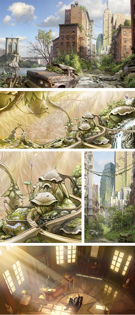
François Baranger is a French concept artist, illustrator and comics artist. He has done concept design for both gaming and film, and his film credits include Harry Potter and the Deathly Hallows, parts I and II, and Prince of Persia, though you won’t yet find art from those films in his online portfolio, as they are still under a non-disclosure agreement.You will find art for Arthur and the Invisibles, a new film by Luc Besson, director of The Fifth Element, and Ek-Tor an interesting but cancelled project, also by Besson.
There are also galleries of Baranger’s work for other film and game projects, as well as fantasy and junior books illustration, and comics.
Baranger uses both digital and traditional media, along with some 3-D rendering. His concept work appears largely like digital painting, in which he maintains a nice feeling of a painterly surface and often utilizes limited, almost monochromatic palettes to great effect.
The pieces of his that I enjoy most are concept illustrations for environments, both interior and exterior, in which he can be very evocative of place.
[Via io9]
Categories:
-
Timur Akhriev

Russian born Timur Akhriev attended middle school and high school at the St. Petersburg Art School. In 1991 he left the politically unstable region near his hometown of Ingushetia, near the border with Chechnya, to join his father, painter Daud Akhriev, in the United States.He now resides in Chattanooga, Tennessee, where he attended the University of Chattanooga Fine Arts program. From 2005 to 2007 he studied in Florence, Italy, for a year and a half at the Florence Academy of Art. You will find a number of scenes of Florence, particularly some wonderful depictions of the characteristic Florentine tile roofs, among the pieces in the galleries where he is represented.
Akhriev has a direct, painterly approach, honed by plein air painting, with a rich variety of textures, vibrant colors and a range of tonal effects. Many of his works are evocations of late afternoon or early evening light, in which foreground objects are often in shadow, and background elements illuminated by shafts of slanting sunlight.
He also frequently depicts landscapes on overcast or foggy days, with subtle color ranges and muted value contrasts.
Categories:
-
John Anster Fitzgerald
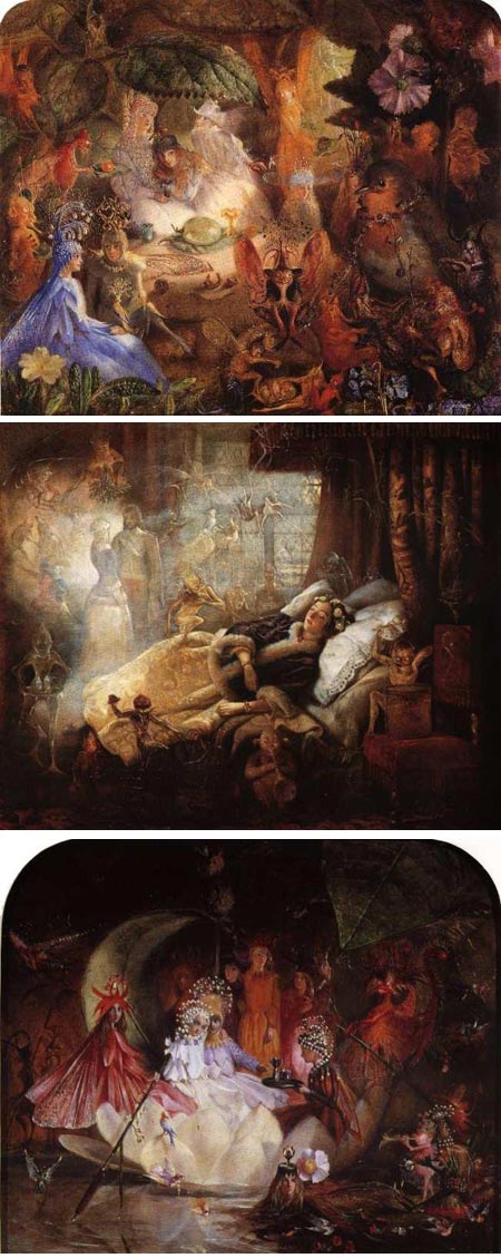
Despite his lack of formal art training, Victorian painter John Anster Fitzgerald became accepted by the Royal Academy, exhibited at the British Institution and established himself as well-known portrait painter and illustrator.However, “Fairy Fitzgerald” earned his nickname as a “fairy painter”, a popular niche genre in Victorian painting that focused on the depictions of fairies and their otherworldly kin, and the sometimes escapist and imaginative settings evoked by the literature from which the ideas are derived.
One might imagine that this was in some ways the Victorian equivalent of the appeal of contemporary fantasy art, which has revisited related themes with regularity.
Fitzgerald’s take on the subject, though whimsical in some respects, was often darker than that of his contemporaries, with influences from Bosch and Brueghel raising their twisted little heads amidst the flowers and moss of the forest floor.
In some ways, this is an appropriate undercurrent for the subject, given the often dark and grisly nature of many of the original fairy tales and folklore that were the basis for the motifs.
Fitzgerald utilized brilliant color, strong value contrasts and richly textural detail to give his work a visual appeal much suited to his subjects and the appetites of his audience.
His work experienced a revival in the 20th Century, to the point where forgers were discovered to be creating numerous fake Fitzgeralds.
Categories:


Charley’s Picks
Bookshop.org
(Bookshop.org affilliate links; sales benefit independent bookshop owners; I get a small percentage to help support my work on Lines and Colors)

John Singer Sargent: Watercolors


Urban Sketching: Understanding Perspective


Charley’s Picks
Amazon
(Amazon.com affiliate links; sales go to a larger yacht for Jeff Bezos; but I get a small percentage to help support my work on Lines and Colors)
John Singer Sargent: Watercolors
Urban Sketching: Understanding Perspective