
Categories
- 3d CGI
- Amusements
- Animation
- Anime & Manga
- Art Materials
- Art Videos
- Blogroll
- Cartoons
- Color
- Comics
- Concept & Visual Dev.
- Creativity
- Digital Art
- Digital Painting
- Displaying Art on the Web
- Drawing
- Eye Candy for Today
- Gallery and Museum Art
- High-res Art Images
- Illustration
- Motion Graphics & Flash
- Museums
- Online Museums
- Outsider Art
- Painting
- Painting a Day
- Paleo Art
- Pastel, Conté & Chalk
- Pen & Ink
- Prints and Printmaking
- Reviews
- Sc-fi and Fantasy
- Sculpture & Dimensional
- Site Comments
- Sketching
- Storyboards
- Tools and Techniques
- Uncategorized
- Vector Art
- Videos & Podcasts
- Vision and Optics
- Watercolor and Gouache
- Webcomics
Archives
- May 2026
- April 2026
- March 2026
- February 2026
- January 2026
- December 2025
- November 2025
- October 2025
- September 2025
- August 2025
- July 2025
- June 2025
- May 2025
- January 2025
- December 2024
- November 2024
- October 2024
- September 2024
- August 2024
- June 2024
- April 2024
- March 2024
- February 2024
- January 2024
- December 2023
- November 2023
- October 2023
- September 2023
- August 2023
- July 2023
- May 2023
- April 2023
- March 2023
- February 2023
- January 2023
- December 2022
- November 2022
- September 2022
- August 2022
- July 2022
- June 2022
- May 2022
- April 2022
- March 2022
- February 2022
- January 2022
- December 2021
- November 2021
- October 2021
- September 2021
- August 2021
- July 2021
- June 2021
- May 2021
- April 2021
- March 2021
- February 2021
- January 2021
- December 2020
- November 2020
- October 2020
- September 2020
- August 2020
- July 2020
- June 2020
- May 2020
- April 2020
- March 2020
- February 2020
- January 2020
- December 2019
- November 2019
- October 2019
- September 2019
- August 2019
- July 2019
- June 2019
- May 2019
- April 2019
- March 2019
- February 2019
- January 2019
- December 2018
- November 2018
- October 2018
- September 2018
- August 2018
- July 2018
- June 2018
- May 2018
- April 2018
- March 2018
- February 2018
- January 2018
- December 2017
- November 2017
- October 2017
- September 2017
- August 2017
- July 2017
- June 2017
- May 2017
- April 2017
- March 2017
- February 2017
- January 2017
- December 2016
- November 2016
- October 2016
- September 2016
- August 2016
- July 2016
- June 2016
- May 2016
- April 2016
- March 2016
- February 2016
- January 2016
- December 2015
- November 2015
- October 2015
- September 2015
- August 2015
- July 2015
- June 2015
- May 2015
- April 2015
- March 2015
- February 2015
- January 2015
- December 2014
- November 2014
- October 2014
- September 2014
- August 2014
- July 2014
- June 2014
- May 2014
- April 2014
- March 2014
- February 2014
- January 2014
- December 2013
- November 2013
- October 2013
- September 2013
- August 2013
- July 2013
- June 2013
- May 2013
- April 2013
- March 2013
- February 2013
- January 2013
- December 2012
- November 2012
- October 2012
- September 2012
- August 2012
- July 2012
- June 2012
- May 2012
- April 2012
- March 2012
- February 2012
- January 2012
- December 2011
- November 2011
- October 2011
- September 2011
- August 2011
- July 2011
- June 2011
- May 2011
- April 2011
- March 2011
- February 2011
- January 2011
- December 2010
- November 2010
- October 2010
- September 2010
- August 2010
- July 2010
- June 2010
- May 2010
- April 2010
- March 2010
- February 2010
- January 2010
- December 2009
- November 2009
- October 2009
- September 2009
- August 2009
- July 2009
- June 2009
- May 2009
- April 2009
- March 2009
- February 2009
- January 2009
- December 2008
- November 2008
- October 2008
- September 2008
- August 2008
- July 2008
- June 2008
- May 2008
- April 2008
- March 2008
- February 2008
- January 2008
- December 2007
- November 2007
- October 2007
- September 2007
- August 2007
- July 2007
- June 2007
- May 2007
- April 2007
- March 2007
- February 2007
- January 2007
- December 2006
- November 2006
- October 2006
- September 2006
- August 2006
- July 2006
- June 2006
- May 2006
- April 2006
- March 2006
- February 2006
- January 2006
- December 2005
- November 2005
- October 2005
- September 2005
- August 2005
Relevant Blogs
Art, Painting & Sketch
- Gurney Journey
- Underpaintings
- Art and Influence
- Painting Perceptions
- Oil Painters of America
- Vasari Paint POV
- Flying Fox
- Urban Sketchers
- Bento (Smithsonian)
- Art Inconnu
- The Hidden Place
- Still Life
- Making a Mark
- The Art of the Landscape
- Exploring Color & Creativity
- Art Contrarian
- Artist A Day
- beinArt Surreal Art Collective
- Eye Level
- David Dunlop
- p.i.g.m.e.n.t.i.u.m
- CultureGrrl
- Joaquín Sorolla blog
- Artists in Pastel
“Painting a Day”
- A Painting a Day (Keiser)
- On Painting (Keiser)
- Julian Merrow-Smith
- Karen Jurick
- Jeffrey Hayes
- Carol Marine
- Abbey Ryan
- Daily Paintworks
Other Painting Blogs
- Virtual Gouache Land
- Neil Hollingsworth
- Marc Hanson
- Kevin Menck
- Marc Dalessio
- Larry Seiler
- Stapleton Kearns
- Colin Page
- Roos Schuring
- Hans Versfelt
- Titus Meeuws
- Régis Pettinari
- René Plein Air
- Belinda Del Pesco
- Robin Weiss
- Nathan Fowkes (Land Sketch)
- William Wray
- Frank Serrano
- Stephen Magsig
- Michael Chesley Johnson
- Twice a Week
- Sarah Wimperis
- Rob Adams
- Michael Cole Manley
- The Dirty Palette Club
- Mike Manley’s Draw!
Gallery Art & Illustration mix
Illustration
- Howard Pyle
- 100 Years of Illustration
- BibliOdyssey
- Illustration Art
- Today’s Inspiration
- Illustration Mundo
- Little Chimp Society
- Danny Gregory
- R D (John Martz
- Illustration Friday blog
- Monster Brains
- Illustrators & Illustrations (RU)
- Elwood H. Smith
- DaniDraws.com
- Designers Who Blog
- iSpot Blog
Sci-Fi & Fantasy
Illustration & Comics
Comics & Cartoons
- Comics Beat
- Robot 6
- Newsarama Blog
- Comic Vine
- Comics Alliance
- Forbidden Planet Int.
- Paolo Rivera
- Bolt City
- Flight
- Scott McCloud
- The Comics Journal
- Comixpedia
- Funnybook Babylon
- James Baker
- Middleton’s Sketchbook
- Boneville
- The Hotel Fred
- Paul Rivoche
- Daily Cartoonist
- Mad About Cartoons (William Wray)
- Digital Strips
Illustration & Concept
Animation & Concept
- Cartoon Brew
- Animation Blog
- Cold Hard Flash
- Concept Art World
- The CAB
- FY Concept Art
- Concept Ships
- Concept Robots
- John Nevarez
- Armand Serrano
- Marcos Mateu-Mestre
- all kinds of stuff (Kricfalusi)
- Yacin the faun (Man Arenas)
- Kelsey Mann
- Cre8tivemarks Blog
- Ice-Cream Monster Toon Cafe
- AAU Character & Creature Design
- AAU Animation Notes
- Articles and Texticles
Paleo & Scientific
Tools & Techniques
Other
Lists of Art Blogs
Art Image Resource Links
Historic Art Images
- Wikimedia Commons: Paintings
- Wikimedia Commons: Drawings
- The Athenaeum
- WikiArt (WikiPaintings)
- Google Art Project: Artists
- Google Art Project: Collections (Museums)
- ArtCyclopedia
- Web Gallery of Art
- Art Renewal Center
- Web Gallery of Impressionism
Auction Consolidation sites
Auction sites
- Sotheby’s
- Bonham’s
- Christies
- Heritage Auctions: Fine Art
- Heritage Auctions: Illustration
- Freeman’s Auctions
- Bukowskis
- Shannon’s
Image Search
Reverse Image Search (search by image)
- Tin Eye
- RevImg
- Google Image Search (camera icon)
- Bing Image Search (camera icon)
Promoting some friends and some clients of my website design business
- Twin Willows T’ai Chi studio in Wilmington DE. Taiji classes with Bryan Davis.
- Ray Hayward, Inspired Teacher of T’ai Chi ( Taiji ) in Minneapolis, Founder of Mindful Motion Tai Chi Academy
- OldHead Tattoo studio and Art Gallery in Wilmington DE. Tattoos and paintings by Bruce Gulick
- Sharon Domenico Art, pet portrait oil paintings
- Platinum Paperhanging, wallpaper hanging, Main Line and Philadelphia, PA
- Lisa Stone Design, interior designer, Main Line and Philadelphia, PA
- Studio12KPT, original art, prints, calendars and other custom printed items by Van Sickle & Rolleri
-
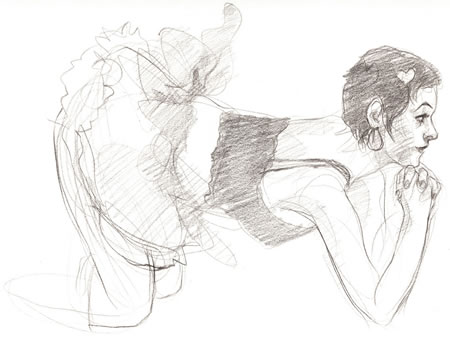
Dr. Sketchy’s Anti Art Show
I’ve long maintained that both men and women have only one erogenous zone. (Got your attention, didn’t I?)I’ll further maintain that this single erogenous zone is located in the same physical location for both sexes, directly between… the ears. Nothing is sexy unless you think it’s sexy.
Which is why life drawing sessions are set up to maintain a professional or academic atmosphere and the sexual element is almost non-existant. This is generally a Good Thing, but it’s nice to know that there are exceptions to every rule.
Dr. Sketchy’s Anti Art School is a series of drawing sessions that looks to put the “arrrrrr” back into art classes, with racy costumes, provocative poses and a generally anti-academic atmosphere.
For more background, see my previous post on Dr. Sketchy’s.
At the time, I mentioned that submissions were being taken for the first Dr. Sketchy’s Anti Art Show.
Dr. Sketchy’s founder, illustrator Molly Crabapple, has written to say that the show is now assembled and will hang at Rapture, 200 Avenue A in NYC, from November 21 to December 20, 2007. The opening party will be November 27th.
There is a gallery online for those of us not in the area, that features work by some of the participants, as well as photographs from the sessions.
Note: The Dr. Sketchy’s site should be considered delightfully NSFW and politically incorrect.
(Image above: Jim Hoover)
Categories:
-
Abigail Ryan

Abbey Ryan is a Philadelphia based painter, designer and illustrator who studied here in Pennsylvania as well as in New York and Massachusetts. She has a portfolio site, in which she showcases her illustration and design work, as well as her gallery art.The latter is non-figurative, with arrangements of soft edged shapes that give impressions of movement and suggestions of morphing forms. They are arranged with a designer’s eye for the importance of negative space and rendered with a muted palette and delicate applications of texture.
Given my predilection for representational work, I find more interest in her painting blog, Ryan Studio, in which she has recently taken on the “painting-a-day” discipline, and paints crisp, painterly oils of simple subjects like fruit, vegetables, candy and other immediately available subjects that are often the chosen subjects for daily painters.
Ryan posts large images of her small paintings that are actually large enough to get a good feeling for the surface of the painting and the way the paint is applied, something I wish more artists would do when presenting their work online, both for the benefit of those just looking, and for the benefit of those looking to buy, who must make a judgement about the appeal of a painting from an online image.
Ryan’s strengths show when she arranges slightly more complex compositions and tackles textured and patterned surfaces in addition to her primary subject.
Ryan appears to be fairly young, and her willingness to take on the painting-a-day regimen, and her confidence in working with more complex elements within it, make me think it will be interesting to watch the course of her development as a painter.
[Link and suggestion courtesy of Jason Waskey]
Categories:
-
Art of War: Eyewitness U.S. Combat Art From the Revolution through the Twentieth Century
 For the benefit of those in other parts of the world, I’ll mention that today is Veterans Day here in the U.S., a day set aside to remember and honor those who have served in the military over the history of the country; though particular attention is given, as it should be, to those involved in conflicts within the memory of living persons.
This past Memorial Day (a U.S. holiday in observance of those who have died in military service) I wrote a post about the PBS series They Drew Fire: Combat Artists of World War II, in which I mentioned this often neglected function of art.
Art as reportage in general, and combat art in particular, gets looked down on by the art establishment as irrelevant, and often “not art”; but then the art establishment has always attempted to elevate itself at the cost of narrowing its vision. The fact is that visual arts like drawing and painting are very different from photography, and reporting a time, place or event through that process gives insight into life and human experience unlike any other. If the purpose of art is to communicate, here is that communication at its most raw and direct.
Artists have been painting their visions of war for centuries, but combat artists have a unique role, that of soldier and artist, participant and reporter, subject and observer. They are able to give us the reality of war in a way that carries the undeniable weight of personal experience.
Art of War: Eyewitness U.S. Combat Art From the Revolution through the Twentieth Century is a collection that puts together artwork depicting war at the level of those who experienced it, both from artists in combat and outside observers who were adapt at capturing some of the same reality.
The book, by combat artist Avery Chenoweth, includes art by a few names you will recognize, John Singer Sargent and Edouard Manet among them, but is mostly of names known only to those familiar with combat art. Some were artist/correspondents for magazines, who also went to the front lines, but most are actual combat artists, soldiers who did double duty as artists.
This is not the “military art” of glorified war machines, sleek warplanes, dramatic fighting ships and cool tanks (though I have to admit here that the 12 year boy in the back of my brain still has a fascination with such things), nor is it an anti-war treatise; it is work by artists who tried to portray war as they saw it, directly, immediately and without filter or apology.
I think it would be hard for those with direct experience of combat to glorify war, leave that to the video game companies and movie makers; combat artists need to convey their experience as honestly as possible.
I haven’t read Art of War, I’m basing my comments on the book on information from those who have, as well as articles and reviews, particularly an excellent article on combat art from the Milwaukee Journal Sentinel, that includes information about Marine Staff Sargent Michael Fay, a contemporary combat artist assigned in Iraq.
I think it’s important that collections like this exist. Here is a role for art that isn’t emphasized and discussed enough. Not only is it a visceral example of the power of art to communicate; but it serves as a reminder, even for those of us who are vehemently anti-war, that the sacrifices of those who have served their nation by putting on a uniform and stepping into the inferno deserve our recognition.
[Images above: “Gassed” by John Singer Sargent (WW I), “Mortarburst” (field sketch) and “The Price” (final painting) by Tom Lea (WW II), “Trip flares” by Michael Fay (Iraq II)]
Categories:
-
Sara Tyson

Canadian illustrator and designer Sara Tyson makes the commonplace monumental, abstracting the forms of her subjects into multi-planed geometric solids and rendering them with colors and textures that give them the weight of planets.She appears to take her influences form 20th century modernism, particularly Picasso’s brand of cubism, Greek sculpture and decorative arts, and 12th and 13th Century European art, as it emerged from the geometric patterns of decoration into figurative realism.
Into this interesting stew she stirs her conceptual editorial approach and produces distinctive illustrations for clients like The Washington Post, CA magazine, The Globe and Mail, The Progressive and others.
Tyson is skilled as a graphic designer as well as an illustrator and that skill is evident in the strength of her compositions, in which the shapes read as strongly as design elements as they do as representational forms.
Categories:
-
M Collier

I know very little about this artist, not even whether “M Collier” is male or female. What little biographical information there is simply mentions that the artist was born in San Francisco, earned a degree in Art History from California State University, has “lived in and traveled to many places”, and now resides in Southern California.M Collier is represented online by a painting blog called Paintings from the Point, as well as by inclusion in the DailyPainters.com site and membership in the Daily Painters Guild. I mentioned Collier briefly in my post last spring about Painting a Day Blogs (Round 6), The Daily Painters Guild. I don’t see any sign of a dedicated portfolio site or mention of gallery representation.
Collier’s paintings appear refined and accomplished, with an emphasis on chiaroscuro and the effects of light as it plays across the the gleaming faces of curved china dishes, around reflective silver surfaces, and through transparent vessels holding water, and usually, flowers.
There is a fascination with light, and the color of flowers and vegetables, but in particular I think, with the way these smooth curved objects sashay the light beams around their forms in graceful arcs and ellipses. If you look at the shapes of the areas of color, soft, muted blue-grays and delicate slivers of highlights, you’ll find those curves and arcs repeated again and again. This is particularly evident in the repeated theme of stacks of teacups, in which your eye follows a swinging line back and forth as it travels down the canvas.
Most of these works are painted in oil on board at a small scale, often 6×6″ (15x15cm), and take on the (I think) difficult challenge of handling square compositions. They are predominantly of small, intimate subjects, treated with a clear realist approach. The compositions usually employ a dark, very neutral background, against which brightest highlights in the foreground objects sometimes go to pure white. Within that range, color is carefully controlled and at times seems almost like an accent; with the red of cherries or the greens and reds of vegetables appearing almost like an extra element on top of a monochromatic final.
When viewing the works in Collier’s blog, there is no “Previous Posts” navigation, so use the dated links in the right hand column. You can also find a thumbnail-gallery display on the DailyPainters.com site that makes it easier to get an overview.
Categories:
-
Forget the film, watch the titles (update)
 If you’re a fan of pop songs, particularly from the 1960’s when the three minute pop song was perhaps at its peak as a musical form, you’re familiar with the concept of a “golden intro”, that delicious first 20 or 30 seconds of instrumental music before the vocals start, that was often a thing of beauty in itself, above an beyond what may or may not have been a great song in total.
For examples, listen to the exquisite first 20 seconds of the Beach Boys’ California Girls or that wonderful descending pattern that forms the intro to the Kinks’ beautiful Waterloo Sunset; ahhhh – fractional moments of musical bliss. (The existence of these little bits of beauty was, of course, accentuated in being defaced by disk jockeys of the time, who made an infuriating, deranged, grafitti-like art form out of talking over entire song intros and ending their blabbering only microseconds before the song’s vocals started, but I digress…).
Similar to the wonderful hidden jewels of song intros, the introductions, or opening credits, of films have long been a repository for gems that often stand out from their surrounding work; which again, may or may not be up to the quality of the intro.
In recent years the opening credits, once considered a form of entertainment in themselves, also prominently in the 1960’s, have been de-emphasized, their place having been taken by the closing credits. In either case, the titles of films are a sort of hidden and underappreciated art form, rarely in the spotlight but as worthy of attention as animated shorts.
In another example of Why I Love the Internet, there is a site out there devoted to just that concept. Forget the film, watch the titles is part of the Submarine Channel, a portal for independent film. When I first wrote about it back in February, the project was just getting off the ground and the selection was small. On checking back, I’ve found the selection expanded, well worth a return visit.
Much to my delight, it now includes the great closing titles to Lemony Snicket’s A Series of Unfortunate Events (sequence at left), one of my favorite pieces of short animation in recent years (and a prime example of the credits being considerably better than the movie). These were designed and directed by Jamie Caliri, who was the director of the terrific animated ad called “Dragon” for United Airlines last year (see my post on Jamie Caliri).
Like that sequence, the Lemony Snicket titles were done essentially with painted paper cut-outs, artfully drawn, arranged and animated. In the case of the Snicket sequence the lead animators and layout artists were Todd Hemker and Benjamin Goldman. Forget the film is good about not only giving you the credits for the credit sequences, but links to further information.
The collection is not growing rapidly, but you can sign up to receive their newsletter and know when the next title sequence gem has been added to the showcase.
Categories:


Charley’s Picks
Bookshop.org
(Bookshop.org affilliate links; sales benefit independent bookshop owners; I get a small percentage to help support my work on Lines and Colors)

John Singer Sargent: Watercolors


Urban Sketching: Understanding Perspective


Charley’s Picks
Amazon
(Amazon.com affiliate links; sales go to a larger yacht for Jeff Bezos; but I get a small percentage to help support my work on Lines and Colors)
John Singer Sargent: Watercolors
Urban Sketching: Understanding Perspective