
Categories
- 3d CGI
- Amusements
- Animation
- Anime & Manga
- Art Materials
- Art Videos
- Blogroll
- Cartoons
- Color
- Comics
- Concept & Visual Dev.
- Creativity
- Digital Art
- Digital Painting
- Displaying Art on the Web
- Drawing
- Eye Candy for Today
- Gallery and Museum Art
- High-res Art Images
- Illustration
- Motion Graphics & Flash
- Museums
- Online Museums
- Outsider Art
- Painting
- Painting a Day
- Paleo Art
- Pastel, Conté & Chalk
- Pen & Ink
- Prints and Printmaking
- Reviews
- Sc-fi and Fantasy
- Sculpture & Dimensional
- Site Comments
- Sketching
- Storyboards
- Tools and Techniques
- Uncategorized
- Vector Art
- Videos & Podcasts
- Vision and Optics
- Watercolor and Gouache
- Webcomics
Archives
- May 2026
- April 2026
- March 2026
- February 2026
- January 2026
- December 2025
- November 2025
- October 2025
- September 2025
- August 2025
- July 2025
- June 2025
- May 2025
- January 2025
- December 2024
- November 2024
- October 2024
- September 2024
- August 2024
- June 2024
- April 2024
- March 2024
- February 2024
- January 2024
- December 2023
- November 2023
- October 2023
- September 2023
- August 2023
- July 2023
- May 2023
- April 2023
- March 2023
- February 2023
- January 2023
- December 2022
- November 2022
- September 2022
- August 2022
- July 2022
- June 2022
- May 2022
- April 2022
- March 2022
- February 2022
- January 2022
- December 2021
- November 2021
- October 2021
- September 2021
- August 2021
- July 2021
- June 2021
- May 2021
- April 2021
- March 2021
- February 2021
- January 2021
- December 2020
- November 2020
- October 2020
- September 2020
- August 2020
- July 2020
- June 2020
- May 2020
- April 2020
- March 2020
- February 2020
- January 2020
- December 2019
- November 2019
- October 2019
- September 2019
- August 2019
- July 2019
- June 2019
- May 2019
- April 2019
- March 2019
- February 2019
- January 2019
- December 2018
- November 2018
- October 2018
- September 2018
- August 2018
- July 2018
- June 2018
- May 2018
- April 2018
- March 2018
- February 2018
- January 2018
- December 2017
- November 2017
- October 2017
- September 2017
- August 2017
- July 2017
- June 2017
- May 2017
- April 2017
- March 2017
- February 2017
- January 2017
- December 2016
- November 2016
- October 2016
- September 2016
- August 2016
- July 2016
- June 2016
- May 2016
- April 2016
- March 2016
- February 2016
- January 2016
- December 2015
- November 2015
- October 2015
- September 2015
- August 2015
- July 2015
- June 2015
- May 2015
- April 2015
- March 2015
- February 2015
- January 2015
- December 2014
- November 2014
- October 2014
- September 2014
- August 2014
- July 2014
- June 2014
- May 2014
- April 2014
- March 2014
- February 2014
- January 2014
- December 2013
- November 2013
- October 2013
- September 2013
- August 2013
- July 2013
- June 2013
- May 2013
- April 2013
- March 2013
- February 2013
- January 2013
- December 2012
- November 2012
- October 2012
- September 2012
- August 2012
- July 2012
- June 2012
- May 2012
- April 2012
- March 2012
- February 2012
- January 2012
- December 2011
- November 2011
- October 2011
- September 2011
- August 2011
- July 2011
- June 2011
- May 2011
- April 2011
- March 2011
- February 2011
- January 2011
- December 2010
- November 2010
- October 2010
- September 2010
- August 2010
- July 2010
- June 2010
- May 2010
- April 2010
- March 2010
- February 2010
- January 2010
- December 2009
- November 2009
- October 2009
- September 2009
- August 2009
- July 2009
- June 2009
- May 2009
- April 2009
- March 2009
- February 2009
- January 2009
- December 2008
- November 2008
- October 2008
- September 2008
- August 2008
- July 2008
- June 2008
- May 2008
- April 2008
- March 2008
- February 2008
- January 2008
- December 2007
- November 2007
- October 2007
- September 2007
- August 2007
- July 2007
- June 2007
- May 2007
- April 2007
- March 2007
- February 2007
- January 2007
- December 2006
- November 2006
- October 2006
- September 2006
- August 2006
- July 2006
- June 2006
- May 2006
- April 2006
- March 2006
- February 2006
- January 2006
- December 2005
- November 2005
- October 2005
- September 2005
- August 2005
Relevant Blogs
Art, Painting & Sketch
- Gurney Journey
- Underpaintings
- Art and Influence
- Painting Perceptions
- Oil Painters of America
- Vasari Paint POV
- Flying Fox
- Urban Sketchers
- Bento (Smithsonian)
- Art Inconnu
- The Hidden Place
- Still Life
- Making a Mark
- The Art of the Landscape
- Exploring Color & Creativity
- Art Contrarian
- Artist A Day
- beinArt Surreal Art Collective
- Eye Level
- David Dunlop
- p.i.g.m.e.n.t.i.u.m
- CultureGrrl
- Joaquín Sorolla blog
- Artists in Pastel
“Painting a Day”
- A Painting a Day (Keiser)
- On Painting (Keiser)
- Julian Merrow-Smith
- Karen Jurick
- Jeffrey Hayes
- Carol Marine
- Abbey Ryan
- Daily Paintworks
Other Painting Blogs
- Virtual Gouache Land
- Neil Hollingsworth
- Marc Hanson
- Kevin Menck
- Marc Dalessio
- Larry Seiler
- Stapleton Kearns
- Colin Page
- Roos Schuring
- Hans Versfelt
- Titus Meeuws
- Régis Pettinari
- René Plein Air
- Belinda Del Pesco
- Robin Weiss
- Nathan Fowkes (Land Sketch)
- William Wray
- Frank Serrano
- Stephen Magsig
- Michael Chesley Johnson
- Twice a Week
- Sarah Wimperis
- Rob Adams
- Michael Cole Manley
- The Dirty Palette Club
- Mike Manley’s Draw!
Gallery Art & Illustration mix
Illustration
- Howard Pyle
- 100 Years of Illustration
- BibliOdyssey
- Illustration Art
- Today’s Inspiration
- Illustration Mundo
- Little Chimp Society
- Danny Gregory
- R D (John Martz
- Illustration Friday blog
- Monster Brains
- Illustrators & Illustrations (RU)
- Elwood H. Smith
- DaniDraws.com
- Designers Who Blog
- iSpot Blog
Sci-Fi & Fantasy
Illustration & Comics
Comics & Cartoons
- Comics Beat
- Robot 6
- Newsarama Blog
- Comic Vine
- Comics Alliance
- Forbidden Planet Int.
- Paolo Rivera
- Bolt City
- Flight
- Scott McCloud
- The Comics Journal
- Comixpedia
- Funnybook Babylon
- James Baker
- Middleton’s Sketchbook
- Boneville
- The Hotel Fred
- Paul Rivoche
- Daily Cartoonist
- Mad About Cartoons (William Wray)
- Digital Strips
Illustration & Concept
Animation & Concept
- Cartoon Brew
- Animation Blog
- Cold Hard Flash
- Concept Art World
- The CAB
- FY Concept Art
- Concept Ships
- Concept Robots
- John Nevarez
- Armand Serrano
- Marcos Mateu-Mestre
- all kinds of stuff (Kricfalusi)
- Yacin the faun (Man Arenas)
- Kelsey Mann
- Cre8tivemarks Blog
- Ice-Cream Monster Toon Cafe
- AAU Character & Creature Design
- AAU Animation Notes
- Articles and Texticles
Paleo & Scientific
Tools & Techniques
Other
Lists of Art Blogs
Art Image Resource Links
Historic Art Images
- Wikimedia Commons: Paintings
- Wikimedia Commons: Drawings
- The Athenaeum
- WikiArt (WikiPaintings)
- Google Art Project: Artists
- Google Art Project: Collections (Museums)
- ArtCyclopedia
- Web Gallery of Art
- Art Renewal Center
- Web Gallery of Impressionism
Auction Consolidation sites
Auction sites
- Sotheby’s
- Bonham’s
- Christies
- Heritage Auctions: Fine Art
- Heritage Auctions: Illustration
- Freeman’s Auctions
- Bukowskis
- Shannon’s
Image Search
Reverse Image Search (search by image)
- Tin Eye
- RevImg
- Google Image Search (camera icon)
- Bing Image Search (camera icon)
Promoting some friends and some clients of my website design business
- Twin Willows T’ai Chi studio in Wilmington DE. Taiji classes with Bryan Davis.
- Ray Hayward, Inspired Teacher of T’ai Chi ( Taiji ) in Minneapolis, Founder of Mindful Motion Tai Chi Academy
- OldHead Tattoo studio and Art Gallery in Wilmington DE. Tattoos and paintings by Bruce Gulick
- Sharon Domenico Art, pet portrait oil paintings
- Platinum Paperhanging, wallpaper hanging, Main Line and Philadelphia, PA
- Lisa Stone Design, interior designer, Main Line and Philadelphia, PA
- Studio12KPT, original art, prints, calendars and other custom printed items by Van Sickle & Rolleri
-
Julian Merrow-Smith

You will often hear people say that artists, in particular the Impressionists and post-Impressionists like van Gogh and Gauguin, found the quality of the light particularly appealing in Provence, that area in the south of France that was the first province established by the Romans outside of Italy.I have to say that I was skeptical of this until I visited the region around Arles a few years ago and experienced it for myself. There really is something extraordinary about the light there and the effect it has on the appearance of color in the area’s beautiful landscape, and I can easily understand why artists find the region particularly appealing.
Julian Merrow-Smith is an English painter in Provence. (Sounds like it should be a Sting song, doesn’t it?) He paints in a direct, Impressionist influenced style that is spare on details and rich in color and light.
His deceptively simple compositions are wonderful expressions of how much can be suggested with a minimum of brush strokes. (The image above is actually one of his more elaborate paintings, I just happen to really like it.) He pulls short of flattening his compositions into planes like Cezanne, who is obviously an influence, and leaves enough suggestion of detail to keep them vibrantly three-dimensional; creating in his landscapes scenes that are at once inviting to walk into and yet obviously paint on a surface.
He paints the countryside in and around his adopted home of Crillon le Brave, a small village in the hill country in the south of France, with an eye to the extraordinary in the ordinary. He has recurring theme that I particularly enjoy of compositions that find rich contrasts in the shadows of trees laying across roads or paths in the warm light of the Provence sun.
Merrow-Smith also paints still life and portraits, but as much as I like his other work, particularly his small scale still lifes, it is the Provence landscapes that I enjoy the most.
His portraits have a rough-hewn appearance, as if the paint were applied like a sculptor adding clay with his thumb. His still lifes range from very simple compositions of a few objects to the more formal large scale paintings that were commissioned by Cunard to hang in the Britannia Restaurant aboard the Queen Mary 2.
In a practice that goes back almost as far as, and I think is independent of, Duane Keiser’s “Painting a Day” project, Merrow-Smith has been posting his small postcard-sized paintings on his “Postcard from Provence” blog. Although not strictly daily, he has kept pretty close to that, and, more importantly, kept a high-level of quality and consistency.
Like Keiser and the growing number of “painting a day” adherents who are following in their footsteps, Merrow-Smith puts his small paintings up for sale on the blog as he creates them. Unlike Keiser, (and much to my amazement) he has not allowed demand to raise his price much and still offers his small works at $120. He sends out notice of new paintings to a mailing list of subscribers where they are, not surprisingly, snapped up within minutes of being posted. He also sometimes photographs the works and makes them available as limited edition prints.
The paintings on the Postcard from Provence site can be viewed by category, so you can contemplate his serene still lifes and intimate flower studies, relax by the Mediterranean or talk a walk through the sunlit fields of Provence.
Categories:
-
Moira Hahn

Moira Hahn was born in Boston and moved west, both physically and artistically, until west met east. She moved to California at one point to continue her education, studied animation as an addition to her BFA and, after working in animation and illustration for time, studied Japanese art in Hawaii and Japan for several years.Her enthusiasm for Asian art extends to Persian, Tibetan, indian and Chinese art, but it is Japanese woodblock prints that most seem to inform her current gallery paintings, particularly Ukiyo-e (“pictures of the floating world”) with their colorful depictions of city life, entertainment and pleasurable pursuits.
Hahn’s work brings together the formal compositions, colors, dress, architecture and decorative elements of those prints with a very modern juxtaposition of elements. In most of the current images in her online gallery you’ll find paintings that almost look as if they could be traditional woodblock prints, except that the houses, rooms and landscapes are populated with animals, anthropomorphically dressed in the stylized and elaborately patterned kimonos and robes of traditional Japanese society at the time of the Ukiyo-e prints.
I don’t know enough about these prints, or others of the time (see my posts on Hokusai, Yoshida and Hasui) to know how accurate any of these representations are, but I do know that Hahn’s work is often laced with liberal doses of humor. Just the images of birds and cats in formal dress can be funny, but they’re made more so by the fact they the animals themselves, particularly the cats, are rendered with the kind of stylistic exaggerations usually assigned to images of tigers and lions.
You’ll also find pop culture references, like Astro Boy and Godzilla, popping up in her images (and in her titles, the image above is titled “A Three Hour Tour”). There are also humorous stories suggested in the relationships and situations portrayed in the images.
Hahn’s online gallery is arranged by time period, so you can follow back from the present (or forward from the 80’s) and watch her work progress through several phases and degrees of influence from various Asian arts.
Hahn also has a blog called sink hole on which she discusses art, exhibitions, travels and anything else that crosses her mind.
Link via recogedor.
Categories:
-
John Uibel
 The term “concept art” is most often associated with movies and games, where the look and feel of characters and environments have to be established before they can be realized in costuming, sets and special effects. In fact, it’s even more important in the planning stages, when the effectiveness of a look is being judged in making choices about visual direction that will achieve the best effect for the story.
In a similar way, creators of entertainment theme parks and resorts need to visualize and assess the intended look of environments for their physical spaces, with much the same intent, the amusement and visual entertainment of their patrons. So it’s not surprising that theme park creators also employ concept artists to help them craft their particular form of entertainment.
John Uibel is a concept artist an designer who has done work for films and television, but specializes in design concept illustrations for theme parks and resorts. His quickly realized color sketches seem to be somewhere between movie concept illustrations and architectural renderings. They are colorful, often very simple, and concentrate on the atmosphere created in addition to the physical characteristics of the proposed environment or structure.
His site is in blog format and he often posts his most recent images and discusses work in progress, at times with multiple versions of the images. He works primarily digitally in Photoshop and sometimes gets specific about technique in his descriptions.
Uibel is the co-author of a new book on Photoshop techniques, Introductory Adobe Photoshop CS2 BASICS: Adobe Photoshop CS2 BASICS along with Karl Barksdale, Cheryl Beck Morse and Bryan Morse.
Uibel’s portfolio includes work from several projects, including film and TV work, story boards, matte paintings, drawings and sketches as well as the more rendered concept illustrations.
I like the tagline for his site: “Not for the feigned of art”.
Categories:
-
Greg Newbold

It’s easy to assume that illustrators in the U.S. live near the centers of of publishing, like New York, Chicago and Los Angeles. While that may be true for a high percentage, the modern era of instant communication, web site portfolios, FedEx and FTP delivery of digital image files makes it practical for illustrators to live almost anywhere and still be part of the illustration mainstream (at least once they are established).Greg Newbold is an illustrator living in Salt Lake City, Utah and his work feels like it has strong roots in the midwestern character of the nation. His gently undulating landscapes carry echoes of Thomas Hart Benton and other great painters of the heartland. His boldly delineated figures can seem almost monolithic in their strength of contrast and modeling, as if descended from the hearty strain of pioneers who pushed west in the days of expansion. His palette seems strong in earth tones, clay reds and harvest orange.
He does wander far afield in his subject matter, however, illustrating fantasy or science fiction topics, scientific subjects, food, mystery novels or even opera posters.
Newbold has won numerous awards from The Society of Illustrators, The American Institute of Graphic Arts, Communication Arts, Spectrum and others. His clients include Simon & Schuster, Random House, Harper Collins, and Sony Pictures. He has also illustrated children’s books like The Touch of the Master’s Hand by Myra Brooks Welch and Winter Lullaby and Spring Song by Barbara Seuling.
Categories:
-
Edmund Tarbell (revisited)
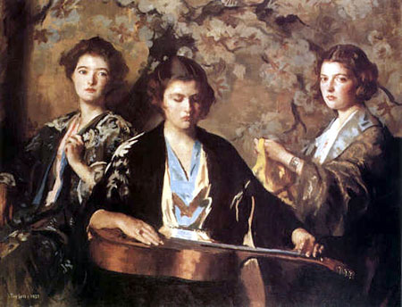
 Painters throughout history have used family members as models, although usually in the service of a composition where they were painted to represent historical, literary or allegorical subjects. In the late 19th Century that changed as many painters, particularly the Impressionists and artists who were influenced by them, began to paint their immediate relatives in compositions meant to capture the immediacy of contemporary life.
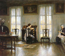
Edmund Charles Tarbell, who is one of the most important of the painters classified as “American Impressionists”, was an enthusiastic participant in this approach. He often populated his canvasses, whether his sun-drenched plein air scenes or his magically serene interiors, with images of his wife, his wife’s sisters, his children and his grandchildren (image at top, My Three Granddaughters, 1937).
In addition to studying at the Boston Museum School, where he would eventually become an influential instructor, Tarbell studied in Paris at the Académie Julian. While in Paris he became exposed to both the revolutionary ideas of the French Impressionists and the great masters of classical art in the Louvre, and he represents one of the most fascinating points at which those two streams of artistic thought converge.
One of the nice things about writing a blog like lines and colors is that I never know when someone will write an email or post a comment about a piece I wrote some time ago. I wrote a post on Tarbell back in May of this year, in which I posted an image of Tarbell’s painting Mother and Mary, showing the artist’s wife and one of his daughters in his home in New Hampshire (left, above).
I was delighted to recently receive an email about the post from Louisa Severance, whose stepmother is one of Edmund Tarbell’s granddaughters. With her kind permission I’ve reprinted it here:
I am here with my stepmother Tarbell, who is Edmund Tarbell’s grandaughter. The painting on your blog page is Tarbell’s aunt at the desk, the artist’s daughter, [and] her grandmother, the artist’s wife. The living room looks just like this. One of the things that I think enhances the light is the reflection of the sunlight off the Piscataqua river which flows about 200 feet from the back of the house in Newcastle, New Hampshire. There was a wonderful exhibit in Nashua, NH several years ago which contained about 50% of his paintings. Check out the catalogue, the paintings are wonderful. Perhaps that is the same exhibit you are referring to.
The reason I am writing you is because I wanted to show “Tarbie” what was on the internet about her grandfather. She was astounded and thought he would be very pleased. I was interested to see he was referrenced in a blog and had to have a look. Tarbie appears in several paintings and is every bit as lovely now as she was beautiful then.
Somehow, the idea of one of Edmund Tarbell’s granddaughters checking out mention of her grandfather’s work in the web in 2006 strikes me as wonderfully cool.
The exhibit mentioned is the one I list in my previous post. There is a description of the exhibit here, along with a brief bio of Tarbell. The catalog of the exhibition, Impressionism Transformed: The Paintings of Edmund C. Tarbell, by Susan Strickler, Linda J. Docherty and Erica E. Hirshler is, as Louisa points out, a beautiful volume and makes a good introduction to the artist’s work. Another nice book is Edmund C. Tarbell: Poet of Domesticity by Laurene Buckley, You will also find Tarbell mentioned prominently in books about “The Ten American Painters”, the group of American Impressionists of which he was a founding member (see my post on Childe Hassam).
For those of you who are not familiar with Edmund Tarbell, I listed some sites and resources for Tarbell’s work on my previous post and I’ve rounded up more for this one. One of them, the Artcyclopedia page, lists museums in which you can see some of Tarbell’s works first hand, which I highly recommend if you get the chance.
And for those artists who are reading this, look around you. Perhaps the people in your immediate family have the potential to be among your best subjects, as they were for Edmund Tarbell.
Categories:
-
Brian Despain
 I just love robots. Big, little, advanced, retro, shiny, dinged, menacing, friendly or simply wacky, ‘bots leave lots of room for artists to play with forms, textures and wild ideas.
Brian Despain paints great bots. His are of the dingy and dinged variety, and he excels at giving his metallic surfaces that battered and oxidized look that lets you know his bots have been around. He also paints highly rendered, whimsical and sometimes dark illustrations of other subjects, but it’s the robots that shine (or not, depending on how dingy he has rendered their aging metal).
Despain is a concept artist and illustrator who has done work for a number of companies in the gaming card realm, including Wizards of the Coast and TSR. He is currently working as a concept artist, designer, modeler and illustrator for the gaming company Snowblind Studios.
Unfortunately, his site doesn’t seem to have been updated for some time, but he occasionally shows up on some of the GC art sites, which makes me assume that he works primarily digitally. His site doesn’t include much about technique.
You can find Despain’s work in some of the Spectrum collections of contemporary fantastic art (including Spectrum 11 and Spectrum 12) as well as collections for gaming enthusiasts like Monstrous Compendium Annual, Vol. 4 (Advanced Dungeons & Dragons Accessory, No. 2173) and Book of the Righteous (d20 System) (Arcana).
Addendum: Brian has written to say that there may be a major site overhaul in the works in the near future, so stay tuned! He was also kind enough to supply me with a higher-res image from which I’ve pulled some larger details of his rendering of the aged metallic surfaces.
Categories:


Charley’s Picks
Bookshop.org
(Bookshop.org affilliate links; sales benefit independent bookshop owners; I get a small percentage to help support my work on Lines and Colors)

John Singer Sargent: Watercolors


Urban Sketching: Understanding Perspective


Charley’s Picks
Amazon
(Amazon.com affiliate links; sales go to a larger yacht for Jeff Bezos; but I get a small percentage to help support my work on Lines and Colors)
John Singer Sargent: Watercolors
Urban Sketching: Understanding Perspective