
Categories
- 3d CGI
- Amusements
- Animation
- Anime & Manga
- Art Materials
- Art Videos
- Blogroll
- Cartoons
- Color
- Comics
- Concept & Visual Dev.
- Creativity
- Digital Art
- Digital Painting
- Displaying Art on the Web
- Drawing
- Eye Candy for Today
- Gallery and Museum Art
- High-res Art Images
- Illustration
- Motion Graphics & Flash
- Museums
- Online Museums
- Outsider Art
- Painting
- Painting a Day
- Paleo Art
- Pastel, Conté & Chalk
- Pen & Ink
- Prints and Printmaking
- Reviews
- Sc-fi and Fantasy
- Sculpture & Dimensional
- Site Comments
- Sketching
- Storyboards
- Tools and Techniques
- Uncategorized
- Vector Art
- Videos & Podcasts
- Vision and Optics
- Watercolor and Gouache
- Webcomics
Archives
- May 2026
- April 2026
- March 2026
- February 2026
- January 2026
- December 2025
- November 2025
- October 2025
- September 2025
- August 2025
- July 2025
- June 2025
- May 2025
- January 2025
- December 2024
- November 2024
- October 2024
- September 2024
- August 2024
- June 2024
- April 2024
- March 2024
- February 2024
- January 2024
- December 2023
- November 2023
- October 2023
- September 2023
- August 2023
- July 2023
- May 2023
- April 2023
- March 2023
- February 2023
- January 2023
- December 2022
- November 2022
- September 2022
- August 2022
- July 2022
- June 2022
- May 2022
- April 2022
- March 2022
- February 2022
- January 2022
- December 2021
- November 2021
- October 2021
- September 2021
- August 2021
- July 2021
- June 2021
- May 2021
- April 2021
- March 2021
- February 2021
- January 2021
- December 2020
- November 2020
- October 2020
- September 2020
- August 2020
- July 2020
- June 2020
- May 2020
- April 2020
- March 2020
- February 2020
- January 2020
- December 2019
- November 2019
- October 2019
- September 2019
- August 2019
- July 2019
- June 2019
- May 2019
- April 2019
- March 2019
- February 2019
- January 2019
- December 2018
- November 2018
- October 2018
- September 2018
- August 2018
- July 2018
- June 2018
- May 2018
- April 2018
- March 2018
- February 2018
- January 2018
- December 2017
- November 2017
- October 2017
- September 2017
- August 2017
- July 2017
- June 2017
- May 2017
- April 2017
- March 2017
- February 2017
- January 2017
- December 2016
- November 2016
- October 2016
- September 2016
- August 2016
- July 2016
- June 2016
- May 2016
- April 2016
- March 2016
- February 2016
- January 2016
- December 2015
- November 2015
- October 2015
- September 2015
- August 2015
- July 2015
- June 2015
- May 2015
- April 2015
- March 2015
- February 2015
- January 2015
- December 2014
- November 2014
- October 2014
- September 2014
- August 2014
- July 2014
- June 2014
- May 2014
- April 2014
- March 2014
- February 2014
- January 2014
- December 2013
- November 2013
- October 2013
- September 2013
- August 2013
- July 2013
- June 2013
- May 2013
- April 2013
- March 2013
- February 2013
- January 2013
- December 2012
- November 2012
- October 2012
- September 2012
- August 2012
- July 2012
- June 2012
- May 2012
- April 2012
- March 2012
- February 2012
- January 2012
- December 2011
- November 2011
- October 2011
- September 2011
- August 2011
- July 2011
- June 2011
- May 2011
- April 2011
- March 2011
- February 2011
- January 2011
- December 2010
- November 2010
- October 2010
- September 2010
- August 2010
- July 2010
- June 2010
- May 2010
- April 2010
- March 2010
- February 2010
- January 2010
- December 2009
- November 2009
- October 2009
- September 2009
- August 2009
- July 2009
- June 2009
- May 2009
- April 2009
- March 2009
- February 2009
- January 2009
- December 2008
- November 2008
- October 2008
- September 2008
- August 2008
- July 2008
- June 2008
- May 2008
- April 2008
- March 2008
- February 2008
- January 2008
- December 2007
- November 2007
- October 2007
- September 2007
- August 2007
- July 2007
- June 2007
- May 2007
- April 2007
- March 2007
- February 2007
- January 2007
- December 2006
- November 2006
- October 2006
- September 2006
- August 2006
- July 2006
- June 2006
- May 2006
- April 2006
- March 2006
- February 2006
- January 2006
- December 2005
- November 2005
- October 2005
- September 2005
- August 2005
Relevant Blogs
Art, Painting & Sketch
- Gurney Journey
- Underpaintings
- Art and Influence
- Painting Perceptions
- Oil Painters of America
- Vasari Paint POV
- Flying Fox
- Urban Sketchers
- Bento (Smithsonian)
- Art Inconnu
- The Hidden Place
- Still Life
- Making a Mark
- The Art of the Landscape
- Exploring Color & Creativity
- Art Contrarian
- Artist A Day
- beinArt Surreal Art Collective
- Eye Level
- David Dunlop
- p.i.g.m.e.n.t.i.u.m
- CultureGrrl
- Joaquín Sorolla blog
- Artists in Pastel
“Painting a Day”
- A Painting a Day (Keiser)
- On Painting (Keiser)
- Julian Merrow-Smith
- Karen Jurick
- Jeffrey Hayes
- Carol Marine
- Abbey Ryan
- Daily Paintworks
Other Painting Blogs
- Virtual Gouache Land
- Neil Hollingsworth
- Marc Hanson
- Kevin Menck
- Marc Dalessio
- Larry Seiler
- Stapleton Kearns
- Colin Page
- Roos Schuring
- Hans Versfelt
- Titus Meeuws
- Régis Pettinari
- René Plein Air
- Belinda Del Pesco
- Robin Weiss
- Nathan Fowkes (Land Sketch)
- William Wray
- Frank Serrano
- Stephen Magsig
- Michael Chesley Johnson
- Twice a Week
- Sarah Wimperis
- Rob Adams
- Michael Cole Manley
- The Dirty Palette Club
- Mike Manley’s Draw!
Gallery Art & Illustration mix
Illustration
- Howard Pyle
- 100 Years of Illustration
- BibliOdyssey
- Illustration Art
- Today’s Inspiration
- Illustration Mundo
- Little Chimp Society
- Danny Gregory
- R D (John Martz
- Illustration Friday blog
- Monster Brains
- Illustrators & Illustrations (RU)
- Elwood H. Smith
- DaniDraws.com
- Designers Who Blog
- iSpot Blog
Sci-Fi & Fantasy
Illustration & Comics
Comics & Cartoons
- Comics Beat
- Robot 6
- Newsarama Blog
- Comic Vine
- Comics Alliance
- Forbidden Planet Int.
- Paolo Rivera
- Bolt City
- Flight
- Scott McCloud
- The Comics Journal
- Comixpedia
- Funnybook Babylon
- James Baker
- Middleton’s Sketchbook
- Boneville
- The Hotel Fred
- Paul Rivoche
- Daily Cartoonist
- Mad About Cartoons (William Wray)
- Digital Strips
Illustration & Concept
Animation & Concept
- Cartoon Brew
- Animation Blog
- Cold Hard Flash
- Concept Art World
- The CAB
- FY Concept Art
- Concept Ships
- Concept Robots
- John Nevarez
- Armand Serrano
- Marcos Mateu-Mestre
- all kinds of stuff (Kricfalusi)
- Yacin the faun (Man Arenas)
- Kelsey Mann
- Cre8tivemarks Blog
- Ice-Cream Monster Toon Cafe
- AAU Character & Creature Design
- AAU Animation Notes
- Articles and Texticles
Paleo & Scientific
Tools & Techniques
Other
Lists of Art Blogs
Art Image Resource Links
Historic Art Images
- Wikimedia Commons: Paintings
- Wikimedia Commons: Drawings
- The Athenaeum
- WikiArt (WikiPaintings)
- Google Art Project: Artists
- Google Art Project: Collections (Museums)
- ArtCyclopedia
- Web Gallery of Art
- Art Renewal Center
- Web Gallery of Impressionism
Auction Consolidation sites
Auction sites
- Sotheby’s
- Bonham’s
- Christies
- Heritage Auctions: Fine Art
- Heritage Auctions: Illustration
- Freeman’s Auctions
- Bukowskis
- Shannon’s
Image Search
Reverse Image Search (search by image)
- Tin Eye
- RevImg
- Google Image Search (camera icon)
- Bing Image Search (camera icon)
Promoting some friends and some clients of my website design business
- Twin Willows T’ai Chi studio in Wilmington DE. Taiji classes with Bryan Davis.
- Ray Hayward, Inspired Teacher of T’ai Chi ( Taiji ) in Minneapolis, Founder of Mindful Motion Tai Chi Academy
- OldHead Tattoo studio and Art Gallery in Wilmington DE. Tattoos and paintings by Bruce Gulick
- Sharon Domenico Art, pet portrait oil paintings
- Platinum Paperhanging, wallpaper hanging, Main Line and Philadelphia, PA
- Lisa Stone Design, interior designer, Main Line and Philadelphia, PA
- Studio12KPT, original art, prints, calendars and other custom printed items by Van Sickle & Rolleri
-
Gamma Ray Studios

One of the fascinating things about concept art is the tension between restraint and imagination. On one hand, concept art is restrained by the set demands of the project, usually a movie or high end game for which specific scenes, settings, costumes, props and other elements must be designed. Within those restrictions, however, the goal is to be as imaginative as possible, all in search of the dazzling images and settings in the finished product that will help bring jaded audiences into the the theaters or game stores in search of a new visual high.The best concept artists manage to be very imaginative in spite of the “creativity on demand” nature of their field, and occasionally step outside the restrictions to do personal work, like the pieces above from veteran concept artists James Clyne (left) and Feng Zhu (right).
I profiled James Clyne last September, and Feng Zhu in October. Both are in the top echelon of movie and gaming concept art and art direction. I just recently learned that they partnered last fall to form a conceptual design studio called Gamma Ray Studios.
Their combined histories have left them with an impressive client list, and a wonderfully imaginative body of work, some of which can be seen in the Gamma Ray Studios Gallery [Note: not anymore, see update below]. The amount of images there is limited, but both artists still maintain their individual portfolio sites, with more extensive galleries, information and tutorials. In addition, Feng Zhu has a new venture and website called SketchGirls.
In both cases, a walk through their galleries will show you something about high end concept art. The “restraint” aspect of the project requirements won’t be visible, but the “imagination” aspect certainly will.
Update: Gamma Ray Studios is no more, and the domain has been grabbed up by spammers. I’ve left the article in place but removed links to the domain. See the individual sites of James Clyne and Feng Zhu, below. – Charley 5/31/09
Categories:
-
Campaigntoons
 By now we’re all acculturated to being sold things by way of animated cartoons.
They start us early, dazzling our just-out-of-babyhood eyes with bouncing, sparkling bowls of chocolate-frosted, sugar-coated imitation food-like substances that are “part of this nutritious breakfast”, and move on to toys and games and even later to cars, insurance and everything else.
With their bright colors, simplified forms and magical moving drawings, animated cartoons are just so gosh darned appealing.
Get ready for a new wave of being sold by way of cartoon animation, this time being sold a political choice.
Most of you are probably familiar with the Jib-Jab cartoons, a series of modestly amusing and not particularly well done animated web cartoons that lampooned political figures. The key thing about them is that they became amazingly popular across the web by word of mouth (or, more accurately, word of email), a phenomenon that has become marked by a buzzword dear to the hearts of marketers, “viral marketing”.
The idea behind viral marketing is that, instead of spending millions to buy a few seconds of air time to try to shove your message down the throats of a resistant and TiVo-armed populace, you spend much less on an advertising vehicle that is clever and appealing enough for people to willingly spread across the internet themselves, via email, blogs, web site links, etc.
You and I are both participating in this process at the moment.
I’m telling you about, and providing a link to, an animated cartoon that is intentional viral marketing for a political campaign.
I find it interesting enough to pass along, partly because it’s well-done and partly because it represents the tip of a trend that will grow to be overwhelmingly obvious in coming months and years.
The ad is part of the govenor’s race in Nevada, where candidate Jim Gibson is using the cartoon to accuse his opponent Dina Titus of taking money from Enron without acknowledging its disposition. To do this he enlisted the services of the web animation studio Slamtoons, which has changed its name to Campaigntoons, to create an animated viral marketing ad that portrays Titus as a Jedi being corrupted by the dark side of the force, in the form a $2000 contribution from The Emperor (who one assumes is Kenneth lay in a hooded cloak).
The cartoon is actually nicely done, with nicely stylized characters, good backgrounds and good use of simple color and shading. The animation is minimal, of course, as in almost all web cartoons, but it’s effectively used.
I think we’ll see a lot more from this group (the cartoon also acts as viral marketing for them), and from many other web-based animators of varying degrees of ability, as the election approaches and the campaign funds start to flow. So pull up a bowl of chocolate-frosted, sugar-coated imitation food-like substance and enjoy the show.
Link via Wired.
Categories:
-
Karen Hollingsworth

Academic art students have a long tradition of starting their training drawing simple-but complex subjects like drapery (often a bed sheet arranged over an object like a chair) or paper bags that have been folded or crumpled and then unfolded. These are easy to come by subjects that both sit still and have lots of shapes and variations in tone to challenge the young artist’s eye and hand.From there the ernest young art students would move to cast drawing, using plaster casts of classical sculpture as a subject, and finally move to drawing the figure from life, rarely looking back at the earlier training subjects they have “graduated” from.
Atlanta based artist Karen Hollingsworth takes these humble subjects of sheets and paper bags and raises them to high forms of interior painting and still life.
Her paintings of interiors with sheet covered chairs, usually arranged in front of windows that are spilling light over them and behind them, making the sheets glowingly translucent, are luminous wonderlands of light and shadow. Her paintings of paper shopping bags, which I just love, are feats of transmogrification. In her hands, the humble paper objects come alive as if flowers of a mythical bag tree.
Her oils of unmade beds, their sheets rippled with valleys and crests of light and shadow rendered with subtle variations in color, are landscapes more than interiors, and her still life paintings of fruit and vegetables (occasionally arranged with drapery and, yes, paper bags) are remarkable excursions into light and dark, which seem to chase each other around the forms.
And, as if this weren’t enough, Hollingsworth is an accomplished portrait artist. Her portrait paintings are beautiful and marvelously done, but my one thought is how wonderful it would be if she brought to them more of that same sensibility of light cascading over forms that she lavishes on her other subjects (a very difficult challenge, I know, but wow).
Hollingsworth is married to artist Neil Hollingsworth, also a wonderful painter, who is sure to be the topic of a future post.
Now, if you’ll excuse me, I’m going to go get my sketchbook and draw some paper bags.
Link courtesy of Karin Jurick.
Categories:
-
tokyoplastic

I wanted to recommend this site to you because of its terrible navigation system (he said, grinning).If you actually want to find something, like a simple “About Us” or “Press” page, the navigation on tokyoplastic is abysmal. If, on the other hand, you want to be amused and delighted by series of clever and superbly executed animations, that selfsame navigation is a treat.
On the “this is no way to navigate a web site” downside, you have to hunt around to find the site entrance (a graphic of some Japanese characters below a tiny gray “enter tokyoplastic”, on a home page with too many things on it), which opens the site proper in a popup. Within that you have to guess about enigmatic navigation choices (“Do I click on something? Are there words here somewhere?”) and work your way through an animation series just to get to the actual navigation choices. Then you have to guess again where to rollover and click on the main navigation image (a big tentacled plant/animal/monster thingie) and guess yet again about enigmatic section names like “workshop”, “factory” and “drummachine”, which are meaningless until you’ve actually gone to those sections at least once to see what the term means. Once you select one of those you have to wait through another animated sequence, which will often pause mid-sequence and require user input to continue, before actually reaching a site section, which is again likely to be enigmatic in content. There’s no way to navigate through this site without having looked around already.
But, of course, looking around is what the tokyoplastic site is all about. tokyoplastic is the site of a UK animation studio that does stylized, cartoonlike, elegant and superfluid CGI/Flash animation. (You can find out more on the Picasso Pictures site.) If you’re wandering around the tokyoplastic site, checking things out instead of actually trying to find something, they will tickle you brain and optic nerve with wonderfully silly, imaginative and amusing animated sequences. You may want to turn off iTunes long enough to listen to their excellent use of sound (particularly drum sounds), beautifully integrated with the animated sequences.
In the “workshop” section (upper left “flytrap” on the plant/animal/monster thingie), you’ll find some examples of their work for clients like MTV and Mitsubishi. The “drummachine” section features that wonderful use of sounds, and you’ll be rewarded with other fun items as you explore. Back on the home page (under the pop-up, remember?), the image of the er,.. dog thingie, is linked to a recently added animation that pops up in a separate window. There is also a newsbox on the home page in a small scrolling inline frame.
Oh, yes, the About Us and Press sections do exist, they’re accessed by clicking on the flower labeled “bits and pieces” (lower right tentacle of the plant/animal/monster thingie), which also gives you access to a bunch of other sections including the whole of their previous web site with lots of other animations.
Enjoy.
Categories:
-
Samuel Palmer
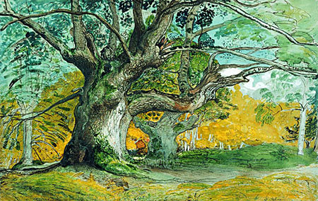
Artistic approaches to landscape can be as fascinatingly varied as landscape itself. The variety of style, material, color, medium and technique is amazing. Samuel Palmer’s landscape paintings in oil, watercolor, gouache, ink and sepia wash often have a unique character that feels like fantasy or children’s book illustration, particularly work from a period when he was heavily influenced by the Romantic artist/poet William Blake.Palmer met Blake through English landscape artist John Linnell, who was something of a mentor to him and whose daughter, Hannah, became Palmer’s wife. Palmer’s own family was less than an asset. His father had an unfavorable reputation and a poor economic situation, putting pressure on his sons to restore the family name. One of Palmer’s brothers, finding himself without funds while Palmer was away on his two-year honeymoon/painting expedition to Italy, pawned most of Palmer’s early work and Palmer had to pay out a great deal to get it back. Palmer’s son, Herbert Palmer, apparently burned large amounts of his father’s work after his death, ostensibly so it would not be disrespected (and you think you have family troubles as an artist).
Palmer never saw great commercial success as a painter and most of his income came from teaching drawing, at which he was apparently quite good. Palmer’s work fell into semi-obscurity for many years and has only recently been re-discovered by the art world.
In 2005 the British Museum and the Metropolitan Museum of Art cooperated to create the first major retrospective exhibition of Palmer’s work, Samuel Palmer: vision and landscape, which helped re-establish him as one of the most important landscape painters of his era. It ran at the British Museum from October 2005 to January of this year and is currently running at the Met until May 29, 2006. The British Museum site still has the section devoted to the exhibition online here. The Met’s section is here. Both have examples of Palmer’s work in several mediums.
“Success” is almost as subjective a concept as “style”. Midway through his career, Samuel Palmer consciously changed his style to a more traditional landscape approach in a failed attempt to make his work more salable, but it is for his visionary Romantic work that he is remembered and revered. He may not have found any greater financial success had he remained true to his original vision, but would he perhaps have found a greater level of personal success? All artists have to find their own meaning for that word, but I think Palmer’s success was in creating unique landscape images that we still find engaging and visually rewarding after 200 years.
Categories:
-
Enrico Casarosa
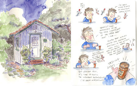
As artists there are those of us who wear many hats (no, no, I mean other than at those weird loft parties…), taking on several styles or different types of visual art for different reasons; sometimes out of necessity to both make a living and pursue personal interests, sometimes out of a desire to be versatile and sometimes just out of a love for working and experimenting with many different types of art.I suspect that Enrico Casarosa works in his many artistic areas for the latter reason, just because he enjoys and appreciates them and wants very much to enjoy all that they have to offer. Professionally, Casarosa is a storyboard artist for Pixar. He is also a character designer, comics artist, designer, illustrator, blogger and inveterate sketcher.
Among his other accomplishments, Casarosa started and still oversees the SketchCrawl events, outdoor group drawing “expeditions” held in various cities around the world (some history here and here). The next Worldwide SketchCrawl is this Saturday, April 22, 2006. A discussion board of the arrangements being made in various cities can be found here.
I briefly profiled Casarosa in my first mention of Sketchcrawl last summer. He has several web sites related to his many pursuits. Enricocasarosa.com serves as a central hub and features information about his publications, including SketchCrawling, containing some of his Sketchcrawl sketches and comics related to the events (photos here), and Fragments Intermezzo, with charcoal figure drawings, paintings and sketches.
The main site also talks about his gallery shows, one of which, Three Trees make a Forest at Gallery Nucleus in LA last November, he shared with Ronnie Del Carmen and the wonderful Tadahiro Uesugi (see my post about Tadahiro Uesugi from last fall).
There is a Portfolio page on Casarosa’s main site with links to many of his projects, as well as a resume and bio, but some of the material may be out of date.
It’s a little disconcerting bouncing around between Casarosa’s sites, because they are many and not always up to date or linked in a consistent fasion. The most recent information usually surfaces on Enrico’s blog, which features photos, ramblings, discussions of art materials and pointers to other sites and artists as well as news and postings of Casarosa’s own work (like the illustration for a wine label, above, left).
Occasionally you’ll find treasures like his online mini-comic review of Canned Coffee (above, right). Casarosa has also posted a complete online comic called Haiku 5-7-5, as well as online previews for his print comic MIA. Casarosa has also participated in the excellent Flight comics anthologies (the new one of which is due this June).
Categories:


Charley’s Picks
Bookshop.org
(Bookshop.org affilliate links; sales benefit independent bookshop owners; I get a small percentage to help support my work on Lines and Colors)

John Singer Sargent: Watercolors


Urban Sketching: Understanding Perspective


Charley’s Picks
Amazon
(Amazon.com affiliate links; sales go to a larger yacht for Jeff Bezos; but I get a small percentage to help support my work on Lines and Colors)
John Singer Sargent: Watercolors
Urban Sketching: Understanding Perspective