
Categories
- 3d CGI
- Amusements
- Animation
- Anime & Manga
- Art Materials
- Art Videos
- Blogroll
- Cartoons
- Color
- Comics
- Concept & Visual Dev.
- Creativity
- Digital Art
- Digital Painting
- Displaying Art on the Web
- Drawing
- Eye Candy for Today
- Gallery and Museum Art
- High-res Art Images
- Illustration
- Motion Graphics & Flash
- Museums
- Online Museums
- Outsider Art
- Painting
- Painting a Day
- Paleo Art
- Pastel, Conté & Chalk
- Pen & Ink
- Prints and Printmaking
- Reviews
- Sc-fi and Fantasy
- Sculpture & Dimensional
- Site Comments
- Sketching
- Storyboards
- Tools and Techniques
- Uncategorized
- Vector Art
- Videos & Podcasts
- Vision and Optics
- Watercolor and Gouache
- Webcomics
Archives
- June 2026
- May 2026
- April 2026
- March 2026
- February 2026
- January 2026
- December 2025
- November 2025
- October 2025
- September 2025
- August 2025
- July 2025
- June 2025
- May 2025
- January 2025
- December 2024
- November 2024
- October 2024
- September 2024
- August 2024
- June 2024
- April 2024
- March 2024
- February 2024
- January 2024
- December 2023
- November 2023
- October 2023
- September 2023
- August 2023
- July 2023
- May 2023
- April 2023
- March 2023
- February 2023
- January 2023
- December 2022
- November 2022
- September 2022
- August 2022
- July 2022
- June 2022
- May 2022
- April 2022
- March 2022
- February 2022
- January 2022
- December 2021
- November 2021
- October 2021
- September 2021
- August 2021
- July 2021
- June 2021
- May 2021
- April 2021
- March 2021
- February 2021
- January 2021
- December 2020
- November 2020
- October 2020
- September 2020
- August 2020
- July 2020
- June 2020
- May 2020
- April 2020
- March 2020
- February 2020
- January 2020
- December 2019
- November 2019
- October 2019
- September 2019
- August 2019
- July 2019
- June 2019
- May 2019
- April 2019
- March 2019
- February 2019
- January 2019
- December 2018
- November 2018
- October 2018
- September 2018
- August 2018
- July 2018
- June 2018
- May 2018
- April 2018
- March 2018
- February 2018
- January 2018
- December 2017
- November 2017
- October 2017
- September 2017
- August 2017
- July 2017
- June 2017
- May 2017
- April 2017
- March 2017
- February 2017
- January 2017
- December 2016
- November 2016
- October 2016
- September 2016
- August 2016
- July 2016
- June 2016
- May 2016
- April 2016
- March 2016
- February 2016
- January 2016
- December 2015
- November 2015
- October 2015
- September 2015
- August 2015
- July 2015
- June 2015
- May 2015
- April 2015
- March 2015
- February 2015
- January 2015
- December 2014
- November 2014
- October 2014
- September 2014
- August 2014
- July 2014
- June 2014
- May 2014
- April 2014
- March 2014
- February 2014
- January 2014
- December 2013
- November 2013
- October 2013
- September 2013
- August 2013
- July 2013
- June 2013
- May 2013
- April 2013
- March 2013
- February 2013
- January 2013
- December 2012
- November 2012
- October 2012
- September 2012
- August 2012
- July 2012
- June 2012
- May 2012
- April 2012
- March 2012
- February 2012
- January 2012
- December 2011
- November 2011
- October 2011
- September 2011
- August 2011
- July 2011
- June 2011
- May 2011
- April 2011
- March 2011
- February 2011
- January 2011
- December 2010
- November 2010
- October 2010
- September 2010
- August 2010
- July 2010
- June 2010
- May 2010
- April 2010
- March 2010
- February 2010
- January 2010
- December 2009
- November 2009
- October 2009
- September 2009
- August 2009
- July 2009
- June 2009
- May 2009
- April 2009
- March 2009
- February 2009
- January 2009
- December 2008
- November 2008
- October 2008
- September 2008
- August 2008
- July 2008
- June 2008
- May 2008
- April 2008
- March 2008
- February 2008
- January 2008
- December 2007
- November 2007
- October 2007
- September 2007
- August 2007
- July 2007
- June 2007
- May 2007
- April 2007
- March 2007
- February 2007
- January 2007
- December 2006
- November 2006
- October 2006
- September 2006
- August 2006
- July 2006
- June 2006
- May 2006
- April 2006
- March 2006
- February 2006
- January 2006
- December 2005
- November 2005
- October 2005
- September 2005
- August 2005
Relevant Blogs
Art, Painting & Sketch
- Gurney Journey
- Underpaintings
- Art and Influence
- Painting Perceptions
- Oil Painters of America
- Vasari Paint POV
- Flying Fox
- Urban Sketchers
- Bento (Smithsonian)
- Art Inconnu
- The Hidden Place
- Still Life
- Making a Mark
- The Art of the Landscape
- Exploring Color & Creativity
- Art Contrarian
- Artist A Day
- beinArt Surreal Art Collective
- Eye Level
- David Dunlop
- p.i.g.m.e.n.t.i.u.m
- CultureGrrl
- Joaquín Sorolla blog
- Artists in Pastel
“Painting a Day”
- A Painting a Day (Keiser)
- On Painting (Keiser)
- Julian Merrow-Smith
- Karen Jurick
- Jeffrey Hayes
- Carol Marine
- Abbey Ryan
- Daily Paintworks
Other Painting Blogs
- Virtual Gouache Land
- Neil Hollingsworth
- Marc Hanson
- Kevin Menck
- Marc Dalessio
- Larry Seiler
- Stapleton Kearns
- Colin Page
- Roos Schuring
- Hans Versfelt
- Titus Meeuws
- Régis Pettinari
- René Plein Air
- Belinda Del Pesco
- Robin Weiss
- Nathan Fowkes (Land Sketch)
- William Wray
- Frank Serrano
- Stephen Magsig
- Michael Chesley Johnson
- Twice a Week
- Sarah Wimperis
- Rob Adams
- Michael Cole Manley
- The Dirty Palette Club
- Mike Manley’s Draw!
Gallery Art & Illustration mix
Illustration
- Howard Pyle
- 100 Years of Illustration
- BibliOdyssey
- Illustration Art
- Today’s Inspiration
- Illustration Mundo
- Little Chimp Society
- Danny Gregory
- R D (John Martz
- Illustration Friday blog
- Monster Brains
- Illustrators & Illustrations (RU)
- Elwood H. Smith
- DaniDraws.com
- Designers Who Blog
- iSpot Blog
Sci-Fi & Fantasy
Illustration & Comics
Comics & Cartoons
- Comics Beat
- Robot 6
- Newsarama Blog
- Comic Vine
- Comics Alliance
- Forbidden Planet Int.
- Paolo Rivera
- Bolt City
- Flight
- Scott McCloud
- The Comics Journal
- Comixpedia
- Funnybook Babylon
- James Baker
- Middleton’s Sketchbook
- Boneville
- The Hotel Fred
- Paul Rivoche
- Daily Cartoonist
- Mad About Cartoons (William Wray)
- Digital Strips
Illustration & Concept
Animation & Concept
- Cartoon Brew
- Animation Blog
- Cold Hard Flash
- Concept Art World
- The CAB
- FY Concept Art
- Concept Ships
- Concept Robots
- John Nevarez
- Armand Serrano
- Marcos Mateu-Mestre
- all kinds of stuff (Kricfalusi)
- Yacin the faun (Man Arenas)
- Kelsey Mann
- Cre8tivemarks Blog
- Ice-Cream Monster Toon Cafe
- AAU Character & Creature Design
- AAU Animation Notes
- Articles and Texticles
Paleo & Scientific
Tools & Techniques
Other
Lists of Art Blogs
Art Image Resource Links
Historic Art Images
- Wikimedia Commons: Paintings
- Wikimedia Commons: Drawings
- The Athenaeum
- WikiArt (WikiPaintings)
- Google Art Project: Artists
- Google Art Project: Collections (Museums)
- ArtCyclopedia
- Web Gallery of Art
- Art Renewal Center
- Web Gallery of Impressionism
Auction Consolidation sites
Auction sites
- Sotheby’s
- Bonham’s
- Christies
- Heritage Auctions: Fine Art
- Heritage Auctions: Illustration
- Freeman’s Auctions
- Bukowskis
- Shannon’s
Image Search
Reverse Image Search (search by image)
- Tin Eye
- RevImg
- Google Image Search (camera icon)
- Bing Image Search (camera icon)
Promoting some friends and some clients of my website design business
- Twin Willows T’ai Chi studio in Wilmington DE. Taiji classes with Bryan Davis.
- Ray Hayward, Inspired Teacher of T’ai Chi ( Taiji ) in Minneapolis, Founder of Mindful Motion Tai Chi Academy
- OldHead Tattoo studio and Art Gallery in Wilmington DE. Tattoos and paintings by Bruce Gulick
- Sharon Domenico Art, pet portrait oil paintings
- Platinum Paperhanging, wallpaper hanging, Main Line and Philadelphia, PA
- Lisa Stone Design, interior designer, Main Line and Philadelphia, PA
- Studio12KPT, original art, prints, calendars and other custom printed items by Van Sickle & Rolleri
-
Rob Rey
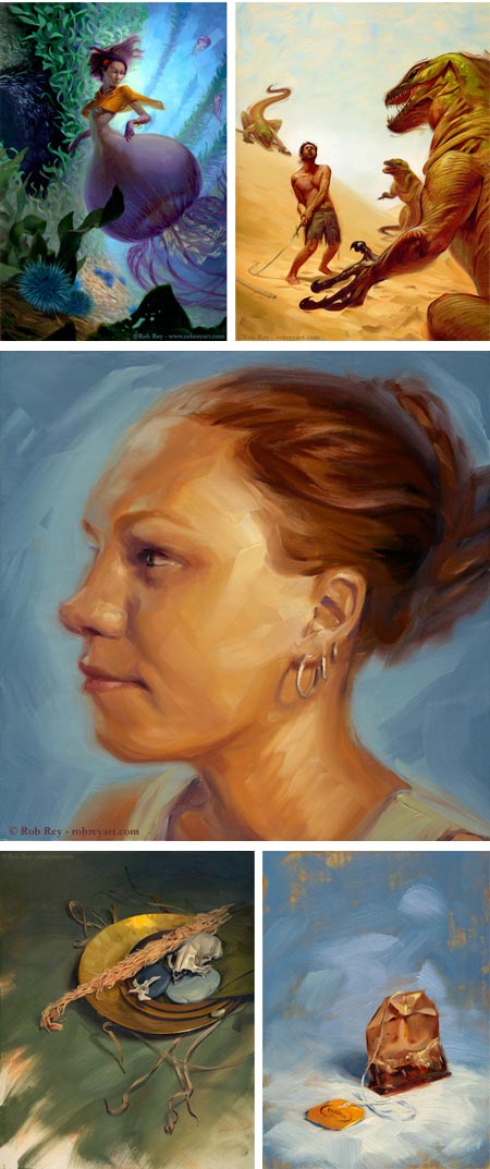
llustrator and painter Rob Rey is originally from Chicago, studied at the Rhode Island School of Design, and now lives and works in Providence, Rhode Island.
His illustrations have been recognized The Society of Illustrators Los Angeles, CMYK Magazine, Applied Arts and Arista.
His web site has a gallery of his illustration, which has a nice painterly feel with dramatically theatrical staging and use of lighting (images above, top).
What I found most appealing, though, were the “in-your-face” portraits in his “Painting” section, with their bold compositions, big textural brushstrokes and dramatic color. I also found many of those elements in his richly textured still life paintings engagingly lit cityscapes.
Rey also has a blog on which he posts additional paintings and nicely rendered cafe sketches.
Categories:
-
Yuko Shimizu Progressions
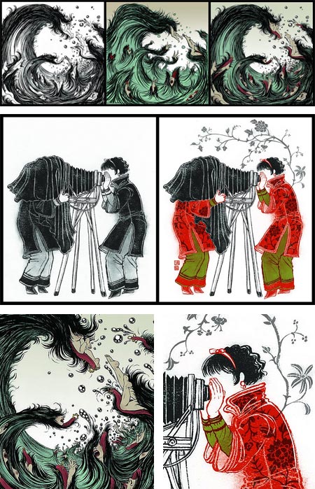
BibliOdyssey, that fount of the wonderful and bizarre, has posted a great series of illustrations by New York based illustrator Yuko Shimizu in two or three stages of progression.These are usually a draft, final line and then final color version of the image. BibliOdyssey author peacay asked Shimizu for copies of her draft versions and put them together with the finals as sets.
The post is called Yuko’s Progressions. Click through to the Flicker postings, and then to the large size to see the details (images above, with my detail crops below).
For more see my 2007 post on Yuko Shimizu. Since then she has redesigned and expanded her web presence and is now blogging on Drawger and Lost at E Minor.
Categories:
-
Anton Pieck

Dutch artist Anton Pieck was, among other things, a painter in oil and watercolor, a printmaker in etching, engraving, lithography and woodcarving; a comics artist and an illustrator of calendars, travel books, textbooks and classics like 1001 Arabian Nights (image above, bottom).He was also a drawing teacher at Kennemer Lyceum in Bloemendaal until he retired in 1960. Pieck was born in 1895, when the “Golden Age” of illustration was in full force. One can only assume that he was exposed to the work of the great illustrators of the time, like Arthur Rackham, Edmund Dulac, Kay Neilsen, John Bauer, and in particular, Gustave Tenngren (also here and here).
Pieck’s more popular work has a wonderful visual charm, crafted from fine detail, deft control of color and atmospheric perspective, and fascinating compositions. His illustrations for 1001 Arabian Nights are marvels of book illustration in the classic Golden Age style, vibrant with adventure, moody and evocative in their rendering, and ripe with the sublime enticement of distant lands and exotic cultures.
[Via One1more2time3’s Weblog]
Categories:
-
The Codex Seraphinianus (Luigi Serafini)

When you were a child, and your parents first exposed you to that wondrous medium of information storage and dream exchange known as a “book”, it was an object that was only moderately intelligible.As a pre-reading age child, the pictures may have had immediate meaning, but the other marks, which you would later come to know as letters and words, did not. They were simply marks or patterns on the page.
Gradually these became meaningful in ways too deep and astonishing to be fully appreciated; opening into other worlds and adding layers and layers of richness to this one.
What a great combination that was, though — fascinating images and mysterious marks, somehow related and holding the promise of meaning, yet withholding that meaning for now, leaving you to guess and wonder.
Italian artist, sculptor, designer and architect Luigi Serafini is best known for his Codex Searphinianus, an art book project that in many ways recreates that state of fascinating images juxtaposed with systematized markings that look like they have meaning, but withhold that meaning.
A “codex” is essentially just a book, in the folded and bound format familiar today. It was first brought into common use by the Romans, for whom it was an adjunct or replacement for the scroll as a form for storing written information. More specifically it refers to the interior pages of a book minus the cover, which was called a “case”. The term codex is now used more specifically to refer to hand-written manuscripts created prior to the advent of movable type. The most famous example is the codex of Leonardo da Vinci, formerly known as the Codex Hammer, renamed as the Codex Leicester by Bill Gates when he purchased it in 1994.
Created over a period from 1976 to 1978, Serafini’s Codex Seraphinianus is a 360 page book appears to be an encyclopedic description of an alternate world, illuminated with drawings of wonderfully strange creatures, objects and architecture.
All of it is accompanied by what is apparently a cryptic language, a systematic collection of marks that is presumed to be “asemic writing”, or writing without meaning, a false language (as opposed to an invented language that does have meaning, like Esperanto or “Klingon”). The writings are hand lettered in a decorative script and accompany the images as though in explanation of them.
The illustrations are imaginative, fanciful, bizarre, lovingly drawn and detailed, with an eye to classic drawings of real flora and fauna. (For a wonderful counterpoint, see some of the real thing, often tending to the bizarre, on BibliOdyssey.)
The Codex Seraphinianus was released in 1981 in a limited edition art book of 5,000 copies, and quickly became a sought after collectors item. Another limited edition was released in the 1990’s. A more widely printed general release of The Codex Seraphinianus was published in 2006. It is out of print but can still be found as a used book.
I don’t know of an online repository for the entire work, but there are pages available at various places on the web.
[Suggestion courtesy of Guy Haddon-Grant]
Categories:
-
Ray Roberts
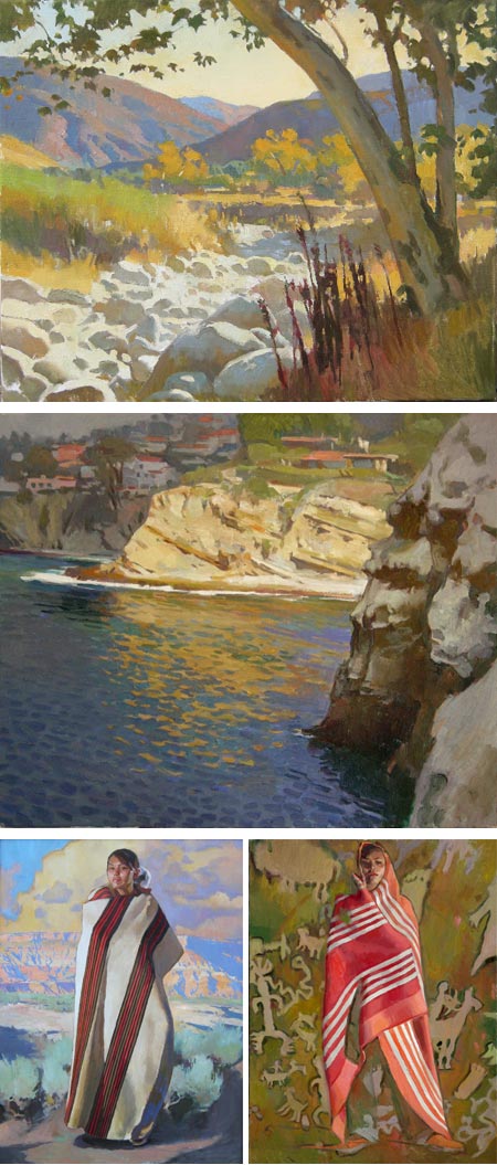
California plein air painter Ray Roberts paints bright, open and airy California landscapes.His influences seem to run to pioneering California Impressionists like Hanson Puthuff and to a lesser extent, Granville Redmond. This is particularly evident in the atmospheric qualities of his work; colors, though vibrant, are often softened in contrast, and their intensity muted in service of atmosphere.
Instead of painting brilliant sunlight reflecting from brightly lit subjects, Robert seems more concerned with light as a presence, filling the space between you and the subject.
His galleries are divided into Landscape, in which the atmospheric qualities are most apparent; Seascape, in which contrasts are more evident; and Figurative work, which is larger in size and presumably done in the studio rather than en plein air.
Don’t miss the Archives of additional work from each category.
Roberts is married to California painter Peggi Kroll-Roberts, who shares a fascination with light and shadow, often in the brilliant sunlight of beach scenes. Both artists conduct workshops, and the shared sections of their site include influences and recommended books.
[Via William Wray (see my post on William Wray)]
Categories:
-
Patrick Gannon

Illustrator Patrick Gannon creates his illustrations and artwork entirely out of cut paper (and wood, which often acts as the “canvas”).He lives and work in Japan, where he found that his penchant for cut-paper art fit into a long cultural tradition of which he was previously unaware.
Gannon studied literature at Providence CoOllege in Rhode Island, and received an MFA in Illustration from Savannah College of Art and Design.
His illustration clients include ABC Radio, The Charlotte Observer, Time Magazine, Baltimore Magazine and Design Press.
Gannon makes the shapes for his works out of handmade Japanese paper, the texture and color of which form the basis for his images. The cut edges and slight shadows give the shapes a rough, organic quality that Gannon uses to effect in both his general subject and children’s illustrations.
Gannon also does gallery pieces. In addition to the portfolios on his site, he maintains a blog called PaperCuts.
Categories:


Charley’s Picks
Bookshop.org
(Bookshop.org affilliate links; sales benefit independent bookshop owners; I get a small percentage to help support my work on Lines and Colors)

John Singer Sargent: Watercolors


Urban Sketching: Understanding Perspective


Charley’s Picks
Amazon
(Amazon.com affiliate links; sales go to a larger yacht for Jeff Bezos; but I get a small percentage to help support my work on Lines and Colors)
John Singer Sargent: Watercolors
Urban Sketching: Understanding Perspective