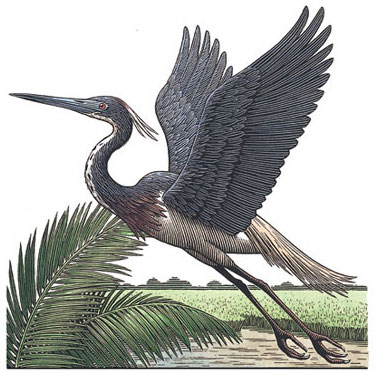
I’m particularly fond of pen and ink illustration, and its less common variant, scratchboard.
Scratchboard is the inverse, or “dark side” (I couldn’t resist) of pen and ink drawing, in which a specially prepared board, coated with a thin layer of white clay, is used as the foundation for the drawing. Large areas of (usually) black ink are then painted onto the board, allowing the artist to scratch crisp white lines out of the black ink. There are special scratchboard tools, multi-pronged scratchboard “rakes” and so on, but any sharp instrument can be used.
Scratchboard is often combined with traditional pen and ink drawing on the same surface, as in the work of illustrator Virgil Finlay, and sometimes combined with color, particularly in some modern illustration. There are also artists, like Chet Phillips who mimic the effect with “digital scratchboard” in Corel Painter.
It’s not often that you see true scratchboard these days, and less frequent still that you see as exceptionally well handled as it is in the scratchboard illustrations of Elizabeth Traynor.
Traynor is an illustrator, formerly based in Delaware and now in Massachussets, who has done editorial work for companies like Simon & Schuster and Random House, publications like The Wall Street Journal, Fortune and Esquire and advertising illustration and logo design for companies ranging from American Express to Coca-Cola.
Her colored scratchboard illustrations have a wonderful feeling of being simultaneously modern and traditional. She also does rich, detailed watercolor illustrations and her site includes examples of her logo design as well. The image above, in fact, was extracted from one of her logo designs.
Link suggestion courtesy of Jack Harris.

