
OK, everybody knows Archie, right? That wonderful comics character with round bulges on top of his head to suggest large curls of bright orange teenage hair, eyes drawn with simple arcs and dots, a mere suggestion of a nose, and those bizarre checks on his head, as if he’s been sleeping on a waffle iron? Archie! Sure! “America’s typical teenager”!
And those girls! Betty and Veronica! Wasp-waisted, large breasted icons of corn-fed all-American teenage girls, somehow simultaneously suggestive and innocent, that share that same dot-and-arc eye shape, even less of a nose, sometimes just a tiny ellipse, and those wonderful lines across the bridge of the nose that make no actual sense in terms of form, but somehow do a delightful job of suggesting the tops of rosy young cheeks… Archie pursued Veronica and Betty pursued Archie, and except in the wonderful Mad parody by Will Elder and Harvey Kurtzman, Archie never noticed that if you switched their hair styles, they look exactly the same! How could anybody not love these characters?
Well, evidently Archie and his “Pals n’ Gals” aren’t getting enough love here in the 21st Century. After more than 60 years of existence as metaphorical and literal icons, the Archie characters are about to be made over in what Archie Comics calls a new “dynamic art” style in an attempt to bring them, kicking and screaming, into the the modern world. (Sigh.)
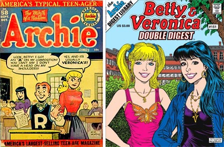
There has been an attempt to modernize one of their second string characters, Sabrina, with a manga-style makeover by Tania del Rio, but this remake, the initial debut of which will be in the Betty and Veronica Double Digest #151 (image above, right) to be released in May of 2007, is taking their main characters and rendering them in a more realistic, mainstream comics style, drawn by Steven Butler.
Butler is a comics veteran who first came to light as the artist of First Comic’s The Badger, went on to work for Marvel comics titles like Silver Sable and Web of Spider Man and has been doing Archie Comics’ Sonic the Hedgehog titie.
OK, I can understand their thinking. These characters were created in the 40’s by Bob Montana, drawn in a wonderful heavy-outline cartoon style (image above, left), and later redefined in a finer lined but still cartoon like style in the late 1950’s by Dan DeCarlo, and have been going pretty much unchanged since. How can they be relevant in this day of hyper-kinetic video games, Saturday morning anime, Glitz-O-Rama Barbie and Pokemon-infested toy store aisles?
They’ve tried “modernizing” the characters at times by writing in topical subjects, but the look of the characters, that can’t-miss-it, unmistakable Archie style, was consistent, and wisely so.
I’m sure the new versions will have a certain appeal, Butler does nice work on the page of pencils I’ve seen, and I wish the company well in their endeavor to attract more readers, but I think they’re missing the point. The Archie characters are the style, the style is the characters!
Scott McCloud has pointed out in his treatises on the nature of comics, that the more iconographic a character is, the easier it is to project more of ourselves into it, without being put off by some detail that “isn’t us” because it’s too specific. The very cartoonyness of the style is the major part of its appeal.
Archie comics, though they say “teen” all over them, aren’t for teens, they’re for pre-teens who desperately want to grow up a bit and move into that stage of life that seems so much more glamorous than being “not quite a teen”. The cartoon style makes that ability to project your imagination into that other phase of “who you want to be” so much easier. Plus, it’s that defining look that makes the Archie comics, well… Archie Comics.
Newsarama link via Metafilter, via Waxy, via Kempa.com.
Addendum: According to continuing coverage over at Drawn!, Archie Comics is responding to a distinctly negative reaction to their plans to make over the characters, emphasizing that the remake in only being tried out in one title at the moment and the other titles will continue in the “classic” Archie style while reactions (and sales) are monitored. The post on Drawn! also provides links to coverage on Wired’s blogs.