
Let me start by saying that I have been a fan of the Google Art Project pretty much since it’s inception in February of 2011 — because I love, love, love high resolution art images — just love ’em! (love ’em!), and the Google Art Project has delivered them — in ever increasing numbers.
Admittedly there has been some inconsistency in size and some lapses in quality, but overall they have done a splendid job of putting our noses right up to some of the world’s great works of art, along with offering virtual tours of many of the museums in which they’re housed.
When they expanded, reorganized and streamlined the site in 2012, I was right on board. Every change they made was a much needed improvement.
Google has just released a new round of revisions to the project, and at the risk of looking a gift horse in the mouth, I have to say I’m not entirely enthused this time around.
First of all, the Google Art Project no longer exists as an independent entity; it has been subsumed into the more ambitious “Google Cultural Institute“, which evidently seeks to cover all aspects of culture (and perhaps, eventually, All Knowledge — who knows?)
So now, instead of the Google Art Project we apparently have the Google Cultural Institute: Art Project, and in place of googleartproject.com, we have google.com/culturalinstitute/project/art-project (though I will give the tech team credit for keeping incoming links intact).
It just seems like an unnecessary sidelining and de-emphasizing of the Art Project, and of course, I think such a great destination for online art images should be made more prominent, not less.
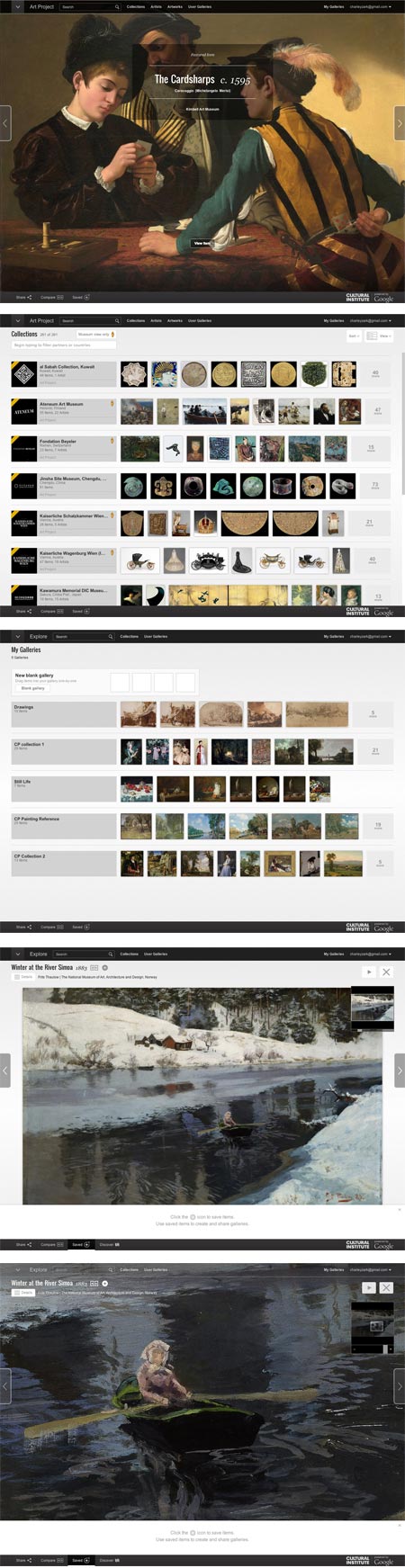
Google has made interface changes to the Google Art Project Google Cultural Institute: Art Project — some I think are indeed for the better, others… not so much.
The overall interface is now soft gray with black or dark gray navigation bars, making text easier to read and the navigation areas more prominent, and some navigation features are better organized.
The layout of the Collections and Artists listings is simultaneously improved — by a selection of thumbnail images next to each item in the list — and made more awkward — by a selection of thumbnail images next to each item in the list, without the ability to leave out the thumbnails and streamline the list to just text for easier scrolling.
The need to load thumbnails and the “endless list” style of layout make the list of museums so awkward to browse it’s essentially unusable unless you choose to filter the list — not a good browsing model.
(Is it just me? Am I the only one who finds this now seemingly universal paradigm of infinitely scrolling pages updated with JavaScript, in lieu of actual separate pages that can be individually linked to and bookmarked, not only unnecessary but annoying?)
Filtering the list is up to you; you have to guess at some filters. They say “Begin typing to filter partners [i.e. museums] or countries” and the only actual built-in filter they give you is on the other side of the page in the form of a choice between list and world map view.
The Artists list is likewise not conducive to browsing unless you’re actually searching by name.
An attempt to filter for “19th century” returned nothing; a filter for “France” returned only an entry with the word “France” in the name, and filtering or searching for “Courbet still life” returned lots of items that were neither. Typing in “b” did not filter the list for artists whose names began with the letter, so that previously available feature is gone along with other useful interface items. Maybe they need to partner with a company that’s experienced with search…. oh, wait.
The “Artworks” tab yielded somewhat better results, with at least a scrollable text based list of museums, but still doesn’t encourage the kind of casual browsing by which unexpected discoveries are made.
The entire interface is still too widgety, too reliant on JavaScript and too likely to be clunky and problematic in browsers other than Google’s own Chrome.
It also suffers from design for the illusion of simplicity at the expense of clarity.
As a case in point, the list for Collections (i.e. museums) at first appears to be without discernible order, until you scroll far enough to realize that is is primarily alphabetical, but with new entries in the first several places. With no indication of their function other than a mouse-over tool tip, these are set off with diagonal corner stripes (you know — the universally understood symbol for “new entries that are out of sequence from the main list”).
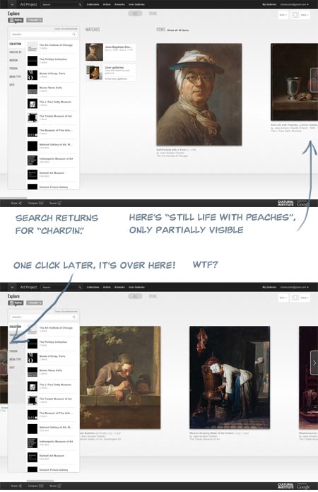
The big sliding image view, which is the default when viewing Collections, doesn’t function correctly, even in Chrome (for Mac), in that an item partially visible to the right is not moved into full view by the use of the advance arrow, but instead maddeningly slides past the center of the screen and under the filter/collection list on the left! WTF?
I signed in to my account (free, and worthwhile for saving galleries) and under “My Galleries” my saved galleries were waiting for me, custom zoom levels intact, but without the convenient row of thumbnails at page bottom that made them previously easier to browse. This area is now apparently set aside for temporarily dropping items to be added to custom galleries, a process that is less straightforward than before.
The actual high-resolution image view is not radically changed; the background is gray instead of black, controls have been moved around and the containing window is now full browser height with overlays, but it’s essentially the same, and even feels a bit smoother and easier to zoom and scroll.
To be fair, creating and maintaining an amazing resource like this like this costs money, and I’m asking for a lot by being cranky about the interface, considering I’m not paying anything directly for the privilege of access. Google is not doing this out of altruism and a love of art, but as promotion for all things Google, and that’s fine.
Corporate world domination and the end of privacy is a small price to pay for access to high resolution art images (frighteningly, part of me means that), and the Google Art Project Google Cultural Institute: Art Project is still a treasure trove, an amazing destination for art lovers and still more than worthy of my Major Time Sink Warning.
Round two of the site was a distinct step up over the first version, and if round three is a bit glitchy, I can live with it while I wait for round four, as long as all those yummy high res images are available.
Interface hiccups aside, I feel the site is still deserving of even more attention and a wider audience, which is why I think submerging its identity into a mere sub-section of a monolithic “Cultural Institute” is an unfortunate choice.
Given Google’s propensity for growth, I’m just hoping the next round of revisions doesn’t leave art lovers digging through the Google Central Repository for All Information: Complete World Knowledge Registry: Humanities Data Bank: Cultural Institute: Art Project just to get to our fix of high-res Rembrandts.