
Categories
- 3d CGI
- Amusements
- Animation
- Anime & Manga
- Art Materials
- Art Videos
- Blogroll
- Cartoons
- Color
- Comics
- Concept & Visual Dev.
- Creativity
- Digital Art
- Digital Painting
- Displaying Art on the Web
- Drawing
- Eye Candy for Today
- Gallery and Museum Art
- High-res Art Images
- Illustration
- Motion Graphics & Flash
- Museums
- Online Museums
- Outsider Art
- Painting
- Painting a Day
- Paleo Art
- Pastel, Conté & Chalk
- Pen & Ink
- Prints and Printmaking
- Reviews
- Sc-fi and Fantasy
- Sculpture & Dimensional
- Site Comments
- Sketching
- Storyboards
- Tools and Techniques
- Uncategorized
- Vector Art
- Videos & Podcasts
- Vision and Optics
- Watercolor and Gouache
- Webcomics
Archives
- June 2026
- May 2026
- April 2026
- March 2026
- February 2026
- January 2026
- December 2025
- November 2025
- October 2025
- September 2025
- August 2025
- July 2025
- June 2025
- May 2025
- January 2025
- December 2024
- November 2024
- October 2024
- September 2024
- August 2024
- June 2024
- April 2024
- March 2024
- February 2024
- January 2024
- December 2023
- November 2023
- October 2023
- September 2023
- August 2023
- July 2023
- May 2023
- April 2023
- March 2023
- February 2023
- January 2023
- December 2022
- November 2022
- September 2022
- August 2022
- July 2022
- June 2022
- May 2022
- April 2022
- March 2022
- February 2022
- January 2022
- December 2021
- November 2021
- October 2021
- September 2021
- August 2021
- July 2021
- June 2021
- May 2021
- April 2021
- March 2021
- February 2021
- January 2021
- December 2020
- November 2020
- October 2020
- September 2020
- August 2020
- July 2020
- June 2020
- May 2020
- April 2020
- March 2020
- February 2020
- January 2020
- December 2019
- November 2019
- October 2019
- September 2019
- August 2019
- July 2019
- June 2019
- May 2019
- April 2019
- March 2019
- February 2019
- January 2019
- December 2018
- November 2018
- October 2018
- September 2018
- August 2018
- July 2018
- June 2018
- May 2018
- April 2018
- March 2018
- February 2018
- January 2018
- December 2017
- November 2017
- October 2017
- September 2017
- August 2017
- July 2017
- June 2017
- May 2017
- April 2017
- March 2017
- February 2017
- January 2017
- December 2016
- November 2016
- October 2016
- September 2016
- August 2016
- July 2016
- June 2016
- May 2016
- April 2016
- March 2016
- February 2016
- January 2016
- December 2015
- November 2015
- October 2015
- September 2015
- August 2015
- July 2015
- June 2015
- May 2015
- April 2015
- March 2015
- February 2015
- January 2015
- December 2014
- November 2014
- October 2014
- September 2014
- August 2014
- July 2014
- June 2014
- May 2014
- April 2014
- March 2014
- February 2014
- January 2014
- December 2013
- November 2013
- October 2013
- September 2013
- August 2013
- July 2013
- June 2013
- May 2013
- April 2013
- March 2013
- February 2013
- January 2013
- December 2012
- November 2012
- October 2012
- September 2012
- August 2012
- July 2012
- June 2012
- May 2012
- April 2012
- March 2012
- February 2012
- January 2012
- December 2011
- November 2011
- October 2011
- September 2011
- August 2011
- July 2011
- June 2011
- May 2011
- April 2011
- March 2011
- February 2011
- January 2011
- December 2010
- November 2010
- October 2010
- September 2010
- August 2010
- July 2010
- June 2010
- May 2010
- April 2010
- March 2010
- February 2010
- January 2010
- December 2009
- November 2009
- October 2009
- September 2009
- August 2009
- July 2009
- June 2009
- May 2009
- April 2009
- March 2009
- February 2009
- January 2009
- December 2008
- November 2008
- October 2008
- September 2008
- August 2008
- July 2008
- June 2008
- May 2008
- April 2008
- March 2008
- February 2008
- January 2008
- December 2007
- November 2007
- October 2007
- September 2007
- August 2007
- July 2007
- June 2007
- May 2007
- April 2007
- March 2007
- February 2007
- January 2007
- December 2006
- November 2006
- October 2006
- September 2006
- August 2006
- July 2006
- June 2006
- May 2006
- April 2006
- March 2006
- February 2006
- January 2006
- December 2005
- November 2005
- October 2005
- September 2005
- August 2005
Relevant Blogs
Art, Painting & Sketch
- Gurney Journey
- Underpaintings
- Art and Influence
- Painting Perceptions
- Oil Painters of America
- Vasari Paint POV
- Flying Fox
- Urban Sketchers
- Bento (Smithsonian)
- Art Inconnu
- The Hidden Place
- Still Life
- Making a Mark
- The Art of the Landscape
- Exploring Color & Creativity
- Art Contrarian
- Artist A Day
- beinArt Surreal Art Collective
- Eye Level
- David Dunlop
- p.i.g.m.e.n.t.i.u.m
- CultureGrrl
- Joaquín Sorolla blog
- Artists in Pastel
“Painting a Day”
- A Painting a Day (Keiser)
- On Painting (Keiser)
- Julian Merrow-Smith
- Karen Jurick
- Jeffrey Hayes
- Carol Marine
- Abbey Ryan
- Daily Paintworks
Other Painting Blogs
- Virtual Gouache Land
- Neil Hollingsworth
- Marc Hanson
- Kevin Menck
- Marc Dalessio
- Larry Seiler
- Stapleton Kearns
- Colin Page
- Roos Schuring
- Hans Versfelt
- Titus Meeuws
- Régis Pettinari
- René Plein Air
- Belinda Del Pesco
- Robin Weiss
- Nathan Fowkes (Land Sketch)
- William Wray
- Frank Serrano
- Stephen Magsig
- Michael Chesley Johnson
- Twice a Week
- Sarah Wimperis
- Rob Adams
- Michael Cole Manley
- The Dirty Palette Club
- Mike Manley’s Draw!
Gallery Art & Illustration mix
Illustration
- Howard Pyle
- 100 Years of Illustration
- BibliOdyssey
- Illustration Art
- Today’s Inspiration
- Illustration Mundo
- Little Chimp Society
- Danny Gregory
- R D (John Martz
- Illustration Friday blog
- Monster Brains
- Illustrators & Illustrations (RU)
- Elwood H. Smith
- DaniDraws.com
- Designers Who Blog
- iSpot Blog
Sci-Fi & Fantasy
Illustration & Comics
Comics & Cartoons
- Comics Beat
- Robot 6
- Newsarama Blog
- Comic Vine
- Comics Alliance
- Forbidden Planet Int.
- Paolo Rivera
- Bolt City
- Flight
- Scott McCloud
- The Comics Journal
- Comixpedia
- Funnybook Babylon
- James Baker
- Middleton’s Sketchbook
- Boneville
- The Hotel Fred
- Paul Rivoche
- Daily Cartoonist
- Mad About Cartoons (William Wray)
- Digital Strips
Illustration & Concept
Animation & Concept
- Cartoon Brew
- Animation Blog
- Cold Hard Flash
- Concept Art World
- The CAB
- FY Concept Art
- Concept Ships
- Concept Robots
- John Nevarez
- Armand Serrano
- Marcos Mateu-Mestre
- all kinds of stuff (Kricfalusi)
- Yacin the faun (Man Arenas)
- Kelsey Mann
- Cre8tivemarks Blog
- Ice-Cream Monster Toon Cafe
- AAU Character & Creature Design
- AAU Animation Notes
- Articles and Texticles
Paleo & Scientific
Tools & Techniques
Other
Lists of Art Blogs
Art Image Resource Links
Historic Art Images
- Wikimedia Commons: Paintings
- Wikimedia Commons: Drawings
- The Athenaeum
- WikiArt (WikiPaintings)
- Google Art Project: Artists
- Google Art Project: Collections (Museums)
- ArtCyclopedia
- Web Gallery of Art
- Art Renewal Center
- Web Gallery of Impressionism
Auction Consolidation sites
Auction sites
- Sotheby’s
- Bonham’s
- Christies
- Heritage Auctions: Fine Art
- Heritage Auctions: Illustration
- Freeman’s Auctions
- Bukowskis
- Shannon’s
Image Search
Reverse Image Search (search by image)
- Tin Eye
- RevImg
- Google Image Search (camera icon)
- Bing Image Search (camera icon)
Promoting some friends and some clients of my website design business
- Twin Willows T’ai Chi studio in Wilmington DE. Taiji classes with Bryan Davis.
- Ray Hayward, Inspired Teacher of T’ai Chi ( Taiji ) in Minneapolis, Founder of Mindful Motion Tai Chi Academy
- OldHead Tattoo studio and Art Gallery in Wilmington DE. Tattoos and paintings by Bruce Gulick
- Sharon Domenico Art, pet portrait oil paintings
- Platinum Paperhanging, wallpaper hanging, Main Line and Philadelphia, PA
- Lisa Stone Design, interior designer, Main Line and Philadelphia, PA
- Studio12KPT, original art, prints, calendars and other custom printed items by Van Sickle & Rolleri
-
“Painting a Day” Blogs (Round 6),
The Daily Painters Guild I’ve been following the phenomenon of “painting-a-day” blogs since my post on the originator of the practice, Duane Keiser, in October of 2005.
At the time only Keiser, and Julian Merrow-Smith were engaged (as far as I know) in this practice of painting one small, roughly postcard-size, painting a day, posting it on a blog and offering it for sale directly over then net at a cost much lower than would be feasible through a gallery.
Before long, other artists began to take notice and adopt the practice. In the past six or eight months, the phenomenon has snowballed, as more and more painting-a-day blogs have appeared.
There seem to be two major philosophies about the practice. The first goes something like:
If I adopt the practice of painting one small painting every day, I will grow and become more disciplined as a painter, learning more rapidly, becoming stronger in my ability to grapple with challenges and push through artistic blocks. If I make my practice public by posting my daily painting to a blog, I will be more encouraged to keep to my schedule, I’ll have a visual record of my progress, and I may also be able to make some money in the process by selling my small works on the net.
The second is more like:
If I start a painting-a-day blog, the world will beat a path to my door and I’ll make lots of money.
The former is a worthwhile endeavor, the latter is folly.
Unfortunately, the latter seems to be a dominant factor in the decision of many to jump on the bandwagon, and those who are doing so with that intention are finding themselves in a crowded field.
Painting-a-day bloggers must clamor for attention now amid their own growing numbers, and quickly find that the practice of daily painting is no longer a novelty or a draw in itself.
Micah Condon’s Daily Painters Art Gallery, at one point an attempt to provide a single portal for daily painters, is up to 50 daily painters, and the once open roster is now juried. The site now seems devoted specifically to promoting itself as a marketing vehicle for the members, for which it now charges a monthly membership fee.
I think the the level of ability of the painters on that site varies widely, partly because the “juried” aspect came late in the process, and is indicative of how the phenomenon has become watered down.
By “watered down” I don’t mean to suggest that anyone should refrain from the practice because of their current level of development as a painter. On the contrary, I think it is a superb discipline for any painter, but it should be undertaken in the spirit of the first philosophy I mentioned, not the latter.
However the ‘painting-a-day label used to be associated with artists who were already disciplined and had benefitted from long periods of study and hard work that had matured them as painters.
These artists, unfortunately, are receiving less attention now in their painting-a-day practice than they should because of the sheer number of those who have adopted the label (to the point where some have stopped associating themselves with the “painting-a-day” phrase).
Many of these painters recognized the quality evident in the work of their compatriots and began listing each other’s blogs on their blogrolls, forming a loose association of sorts. In visiting their blogs I would notice many of the same names consistently.
David R. Darrow has written to let me know that several of those painters have now formed a more direct association in an attempt to be seen again above the background radiation of the large number of “daily painters”. The result is the Daily Painters Guild, a group of (at the moment) 15 painters who share a common, professionally consistent, site in addition to their own blogs.
Though the Guild doesn’t include “Painting a Day” originator Duane Keiser, or Julian Merrow Smith, who followed close after, neither of whom need such an association to keep their profile high, the list otherwise reads like the cream of the crop of the daily painters of which I’m currently aware.
Most of them are artists I have already mentioned on lines and colors, many of them in the course of my posts about Painting a Day blogs, like
Louis Boileau (Round 3),
Justin Clayton (Round 4),
David R. Darrow (Round 1), and
Darren Maurer (Round 3).Others are artists I have had a chance to feature individually, like
Belinda del Pesco,
Jeff Hayes,
Neil Hollingsworth,
Karin Jurick,
Carol Marine,
Mick McGinty, and
William Wray.Many of these painters were featured before they started their painting-a-day blogs, so check on the Daily Painters Guild site for their current blog URLs.
The remaining four I haven’t gotten to yet, though two were on my list for the next round of “Painting a Day” blogs, and the other two I hadn’t visited yet.
M Collier
J Matt Miller
Vivienne St. Clair
Peter YesisThe Daily Painters Guild site has links to the artists’ blogs and websites as well as individual pages with short bios. You can bypass the somewhat awkward drop-down navigation from the main page by clicking on the artist’s name for their DPG bio page, an on the “Click here to see more” link for their blog. There is also some general information about the Guild on the “About” page.
Membership in the Daily Painters Guild is by invitation, but they also maintain a large list of Worldwide Daily Painters, to which artists can be added by request.
I don’t mean to imply that the members of the Guild are the only daily painters working at this level, simply that they are representative of the practice at its best and can serve as an example for other artists who are interested in investigating the phenomenon.
I certainly wouldn’t want any of this to intimidate or discourage any artist, whatever their current level of accomplishment, from taking on the challenge of the painting-a-day discipline.
Allowing yourself to be intimidated by the accomplishments of others is one of the deadliest traps an artist can fall prey to (I speak here from experience). Rather, artists who are starting down this road can simply take the Daily Painters Guild as a signpost of where others are going.
If you take up the practice daily painting with the intentions of the first philosophical approach I mention above, you may find that the result is a quicker advancement toward that signpost and beyond.
Categories:
-
Alyssa Monks

Alyssa Monks paints figures. Starting from that simple statement, her figures are explorations of the forms within the human form, something that figurative artists have found compelling for hundreds of years.The figures in her compositions are sometimes collapsed into contracted positions, arms wrapped around themselves, almost, but usually not quite, fetally. My guess is that this is not so much conceptual as visual, a desire to perceive the forms as forms, often revealed in sheets of light and shade cascading across their surface.
If you look through her online galleries, which are arranged by year, you will find excursions into more traditional figures, laying in beds, standing in rooms or arranged almost as portraits, but her most intensely focused work isolates the figures in the space of the composition, with just a bit of the surrounding environment. She uses the white of beedsheets or, in her recent work, the porcelain bathtubs or wall tiles of bathrooms, to compose the figure as dark elements against light.
There is an erotic element in her work, but I think it is fairly subdued, and comes through stronger in her images of clothed figures, like Surrender from 2002 (second row of thumbnails, middle image) than in her nudes. Her work can sometimes feel intimate, but more often the viewpoint feels objective and detached, as though we are an observer, but not a participant in the scene.
In her work from the past year, she is focusing in more closely on small parts of the figure, like part of a face and neck, a composition consisting of a breast, hand and cheek, or other small glimpses of the form, accenting the perception of the figure almost as landscape.
In her work from 2002, the environment came forward, and some of her paintings from that year are interiors without figures, or interiors in which the figure is only a small element. It’s fascinating to look at her eye for these spaces and compare it to her exploration of the figure as both a form and a place.
Link via Neil Hollingsworth
Categories:
-
Adam Phillips

Unlike many of his compatriots, animators who left Disney Studios when the company ovelords decided to abandon their 100 year heritage and close their 2-D animation studios in favor of CGI, Adam Phillips left his position running the effects department of the Sydney-based studio of his own volition.His focus since then has been on his own short animations, composed in Flash and posted on the net. His Hitchiker short won the Flash Forward Film Festival in 2003, followed eventually by the first of what has be called the “Brackenwood” series of short animations, which are simply remarkable. One of the early shorts from that series, Prowlies at the River, really made people in the animation community sit up and take notice, and set new standards for the use of Flash in animation.
The “Brackenwood” stories focus around Bitey, a mischievous faun-like character who taunts and teases other creatures, and usually gets his comeuppance. They take place in some mythical place or time, populated with unreal creatures that, in Phillips hands, act and feel very much like real animals. The image above is from LittleFoot, the most recent in the series.
You will find most of the Brackenwood animations on the Animations page of Phillips website, as well as some other shorts on the Bitey Castle page. Don’t forget to go back to the home page, though, and check out the great little shorts in the 30 days: 30 shorts section, linked by small numbered boxes in the upper right.
There is also a 3-part interview with Phillips on the Cold Hard Flash site. (Here are parts 2 and 3.)
Phillips’ professional background is apparent in his superb command of timing (which is everything in animation), his fluid ability to tell a story visually (most of the Brackenwood animations are wordless, or at least not in any language I recognize), and to compose and frame images dramatically. He combines those skills with a great sense of color, atmosphere and lighting, and a nuanced ability to suggest the complex with the simple, to immerse you in his wonderful pseudo-mythical world.
What really sets Phillips apart as a Flash animator is the ingenious way he has worked within the limits of vector based animation to achieve a wonderful sense of studio-level animation. He occasionally uses Swift 3-D, a vector based 3-D animation app that compliments Flash, for some camera moves, certain types of animation and a bit of modeling, but Flash is the main tool, and he really makes it look like it was created for character animation, rather than motion graphics.
It is his thorough understanding and clever application of the limits and strengths of vector animation that make his work shine. Look, in particular, at the way he suggests dappled light and shadows, and the remarkable way he creates the effects of moving water.
Phillips has been able to generate enough interest to keep producing his independent animations, which get a large audience, but still has to put projects on hold, like his much anticipated Waterlollies, the latest in the Brackenwood series, while he takes on freelance animation jobs. Phillips indicates that he has plans for a Brackenwood feature film, which is something to look forward to.
Link via Cold Hard Flash
Categories:
-
Milton Caniff

It’s hard to imagine these days, but newspaper comics were once a place where adventure reigned.Alongside genuinely funny humor strips (also hard to imagine in this day of watered-down, milquetoast comics pages where blandness seems a requirement), there were wonderful adventure comics, like Prince Valiant, Tarzan, Flash Gordon, Rip Kirby, Wash Tubbs, Buzz Sawyer, The Phantom, Mandrake the Magician, Red Ryder, and many others (some of which still exist as pale shodows of their former incarnations). Two of the best and most influential were Terry and the Pirates and Steve Canyon, both created by Milton Caniff.
Caniff has been called “The Rembrandt of the comic strip”, fitting perhaps both because of his importance in the ranks of great comics artists and, in particular, for his mastery of chiaroscuro, the use of highly contrasting areas of dark and light.
Caniff was a pioneer of the adventure strip and one of the undisputed masters of the form. He was very influential on other comics artists (and illustrators) of his day, and was featured on the cover of Time magazine in 1947.
Caniff’s remarkable high-contrast style, shared in part with his early collaborator Noel Sickles, also a fantastic adventure comics artist, has been a tremendous influence on modern comics artists like Alex Toth, Frank Robbins, Jamie Hernandez, Mike Mignola, David Mazzuchelli, Tim Sale and, in particular, Frank Miller, notably in his work in the Sin City books, as well as a number of other comics artists who are working in a high-contrast style (often influenced by Miller and perhaps unaware of how much he has carried over from Caniff).
Both Terry and the Pirates and Steve Canyon were adventure stories in the 30’s and 40’s adventure film mold (think Indiana Jones), about wild spirited pilots in search of adventure and trouble. Caniff left a successful 17 year run on doing Terry and the Pirates for the New York Daily News, and started Steve Canyon for for the Chicago Sun because he wanted more control over his work. During World War II, in the latter part of his run on Terry, Caniff also did a strip called Male Call, (strips online here) which ran in military newspapers and for which he accepted no payment; he considered it a contribution to the war effort.
While both Terry and Steve Canyon are great strips, I tend to prefer Terry and the Pirates (from which we get the term “Dragon Lady”) because of its atmospheric, far-Eastern strange-lands-and-pirates milieu; and despite its occasional unflattering portrayal of women, non-white races and otherwise politically incorrect leanings. These were perhaps more a reflection of the times than any intentional meanness on Caniff’s part, but criticism has been leveled in hindsight at Caniff for that, as well as his participation in such government sponsored weirdness as this illustrated WWII pamphlet fot the U.S. Army called How to Spot a Jap.
Terry and the Pirates and Steve Canyon are both terrific top-of-the-form classic adventure comics. Most of the Reprints of Terry that I’m aware of are out of print, but worth looking for. Steve Canyon, on the other hand, is available in a number of inexpensive volumes. Unfortunately, the strips, though printed OK, are small. Early daily comic strips were printed large, often at the full width of a newspaper page, as contrasted to the tiny splotches they’ve been reduced to by modern newspapers as part of their concerted campaign to drive away readers.
There is a new biography and analysis of Caniff’s work, not yet published but due soon, Meanwhile…: Milton Caniff, Terry and the Pirates, and Steve Canyon by R.C. Harvey, that also promises to be a fascinating look at the art and business of newspaper comics in their heyday. You can read bit more on Harvey’s site about his previous book on Caniff, Milton Caniff Conversations.
There are some extensive bio pages The King of the Comic Strips, Milton Caniff (page 2 here) from Steve Stiles. There is also a good short bio on Comiclopedia (from which I borrowed two of the clippings shown above).
A special treat right now is that the original Steve Canyon strips are being made available online, with permission from the artist’s estate, on the Humorus Maximus site. They start here. (There is no “Next page” button, click on the next date, in this case January 22, to advance.) This is a rare opportunity to read one of the great newspaper adventure strips day-by-day, as if it were a currently running strip. Compare it to what passes for newspaper comics today and be amazed.
Categories:
-
Arthur Getz

I love New Yorker covers. For years the venerable magazine has been featuring illustrations, often by cartoonists and illustrators working in a cartoon-like line and color style, that can be funny, poignant, beautiful, wistful and, at their best, reminders of the beautiful in the ordinary, glimpses of commonplace scenes that are suddenly brought into light as remarkable and worthy of attention.Over the years some of the most effective of the latter have been by Arthur Getz. Getz was an illustrator and painter who created more New Yorker covers than any other artist (213). His palette ranged from the darks of night scenes to the bright, almost bleached out light of sunny days. He had a knack for composing paintings out of scenes that other artists might never notice and painting them with a deceptively casual style that actually reveals a superb eye for composition, color and the effects of light.
In addition to his New Yorker covers, Getz did hundreds of pen and ink spot illustrations for the magazine, as well as illustrations for Esquire, Fortune, The Nation and other publications. He also created murals for public spaces, including one for the 1939 World’s Fair. He was also a well-respected instructor at the School of Visual Arts in NYC, the University of Connecticut and other schools.
Feeling his name as an illustrator would interfere with his gallery work, he exhibited his gallery paintings for many years under the pseudonym of his middle name, “Kimmig”.
Getz also illustrated children’s books, including four he wrote himself. There is a web site devoted to Getz’ work, maintained by his daughter, Sarah. One of the best places to see work is in the CartoonBank archive, from which you can purchase original artwork as well as prints of his remarkable New Yorker covers. There was also a nice piece about Getz in the New Yorker in 2002, called Cover Gallery: Glimpses of Light.
Link suggestion courtesy of Don O’Shea
Categories:
-
The New Creative Artist by Nita Leland
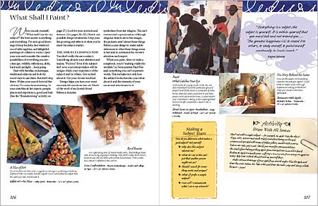
I received a review copy of The New Creative Artist: A Guide to Developing Your Creative Spirit by Nita Leland from North Light Books. Leland is the author of several popular books including Exploring Color, Creative Collage Techniques, and The Creative Artist, her first book, of which The New Creative Artist is a considerably revised and expanded version.Leland has long had a presence on the web. Her blog Exploring Color and Creativity, which is one of the oldest links on the lines and colors blogroll, covers a variety of art related topics, as does her web site, which contains an extensive, if loosely arranged, array of resources, from a succinct description of split-primary color mixing, to an extensive list of art related books and mini book reviews. (Her site is perhaps best navigated through the site map.)
Leland often brings her resources to bear in service of those who need some help or guidance getting started down an artistic path. She has been teaching workshops since the ’70s, and her books, in particular The New Creative Artist, work hard at building a bridge onto that path, either for beginners or even seasoned artists who are struggling with being “blocked” or are in need of a recharge for their artistic confidence.
The New Creative Artist is a compendium of suggestions, exercises, and short articles on various ways to jump start the creative process. Like Bert Dodson’s Keys to Drawing with Imagination, also from North Light Books, which I reviewed a few weeks ago, Leland’s creativity enhancement principles are not new, the value is in her choice and presentation of them.
Like Keys to Drawing With Imagination, The New Creative Artist makes those techniques specific to artistic creation, as opposed to the many creativity enhancement books that try to cover all bases and include business and office creativity in the mix. Also like that book, this one is bound as a spiral/hardback hybrid meant to lay open flat on your drawing table while you work. Unlike Keys, which is specifically related to drawing, Leland’s book is more generally oriented to a variety of artistic endeavors, including painting, drawing, collage, and even crafts like fiber arts, papermaking and decorative painting.
In the process, The New Creative Artist serves as a brief introduction to a multitude of artistic techniques. Various mediums and working methods are mentioned briefly, but with enough detail to engage in them. Her section on Drawing Methods, for example, gives you short but workable descriptions of contour drawing, gesture drawing, portraiture, figure drawing and even the Surrealists’ specialty of automatic drawing. She also talks about design in relation to composing works, and the importance of elements like shape, value, rhythm, contrast and balance.
Design is perhaps an issue in the appreciation of the book, The book itself is an intense exercise in book design (by Wendy Dunning, possibly in collaboration with Leland). It is full of colors, patterns, textures and graphic elements meant to look like notes or scraps of paper, with exercises and quotes written on them, scattered about as if lying on top of the pages. It’s illustrated with works from a number of artists, in addition to Leland’s own, that generally use a bright palette. While sure to be delightful to some, The overall effect is, to my eye, a bit feminine, and may be off-putting to hard bitten concept artists, comic book artists and dyed-in-the-wool starving-in-a-garret bohemian painters. If you can get past that initial impression, and the cheery, informal, hand-holding tone of the text, you may find that the techniques are just as valid as if printed in plain Garamond on stark white pages.
There is an online preview of the book, which allows you to thumb through small but legible examples of over 30 pages.
Though of potential benefit to almost any artist who wants a source of techniques for unblocking and reviving artistic confidence, (one the best of which, I feel, is to break from what you are used to doing and explore another approach, medium or set of tools, as this book suggests), the The New Creative Artist is more directly aimed at those who are working to get started, and who will find it full of gentle encouragement and a wide array of approaches to creative exploration.
Categories:


Charley’s Picks
Bookshop.org
(Bookshop.org affilliate links; sales benefit independent bookshop owners; I get a small percentage to help support my work on Lines and Colors)

John Singer Sargent: Watercolors


Urban Sketching: Understanding Perspective


Charley’s Picks
Amazon
(Amazon.com affiliate links; sales go to a larger yacht for Jeff Bezos; but I get a small percentage to help support my work on Lines and Colors)
John Singer Sargent: Watercolors
Urban Sketching: Understanding Perspective