
Categories
- 3d CGI
- Amusements
- Animation
- Anime & Manga
- Art Materials
- Art Videos
- Blogroll
- Cartoons
- Color
- Comics
- Concept & Visual Dev.
- Creativity
- Digital Art
- Digital Painting
- Displaying Art on the Web
- Drawing
- Eye Candy for Today
- Gallery and Museum Art
- High-res Art Images
- Illustration
- Motion Graphics & Flash
- Museums
- Online Museums
- Outsider Art
- Painting
- Painting a Day
- Paleo Art
- Pastel, Conté & Chalk
- Pen & Ink
- Prints and Printmaking
- Reviews
- Sc-fi and Fantasy
- Sculpture & Dimensional
- Site Comments
- Sketching
- Storyboards
- Tools and Techniques
- Uncategorized
- Vector Art
- Videos & Podcasts
- Vision and Optics
- Watercolor and Gouache
- Webcomics
Archives
- June 2026
- May 2026
- April 2026
- March 2026
- February 2026
- January 2026
- December 2025
- November 2025
- October 2025
- September 2025
- August 2025
- July 2025
- June 2025
- May 2025
- January 2025
- December 2024
- November 2024
- October 2024
- September 2024
- August 2024
- June 2024
- April 2024
- March 2024
- February 2024
- January 2024
- December 2023
- November 2023
- October 2023
- September 2023
- August 2023
- July 2023
- May 2023
- April 2023
- March 2023
- February 2023
- January 2023
- December 2022
- November 2022
- September 2022
- August 2022
- July 2022
- June 2022
- May 2022
- April 2022
- March 2022
- February 2022
- January 2022
- December 2021
- November 2021
- October 2021
- September 2021
- August 2021
- July 2021
- June 2021
- May 2021
- April 2021
- March 2021
- February 2021
- January 2021
- December 2020
- November 2020
- October 2020
- September 2020
- August 2020
- July 2020
- June 2020
- May 2020
- April 2020
- March 2020
- February 2020
- January 2020
- December 2019
- November 2019
- October 2019
- September 2019
- August 2019
- July 2019
- June 2019
- May 2019
- April 2019
- March 2019
- February 2019
- January 2019
- December 2018
- November 2018
- October 2018
- September 2018
- August 2018
- July 2018
- June 2018
- May 2018
- April 2018
- March 2018
- February 2018
- January 2018
- December 2017
- November 2017
- October 2017
- September 2017
- August 2017
- July 2017
- June 2017
- May 2017
- April 2017
- March 2017
- February 2017
- January 2017
- December 2016
- November 2016
- October 2016
- September 2016
- August 2016
- July 2016
- June 2016
- May 2016
- April 2016
- March 2016
- February 2016
- January 2016
- December 2015
- November 2015
- October 2015
- September 2015
- August 2015
- July 2015
- June 2015
- May 2015
- April 2015
- March 2015
- February 2015
- January 2015
- December 2014
- November 2014
- October 2014
- September 2014
- August 2014
- July 2014
- June 2014
- May 2014
- April 2014
- March 2014
- February 2014
- January 2014
- December 2013
- November 2013
- October 2013
- September 2013
- August 2013
- July 2013
- June 2013
- May 2013
- April 2013
- March 2013
- February 2013
- January 2013
- December 2012
- November 2012
- October 2012
- September 2012
- August 2012
- July 2012
- June 2012
- May 2012
- April 2012
- March 2012
- February 2012
- January 2012
- December 2011
- November 2011
- October 2011
- September 2011
- August 2011
- July 2011
- June 2011
- May 2011
- April 2011
- March 2011
- February 2011
- January 2011
- December 2010
- November 2010
- October 2010
- September 2010
- August 2010
- July 2010
- June 2010
- May 2010
- April 2010
- March 2010
- February 2010
- January 2010
- December 2009
- November 2009
- October 2009
- September 2009
- August 2009
- July 2009
- June 2009
- May 2009
- April 2009
- March 2009
- February 2009
- January 2009
- December 2008
- November 2008
- October 2008
- September 2008
- August 2008
- July 2008
- June 2008
- May 2008
- April 2008
- March 2008
- February 2008
- January 2008
- December 2007
- November 2007
- October 2007
- September 2007
- August 2007
- July 2007
- June 2007
- May 2007
- April 2007
- March 2007
- February 2007
- January 2007
- December 2006
- November 2006
- October 2006
- September 2006
- August 2006
- July 2006
- June 2006
- May 2006
- April 2006
- March 2006
- February 2006
- January 2006
- December 2005
- November 2005
- October 2005
- September 2005
- August 2005
Relevant Blogs
Art, Painting & Sketch
- Gurney Journey
- Underpaintings
- Art and Influence
- Painting Perceptions
- Oil Painters of America
- Vasari Paint POV
- Flying Fox
- Urban Sketchers
- Bento (Smithsonian)
- Art Inconnu
- The Hidden Place
- Still Life
- Making a Mark
- The Art of the Landscape
- Exploring Color & Creativity
- Art Contrarian
- Artist A Day
- beinArt Surreal Art Collective
- Eye Level
- David Dunlop
- p.i.g.m.e.n.t.i.u.m
- CultureGrrl
- Joaquín Sorolla blog
- Artists in Pastel
“Painting a Day”
- A Painting a Day (Keiser)
- On Painting (Keiser)
- Julian Merrow-Smith
- Karen Jurick
- Jeffrey Hayes
- Carol Marine
- Abbey Ryan
- Daily Paintworks
Other Painting Blogs
- Virtual Gouache Land
- Neil Hollingsworth
- Marc Hanson
- Kevin Menck
- Marc Dalessio
- Larry Seiler
- Stapleton Kearns
- Colin Page
- Roos Schuring
- Hans Versfelt
- Titus Meeuws
- Régis Pettinari
- René Plein Air
- Belinda Del Pesco
- Robin Weiss
- Nathan Fowkes (Land Sketch)
- William Wray
- Frank Serrano
- Stephen Magsig
- Michael Chesley Johnson
- Twice a Week
- Sarah Wimperis
- Rob Adams
- Michael Cole Manley
- The Dirty Palette Club
- Mike Manley’s Draw!
Gallery Art & Illustration mix
Illustration
- Howard Pyle
- 100 Years of Illustration
- BibliOdyssey
- Illustration Art
- Today’s Inspiration
- Illustration Mundo
- Little Chimp Society
- Danny Gregory
- R D (John Martz
- Illustration Friday blog
- Monster Brains
- Illustrators & Illustrations (RU)
- Elwood H. Smith
- DaniDraws.com
- Designers Who Blog
- iSpot Blog
Sci-Fi & Fantasy
Illustration & Comics
Comics & Cartoons
- Comics Beat
- Robot 6
- Newsarama Blog
- Comic Vine
- Comics Alliance
- Forbidden Planet Int.
- Paolo Rivera
- Bolt City
- Flight
- Scott McCloud
- The Comics Journal
- Comixpedia
- Funnybook Babylon
- James Baker
- Middleton’s Sketchbook
- Boneville
- The Hotel Fred
- Paul Rivoche
- Daily Cartoonist
- Mad About Cartoons (William Wray)
- Digital Strips
Illustration & Concept
Animation & Concept
- Cartoon Brew
- Animation Blog
- Cold Hard Flash
- Concept Art World
- The CAB
- FY Concept Art
- Concept Ships
- Concept Robots
- John Nevarez
- Armand Serrano
- Marcos Mateu-Mestre
- all kinds of stuff (Kricfalusi)
- Yacin the faun (Man Arenas)
- Kelsey Mann
- Cre8tivemarks Blog
- Ice-Cream Monster Toon Cafe
- AAU Character & Creature Design
- AAU Animation Notes
- Articles and Texticles
Paleo & Scientific
Tools & Techniques
Other
Lists of Art Blogs
Art Image Resource Links
Historic Art Images
- Wikimedia Commons: Paintings
- Wikimedia Commons: Drawings
- The Athenaeum
- WikiArt (WikiPaintings)
- Google Art Project: Artists
- Google Art Project: Collections (Museums)
- ArtCyclopedia
- Web Gallery of Art
- Art Renewal Center
- Web Gallery of Impressionism
Auction Consolidation sites
Auction sites
- Sotheby’s
- Bonham’s
- Christies
- Heritage Auctions: Fine Art
- Heritage Auctions: Illustration
- Freeman’s Auctions
- Bukowskis
- Shannon’s
Image Search
Reverse Image Search (search by image)
- Tin Eye
- RevImg
- Google Image Search (camera icon)
- Bing Image Search (camera icon)
Promoting some friends and some clients of my website design business
- Twin Willows T’ai Chi studio in Wilmington DE. Taiji classes with Bryan Davis.
- Ray Hayward, Inspired Teacher of T’ai Chi ( Taiji ) in Minneapolis, Founder of Mindful Motion Tai Chi Academy
- OldHead Tattoo studio and Art Gallery in Wilmington DE. Tattoos and paintings by Bruce Gulick
- Sharon Domenico Art, pet portrait oil paintings
- Platinum Paperhanging, wallpaper hanging, Main Line and Philadelphia, PA
- Lisa Stone Design, interior designer, Main Line and Philadelphia, PA
- Studio12KPT, original art, prints, calendars and other custom printed items by Van Sickle & Rolleri
-
Americans in Paris

Say what you will, but as far as I’m concerned, Paris is the capital of the world.Well, if we have any pride in ourselves as human beings, it should be. There may be other cities that could lay claim to that title on the basis of commerce, power, wealth or sheer size, but Paris, if aliens were to come down and ask, represents what a beautiful, entrancing, inspirational, livable, colorful and spectacularly glorious city we humans can make if we set our minds to it and back it up with our finest craftsmen, architects, designers and artists.
Little wonder it has been attracting the attention of artists for generations, particularly American artists in the latter half of the 19th Century, who flocked there for inspiration, instruction and to connect with the planet’s glowing center of art and culture.
The Metropolitan Museum of Art in New York (a city that is no slouch when it comes to culture but, sorry, isn’t in the same league with Paris), is hosting an absolutely wonderful exhibit of some of the American painters who went to Paris at that time to study and exhibit, in other words, some of the best American painters ever. This list includes many of the painters I particularly admire because they fit into the area of “realism under the influence of Impressionism” that I really enjoy.
The show is called Americans in Paris and is a spectacularly high-level show, featuring great works by John Singer Sargent, Childe Hassam, James McNeil Whistler, Celia Beaux, John Henry Twatchman, Charles Courtney Curran, J. Alden Weir, Robert Vonnoh, John White Alexander, Winslow Homer, Thomas Eakins, William Metcalf, Charles Sprague Pearce, Charles Edmund Tarbell and more.
Wow.
(Image above, clockwise from top-left: Sargent, Alexander, Curran, Pearce, Hassam, Whistler.)
The exhibit not only features these great artists, but many are represented by some of their best works, including several paintings that I have wanted to see in person for years, like Sargent’s stunning group portrait of The Daughters of Edward Darley Boit and Fishing for Oysters at Cancale (the small version), Alexander’s Isabella and the Pot of Basil (that I show here), Hassam’s Grand Prix Day and unexpected delights like Charles Curran’s Afternoon in the Cluny Garden, Paris, Harry van der Weyden’s Morning Labor on the Seine and several amazing little paintings by Charles Sprague Pearce.
The show runs from yesterday, October 24th, 2006, to January 28, 2007. I plan to see it again if I can. Short of traveling to Paris (sigh), it’s as close as I can get in terms of inspiration for this American.
[Addendum, 2012: Americans in Paris archive at the Met is now here.]
Categories:
-
Dave Malan

Dave Malan is an illustrator and gallery artist based in Salt lake City, where he works for Disney Games. The work displayed on his site and blog, however, is mostly his personal and gallery work, which ranges from straightforward portraiture to highly finished oils in a style that leans to caricature-like exaggeration.The paintings on his site are mostly portraits, often of family members, painted in a frank “direct observer” kind of approach, at times incorporating a landscape or interior background. The illustrations are caricature style paintings that have a fun rendered cartoon feeling to them. The drawings, in pencil or NuPastel, are a bit of a mix, but tend toward straightforward portraiture.
His blog, Brilliant Anyway, features his work in a more casual format, includes work he doesn’t consider finished or refined enough to post on the main site, comments on the images and the process behind them and additional drawings. He also has some excellent links to the web presence for artists that he admires, his taste in which would be of interest to readers of lines and colors.
Malan seems to be fascinated in particular with faces, whether portraits or caricature, and often posts sketches from his sketchbook of people from the news or popular entertainment.
Malan is a contributor the Avalance Software Blog, a group blog where artists for the company (which is in some way affiliated with Disney) post artwork, often in response to a topic suggested by one of them.
Dave Malan is married to illustrator Natalie Malan.
Categories:
-
Jean-Honoré Fragonard
 I’m in New York for a few days (hence no post yesterday), and I had a chance to see a number of shows. One is a small but beautiful show of French Rococo drawings at the newly renovated and expanded Morgan Library and Museum, “Fragonard and the French Tradition“, with drawings by Fragonard, his mentors Francois Boucher and Charles-Joseph Natoire, and contemporaries Hubert Robert, Jean-Babtiste Greuze and Jacques-Louis David.
The exhibit is drawn (if you’ll excuse the expression) from the Morgan’s own superb collection. The show is small, but beautiful.
Jean-Honoré Fragonard was a French Rococo painter whose playful, sensual and often erotic canvasses, along with those of Boucher, exemplify the voluptuously romantic visions of the period.
Fragonard’s drawings, most often executed in brown inks and wash, are wonderful in their ability to appear richly detailed while, in fact, having a remarkable economy of line and texture. Foliage that might be represented by hundreds of curved strokes in the drawings of other artists, even in the case of that sublime master of quick suggestion, Rembrandt, are created by Fragonard in a flurried illusion of wonderful scribbles that somehow convince your eye that you are, indeed, looking a leaves and branches.
The luxurious color and detail in his paintings are a fascinating contrast to the directness and quick suggestion of his drawings. If you go to the Morgan show and want to see that contrast, go uptown to the Frick Collection to see their wonderful examples of his paintings from the series titled “The Progress of Love”.
Categories:
-
Zita the Space Girl

Zita the Space Girl is a series of charming short webcomics by Ben Hatke.Hatke draws Zita with a simple, somewhat cartoony outline style reminiscent of early 20th Century newspaper comics, and occasional elaborations with atmospheric color.
The home page of the site serves as a news and updates page. The Comics section has the strips posted in chronological order from the bottom up.
The bad news is that Zita is updated very infrequently (although not as infrequently as, *Ahem!*, certain other webcomics are updated). The good news is that Hatke is working on new Zita material for print.
Hatke has been a contributor to the Flight comics anthologies (see previews here and here) and is working on a Zita strip for inclusion in #4. There is a nice write-up on the Flight blog that goes into more detail including the origins of the character and initial designs.
Categories:
-
Daryl Mandryk

I don’t know why, exactly, but it seems like most adolescent boys, including the ones that remain in charge of some part of us as adults, love a good monster. A lot of girls like monsters too, of course, but it seems much more ingrained in boys.Perhaps it’s some primal urge to slay the demons threatening our family/village/tribe/species that compels our fascination with monsters, or maybe it’s just the gee-whiz wow cool factor. Regardless, most of us, even as “responsible adults” have to admit that we like to see a good monster now and then.
Daryl Mandryk paints good monsters, as well as nasty zombies, giant ice warriors, menacing mecha, rampaging bots, evil aliens and all manner of deliciously threatening beasties. All of which, of course, make for the ideal stock in trade of today’s gaming market.
Mandryk is a concept artist for the gaming industry, and has worked on games like Def Jam Fight, SSX on Tour, Need for Speed Underground 2, and Def Jam Vendetta for EA Games. He is currently a senior concept artist for Propaganda Games where he is working on a new game listed under the working title of Turok, which I hope means it is a version of those great old Turok, Son of Stone Indians and Dinosaurs comic books.
Mandryk has also done illustrations for fantasy and gaming publications and his work was the subject of a recent feature article and tutorial in Imagine FX Magazine.
Mandryk started out working with 3-D modeling, but has shifted into direct digital painting in Painter and Photoshop, as well as working in traditional media.
The galleries on his site are arranged by date, and include sections of older work, sketches and figure drawings from life. The highlights, though, are the nicely scary monsters, demons, and otherworldly nasties that crawl out of his electronic paintbrush.
Categories:
-
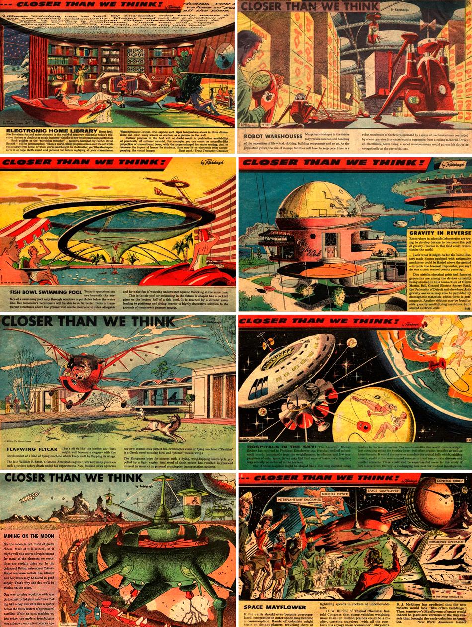
Arthur Radenbaugh

Are we there yet? Is this the future?Apparently not, judging by the lack of seed-shaped aerodynamic three-wheeled cars and art deco skyscrapers (Chrysler Building notwithstanding), but the future as depicted by futurist illustrator Arthur Radenbaugh in the 1930’s would have been very cool indeed.
Radenbaugh did his futuristic renderings of cars for Motor magazine, and his advertising and editorial illustrations for magazines like Esquire, Fortune and Advertising Agency with an eye to the future, and rendered them with a futuristic tool, the airbrush, which was coming into broader use at the time.
The ability of the airbrush to lay down remarkably smooth, even tones and gradations (today being replaced by digital tools that do the same thing more easily), made it the tool of choice for rendering a future that would obviously be seemlessly smooth, shiny and sleekly modern (just like today!)
There is a virtual exhibition of Radenbaugh’s work, Radenbaugh, The Future We Were Promised online as part of The Palace of Culture Museum.
Hey, I still want to know why we don’t all have a gyrocopter in our driveway. Must not be the future yet.
Categories:


Charley’s Picks
Bookshop.org
(Bookshop.org affilliate links; sales benefit independent bookshop owners; I get a small percentage to help support my work on Lines and Colors)

John Singer Sargent: Watercolors


Urban Sketching: Understanding Perspective


Charley’s Picks
Amazon
(Amazon.com affiliate links; sales go to a larger yacht for Jeff Bezos; but I get a small percentage to help support my work on Lines and Colors)
John Singer Sargent: Watercolors
Urban Sketching: Understanding Perspective