
Categories
- 3d CGI
- Amusements
- Animation
- Anime & Manga
- Art Materials
- Art Videos
- Blogroll
- Cartoons
- Color
- Comics
- Concept & Visual Dev.
- Creativity
- Digital Art
- Digital Painting
- Displaying Art on the Web
- Drawing
- Eye Candy for Today
- Gallery and Museum Art
- High-res Art Images
- Illustration
- Motion Graphics & Flash
- Museums
- Online Museums
- Outsider Art
- Painting
- Painting a Day
- Paleo Art
- Pastel, Conté & Chalk
- Pen & Ink
- Prints and Printmaking
- Reviews
- Sc-fi and Fantasy
- Sculpture & Dimensional
- Site Comments
- Sketching
- Storyboards
- Tools and Techniques
- Uncategorized
- Vector Art
- Videos & Podcasts
- Vision and Optics
- Watercolor and Gouache
- Webcomics
Archives
- May 2026
- April 2026
- March 2026
- February 2026
- January 2026
- December 2025
- November 2025
- October 2025
- September 2025
- August 2025
- July 2025
- June 2025
- May 2025
- January 2025
- December 2024
- November 2024
- October 2024
- September 2024
- August 2024
- June 2024
- April 2024
- March 2024
- February 2024
- January 2024
- December 2023
- November 2023
- October 2023
- September 2023
- August 2023
- July 2023
- May 2023
- April 2023
- March 2023
- February 2023
- January 2023
- December 2022
- November 2022
- September 2022
- August 2022
- July 2022
- June 2022
- May 2022
- April 2022
- March 2022
- February 2022
- January 2022
- December 2021
- November 2021
- October 2021
- September 2021
- August 2021
- July 2021
- June 2021
- May 2021
- April 2021
- March 2021
- February 2021
- January 2021
- December 2020
- November 2020
- October 2020
- September 2020
- August 2020
- July 2020
- June 2020
- May 2020
- April 2020
- March 2020
- February 2020
- January 2020
- December 2019
- November 2019
- October 2019
- September 2019
- August 2019
- July 2019
- June 2019
- May 2019
- April 2019
- March 2019
- February 2019
- January 2019
- December 2018
- November 2018
- October 2018
- September 2018
- August 2018
- July 2018
- June 2018
- May 2018
- April 2018
- March 2018
- February 2018
- January 2018
- December 2017
- November 2017
- October 2017
- September 2017
- August 2017
- July 2017
- June 2017
- May 2017
- April 2017
- March 2017
- February 2017
- January 2017
- December 2016
- November 2016
- October 2016
- September 2016
- August 2016
- July 2016
- June 2016
- May 2016
- April 2016
- March 2016
- February 2016
- January 2016
- December 2015
- November 2015
- October 2015
- September 2015
- August 2015
- July 2015
- June 2015
- May 2015
- April 2015
- March 2015
- February 2015
- January 2015
- December 2014
- November 2014
- October 2014
- September 2014
- August 2014
- July 2014
- June 2014
- May 2014
- April 2014
- March 2014
- February 2014
- January 2014
- December 2013
- November 2013
- October 2013
- September 2013
- August 2013
- July 2013
- June 2013
- May 2013
- April 2013
- March 2013
- February 2013
- January 2013
- December 2012
- November 2012
- October 2012
- September 2012
- August 2012
- July 2012
- June 2012
- May 2012
- April 2012
- March 2012
- February 2012
- January 2012
- December 2011
- November 2011
- October 2011
- September 2011
- August 2011
- July 2011
- June 2011
- May 2011
- April 2011
- March 2011
- February 2011
- January 2011
- December 2010
- November 2010
- October 2010
- September 2010
- August 2010
- July 2010
- June 2010
- May 2010
- April 2010
- March 2010
- February 2010
- January 2010
- December 2009
- November 2009
- October 2009
- September 2009
- August 2009
- July 2009
- June 2009
- May 2009
- April 2009
- March 2009
- February 2009
- January 2009
- December 2008
- November 2008
- October 2008
- September 2008
- August 2008
- July 2008
- June 2008
- May 2008
- April 2008
- March 2008
- February 2008
- January 2008
- December 2007
- November 2007
- October 2007
- September 2007
- August 2007
- July 2007
- June 2007
- May 2007
- April 2007
- March 2007
- February 2007
- January 2007
- December 2006
- November 2006
- October 2006
- September 2006
- August 2006
- July 2006
- June 2006
- May 2006
- April 2006
- March 2006
- February 2006
- January 2006
- December 2005
- November 2005
- October 2005
- September 2005
- August 2005
Relevant Blogs
Art, Painting & Sketch
- Gurney Journey
- Underpaintings
- Art and Influence
- Painting Perceptions
- Oil Painters of America
- Vasari Paint POV
- Flying Fox
- Urban Sketchers
- Bento (Smithsonian)
- Art Inconnu
- The Hidden Place
- Still Life
- Making a Mark
- The Art of the Landscape
- Exploring Color & Creativity
- Art Contrarian
- Artist A Day
- beinArt Surreal Art Collective
- Eye Level
- David Dunlop
- p.i.g.m.e.n.t.i.u.m
- CultureGrrl
- Joaquín Sorolla blog
- Artists in Pastel
“Painting a Day”
- A Painting a Day (Keiser)
- On Painting (Keiser)
- Julian Merrow-Smith
- Karen Jurick
- Jeffrey Hayes
- Carol Marine
- Abbey Ryan
- Daily Paintworks
Other Painting Blogs
- Virtual Gouache Land
- Neil Hollingsworth
- Marc Hanson
- Kevin Menck
- Marc Dalessio
- Larry Seiler
- Stapleton Kearns
- Colin Page
- Roos Schuring
- Hans Versfelt
- Titus Meeuws
- Régis Pettinari
- René Plein Air
- Belinda Del Pesco
- Robin Weiss
- Nathan Fowkes (Land Sketch)
- William Wray
- Frank Serrano
- Stephen Magsig
- Michael Chesley Johnson
- Twice a Week
- Sarah Wimperis
- Rob Adams
- Michael Cole Manley
- The Dirty Palette Club
- Mike Manley’s Draw!
Gallery Art & Illustration mix
Illustration
- Howard Pyle
- 100 Years of Illustration
- BibliOdyssey
- Illustration Art
- Today’s Inspiration
- Illustration Mundo
- Little Chimp Society
- Danny Gregory
- R D (John Martz
- Illustration Friday blog
- Monster Brains
- Illustrators & Illustrations (RU)
- Elwood H. Smith
- DaniDraws.com
- Designers Who Blog
- iSpot Blog
Sci-Fi & Fantasy
Illustration & Comics
Comics & Cartoons
- Comics Beat
- Robot 6
- Newsarama Blog
- Comic Vine
- Comics Alliance
- Forbidden Planet Int.
- Paolo Rivera
- Bolt City
- Flight
- Scott McCloud
- The Comics Journal
- Comixpedia
- Funnybook Babylon
- James Baker
- Middleton’s Sketchbook
- Boneville
- The Hotel Fred
- Paul Rivoche
- Daily Cartoonist
- Mad About Cartoons (William Wray)
- Digital Strips
Illustration & Concept
Animation & Concept
- Cartoon Brew
- Animation Blog
- Cold Hard Flash
- Concept Art World
- The CAB
- FY Concept Art
- Concept Ships
- Concept Robots
- John Nevarez
- Armand Serrano
- Marcos Mateu-Mestre
- all kinds of stuff (Kricfalusi)
- Yacin the faun (Man Arenas)
- Kelsey Mann
- Cre8tivemarks Blog
- Ice-Cream Monster Toon Cafe
- AAU Character & Creature Design
- AAU Animation Notes
- Articles and Texticles
Paleo & Scientific
Tools & Techniques
Other
Lists of Art Blogs
Art Image Resource Links
Historic Art Images
- Wikimedia Commons: Paintings
- Wikimedia Commons: Drawings
- The Athenaeum
- WikiArt (WikiPaintings)
- Google Art Project: Artists
- Google Art Project: Collections (Museums)
- ArtCyclopedia
- Web Gallery of Art
- Art Renewal Center
- Web Gallery of Impressionism
Auction Consolidation sites
Auction sites
- Sotheby’s
- Bonham’s
- Christies
- Heritage Auctions: Fine Art
- Heritage Auctions: Illustration
- Freeman’s Auctions
- Bukowskis
- Shannon’s
Image Search
Reverse Image Search (search by image)
- Tin Eye
- RevImg
- Google Image Search (camera icon)
- Bing Image Search (camera icon)
Promoting some friends and some clients of my website design business
- Twin Willows T’ai Chi studio in Wilmington DE. Taiji classes with Bryan Davis.
- Ray Hayward, Inspired Teacher of T’ai Chi ( Taiji ) in Minneapolis, Founder of Mindful Motion Tai Chi Academy
- OldHead Tattoo studio and Art Gallery in Wilmington DE. Tattoos and paintings by Bruce Gulick
- Sharon Domenico Art, pet portrait oil paintings
- Platinum Paperhanging, wallpaper hanging, Main Line and Philadelphia, PA
- Lisa Stone Design, interior designer, Main Line and Philadelphia, PA
- Studio12KPT, original art, prints, calendars and other custom printed items by Van Sickle & Rolleri
-
KIm Jung Gi

Despite some glaring flaws in its presentation, this time lapse video of Kim Jung Gi drawing a complex panorama in markers, across two walls at 90° and apparently without preliminary sketch, is fascinating.Starting with a driver’s face, he goes on to draw cars, bikes, scuba divers and a variety of animals and people, including a self portrait (in red) near the end.
Though there is music initially, it quickly ends, and the video runs an hour and a quarter. James Gurney suggests listening to podcasts while watching.
Unfortunately, the video is marred by a presentation that includes a line advertising a website that features Kim Jung Gi’s work (along with other artists), that is unnecessarily overlapping the image and annoyingly animated.
In addition the video (frustratingly, inexplicably) ends abruptly without a good view of the finished image, and I haven’t been able to find a still of the final piece.
There is another, much shorter drawing demo here. I’ve included links to Kim Jung Gi’s other sites below.
Watching this kind of stream of consciousness drawing reminds me a bit of a time I got to watch Jean “Moebius” Giraud draw convention sketches for an hour or so — seemingly effortlessly.
[Note: some of the images on the linked sites (though not in the video) are distinctly NSFW and not suitable for children.]
[Via Gurney Journey]
Categories:
-
Eye Candy for Today: Emil Carlsen still life

Still Life with Fish, Emil CarlsenIn the National Gallery of Art, Washington; use “Zoom” control.
Early in his career, the Danish-American painter spent six months in Paris, where he studied the still life paintings of Jean Siméon Chardin, apparently to great effect.
Categories:
-
Mirage

Mirage is a 10 minute animated short from Iker Maidagan and Dana Terrace, (with help from others listed in the credits).The short was created for their thesis project as students at the School of Visual Arts and is remarkably sophisticated in its storytelling and overall realization.
It starts with an Inuit boy making a discovery while fishing, and goes from there into an engaging series of events I’ve tried not to spoil with my screen captures above.
[Via Michael Ruocco on CartoonBrew]
Categories:
-
Daniel Adel (update)
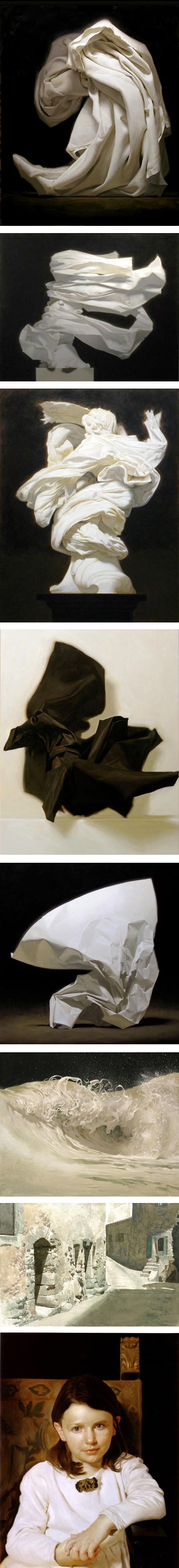
For hundreds of years, artists have been studying drapery, both as garments and backgrounds for still life, and more abstractly as a subject in which is revealed the play of light against complex folds, waves, valleys and ridges — in effect, a microcosm of light in nature.Daniel Adel evidently sees that microcosm, finding continuing fascination with the subject of strongly lit folded or draped cloth, but pulled in his imagination by invisible forces of oblique gravity and force of air into shapes that seem both physically improbable and perfectly naturalistic.
At times, in his recent work, he reveals that his windswept draperies are embracing bits of statuary; elements of putti or cherubs peak from under the flying folds.
Adel’s interest in the subject extends into fascinating variations: black folds against light backgrounds; similar forms like wings, swirling surf and foam; and my personal favorite, intricate wads of crumpled paper, with their contrasting crisp and soft edges, subtle ranges of value and shimmering areas of translucency.
Adel’s recent work will be on display in a one-person show at Arcadia Fine Arts in Soho that opens this Saturday, June 15 and runs until June 28, 2013.
During the exhibition you will be able to see a preview of the show here. After that the link will change to the next exhibition, but you can see a continuing gallery of Adel’s work on the Arcadia site here.
On Adel’s website you will find not only additional example of his work in the motifs mentioned above, but more traditional subjects of landscape in watercolor, as well as portraiture, along with examples of his work as a professional illustrator.
Within those seemingly disparate subjects you will still see Adel’s fascination with drapery, cloth and the play of light against brightly lit surfaces.
For more, see my 2007 post on Daniel Adel.
Categories:
-
Google Art Project changes
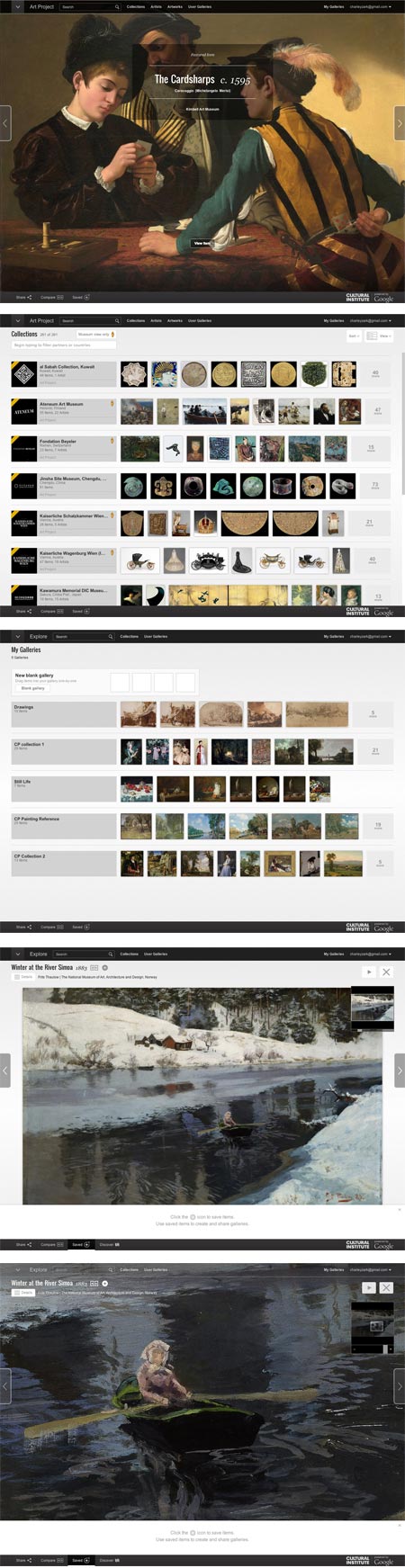
Let me start by saying that I have been a fan of the Google Art Project pretty much since it’s inception in February of 2011 — because I love, love, love high resolution art images — just love ’em! (love ’em!), and the Google Art Project has delivered them — in ever increasing numbers.Admittedly there has been some inconsistency in size and some lapses in quality, but overall they have done a splendid job of putting our noses right up to some of the world’s great works of art, along with offering virtual tours of many of the museums in which they’re housed.
When they expanded, reorganized and streamlined the site in 2012, I was right on board. Every change they made was a much needed improvement.
Google has just released a new round of revisions to the project, and at the risk of looking a gift horse in the mouth, I have to say I’m not entirely enthused this time around.
First of all, the Google Art Project no longer exists as an independent entity; it has been subsumed into the more ambitious “Google Cultural Institute“, which evidently seeks to cover all aspects of culture (and perhaps, eventually, All Knowledge — who knows?)
So now, instead of the Google Art Project we apparently have the Google Cultural Institute: Art Project, and in place of googleartproject.com, we have google.com/culturalinstitute/project/art-project (though I will give the tech team credit for keeping incoming links intact).
It just seems like an unnecessary sidelining and de-emphasizing of the Art Project, and of course, I think such a great destination for online art images should be made more prominent, not less.
Google has made interface changes to the
Google Art ProjectGoogle Cultural Institute: Art Project — some I think are indeed for the better, others… not so much.The overall interface is now soft gray with black or dark gray navigation bars, making text easier to read and the navigation areas more prominent, and some navigation features are better organized.
The layout of the Collections and Artists listings is simultaneously improved — by a selection of thumbnail images next to each item in the list — and made more awkward — by a selection of thumbnail images next to each item in the list, without the ability to leave out the thumbnails and streamline the list to just text for easier scrolling.
The need to load thumbnails and the “endless list” style of layout make the list of museums so awkward to browse it’s essentially unusable unless you choose to filter the list — not a good browsing model.
(Is it just me? Am I the only one who finds this now seemingly universal paradigm of infinitely scrolling pages updated with JavaScript, in lieu of actual separate pages that can be individually linked to and bookmarked, not only unnecessary but annoying?)
Filtering the list is up to you; you have to guess at some filters. They say “Begin typing to filter partners [i.e. museums] or countries” and the only actual built-in filter they give you is on the other side of the page in the form of a choice between list and world map view.
The Artists list is likewise not conducive to browsing unless you’re actually searching by name.
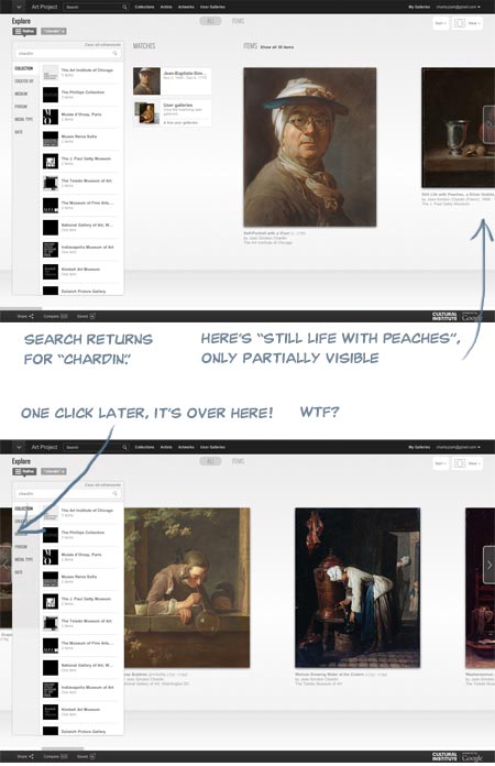
An attempt to filter for “19th century” returned nothing; a filter for “France” returned only an entry with the word “France” in the name, and filtering or searching for “Courbet still life” returned lots of items that were neither. Typing in “b” did not filter the list for artists whose names began with the letter, so that previously available feature is gone along with other useful interface items. Maybe they need to partner with a company that’s experienced with search…. oh, wait.
The “Artworks” tab yielded somewhat better results, with at least a scrollable text based list of museums, but still doesn’t encourage the kind of casual browsing by which unexpected discoveries are made.
The entire interface is still too widgety, too reliant on JavaScript and too likely to be clunky and problematic in browsers other than Google’s own Chrome.
It also suffers from design for the illusion of simplicity at the expense of clarity.
As a case in point, the list for Collections (i.e. museums) at first appears to be without discernible order, until you scroll far enough to realize that is is primarily alphabetical, but with new entries in the first several places. With no indication of their function other than a mouse-over tool tip, these are set off with diagonal corner stripes (you know — the universally understood symbol for “new entries that are out of sequence from the main list”).
The big sliding image view, which is the default when viewing Collections, doesn’t function correctly, even in Chrome (for Mac), in that an item partially visible to the right is not moved into full view by the use of the advance arrow, but instead maddeningly slides past the center of the screen and under the filter/collection list on the left! WTF?
I signed in to my account (free, and worthwhile for saving galleries) and under “My Galleries” my saved galleries were waiting for me, custom zoom levels intact, but without the convenient row of thumbnails at page bottom that made them previously easier to browse. This area is now apparently set aside for temporarily dropping items to be added to custom galleries, a process that is less straightforward than before.
The actual high-resolution image view is not radically changed; the background is gray instead of black, controls have been moved around and the containing window is now full browser height with overlays, but it’s essentially the same, and even feels a bit smoother and easier to zoom and scroll.
To be fair, creating and maintaining an amazing resource like this like this costs money, and I’m asking for a lot by being cranky about the interface, considering I’m not paying anything directly for the privilege of access. Google is not doing this out of altruism and a love of art, but as promotion for all things Google, and that’s fine.
Corporate world domination and the end of privacy is a small price to pay for access to high resolution art images (frighteningly, part of me means that), and the
Google Art ProjectGoogle Cultural Institute: Art Project is still a treasure trove, an amazing destination for art lovers and still more than worthy of my Major Time Sink Warning.Round two of the site was a distinct step up over the first version, and if round three is a bit glitchy, I can live with it while I wait for round four, as long as all those yummy high res images are available.
Interface hiccups aside, I feel the site is still deserving of even more attention and a wider audience, which is why I think submerging its identity into a mere sub-section of a monolithic “Cultural Institute” is an unfortunate choice.
Given Google’s propensity for growth, I’m just hoping the next round of revisions doesn’t leave art lovers digging through the Google Central Repository for All Information: Complete World Knowledge Registry: Humanities Data Bank: Cultural Institute: Art Project just to get to our fix of high-res Rembrandts.
Categories:
-
Joe Watmough
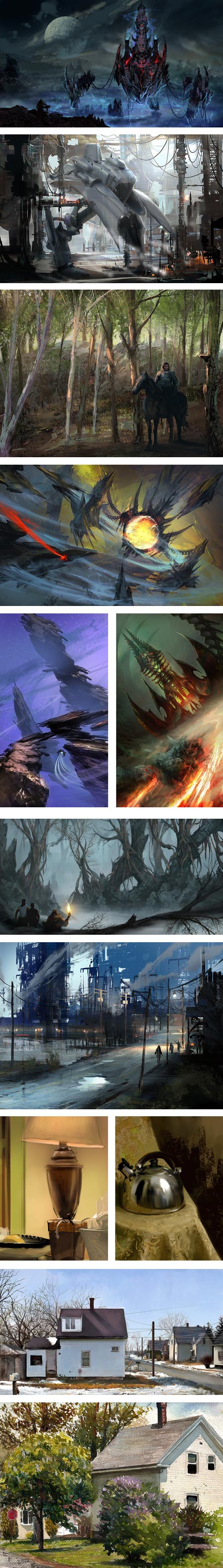
Joe Watmough is a concept artist for the gaming industry, currently working with Zenimax Online Studios, whose credits include work on Darksiders2, WARHAMMER 40K: Dark Millenium Online, Omega and Blackstar.In addition to a portfolio on CGHub, Watmough has two blogs, WatmoughPaintings and Ashakar. Though neither has been updated recently, both have additional images of the artist’s work. In addition, you can find a nice sampling of his work on Concept Art World.
I enjoy the way Watmough moves effortlessly between digital and traditional media, using digital painting not only for his professional work, but for sketching still life and landscape subjects from life (images above, second and third from bottom), as well as working from life in traditional media like watercolor (above, bottom).
He brings some of that study of the real world, and the play of light on landscapes and physical objects, into his professional work, where it adds a dimension of tactile immediacy to his imaginary landscapes and built environments.
Categories:


Charley’s Picks
Bookshop.org
(Bookshop.org affilliate links; sales benefit independent bookshop owners; I get a small percentage to help support my work on Lines and Colors)

John Singer Sargent: Watercolors


Urban Sketching: Understanding Perspective


Charley’s Picks
Amazon
(Amazon.com affiliate links; sales go to a larger yacht for Jeff Bezos; but I get a small percentage to help support my work on Lines and Colors)
John Singer Sargent: Watercolors
Urban Sketching: Understanding Perspective