
Categories
- 3d CGI
- Amusements
- Animation
- Anime & Manga
- Art Materials
- Art Videos
- Blogroll
- Cartoons
- Color
- Comics
- Concept & Visual Dev.
- Creativity
- Digital Art
- Digital Painting
- Displaying Art on the Web
- Drawing
- Eye Candy for Today
- Gallery and Museum Art
- High-res Art Images
- Illustration
- Motion Graphics & Flash
- Museums
- Online Museums
- Outsider Art
- Painting
- Painting a Day
- Paleo Art
- Pastel, Conté & Chalk
- Pen & Ink
- Prints and Printmaking
- Reviews
- Sc-fi and Fantasy
- Sculpture & Dimensional
- Site Comments
- Sketching
- Storyboards
- Tools and Techniques
- Uncategorized
- Vector Art
- Videos & Podcasts
- Vision and Optics
- Watercolor and Gouache
- Webcomics
Archives
- May 2026
- April 2026
- March 2026
- February 2026
- January 2026
- December 2025
- November 2025
- October 2025
- September 2025
- August 2025
- July 2025
- June 2025
- May 2025
- January 2025
- December 2024
- November 2024
- October 2024
- September 2024
- August 2024
- June 2024
- April 2024
- March 2024
- February 2024
- January 2024
- December 2023
- November 2023
- October 2023
- September 2023
- August 2023
- July 2023
- May 2023
- April 2023
- March 2023
- February 2023
- January 2023
- December 2022
- November 2022
- September 2022
- August 2022
- July 2022
- June 2022
- May 2022
- April 2022
- March 2022
- February 2022
- January 2022
- December 2021
- November 2021
- October 2021
- September 2021
- August 2021
- July 2021
- June 2021
- May 2021
- April 2021
- March 2021
- February 2021
- January 2021
- December 2020
- November 2020
- October 2020
- September 2020
- August 2020
- July 2020
- June 2020
- May 2020
- April 2020
- March 2020
- February 2020
- January 2020
- December 2019
- November 2019
- October 2019
- September 2019
- August 2019
- July 2019
- June 2019
- May 2019
- April 2019
- March 2019
- February 2019
- January 2019
- December 2018
- November 2018
- October 2018
- September 2018
- August 2018
- July 2018
- June 2018
- May 2018
- April 2018
- March 2018
- February 2018
- January 2018
- December 2017
- November 2017
- October 2017
- September 2017
- August 2017
- July 2017
- June 2017
- May 2017
- April 2017
- March 2017
- February 2017
- January 2017
- December 2016
- November 2016
- October 2016
- September 2016
- August 2016
- July 2016
- June 2016
- May 2016
- April 2016
- March 2016
- February 2016
- January 2016
- December 2015
- November 2015
- October 2015
- September 2015
- August 2015
- July 2015
- June 2015
- May 2015
- April 2015
- March 2015
- February 2015
- January 2015
- December 2014
- November 2014
- October 2014
- September 2014
- August 2014
- July 2014
- June 2014
- May 2014
- April 2014
- March 2014
- February 2014
- January 2014
- December 2013
- November 2013
- October 2013
- September 2013
- August 2013
- July 2013
- June 2013
- May 2013
- April 2013
- March 2013
- February 2013
- January 2013
- December 2012
- November 2012
- October 2012
- September 2012
- August 2012
- July 2012
- June 2012
- May 2012
- April 2012
- March 2012
- February 2012
- January 2012
- December 2011
- November 2011
- October 2011
- September 2011
- August 2011
- July 2011
- June 2011
- May 2011
- April 2011
- March 2011
- February 2011
- January 2011
- December 2010
- November 2010
- October 2010
- September 2010
- August 2010
- July 2010
- June 2010
- May 2010
- April 2010
- March 2010
- February 2010
- January 2010
- December 2009
- November 2009
- October 2009
- September 2009
- August 2009
- July 2009
- June 2009
- May 2009
- April 2009
- March 2009
- February 2009
- January 2009
- December 2008
- November 2008
- October 2008
- September 2008
- August 2008
- July 2008
- June 2008
- May 2008
- April 2008
- March 2008
- February 2008
- January 2008
- December 2007
- November 2007
- October 2007
- September 2007
- August 2007
- July 2007
- June 2007
- May 2007
- April 2007
- March 2007
- February 2007
- January 2007
- December 2006
- November 2006
- October 2006
- September 2006
- August 2006
- July 2006
- June 2006
- May 2006
- April 2006
- March 2006
- February 2006
- January 2006
- December 2005
- November 2005
- October 2005
- September 2005
- August 2005
Relevant Blogs
Art, Painting & Sketch
- Gurney Journey
- Underpaintings
- Art and Influence
- Painting Perceptions
- Oil Painters of America
- Vasari Paint POV
- Flying Fox
- Urban Sketchers
- Bento (Smithsonian)
- Art Inconnu
- The Hidden Place
- Still Life
- Making a Mark
- The Art of the Landscape
- Exploring Color & Creativity
- Art Contrarian
- Artist A Day
- beinArt Surreal Art Collective
- Eye Level
- David Dunlop
- p.i.g.m.e.n.t.i.u.m
- CultureGrrl
- Joaquín Sorolla blog
- Artists in Pastel
“Painting a Day”
- A Painting a Day (Keiser)
- On Painting (Keiser)
- Julian Merrow-Smith
- Karen Jurick
- Jeffrey Hayes
- Carol Marine
- Abbey Ryan
- Daily Paintworks
Other Painting Blogs
- Virtual Gouache Land
- Neil Hollingsworth
- Marc Hanson
- Kevin Menck
- Marc Dalessio
- Larry Seiler
- Stapleton Kearns
- Colin Page
- Roos Schuring
- Hans Versfelt
- Titus Meeuws
- Régis Pettinari
- René Plein Air
- Belinda Del Pesco
- Robin Weiss
- Nathan Fowkes (Land Sketch)
- William Wray
- Frank Serrano
- Stephen Magsig
- Michael Chesley Johnson
- Twice a Week
- Sarah Wimperis
- Rob Adams
- Michael Cole Manley
- The Dirty Palette Club
- Mike Manley’s Draw!
Gallery Art & Illustration mix
Illustration
- Howard Pyle
- 100 Years of Illustration
- BibliOdyssey
- Illustration Art
- Today’s Inspiration
- Illustration Mundo
- Little Chimp Society
- Danny Gregory
- R D (John Martz
- Illustration Friday blog
- Monster Brains
- Illustrators & Illustrations (RU)
- Elwood H. Smith
- DaniDraws.com
- Designers Who Blog
- iSpot Blog
Sci-Fi & Fantasy
Illustration & Comics
Comics & Cartoons
- Comics Beat
- Robot 6
- Newsarama Blog
- Comic Vine
- Comics Alliance
- Forbidden Planet Int.
- Paolo Rivera
- Bolt City
- Flight
- Scott McCloud
- The Comics Journal
- Comixpedia
- Funnybook Babylon
- James Baker
- Middleton’s Sketchbook
- Boneville
- The Hotel Fred
- Paul Rivoche
- Daily Cartoonist
- Mad About Cartoons (William Wray)
- Digital Strips
Illustration & Concept
Animation & Concept
- Cartoon Brew
- Animation Blog
- Cold Hard Flash
- Concept Art World
- The CAB
- FY Concept Art
- Concept Ships
- Concept Robots
- John Nevarez
- Armand Serrano
- Marcos Mateu-Mestre
- all kinds of stuff (Kricfalusi)
- Yacin the faun (Man Arenas)
- Kelsey Mann
- Cre8tivemarks Blog
- Ice-Cream Monster Toon Cafe
- AAU Character & Creature Design
- AAU Animation Notes
- Articles and Texticles
Paleo & Scientific
Tools & Techniques
Other
Lists of Art Blogs
Art Image Resource Links
Historic Art Images
- Wikimedia Commons: Paintings
- Wikimedia Commons: Drawings
- The Athenaeum
- WikiArt (WikiPaintings)
- Google Art Project: Artists
- Google Art Project: Collections (Museums)
- ArtCyclopedia
- Web Gallery of Art
- Art Renewal Center
- Web Gallery of Impressionism
Auction Consolidation sites
Auction sites
- Sotheby’s
- Bonham’s
- Christies
- Heritage Auctions: Fine Art
- Heritage Auctions: Illustration
- Freeman’s Auctions
- Bukowskis
- Shannon’s
Image Search
Reverse Image Search (search by image)
- Tin Eye
- RevImg
- Google Image Search (camera icon)
- Bing Image Search (camera icon)
Promoting some friends and some clients of my website design business
- Twin Willows T’ai Chi studio in Wilmington DE. Taiji classes with Bryan Davis.
- Ray Hayward, Inspired Teacher of T’ai Chi ( Taiji ) in Minneapolis, Founder of Mindful Motion Tai Chi Academy
- OldHead Tattoo studio and Art Gallery in Wilmington DE. Tattoos and paintings by Bruce Gulick
- Sharon Domenico Art, pet portrait oil paintings
- Platinum Paperhanging, wallpaper hanging, Main Line and Philadelphia, PA
- Lisa Stone Design, interior designer, Main Line and Philadelphia, PA
- Studio12KPT, original art, prints, calendars and other custom printed items by Van Sickle & Rolleri
-
All Over Coffee on The Rumpus

First of all, if you’re not familiar with Paul Madonna’s wonderful All Over Coffee, you may want to read my previous article on All Over Coffee, or my subsequent post on the second collection, Everything is its own reward, in which I struggle to find sufficient superlatives to describe the feature.Though ostensibly classified as a comic strip, the weekly feature, which has run for years in the San Francisco Chronicle, is part beautiful ink and wash drawings, part poetry, part wry observations, part story, and part I-don’t-know-what-but-I-really-like-it.
The good news, for those of us who are familiar with the feature, is not only that All Over Coffee has continued and flourished, but it is now available in at least two more forms. In addition to Madonna’s own site and the Chronicle’s SF Gate site, All over Coffee is now available on The Rumpus (where it is perhaps easiest to browse), and the second collection, Everything is its own reward is now available as a free iPad app (iTunes link).
The iPad app, rather than just offering the collection in book format, is actually linear, stepping from image to image with the words slowly revealed, adding an element of time and contemplation. (Ideally, you would want both the app and the printed version.)
The Rumpus also hosts Madonna’s Small Potatoes, a more traditional and less extravagant comic strip, as well as an interview with the artist in which he discusses his recent (and very different) book, Album.
The Rumpus also features an eclectic collection of other comics, and Paul Madonna serves as the Comics Editor.
I’m delighted to see Madonna continuing All Over Coffee and broadening its reach in addition to pursuing other projects.
All Over Coffee, in any of its available forms, is simply a treat.
[Addendum: Reader MJ was kind enough to let me know there is a KQED video interview with Paul Madonna.]
Categories:
-
Eye Candy for Today: Adolph Menzel watermedia

The Choirstalls in the Mainz Cathedral by Adolph Menzel.Watercolor and gouache. 8 7/8 x 11 3/8″ (22.6 x 28.9cm).
In the collection of the Metropolitan Museum of Art. Use the “Fullscreen” link below the image and then zoom or download arrow.
Categories:
-
How to Ship Paintings on red dot blog

Jason Horejs is the owner of Xanadu Gallery in Scottsdale, Arizona.In addition to running the gallery, Horejs provides art marketing advice from the point of view of a gallery owner — some of it dispensed freely through his red dot blog (named, if you didn’t catch it, for the small red dots that traditionally indicate sold paintings in galleries), and some in a book, “Starving” to Sccessful, that is available through the blog.
His latest entry on the blog is How to Ship Paintings: A Step-by-Step Guide for Artists and Galleries, in which he gives a detailed and painstaking approach to protecting paintings and other two dimensional art from the terrors of the shipping process.
In addition to packing, Horejs covers topics like carrier policies and insurance, as well as things to avoid (like packing peanuts).
From the article:
Don’t Allow Bubble Wrap to Come in Direct Contact with Your Art
Recently we received a painting the artist wrapped using only bubble wrap. As I mentioned above, bubble wrap is great for padding your art in transit, but it should not come in direct contact with the art.
When we unwrapped the painting we could see that the bubble had stuck to the varnish. Removing it left an imprint of the bubble wrap on the surface of the entire painting. From certain angles you could see the perfectly spaced imprints of the bubbles. We had to have the artwork re-varnished before we could present it to a client who had already purchased it.
Categories:
-
Trail of Steel – 1441 A.D., Marcos Mateu-Mestre

The link between movies and comics is a strong one. Even without the obvious bridge of their wonderful merging in animation, they share numerous qualities.Both are visual storytelling mediums, and share a common concern with establishing shots, close-ups, framing a scene, conveying the spatial relationship of characters one to the other and other elements of essential visual continuity from scene to scene.
Both involve the element of time and of visual compositions that change over time.
Both have a “director’s” viewpoint, and the impact of choices of lighting, contrast and visual mood cannot be understated in the effectiveness with which a story is told.
Storyboards, which are used to plan movies, television and animation, are in essence a from of comics.
It’s not surprising then that there is crossover between the two fields; a number of comics artists and writers have moved into the fields of film and television and visual development artists have ventured into comics.
Marcos Mateu-Mestre, who I have profiled previously, has moved back and forth — he started as a comics artist for newspapers in his native Spain, moved into production design for animation and is currently a visual development artist working at Dreamworks.
In his excellent book, Framed Ink: Drawing and Composition for Visual Storytellers, which I reviewed here, he applied his expertise in both fields to create a superb framework for narrative illustration.
In his new book, Trail of Steel – 1441 A.D., Mateu-Mestre places those skills in the service of a graphic story about mercenary soldiers in 15th century Spain. The artist provided me with a review copy.
The storytelling, as you would expect, is dramatically cinematic, conveyed in Mateu-Mestre’s wonderfully fluid drawing style. He has an uncanny ability to combine precision draftsmanship and free, energetic rendering. I’ve spoken before about the delight I take in his drawing style.
The real highlight for me, however, is his mastery of tone. To say that the drawings are in black and white and grays is to miss the point. Here is a story told in both subtle and dramatic value contrasts that would not have been as effective if rendered any other way.
Mateu-Mestre uses value here in much the way skilled film directors use black and white film in many classic movies, creating a mood and atmosphere that would actually be difficult to achieve in color. These are images in which color would be a distraction and actually lessen the impact.
He has posted some images from the book on his blog in which he plays with the application of subtle colors to some of the pages (images above, second from bottom). As much as I like them as images and interesting experiments, I much prefer the panels as presented in the book.
Even though this is a story, students of comics (and visual storytelling in general) could consider Trail of Steel effective as a continuation of the lessons in Framed Ink — a textbook use of cinematic comics storytelling and the application of light and dark in narrative illustration.
The book is appended with a few notes on process, preliminary drawings and thumbnail page layouts. It is available as both a European style hardcover album (the best format for comics, IMHO) and a trade paperback.
You can find more mentions of the book on Mateu-Mestre’s blog, along with more of his visual development work, including some beautiful tone and color images from his work on Puss In Boots.
Categories:
-
Eye Candy for Today: Ilya Repin’s Sadko
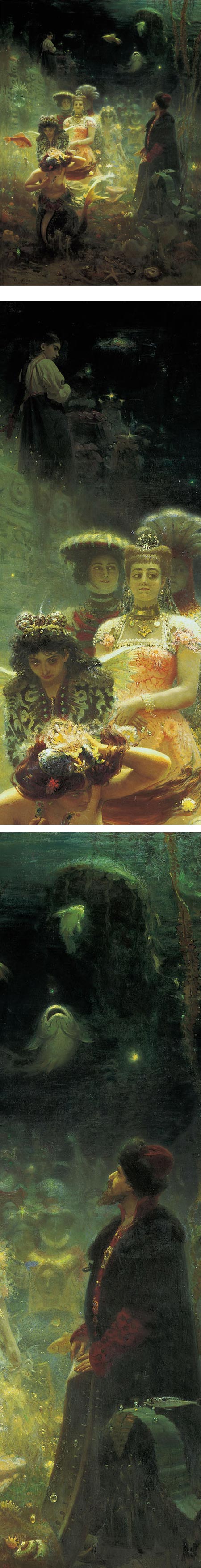
Sadko in the Underwater Kingdom, Ilya Repin.Link is to large image on Wikimedia Commons. Original is in the State Russian Museum, St. Petersburg. Sadko is a medieval Russian epic.
[Note: full size version might be considered mildly NSFW.]
Categories:
-
New Rijksmuseum website

The Rijksmuseum in Amsterdam is one of the world’s great museums, with a collection rich in famous masterpieces from the likes of Rembrandt and Vermeer, as well as hundreds of lesser known treasures.The museum’s website, like many museum websites, long left something to be desired. Though numerous images were available, many in high resolution, they were not easy to search or browse, and overall presentation was somewhat awkward.
The museum recently launched a completely redesigned website, with a much better interface, easier access for searching, and in particular much better provisions for browsing and discovering images.
Choose Language at upper right if you would like to change to English, and then “Collection” to either Explore or Search the collection. The Explore section offers highlights, a good place to start, and offers categories like Artists, Works, Subjects and Styles which are then subdivided into subcategories.
The selections within a given artist or subject are no longer presented as tiny scrolling thumbnails, but as large scrolling thumbnails (certainly an improvement).
The individual images are then presented fullscreen, adapting dynamically to the size of your browser window, and overlaid with navigation widgets (I don’t know of a way to hide the latter), including controls to zoom the image. You can also move the image within the browser window by clicking and dragging.
The “i” at the bottom of the screen brings up an information panel with information about the image, links to details and a “Download image” link. To download images, however, requires creating a free “Rijksstudio” account (basically just an email address). You must then, for every image you download, choose the level of rights (“Personal use”) and click an “I agree with terms and conditions” checkbox — every time.
I will be quick to say that the new site is a vast and welcome improvement over their old one, and the images are large and well reproduced, but this kind of nonsensical legal paranoia mars the experience and makes the museum look small minded and disrespectful of their visitors.
(Hello! Almost all of these works are hundreds of years old, therefore in the public domain, and are not subject to copyright by international, or even specifically Dutch, copyright law. The standard here in the US is that photographs that just reproduce public domain artworks are also in the public domain. Perhaps this has yet to be tested in Dutch courts; but the checkbox barrier to downloading, or even viewing the work without the navigation widgets, just seems petty.)
That being groused about, the new site is well worth visiting and exploring, and a Rijksstudio account is worth setting up, if only for the unobstructed view of the high resolution images. Their intention is for visitors to form their own Rijksstudio collections, essentially bookmarked images similar to the collections you can make in the Google Art Project. They go on to offer to sell you prints of the images, or crops of them, in various modes (hence, I suppose, some of the reproduction rights BS).
Though not quite at the level of the Metropolitan Museum of Art’s fantastic website makeover, this is still a worthy world-class museum website, suited to a world class museum, and a welcome addition to the web’s list of outstanding art resources. (Now if only the Louvre and the Musée d’Orsay would follow suit…)
(Images above: Rembrandt, Vermeer, Aelbert Cuyp, Cornelis Springer)
Categories:


Charley’s Picks
Bookshop.org
(Bookshop.org affilliate links; sales benefit independent bookshop owners; I get a small percentage to help support my work on Lines and Colors)

John Singer Sargent: Watercolors


Urban Sketching: Understanding Perspective


Charley’s Picks
Amazon
(Amazon.com affiliate links; sales go to a larger yacht for Jeff Bezos; but I get a small percentage to help support my work on Lines and Colors)
John Singer Sargent: Watercolors
Urban Sketching: Understanding Perspective