
Categories
- 3d CGI
- Amusements
- Animation
- Anime & Manga
- Art Materials
- Art Videos
- Blogroll
- Cartoons
- Color
- Comics
- Concept & Visual Dev.
- Creativity
- Digital Art
- Digital Painting
- Displaying Art on the Web
- Drawing
- Eye Candy for Today
- Gallery and Museum Art
- High-res Art Images
- Illustration
- Motion Graphics & Flash
- Museums
- Online Museums
- Outsider Art
- Painting
- Painting a Day
- Paleo Art
- Pastel, Conté & Chalk
- Pen & Ink
- Prints and Printmaking
- Reviews
- Sc-fi and Fantasy
- Sculpture & Dimensional
- Site Comments
- Sketching
- Storyboards
- Tools and Techniques
- Uncategorized
- Vector Art
- Videos & Podcasts
- Vision and Optics
- Watercolor and Gouache
- Webcomics
Archives
- May 2026
- April 2026
- March 2026
- February 2026
- January 2026
- December 2025
- November 2025
- October 2025
- September 2025
- August 2025
- July 2025
- June 2025
- May 2025
- January 2025
- December 2024
- November 2024
- October 2024
- September 2024
- August 2024
- June 2024
- April 2024
- March 2024
- February 2024
- January 2024
- December 2023
- November 2023
- October 2023
- September 2023
- August 2023
- July 2023
- May 2023
- April 2023
- March 2023
- February 2023
- January 2023
- December 2022
- November 2022
- September 2022
- August 2022
- July 2022
- June 2022
- May 2022
- April 2022
- March 2022
- February 2022
- January 2022
- December 2021
- November 2021
- October 2021
- September 2021
- August 2021
- July 2021
- June 2021
- May 2021
- April 2021
- March 2021
- February 2021
- January 2021
- December 2020
- November 2020
- October 2020
- September 2020
- August 2020
- July 2020
- June 2020
- May 2020
- April 2020
- March 2020
- February 2020
- January 2020
- December 2019
- November 2019
- October 2019
- September 2019
- August 2019
- July 2019
- June 2019
- May 2019
- April 2019
- March 2019
- February 2019
- January 2019
- December 2018
- November 2018
- October 2018
- September 2018
- August 2018
- July 2018
- June 2018
- May 2018
- April 2018
- March 2018
- February 2018
- January 2018
- December 2017
- November 2017
- October 2017
- September 2017
- August 2017
- July 2017
- June 2017
- May 2017
- April 2017
- March 2017
- February 2017
- January 2017
- December 2016
- November 2016
- October 2016
- September 2016
- August 2016
- July 2016
- June 2016
- May 2016
- April 2016
- March 2016
- February 2016
- January 2016
- December 2015
- November 2015
- October 2015
- September 2015
- August 2015
- July 2015
- June 2015
- May 2015
- April 2015
- March 2015
- February 2015
- January 2015
- December 2014
- November 2014
- October 2014
- September 2014
- August 2014
- July 2014
- June 2014
- May 2014
- April 2014
- March 2014
- February 2014
- January 2014
- December 2013
- November 2013
- October 2013
- September 2013
- August 2013
- July 2013
- June 2013
- May 2013
- April 2013
- March 2013
- February 2013
- January 2013
- December 2012
- November 2012
- October 2012
- September 2012
- August 2012
- July 2012
- June 2012
- May 2012
- April 2012
- March 2012
- February 2012
- January 2012
- December 2011
- November 2011
- October 2011
- September 2011
- August 2011
- July 2011
- June 2011
- May 2011
- April 2011
- March 2011
- February 2011
- January 2011
- December 2010
- November 2010
- October 2010
- September 2010
- August 2010
- July 2010
- June 2010
- May 2010
- April 2010
- March 2010
- February 2010
- January 2010
- December 2009
- November 2009
- October 2009
- September 2009
- August 2009
- July 2009
- June 2009
- May 2009
- April 2009
- March 2009
- February 2009
- January 2009
- December 2008
- November 2008
- October 2008
- September 2008
- August 2008
- July 2008
- June 2008
- May 2008
- April 2008
- March 2008
- February 2008
- January 2008
- December 2007
- November 2007
- October 2007
- September 2007
- August 2007
- July 2007
- June 2007
- May 2007
- April 2007
- March 2007
- February 2007
- January 2007
- December 2006
- November 2006
- October 2006
- September 2006
- August 2006
- July 2006
- June 2006
- May 2006
- April 2006
- March 2006
- February 2006
- January 2006
- December 2005
- November 2005
- October 2005
- September 2005
- August 2005
Relevant Blogs
Art, Painting & Sketch
- Gurney Journey
- Underpaintings
- Art and Influence
- Painting Perceptions
- Oil Painters of America
- Vasari Paint POV
- Flying Fox
- Urban Sketchers
- Bento (Smithsonian)
- Art Inconnu
- The Hidden Place
- Still Life
- Making a Mark
- The Art of the Landscape
- Exploring Color & Creativity
- Art Contrarian
- Artist A Day
- beinArt Surreal Art Collective
- Eye Level
- David Dunlop
- p.i.g.m.e.n.t.i.u.m
- CultureGrrl
- Joaquín Sorolla blog
- Artists in Pastel
“Painting a Day”
- A Painting a Day (Keiser)
- On Painting (Keiser)
- Julian Merrow-Smith
- Karen Jurick
- Jeffrey Hayes
- Carol Marine
- Abbey Ryan
- Daily Paintworks
Other Painting Blogs
- Virtual Gouache Land
- Neil Hollingsworth
- Marc Hanson
- Kevin Menck
- Marc Dalessio
- Larry Seiler
- Stapleton Kearns
- Colin Page
- Roos Schuring
- Hans Versfelt
- Titus Meeuws
- Régis Pettinari
- René Plein Air
- Belinda Del Pesco
- Robin Weiss
- Nathan Fowkes (Land Sketch)
- William Wray
- Frank Serrano
- Stephen Magsig
- Michael Chesley Johnson
- Twice a Week
- Sarah Wimperis
- Rob Adams
- Michael Cole Manley
- The Dirty Palette Club
- Mike Manley’s Draw!
Gallery Art & Illustration mix
Illustration
- Howard Pyle
- 100 Years of Illustration
- BibliOdyssey
- Illustration Art
- Today’s Inspiration
- Illustration Mundo
- Little Chimp Society
- Danny Gregory
- R D (John Martz
- Illustration Friday blog
- Monster Brains
- Illustrators & Illustrations (RU)
- Elwood H. Smith
- DaniDraws.com
- Designers Who Blog
- iSpot Blog
Sci-Fi & Fantasy
Illustration & Comics
Comics & Cartoons
- Comics Beat
- Robot 6
- Newsarama Blog
- Comic Vine
- Comics Alliance
- Forbidden Planet Int.
- Paolo Rivera
- Bolt City
- Flight
- Scott McCloud
- The Comics Journal
- Comixpedia
- Funnybook Babylon
- James Baker
- Middleton’s Sketchbook
- Boneville
- The Hotel Fred
- Paul Rivoche
- Daily Cartoonist
- Mad About Cartoons (William Wray)
- Digital Strips
Illustration & Concept
Animation & Concept
- Cartoon Brew
- Animation Blog
- Cold Hard Flash
- Concept Art World
- The CAB
- FY Concept Art
- Concept Ships
- Concept Robots
- John Nevarez
- Armand Serrano
- Marcos Mateu-Mestre
- all kinds of stuff (Kricfalusi)
- Yacin the faun (Man Arenas)
- Kelsey Mann
- Cre8tivemarks Blog
- Ice-Cream Monster Toon Cafe
- AAU Character & Creature Design
- AAU Animation Notes
- Articles and Texticles
Paleo & Scientific
Tools & Techniques
Other
Lists of Art Blogs
Art Image Resource Links
Historic Art Images
- Wikimedia Commons: Paintings
- Wikimedia Commons: Drawings
- The Athenaeum
- WikiArt (WikiPaintings)
- Google Art Project: Artists
- Google Art Project: Collections (Museums)
- ArtCyclopedia
- Web Gallery of Art
- Art Renewal Center
- Web Gallery of Impressionism
Auction Consolidation sites
Auction sites
- Sotheby’s
- Bonham’s
- Christies
- Heritage Auctions: Fine Art
- Heritage Auctions: Illustration
- Freeman’s Auctions
- Bukowskis
- Shannon’s
Image Search
Reverse Image Search (search by image)
- Tin Eye
- RevImg
- Google Image Search (camera icon)
- Bing Image Search (camera icon)
Promoting some friends and some clients of my website design business
- Twin Willows T’ai Chi studio in Wilmington DE. Taiji classes with Bryan Davis.
- Ray Hayward, Inspired Teacher of T’ai Chi ( Taiji ) in Minneapolis, Founder of Mindful Motion Tai Chi Academy
- OldHead Tattoo studio and Art Gallery in Wilmington DE. Tattoos and paintings by Bruce Gulick
- Sharon Domenico Art, pet portrait oil paintings
- Platinum Paperhanging, wallpaper hanging, Main Line and Philadelphia, PA
- Lisa Stone Design, interior designer, Main Line and Philadelphia, PA
- Studio12KPT, original art, prints, calendars and other custom printed items by Van Sickle & Rolleri
-
The Colored Pencil Society of America

Like pastel, gouache and various drawing media, colored pencil is an artist’s medium that doesn’t receive the level of recognition its adherents would like.In part it shares the relative fragility and light exposure issues of works on paper (though materials are now being subjected to lightfastness tests), but largely colored pencil in particular suffers from an image problem, the impression that it’s not a “serious” medium.
The Colored Pencil Society of America is an organization founded in 1990 to promote the use of colored pencil, provide exhibition opportunities for its membership and in general elevate the perception of colored pencil as a medium.
To these ends, the society organizes two shows each year, the International Exhibition, in which the medium for accepted works must be only colored pencil, and the Explore This! Exhibition, in which the primary medium for works must be colored pencil, but allows for the incorporation of other media, surfaces and techniques not allowed in the International Exhibition.
The society hosts galleries of the award winners in both exhibitions, going back several years. Unfortunately, the website is not well organized (you must drill down into the Galleries page, then to the individual listings and then to the individual year before seeing images, and from there navigation disappears except for a Home link).
Here are the gallery lists for the International Exhibitions and the Explore This! exhibitions.
Once into the galleries, you will find examples of colored pencil being used in ways you may not have expected if you haven’t been keeping up with the medium. Like work in pastel, much of it is more like painting than drawing, and furthers the notion that both could be thought of as dry painting mediums.
The society’s website provides a list of links to member websites.
There is an article on The Artist’s Magazine blog about the recent CPSA awards dinner, which prompted this post.
There is also a smaller, UK Colored Pencil Society, and Katherine Tyrrell, herself a proponent of the medium, lists other colored pencil societies and exhibitions on her Squidoo lens for colored pencil resources.
(Images above: Linda Lucas Hardy, Gregory Joy, Deborah Friedman, Jaclyn Wukela, Cecile Baird, Marge Dreher, Catherine Gauldin, Ester Roi, David Billingsley, Pat Averill, Kare Williams, Linda Koffenberger, Shawn Falchetti)
Categories:
-
Eye Candy for Today: Luca Forte still life

Still Life with Grapes and other Fruit, Luca Forte. On Google Art Project.
Categories:
-
Ralph Heimans

Originally from Austalia and now based in Paris, portrait artist Ralph Heimans has received much attention for his striking portraits of musician and conductor Vladimir Ashkenazy (image above, top three) and Princess Mary of Denmark (fourth and fifth down), among others. He has recently accepted a commission to paint an official portrait of the Queen of England.Heimans uses a traditional glazing technique more common in the 17th and 18th centuries than in contemporary painting, and his approach shows his admiration for masters of chiaroscuro like Caravaggiao and Velazquez. For some reason, though, my first thought was of Jacques Louis David (though much warmer), perhaps because of the importance that the settings play in his portraits.
It’s interesting to note that most of Heimans’ portrait compositions are horizontal — “landscape” rather than “portrait” orientation. The settings say something about the sitter, putting them in a context, and also create a great deal of the visual interest in the works when viewed as paintings, rather than as portraits of specific individuals.
He experiments with his compositions in other ways, taking chances on unusual angles and points of view, working with cast shadows, and creating wonderfully engaging images within his images in the form of reflections.
In addition to the (unfortunately limited) selection of work on his site, there are a few short videos that delve into the creation of two of his signature pieces.
[Via Bo Bartlett on Twitter]
Categories:
-
Art Nouveau Windows

Art Nouveau was a movement that encompassed more than visual art, extending into packaging design, decorative arts and architecture. Art Nouveau artists, designers and architects wanted to beautify the world. In some small part, at least, they succeeded.A Russian language LiveJournal blog post by an individual identified as “marinni” titled (as close as I can get with Google Translate) “Windows in the Art Nouveau Style and the mystery of Moscow Windows” is loaded with photographs of glorious Art Nouveau style windows and building facades from various cities in Europe.
There are links at the bottom of the post (before the comments) to Flickr sets, presumably from which the images were drawn.
Can you imagine if this architectural movement had taken hold, and buildings like these defined our cities, instead of the Bauhaus boxes that rise in their stead?
[Via the always alert to visual wonders author of BibliOdyssey, by way of Twitter.]
Categories:
-
Eye Candy for Today: Pissarro landscape

A Cowherd at Valhermeil, Auvers-sur-Oise by Camille Pissarro.One of my favorite landscapes by an under-appreciated master of Impressionism. The texture and brushwork are just beautiful.
In the Metropolitan Museum of Art. Click on “Fullscreen” under the image and then the Download arrow for high-resolution image.
Categories:
-
Pre-Raphaelites: Victorian Avant Garde
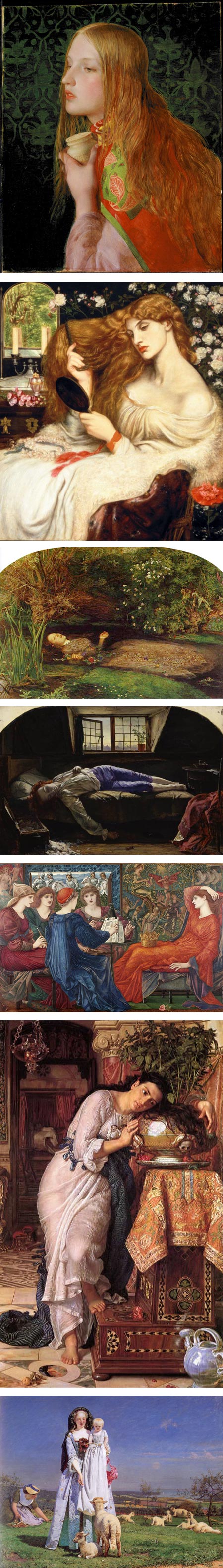
My love of British Pre-Raphaelite painting goes back to childhood.I grew up just outside of Wilmington, Delaware, and from an early age my artistic diet was rich in the the glorious storytelling of Howard Pyle and his students, and the dazzling works of the Pre-Raphaelites, both of which are represented by strong collections at the Delaware Art Museum.
I remember being impressed in particular by paintings in the Pre-Raphaelite collection by John Everett Millais and William Holman Hunt, with their mesmerizing detail, intense color and preternaturally sharp focus.
it was later, as a teenager who had been exposed to more art at the Philadelphia Art Museum and on school trips to museums in New York, that I became just as interested in work by less well known artists associated with the movement, like Frederick Sandys, Marie Spartelli Stillman, Edward Burne-Jones and Albert Joseph Moore. (I was then, as now, somewhat lukewarm on the work of Dante Gabriel Rosetti, leader of the Pre-Raphaelite Brotherhood, but not the strongest of the painters in the group.)
The Bancroft Collection of Pre-Raphaelite Art at the Delaware Art Museum is one of the best outside of England, and it was tapped recently for the loan of key works (images above, top two) for a new major exhibition at the Tate Britain titled Pre-Raphaelites: Victorian Avant Garde.
The exhibition contains over 150 works and I believe it is the largest of its kind since a show at the Tate in the 1980’s. Pre-Raphaelites: Victorian Avant Garde just opened on the 12th and will be on display until 13 January 2013.
(For those in the U.S. and Russia, read on — I’m happy to say that a traveling version of the exhibition, at least 130 works, will be crossing the Atlantic for a run at the National Gallery in Washington, DC from February 17 to May 19, 2013. Those in Russia can look for it in Pushkin State Museum in Moscow in Summer 2013.)
The Tate has a small selection of works on their page for the exhibit, supplemented by a Pinterest page and some mentions on a blog, but in general follows the cluelessness that major museums seem to have about using the internet to promote their exhibitions. (Here’s a clue: it’s about the art, i.e. images of what’s in the show!)
As is often the case, newspapers do a better job of showing what’s in the exhibition than the museum itself; there are articles with images on the Guardian (slideshow and audio tour), The Telagraph and Bloomberg. Artist and writer Katherine Tyrell has a review and list of resources relevant to the exhibit on her blog Making a Mark.
You can also take hints from the works shown or mentioned and look them up. Wikipedia has a list of Pre-Raphaelite paintings. I list some additional links to resources on my 2007 post on The Pre-Raphaelites.
The exhibition looks to be a major event, with an extensive overview of this group of painters, highlighted many of their most important and well-known works.
This is despite a theme that reflects the Tate’s wrong-headed attempt to cast the Pre-Raphaelites as somehow precursors to Modernism, when in fact they were deliberate throwbacks and perhaps the last hurrah of artistic traditions that 20th century Modernism would come to revile as ‘false” and “illusionist” in the face of Modernist “truth”.
The weird theme of “Victorian Avant Garde” attempts to tie the Pre-Raphaelites into the lineage of Modernism by painting them as rebels and ahead of their time (and linking their penchant for plein air studies to the Impressionists), but comes off as an attempt to avoid the embarrassment that major art institutions still feel when catering to the public fascination with Victorian art.
It’s made more ridiculous by the way the Pre-raphaelites in particular were despised by the Modernist establishment, not only for their avowed truth to nature (illusion! illusion!), but by their narrative elements (mere illustration!!). Sigh.
Not that I’m saying the Pre-Raphaelites are without their flaws and excesses (they certainly had those, but that’s part of the fun); just that to break the flow of art history and relegate a quarter of a century of art to worthlessness on the basis of some pesudo-intellectual theories by Modernist art critics is what should really be embarrassing — but we apparently haven’t reached that point yet.
Those of us who have always loved Victorian painting, and the Pre-Raphaelites in particular, can take heart that they are at least receiving some light in major shows, under whatever excuse necessary.
[Correction: One of the exhibition’s co-curators has been kind enough to write a comment and correct my premature assumption about the museum’s intentions in the theme of the exhibit (see this post’s comments). I stand corrected and apologize for projecting my predisposed generalities on someone else’s intentions. (I should know better, not that it will likely stop me from doing it again when I get my dander up about the pervasiveness of Modernist influence in the arts, but I really should be more careful.) In this case, it’s nice to know I was wrong.]
(Images above, Frederick Sandys, Dante Gabriel Rosetti, Sir John Everett Millais, Henry Wallis, William Holman-Hunt, Ford Maddox Brown)
(For the benefit of those familiar with the Delaware Art Museum’s Pre-Raphaelite collection, I’ll point out the the version of William Holman-Hunt’s Isabella and the Pot of Basil [above, third down] that is in the Tate show is the large one from the Laing Art Gallery, Newcastle upon Tyne, not the smaller but equally beautiful one from the Bancroft Collection.)
Categories:


Charley’s Picks
Bookshop.org
(Bookshop.org affilliate links; sales benefit independent bookshop owners; I get a small percentage to help support my work on Lines and Colors)

John Singer Sargent: Watercolors


Urban Sketching: Understanding Perspective


Charley’s Picks
Amazon
(Amazon.com affiliate links; sales go to a larger yacht for Jeff Bezos; but I get a small percentage to help support my work on Lines and Colors)
John Singer Sargent: Watercolors
Urban Sketching: Understanding Perspective