
Categories
- 3d CGI
- Amusements
- Animation
- Anime & Manga
- Art Materials
- Art Videos
- Blogroll
- Cartoons
- Color
- Comics
- Concept & Visual Dev.
- Creativity
- Digital Art
- Digital Painting
- Displaying Art on the Web
- Drawing
- Eye Candy for Today
- Gallery and Museum Art
- High-res Art Images
- Illustration
- Motion Graphics & Flash
- Museums
- Online Museums
- Outsider Art
- Painting
- Painting a Day
- Paleo Art
- Pastel, Conté & Chalk
- Pen & Ink
- Prints and Printmaking
- Reviews
- Sc-fi and Fantasy
- Sculpture & Dimensional
- Site Comments
- Sketching
- Storyboards
- Tools and Techniques
- Uncategorized
- Vector Art
- Videos & Podcasts
- Vision and Optics
- Watercolor and Gouache
- Webcomics
Archives
- April 2026
- March 2026
- February 2026
- January 2026
- December 2025
- November 2025
- October 2025
- September 2025
- August 2025
- July 2025
- June 2025
- May 2025
- January 2025
- December 2024
- November 2024
- October 2024
- September 2024
- August 2024
- June 2024
- April 2024
- March 2024
- February 2024
- January 2024
- December 2023
- November 2023
- October 2023
- September 2023
- August 2023
- July 2023
- May 2023
- April 2023
- March 2023
- February 2023
- January 2023
- December 2022
- November 2022
- September 2022
- August 2022
- July 2022
- June 2022
- May 2022
- April 2022
- March 2022
- February 2022
- January 2022
- December 2021
- November 2021
- October 2021
- September 2021
- August 2021
- July 2021
- June 2021
- May 2021
- April 2021
- March 2021
- February 2021
- January 2021
- December 2020
- November 2020
- October 2020
- September 2020
- August 2020
- July 2020
- June 2020
- May 2020
- April 2020
- March 2020
- February 2020
- January 2020
- December 2019
- November 2019
- October 2019
- September 2019
- August 2019
- July 2019
- June 2019
- May 2019
- April 2019
- March 2019
- February 2019
- January 2019
- December 2018
- November 2018
- October 2018
- September 2018
- August 2018
- July 2018
- June 2018
- May 2018
- April 2018
- March 2018
- February 2018
- January 2018
- December 2017
- November 2017
- October 2017
- September 2017
- August 2017
- July 2017
- June 2017
- May 2017
- April 2017
- March 2017
- February 2017
- January 2017
- December 2016
- November 2016
- October 2016
- September 2016
- August 2016
- July 2016
- June 2016
- May 2016
- April 2016
- March 2016
- February 2016
- January 2016
- December 2015
- November 2015
- October 2015
- September 2015
- August 2015
- July 2015
- June 2015
- May 2015
- April 2015
- March 2015
- February 2015
- January 2015
- December 2014
- November 2014
- October 2014
- September 2014
- August 2014
- July 2014
- June 2014
- May 2014
- April 2014
- March 2014
- February 2014
- January 2014
- December 2013
- November 2013
- October 2013
- September 2013
- August 2013
- July 2013
- June 2013
- May 2013
- April 2013
- March 2013
- February 2013
- January 2013
- December 2012
- November 2012
- October 2012
- September 2012
- August 2012
- July 2012
- June 2012
- May 2012
- April 2012
- March 2012
- February 2012
- January 2012
- December 2011
- November 2011
- October 2011
- September 2011
- August 2011
- July 2011
- June 2011
- May 2011
- April 2011
- March 2011
- February 2011
- January 2011
- December 2010
- November 2010
- October 2010
- September 2010
- August 2010
- July 2010
- June 2010
- May 2010
- April 2010
- March 2010
- February 2010
- January 2010
- December 2009
- November 2009
- October 2009
- September 2009
- August 2009
- July 2009
- June 2009
- May 2009
- April 2009
- March 2009
- February 2009
- January 2009
- December 2008
- November 2008
- October 2008
- September 2008
- August 2008
- July 2008
- June 2008
- May 2008
- April 2008
- March 2008
- February 2008
- January 2008
- December 2007
- November 2007
- October 2007
- September 2007
- August 2007
- July 2007
- June 2007
- May 2007
- April 2007
- March 2007
- February 2007
- January 2007
- December 2006
- November 2006
- October 2006
- September 2006
- August 2006
- July 2006
- June 2006
- May 2006
- April 2006
- March 2006
- February 2006
- January 2006
- December 2005
- November 2005
- October 2005
- September 2005
- August 2005
Relevant Blogs
Art, Painting & Sketch
- Gurney Journey
- Underpaintings
- Art and Influence
- Painting Perceptions
- Oil Painters of America
- Vasari Paint POV
- Flying Fox
- Urban Sketchers
- Bento (Smithsonian)
- Art Inconnu
- The Hidden Place
- Still Life
- Making a Mark
- The Art of the Landscape
- Exploring Color & Creativity
- Art Contrarian
- Artist A Day
- beinArt Surreal Art Collective
- Eye Level
- David Dunlop
- p.i.g.m.e.n.t.i.u.m
- CultureGrrl
- Joaquín Sorolla blog
- Artists in Pastel
“Painting a Day”
- A Painting a Day (Keiser)
- On Painting (Keiser)
- Julian Merrow-Smith
- Karen Jurick
- Jeffrey Hayes
- Carol Marine
- Abbey Ryan
- Daily Paintworks
Other Painting Blogs
- Virtual Gouache Land
- Neil Hollingsworth
- Marc Hanson
- Kevin Menck
- Marc Dalessio
- Larry Seiler
- Stapleton Kearns
- Colin Page
- Roos Schuring
- Hans Versfelt
- Titus Meeuws
- Régis Pettinari
- René Plein Air
- Belinda Del Pesco
- Robin Weiss
- Nathan Fowkes (Land Sketch)
- William Wray
- Frank Serrano
- Stephen Magsig
- Michael Chesley Johnson
- Twice a Week
- Sarah Wimperis
- Rob Adams
- Michael Cole Manley
- The Dirty Palette Club
- Mike Manley’s Draw!
Gallery Art & Illustration mix
Illustration
- Howard Pyle
- 100 Years of Illustration
- BibliOdyssey
- Illustration Art
- Today’s Inspiration
- Illustration Mundo
- Little Chimp Society
- Danny Gregory
- R D (John Martz
- Illustration Friday blog
- Monster Brains
- Illustrators & Illustrations (RU)
- Elwood H. Smith
- DaniDraws.com
- Designers Who Blog
- iSpot Blog
Sci-Fi & Fantasy
Illustration & Comics
Comics & Cartoons
- Comics Beat
- Robot 6
- Newsarama Blog
- Comic Vine
- Comics Alliance
- Forbidden Planet Int.
- Paolo Rivera
- Bolt City
- Flight
- Scott McCloud
- The Comics Journal
- Comixpedia
- Funnybook Babylon
- James Baker
- Middleton’s Sketchbook
- Boneville
- The Hotel Fred
- Paul Rivoche
- Daily Cartoonist
- Mad About Cartoons (William Wray)
- Digital Strips
Illustration & Concept
Animation & Concept
- Cartoon Brew
- Animation Blog
- Cold Hard Flash
- Concept Art World
- The CAB
- FY Concept Art
- Concept Ships
- Concept Robots
- John Nevarez
- Armand Serrano
- Marcos Mateu-Mestre
- all kinds of stuff (Kricfalusi)
- Yacin the faun (Man Arenas)
- Kelsey Mann
- Cre8tivemarks Blog
- Ice-Cream Monster Toon Cafe
- AAU Character & Creature Design
- AAU Animation Notes
- Articles and Texticles
Paleo & Scientific
Tools & Techniques
Other
Lists of Art Blogs
Art Image Resource Links
Historic Art Images
- Wikimedia Commons: Paintings
- Wikimedia Commons: Drawings
- The Athenaeum
- WikiArt (WikiPaintings)
- Google Art Project: Artists
- Google Art Project: Collections (Museums)
- ArtCyclopedia
- Web Gallery of Art
- Art Renewal Center
- Web Gallery of Impressionism
Auction Consolidation sites
Auction sites
- Sotheby’s
- Bonham’s
- Christies
- Heritage Auctions: Fine Art
- Heritage Auctions: Illustration
- Freeman’s Auctions
- Bukowskis
- Shannon’s
Image Search
Reverse Image Search (search by image)
- Tin Eye
- RevImg
- Google Image Search (camera icon)
- Bing Image Search (camera icon)
Promoting some friends and some clients of my website design business
- Twin Willows T’ai Chi studio in Wilmington DE. Taiji classes with Bryan Davis.
- Ray Hayward, Inspired Teacher of T’ai Chi ( Taiji ) in Minneapolis, Founder of Mindful Motion Tai Chi Academy
- OldHead Tattoo studio and Art Gallery in Wilmington DE. Tattoos and paintings by Bruce Gulick
- Sharon Domenico Art, pet portrait oil paintings
- Platinum Paperhanging, wallpaper hanging, Main Line and Philadelphia, PA
- Lisa Stone Design, interior designer, Main Line and Philadelphia, PA
- Studio12KPT, original art, prints, calendars and other custom printed items by Van Sickle & Rolleri
-
Eye Candy for Today: Vermeer’s Geographer
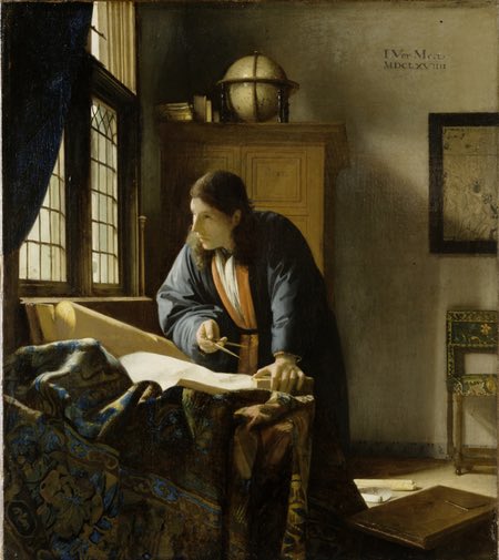

The Geographer, Johannes Vermeer, oil on canvas, roughly 18×20 inches(45 x 51 cm). Link is to zoomable version on the Google Art Project, downloadable file on Wikimedia Commons; original is in the Staedel Museum, Germany.
Twenty six years ago this month, the National Gallery of Art in Washington, DC debuted a most remarkable exhibition of the works of 17th century Dutch master Johannes Vermeer. The exhibition included 21 of the painter’s 35 known works, including such famed works as Girl with a Pearl Earring, The Music Lesson, Woman with a Pearl Necklace and The Lacemaker, as well as his only two existing landscapes.
By comparison, the blockbuster exhibition of Vermeer’s work at the Metropolitan Museum of Art in 2001 showcased 15 of the master’s works, which was still considered an impressive number.
There is a chart on Jonathan Janson’s excellent Essential Vermeer website that lists the pieces present in every major Vermeer exhibition.
I had the good fortune to see both the D.C. and New York exhibitions. Even in the midst of the mind boggling cornucopia of Vermeer’s gem-like paintings in the 1995 show in D.C., The Geographer stood out as one of his finest paintings.
Categories:
-
Drawings of Andrew Fisher Brunner
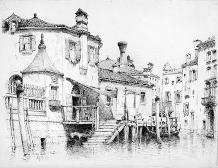

Andrew Fisher Brunner was an American artist active in the late 19th century. He is noted for his landcape watercolors and for his drawings, particularly those in pen and ink.
The Metropolitan Museum of Art has a nice collection of his drawings, visible online in reasonably large images. Many of these are of Venice.
He has a seemingly casual style of ink rendering that belies the solid draftsmanship on which his drawings are based.
The National Gallery of Art in Washington also has a smaller collection of some of his graphite drawings.
Categories:
-
Eye Candy for Today: Levitan’s Birch Grove

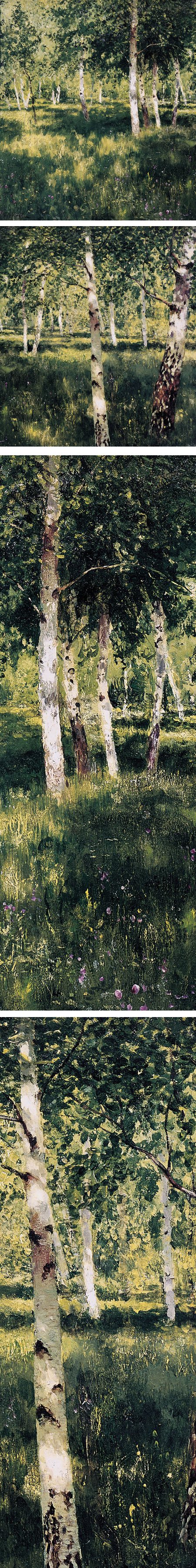
Birch Grove, by Isaac Levitan, oil on paper mounted to canvas, roughly 12 x 20 inches (30 x 50 cm). Link is to image page on WikiArt (click “View all Sizes” for access to large image); original is in the Tretyakov Gallery, Moscow.
This is a beautiful and widely recognized landscape painting by the brilliant 19th century Russian painter.
I love everything about this — the dappled shade, the feeling of summer, the strong value relationships, the compositional arrangement of the birch trunks, the delicate accents of color on them and the depth created by their variation in width.
For painters who complain of “too much green” when painting trees and foliage in mid to late summer, I present to you a textbook example of how “too much green” can be taken into the realm of the sublime.
Categories:
-
Edmund Dulac (revisited)
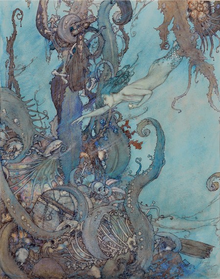

Edmund Dulac was a French illustrator who moved to England relatively early in his career and eventually became a naturalized British citizen. He worked in the latter part of the “Golden Age” of illustration and beyond.
He was renowned in particular his illustrations for several series of books based on the Arabian Nights.
I wrote more extensively about him in my post about Dulac in 2006, and I’ll refer you to that post for more of my comments. At the time, I was not including as many example images in a post as I currently do, so in this revisit I hope to rectify that.
Categories:
-
Eye Candy for Today: Jules Bastien-Lepage genre painting


Le Père Jacques (The Wood Gatherer), Jules Bastien-Lepage, oil on canvas, roughly 77 x 71 inches (197 x 182 cm). Original is in the Milwaukee Art Museum.
One of the things that has always fascinated me about 19th century French painter Jules Bastien-Lepage is his use of value relationships.
Notice how vibrantly the young girl, and in particular her blue dress, stand out in the original painting, and yet how, in the grayscale version of the image I’ve provided, she almost disappears into the background.
It accentuates the color in a different way than just applying bright colors.
I’ve seen Impressionist paintings in which a similar technique was used — objects made to stand out only with color, their values kept close to that of the background. See my previous post on Values in Monet’s Impression, Sunrise.
Categories:
-
Values in Monet’s Impression, Sunrise


Originally exhibited in the April 1874 exhibit of the Societe’ Anonyme des Artistes, Peintires, Sculpters, Graveurs, Etc. (Anonymous Society of Painters, Sculptors, Engravers, etc.), now referred to as the First Impressionist Exhibition, this painting by Claude Monet appeared with the title: Impression, Sunrise.
The name was picked up by unsympathetic critics and used derisively to label the group “Impressionists”. The name stuck, and the Impressionists picked it up and ran with it.
The painting is, as Monet has suggests in his title, an impression, or quick representation, of a fleeting effect.
As part of their effort to portray the effects of light and atmosphere, the Impressionist painters, and Monet especially, were fascinated with new theories of color that were being investigated at the time. Perhaps one of the most important of these ideas was the concept of simultaneous contrast, as presented by French chemist Michel Eugène Chevreul in his book The Principles of Color Harmony and Contrast.
But simultaneous contrast was only one of the visual tools the Impressionist painters were adding to their methods of conveying the effects of light.
In more recent times, a professor of neurobiology at Harvard, Dr. Margaret Livingstone, noticed that if you reduce an image of Impression: Sunrise to grayscale — so that we see only value (luminance) — the sun almost disappears, save for the edges of the scant few brushstrokes with which it was painted.
She went on to point out this gave the painting a particular quality.
Our brain processes visual information in two different parts of our visual cortex, old and new. The older one senses light in a relatively primitive way — shared with other mammals, — in which it detects only luminance, but not color. The other, more evolutionarily recent area of the visual cortex — that we share only with other primates — sees color.
So, to one part of our brain, Monet’s sun, and the bright orange areas in the water and sky, are almost invisible. To the other, more sophisticated part, the sun is very much visible. In addition, against the muted blue of the background clouds, the effective brightness of the orange areas is accentuated by simultaneous contrast.
Categories:


Charley’s Picks
Bookshop.org
(Bookshop.org affilliate links; sales benefit independent bookshop owners; I get a small percentage to help support my work on Lines and Colors)

John Singer Sargent: Watercolors


Urban Sketching: Understanding Perspective


Charley’s Picks
Amazon
(Amazon.com affiliate links; sales go to a larger yacht for Jeff Bezos; but I get a small percentage to help support my work on Lines and Colors)
John Singer Sargent: Watercolors
Urban Sketching: Understanding Perspective