
Categories
- 3d CGI
- Amusements
- Animation
- Anime & Manga
- Art Materials
- Art Videos
- Blogroll
- Cartoons
- Color
- Comics
- Concept & Visual Dev.
- Creativity
- Digital Art
- Digital Painting
- Displaying Art on the Web
- Drawing
- Eye Candy for Today
- Gallery and Museum Art
- High-res Art Images
- Illustration
- Motion Graphics & Flash
- Museums
- Online Museums
- Outsider Art
- Painting
- Painting a Day
- Paleo Art
- Pastel, Conté & Chalk
- Pen & Ink
- Prints and Printmaking
- Reviews
- Sc-fi and Fantasy
- Sculpture & Dimensional
- Site Comments
- Sketching
- Storyboards
- Tools and Techniques
- Uncategorized
- Vector Art
- Videos & Podcasts
- Vision and Optics
- Watercolor and Gouache
- Webcomics
Archives
- May 2026
- April 2026
- March 2026
- February 2026
- January 2026
- December 2025
- November 2025
- October 2025
- September 2025
- August 2025
- July 2025
- June 2025
- May 2025
- January 2025
- December 2024
- November 2024
- October 2024
- September 2024
- August 2024
- June 2024
- April 2024
- March 2024
- February 2024
- January 2024
- December 2023
- November 2023
- October 2023
- September 2023
- August 2023
- July 2023
- May 2023
- April 2023
- March 2023
- February 2023
- January 2023
- December 2022
- November 2022
- September 2022
- August 2022
- July 2022
- June 2022
- May 2022
- April 2022
- March 2022
- February 2022
- January 2022
- December 2021
- November 2021
- October 2021
- September 2021
- August 2021
- July 2021
- June 2021
- May 2021
- April 2021
- March 2021
- February 2021
- January 2021
- December 2020
- November 2020
- October 2020
- September 2020
- August 2020
- July 2020
- June 2020
- May 2020
- April 2020
- March 2020
- February 2020
- January 2020
- December 2019
- November 2019
- October 2019
- September 2019
- August 2019
- July 2019
- June 2019
- May 2019
- April 2019
- March 2019
- February 2019
- January 2019
- December 2018
- November 2018
- October 2018
- September 2018
- August 2018
- July 2018
- June 2018
- May 2018
- April 2018
- March 2018
- February 2018
- January 2018
- December 2017
- November 2017
- October 2017
- September 2017
- August 2017
- July 2017
- June 2017
- May 2017
- April 2017
- March 2017
- February 2017
- January 2017
- December 2016
- November 2016
- October 2016
- September 2016
- August 2016
- July 2016
- June 2016
- May 2016
- April 2016
- March 2016
- February 2016
- January 2016
- December 2015
- November 2015
- October 2015
- September 2015
- August 2015
- July 2015
- June 2015
- May 2015
- April 2015
- March 2015
- February 2015
- January 2015
- December 2014
- November 2014
- October 2014
- September 2014
- August 2014
- July 2014
- June 2014
- May 2014
- April 2014
- March 2014
- February 2014
- January 2014
- December 2013
- November 2013
- October 2013
- September 2013
- August 2013
- July 2013
- June 2013
- May 2013
- April 2013
- March 2013
- February 2013
- January 2013
- December 2012
- November 2012
- October 2012
- September 2012
- August 2012
- July 2012
- June 2012
- May 2012
- April 2012
- March 2012
- February 2012
- January 2012
- December 2011
- November 2011
- October 2011
- September 2011
- August 2011
- July 2011
- June 2011
- May 2011
- April 2011
- March 2011
- February 2011
- January 2011
- December 2010
- November 2010
- October 2010
- September 2010
- August 2010
- July 2010
- June 2010
- May 2010
- April 2010
- March 2010
- February 2010
- January 2010
- December 2009
- November 2009
- October 2009
- September 2009
- August 2009
- July 2009
- June 2009
- May 2009
- April 2009
- March 2009
- February 2009
- January 2009
- December 2008
- November 2008
- October 2008
- September 2008
- August 2008
- July 2008
- June 2008
- May 2008
- April 2008
- March 2008
- February 2008
- January 2008
- December 2007
- November 2007
- October 2007
- September 2007
- August 2007
- July 2007
- June 2007
- May 2007
- April 2007
- March 2007
- February 2007
- January 2007
- December 2006
- November 2006
- October 2006
- September 2006
- August 2006
- July 2006
- June 2006
- May 2006
- April 2006
- March 2006
- February 2006
- January 2006
- December 2005
- November 2005
- October 2005
- September 2005
- August 2005
Relevant Blogs
Art, Painting & Sketch
- Gurney Journey
- Underpaintings
- Art and Influence
- Painting Perceptions
- Oil Painters of America
- Vasari Paint POV
- Flying Fox
- Urban Sketchers
- Bento (Smithsonian)
- Art Inconnu
- The Hidden Place
- Still Life
- Making a Mark
- The Art of the Landscape
- Exploring Color & Creativity
- Art Contrarian
- Artist A Day
- beinArt Surreal Art Collective
- Eye Level
- David Dunlop
- p.i.g.m.e.n.t.i.u.m
- CultureGrrl
- Joaquín Sorolla blog
- Artists in Pastel
“Painting a Day”
- A Painting a Day (Keiser)
- On Painting (Keiser)
- Julian Merrow-Smith
- Karen Jurick
- Jeffrey Hayes
- Carol Marine
- Abbey Ryan
- Daily Paintworks
Other Painting Blogs
- Virtual Gouache Land
- Neil Hollingsworth
- Marc Hanson
- Kevin Menck
- Marc Dalessio
- Larry Seiler
- Stapleton Kearns
- Colin Page
- Roos Schuring
- Hans Versfelt
- Titus Meeuws
- Régis Pettinari
- René Plein Air
- Belinda Del Pesco
- Robin Weiss
- Nathan Fowkes (Land Sketch)
- William Wray
- Frank Serrano
- Stephen Magsig
- Michael Chesley Johnson
- Twice a Week
- Sarah Wimperis
- Rob Adams
- Michael Cole Manley
- The Dirty Palette Club
- Mike Manley’s Draw!
Gallery Art & Illustration mix
Illustration
- Howard Pyle
- 100 Years of Illustration
- BibliOdyssey
- Illustration Art
- Today’s Inspiration
- Illustration Mundo
- Little Chimp Society
- Danny Gregory
- R D (John Martz
- Illustration Friday blog
- Monster Brains
- Illustrators & Illustrations (RU)
- Elwood H. Smith
- DaniDraws.com
- Designers Who Blog
- iSpot Blog
Sci-Fi & Fantasy
Illustration & Comics
Comics & Cartoons
- Comics Beat
- Robot 6
- Newsarama Blog
- Comic Vine
- Comics Alliance
- Forbidden Planet Int.
- Paolo Rivera
- Bolt City
- Flight
- Scott McCloud
- The Comics Journal
- Comixpedia
- Funnybook Babylon
- James Baker
- Middleton’s Sketchbook
- Boneville
- The Hotel Fred
- Paul Rivoche
- Daily Cartoonist
- Mad About Cartoons (William Wray)
- Digital Strips
Illustration & Concept
Animation & Concept
- Cartoon Brew
- Animation Blog
- Cold Hard Flash
- Concept Art World
- The CAB
- FY Concept Art
- Concept Ships
- Concept Robots
- John Nevarez
- Armand Serrano
- Marcos Mateu-Mestre
- all kinds of stuff (Kricfalusi)
- Yacin the faun (Man Arenas)
- Kelsey Mann
- Cre8tivemarks Blog
- Ice-Cream Monster Toon Cafe
- AAU Character & Creature Design
- AAU Animation Notes
- Articles and Texticles
Paleo & Scientific
Tools & Techniques
Other
Lists of Art Blogs
Art Image Resource Links
Historic Art Images
- Wikimedia Commons: Paintings
- Wikimedia Commons: Drawings
- The Athenaeum
- WikiArt (WikiPaintings)
- Google Art Project: Artists
- Google Art Project: Collections (Museums)
- ArtCyclopedia
- Web Gallery of Art
- Art Renewal Center
- Web Gallery of Impressionism
Auction Consolidation sites
Auction sites
- Sotheby’s
- Bonham’s
- Christies
- Heritage Auctions: Fine Art
- Heritage Auctions: Illustration
- Freeman’s Auctions
- Bukowskis
- Shannon’s
Image Search
Reverse Image Search (search by image)
- Tin Eye
- RevImg
- Google Image Search (camera icon)
- Bing Image Search (camera icon)
Promoting some friends and some clients of my website design business
- Twin Willows T’ai Chi studio in Wilmington DE. Taiji classes with Bryan Davis.
- Ray Hayward, Inspired Teacher of T’ai Chi ( Taiji ) in Minneapolis, Founder of Mindful Motion Tai Chi Academy
- OldHead Tattoo studio and Art Gallery in Wilmington DE. Tattoos and paintings by Bruce Gulick
- Sharon Domenico Art, pet portrait oil paintings
- Platinum Paperhanging, wallpaper hanging, Main Line and Philadelphia, PA
- Lisa Stone Design, interior designer, Main Line and Philadelphia, PA
- Studio12KPT, original art, prints, calendars and other custom printed items by Van Sickle & Rolleri
-
Eric Drooker
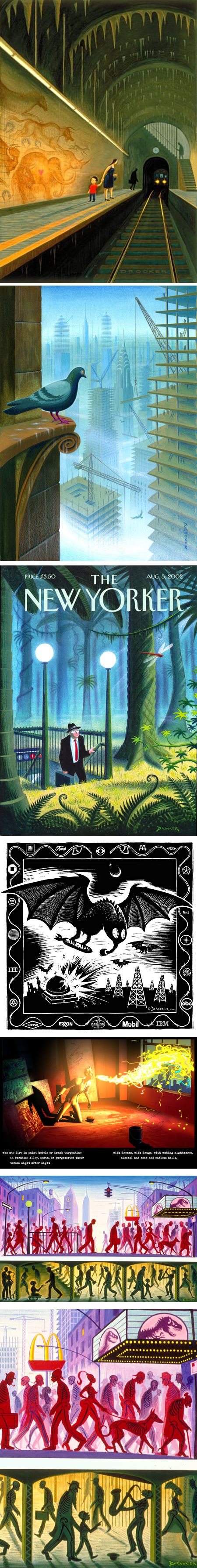
It’s worth a visit to the website of illustrator, painter and graphic novel artist Eric Drooker for his beautifully realized, humorous and thought provoking New Yorker covers alone.You can add to this his expressive paintings and graphically powerful drawings, along with previews of some of his illustrated books, notably Howl (images above, 3rd from bottom), a graphic novel illustrating Allen Ginsburg’s landmark poem, based on the animation Drooker designed for the recent feature film.
Drooker has collaborated with Ginsburg before on a volume called Illuminated Poems, and the poet wrote a bio of Drooker that appears on his website.
One of Drooker’s other graphic stories, Flood! A Novel in Pictures, is drawn in his stark, woodcut-like black and white style, in some ways reminiscent of the groundbreaking graphic stories of Frans Masareel.
When visiting Drooker’s website, be sure to note that the sections devoted to individual books include previews of the books and more, often with additional illustrations.
Many of his drawings and paintings share with his New Yorker covers a “stop and think” visual twist, like the wonderful “X-Ray Manhattan” (images above, 2nd from bottom and detail, bottom).
There is an additional gallery and a brief slideshow about his process on the site of his artist’s representative, Richard Solomon.
In addition to The New Yorker, his illustrations appear in publications like The New York Times, The Village Voice, The Nation, The Guardian and Heavy Metal.
Drooker often gives lectures at colleges, universities and similar venues, and will be appearing at the Jewish Community Center of San Francisco on Wednesday, March 16, 2011, for an event called The Surreal World of Eric Drooker, described as “a slide lecture with live musical accompaniment by the artist”.
Categories:
-
“Watercolour” at the Tate Britain

Watercolor, or watercolour, with an added “u” if you learned your English in England (grin), has a long history, perhaps going back to cave paintings that predate most of recorded history.Watercolor involves the creation of paint by suspending pigment in a water soluble binder, for a long time animal hide glues or plant sugars, but as of the 19th Century, gum arabic, made from the sap of acacia trees.
Though watercolor has been around for all of that time, its use by artists was predominantly relegated to studies, location sketches and personal notation. It wasn’t until the 18th Century that artists, most notably in England, brought watercolor to the fore as an artistic medium for finished works.
A new exhibition at the Tate Britain seeks to celebrate and expand on that heritage. Simply called “Watercolour“, the exhibit traces the history of watercolor back over 800 years, features a wide variety of artists, styles, periods and subject matter, and of course brings forward the greats of the “English School” of watercolorists, including William Blake and JMW Turner along with the Pre-Raphaelites and a number of contemporary painters.
It seeks to broaden the perception of watercolor as a medium, beyond the bounds of the common association of watercolor with landscape, amateur painters and sketches.
Unfortunately the Tate hasn’t put much of the exhibition online, but there are a few images and some videos on the site (one of which shows you Turner’s portable watercolor palette), as well as other images on the Tate Blog.
The best selection of images from the exhibition is probably in the Guardian article, Watercolor at Tate Britain – in pictures, and accompanying the text articles Tate Britain makes a splash with watercolours and Tate Britain’s Watercolour: Awash with inspiration (they’re so witty, those British), and Watercolour at Tate Britain – review.
There is a book accompanying the exhibition, also simply titled Watercolour (also here), authored by its curator, Alison Smith.
Watercolor at Tate Britain runs until 21 August 2011.
(Images above: JMW Turner, Rachael Pedder-Smith, Paul Sandby, JMW Turner, William Blake, Thomas Girtin)
Categories:
-
Van Gogh’s yellows turning brown
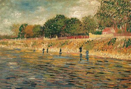
Much has been made of the advances over the centuries, and particularly in the last century or two, in paint chemistry, allowing artists to work with an ever-broadening array of pigments, and often providing much needed replacements for older, plant-based pigments that were fugitive over time.Not all advances in paint technology are for the better in that respect, however. A case in point is the mystery of why the brilliant yellows in many of Vincent van Gogh’s paintings have been turning brown with age.
A recent study, carried out with an ultra high-tech process, using high intensity x-rays generated by a synchrotron at the ESRF, a center for the study of materials in France, has found the chemical reaction responsible for the unfortunate degradation.
It turns out that Van Gogh was fond of using the relatively new color, chrome yellow (also here), made from lead chromate. This is an inexpensive pigment that produces a bright orange-yellow (think school bus color), but is prone to darkening. Presumably, Van Gogh choose chrome yellow over the also relatively new cadmium colors (also here) because of their relative expense.
The mystery in the pronounced degree with which Van Gogh’s yellows have been turning brown is apparently due to his penchant for adding white paint, of a kind that contained barium and sulphur, to his yellow. The combination of the other materials accelerated the darkening of the chrome yellow.
Research is continuing into how to stop, and possibly even reverse, the changes to his paintings.
The Van Gogh Museum has for some time been studying his materials, and their sources, in an effort to better conserve the works, and conservators have encountered other uses of fugitive pigments (see my post on the Restoration of Van Gogh’s The Bedroom).
One of the paintings examined in the recent study was Van Gogh’s Bank of the Seine (above). The Van Gogh museum’s page for this painting also has an interesting video about their comparison of the work, and the techniques used, with that of his contemporary, Monet.
[Via io9]
Categories:
-
Olga Antonenko and Arseny Gutov (update)
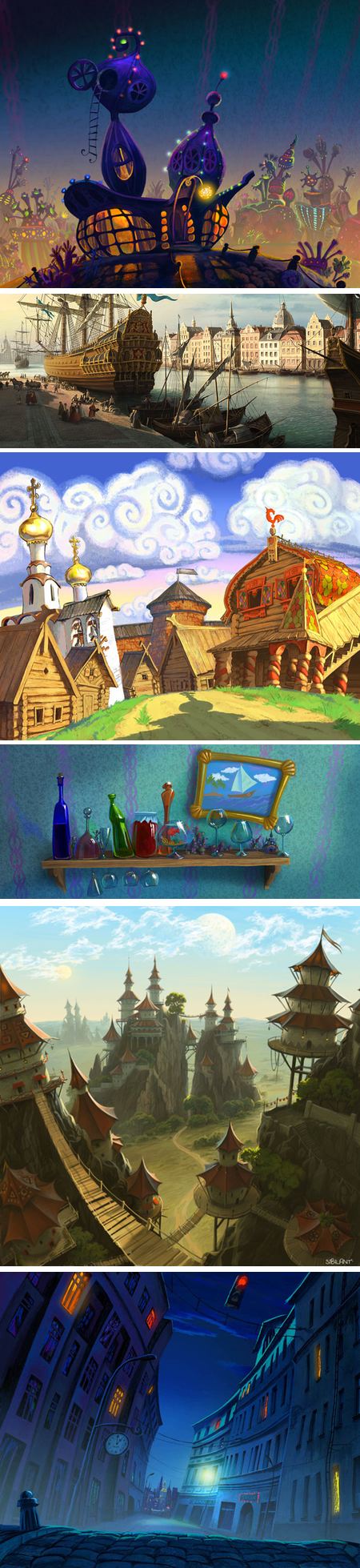
When I first wrote about Russian concept artists, matte painters and illustrators Olga Antonenko and Arseny Gutov back in 2006, I was disappointed that their shared website, CGpolis didn’t assign credits for individual pieces, so it was impossible to determine which works were by one artist or the other, or whether any or all were collaborative.The bad news is that I still can’t find much about the two artists individually, short of a small gallery on CGSociety credited to Antonenko, and two digital portraits on CGSociety and a small deviantART gallery devoted to Gutov.
The good news is that the CGplis site has been expanded and added to with more of their work. It’s divided into sections devoted to concept art, matte painting, 3D Graphics, compositing, cartoons and personal artworks in both digital and traditional media.
Of particular interest to me were the cartoons and concept art sections, where their boldly colorful and wonderfully stylized work for a number of projects comes to the fore.
Categories:
-
Caravaggio in Rome

Michelangelo Merisi, AKA Caravaggio, was one of history’s great painters. Born in Milan, his later assigned name come from his father’s association with the town of Caravaggio.Caravaggio spent a good part of his checkered life in Rome, where an exhibition of his work
goeswent on display on the 20th of February andrunsran until 13 June,20112010. [Sorry: got the year wrong – this was last year, I got caught in an internet time warp. I’ve changed tense in the rest of the article See addendum below.]The exhibition marked the 400th anniversary of the artist’s death and was at the Scuderie del Quirinale, a museum housed in what was once stables for a palace.
The exhibition consisted of 24 paintings, seemingly a small number for a major exhibit, but the curators eschewed the usual practice of including works “related to” or “of the school of, or “from the workshop of” and limited the selections to works accepted without question to be from the master’s hand.
On loan from a number of sources were some of Caravaggio’s most striking and iconic works, a surprising accomplishment given the anniversary year.
The museum’s pages for the exhibition have information and a viewer for the works. The latter is unfortunately a poorly designed Flash module, in which you must painstakingly click through the thumbnails three at a time (how much simpler a page of linked thumbnails would have been, but museum sites love their little widgets).
The reward, after clicking on the larger preview image, is a pop-up with a reasonably large image of the painting. It’s tedious, but worth clicking through just to see the impressive selection of works included in the exhibit.
For better reproductions, see a resource like the Web Gallery of Art, or one of the many other resources for Caravaggio listed on ArtCyclopedia.
[Correction: I saw a notice about this exhibit in Rome, that is current and runs to 15 May, 2011. I did a Google search and came up with the other one from last year. Sorry to disappoint, but the online resources are still there and make a good jumping off point for digging into Caravaggio, always a worthwhile pursuit. – Charley]
Categories:
-
The Lighthouse Keeper
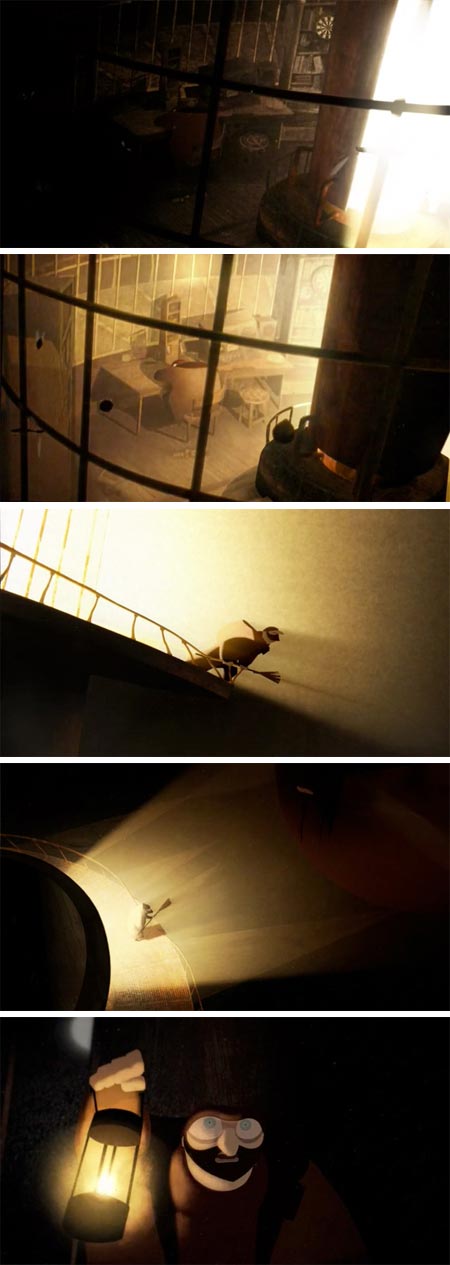
The Lighthouse Keeper is a beautifully realized short (3 minute) animation that won the award for “Best Graduation Film” from the 2010 Annecy festival.The film was created by a team of students (credits on the Vimeo page) graduating from the amazing Gobelins, l’école de l’image in Paris.
(See my previous posts about Gobelins students’ animations for Annecy, or a general search of Lines and Colors for other mentions.)
[Via Irene Gallo’s Saturday morning cartoons]
Categories:


Charley’s Picks
Bookshop.org
(Bookshop.org affilliate links; sales benefit independent bookshop owners; I get a small percentage to help support my work on Lines and Colors)

John Singer Sargent: Watercolors


Urban Sketching: Understanding Perspective


Charley’s Picks
Amazon
(Amazon.com affiliate links; sales go to a larger yacht for Jeff Bezos; but I get a small percentage to help support my work on Lines and Colors)
John Singer Sargent: Watercolors
Urban Sketching: Understanding Perspective