
Categories
- 3d CGI
- Amusements
- Animation
- Anime & Manga
- Art Materials
- Art Videos
- Blogroll
- Cartoons
- Color
- Comics
- Concept & Visual Dev.
- Creativity
- Digital Art
- Digital Painting
- Displaying Art on the Web
- Drawing
- Eye Candy for Today
- Gallery and Museum Art
- High-res Art Images
- Illustration
- Motion Graphics & Flash
- Museums
- Online Museums
- Outsider Art
- Painting
- Painting a Day
- Paleo Art
- Pastel, Conté & Chalk
- Pen & Ink
- Prints and Printmaking
- Reviews
- Sc-fi and Fantasy
- Sculpture & Dimensional
- Site Comments
- Sketching
- Storyboards
- Tools and Techniques
- Uncategorized
- Vector Art
- Videos & Podcasts
- Vision and Optics
- Watercolor and Gouache
- Webcomics
Archives
- April 2026
- March 2026
- February 2026
- January 2026
- December 2025
- November 2025
- October 2025
- September 2025
- August 2025
- July 2025
- June 2025
- May 2025
- January 2025
- December 2024
- November 2024
- October 2024
- September 2024
- August 2024
- June 2024
- April 2024
- March 2024
- February 2024
- January 2024
- December 2023
- November 2023
- October 2023
- September 2023
- August 2023
- July 2023
- May 2023
- April 2023
- March 2023
- February 2023
- January 2023
- December 2022
- November 2022
- September 2022
- August 2022
- July 2022
- June 2022
- May 2022
- April 2022
- March 2022
- February 2022
- January 2022
- December 2021
- November 2021
- October 2021
- September 2021
- August 2021
- July 2021
- June 2021
- May 2021
- April 2021
- March 2021
- February 2021
- January 2021
- December 2020
- November 2020
- October 2020
- September 2020
- August 2020
- July 2020
- June 2020
- May 2020
- April 2020
- March 2020
- February 2020
- January 2020
- December 2019
- November 2019
- October 2019
- September 2019
- August 2019
- July 2019
- June 2019
- May 2019
- April 2019
- March 2019
- February 2019
- January 2019
- December 2018
- November 2018
- October 2018
- September 2018
- August 2018
- July 2018
- June 2018
- May 2018
- April 2018
- March 2018
- February 2018
- January 2018
- December 2017
- November 2017
- October 2017
- September 2017
- August 2017
- July 2017
- June 2017
- May 2017
- April 2017
- March 2017
- February 2017
- January 2017
- December 2016
- November 2016
- October 2016
- September 2016
- August 2016
- July 2016
- June 2016
- May 2016
- April 2016
- March 2016
- February 2016
- January 2016
- December 2015
- November 2015
- October 2015
- September 2015
- August 2015
- July 2015
- June 2015
- May 2015
- April 2015
- March 2015
- February 2015
- January 2015
- December 2014
- November 2014
- October 2014
- September 2014
- August 2014
- July 2014
- June 2014
- May 2014
- April 2014
- March 2014
- February 2014
- January 2014
- December 2013
- November 2013
- October 2013
- September 2013
- August 2013
- July 2013
- June 2013
- May 2013
- April 2013
- March 2013
- February 2013
- January 2013
- December 2012
- November 2012
- October 2012
- September 2012
- August 2012
- July 2012
- June 2012
- May 2012
- April 2012
- March 2012
- February 2012
- January 2012
- December 2011
- November 2011
- October 2011
- September 2011
- August 2011
- July 2011
- June 2011
- May 2011
- April 2011
- March 2011
- February 2011
- January 2011
- December 2010
- November 2010
- October 2010
- September 2010
- August 2010
- July 2010
- June 2010
- May 2010
- April 2010
- March 2010
- February 2010
- January 2010
- December 2009
- November 2009
- October 2009
- September 2009
- August 2009
- July 2009
- June 2009
- May 2009
- April 2009
- March 2009
- February 2009
- January 2009
- December 2008
- November 2008
- October 2008
- September 2008
- August 2008
- July 2008
- June 2008
- May 2008
- April 2008
- March 2008
- February 2008
- January 2008
- December 2007
- November 2007
- October 2007
- September 2007
- August 2007
- July 2007
- June 2007
- May 2007
- April 2007
- March 2007
- February 2007
- January 2007
- December 2006
- November 2006
- October 2006
- September 2006
- August 2006
- July 2006
- June 2006
- May 2006
- April 2006
- March 2006
- February 2006
- January 2006
- December 2005
- November 2005
- October 2005
- September 2005
- August 2005
Relevant Blogs
Art, Painting & Sketch
- Gurney Journey
- Underpaintings
- Art and Influence
- Painting Perceptions
- Oil Painters of America
- Vasari Paint POV
- Flying Fox
- Urban Sketchers
- Bento (Smithsonian)
- Art Inconnu
- The Hidden Place
- Still Life
- Making a Mark
- The Art of the Landscape
- Exploring Color & Creativity
- Art Contrarian
- Artist A Day
- beinArt Surreal Art Collective
- Eye Level
- David Dunlop
- p.i.g.m.e.n.t.i.u.m
- CultureGrrl
- Joaquín Sorolla blog
- Artists in Pastel
“Painting a Day”
- A Painting a Day (Keiser)
- On Painting (Keiser)
- Julian Merrow-Smith
- Karen Jurick
- Jeffrey Hayes
- Carol Marine
- Abbey Ryan
- Daily Paintworks
Other Painting Blogs
- Virtual Gouache Land
- Neil Hollingsworth
- Marc Hanson
- Kevin Menck
- Marc Dalessio
- Larry Seiler
- Stapleton Kearns
- Colin Page
- Roos Schuring
- Hans Versfelt
- Titus Meeuws
- Régis Pettinari
- René Plein Air
- Belinda Del Pesco
- Robin Weiss
- Nathan Fowkes (Land Sketch)
- William Wray
- Frank Serrano
- Stephen Magsig
- Michael Chesley Johnson
- Twice a Week
- Sarah Wimperis
- Rob Adams
- Michael Cole Manley
- The Dirty Palette Club
- Mike Manley’s Draw!
Gallery Art & Illustration mix
Illustration
- Howard Pyle
- 100 Years of Illustration
- BibliOdyssey
- Illustration Art
- Today’s Inspiration
- Illustration Mundo
- Little Chimp Society
- Danny Gregory
- R D (John Martz
- Illustration Friday blog
- Monster Brains
- Illustrators & Illustrations (RU)
- Elwood H. Smith
- DaniDraws.com
- Designers Who Blog
- iSpot Blog
Sci-Fi & Fantasy
Illustration & Comics
Comics & Cartoons
- Comics Beat
- Robot 6
- Newsarama Blog
- Comic Vine
- Comics Alliance
- Forbidden Planet Int.
- Paolo Rivera
- Bolt City
- Flight
- Scott McCloud
- The Comics Journal
- Comixpedia
- Funnybook Babylon
- James Baker
- Middleton’s Sketchbook
- Boneville
- The Hotel Fred
- Paul Rivoche
- Daily Cartoonist
- Mad About Cartoons (William Wray)
- Digital Strips
Illustration & Concept
Animation & Concept
- Cartoon Brew
- Animation Blog
- Cold Hard Flash
- Concept Art World
- The CAB
- FY Concept Art
- Concept Ships
- Concept Robots
- John Nevarez
- Armand Serrano
- Marcos Mateu-Mestre
- all kinds of stuff (Kricfalusi)
- Yacin the faun (Man Arenas)
- Kelsey Mann
- Cre8tivemarks Blog
- Ice-Cream Monster Toon Cafe
- AAU Character & Creature Design
- AAU Animation Notes
- Articles and Texticles
Paleo & Scientific
Tools & Techniques
Other
Lists of Art Blogs
Art Image Resource Links
Historic Art Images
- Wikimedia Commons: Paintings
- Wikimedia Commons: Drawings
- The Athenaeum
- WikiArt (WikiPaintings)
- Google Art Project: Artists
- Google Art Project: Collections (Museums)
- ArtCyclopedia
- Web Gallery of Art
- Art Renewal Center
- Web Gallery of Impressionism
Auction Consolidation sites
Auction sites
- Sotheby’s
- Bonham’s
- Christies
- Heritage Auctions: Fine Art
- Heritage Auctions: Illustration
- Freeman’s Auctions
- Bukowskis
- Shannon’s
Image Search
Reverse Image Search (search by image)
- Tin Eye
- RevImg
- Google Image Search (camera icon)
- Bing Image Search (camera icon)
Promoting some friends and some clients of my website design business
- Twin Willows T’ai Chi studio in Wilmington DE. Taiji classes with Bryan Davis.
- Ray Hayward, Inspired Teacher of T’ai Chi ( Taiji ) in Minneapolis, Founder of Mindful Motion Tai Chi Academy
- OldHead Tattoo studio and Art Gallery in Wilmington DE. Tattoos and paintings by Bruce Gulick
- Sharon Domenico Art, pet portrait oil paintings
- Platinum Paperhanging, wallpaper hanging, Main Line and Philadelphia, PA
- Lisa Stone Design, interior designer, Main Line and Philadelphia, PA
- Studio12KPT, original art, prints, calendars and other custom printed items by Van Sickle & Rolleri
-
Lui Ferreya


Lui Ferreya is a freelance artist based in Denver, Colorado. On his website and in his Behance portfolio you will find drawings and other works in media both tradtional and digital.
Ferreya breaks down forms, whether of landscape, still life or portraiture, into geometric planes, and further subdivides these into smaller planes that he defines with linear patterns of tone and color.
His palette, though often high in chroma, is carefully controlled in terms of value and color relationships, allowing him to work a wide range of colors into small areas that in turn read as larger areas and feel almost naturalistic.
I particularly enjoy the way he approaches faces. With a keen awareness of the planes of the head and face, he marks off discreet areas, but maintains transitions that look soft edged because of the subtlety of the color relationships.
Categories:
-
Eye Candy for Today: Fragonard’s La Bascule


La Bascule (The See-saw), Jean-Honoré Fragonard, oil on canvas, roughly 30 x 39″ (75 x 99 cm), in the collection of the Louvre, currently on display at Musée Fabre, Montpellier. Link is to the Louvre’s page, which has zoomable and downloadable images.
This painting and another by the French Rococo artist were recently acquired by France after having been thought missing for years.
Fragonard is sometimes dissed as frivolous and pandering, but I quite like him — particularly his drawings. Here, though, the elements of his painting style I most admire are present: his soft, atmospheric landscapes, theatrical lighting and playful compositions.
Categories:
-
Gradients: Color, Form and Illusion


I received review copy of Gradients: Color, Form and Illusion, a new instructional video from painter, illustrator, writer and teacher James Gurney.
The concepts behind making gradations of color in visual art can seem as though they should be simple, until you find yourself trying to paint something like different bands of color on a coffee mug as they round the form into shadow, and you suddenly realize you’re in uncharted territory.
In Gradients: Color, Form and Illusion, Gurney takes on the concepts behind achieving gradual transitions in color.
Gradient, is a term that has come into popular use from its prevalence in digital art; it is used here used as a collective term for gradations, gradated washes, and other gradual tone or color changes.
Gurney uses methodical studio demonstrations to set out the concepts and techniques of working with these kind of color transitions, and then shows real world application of them in sequences of on location painting, adding a dimension of understanding that would be difficult to convey in studio demos alone.
Interestingly, Gurney leaves in what otherwise might be outtakes, demonstrating some of the real world problems painters encounter, such as sudden drenching rain, or coming up against the limitations of an experimental technique, like painting in gouache over water soluble printing ink.
He has also interspersed recorded questions from viewers of his other videos or readers of his blog, in which they ask about concepts that relate to the demo or painting that Gurney is working with.
One of the key points he makes is the degree to which our perception of a color is influenced by the surrounding colors. He brings this home in the last segment, in which he demonstrates how to paint one of those optical illusions that show two squares in a checkerboard pattern on a cylinder that look completely different in context, but, when isolated are shown to be the same color and value. It’s one thing to see one of these optical demonstrations, it’s another level of insight to paint one yourself.
In Gradients: Color, Form and Illusion, Gurney has once again demonstrated his ability to take complex or confusing concepts, reduce them to their essential components and lay out a path to understanding with clarity and ease.
Gradients: Color, Form and Illusion is available for download or streaming through Gumroad, and is also available as a DVD. Both are 10% off Saturday and Sunday, September 11th and 12th, 2021.
Categories:
-
Vermeer restoration unveiled with revealed Cupid
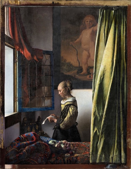

Johannes Vermeer, the remarkable 17th century painter from the city of Delft in the Netherlands, is revered for his transcendent portrayals of the effects of light and atmosphere in domestic scenes.
He is best known for his series of compositions in which people, predominantly young women, are seen engaged in simple activities in front of a window — always to the viewer’s left. These make up the majority of Vermeer’s oeuvre, and consist of many variations on the theme.
The painting known as Girl Reading a Letter at a Window, which has been a centerpiece of the collection of the Gemäldegalerie Alte Meister in Dresden for over 250 years, is recognized as the first of these.
It has been known since 1979, when an X-ray analysis was made of the painting, that Vermeer had placed a painting within a painting of a large portrayal of Cupid on the wall behind the figure. It was assumed that Vermeer had thought better of his compositional choice and painted over the image of the painting.
However, a restoration was undertaken in May of 2017, in which it was determined by materials analysis that the overpainting of the blank wall had, in fact, been added by another hand after the time of Vermeer’s death.
Given that knowledge, the conservators began to remove the third-hand paint-over, including painted over extensions of the composition at the edges of the canvas, which Vermeer had left blank, perhaps in anticipation of mounting the work in a particular frame.
Gemäldegalerie Alte Meister has now unveiled the restoration, which will be the center of a new exhibition, Johannes Vermeer. On Reflection, that will be on display from 10/9/2021 to 2/1/2022.
The restoration reveals the detailed, large scale painting of Cupid, similar to the painting within a painting of Vermeer’s later work, Lady Standing at a Virginal.
This page on the website of the Gemäldegalerie Alte Meister goes into the restoration of the painting at a time when the process was about half way completed.
The Gemäldegalerie Alte Meister has not yet released a high resolution image of the restored painting, so I’m including images of the pre-restoration version — that are available in high resolution on the Google Art Project and Wikipedia — in which you can see a shadowy pentimento of the covered painting.
You can see the pre-restoration version in context, both by date and in size comparison to Vermeer’s other works in this fascinating comparison on the fantastic Essential Vermeer website. (See my post on Essential Vermeer.)
[Via Colossal and Kottke, thanks to Erlc Lee Smith for the suggestion]
Categories:
-
Eye Candy for Today: luminous Howard Pyle painting


Why seek ye the living in a place of the dead?, Howard Pyle
Source for this version of the image is Fleurdulys Tumblr (large image here); original is in the Kelly Collection of American Illustration Art.
This was an illustration for the April 15, 1905 Easter themed issue of Colliers. Whether it accompanied a particular article or story, I don’t know. It was not the cover, as that was done by Maxfield Parrish.
Pyle has controlled the values brilliantly here (in both senses of the word).
Categories:
-
James Patterson


Scottish artist James Patterson, who was active in the late 19th and early 20th centuries, was known for his atmospheric landscapes, concise insightful portraits and tactile still life subjects.
Patterson studied at the Glasgow School of Art and also in Paris. He was adept at painting with both watercolor and oil.
The best online representation of his work is to be found on the website of the National Galleries of Scotland. There, in addition to paintings, you will find many portrait studies in black and red chalk.
Categories:


Charley’s Picks
Bookshop.org
(Bookshop.org affilliate links; sales benefit independent bookshop owners; I get a small percentage to help support my work on Lines and Colors)

John Singer Sargent: Watercolors


Urban Sketching: Understanding Perspective


Charley’s Picks
Amazon
(Amazon.com affiliate links; sales go to a larger yacht for Jeff Bezos; but I get a small percentage to help support my work on Lines and Colors)
John Singer Sargent: Watercolors
Urban Sketching: Understanding Perspective