
Categories
- 3d CGI
- Amusements
- Animation
- Anime & Manga
- Art Materials
- Art Videos
- Blogroll
- Cartoons
- Color
- Comics
- Concept & Visual Dev.
- Creativity
- Digital Art
- Digital Painting
- Displaying Art on the Web
- Drawing
- Eye Candy for Today
- Gallery and Museum Art
- High-res Art Images
- Illustration
- Motion Graphics & Flash
- Museums
- Online Museums
- Outsider Art
- Painting
- Painting a Day
- Paleo Art
- Pastel, Conté & Chalk
- Pen & Ink
- Prints and Printmaking
- Reviews
- Sc-fi and Fantasy
- Sculpture & Dimensional
- Site Comments
- Sketching
- Storyboards
- Tools and Techniques
- Uncategorized
- Vector Art
- Videos & Podcasts
- Vision and Optics
- Watercolor and Gouache
- Webcomics
Archives
- May 2026
- April 2026
- March 2026
- February 2026
- January 2026
- December 2025
- November 2025
- October 2025
- September 2025
- August 2025
- July 2025
- June 2025
- May 2025
- January 2025
- December 2024
- November 2024
- October 2024
- September 2024
- August 2024
- June 2024
- April 2024
- March 2024
- February 2024
- January 2024
- December 2023
- November 2023
- October 2023
- September 2023
- August 2023
- July 2023
- May 2023
- April 2023
- March 2023
- February 2023
- January 2023
- December 2022
- November 2022
- September 2022
- August 2022
- July 2022
- June 2022
- May 2022
- April 2022
- March 2022
- February 2022
- January 2022
- December 2021
- November 2021
- October 2021
- September 2021
- August 2021
- July 2021
- June 2021
- May 2021
- April 2021
- March 2021
- February 2021
- January 2021
- December 2020
- November 2020
- October 2020
- September 2020
- August 2020
- July 2020
- June 2020
- May 2020
- April 2020
- March 2020
- February 2020
- January 2020
- December 2019
- November 2019
- October 2019
- September 2019
- August 2019
- July 2019
- June 2019
- May 2019
- April 2019
- March 2019
- February 2019
- January 2019
- December 2018
- November 2018
- October 2018
- September 2018
- August 2018
- July 2018
- June 2018
- May 2018
- April 2018
- March 2018
- February 2018
- January 2018
- December 2017
- November 2017
- October 2017
- September 2017
- August 2017
- July 2017
- June 2017
- May 2017
- April 2017
- March 2017
- February 2017
- January 2017
- December 2016
- November 2016
- October 2016
- September 2016
- August 2016
- July 2016
- June 2016
- May 2016
- April 2016
- March 2016
- February 2016
- January 2016
- December 2015
- November 2015
- October 2015
- September 2015
- August 2015
- July 2015
- June 2015
- May 2015
- April 2015
- March 2015
- February 2015
- January 2015
- December 2014
- November 2014
- October 2014
- September 2014
- August 2014
- July 2014
- June 2014
- May 2014
- April 2014
- March 2014
- February 2014
- January 2014
- December 2013
- November 2013
- October 2013
- September 2013
- August 2013
- July 2013
- June 2013
- May 2013
- April 2013
- March 2013
- February 2013
- January 2013
- December 2012
- November 2012
- October 2012
- September 2012
- August 2012
- July 2012
- June 2012
- May 2012
- April 2012
- March 2012
- February 2012
- January 2012
- December 2011
- November 2011
- October 2011
- September 2011
- August 2011
- July 2011
- June 2011
- May 2011
- April 2011
- March 2011
- February 2011
- January 2011
- December 2010
- November 2010
- October 2010
- September 2010
- August 2010
- July 2010
- June 2010
- May 2010
- April 2010
- March 2010
- February 2010
- January 2010
- December 2009
- November 2009
- October 2009
- September 2009
- August 2009
- July 2009
- June 2009
- May 2009
- April 2009
- March 2009
- February 2009
- January 2009
- December 2008
- November 2008
- October 2008
- September 2008
- August 2008
- July 2008
- June 2008
- May 2008
- April 2008
- March 2008
- February 2008
- January 2008
- December 2007
- November 2007
- October 2007
- September 2007
- August 2007
- July 2007
- June 2007
- May 2007
- April 2007
- March 2007
- February 2007
- January 2007
- December 2006
- November 2006
- October 2006
- September 2006
- August 2006
- July 2006
- June 2006
- May 2006
- April 2006
- March 2006
- February 2006
- January 2006
- December 2005
- November 2005
- October 2005
- September 2005
- August 2005
Relevant Blogs
Art, Painting & Sketch
- Gurney Journey
- Underpaintings
- Art and Influence
- Painting Perceptions
- Oil Painters of America
- Vasari Paint POV
- Flying Fox
- Urban Sketchers
- Bento (Smithsonian)
- Art Inconnu
- The Hidden Place
- Still Life
- Making a Mark
- The Art of the Landscape
- Exploring Color & Creativity
- Art Contrarian
- Artist A Day
- beinArt Surreal Art Collective
- Eye Level
- David Dunlop
- p.i.g.m.e.n.t.i.u.m
- CultureGrrl
- Joaquín Sorolla blog
- Artists in Pastel
“Painting a Day”
- A Painting a Day (Keiser)
- On Painting (Keiser)
- Julian Merrow-Smith
- Karen Jurick
- Jeffrey Hayes
- Carol Marine
- Abbey Ryan
- Daily Paintworks
Other Painting Blogs
- Virtual Gouache Land
- Neil Hollingsworth
- Marc Hanson
- Kevin Menck
- Marc Dalessio
- Larry Seiler
- Stapleton Kearns
- Colin Page
- Roos Schuring
- Hans Versfelt
- Titus Meeuws
- Régis Pettinari
- René Plein Air
- Belinda Del Pesco
- Robin Weiss
- Nathan Fowkes (Land Sketch)
- William Wray
- Frank Serrano
- Stephen Magsig
- Michael Chesley Johnson
- Twice a Week
- Sarah Wimperis
- Rob Adams
- Michael Cole Manley
- The Dirty Palette Club
- Mike Manley’s Draw!
Gallery Art & Illustration mix
Illustration
- Howard Pyle
- 100 Years of Illustration
- BibliOdyssey
- Illustration Art
- Today’s Inspiration
- Illustration Mundo
- Little Chimp Society
- Danny Gregory
- R D (John Martz
- Illustration Friday blog
- Monster Brains
- Illustrators & Illustrations (RU)
- Elwood H. Smith
- DaniDraws.com
- Designers Who Blog
- iSpot Blog
Sci-Fi & Fantasy
Illustration & Comics
Comics & Cartoons
- Comics Beat
- Robot 6
- Newsarama Blog
- Comic Vine
- Comics Alliance
- Forbidden Planet Int.
- Paolo Rivera
- Bolt City
- Flight
- Scott McCloud
- The Comics Journal
- Comixpedia
- Funnybook Babylon
- James Baker
- Middleton’s Sketchbook
- Boneville
- The Hotel Fred
- Paul Rivoche
- Daily Cartoonist
- Mad About Cartoons (William Wray)
- Digital Strips
Illustration & Concept
Animation & Concept
- Cartoon Brew
- Animation Blog
- Cold Hard Flash
- Concept Art World
- The CAB
- FY Concept Art
- Concept Ships
- Concept Robots
- John Nevarez
- Armand Serrano
- Marcos Mateu-Mestre
- all kinds of stuff (Kricfalusi)
- Yacin the faun (Man Arenas)
- Kelsey Mann
- Cre8tivemarks Blog
- Ice-Cream Monster Toon Cafe
- AAU Character & Creature Design
- AAU Animation Notes
- Articles and Texticles
Paleo & Scientific
Tools & Techniques
Other
Lists of Art Blogs
Art Image Resource Links
Historic Art Images
- Wikimedia Commons: Paintings
- Wikimedia Commons: Drawings
- The Athenaeum
- WikiArt (WikiPaintings)
- Google Art Project: Artists
- Google Art Project: Collections (Museums)
- ArtCyclopedia
- Web Gallery of Art
- Art Renewal Center
- Web Gallery of Impressionism
Auction Consolidation sites
Auction sites
- Sotheby’s
- Bonham’s
- Christies
- Heritage Auctions: Fine Art
- Heritage Auctions: Illustration
- Freeman’s Auctions
- Bukowskis
- Shannon’s
Image Search
Reverse Image Search (search by image)
- Tin Eye
- RevImg
- Google Image Search (camera icon)
- Bing Image Search (camera icon)
Promoting some friends and some clients of my website design business
- Twin Willows T’ai Chi studio in Wilmington DE. Taiji classes with Bryan Davis.
- Ray Hayward, Inspired Teacher of T’ai Chi ( Taiji ) in Minneapolis, Founder of Mindful Motion Tai Chi Academy
- OldHead Tattoo studio and Art Gallery in Wilmington DE. Tattoos and paintings by Bruce Gulick
- Sharon Domenico Art, pet portrait oil paintings
- Platinum Paperhanging, wallpaper hanging, Main Line and Philadelphia, PA
- Lisa Stone Design, interior designer, Main Line and Philadelphia, PA
- Studio12KPT, original art, prints, calendars and other custom printed items by Van Sickle & Rolleri
-
Vermeer: Master of Light
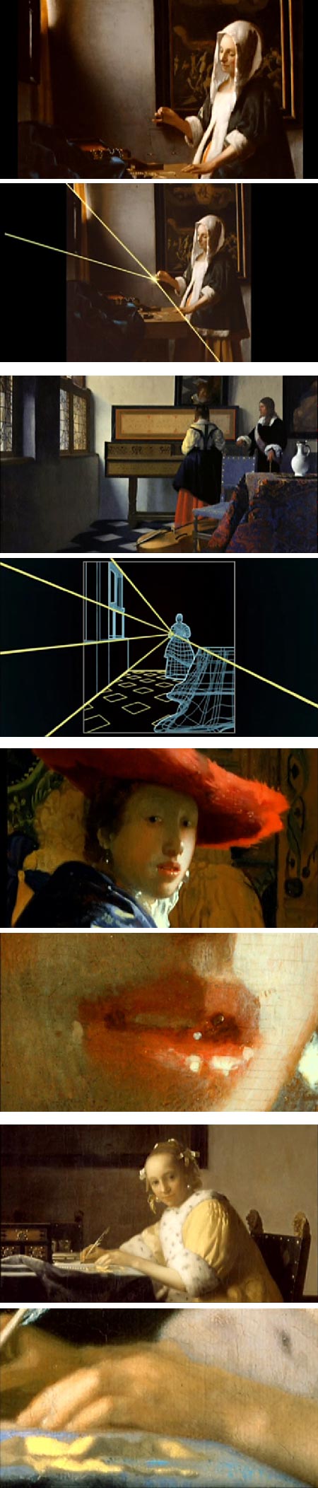
Vermeer: Master of Light is a short series of videos from the National Gallery of Art in Washington that explores some aspects of Vermeer’s paintings, like composition, color and diffuse edges, that are characteristic of his work and make a Vermeer a Vermeer.The series can be accessed on ArtBabble.
There are five episodes, plus a compilation that puts them together as one 20 minute video. Each features curators from the National Gallery discussing one of the museum’s Vermeers in terms of a particular aspect of the master’s approach.
You may want to start with The Music Lesson, Part 2 (second pair of images, above), lest you be initially put off by the drier analysis of Woman Holding a Balance, Part 1 (first pair of images, above).
I found it interesting in a discussion of elements that make a work characteristic of Vermeer, that the episode Girl with the Red Hat: Part 3 (third set of images, above) skips any mention of the fact that attribution of the painting to Vermeer has been questioned.
Camera Obscura, Part 4 offers a brief look at Vermeer’s use of the optical device as an aid in seeing.
Woman Writing a Letter, Part 5 (bottom pair of images, above) delves into Vermeer as a master of suggestion, creating the illusion that there is more than he has actually presented, as well as examining his use and mastery of diffuse edges.
The presentation itself is too brief, leaving you wanting more. You can do a search on ArtBabble for other video productions from the National Gallery, or plow into the overall resources there, either by searching or through their indexes of Series, Channels, Artists or Partners.
ArtBabble, as I mentioned in a previous post, is a terrific resource of videos about art, examining and discussing art in a number of categories.. Their motto is “Play Art Loud”.
If you are hungry for more Vermeer, you can spend hours on Jonathan Janson’s amazing resource Essential Vermeer.
Categories:
-
Paul Antonson
Sacramento based illustrator Paul Antonson has for several years done illustration and interactive design for the Wall Street Journal Online. He also has editorial clients that include The Village Voice, New York Press and The Onion. He is a children’s book illustrator as well.Antonson’s website includes work from various aspects of his career, and fun range of styles, along with personal projects and sketchbooks.
He combines a painter’s skills with a strong graphic sensibility, at times working with graphic patterns, at times riotously complex and at other times moving into a style that harkens to classic children’s’ book illustration.
Antonson is a contributor to the Invisibleman collaborative blog (see my post on Invisibleman from 2006). There you will find more descriptions of his individual pieces and working process, as well as additional artwork.
Categories:
-
Piranesi’s Prisons: Architecture of Mystery and Imagination

18th Century Venetian artist Giovanni Battista Piranesi was famous for his elaborate engravings of the fantastic architectural ruins of Rome.He is even more well known for a set of 14 copper plate etchings titled Carceri (“Prisons”). These are architectural fantasies, “capricious inventions” as they are described on the title page. Their monumental size, grand design and Escher-like defiance of architectural realities are a far cry from the shabby dungeons that were the actual prisons of the day.
Loosely based on stage set designs, they show Piranesi indulging in his fascination with monumental Roman architecture; creating a fanciful series of structures and interiors in which he gets to play with perspective, geometry, scale, lighting and shadow effects.
The Surrealists admired Piranesi’s dreamlike evocations of imaginary spaces, and students of etching have praised his exploration of the medium, using etching needles, burin and burnisher in a variety of ways to achieve his effects.
The Art Gallery of Albeta in Edmonton is hosting an exhibition of images from the Carceri d’invenzione (Imaginary Prisons) series titled Piranesi’s Prisons: Architecture of Mystery and Imagination that is on display until November 7, 2010.
There doesn’t seem to be a catalog associated with the exhibit. A book of the etching series, The Prisons / Le Carceri is available from Amazon.
The museum also doesn’t appear to have an online preview of the exhibition. I’ve listed some links and resources for Piranesi below.
The best images of Piranesi’s etchings I’ve found are on the New York Public Library Digital Gallery. Click on the images for a larger version; you can click through in sequence at either size. There is a zoom button that pops up a new window and allows you to zoom in on parts of the image, albeit in a frustratingly small window. (Note that in addition to impressions from the Prisons series, there are many more works here; there are 6 pages of thumbnails for Piranesi. Wonderful images of grand Roman architecture and more.)
There is also a nice section on Piranesi as part of the Heilbrunn Timeline of Art History, with a detail page on the Round Tower from Prison series. (See my post on the Heilbrunn Timeline of Art History.)
There is an interesting blog post from Murray Ewing about piranesi’s effect on pop culture and cinema, and for an interesting twist on Piranesi’s series by a contemporary collage artist, see my post on Emily Allchurch.
According to an early biography of Piranesi, he is reported to have said:
“I need to produce great ideas, and I believe that if I were commissioned to design a new universe, I would be mad enough to undertake it.”
[Thanks to ianehunt, @condottiere94 (Twitter page) for the suggestion]
Categories:
-
Salesman Pete and the Amazing Stone From Outer Space!

Salesman Pete and the Amazing Stone From Outer Space! is a beautifully designed and wonderfully realized, if somewhat nonsensical, animated short by the team of Marc Bouyer, Max Loubaresse and Anthony Vivien, with music by Cyrille Marchesseau and sound design by Mael Vignaux.Involving a clumsy but super powered salesman protagonist, a villain with, er,.. appendages, and a stone from outer space that turns whatever it touches into seafood, the animation careens, tilts, bounces, wobbles and rockets through numerous scenes, each beautifully designed, drawn and colored, with a slap dash pace, whiplike motion and artful style that puts many of the current big studio animation efforts to shame.
The film utilizes computer animation, either combined with hand-drawn animation or in the service of CGI models that have been given a hand-drawn look, that overall is remarkably successful and just a visual treat.
There is a blog, partly in French, partly in English, that features preliminary art, model studies, character designs, backgrounds and other aspects of the development of the film.
The official website also has a link to an earlier trailer the group did for a never fully realized short, Meet Buck, that shows them developing the skills exhibited in Salesman Pete. There is also a short trailer for Salesman Pete on Vimeo.
I don’t know what this group is up to next, but I’m looking forward to seeing their next project, whatever it may be.
[Via Neatorama]
Categories:
-
Haltadefinizione, high resolution art images

In my recent post on Monet at the Grand Palais, I was praising the online gallery in which a large number of Monet’s works have been made viewable on the web in relatively high resolution images.I say “relatively” because Haltadefinizione, or “HAL9000” (English version here), an Italian project specializing in high-definition photography, has made available on the web several great masterpieces in what can be considered extreme high resolution.
I wrote in 2007 about their high resolution online image of Leonardo da Vinci’s Last Supper. That image consisted of 16 billion pixels, at the time reaching the limits of the technology.
Their more recent image of Botticelli’s La Primivera consists of 28 billion pixels, about 3,000 times the resolution of a consumer digital camera. The pixel density (pixels per inch, or ppi) has also increased, from 580 to 1,500ppi (magazine and book printing are typically 300ppi).
In contrast to the “gallery view” afforded by the online Monet exhibit (in which you can see individual brushstrokes wonderfully), these images are more like a “conservator’s view”, allowing you to zoom in to a level as if observed under a magnifying lens.
You need to be patient with the image as it loads, but once loaded, the interface is remarkably responsive as you zoom. The images are watermarked, but that’s a small quibble considering what they are offering, and you can work around the watermarks by altering the magnification level and scrolling a bit.
In addition to several works already imaged, they are working in cooperation with the famed Uffizi Gallery in Florence to digitize 24 of the great museum’s works.
So far, there are ten works viewable on the site:
Da Vinci’s Last Supper
Da Vinci’s Annunciation
Botticelli’s The Birth of Venus
Verrocchio & Leonardo’s The Baptism of Christ
Gaudenzio Ferrari’s Life Stories of Christ
Pontormo’s Deposition
Agnolo Bronzino’s Elanor of Toledo
Francesco Paolo Michetti’s The Daughter of Iorio
Caravaggio’s BacchusIn addition Botticelli’s La Primavera is available on the la Repubblica site.
All are remarkable in their own way. The experience of putting your nose up to these works is amazing.
I had the pleasure of spending the better part of an hour with Botticelli’s La Primavera and Birth of Venus (image above) when I was in Florence a few years ago.
I won’t say that the digital image is a substitute for seeing great works like this in person, it’s a different experience with its own plusses and minuses (I couldn’t put my nose up to the canvas), but if you can’t get to the Uffizi, it may well be the next best thing.
[Via Underwire]
[Addendum: (2013) This has largely been superseded by the Google Art Project, for which no account is necessary to view all the high definition images, and within which the images are not annoyingly watermarked.
Here is the Uffizi Gallery’s selections on the Google Art Project, including The Birth of Venus and La Primavera.
See my posts on the Google Art Project.]
Categories:
-
Paul Felix

Paul Felix is a visual development artist whose credits include Disney feature animation titles like Mulan, Brother Bear, The Little Mermaid, Lilo & Stitch, Tarzan and The Emperor’s New Groove.Felix doesn’t maintain a website, so John Nevarez, himself a talented visual development and storyboard artist for animation, and an ardent admirer of Paul Felix’s work, has stepped in and created an Unofficial Paul Felix blog to bring him to the attention of art appreciators like us (grin).
Felix’s work is wonderful, full of springy linework, terrific draftsmanship and the vivid outpourings of a fertile imagination.
His command of line and tone in the representation not only of the layout and design of proposed scenes, but of their atmosphere and feeling, is brilliant.
Nevarez has been kind enough to post most of the images with larger versions, in which you can get an appreciation for Felix’s style and approach, his fluidity of line and subtle use of value; all in the service of images that are not meant to be final drawings, but merely guides for the design and composition of final animation drawings.
I’ve included some closer crops with the images above. The blog also features some of Felix’s superb color work.
Wonderful stuff.
[Suggestion via Zelda Devon, see my post on Kurt Huggins and Zelda Devon.]
Categories:


Charley’s Picks
Bookshop.org
(Bookshop.org affilliate links; sales benefit independent bookshop owners; I get a small percentage to help support my work on Lines and Colors)

John Singer Sargent: Watercolors


Urban Sketching: Understanding Perspective


Charley’s Picks
Amazon
(Amazon.com affiliate links; sales go to a larger yacht for Jeff Bezos; but I get a small percentage to help support my work on Lines and Colors)
John Singer Sargent: Watercolors
Urban Sketching: Understanding Perspective