
Categories
- 3d CGI
- Amusements
- Animation
- Anime & Manga
- Art Materials
- Art Videos
- Blogroll
- Cartoons
- Color
- Comics
- Concept & Visual Dev.
- Creativity
- Digital Art
- Digital Painting
- Displaying Art on the Web
- Drawing
- Eye Candy for Today
- Gallery and Museum Art
- High-res Art Images
- Illustration
- Motion Graphics & Flash
- Museums
- Online Museums
- Outsider Art
- Painting
- Painting a Day
- Paleo Art
- Pastel, Conté & Chalk
- Pen & Ink
- Prints and Printmaking
- Reviews
- Sc-fi and Fantasy
- Sculpture & Dimensional
- Site Comments
- Sketching
- Storyboards
- Tools and Techniques
- Uncategorized
- Vector Art
- Videos & Podcasts
- Vision and Optics
- Watercolor and Gouache
- Webcomics
Archives
- April 2026
- March 2026
- February 2026
- January 2026
- December 2025
- November 2025
- October 2025
- September 2025
- August 2025
- July 2025
- June 2025
- May 2025
- January 2025
- December 2024
- November 2024
- October 2024
- September 2024
- August 2024
- June 2024
- April 2024
- March 2024
- February 2024
- January 2024
- December 2023
- November 2023
- October 2023
- September 2023
- August 2023
- July 2023
- May 2023
- April 2023
- March 2023
- February 2023
- January 2023
- December 2022
- November 2022
- September 2022
- August 2022
- July 2022
- June 2022
- May 2022
- April 2022
- March 2022
- February 2022
- January 2022
- December 2021
- November 2021
- October 2021
- September 2021
- August 2021
- July 2021
- June 2021
- May 2021
- April 2021
- March 2021
- February 2021
- January 2021
- December 2020
- November 2020
- October 2020
- September 2020
- August 2020
- July 2020
- June 2020
- May 2020
- April 2020
- March 2020
- February 2020
- January 2020
- December 2019
- November 2019
- October 2019
- September 2019
- August 2019
- July 2019
- June 2019
- May 2019
- April 2019
- March 2019
- February 2019
- January 2019
- December 2018
- November 2018
- October 2018
- September 2018
- August 2018
- July 2018
- June 2018
- May 2018
- April 2018
- March 2018
- February 2018
- January 2018
- December 2017
- November 2017
- October 2017
- September 2017
- August 2017
- July 2017
- June 2017
- May 2017
- April 2017
- March 2017
- February 2017
- January 2017
- December 2016
- November 2016
- October 2016
- September 2016
- August 2016
- July 2016
- June 2016
- May 2016
- April 2016
- March 2016
- February 2016
- January 2016
- December 2015
- November 2015
- October 2015
- September 2015
- August 2015
- July 2015
- June 2015
- May 2015
- April 2015
- March 2015
- February 2015
- January 2015
- December 2014
- November 2014
- October 2014
- September 2014
- August 2014
- July 2014
- June 2014
- May 2014
- April 2014
- March 2014
- February 2014
- January 2014
- December 2013
- November 2013
- October 2013
- September 2013
- August 2013
- July 2013
- June 2013
- May 2013
- April 2013
- March 2013
- February 2013
- January 2013
- December 2012
- November 2012
- October 2012
- September 2012
- August 2012
- July 2012
- June 2012
- May 2012
- April 2012
- March 2012
- February 2012
- January 2012
- December 2011
- November 2011
- October 2011
- September 2011
- August 2011
- July 2011
- June 2011
- May 2011
- April 2011
- March 2011
- February 2011
- January 2011
- December 2010
- November 2010
- October 2010
- September 2010
- August 2010
- July 2010
- June 2010
- May 2010
- April 2010
- March 2010
- February 2010
- January 2010
- December 2009
- November 2009
- October 2009
- September 2009
- August 2009
- July 2009
- June 2009
- May 2009
- April 2009
- March 2009
- February 2009
- January 2009
- December 2008
- November 2008
- October 2008
- September 2008
- August 2008
- July 2008
- June 2008
- May 2008
- April 2008
- March 2008
- February 2008
- January 2008
- December 2007
- November 2007
- October 2007
- September 2007
- August 2007
- July 2007
- June 2007
- May 2007
- April 2007
- March 2007
- February 2007
- January 2007
- December 2006
- November 2006
- October 2006
- September 2006
- August 2006
- July 2006
- June 2006
- May 2006
- April 2006
- March 2006
- February 2006
- January 2006
- December 2005
- November 2005
- October 2005
- September 2005
- August 2005
Relevant Blogs
Art, Painting & Sketch
- Gurney Journey
- Underpaintings
- Art and Influence
- Painting Perceptions
- Oil Painters of America
- Vasari Paint POV
- Flying Fox
- Urban Sketchers
- Bento (Smithsonian)
- Art Inconnu
- The Hidden Place
- Still Life
- Making a Mark
- The Art of the Landscape
- Exploring Color & Creativity
- Art Contrarian
- Artist A Day
- beinArt Surreal Art Collective
- Eye Level
- David Dunlop
- p.i.g.m.e.n.t.i.u.m
- CultureGrrl
- Joaquín Sorolla blog
- Artists in Pastel
“Painting a Day”
- A Painting a Day (Keiser)
- On Painting (Keiser)
- Julian Merrow-Smith
- Karen Jurick
- Jeffrey Hayes
- Carol Marine
- Abbey Ryan
- Daily Paintworks
Other Painting Blogs
- Virtual Gouache Land
- Neil Hollingsworth
- Marc Hanson
- Kevin Menck
- Marc Dalessio
- Larry Seiler
- Stapleton Kearns
- Colin Page
- Roos Schuring
- Hans Versfelt
- Titus Meeuws
- Régis Pettinari
- René Plein Air
- Belinda Del Pesco
- Robin Weiss
- Nathan Fowkes (Land Sketch)
- William Wray
- Frank Serrano
- Stephen Magsig
- Michael Chesley Johnson
- Twice a Week
- Sarah Wimperis
- Rob Adams
- Michael Cole Manley
- The Dirty Palette Club
- Mike Manley’s Draw!
Gallery Art & Illustration mix
Illustration
- Howard Pyle
- 100 Years of Illustration
- BibliOdyssey
- Illustration Art
- Today’s Inspiration
- Illustration Mundo
- Little Chimp Society
- Danny Gregory
- R D (John Martz
- Illustration Friday blog
- Monster Brains
- Illustrators & Illustrations (RU)
- Elwood H. Smith
- DaniDraws.com
- Designers Who Blog
- iSpot Blog
Sci-Fi & Fantasy
Illustration & Comics
Comics & Cartoons
- Comics Beat
- Robot 6
- Newsarama Blog
- Comic Vine
- Comics Alliance
- Forbidden Planet Int.
- Paolo Rivera
- Bolt City
- Flight
- Scott McCloud
- The Comics Journal
- Comixpedia
- Funnybook Babylon
- James Baker
- Middleton’s Sketchbook
- Boneville
- The Hotel Fred
- Paul Rivoche
- Daily Cartoonist
- Mad About Cartoons (William Wray)
- Digital Strips
Illustration & Concept
Animation & Concept
- Cartoon Brew
- Animation Blog
- Cold Hard Flash
- Concept Art World
- The CAB
- FY Concept Art
- Concept Ships
- Concept Robots
- John Nevarez
- Armand Serrano
- Marcos Mateu-Mestre
- all kinds of stuff (Kricfalusi)
- Yacin the faun (Man Arenas)
- Kelsey Mann
- Cre8tivemarks Blog
- Ice-Cream Monster Toon Cafe
- AAU Character & Creature Design
- AAU Animation Notes
- Articles and Texticles
Paleo & Scientific
Tools & Techniques
Other
Lists of Art Blogs
Art Image Resource Links
Historic Art Images
- Wikimedia Commons: Paintings
- Wikimedia Commons: Drawings
- The Athenaeum
- WikiArt (WikiPaintings)
- Google Art Project: Artists
- Google Art Project: Collections (Museums)
- ArtCyclopedia
- Web Gallery of Art
- Art Renewal Center
- Web Gallery of Impressionism
Auction Consolidation sites
Auction sites
- Sotheby’s
- Bonham’s
- Christies
- Heritage Auctions: Fine Art
- Heritage Auctions: Illustration
- Freeman’s Auctions
- Bukowskis
- Shannon’s
Image Search
Reverse Image Search (search by image)
- Tin Eye
- RevImg
- Google Image Search (camera icon)
- Bing Image Search (camera icon)
Promoting some friends and some clients of my website design business
- Twin Willows T’ai Chi studio in Wilmington DE. Taiji classes with Bryan Davis.
- Ray Hayward, Inspired Teacher of T’ai Chi ( Taiji ) in Minneapolis, Founder of Mindful Motion Tai Chi Academy
- OldHead Tattoo studio and Art Gallery in Wilmington DE. Tattoos and paintings by Bruce Gulick
- Sharon Domenico Art, pet portrait oil paintings
- Platinum Paperhanging, wallpaper hanging, Main Line and Philadelphia, PA
- Lisa Stone Design, interior designer, Main Line and Philadelphia, PA
- Studio12KPT, original art, prints, calendars and other custom printed items by Van Sickle & Rolleri
-
Vincent van Gogh Gallery

Tough perhaps not definitive in terms of image quality or resolution, the Vincent van Gogh Gallery is nonetheless a terrific resource on the iconic Dutch artist, notable for the breadth of the material it presents.As a labor of love for 14 years, Canadian David Brooks has attempted to collect an online catalog raisonné of Van Gogh’s works, no mean feat given the artist’s prolific nature.
There are catalogues of Van Gogh’s paintings arranged chronologically, alphabetically or by category in both text and thumbnailed listings. There are also galleries of his watercolors, graphics and letter sketches, as well as his wonderfully textural and often unjustly overlooked drawings.
Even if you have a dozen books on Van Gogh, you will likely be delighted here to encounter paintings and drawings that you have never seen.
I found it particularly enjoyable to browse by category, getting that way more of a mix and juxtaposition of time periods, from the dark earth tones of his early work to the brilliant sunbursts from Arles and Saint-Rémy.
You can also browse another Van Gogh Gallery that offers a complete catalog of paintings, though in a less flexible variety of access.
For a more definitive view of Van Gogh and his works, see the excellent resources on the site of the Van Gogh Museum, which I recently mentioned in my post about the restoration of his famous painting The Bedroom.
For additional resources on the artist, including museum listings and other image archives, see the Van Gogh listings on Artcyclopedia.
The joy here, though, is in the discovery of works by Van Gogh outside the 100 or so that you usually encounter.
Categories:
-
Lisa Brawn
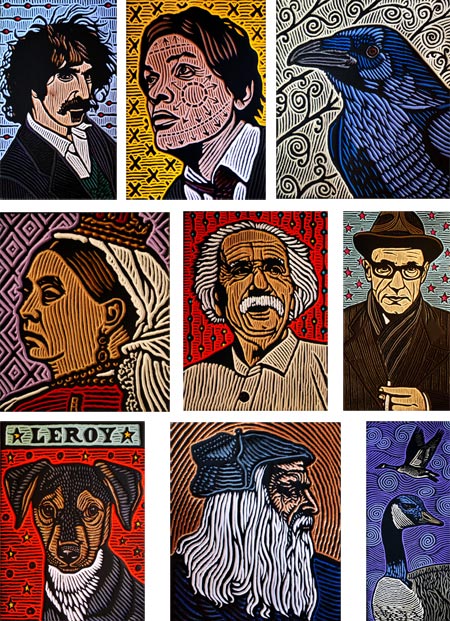
Lisa Brawn is a Canadian artist working in the medium of woodcut. Unusual enough these days, she adds several elements to the process that make it even more unique.One is her choice of wood. Woodcut a painstaking relief printmaking process in which the “negative” areas, those not to be printed, are carved away leaving the parts to be inked raised as part of the original surface (as opposed to intaglio processes, like etching, in which the lines that receive ink are lower than the surface).
Most artists working in woodcut choose wood with an even grain and smooth surface, commonly beechwood, cherry or walnut. Brawn has worked that way, but she responded to the opportunity a couple of years ago to by five truckloads of salvaged douglas fir beams from dismantled grain elevators and the restoration of the Alberta Block in Calgary, wood that has knots, holes and gouges and is often peppered with rusty nails, wood with a history, as she puts it.
Brawn has matched her quirky choice of materials with a quirky range of subjects, largely portraits of figures from history and pop culture, as well as several series of animal subjects. When searching through her online gallery of woodcuts, which you can do by year or alphabetically by subject, you can have a single page in which the subjects include Da Vinci, Dirty Harry, Dorothy Parker, David Suzuki, David Bowie, Don Cherry, the Dalai Lama, a deer and a duck.
Another aspect of her work that is unusual is the role of the woodblock itself. Usually prints are pulled from the block until it is retired at the end of the decided upon run. While Brawn pulls a small run of monochromatic prints from her blocks, it is the blocks themselves that stand out and are presented as art objects, with the raised areas painted black, as though inked, and the recessed areas painted in bright colors.
The other unusual feature of Brawn’s work is her use of patterns and decorative elements in the backgrounds, and sometimes within the faces, of her subjects.
She follows up on her other eccentricities with a penchant for alternative display spaces and unusual venues for her work, including Surgarmobile, a 1935 silver travel trailer that she used for a time as a mobile gallery.
[Via Metafilter]
Categories:
-
Scientific Analysis of Rembrandt’s Techniques for Guiding the Eye

Artists have long known, whether by intuition or study, how to direct a viewer’s eye through a painting. It’s always interesting, though, when researchers attempt to codify and study these aspects of vision and perception in scientific experiment.Researchers at the University of British Columbia’s Vision Lab recently turned their attention to Rembrandt’s incisive and justly famous portrait paintings in an attempt to identify the source of their visual power and appeal, and in the process, the techniques by which he commands your eye and directs it where he will.
It may not come as a surprise to artists who study such techniques that Rembrandt uses value contrasts, “lost and found edges”, and contrasting areas of texture to add interest, and grab and lead the eye; but the UBC researchers found ways to test the efficacy of the techniques by modifying photographs with some of the same characteristics and comparing the response to those and to control photographs without the specified characteristics.
You can read an abstract of their article, Rembrandt’s Textural Agency or the press release, UBC Researcher Decodes Rembrandt’s “Magic”, or download a PDF of the entire article, and see the gist of the techniques collected in a poster.
For a great resource on Rembrandt, see Jonathan Jansen’s Rembrandt van Rijn: Life and Work.
[Via BoingBoing, with a thank you to James Bright of Ottawa]
Categories:
-
Artists’ Self Portraits with Palettes

In a link from the article mentioned in my previous post on Master Artists’ Palettes, Lucy Davies pointed to a search on the Bridgeman Art Library for “self portrait palette“. This turns up range of artists’ self-portraits with their palette in hand, a fairly common arrangement given that the artist is usually holding a palette when painting a self portrait.The linked images are on the small side, and unfortunately watermarked, but think of this as a jumping off point. The images are large enough to tell if you’re interested and the listings make it easy to do a broader search for the artist and their works, including the named self-portrait.
When looking to match a particular image, you might avail yourself of the specialty search engines that perform similarity based image search (my favorite is TinEye).
You can also try the same search on Google Images, though results tend to be more repetitive.
You can also search for simply “portrait palette” for a wider range of images not limited to self-portraits, and perhaps more likely to include views of the working part of the palette, often hidden by the angle in the self portraits.
There is also an excellent post by James Gurney on Gurney Journey about artists’ Palette Arrangements that is illustrated with portraits.
(Images above: Vincent van Gogh, Giovanni Fattori, Diego Velázquez, Sir John Everett Millais, Gustav Courbet, Rembrandt van Rijn; links are to my articles, Velázquez and Courbet images are crops from much larger compositions)
Categories:
-
Master Artists’ Palettes

Writing in her blog on the Telegraph in an article titled Why preserve Van Gogh’s palette?, Lucy Davies points to some of the considerations for artists learning from the palettes of the masters, both in choice and arrangement of colors.Those fascinated by the techniques of the great painters would benefit from understanding their palettes. Even when learning from contemporary artists, the palette plays a greater part than is often acknowledged.
I always find instructional videos exasperating when they ignore color mixing and act as though the brush is always magically loaded with the the proper color, with little thought or work on the part of the artist. This seems to apply to a great majority of the instructional videos one encounters on the web, though those that are professionally prepared often address color mixing more thoroughly (as in the instructional videos of Richard Schmid).
There has, of course, been an effort to preserve the palettes of master artists when possible, even if only as historic artifacts. Davies’ article shows several, including those of Eugene Delacroix (image above, top), Gustave Moreau, Auguste Renoir, Georges Seurat and Edgar Degas (image above, bottom) .
If you look around, you can find other photos of famous artists’ palettes, as well as much verbal discussion and listing of the colors used by individual artists, including those of Delacroix, Whistler, Vermeer, Degas and Monet. Often these discussions will make a point of mentioning modern equivalents to fugitive colors used in the originals.
In general, the range of colors available to artists has increased over time, with significant additions in the 18th, 19th and 20th centuries as the range of materials increased and artificial pigments became widely explored, importantly reducing reliance on pigments that are not lightfast.
Davies also links to selections by art supplier Natural Pigments which sells sets of colors matched to Titian’s Palette and Goya’s Palette.
The article is peppered with links and is a nice jumping off point on the subject, including links to discussion of color theory, another aspect of artists’ practice that has changed over time (see my post on the History of the Color Wheel).
[Via Neatorama]
Categories:
-
Alexander Creswell

Alexander Creswell is a well known English watercolorist, carrying on in the traditions of the country in which watercolor first reached acceptance as a major art medium.He is noted for his association with British royalty, painting the Windsor Castle Royal Collection fire and restoration in a book Out of the Ashes and traveling as official artist with the Prince of Wales.
The images on his website are found in the sales gallery. He places emphasis on his watercolors and drawings of sailing yachts, showing them first in the gallery. Though these are beautifully done, they are not subjects I find personally compelling.
I much prefer his urban landscapes of Venice, Florence and other places in Italy, as well as France, the UK and locations in the Middle East. These owe much to John Singer Sargent’s luminous watercolors of Venice, but of course this is a Good Thing.
You can skip ahead to the landscapes by going to page 10 in the numbered navigation at the bottom of the pages. It reverts to sailing subjects again after a while, and picks back up in Italy around 21 and again around 27 (this may change as new images are added to the galleries).
You can also see a smaller selection of his urban landscapes on the Portland Gallery site.
His watercolors capture that wonderful brilliant sunlight associated with the Mediterranean basin, whether in the intricate buildings of Venice or the rough stones of ancient ruins in Oman, rich with shimmering colors and light-filled compositions.
Unfortunately, most of the images on his site are watermarked, though not so egregiously as to make them unsuitable for viewing.
Creswell also does large scale banners and hangings of his watercolor images that are used like murals. The gallery for these is accessed through an alternate entry from his site’s home page.
Categories:


Charley’s Picks
Bookshop.org
(Bookshop.org affilliate links; sales benefit independent bookshop owners; I get a small percentage to help support my work on Lines and Colors)

John Singer Sargent: Watercolors


Urban Sketching: Understanding Perspective


Charley’s Picks
Amazon
(Amazon.com affiliate links; sales go to a larger yacht for Jeff Bezos; but I get a small percentage to help support my work on Lines and Colors)
John Singer Sargent: Watercolors
Urban Sketching: Understanding Perspective