
Categories
- 3d CGI
- Amusements
- Animation
- Anime & Manga
- Art Materials
- Art Videos
- Blogroll
- Cartoons
- Color
- Comics
- Concept & Visual Dev.
- Creativity
- Digital Art
- Digital Painting
- Displaying Art on the Web
- Drawing
- Eye Candy for Today
- Gallery and Museum Art
- High-res Art Images
- Illustration
- Motion Graphics & Flash
- Museums
- Online Museums
- Outsider Art
- Painting
- Painting a Day
- Paleo Art
- Pastel, Conté & Chalk
- Pen & Ink
- Prints and Printmaking
- Reviews
- Sc-fi and Fantasy
- Sculpture & Dimensional
- Site Comments
- Sketching
- Storyboards
- Tools and Techniques
- Uncategorized
- Vector Art
- Videos & Podcasts
- Vision and Optics
- Watercolor and Gouache
- Webcomics
Archives
- April 2026
- March 2026
- February 2026
- January 2026
- December 2025
- November 2025
- October 2025
- September 2025
- August 2025
- July 2025
- June 2025
- May 2025
- January 2025
- December 2024
- November 2024
- October 2024
- September 2024
- August 2024
- June 2024
- April 2024
- March 2024
- February 2024
- January 2024
- December 2023
- November 2023
- October 2023
- September 2023
- August 2023
- July 2023
- May 2023
- April 2023
- March 2023
- February 2023
- January 2023
- December 2022
- November 2022
- September 2022
- August 2022
- July 2022
- June 2022
- May 2022
- April 2022
- March 2022
- February 2022
- January 2022
- December 2021
- November 2021
- October 2021
- September 2021
- August 2021
- July 2021
- June 2021
- May 2021
- April 2021
- March 2021
- February 2021
- January 2021
- December 2020
- November 2020
- October 2020
- September 2020
- August 2020
- July 2020
- June 2020
- May 2020
- April 2020
- March 2020
- February 2020
- January 2020
- December 2019
- November 2019
- October 2019
- September 2019
- August 2019
- July 2019
- June 2019
- May 2019
- April 2019
- March 2019
- February 2019
- January 2019
- December 2018
- November 2018
- October 2018
- September 2018
- August 2018
- July 2018
- June 2018
- May 2018
- April 2018
- March 2018
- February 2018
- January 2018
- December 2017
- November 2017
- October 2017
- September 2017
- August 2017
- July 2017
- June 2017
- May 2017
- April 2017
- March 2017
- February 2017
- January 2017
- December 2016
- November 2016
- October 2016
- September 2016
- August 2016
- July 2016
- June 2016
- May 2016
- April 2016
- March 2016
- February 2016
- January 2016
- December 2015
- November 2015
- October 2015
- September 2015
- August 2015
- July 2015
- June 2015
- May 2015
- April 2015
- March 2015
- February 2015
- January 2015
- December 2014
- November 2014
- October 2014
- September 2014
- August 2014
- July 2014
- June 2014
- May 2014
- April 2014
- March 2014
- February 2014
- January 2014
- December 2013
- November 2013
- October 2013
- September 2013
- August 2013
- July 2013
- June 2013
- May 2013
- April 2013
- March 2013
- February 2013
- January 2013
- December 2012
- November 2012
- October 2012
- September 2012
- August 2012
- July 2012
- June 2012
- May 2012
- April 2012
- March 2012
- February 2012
- January 2012
- December 2011
- November 2011
- October 2011
- September 2011
- August 2011
- July 2011
- June 2011
- May 2011
- April 2011
- March 2011
- February 2011
- January 2011
- December 2010
- November 2010
- October 2010
- September 2010
- August 2010
- July 2010
- June 2010
- May 2010
- April 2010
- March 2010
- February 2010
- January 2010
- December 2009
- November 2009
- October 2009
- September 2009
- August 2009
- July 2009
- June 2009
- May 2009
- April 2009
- March 2009
- February 2009
- January 2009
- December 2008
- November 2008
- October 2008
- September 2008
- August 2008
- July 2008
- June 2008
- May 2008
- April 2008
- March 2008
- February 2008
- January 2008
- December 2007
- November 2007
- October 2007
- September 2007
- August 2007
- July 2007
- June 2007
- May 2007
- April 2007
- March 2007
- February 2007
- January 2007
- December 2006
- November 2006
- October 2006
- September 2006
- August 2006
- July 2006
- June 2006
- May 2006
- April 2006
- March 2006
- February 2006
- January 2006
- December 2005
- November 2005
- October 2005
- September 2005
- August 2005
Relevant Blogs
Art, Painting & Sketch
- Gurney Journey
- Underpaintings
- Art and Influence
- Painting Perceptions
- Oil Painters of America
- Vasari Paint POV
- Flying Fox
- Urban Sketchers
- Bento (Smithsonian)
- Art Inconnu
- The Hidden Place
- Still Life
- Making a Mark
- The Art of the Landscape
- Exploring Color & Creativity
- Art Contrarian
- Artist A Day
- beinArt Surreal Art Collective
- Eye Level
- David Dunlop
- p.i.g.m.e.n.t.i.u.m
- CultureGrrl
- Joaquín Sorolla blog
- Artists in Pastel
“Painting a Day”
- A Painting a Day (Keiser)
- On Painting (Keiser)
- Julian Merrow-Smith
- Karen Jurick
- Jeffrey Hayes
- Carol Marine
- Abbey Ryan
- Daily Paintworks
Other Painting Blogs
- Virtual Gouache Land
- Neil Hollingsworth
- Marc Hanson
- Kevin Menck
- Marc Dalessio
- Larry Seiler
- Stapleton Kearns
- Colin Page
- Roos Schuring
- Hans Versfelt
- Titus Meeuws
- Régis Pettinari
- René Plein Air
- Belinda Del Pesco
- Robin Weiss
- Nathan Fowkes (Land Sketch)
- William Wray
- Frank Serrano
- Stephen Magsig
- Michael Chesley Johnson
- Twice a Week
- Sarah Wimperis
- Rob Adams
- Michael Cole Manley
- The Dirty Palette Club
- Mike Manley’s Draw!
Gallery Art & Illustration mix
Illustration
- Howard Pyle
- 100 Years of Illustration
- BibliOdyssey
- Illustration Art
- Today’s Inspiration
- Illustration Mundo
- Little Chimp Society
- Danny Gregory
- R D (John Martz
- Illustration Friday blog
- Monster Brains
- Illustrators & Illustrations (RU)
- Elwood H. Smith
- DaniDraws.com
- Designers Who Blog
- iSpot Blog
Sci-Fi & Fantasy
Illustration & Comics
Comics & Cartoons
- Comics Beat
- Robot 6
- Newsarama Blog
- Comic Vine
- Comics Alliance
- Forbidden Planet Int.
- Paolo Rivera
- Bolt City
- Flight
- Scott McCloud
- The Comics Journal
- Comixpedia
- Funnybook Babylon
- James Baker
- Middleton’s Sketchbook
- Boneville
- The Hotel Fred
- Paul Rivoche
- Daily Cartoonist
- Mad About Cartoons (William Wray)
- Digital Strips
Illustration & Concept
Animation & Concept
- Cartoon Brew
- Animation Blog
- Cold Hard Flash
- Concept Art World
- The CAB
- FY Concept Art
- Concept Ships
- Concept Robots
- John Nevarez
- Armand Serrano
- Marcos Mateu-Mestre
- all kinds of stuff (Kricfalusi)
- Yacin the faun (Man Arenas)
- Kelsey Mann
- Cre8tivemarks Blog
- Ice-Cream Monster Toon Cafe
- AAU Character & Creature Design
- AAU Animation Notes
- Articles and Texticles
Paleo & Scientific
Tools & Techniques
Other
Lists of Art Blogs
Art Image Resource Links
Historic Art Images
- Wikimedia Commons: Paintings
- Wikimedia Commons: Drawings
- The Athenaeum
- WikiArt (WikiPaintings)
- Google Art Project: Artists
- Google Art Project: Collections (Museums)
- ArtCyclopedia
- Web Gallery of Art
- Art Renewal Center
- Web Gallery of Impressionism
Auction Consolidation sites
Auction sites
- Sotheby’s
- Bonham’s
- Christies
- Heritage Auctions: Fine Art
- Heritage Auctions: Illustration
- Freeman’s Auctions
- Bukowskis
- Shannon’s
Image Search
Reverse Image Search (search by image)
- Tin Eye
- RevImg
- Google Image Search (camera icon)
- Bing Image Search (camera icon)
Promoting some friends and some clients of my website design business
- Twin Willows T’ai Chi studio in Wilmington DE. Taiji classes with Bryan Davis.
- Ray Hayward, Inspired Teacher of T’ai Chi ( Taiji ) in Minneapolis, Founder of Mindful Motion Tai Chi Academy
- OldHead Tattoo studio and Art Gallery in Wilmington DE. Tattoos and paintings by Bruce Gulick
- Sharon Domenico Art, pet portrait oil paintings
- Platinum Paperhanging, wallpaper hanging, Main Line and Philadelphia, PA
- Lisa Stone Design, interior designer, Main Line and Philadelphia, PA
- Studio12KPT, original art, prints, calendars and other custom printed items by Van Sickle & Rolleri
-
Ray Roberts
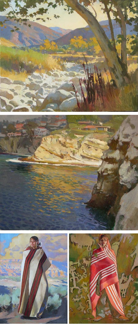
California plein air painter Ray Roberts paints bright, open and airy California landscapes.His influences seem to run to pioneering California Impressionists like Hanson Puthuff and to a lesser extent, Granville Redmond. This is particularly evident in the atmospheric qualities of his work; colors, though vibrant, are often softened in contrast, and their intensity muted in service of atmosphere.
Instead of painting brilliant sunlight reflecting from brightly lit subjects, Robert seems more concerned with light as a presence, filling the space between you and the subject.
His galleries are divided into Landscape, in which the atmospheric qualities are most apparent; Seascape, in which contrasts are more evident; and Figurative work, which is larger in size and presumably done in the studio rather than en plein air.
Don’t miss the Archives of additional work from each category.
Roberts is married to California painter Peggi Kroll-Roberts, who shares a fascination with light and shadow, often in the brilliant sunlight of beach scenes. Both artists conduct workshops, and the shared sections of their site include influences and recommended books.
[Via William Wray (see my post on William Wray)]
Categories:
-
Patrick Gannon

Illustrator Patrick Gannon creates his illustrations and artwork entirely out of cut paper (and wood, which often acts as the “canvas”).He lives and work in Japan, where he found that his penchant for cut-paper art fit into a long cultural tradition of which he was previously unaware.
Gannon studied literature at Providence CoOllege in Rhode Island, and received an MFA in Illustration from Savannah College of Art and Design.
His illustration clients include ABC Radio, The Charlotte Observer, Time Magazine, Baltimore Magazine and Design Press.
Gannon makes the shapes for his works out of handmade Japanese paper, the texture and color of which form the basis for his images. The cut edges and slight shadows give the shapes a rough, organic quality that Gannon uses to effect in both his general subject and children’s illustrations.
Gannon also does gallery pieces. In addition to the portfolios on his site, he maintains a blog called PaperCuts.
Categories:
-
Coby Whitmore
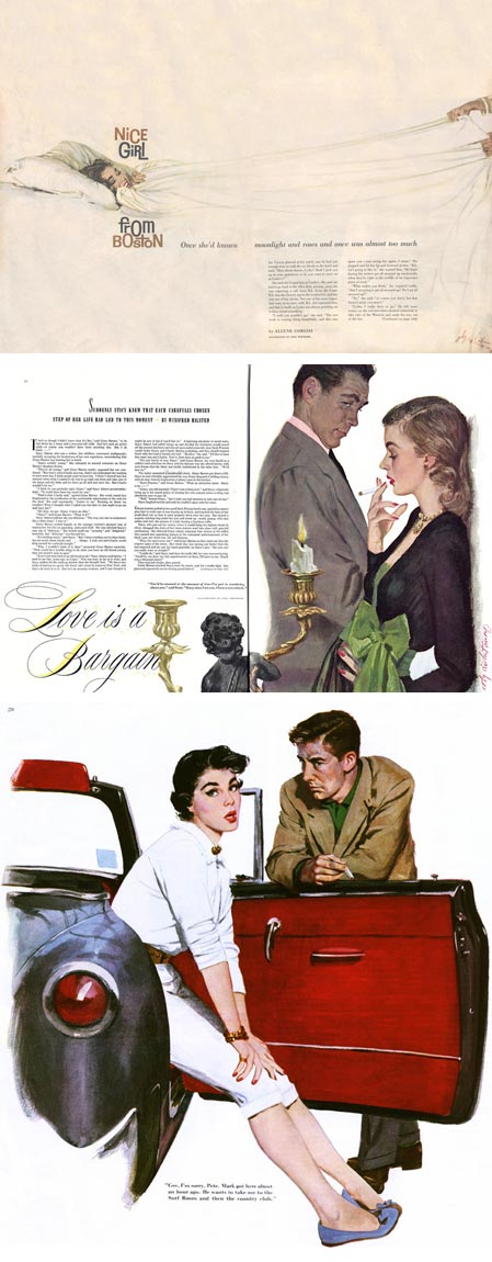
Known of his romantically suggestive story illustrations for magazines like McCalls, Good Housekeeping and Ladies Home Journal during their heyday in the 1940’s and 50’s, Coby Whitmore was a major figure in the wave of new style illustration that flowered at the time (see my post on Al Parker).After studying at the Dayton Art Institute, Whitmore started his career as an apprentice in the studio of Haddon Sundblom (also here), afterward joining the famous Charles E. Cooper Studio. There he worked alongside the studio’s other major talents like Jon Whitcomb and Joe Bowler, painting his well-known magazine interiors and covers, including many for The Saturday Evening Post, as well as creating memorable advertising illustration.
Like the other notable illustrators who were defining a new style of illustration as photography pushed the more traditional realism of the Golden Age style out of fashion, Whitmore became concerned with the design of the page as an integral factor in the image.
In particular negative space, and the arrangement of figures and objects as design elements defining and defined by that space, became a dominant factor. Realistic rendering was de-emphasized and suggestions of rendering, combined with shapes filled with tone and texture, defined the images; with wonderfully designed passages contrasting the textured areas with the open spaces.
For an insightful take on Whitmore and his place in the transitions of illustration styles in the mid 20the Century, see Leif Peng’s article: The New School: Coby Whitmore, accompanied by his excellent Flickr set of Whitmore’s work (from which I borrowed the bottom two images above, large versions here and here). (Incidentally, Leif Peng has now added his considerable knowledge and resources to the team at Drawn!)
Later in his career, Whitmore became an instructor for the Famous Artists School, a correspondence art school founded by Albert Dorne and Norman Rockwell [Correction: please see this post’s comments]. He was inducted into the Society of Illustrators Hall of Fame in 1978.
Categories:
-
Nate Simpson
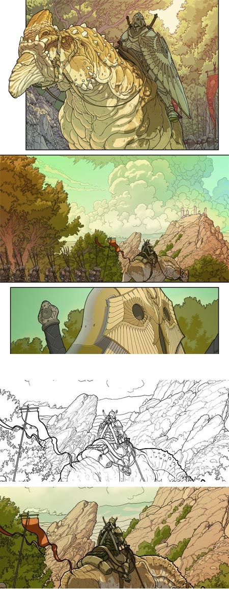
Nate Simpson is a concept artist who has worked in the gaming industry since 1993. He has worked for companies like The Dreamers Guild, Taldren, GoPets Inc. and Gas Powered Games.His credits include leading the art team for Demigod, a 2009 game from Gas Powered Games and Stardock, from which you can see an image in the Concepts section of is web site.
According to a short note on his site, Simpson is “…currently taking year off to learn how to make comics”. Judging from the sample pages he has posted, particularly those in the section of his site for “New Comics“, which are for a an endeavor Simpson calls “Project Waldo”, he is learning quite well indeed.
Simpson’s comic art sensibilities are distinctly European, having a feeling in keeping with some French and Belgian comics artists (which is a Good Thing in my book).
When clicking through the galleries on his site, click on an image to make it larger and then step through with the arrows. Much of the appeal is in the rendering and contrast between levels of line weight in the inks. This is again more in keeping with European (or Japanese) comics than mainstream American comics, in which line weight is frequently varied throughout the delineation of every figure.
You can find even larger images, including inked pages prior to the application of color, on Simpson’s blog, which is named for and devoted to Project Waldo.
His tagline for the blog reads “Follow along as I learn how to make a comic by making a comic. I hope you’re not in a hurry.”
Those who aren’t in a hurry, and can take the time to go back to the beginning of Simpson’s posts and follow through, will find a good deal of insight and valuable information that he has accrued in his learning process, and offered up in the course of the past year.
The image above shows page two of the story, along with detail crops below of inks and final color from the lower center portion of the middle panel. (See the original large image on Simpson’s blog here.)
Simpson puts a great deal of detail into some elements, leaving others open to be carried by the application of color. His background landscapes have more in common with Bruegel’s landscape drawings than with mainstream comics.
The color itself is in the style of European comics albums, bringing to mind the work of Moebius in particular (when he is coloring his own work, not handing it over to someone else to bury under inappropriate Beltran-like over-rendering, but I digress; that’s a topic for another post).
Word is that Simpson has gotten expressions of interest from some publishers, but there are no specifics yet, and it has now been a year since his first post on the Project Waldo, and he is only up to page 8 (out of how many pages total, I don’t know). It looks like those of us who, like myself, are looking forward to reading the finished story, will also have to not be in a hurry.
In the meanwhile, whether in concept art or comics, Simpson is a artist to watch.
[Via Drawn!]
Categories:
-
Jeffrey Hayes (update)
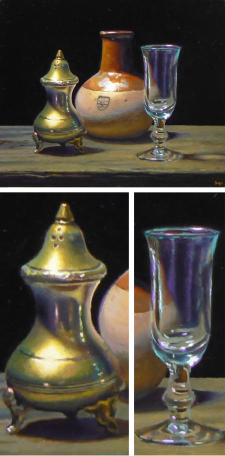
I’ve profiled Boston based painter Jeffrey Hayes before (also here and here).After being an early adopter of the painting a day regimen, Hayes realized that his inclinations required more time, even when painting on an intimate scale. Today he follows that direction, painting small, carefully composed and rendered still life paintings, with an eye to the influence of the Dutch still life painters of the 17th Century.
Hayes frequently utilizes a shadow box, for which he gives basic building instructions here, to compose his directly lit still life subjects in strong contrast.
If you look through his blog, or use the topics links for subjects like “In Progress” or “In the Studio” you will find additional posts about his process and techniques and insightful comments on the the work of a painter, as well as images of works in progress.
Hayes also maintains an archive of another blog that he is no longer updating, Watching Paint Dry. In addition, he has a YouTube channel with video demonstrations of his painting process.
Hayes posts paintings that are for sale, with links to purchase information. I still find it disconcerting that clicking on the images themselves takes you directly to the eBay page for the piece rather than a larger image directly on the blog, but it seems to serve well enough. In addition to a larger single image of the work, the eBay pages sometimes have one or more detail images from the painting.
There is also a link on his blog to Available Work, that also leads directly to an eBay page.
I’ve had the pleasure of watching Hayes develop and evolve as a painter over the time since I first encountered his work; his subjects becoming richer with multiple colors, surfaces taking on greater subtlety and character of texture, and the effects of light emerging as a driving force in his approach.
I’m particularly fond of the way he handles reflective metallic surfaces and transparent glassware, with hints of iridescent color delineating edges and bouncing from one surface to another.
(Image above: “Silver, Pottery, Glass”, original post here)
Categories:
-
Ed Binkley
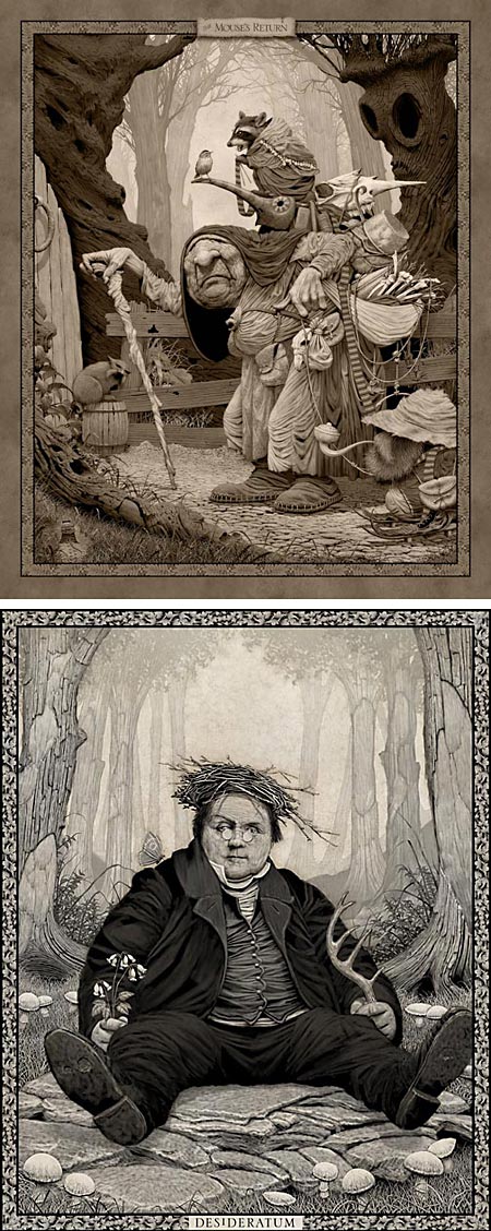
Concept artist and illustrator Ed Binkley has crafted a style of illustration that seems at once old and new.His finely detailed, almost monochromatic images feel as though they are from another time, or perhaps another place, with fantasy subjects inhabiting misty woods and glades, all drawn with meticulous care.
Despite the level of detail lavished on the works, they never feel overworked or artificially detailed, as is so often the case of similar subjects in the hands of less accomplished artists. Binkley knows how to balance passages of detail with open areas, both for composition and for visual dynamics. In particular there is a wonderful contrast between highly textural foreground elements and beautifully atmospheric backgrounds, in which his imaginary worlds extend into misty infinity.
Occasionally, his approach reminds me of such delightful fantasy artists as Jean-Baptiste Monge, but he really has created his own world. Binkley is obviously versed in art history, as evidenced both by his solid grounding in traditional drawing skills and occasional nods to the greats, like his wonderful take-off of Ingres’ portrait of Louis-François Bertin in Desideratum (image above, bottom, detail image here).
Binkley’s web site is not directly arranged as a gallery, but treasures are to be had if you poke around and lift a few leaves, like his step by step walk through of the creation of his piece, The Mouse’s Return (image above, top).
He also has a secondary site, Holy Men and Monsters, with a gallery of color work.
Categories:


Charley’s Picks
Bookshop.org
(Bookshop.org affilliate links; sales benefit independent bookshop owners; I get a small percentage to help support my work on Lines and Colors)

John Singer Sargent: Watercolors


Urban Sketching: Understanding Perspective


Charley’s Picks
Amazon
(Amazon.com affiliate links; sales go to a larger yacht for Jeff Bezos; but I get a small percentage to help support my work on Lines and Colors)
John Singer Sargent: Watercolors
Urban Sketching: Understanding Perspective