
Categories
- 3d CGI
- Amusements
- Animation
- Anime & Manga
- Art Materials
- Art Videos
- Blogroll
- Cartoons
- Color
- Comics
- Concept & Visual Dev.
- Creativity
- Digital Art
- Digital Painting
- Displaying Art on the Web
- Drawing
- Eye Candy for Today
- Gallery and Museum Art
- High-res Art Images
- Illustration
- Motion Graphics & Flash
- Museums
- Online Museums
- Outsider Art
- Painting
- Painting a Day
- Paleo Art
- Pastel, Conté & Chalk
- Pen & Ink
- Prints and Printmaking
- Reviews
- Sc-fi and Fantasy
- Sculpture & Dimensional
- Site Comments
- Sketching
- Storyboards
- Tools and Techniques
- Uncategorized
- Vector Art
- Videos & Podcasts
- Vision and Optics
- Watercolor and Gouache
- Webcomics
Archives
- April 2026
- March 2026
- February 2026
- January 2026
- December 2025
- November 2025
- October 2025
- September 2025
- August 2025
- July 2025
- June 2025
- May 2025
- January 2025
- December 2024
- November 2024
- October 2024
- September 2024
- August 2024
- June 2024
- April 2024
- March 2024
- February 2024
- January 2024
- December 2023
- November 2023
- October 2023
- September 2023
- August 2023
- July 2023
- May 2023
- April 2023
- March 2023
- February 2023
- January 2023
- December 2022
- November 2022
- September 2022
- August 2022
- July 2022
- June 2022
- May 2022
- April 2022
- March 2022
- February 2022
- January 2022
- December 2021
- November 2021
- October 2021
- September 2021
- August 2021
- July 2021
- June 2021
- May 2021
- April 2021
- March 2021
- February 2021
- January 2021
- December 2020
- November 2020
- October 2020
- September 2020
- August 2020
- July 2020
- June 2020
- May 2020
- April 2020
- March 2020
- February 2020
- January 2020
- December 2019
- November 2019
- October 2019
- September 2019
- August 2019
- July 2019
- June 2019
- May 2019
- April 2019
- March 2019
- February 2019
- January 2019
- December 2018
- November 2018
- October 2018
- September 2018
- August 2018
- July 2018
- June 2018
- May 2018
- April 2018
- March 2018
- February 2018
- January 2018
- December 2017
- November 2017
- October 2017
- September 2017
- August 2017
- July 2017
- June 2017
- May 2017
- April 2017
- March 2017
- February 2017
- January 2017
- December 2016
- November 2016
- October 2016
- September 2016
- August 2016
- July 2016
- June 2016
- May 2016
- April 2016
- March 2016
- February 2016
- January 2016
- December 2015
- November 2015
- October 2015
- September 2015
- August 2015
- July 2015
- June 2015
- May 2015
- April 2015
- March 2015
- February 2015
- January 2015
- December 2014
- November 2014
- October 2014
- September 2014
- August 2014
- July 2014
- June 2014
- May 2014
- April 2014
- March 2014
- February 2014
- January 2014
- December 2013
- November 2013
- October 2013
- September 2013
- August 2013
- July 2013
- June 2013
- May 2013
- April 2013
- March 2013
- February 2013
- January 2013
- December 2012
- November 2012
- October 2012
- September 2012
- August 2012
- July 2012
- June 2012
- May 2012
- April 2012
- March 2012
- February 2012
- January 2012
- December 2011
- November 2011
- October 2011
- September 2011
- August 2011
- July 2011
- June 2011
- May 2011
- April 2011
- March 2011
- February 2011
- January 2011
- December 2010
- November 2010
- October 2010
- September 2010
- August 2010
- July 2010
- June 2010
- May 2010
- April 2010
- March 2010
- February 2010
- January 2010
- December 2009
- November 2009
- October 2009
- September 2009
- August 2009
- July 2009
- June 2009
- May 2009
- April 2009
- March 2009
- February 2009
- January 2009
- December 2008
- November 2008
- October 2008
- September 2008
- August 2008
- July 2008
- June 2008
- May 2008
- April 2008
- March 2008
- February 2008
- January 2008
- December 2007
- November 2007
- October 2007
- September 2007
- August 2007
- July 2007
- June 2007
- May 2007
- April 2007
- March 2007
- February 2007
- January 2007
- December 2006
- November 2006
- October 2006
- September 2006
- August 2006
- July 2006
- June 2006
- May 2006
- April 2006
- March 2006
- February 2006
- January 2006
- December 2005
- November 2005
- October 2005
- September 2005
- August 2005
Relevant Blogs
Art, Painting & Sketch
- Gurney Journey
- Underpaintings
- Art and Influence
- Painting Perceptions
- Oil Painters of America
- Vasari Paint POV
- Flying Fox
- Urban Sketchers
- Bento (Smithsonian)
- Art Inconnu
- The Hidden Place
- Still Life
- Making a Mark
- The Art of the Landscape
- Exploring Color & Creativity
- Art Contrarian
- Artist A Day
- beinArt Surreal Art Collective
- Eye Level
- David Dunlop
- p.i.g.m.e.n.t.i.u.m
- CultureGrrl
- Joaquín Sorolla blog
- Artists in Pastel
“Painting a Day”
- A Painting a Day (Keiser)
- On Painting (Keiser)
- Julian Merrow-Smith
- Karen Jurick
- Jeffrey Hayes
- Carol Marine
- Abbey Ryan
- Daily Paintworks
Other Painting Blogs
- Virtual Gouache Land
- Neil Hollingsworth
- Marc Hanson
- Kevin Menck
- Marc Dalessio
- Larry Seiler
- Stapleton Kearns
- Colin Page
- Roos Schuring
- Hans Versfelt
- Titus Meeuws
- Régis Pettinari
- René Plein Air
- Belinda Del Pesco
- Robin Weiss
- Nathan Fowkes (Land Sketch)
- William Wray
- Frank Serrano
- Stephen Magsig
- Michael Chesley Johnson
- Twice a Week
- Sarah Wimperis
- Rob Adams
- Michael Cole Manley
- The Dirty Palette Club
- Mike Manley’s Draw!
Gallery Art & Illustration mix
Illustration
- Howard Pyle
- 100 Years of Illustration
- BibliOdyssey
- Illustration Art
- Today’s Inspiration
- Illustration Mundo
- Little Chimp Society
- Danny Gregory
- R D (John Martz
- Illustration Friday blog
- Monster Brains
- Illustrators & Illustrations (RU)
- Elwood H. Smith
- DaniDraws.com
- Designers Who Blog
- iSpot Blog
Sci-Fi & Fantasy
Illustration & Comics
Comics & Cartoons
- Comics Beat
- Robot 6
- Newsarama Blog
- Comic Vine
- Comics Alliance
- Forbidden Planet Int.
- Paolo Rivera
- Bolt City
- Flight
- Scott McCloud
- The Comics Journal
- Comixpedia
- Funnybook Babylon
- James Baker
- Middleton’s Sketchbook
- Boneville
- The Hotel Fred
- Paul Rivoche
- Daily Cartoonist
- Mad About Cartoons (William Wray)
- Digital Strips
Illustration & Concept
Animation & Concept
- Cartoon Brew
- Animation Blog
- Cold Hard Flash
- Concept Art World
- The CAB
- FY Concept Art
- Concept Ships
- Concept Robots
- John Nevarez
- Armand Serrano
- Marcos Mateu-Mestre
- all kinds of stuff (Kricfalusi)
- Yacin the faun (Man Arenas)
- Kelsey Mann
- Cre8tivemarks Blog
- Ice-Cream Monster Toon Cafe
- AAU Character & Creature Design
- AAU Animation Notes
- Articles and Texticles
Paleo & Scientific
Tools & Techniques
Other
Lists of Art Blogs
Art Image Resource Links
Historic Art Images
- Wikimedia Commons: Paintings
- Wikimedia Commons: Drawings
- The Athenaeum
- WikiArt (WikiPaintings)
- Google Art Project: Artists
- Google Art Project: Collections (Museums)
- ArtCyclopedia
- Web Gallery of Art
- Art Renewal Center
- Web Gallery of Impressionism
Auction Consolidation sites
Auction sites
- Sotheby’s
- Bonham’s
- Christies
- Heritage Auctions: Fine Art
- Heritage Auctions: Illustration
- Freeman’s Auctions
- Bukowskis
- Shannon’s
Image Search
Reverse Image Search (search by image)
- Tin Eye
- RevImg
- Google Image Search (camera icon)
- Bing Image Search (camera icon)
Promoting some friends and some clients of my website design business
- Twin Willows T’ai Chi studio in Wilmington DE. Taiji classes with Bryan Davis.
- Ray Hayward, Inspired Teacher of T’ai Chi ( Taiji ) in Minneapolis, Founder of Mindful Motion Tai Chi Academy
- OldHead Tattoo studio and Art Gallery in Wilmington DE. Tattoos and paintings by Bruce Gulick
- Sharon Domenico Art, pet portrait oil paintings
- Platinum Paperhanging, wallpaper hanging, Main Line and Philadelphia, PA
- Lisa Stone Design, interior designer, Main Line and Philadelphia, PA
- Studio12KPT, original art, prints, calendars and other custom printed items by Van Sickle & Rolleri
-
Isaac Levitan
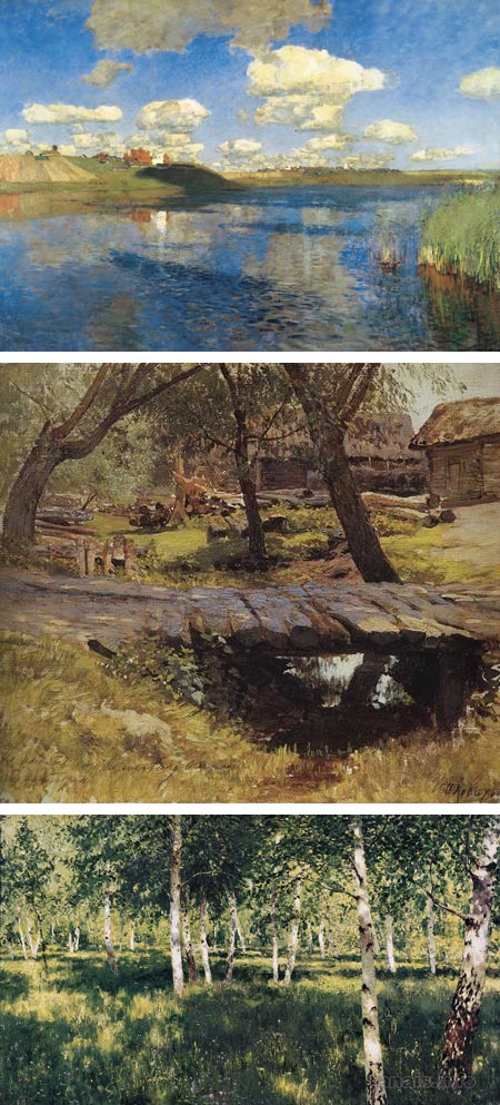
Isaac Ilyich Levitan (Isaak Il’ich Levitan) was one of the greatest of Russian landscape painters, one of the greatest Russian painters in general, and one of the great landscape painters in the history of art.Born into a poor family, he managed to begin study at the Moscow School of Painting and Sculpture when his family moved to Moscow in the late 1860’s. While at school, he lost both of his parents within two years of each other and was left without resources, but was allowed to continue at the school, his tuition waved, because of his extraordinary talent.
He was greatly influenced by his teachers, Alexei Savrasov and Vasily Polenov. The latter shared a penchant for light-filled plein air painting with the French painters of the Barbizon School, who would also be an influence on Levitan.
Levitan didn’t paint urban landscapes, preferring the lyrical countryside, and created his own branch of the Russian style of landscape known as “the landscape of mood”. His occasional forays into the sunny and brightly colored fields made popular by the Impressionist painters are balanced by many paintings of cloud filled or overcast skies, great shadows across the land and dark masses of trees, though often with hints of breaking light, or impending change.
You will sometimes see Levitan mentioned in concert with the Russian Impressionist painters. Though he had an appreciation and talent for handling color and light in keeping with the young French painters, he rejected Monet’s Impressionism. He remained essentially a realist, but his later work was emotional and romantic in a way that is suggestive of Symbolism. For an excellent article on this direction in his work, and Levitan in general, see Michael Hirsch’s “Good Evening from Isaac Levitan” on Articles & Texticles. There is also a good article on Gurney Journey, titled “Plein Air and Poetry“, comparing one of Levitan’s studies with the finished piece.
Levitan’s place in Russian culture has been compared to that of the writer Anton Checkov, who became one of his closest friends. Levitan exhibited with the Peredvizhniky (Itinerants), a group that included his teacher Vasily Polenov, along with Ivan Kramskoy, Ilya Repin, Ivan Shishkin, Vasily Surikov and other great Russian realist painters.
Levitan was prolific, leaving behind over a thousand works.
Categories:
-
István Orosz

In my post from 2008 about Anamorphic Art, I briefly mentioned the work of Hungarian artist István Orosz.Orosz is a graphic designer, illustrator, printmaker, poster artist, animator, stage designer and painter. He has a fascination with anamorphosis, and has several examples of his own in the gallery on his web site.
Unfortunately the site is inconvenient to deal with, one of those web site designs that is too “clever” for its own good (see my rant on How Not to Display Your Art on the Web). It opens in a pop-up, you have to wait for the white square to fill to indicate the site is loaded, and then deal with a difficult navigation system that is hidden until you roll over it and search out the links. Hints: main navigation is at the bottom, portfolio sections at the top, individual pieces in a band over the image in the center that you have to scroll through.
If you’re willing to work your way through, however, there are many interesting pieces in the section of Anamorphoses, along with illustrations, posters, paintings and Escher influenced etchings that explore the realm of impossible figures (see my posts on M.C. Escher and Andreas Aronsson).
You may find it easier to view Orosz’s work on Gallery Diabolus or Marlena Agency.
Orosz wrote an article titled The Mirrors of the Master in the book M.C. Escher’s Legacy: A Centennial Celebration.
Some of Orosz’s anamorphoses are particularly well done, in that the flat image makes perfect visual sense in itself, as in the image at top, with it’s anamorphic component hidden until revealed in the proper curved reflective surface (above, middle), as opposed to the somewhat easier paradigm of a flat image that simply appears distorted until viewed in the reflective surface.
Orosz also explores illusionistic double-images, as found in the work of Dalí and earlier artists, in which a secondary image can be seen in the main image (e.g. a face in a landscape).
I particularly like his poster designs, in which his playfully brain-teasing themes are presented in strong, simplified graphics.
Categories:
-
Demons and Devotion: The Hours of Catherine of Cleves
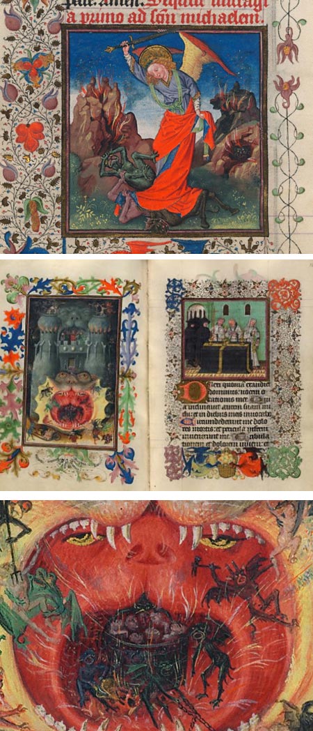
A “Book or hours” (Wikipedia) is a devotional text of prayers, stories and psalms common in the Middle Ages. Though they followed similar forms, each was unique and, of course, hand lettered.Many of them were illuminated, but few as lavishly and beautifully as the one known as The Hours of Catherine of Cleves. It is one of the most striking examples in existence; and is in the collection of the Morgan Library and Museum in New York.
The museum has put this rare treasure on display, along with supplementary material, in an exhibit titled Demons and Devotion: The Hours of Catherine of Cleves, that runs until May 2nd, 2010.
The illuminations, in this case, go far beyond the decoration of the pages and include beautifully painted miniatures, some 157 of them. The Morgan has an online exhibit, in which you can see the pages, and view their details in a zoomable interface. You can also view the pages as thumbnails. The limited space for viewing the image can be frustrating, but zooming is still better than just small images. [Addendum: John Overholt was kind enough to write and let us know that there is a “Full Screen View” button at the far right of the zooming controls below the zoomable images. There is a “Zoom Help” link that shows the button labels. Much better!]
They’re not all as striking as the examples here, of course, but many are quite beautiful, and the ones like The Mouth of Hell (above, middle and bottom) are worth the effort alone. Interesting how graphic visions of hell and damnation are always much more interesting than those of heaven and salvation, but then, the promptings of the Church in the Middle Ages were often more stick than carrot.
The artist in this case is known only as the Master of Catherine of Cleves. The amount of work lavished on this single book is astonishing. When you’re not being dazzled by the miniatures, take a moment to appreciate the rest of the decorative illumination.
Works like this take the concept of “book illustration” to an entirely different level.
Addendum: The Morgan is concurrently running an exhibit titled: Flemish Illumination in the Era of Catherine of Cleves featuring 18 illuminated manuscripts that should provide an excellent context for this exhibit.
(For more on miniature paintings in illuminated manuscripts, see my post on Jean Fouquet.)
[Via Horace Rumpole (John Overholt) on MetaFilter]
Categories:
-
Jan Toorop

Jan Toorop (also known as Jean Theodoro Toorop or Johannes Theodorus Toorop) was a Dutch Symbolist painter with a wonderfully unique style.He was born in Purworedjo, Java, at a time when Java was a Dutch colony. Ne moved to the Netherlands in 1872 and studied in Delft and at the Rijksakademie in Amsterdam.
Toorop’s work fits loosely into the category of Symbolist painting (a bit of a grab bag to begin with), as well as Art Nouveau. At times in his career he flirted with various styles, including Realism, Impressionism, Pointillism and Applied art.
His paintings combined both European and Javanese elements and aesthetics. The long thin arms of the figures in the image above, bottom, are indicative of Javanese shadow theatre.
In The Young Generation (image above, top), we see Toorop’s young daughter, Charley, seated in her high-chair, arms outstretched toward the strange and wondrous world that beckons her. Charley Toorop would also become a respected artist, as would her son.
In addition to his gallery work, Jan Toorop also created book illustrations, posters and stained glass designs.
There is an extensive site devoted to the artist, The Jan Toorop Research Center, which has a comprehensive gallery of his works, arranged by year, along with a bio, writings and section devoted to his experiments with different art movements.
Categories:
-
Sally Tharp

Michigan born painter Sally Tharp graduated from the University of Rhode Island with a BFA, but considers herself a self-taught painter.Her web site features several series of painting themes, including outdoor sign letters and a series of still life objects on shelves and other still life subjects.
Her primary focus, however, is a wonderful series that she calls Glass Paintings, featuring a variety of glass objects that prominently include home canning jars, apothecary bottles, glass marbles and coke bottles.
These are marvels of refraction and reflection, often with multiple objects arranged behind one another, and cropped close, creating a sort of refractive geometric lattice of color, within which are the representational characteristics of the image.
Tharp has a blog called Sally is Painting Today in which she posts images of current works, oil sketches on different subjects, including her contributions to Karin Jurick’s Different strokes from Different Folks (see my posts here and here).
She also occasionally posts images of her work hung in galleries, from which you can see the large scale of her paintings, such as this image of the painting at top, Sometimes I Feel Like You Look Right Through Me.
Categories:
-
Black & White ImageS: The Fifth Special Collection
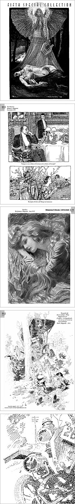 We are jaded by an abundance of color images.
Dazzled, distracted and spoiled by color’s overt and often brash appeal, we can easily lose sight of the sublime pleasures to be had in the appreciation of black and white artwork.
There is a visual charm and magic to black and white images that is difficult to describe, a sensation of value, texture and tonal contrasts that have their own kind of appeal quite separate than that of painting, or even drawings in colored media. (True aficionados of black and white film will confirm that appeal in a different medium.)
Nowhere is this more apparent than in the work of the master illustrators from the Golden Age of Illustration, roughly from the 1880’s through the 1920’s.
Particularly in the early part of that span, when reproduction techniques improved dramatically, but had not yet made color printing inexpensive enough to be widespread, black and white illustration flourished and bloomed, producing astonishing works from the masters of the genre.
Pen and ink drawing, in particular, achieved a kind of modern Renaissance, with masters like Howard Pyle, Franklin Booth, Joseph Clement Coll, James Montgomery Flagg, Arthur Rackham and many others producing drawings that are masterworks of the medium.
In addition, great illustrators like Howard Pyle and others painted beautifully evocative oil paintings in black and white (If you ever get a chance to visit the Delaware Art Museum, you’ll see what I mean).
Unfortunately, this work is overshadowed by color images, even those by the same artists, and is not widely reproduced these days, even on the web. Fine lined pen and ink drawing, in particular, does not fare well in reproduction on the web, suffering from the limitations of low-resolution display on screen.
As I’ve pointed out before, even though it’s not evident at first glance, computer monitors are low resolution (about 103ppi) — print images in glossy magazines and books are almost three times higher in resolution than your monitor (300dpi); and the difference in reproducing this kind of image is striking.
Fortunately, there is a source for some of the most beautiful black and white images from that period when great illustration was at its height, printed as they should be; and a terrific new collection has just been released.
Black & White ImageS: The Fifth Special Collection of Images from the Vadeboncoeur Collection is the latest in a series of annuals form the ImageS series of collections of great Golden Age illustration (see my previous posts on The Vadeboncoeur Collection of ImageS and ImageS 11).
As always, Vadeboncoeur has managed to feature work by some of the best known names along with discoveries that are likely to be new even to those already hooked on the beauty of great Golden Age illustration. The issue features over 35 artists, including Howard Pyle, Joseph Clement Coll, James Montgomery Flagg, Arthur Rackham, Rose O’Neill, Herbert Railton, Howard Chandler Christy, Dorothy Lathrop, Daniel Vierge and Elizabeth Shippen Green (links to my posts).
There is a preview on the ImageS site of the entire issue. Vadeboncoeur is showing larger previews for this issue than for previous issues (and I take a little bit of credit for encouraging him to do so), but I have to stress again that you cannot begin to appreciate the quality of these images, or their true visual appeal, from small reproductions on the computer screen. (As an example I’ve included at left, bottom, a detail from the image above it.)
In particular, the printing of ImageS goes beyond even normal high resolution printing, with image quality and printing standards comparable to limited edition prints. The edition is oversize at 9×12, on 100lb matte paper, and can be ordered from the publisher for $25 + $5 postage (U.S., postage is higher elsewhere). Many $100 art books don’t give you this many great images.
To order online, go here, click on “Product Overview”, then “The Vadeboncoeur Collection of Images” and then scroll down to Black & White ImageS Special #5. You can also contact the publisher by phone or email here.
Whether you’re reading by gaslight, or Edison’s newfangled electric bulbs, images like these are a rare treat.
(Images above left: Henri-Jules-Ferdinand Bellery-Desfontaines, Elizabeth Shippen Green, Wladyslaw T. Benda, Will Crawford)
Categories:


Charley’s Picks
Bookshop.org
(Bookshop.org affilliate links; sales benefit independent bookshop owners; I get a small percentage to help support my work on Lines and Colors)

John Singer Sargent: Watercolors


Urban Sketching: Understanding Perspective


Charley’s Picks
Amazon
(Amazon.com affiliate links; sales go to a larger yacht for Jeff Bezos; but I get a small percentage to help support my work on Lines and Colors)
John Singer Sargent: Watercolors
Urban Sketching: Understanding Perspective