
Categories
- 3d CGI
- Amusements
- Animation
- Anime & Manga
- Art Materials
- Art Videos
- Blogroll
- Cartoons
- Color
- Comics
- Concept & Visual Dev.
- Creativity
- Digital Art
- Digital Painting
- Displaying Art on the Web
- Drawing
- Eye Candy for Today
- Gallery and Museum Art
- High-res Art Images
- Illustration
- Motion Graphics & Flash
- Museums
- Online Museums
- Outsider Art
- Painting
- Painting a Day
- Paleo Art
- Pastel, Conté & Chalk
- Pen & Ink
- Prints and Printmaking
- Reviews
- Sc-fi and Fantasy
- Sculpture & Dimensional
- Site Comments
- Sketching
- Storyboards
- Tools and Techniques
- Uncategorized
- Vector Art
- Videos & Podcasts
- Vision and Optics
- Watercolor and Gouache
- Webcomics
Archives
- April 2026
- March 2026
- February 2026
- January 2026
- December 2025
- November 2025
- October 2025
- September 2025
- August 2025
- July 2025
- June 2025
- May 2025
- January 2025
- December 2024
- November 2024
- October 2024
- September 2024
- August 2024
- June 2024
- April 2024
- March 2024
- February 2024
- January 2024
- December 2023
- November 2023
- October 2023
- September 2023
- August 2023
- July 2023
- May 2023
- April 2023
- March 2023
- February 2023
- January 2023
- December 2022
- November 2022
- September 2022
- August 2022
- July 2022
- June 2022
- May 2022
- April 2022
- March 2022
- February 2022
- January 2022
- December 2021
- November 2021
- October 2021
- September 2021
- August 2021
- July 2021
- June 2021
- May 2021
- April 2021
- March 2021
- February 2021
- January 2021
- December 2020
- November 2020
- October 2020
- September 2020
- August 2020
- July 2020
- June 2020
- May 2020
- April 2020
- March 2020
- February 2020
- January 2020
- December 2019
- November 2019
- October 2019
- September 2019
- August 2019
- July 2019
- June 2019
- May 2019
- April 2019
- March 2019
- February 2019
- January 2019
- December 2018
- November 2018
- October 2018
- September 2018
- August 2018
- July 2018
- June 2018
- May 2018
- April 2018
- March 2018
- February 2018
- January 2018
- December 2017
- November 2017
- October 2017
- September 2017
- August 2017
- July 2017
- June 2017
- May 2017
- April 2017
- March 2017
- February 2017
- January 2017
- December 2016
- November 2016
- October 2016
- September 2016
- August 2016
- July 2016
- June 2016
- May 2016
- April 2016
- March 2016
- February 2016
- January 2016
- December 2015
- November 2015
- October 2015
- September 2015
- August 2015
- July 2015
- June 2015
- May 2015
- April 2015
- March 2015
- February 2015
- January 2015
- December 2014
- November 2014
- October 2014
- September 2014
- August 2014
- July 2014
- June 2014
- May 2014
- April 2014
- March 2014
- February 2014
- January 2014
- December 2013
- November 2013
- October 2013
- September 2013
- August 2013
- July 2013
- June 2013
- May 2013
- April 2013
- March 2013
- February 2013
- January 2013
- December 2012
- November 2012
- October 2012
- September 2012
- August 2012
- July 2012
- June 2012
- May 2012
- April 2012
- March 2012
- February 2012
- January 2012
- December 2011
- November 2011
- October 2011
- September 2011
- August 2011
- July 2011
- June 2011
- May 2011
- April 2011
- March 2011
- February 2011
- January 2011
- December 2010
- November 2010
- October 2010
- September 2010
- August 2010
- July 2010
- June 2010
- May 2010
- April 2010
- March 2010
- February 2010
- January 2010
- December 2009
- November 2009
- October 2009
- September 2009
- August 2009
- July 2009
- June 2009
- May 2009
- April 2009
- March 2009
- February 2009
- January 2009
- December 2008
- November 2008
- October 2008
- September 2008
- August 2008
- July 2008
- June 2008
- May 2008
- April 2008
- March 2008
- February 2008
- January 2008
- December 2007
- November 2007
- October 2007
- September 2007
- August 2007
- July 2007
- June 2007
- May 2007
- April 2007
- March 2007
- February 2007
- January 2007
- December 2006
- November 2006
- October 2006
- September 2006
- August 2006
- July 2006
- June 2006
- May 2006
- April 2006
- March 2006
- February 2006
- January 2006
- December 2005
- November 2005
- October 2005
- September 2005
- August 2005
Relevant Blogs
Art, Painting & Sketch
- Gurney Journey
- Underpaintings
- Art and Influence
- Painting Perceptions
- Oil Painters of America
- Vasari Paint POV
- Flying Fox
- Urban Sketchers
- Bento (Smithsonian)
- Art Inconnu
- The Hidden Place
- Still Life
- Making a Mark
- The Art of the Landscape
- Exploring Color & Creativity
- Art Contrarian
- Artist A Day
- beinArt Surreal Art Collective
- Eye Level
- David Dunlop
- p.i.g.m.e.n.t.i.u.m
- CultureGrrl
- Joaquín Sorolla blog
- Artists in Pastel
“Painting a Day”
- A Painting a Day (Keiser)
- On Painting (Keiser)
- Julian Merrow-Smith
- Karen Jurick
- Jeffrey Hayes
- Carol Marine
- Abbey Ryan
- Daily Paintworks
Other Painting Blogs
- Virtual Gouache Land
- Neil Hollingsworth
- Marc Hanson
- Kevin Menck
- Marc Dalessio
- Larry Seiler
- Stapleton Kearns
- Colin Page
- Roos Schuring
- Hans Versfelt
- Titus Meeuws
- Régis Pettinari
- René Plein Air
- Belinda Del Pesco
- Robin Weiss
- Nathan Fowkes (Land Sketch)
- William Wray
- Frank Serrano
- Stephen Magsig
- Michael Chesley Johnson
- Twice a Week
- Sarah Wimperis
- Rob Adams
- Michael Cole Manley
- The Dirty Palette Club
- Mike Manley’s Draw!
Gallery Art & Illustration mix
Illustration
- Howard Pyle
- 100 Years of Illustration
- BibliOdyssey
- Illustration Art
- Today’s Inspiration
- Illustration Mundo
- Little Chimp Society
- Danny Gregory
- R D (John Martz
- Illustration Friday blog
- Monster Brains
- Illustrators & Illustrations (RU)
- Elwood H. Smith
- DaniDraws.com
- Designers Who Blog
- iSpot Blog
Sci-Fi & Fantasy
Illustration & Comics
Comics & Cartoons
- Comics Beat
- Robot 6
- Newsarama Blog
- Comic Vine
- Comics Alliance
- Forbidden Planet Int.
- Paolo Rivera
- Bolt City
- Flight
- Scott McCloud
- The Comics Journal
- Comixpedia
- Funnybook Babylon
- James Baker
- Middleton’s Sketchbook
- Boneville
- The Hotel Fred
- Paul Rivoche
- Daily Cartoonist
- Mad About Cartoons (William Wray)
- Digital Strips
Illustration & Concept
Animation & Concept
- Cartoon Brew
- Animation Blog
- Cold Hard Flash
- Concept Art World
- The CAB
- FY Concept Art
- Concept Ships
- Concept Robots
- John Nevarez
- Armand Serrano
- Marcos Mateu-Mestre
- all kinds of stuff (Kricfalusi)
- Yacin the faun (Man Arenas)
- Kelsey Mann
- Cre8tivemarks Blog
- Ice-Cream Monster Toon Cafe
- AAU Character & Creature Design
- AAU Animation Notes
- Articles and Texticles
Paleo & Scientific
Tools & Techniques
Other
Lists of Art Blogs
Art Image Resource Links
Historic Art Images
- Wikimedia Commons: Paintings
- Wikimedia Commons: Drawings
- The Athenaeum
- WikiArt (WikiPaintings)
- Google Art Project: Artists
- Google Art Project: Collections (Museums)
- ArtCyclopedia
- Web Gallery of Art
- Art Renewal Center
- Web Gallery of Impressionism
Auction Consolidation sites
Auction sites
- Sotheby’s
- Bonham’s
- Christies
- Heritage Auctions: Fine Art
- Heritage Auctions: Illustration
- Freeman’s Auctions
- Bukowskis
- Shannon’s
Image Search
Reverse Image Search (search by image)
- Tin Eye
- RevImg
- Google Image Search (camera icon)
- Bing Image Search (camera icon)
Promoting some friends and some clients of my website design business
- Twin Willows T’ai Chi studio in Wilmington DE. Taiji classes with Bryan Davis.
- Ray Hayward, Inspired Teacher of T’ai Chi ( Taiji ) in Minneapolis, Founder of Mindful Motion Tai Chi Academy
- OldHead Tattoo studio and Art Gallery in Wilmington DE. Tattoos and paintings by Bruce Gulick
- Sharon Domenico Art, pet portrait oil paintings
- Platinum Paperhanging, wallpaper hanging, Main Line and Philadelphia, PA
- Lisa Stone Design, interior designer, Main Line and Philadelphia, PA
- Studio12KPT, original art, prints, calendars and other custom printed items by Van Sickle & Rolleri
-
Richard Schmid 1934-2021
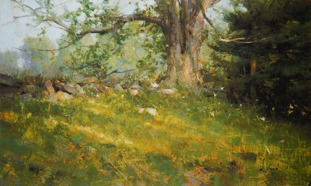

I was saddened to learn of the death on Sunday of American artist Richard Schmid, one of the finest and most influential realist artists of the late 20th and early 21st centuries.
His paintings are veritable textbooks of color and value relationships, texture, brush handling, and the subtle power of edges in painting. Schmid was not only a formidable painter, but a hugely influential teacher; you can see his influence in the work of his students, their students and even those who have just known his work from afar.
Fortunately, Schmid has left a legacy of teaching materials — treasure troves of painting knowledge that are available to the rest of us. His book Alla Prima II: Everything I know About Painting – and More is the single best book on the art of painting of which I am aware. I learn something new every time I go through it. I have also found his instructional videos — particularly those on landscape painting — of great value. (Most outstanding for me is the second in his landscape series: June.)
If you are not well acquainted with his work, the official Richard Schmid website is a great place to start. You will find examples of his work not only in the Portfolio, but in the sections on Available Art, Lithographs and Books and Videos. (In the Books section, on the pages for the individual titles, look below the image of the cover for the “Preview This Item” tab.)
Unfortunately, the official website pulls up short of showing his work to best advantage in large images. For that, you may need to use a Bing or Google image search, with the parameters set to “Large” or “Extra Large” (see my recent article on image search). In this way you can view larger images of his work that have been reproduced by auction houses.
As much as I admire Schmid’s work as a portraitist and still life painter, it is his landscapes that have long captured my attention. Subtle, atmospheric and evocative, his landscapes are masterful examples of the power of suggestion in painting, convincing your eye that there is more there than is actually delineated. The published collection, The Landscapes is a visual treat, beautifully printed and at a marvelously large size (see my review here).
I haven’t yet gotten a copy of the new still life book, but I can’t imagine it is anything less than superb.
In all cases, I strongly recommend purchasing his books and videos direct from the official website. Not only will the proceeds go more directly to his family, but the materials are actually less expensive there than through third party sites like Amazon.
Categories:
-
Kris Parins

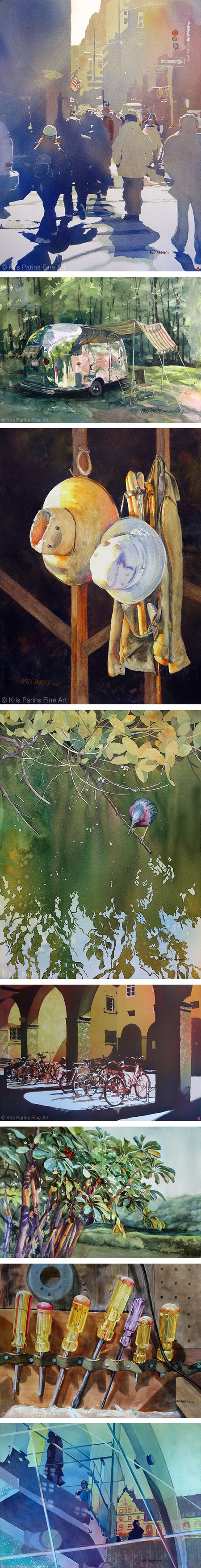
Kris Parins is a watercolor painter who is originally from Wisconsin, and now shares her time between a studio there and one in Florida.
Her bright, crisp watercolors reflect a love of the natural world as exemplified by both places as well as the play of light and shadow to be found in urban environments and still life objects.
Her approach varies, at times areas of color are abstracted to the point of giving the work a seirgraph-like appearance.
Her website portfolio is divided into ranges of subject matter. In addition, there is a section for prints, and a video in which she talks about her inspiration and process. The Articles section includes articles Parins has written for Watercolor Artist Magazine.
Categories:
-
Eye Candy for Today: Carl Thomsen’s Arranging Daffodils
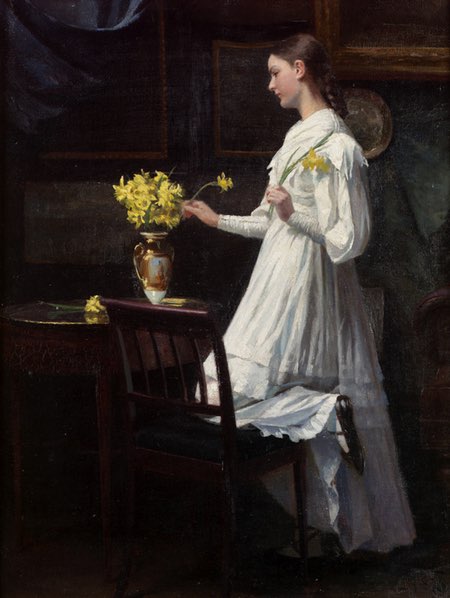

Arranging Daffodils, Carl Thomsen; oil on canvas, roughly 16 x 12 inches (41 x 32 cm); link is to image file page on Wikimedia Commons, zoomable image on Bonham’s. (My assumption from the auction listing is that the painting is currently in a private collection.)
This 1894 painting by Danish artist Carl Thomsen is a perfect image of bringing spring indoors. The vase of blossoms and the young woman and her white dress are illuminated highlights in the dark room, giving a feeling of the bright promise of spring making an advance into the darkness of fading winter.
Thomsen’s painterly approach makes the bright subjects stand out even more against the almost flat background.
Categories:
-
Bernard Völlmy

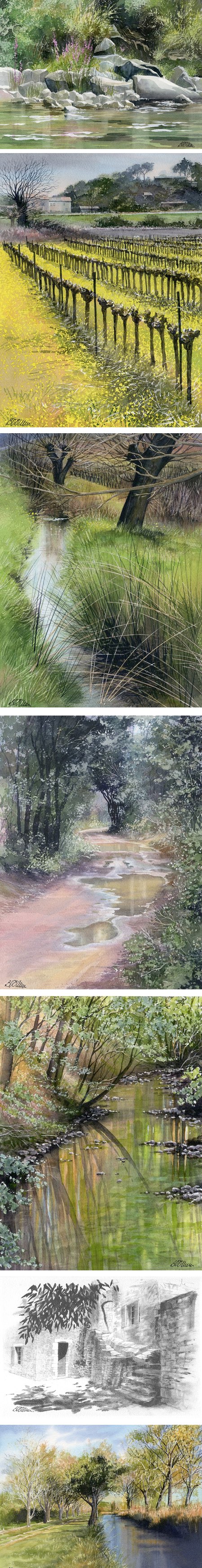
Bernard Völlmy is a Swiss painter, now based in France, who works primarily in watercolor, but also in monochromatic and color watercolors combined with graphite.
His watercolor themes often include subjects with water — creeks and streams, small runs or even reflective puddles. These are approached with an eye to texture and interesting value contrasts.
Völlmy’s website is in French, but is relatively easily navigable by non-French speakers. The link I’ve posted takes you directly to his watercolor on paper gallery. You can find other galleries of images under the “Bernard Völlmy” menu tab. Among them is a section for his sketchbooks.
Categories:
-
Eye Candy for Today: John Sell Cotman graphite and wash drawing

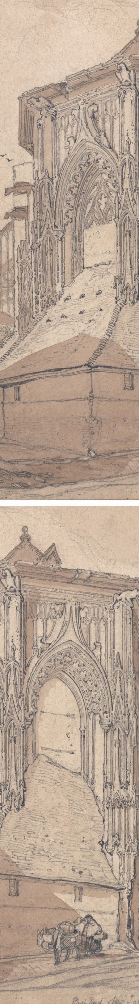
East End of Saint Jacques at Dieppe, Normandy; John Sell Cotman; graphite and brown wash; roughly 12 x 9 inches (29 x 22 cm). LInk is to zoomable version on Google Art Project, downloadable file on Wikimedia Commons, original is in the Yale Center for British Art.
English painter, printmaker and illustrator John Sell Cotman, who was active in the late 18th and early 19th centuries, was prolific and left a trove of drawings in addition to his paintings and graphics. Here, he confidently delineates the intricately decorative structure of a large Renaissance church with graphite, augmented with subtle washes.
The drawing exhibits both the substantial accuracy of a careful architectural drawing, and the liveliness of a more casual sketch.
In part, this is likely due to the loosely free rendering of the roof of the lower structure, but I think it’s also due to an approach I have also noticed in the wonderful architectural drawings of Canaletto.
In both cases, lines that over their course are ruler straight, are along the way wavering and often lightly broken. It’s a wonderful technique.
Categories:
-
Jennifer McChristian (update)


Originally from Montreal and now based in California, Jennifer McChristian is a painter I first featured back in 2007.
Working primarily in oil, and secondarily in gouache and watercolor, McChristian paints both plein air and in the studio. While she sometimes paints the natural landscape, her preference is to find subjects in the built environment, often taking obvious delight in the geometry of buildings, highways, streets, and bridges, and the shapes of shadow and light they produce.
She also finds inspiration in nocturnes, working with the contrasts of darkness and artificial light in a way that strikes me as appealingly playful. McChristian also studies people, placing her figures and portraits within their environment.
Her approach is quite interesting; she apparently works with a bright, high chroma imprimatura, reddish or almost magenta, that she allows to freely come through in areas of her brusquely textural paint application.
I find the textural, painterly nature of her brush marks particularly appealing. Unfortunately, this character of her pantings doesn’t come through well when reproduced at the size of my example images (I’ve included one detail crop to demonstrate). Fortunately, if you click through the thumbnails on her website to the full size images, most of them are just large enough to see and appreciate this aspect of her work.
Her website is divided into galleries for landscape, figures, drawings and an archive of older work. Her blog also serves as an archive of sorts; though no longer active, it still includes additional examples of her work as well as photos of her conducting workshops and classes.
McChristian’s work is featured on the cover and in the lead article of the current April/May 2021 issue of PleinAir Magazine.
Categories:


Charley’s Picks
Bookshop.org
(Bookshop.org affilliate links; sales benefit independent bookshop owners; I get a small percentage to help support my work on Lines and Colors)

John Singer Sargent: Watercolors


Urban Sketching: Understanding Perspective


Charley’s Picks
Amazon
(Amazon.com affiliate links; sales go to a larger yacht for Jeff Bezos; but I get a small percentage to help support my work on Lines and Colors)
John Singer Sargent: Watercolors
Urban Sketching: Understanding Perspective