
Categories
- 3d CGI
- Amusements
- Animation
- Anime & Manga
- Art Materials
- Art Videos
- Blogroll
- Cartoons
- Color
- Comics
- Concept & Visual Dev.
- Creativity
- Digital Art
- Digital Painting
- Displaying Art on the Web
- Drawing
- Eye Candy for Today
- Gallery and Museum Art
- High-res Art Images
- Illustration
- Motion Graphics & Flash
- Museums
- Online Museums
- Outsider Art
- Painting
- Painting a Day
- Paleo Art
- Pastel, Conté & Chalk
- Pen & Ink
- Prints and Printmaking
- Reviews
- Sc-fi and Fantasy
- Sculpture & Dimensional
- Site Comments
- Sketching
- Storyboards
- Tools and Techniques
- Uncategorized
- Vector Art
- Videos & Podcasts
- Vision and Optics
- Watercolor and Gouache
- Webcomics
Archives
- April 2026
- March 2026
- February 2026
- January 2026
- December 2025
- November 2025
- October 2025
- September 2025
- August 2025
- July 2025
- June 2025
- May 2025
- January 2025
- December 2024
- November 2024
- October 2024
- September 2024
- August 2024
- June 2024
- April 2024
- March 2024
- February 2024
- January 2024
- December 2023
- November 2023
- October 2023
- September 2023
- August 2023
- July 2023
- May 2023
- April 2023
- March 2023
- February 2023
- January 2023
- December 2022
- November 2022
- September 2022
- August 2022
- July 2022
- June 2022
- May 2022
- April 2022
- March 2022
- February 2022
- January 2022
- December 2021
- November 2021
- October 2021
- September 2021
- August 2021
- July 2021
- June 2021
- May 2021
- April 2021
- March 2021
- February 2021
- January 2021
- December 2020
- November 2020
- October 2020
- September 2020
- August 2020
- July 2020
- June 2020
- May 2020
- April 2020
- March 2020
- February 2020
- January 2020
- December 2019
- November 2019
- October 2019
- September 2019
- August 2019
- July 2019
- June 2019
- May 2019
- April 2019
- March 2019
- February 2019
- January 2019
- December 2018
- November 2018
- October 2018
- September 2018
- August 2018
- July 2018
- June 2018
- May 2018
- April 2018
- March 2018
- February 2018
- January 2018
- December 2017
- November 2017
- October 2017
- September 2017
- August 2017
- July 2017
- June 2017
- May 2017
- April 2017
- March 2017
- February 2017
- January 2017
- December 2016
- November 2016
- October 2016
- September 2016
- August 2016
- July 2016
- June 2016
- May 2016
- April 2016
- March 2016
- February 2016
- January 2016
- December 2015
- November 2015
- October 2015
- September 2015
- August 2015
- July 2015
- June 2015
- May 2015
- April 2015
- March 2015
- February 2015
- January 2015
- December 2014
- November 2014
- October 2014
- September 2014
- August 2014
- July 2014
- June 2014
- May 2014
- April 2014
- March 2014
- February 2014
- January 2014
- December 2013
- November 2013
- October 2013
- September 2013
- August 2013
- July 2013
- June 2013
- May 2013
- April 2013
- March 2013
- February 2013
- January 2013
- December 2012
- November 2012
- October 2012
- September 2012
- August 2012
- July 2012
- June 2012
- May 2012
- April 2012
- March 2012
- February 2012
- January 2012
- December 2011
- November 2011
- October 2011
- September 2011
- August 2011
- July 2011
- June 2011
- May 2011
- April 2011
- March 2011
- February 2011
- January 2011
- December 2010
- November 2010
- October 2010
- September 2010
- August 2010
- July 2010
- June 2010
- May 2010
- April 2010
- March 2010
- February 2010
- January 2010
- December 2009
- November 2009
- October 2009
- September 2009
- August 2009
- July 2009
- June 2009
- May 2009
- April 2009
- March 2009
- February 2009
- January 2009
- December 2008
- November 2008
- October 2008
- September 2008
- August 2008
- July 2008
- June 2008
- May 2008
- April 2008
- March 2008
- February 2008
- January 2008
- December 2007
- November 2007
- October 2007
- September 2007
- August 2007
- July 2007
- June 2007
- May 2007
- April 2007
- March 2007
- February 2007
- January 2007
- December 2006
- November 2006
- October 2006
- September 2006
- August 2006
- July 2006
- June 2006
- May 2006
- April 2006
- March 2006
- February 2006
- January 2006
- December 2005
- November 2005
- October 2005
- September 2005
- August 2005
Relevant Blogs
Art, Painting & Sketch
- Gurney Journey
- Underpaintings
- Art and Influence
- Painting Perceptions
- Oil Painters of America
- Vasari Paint POV
- Flying Fox
- Urban Sketchers
- Bento (Smithsonian)
- Art Inconnu
- The Hidden Place
- Still Life
- Making a Mark
- The Art of the Landscape
- Exploring Color & Creativity
- Art Contrarian
- Artist A Day
- beinArt Surreal Art Collective
- Eye Level
- David Dunlop
- p.i.g.m.e.n.t.i.u.m
- CultureGrrl
- Joaquín Sorolla blog
- Artists in Pastel
“Painting a Day”
- A Painting a Day (Keiser)
- On Painting (Keiser)
- Julian Merrow-Smith
- Karen Jurick
- Jeffrey Hayes
- Carol Marine
- Abbey Ryan
- Daily Paintworks
Other Painting Blogs
- Virtual Gouache Land
- Neil Hollingsworth
- Marc Hanson
- Kevin Menck
- Marc Dalessio
- Larry Seiler
- Stapleton Kearns
- Colin Page
- Roos Schuring
- Hans Versfelt
- Titus Meeuws
- Régis Pettinari
- René Plein Air
- Belinda Del Pesco
- Robin Weiss
- Nathan Fowkes (Land Sketch)
- William Wray
- Frank Serrano
- Stephen Magsig
- Michael Chesley Johnson
- Twice a Week
- Sarah Wimperis
- Rob Adams
- Michael Cole Manley
- The Dirty Palette Club
- Mike Manley’s Draw!
Gallery Art & Illustration mix
Illustration
- Howard Pyle
- 100 Years of Illustration
- BibliOdyssey
- Illustration Art
- Today’s Inspiration
- Illustration Mundo
- Little Chimp Society
- Danny Gregory
- R D (John Martz
- Illustration Friday blog
- Monster Brains
- Illustrators & Illustrations (RU)
- Elwood H. Smith
- DaniDraws.com
- Designers Who Blog
- iSpot Blog
Sci-Fi & Fantasy
Illustration & Comics
Comics & Cartoons
- Comics Beat
- Robot 6
- Newsarama Blog
- Comic Vine
- Comics Alliance
- Forbidden Planet Int.
- Paolo Rivera
- Bolt City
- Flight
- Scott McCloud
- The Comics Journal
- Comixpedia
- Funnybook Babylon
- James Baker
- Middleton’s Sketchbook
- Boneville
- The Hotel Fred
- Paul Rivoche
- Daily Cartoonist
- Mad About Cartoons (William Wray)
- Digital Strips
Illustration & Concept
Animation & Concept
- Cartoon Brew
- Animation Blog
- Cold Hard Flash
- Concept Art World
- The CAB
- FY Concept Art
- Concept Ships
- Concept Robots
- John Nevarez
- Armand Serrano
- Marcos Mateu-Mestre
- all kinds of stuff (Kricfalusi)
- Yacin the faun (Man Arenas)
- Kelsey Mann
- Cre8tivemarks Blog
- Ice-Cream Monster Toon Cafe
- AAU Character & Creature Design
- AAU Animation Notes
- Articles and Texticles
Paleo & Scientific
Tools & Techniques
Other
Lists of Art Blogs
Art Image Resource Links
Historic Art Images
- Wikimedia Commons: Paintings
- Wikimedia Commons: Drawings
- The Athenaeum
- WikiArt (WikiPaintings)
- Google Art Project: Artists
- Google Art Project: Collections (Museums)
- ArtCyclopedia
- Web Gallery of Art
- Art Renewal Center
- Web Gallery of Impressionism
Auction Consolidation sites
Auction sites
- Sotheby’s
- Bonham’s
- Christies
- Heritage Auctions: Fine Art
- Heritage Auctions: Illustration
- Freeman’s Auctions
- Bukowskis
- Shannon’s
Image Search
Reverse Image Search (search by image)
- Tin Eye
- RevImg
- Google Image Search (camera icon)
- Bing Image Search (camera icon)
Promoting some friends and some clients of my website design business
- Twin Willows T’ai Chi studio in Wilmington DE. Taiji classes with Bryan Davis.
- Ray Hayward, Inspired Teacher of T’ai Chi ( Taiji ) in Minneapolis, Founder of Mindful Motion Tai Chi Academy
- OldHead Tattoo studio and Art Gallery in Wilmington DE. Tattoos and paintings by Bruce Gulick
- Sharon Domenico Art, pet portrait oil paintings
- Platinum Paperhanging, wallpaper hanging, Main Line and Philadelphia, PA
- Lisa Stone Design, interior designer, Main Line and Philadelphia, PA
- Studio12KPT, original art, prints, calendars and other custom printed items by Van Sickle & Rolleri
-
Urban Sketchers turns 1

Urban Sketchers, a terrific group sketchblog that I wrote about previously here and here, celebrated its first year anniversary this month.Urban Sketchers is devoted to drawing on location in urban environments, and it has come a long way in the year since it was established by Gabi Campanario, an illustrator and journalist based in Seattle, Washington.
The blog now boasts a long list of invited corespondents from numerous cities and countries around the world, with a delightfully broad range of styles, mediums and approaches. Their first anniversary press release has the stats.
With its wide base of contributors, Urban Sketchers is updated often, making frequent visits rewarding. There is always something new and interesting.
You can browse by artist, listed in the left sidebar by name and home base location, or by subject tags on the right sidebar.
If you want to just flip through the entries in reverse chronological order, look for the small “Older Posts” link at the bottom of the center column.
Going forward, the group plans to formalize as a nonprofit organization, raise money for scholarships and grants, publish a book and organize international meetings; all in support of promoting location drawing, and enabling others to “See the world, one drawing at a time”.
(Images above: Matt Jones, Thomas Thorspecken, Benedetta Dossi, Gérard Michel, Stephen Gardner)
Categories:
-
NuFormer 3-D Building Projections

NuFormer is a design firm based in the Netherlands. They have developed a computer-based projection system for creating the illusion of moving, 3-dimensional alterations to the surfaces of buildings.The results are striking, as you can see in this video on Vimeo. Bear in mind that these are not CGI in the usual sense, the computer imagery is in the projections on the buildings, not in the manipulation of the video images themselves. This is essentially what you would see if you were standing on the street in front of the buildings.
Take note of what each of the two buildings actually looks like early in the video, as their actual appearance will be delightfully called into question in the course of the display.
[Via Metafilter]
Categories:
-
Gennady Spirin

Russian born illustrator Gennady Spirin studied at the Moscow Art School and the Academy of Arts, as well as the Moscow Stroganov Institute, and currently resides in the U.S.Spirin is the author and illustrator of a number of children’s books for which his illustrations have garnered awards in Europe and the U.S.
Spirin blends imagery and painting styles from the Renaissance with a modern design sensibility, and, to my eye, seasons it with influences from great turn of the 20th Century illustrators like Arthur Rackham, Edmund Dulac, Walter Crane, Kay Neilsen and Howard Pyle.
His meticulously detailed images are muted in color, rich with texture and marvelously evocative of other times and places. They often combine pictorial and decorative elements, in a way suggestive of both the Renaissance and Art Nouveau artists like Alphonse Mucha (also bringing to mind Russian illustrator Ivan Bilibin). There is a quality of finesse and attention to pictorial unity that gives Spirin’s paintings a quiet strength, drawing you in and guiding your eye through through the composition.
His work can have a feeling of timelessness, as though it was situated outside the stream of time and plucking elements from it at will.
(As a side note, it occurs to me that contemporary illustrators like Olga Dugina and Andrej Dugan may have been influenced by Spirin.)
Unfortunately I don’t know of a definitive repository of Spirin’s work on the web, or an official site, but I’ve gathered what resources I could find for you below.
[Suggestion courtesy of Don Green]
Addendum: another good resource was added to the list in the form of this blog post, with several of Spirin’s illustrations; which was found for us by Tat, who searched for Spirin’s name in Russian. (See this post’s comments.)
Categories:
-
Al Williamson’s Flash Gordon: A Lifelong Vision of the Heroic
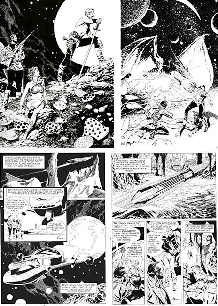
Anyone who has read my previous post about comics art great Al Williamson, knows that he is high on my personal list of adventure comics artists, but I have to admit that even I was surprised by the new book from Flesk publications, Al Williamson’s Flash Gordon: A Lifelong Vision of the Heroic, that collects all of his art for several comic book incarnations of Alex Raymond’s iconic space hero.I had seen a few of the the stories collected here, but by no means all. The 5 or 6 collections I have of Williamson’s work hinted at even more terrific Flash Gordon pieces by Williamson, with short excerpts and individual panels, but until I got this collection I didn’t realize how consistently amazing his Flash Gordon work was.
In terms of his wildly imagined and intricately detailed science fiction settings, it easily rivals his stunning work for the classic EC Comics stories from the 1950’s, but the sophisticated renderings of figures and faces from some of the later stories bring with them the elegance of his work from the Secret Agent Corrigan strips.
In many ways, Williamson was the inheritor of Alex Raymond’s role as one of the artists who carried the superb draftsmanship and refined pen and ink techniques of the turn of the century illustrators into the 20th Century world of adventure comics
The book collects three periods during which Williamson worked on Raymond’s most recognizable character, from the King Comics stories of the 1960’s, the 1980’s adaptation of the campy motion picture (of which it was by far the best aspect) and the easily missed Marvel Comics miniseries from 1994, as well as including much supplementary and related art in its 256 pages.
I have Williamson’s 1980’s Flash Gordon movie adaptation as published by Golden Books, in which the printing is terrible and the art is lost in sloppy over-saturated color and poor reproduction values in general. I didn’t realize how beautiful the art for that story actually was until I saw the same story printed here in it’s original glorious black and white.
This kind of comic art, when printed in black and white, is like having a book of classic pen and ink illustration that happens to tell terrific pulp adventure stories.
If you look at the pages in the book you’ll see that in many places the black areas are shades of dark gray rather than solid black. This is not because the quality of the printing is in any way off; Flesk Publications is a small niche-publisher devoted to creating superb editions of books about classic illustrators and comics artists, and the standards of book design and printing from Flesk are always high.
Those areas are, in fact, not quite black because the quality of the printing is superb, and the majority of the art has been reproduced not from stats or mechanical copies, as wold be the usual procedure with this kind of collection, but from brand new scans of the original artwork, allowing you to actually see the tones of ink as laid down by the artist! Wonderful.
Mark Schultz, who acknowledges being tremendously inspired by Williamson’s work, was instrumental in working with John Fleskes to assemble the book, and contributes the major essay. There is an interview with Schultz about the collection on Newsarama.
For admirers of great adventure comics art (and I obviously include myself here), Al Williamson’s Flash Gordon: A Lifelong Vision of the Heroic is one of the must have books this year. It can be found in better bookstores and comics shops, or ordered from Amazon and other online bookstores, as well as directly from the Flesk Publications.
For more on Al Williamson, see my previous post.
Categories:
-
Dahesh Museum of Art
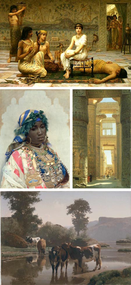
One of the problems confronting small museums, that are most often originally based on the art collection of an individual at their inception, is the question acquiring and maintaining a physical space in which to display the works.Maintaining a physical space is often more difficult for small museums than large ones. Even though large museums have much higher expenses, they also have larger support and financial structures. There is a balancing point museums must reach in terms of support to make the operation of a physical museum viable. This is particularly difficult in places where real estate is at a premium, as in New York City.
Such has been the struggle for the Dahesh Museum of Art, which moved between several venues, and left its last one due to the high cost of renting the space. It is currently a museum without a physical home. But the good news is that the Museum has put some of its collection online in a virtual exhibition.
This is particularly nice because of the museum’s rather unique mission, as the only museum in the U.S. devoted to 18th and 19th Century European academic art.
This, as fans of the genre(s) will tell you, is important because this art often gets short shrift among the larger art establishment. It is seen as the stodgy, formulaic art that post-war 20th Century Modernism (the pinnacle of all artistic achievement) came along to save us from (as well as liberating us from the associated stifling conventions of draftsmanship, perspective, representation and such outmoded concepts as “beauty”, but I digress).
The Dahesh collection started with Lebanese writer and philosopher Saleem Moussa Ashi, whose pen name was Dr. Dahesh. His collection of more than 2,000 academic paintings, sculpture and works on paper form the core of the collection.
It is worth noting that the museum has also paid attention to illustration (an equally bankrupt form of making images, even more reviled among the modernist factions, and obviously “not art” – sigh).
Not having the museum in a physical space for the time being is unfortunate, but as they look for a new home for the collection, parts of it travel on loan; and the online presence gives those of us who love this misunderstood and neglected chapter of art history a source of inspiration.
Most of the images are zoomable, which, while not as satisfying as full high-resolution images, is still better than just small ones. The collection is a little awkward to browse, the only alternative to a search is alphabetical arrangement; and someone had the misbegotten idea to watermark some of the smaller images (please stop demonstrating your ignorance, whoever you are), but the zoomable images can be enjoyed.
The museum shop does currently has a physical presence, at 55 East 52nd St. in Manhattan. They have an interesting selection of books, prints, posters and exhibition catalogs.
(Images above: Edwin Long, José Tapiró Baró, Ernst Karl Eugen Koerner, Aguste Bonheur)
Categories:
-
The Zoomquilt II
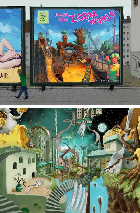
Like its predecessor, The Zoomquilt I, which I wrote about in 2006, The Zoomquilt II is a collaborative art project by 34 different artists.Basically an amusement, this is an animated sequence of scenes, each one of which is related to the others by a transitional area within the image that allows for a continuous zoom, one scene leading into the next, leading into the next and so on.
The effect is nicely hypnotic, and the images are fun pseudo-Surrealism, full of monsters and trippy landscapes. You can control the speed and direction of the zoom with a slider on a pop-out panel at the left, that also contains the credits.
The Flash based animation is set to render to the size of the browser window, so maximize your browser for best effect.
In what may turn out to be an unfortunate choice, one of the participants used Disney characters in one of the scenes, so if the web site is hosted anywhere that has a copyright treaty with the U.S. this version may not be available for long. Enjoy it while you can.
[Via BoingBoing]
Categories:


Charley’s Picks
Bookshop.org
(Bookshop.org affilliate links; sales benefit independent bookshop owners; I get a small percentage to help support my work on Lines and Colors)

John Singer Sargent: Watercolors


Urban Sketching: Understanding Perspective


Charley’s Picks
Amazon
(Amazon.com affiliate links; sales go to a larger yacht for Jeff Bezos; but I get a small percentage to help support my work on Lines and Colors)
John Singer Sargent: Watercolors
Urban Sketching: Understanding Perspective