
Categories
- 3d CGI
- Amusements
- Animation
- Anime & Manga
- Art Materials
- Art Videos
- Blogroll
- Cartoons
- Color
- Comics
- Concept & Visual Dev.
- Creativity
- Digital Art
- Digital Painting
- Displaying Art on the Web
- Drawing
- Eye Candy for Today
- Gallery and Museum Art
- High-res Art Images
- Illustration
- Motion Graphics & Flash
- Museums
- Online Museums
- Outsider Art
- Painting
- Painting a Day
- Paleo Art
- Pastel, Conté & Chalk
- Pen & Ink
- Prints and Printmaking
- Reviews
- Sc-fi and Fantasy
- Sculpture & Dimensional
- Site Comments
- Sketching
- Storyboards
- Tools and Techniques
- Uncategorized
- Vector Art
- Videos & Podcasts
- Vision and Optics
- Watercolor and Gouache
- Webcomics
Archives
- April 2026
- March 2026
- February 2026
- January 2026
- December 2025
- November 2025
- October 2025
- September 2025
- August 2025
- July 2025
- June 2025
- May 2025
- January 2025
- December 2024
- November 2024
- October 2024
- September 2024
- August 2024
- June 2024
- April 2024
- March 2024
- February 2024
- January 2024
- December 2023
- November 2023
- October 2023
- September 2023
- August 2023
- July 2023
- May 2023
- April 2023
- March 2023
- February 2023
- January 2023
- December 2022
- November 2022
- September 2022
- August 2022
- July 2022
- June 2022
- May 2022
- April 2022
- March 2022
- February 2022
- January 2022
- December 2021
- November 2021
- October 2021
- September 2021
- August 2021
- July 2021
- June 2021
- May 2021
- April 2021
- March 2021
- February 2021
- January 2021
- December 2020
- November 2020
- October 2020
- September 2020
- August 2020
- July 2020
- June 2020
- May 2020
- April 2020
- March 2020
- February 2020
- January 2020
- December 2019
- November 2019
- October 2019
- September 2019
- August 2019
- July 2019
- June 2019
- May 2019
- April 2019
- March 2019
- February 2019
- January 2019
- December 2018
- November 2018
- October 2018
- September 2018
- August 2018
- July 2018
- June 2018
- May 2018
- April 2018
- March 2018
- February 2018
- January 2018
- December 2017
- November 2017
- October 2017
- September 2017
- August 2017
- July 2017
- June 2017
- May 2017
- April 2017
- March 2017
- February 2017
- January 2017
- December 2016
- November 2016
- October 2016
- September 2016
- August 2016
- July 2016
- June 2016
- May 2016
- April 2016
- March 2016
- February 2016
- January 2016
- December 2015
- November 2015
- October 2015
- September 2015
- August 2015
- July 2015
- June 2015
- May 2015
- April 2015
- March 2015
- February 2015
- January 2015
- December 2014
- November 2014
- October 2014
- September 2014
- August 2014
- July 2014
- June 2014
- May 2014
- April 2014
- March 2014
- February 2014
- January 2014
- December 2013
- November 2013
- October 2013
- September 2013
- August 2013
- July 2013
- June 2013
- May 2013
- April 2013
- March 2013
- February 2013
- January 2013
- December 2012
- November 2012
- October 2012
- September 2012
- August 2012
- July 2012
- June 2012
- May 2012
- April 2012
- March 2012
- February 2012
- January 2012
- December 2011
- November 2011
- October 2011
- September 2011
- August 2011
- July 2011
- June 2011
- May 2011
- April 2011
- March 2011
- February 2011
- January 2011
- December 2010
- November 2010
- October 2010
- September 2010
- August 2010
- July 2010
- June 2010
- May 2010
- April 2010
- March 2010
- February 2010
- January 2010
- December 2009
- November 2009
- October 2009
- September 2009
- August 2009
- July 2009
- June 2009
- May 2009
- April 2009
- March 2009
- February 2009
- January 2009
- December 2008
- November 2008
- October 2008
- September 2008
- August 2008
- July 2008
- June 2008
- May 2008
- April 2008
- March 2008
- February 2008
- January 2008
- December 2007
- November 2007
- October 2007
- September 2007
- August 2007
- July 2007
- June 2007
- May 2007
- April 2007
- March 2007
- February 2007
- January 2007
- December 2006
- November 2006
- October 2006
- September 2006
- August 2006
- July 2006
- June 2006
- May 2006
- April 2006
- March 2006
- February 2006
- January 2006
- December 2005
- November 2005
- October 2005
- September 2005
- August 2005
Relevant Blogs
Art, Painting & Sketch
- Gurney Journey
- Underpaintings
- Art and Influence
- Painting Perceptions
- Oil Painters of America
- Vasari Paint POV
- Flying Fox
- Urban Sketchers
- Bento (Smithsonian)
- Art Inconnu
- The Hidden Place
- Still Life
- Making a Mark
- The Art of the Landscape
- Exploring Color & Creativity
- Art Contrarian
- Artist A Day
- beinArt Surreal Art Collective
- Eye Level
- David Dunlop
- p.i.g.m.e.n.t.i.u.m
- CultureGrrl
- Joaquín Sorolla blog
- Artists in Pastel
“Painting a Day”
- A Painting a Day (Keiser)
- On Painting (Keiser)
- Julian Merrow-Smith
- Karen Jurick
- Jeffrey Hayes
- Carol Marine
- Abbey Ryan
- Daily Paintworks
Other Painting Blogs
- Virtual Gouache Land
- Neil Hollingsworth
- Marc Hanson
- Kevin Menck
- Marc Dalessio
- Larry Seiler
- Stapleton Kearns
- Colin Page
- Roos Schuring
- Hans Versfelt
- Titus Meeuws
- Régis Pettinari
- René Plein Air
- Belinda Del Pesco
- Robin Weiss
- Nathan Fowkes (Land Sketch)
- William Wray
- Frank Serrano
- Stephen Magsig
- Michael Chesley Johnson
- Twice a Week
- Sarah Wimperis
- Rob Adams
- Michael Cole Manley
- The Dirty Palette Club
- Mike Manley’s Draw!
Gallery Art & Illustration mix
Illustration
- Howard Pyle
- 100 Years of Illustration
- BibliOdyssey
- Illustration Art
- Today’s Inspiration
- Illustration Mundo
- Little Chimp Society
- Danny Gregory
- R D (John Martz
- Illustration Friday blog
- Monster Brains
- Illustrators & Illustrations (RU)
- Elwood H. Smith
- DaniDraws.com
- Designers Who Blog
- iSpot Blog
Sci-Fi & Fantasy
Illustration & Comics
Comics & Cartoons
- Comics Beat
- Robot 6
- Newsarama Blog
- Comic Vine
- Comics Alliance
- Forbidden Planet Int.
- Paolo Rivera
- Bolt City
- Flight
- Scott McCloud
- The Comics Journal
- Comixpedia
- Funnybook Babylon
- James Baker
- Middleton’s Sketchbook
- Boneville
- The Hotel Fred
- Paul Rivoche
- Daily Cartoonist
- Mad About Cartoons (William Wray)
- Digital Strips
Illustration & Concept
Animation & Concept
- Cartoon Brew
- Animation Blog
- Cold Hard Flash
- Concept Art World
- The CAB
- FY Concept Art
- Concept Ships
- Concept Robots
- John Nevarez
- Armand Serrano
- Marcos Mateu-Mestre
- all kinds of stuff (Kricfalusi)
- Yacin the faun (Man Arenas)
- Kelsey Mann
- Cre8tivemarks Blog
- Ice-Cream Monster Toon Cafe
- AAU Character & Creature Design
- AAU Animation Notes
- Articles and Texticles
Paleo & Scientific
Tools & Techniques
Other
Lists of Art Blogs
Art Image Resource Links
Historic Art Images
- Wikimedia Commons: Paintings
- Wikimedia Commons: Drawings
- The Athenaeum
- WikiArt (WikiPaintings)
- Google Art Project: Artists
- Google Art Project: Collections (Museums)
- ArtCyclopedia
- Web Gallery of Art
- Art Renewal Center
- Web Gallery of Impressionism
Auction Consolidation sites
Auction sites
- Sotheby’s
- Bonham’s
- Christies
- Heritage Auctions: Fine Art
- Heritage Auctions: Illustration
- Freeman’s Auctions
- Bukowskis
- Shannon’s
Image Search
Reverse Image Search (search by image)
- Tin Eye
- RevImg
- Google Image Search (camera icon)
- Bing Image Search (camera icon)
Promoting some friends and some clients of my website design business
- Twin Willows T’ai Chi studio in Wilmington DE. Taiji classes with Bryan Davis.
- Ray Hayward, Inspired Teacher of T’ai Chi ( Taiji ) in Minneapolis, Founder of Mindful Motion Tai Chi Academy
- OldHead Tattoo studio and Art Gallery in Wilmington DE. Tattoos and paintings by Bruce Gulick
- Sharon Domenico Art, pet portrait oil paintings
- Platinum Paperhanging, wallpaper hanging, Main Line and Philadelphia, PA
- Lisa Stone Design, interior designer, Main Line and Philadelphia, PA
- Studio12KPT, original art, prints, calendars and other custom printed items by Van Sickle & Rolleri
-
M. Shawn Cornell

M. Shawn Cornell’s web site opens with the statement "If you see snow in the painting, it means that the artist was standing in snow. If you see rain in the painting, it means that the artist was getting very wet."Inexplicably, it requires that you drill down into Paintings, and then choose a sub-section (summer, spring, etc.) before seeing a color image.
Cornell’s paintings, when you do get to them, are rewardingly fresh and lively, with accomplished but abbreviated notation of the subjects, nicely embodying the strengths of the plein air approach.
Subjects include rocky bluffs, wooded hillsides, muddy fields, formal gardens and placid streams, mostly of places in Wisconsin, Colorado and Missouri, arranged on the site by season.
Cornell’s palette is controlled and understated, to the extent that the bright colors of autumn can be represented in muted tones, lending the images a feeling of quiet refinement. Most are fairly large by contemporary plein air standards, and it’s a little disappointing that there are no larger or detail images provided on the site.
Cornell is also a potter, and apparently represents himself and sells his work through art events rather than gallery representation. He also conducts workshops, sometimes in the company of his father, David M.Cornell, who is also a plein air painter.
Categories:
-
A is for Atom
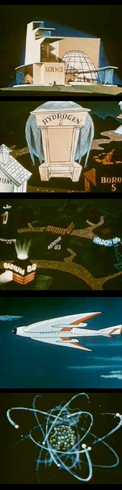 A is for Atom is a 1952 (released in 1953) educational cartoon explaining the wonders and mysteries of atomic power, sponsored by General Electric and directed by Carl Urbano (who later went on to work for Hanna & Barbara).
Like the more well known and widely distributed Our Friend the Atom, a longer, part live action, part animated, 1957 film from Disney, this was basically an indoctrination for school children as to why atomic power was a Good Idea. As part of an overall campaign to promote acceptance of that idea, they were quite successful.
Both films, Disney’s explicitly, this film implicitly, treat atomic power as an obedient genie, ready to grant our wishes for nuclear powered cruise ships and airplanes, saving lives with isotope based medicine, and, of course, providing the clean, efficient and oh-so-advanced Energy of the Future to power our cities.
In the course of their ad for atomic power, the two films actually manage to teach some basic principles of atomic physics.
A is for Atom in particular is charming and efficient in this. I especially like portrayal of “Element Town” (about 5 minutes in) and the wonderful building representing “Science”.
Though A is for Atom opens with a (somewhat mild) representation of a mushroom cloud; as you might expect, it conveniently dismisses with a few nods to “shadow of the atom bomb” and “men of good will” the fact that hundreds of thousands had died in the atomic bomb attacks on Hiroshima and Nagasaki only 7 years earlier. (For a sobering counterpoint, see my post on Barefoot Gen.)
This was the dawn of the “Atomic Age”, a time of postwar prosperity with the promise of atomic power balanced against the cold war insanity in which school children were drilled to cower under their desks or line up in the halls with their hands over their heads, and enterprising, forward-thinking families were building backyard bomb shelters. (Ah! The shining promise of the future!)
Films like A is for Atom illustrate again the power that cartoons and animation have to explain and educate (and influence), with the strong appeal of moving drawings.
I’m convinced there was more before the beginning scene, which seems abrupt and more like the end of a sentence than an opening statement, but I haven’t found anything to indicate that is the case.
[Link via BoingBoing]
Categories:
-
Jean Fouquet

Jean Fouquet was a painter of portraits and landscapes, even though, as a painter of the early Renaissance in 15th century France, he was largely limited to painting those things in the context of religious art (see my post on Giovanni Bellini).Fouquet was the court painter to Louis XI, and is usually regarded as the most important French painter of his period. He traveled to Italy, where he caused a stir by painting a portrait of Pope Eugenius IV on canvas rather than wood; and brought the influence of Italian art into his own style, combining it with the influences from Jan and Hubert van Eyck, whose styles dominated northern European painting at the time (see my post on Jan van Eyck).
Fouquet painted at least one free-standing portrait, a self portrait on a copper medallion, now in the Louvre, that is the earliest known portrait miniature; and is in contention for the earliest formal self-portrait in Western art, depending on whether Jan van Eyck’s Portrait of a Man is actually a self-portrait (which it likely is).
It is as a miniaturist that I find Fouquet at his most interesting. He produced astonishing “illuminations”, miniature paintings on pages of manuscript, that have an uncanny monumentality and presence, and a surprising feeling of painting styles more common many years after his time. He was particularly known for his miniatures form the Book of Hours by Étienne Chevalier.
The image at top, above (larger version here, click for enlargement and click “100%’ if image doesn’t show), is a manuscript illumination from a history of Julius Ceasar, and portrays his crossing of the Rubicon. The naturalistic feeling and attention lavished on the background convinces me that, were he born a few centuries later, Fouquet might have dedicated himself to landscape. (It’s interesting, though, as accomplished as he is, to see Fouquet apparently struggle a bit with perspective, particularly if you assume the trees to be the same height. Perhaps the confines of the illuminated manuscript made laying out geometric perspective difficult.)
The other image, Virgin and Child Surrounded by Angels, is the right half of a now separated diptych. It caused a stir in later years (and perhaps at the time) for its sensual overtones, and portrayal of the Madonna in fancy and stylish fashions of the time. (Hey Renaissance fair re-enactors, are the noblewomen among you shaving your forehead and temples as part of your period dress?) It has also been suggested that the model for Mary was Agnés Sorel, a famously beautiful woman of the time, further cause for moral outrage. The Madonna is accompanied by some bizarre cherubs, starkly blue and red, except for their glassy eyes, arranged in a pattern reminiscent of one of M.C. Escher’s surface tessellations.
The Bibliothéque nationale de France (the National Library of France, roughly analogous to the Library of Congress for the U.S.) has mounted a virtual exhibition of Fouquet’s work, particularly his manuscript illumination miniatures, titled Fouquet, painter and illuminator of the XVth century, that gives a good introduction, though the images are somewhat small. You can supplement it with some of the other resources I’ve listed below, particularly the Web Gallery of Art.
[Virtual exhibition listing via “Thomas J. Wise” on MetaFilter]
Categories:
-
Al Williamson

Al Williamson is one of the unsung greats of comics art. Well, perhaps “undersung” is a better word (if it is a word), in that those aware of his contributions are usually great admirers, but his work is not as widely known among contemporary comics readers as it should be (not by a long shot).Williamson occupies a unique place in the history of comics, acting as a kind of bridge between the dazzling full page newspaper adventure comics of the early 20th Century (and the traditions of the great 19th Century pen and ink illustrators that they embodied) and the modern comics upheaval and revolutions of the late 20th Century.
At the early stages of his career, Williamson fell smack in the middle, going to work for the notorious EC comics in 1952, where he was the youngster amid legendary comics greats like Frank Frazetta, Roy Krenkel, Wally Wood and others. His striking science fiction work graced the pages and covers of EC titles like Weird Science and Weird Fantasy, and influenced the generations of comic artists who were growing up at the time, goggle-eyed with flashlights under the covers, reading his lavishly illustrated tales of outer space adventures and outlandish monsters.
Prior to his work with EC, Williamson studied with Burne Hogarth, and assisted him on pages for his Tarzan Sunday newspaper strip. Newspaper adventure comics were dying at the time, however, under pressure from other forms of entertainment and economic squeezing from newspaper editors, and what would have seemed Williamson’s natural place became something of a dead end.
Though he worked within the increasingly restrictive format of small daily adventure news paper strips off and on for years, he also moved into comic books, where adventure comics went and morphed into something different in the middle of the century, and he followed them into the latter half of the century, working for the Warren comics magazines (image above, 2nd from top) and Marvel Comics in its heyday, where he was known in particular for his work on a series of Star Wars comics.
All the while he carried forward his love for the great adventure comics, and especially his admiration for the work of Alex Raymond, creator of Flash Gordon, and one of the all time greats of comics art (more on Alex Raymond in a future post).
Williamson had a chance to step into Raymond’s considerably large shoes on several occasions, taking over his spy adventure newspaper strip Secret Agent X-9, which became Secret Agent Corrigan and moved from film-noir to James Bond style adventures (image above, bottom and detail), ably scripted by Archie Goodwin. He also assisted John Prentice, who took the reins of Raymond’s Rip Kirby strip.
Williamson worked on several versions of Raymond’s star character Flash Gordon (image above, top), the strip that had obviously been such and influence on him, from the amazing King Comics version in the 1960’s to the Marvel Comics version in the ’90s (more on Williamson’s Flash Gordon work in a subsequent post).
Unfortunately, though there are scattered resources, I can’t find a major repository of Williamson’s work in the web, so it’s hard to convey the grace of his figures, the elegance of his pen lines, the chiaroscuro drama of his spotted blacks, the dynamics of his compositions or the ground breaking inventiveness of his storytelling and panel layouts. I also can’t lead you directly to great examples of his astonishingly rendered details, applied with a delicate finesse that never leaves the impression of gratuitous unnecessary fiddling, unlike so many lesser artists whose grasp of the use of pen and ink textures will never approach Williamson’s.
The only thing I can supply, apart from those resources I can list, is a hearty recommendation that those of you with any appreciation for great adventure comics art, or graphic stories told with superb draftsmanship and a subtle command of the visual language of the great pen and ink illustrators, who are not yet familiar with Williamson, treat yourself to one of the many printed collections available that feature his work.
There is a recent book collecting some of his short story work, titled Al Williamson Adventures, from Insight Studios (more here). The limited edition hardcover has apparently come and gone, and I’m unsure of the status of the softcover edition (if it’s out, Insight needs to promote it better, I couldn’t even find mention of it on their web site.)
Fortunately, there is a great new collection from Flesk Publications, Al Williamson’s Flash Gordon: A Lifelong Vision of the Heroic. This book is so terrific I’m going to make it the topic of a separate post.
Categories:
-
Time Out’s 50 greatest animated films, with added commentary by Terry Gilliam

“Greatest” and “best” lists always elicit responses of varying degrees of disagreement, as they are meant to do, from “Well, maybe…” to “You’ve got to be kidding!”, and this list, Time Out’s 50 greatest animated films, with added commentary by Terry Gilliam, is no exception.That’s the fun of it, of course, you’re prompted to fire up your own list, and run through your favorites with a mind to comparison and debate.
This one certainly gave me plenty of occasions to say “You’ve got to be kidding!”, but on the whole it was enjoyably thought provoking; and I have to say I was actually surprised at how often I agreed, even in the selection of the #1 animated film.
The interesting angle here, of course, is the added commentary by ex-Python and celebrated director of cinematic weirdness, Terry Gilliam, himself no stranger to animation, which livens up the proceedings (and produces it’s share of “Huh?” moments as well).
There aren’t a lot of images, but each film is illustrated with at least one image, and if your curiosity if piqued, you gan crank up Google Image Search to look for more.
At the very least, it’s a list to investigate for interesting and often terrific animated films you may not have seen.
(Images above: My Neighbor Totoro, directed by Hayao Miyazaki; Walt Disney’s Fantasia, (multiple directors); Akira, directed by Katsuhiro Otomo; and The Iron Giant, directed by Brad Bird.)
Categories:
-
Frits Thaulow (update)

Norwegian painter and engraver Frits Thaulow long ago became one of my favorite artists on the basis of a single painting in the collection of the Philadelphia Museum of Art, Water Mill. I make a point of visiting it every time I’m at the museum.This stunningly beautiful and dramatically large painting embodies Thaulow’s wonderful touch with the portrayal of small bodies of water. He captures again and again the mercurial effects of light as it dances over, under and through the rippled surfaces of small streams, canals, mill races and rivers.
Thaulow is often classed as a “Norwegian Impressionist”, and it’s interesting to compare his paintings to works by Sisley and Caillebotte; but like most painters outside the circle of original French Impressionism, he was actually a painter who learned when he liked from the French painters, but took it in his own direction, with a more naturalistic academic draftsmanship underlying the vibrant colors and painterly brushwork.
For that reason, and because of his command of light, color and tonal subtleties, I think of him in comparison to painters labeled “American Impressionists”, like William Merritt Chase, Childe Hassam, Edmund Tarbell, and Daniel Garber.
When I first wrote about Thaulow for Lines and Colors back in 2006, there were few resources available and most of them frustratingly repeated the same 6 or 8 images. Last year, I wrote specifically about Thaulow’s Water Mill, and resorted to posting my own photo.
Since then, I’m delighted to say, resources for viewing Thaulow’s work on the web have expanded considerably, and you can now get a sense of his overall range of subject matter and approach.
In particular, Allpaintings Art Portal has an extensive collection of Thaulow’s work; be sure to click through on the text link above the main image for the larger version (see my post on Allpaintings Art Portal). There are other new and expanded resources, and I’ve listed as many as I can find below.
It’s obvious that interest is growing in the work of this wonderful Norwegian painter. Maybe it will even convince a publisher to bring out a new English edition of Vidar Poulsson’s hard to find book on Frits Thaulow. (See Vidar Poulsson’s comments on my original post for more details about the book.)
I’m particularly delighted to report that Thaulow’s Water Mill, which had disappointingly been rotated out of view and into storage last year, has been returned to view at the Philadelphia Museum of Art. (Thanks to Barbara Lesley for letting me know.)
It’s like having an old friend move back into town.
Categories:


Charley’s Picks
Bookshop.org
(Bookshop.org affilliate links; sales benefit independent bookshop owners; I get a small percentage to help support my work on Lines and Colors)

John Singer Sargent: Watercolors


Urban Sketching: Understanding Perspective


Charley’s Picks
Amazon
(Amazon.com affiliate links; sales go to a larger yacht for Jeff Bezos; but I get a small percentage to help support my work on Lines and Colors)
John Singer Sargent: Watercolors
Urban Sketching: Understanding Perspective