
Categories
- 3d CGI
- Amusements
- Animation
- Anime & Manga
- Art Materials
- Art Videos
- Blogroll
- Cartoons
- Color
- Comics
- Concept & Visual Dev.
- Creativity
- Digital Art
- Digital Painting
- Displaying Art on the Web
- Drawing
- Eye Candy for Today
- Gallery and Museum Art
- High-res Art Images
- Illustration
- Motion Graphics & Flash
- Museums
- Online Museums
- Outsider Art
- Painting
- Painting a Day
- Paleo Art
- Pastel, Conté & Chalk
- Pen & Ink
- Prints and Printmaking
- Reviews
- Sc-fi and Fantasy
- Sculpture & Dimensional
- Site Comments
- Sketching
- Storyboards
- Tools and Techniques
- Uncategorized
- Vector Art
- Videos & Podcasts
- Vision and Optics
- Watercolor and Gouache
- Webcomics
Archives
- April 2026
- March 2026
- February 2026
- January 2026
- December 2025
- November 2025
- October 2025
- September 2025
- August 2025
- July 2025
- June 2025
- May 2025
- January 2025
- December 2024
- November 2024
- October 2024
- September 2024
- August 2024
- June 2024
- April 2024
- March 2024
- February 2024
- January 2024
- December 2023
- November 2023
- October 2023
- September 2023
- August 2023
- July 2023
- May 2023
- April 2023
- March 2023
- February 2023
- January 2023
- December 2022
- November 2022
- September 2022
- August 2022
- July 2022
- June 2022
- May 2022
- April 2022
- March 2022
- February 2022
- January 2022
- December 2021
- November 2021
- October 2021
- September 2021
- August 2021
- July 2021
- June 2021
- May 2021
- April 2021
- March 2021
- February 2021
- January 2021
- December 2020
- November 2020
- October 2020
- September 2020
- August 2020
- July 2020
- June 2020
- May 2020
- April 2020
- March 2020
- February 2020
- January 2020
- December 2019
- November 2019
- October 2019
- September 2019
- August 2019
- July 2019
- June 2019
- May 2019
- April 2019
- March 2019
- February 2019
- January 2019
- December 2018
- November 2018
- October 2018
- September 2018
- August 2018
- July 2018
- June 2018
- May 2018
- April 2018
- March 2018
- February 2018
- January 2018
- December 2017
- November 2017
- October 2017
- September 2017
- August 2017
- July 2017
- June 2017
- May 2017
- April 2017
- March 2017
- February 2017
- January 2017
- December 2016
- November 2016
- October 2016
- September 2016
- August 2016
- July 2016
- June 2016
- May 2016
- April 2016
- March 2016
- February 2016
- January 2016
- December 2015
- November 2015
- October 2015
- September 2015
- August 2015
- July 2015
- June 2015
- May 2015
- April 2015
- March 2015
- February 2015
- January 2015
- December 2014
- November 2014
- October 2014
- September 2014
- August 2014
- July 2014
- June 2014
- May 2014
- April 2014
- March 2014
- February 2014
- January 2014
- December 2013
- November 2013
- October 2013
- September 2013
- August 2013
- July 2013
- June 2013
- May 2013
- April 2013
- March 2013
- February 2013
- January 2013
- December 2012
- November 2012
- October 2012
- September 2012
- August 2012
- July 2012
- June 2012
- May 2012
- April 2012
- March 2012
- February 2012
- January 2012
- December 2011
- November 2011
- October 2011
- September 2011
- August 2011
- July 2011
- June 2011
- May 2011
- April 2011
- March 2011
- February 2011
- January 2011
- December 2010
- November 2010
- October 2010
- September 2010
- August 2010
- July 2010
- June 2010
- May 2010
- April 2010
- March 2010
- February 2010
- January 2010
- December 2009
- November 2009
- October 2009
- September 2009
- August 2009
- July 2009
- June 2009
- May 2009
- April 2009
- March 2009
- February 2009
- January 2009
- December 2008
- November 2008
- October 2008
- September 2008
- August 2008
- July 2008
- June 2008
- May 2008
- April 2008
- March 2008
- February 2008
- January 2008
- December 2007
- November 2007
- October 2007
- September 2007
- August 2007
- July 2007
- June 2007
- May 2007
- April 2007
- March 2007
- February 2007
- January 2007
- December 2006
- November 2006
- October 2006
- September 2006
- August 2006
- July 2006
- June 2006
- May 2006
- April 2006
- March 2006
- February 2006
- January 2006
- December 2005
- November 2005
- October 2005
- September 2005
- August 2005
Relevant Blogs
Art, Painting & Sketch
- Gurney Journey
- Underpaintings
- Art and Influence
- Painting Perceptions
- Oil Painters of America
- Vasari Paint POV
- Flying Fox
- Urban Sketchers
- Bento (Smithsonian)
- Art Inconnu
- The Hidden Place
- Still Life
- Making a Mark
- The Art of the Landscape
- Exploring Color & Creativity
- Art Contrarian
- Artist A Day
- beinArt Surreal Art Collective
- Eye Level
- David Dunlop
- p.i.g.m.e.n.t.i.u.m
- CultureGrrl
- Joaquín Sorolla blog
- Artists in Pastel
“Painting a Day”
- A Painting a Day (Keiser)
- On Painting (Keiser)
- Julian Merrow-Smith
- Karen Jurick
- Jeffrey Hayes
- Carol Marine
- Abbey Ryan
- Daily Paintworks
Other Painting Blogs
- Virtual Gouache Land
- Neil Hollingsworth
- Marc Hanson
- Kevin Menck
- Marc Dalessio
- Larry Seiler
- Stapleton Kearns
- Colin Page
- Roos Schuring
- Hans Versfelt
- Titus Meeuws
- Régis Pettinari
- René Plein Air
- Belinda Del Pesco
- Robin Weiss
- Nathan Fowkes (Land Sketch)
- William Wray
- Frank Serrano
- Stephen Magsig
- Michael Chesley Johnson
- Twice a Week
- Sarah Wimperis
- Rob Adams
- Michael Cole Manley
- The Dirty Palette Club
- Mike Manley’s Draw!
Gallery Art & Illustration mix
Illustration
- Howard Pyle
- 100 Years of Illustration
- BibliOdyssey
- Illustration Art
- Today’s Inspiration
- Illustration Mundo
- Little Chimp Society
- Danny Gregory
- R D (John Martz
- Illustration Friday blog
- Monster Brains
- Illustrators & Illustrations (RU)
- Elwood H. Smith
- DaniDraws.com
- Designers Who Blog
- iSpot Blog
Sci-Fi & Fantasy
Illustration & Comics
Comics & Cartoons
- Comics Beat
- Robot 6
- Newsarama Blog
- Comic Vine
- Comics Alliance
- Forbidden Planet Int.
- Paolo Rivera
- Bolt City
- Flight
- Scott McCloud
- The Comics Journal
- Comixpedia
- Funnybook Babylon
- James Baker
- Middleton’s Sketchbook
- Boneville
- The Hotel Fred
- Paul Rivoche
- Daily Cartoonist
- Mad About Cartoons (William Wray)
- Digital Strips
Illustration & Concept
Animation & Concept
- Cartoon Brew
- Animation Blog
- Cold Hard Flash
- Concept Art World
- The CAB
- FY Concept Art
- Concept Ships
- Concept Robots
- John Nevarez
- Armand Serrano
- Marcos Mateu-Mestre
- all kinds of stuff (Kricfalusi)
- Yacin the faun (Man Arenas)
- Kelsey Mann
- Cre8tivemarks Blog
- Ice-Cream Monster Toon Cafe
- AAU Character & Creature Design
- AAU Animation Notes
- Articles and Texticles
Paleo & Scientific
Tools & Techniques
Other
Lists of Art Blogs
Art Image Resource Links
Historic Art Images
- Wikimedia Commons: Paintings
- Wikimedia Commons: Drawings
- The Athenaeum
- WikiArt (WikiPaintings)
- Google Art Project: Artists
- Google Art Project: Collections (Museums)
- ArtCyclopedia
- Web Gallery of Art
- Art Renewal Center
- Web Gallery of Impressionism
Auction Consolidation sites
Auction sites
- Sotheby’s
- Bonham’s
- Christies
- Heritage Auctions: Fine Art
- Heritage Auctions: Illustration
- Freeman’s Auctions
- Bukowskis
- Shannon’s
Image Search
Reverse Image Search (search by image)
- Tin Eye
- RevImg
- Google Image Search (camera icon)
- Bing Image Search (camera icon)
Promoting some friends and some clients of my website design business
- Twin Willows T’ai Chi studio in Wilmington DE. Taiji classes with Bryan Davis.
- Ray Hayward, Inspired Teacher of T’ai Chi ( Taiji ) in Minneapolis, Founder of Mindful Motion Tai Chi Academy
- OldHead Tattoo studio and Art Gallery in Wilmington DE. Tattoos and paintings by Bruce Gulick
- Sharon Domenico Art, pet portrait oil paintings
- Platinum Paperhanging, wallpaper hanging, Main Line and Philadelphia, PA
- Lisa Stone Design, interior designer, Main Line and Philadelphia, PA
- Studio12KPT, original art, prints, calendars and other custom printed items by Van Sickle & Rolleri
-
Matt Gaser (update)

When I first wrote about Matt Gaser back in 2007, I remember being impressed, but when I recently revisited his site I was knocked out.Gaser is a concept artist and art director for the film industry, though his previous work includes art for gaming companies. He has worked for companies like Electronic Arts and Sega Studios, and is now with Lucasfilm Animation.
His credits include projects like Demonstone: Forgotten Realms, Eragon, Star Wars: The Clone Wars, and a new project called Blue Mars.
Since my previous article, Gaser has completely redone and expanded his web site, and has been maintaining a blog.
Gaser works digitally, painting his images in Photoshop, but the term I keep wanting to apply to his approach is “painterly”; though not in the sense of working in a manner that emulates traditional brush strokes, (as is possible in digital painting); Gaser paints in a way that is fundamentally digital, with strokes of color (often translucent) that are quite unlike traditional brushstrokes in many ways. I use the word “painterly” in the sense that the strokes of color are visible components of the painting. They impart texture and surface variation that contribute to the character of the image in a way analogous to paint strokes on canvas.
Gaser’s loose, but highly accurate application of color, and his wonderfully developed sense of color and value relationships, give his concept paintings, which are basically meant as a guide for filmmakers and game designers in composing the final animated images, a degree of visual interest that makes them stand on their own.
He has a nice balance of quickly noted passages, often in the form of atmospheric backgrounds, with just the right touches of detail, harder edges and sharp contrasts. It gives his images a feeling of dimensionality and compositional strength that I find particularly appealing.
In addition to selections of professional work, his is new web site includes sections of personal work, plein air painting, sketches, doodles and sculpture. Be sure to note that most of the galleries have multiple pages, accessed by numbered links at bottom right.
The Projects section promises that work from his most recent projects, Star Wars: The Clone Wars and Blue Mars will be added soon. I’m looking forward to that, but in the meantime, you can find some work from the Blue Mars project (image above, middle) on his blog.
Also on the blog, you will find mention of another recent project, an as yet unpublished book called In the Between, illustrated by Gaser and written by his mother, Sandy Gaser.
Categories:
-
Robert MacKenzie
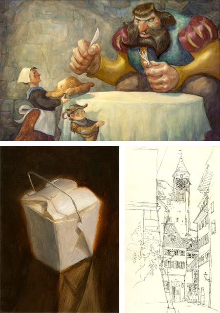
Robert MacKenzie is a California born artist currently living in New York City and working for Blue SKy Studios, the film and animation development studio whose credits include the Ice Age movies, Horton Hears a Who and Robots.On his blog MacKenzie occasionally posts about his work with Blue Sky, but more often chronicles his personal projects, from travel sketches to still life or on-location cityscape subjects, to the illustrations for his new book, which is a retelling of the classic Jack and the Beanstalk story.
He painted the illustrations for the latter in gouache and watercolor. Prior to his recent book illustration projects, MacKenzie had been working professionally for years in Photoshop, and he found the return to traditional media both challenging and rewarding.
There is a detailed walk through of his process for the image above, top.
MacKenzie also illustrated a children’s book titled Fly, Cher Ami, Fly!: The Pigeon Who Saved the Lost Battalion, an at least one other whose title I don’t know.
MacKenzie also contributed to the collaborative comics/illustration volume Out of Picture, with his colleagues at Blue Sky.
Categories:
-
Sadie J. Valeri

Value, the quality of light or dark in a tone or color, is one of the most undervalued, misunderstood and vitally important aspects of painting.Sadie J. Valeri is a contemporary realist painter who has followed a fascination with value into a series of challenging still life subjects in which wax paper, a humble household item more common when I was growing up than it is now, is given a role of high drama.
Her arrangements of crumpled wax paper, wrapped around, behind or over objects like glass bottles, pewter cups or silver pitchers, all with their own unique characteristics of reflectivity, are intricate marvels of value and subtle color.
The translucency of the wax paper, so different from plastic, when crumpled and folded back upon itself, creates a broad range of values, across the scale. Valeri’s paintings capture the effects of light passing through and over the complex surfaces, revealing intricate details within a delicate fog of tonal subtleties.
The image above (with detail, below), Silver Globe Pitcher, is 16 x 20 inches (40 x 50cm) oil on panel. There is a video of her process for this particular painting, tracing its progress from original sketch to finished painting (image above, bottom).
When viewing the paintings in her online gallery, be sure to click on the initial large images for the larger versions. There is also a selection of figure drawings, including a study after one of my favorite Michelangelo drawings.
The selection of work in the gallery is disappointingly small; fortunately, there more images available on Valeri’s blog, which goes into details about process (again, be sure to click for the larger images) and chronicles her recent month of study with the Hudson River Fellowship.
The latter group of posts features a post on materials for outdoor painting, which includes a nod to my own post about pochade boxes.
(For more on the Hudson River Fellowship, a sort of outdoor atelier led by Jacob Collins and devoted to the artistic principles of pre-impressionist landscape painters like Asher B. Durand, Thomas Cole and Frederic Church, see their web site, and these posts from James Gurney.)
In addition to her personal blog, Valeri maintains a fascinating blog called Women Painting Women, which features contemporary women artists painting women as subjects (and is likely to be the subject of a separate post when I can go through it in more detail, as well as a source of other potential subjects).
By the way, if you haven’t used wax paper for a while (or ever) pick some up for both your kitchen and studio (I prefer it to plastic in may ways, it’s great for stay-wet palettes). If you’re an artist in the mood to give yourself a challenge, crumple some up as subjects for some value studies (then come back and look at Valeri’s work with renewed appreciation).
Categories:
-
Ivan Titor

Ivan Titor is a Czech painter whose work floats in that hazy twilight between representational and non-representational painting. He paints objects, but they are often not identifiable. You might fit them into the category of freely imagined or hallucinatory landscapes.As such he puts me in mind of Surrealists and Dadaists like Yves Tanguy and Max Ernst; though if I see the direct influence of any Surrealist painter in Titor’s work, it would be Dalí in his “Atomic” phase, in which objects deconstruct themselves (or construct themselves) in apparent defiance of the laws of time and gravity.
Occasionally Titor will indulge in more directly recognizable objects, but he plays with them in impossible spatial arrangements, exploded into suspended fragments, like assembly diagrams for dreamscapes.
Titor studied at the University of Ostrava, Department of Arts, and is now a senior lecturer there in the Painting Studio.
His web site has a selection of his work, as well as a Studio section in which you can see some of his working methods and the scale of his work. The studio section shows him working with a variety of media, but most of the work in the gallery is in oil.
[Via Peter Gric (see my post on Peter Gric)]
Categories:
-
Count Amadeo Preziosi
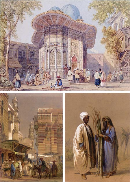
In the 19th Century a number of European artists, and many American artists, traveled to destinations in what we in Europe and the U.S. would now call the “Middle East”, staying for months or even years, returning home with paintings of exotic cities, landscapes and costumed figures that were immensely popular (see my post on Jean-Léon Gérôme, for example).Amadeo Preziosi, who was born in Malta (a group of islands off the coast of Sicily, you know, where The Falcon came from), did more than visit. He became enamored with the Turkish city of Istanbul (at the time still called Constantinople), and stayed past his intended visit of two years, settling there for the remainder of his life.
In addition to his paintings and sketches of the streets an people of Istanbul, Preziosi had traveled in Europe during his art training in Paris and Italy and a remarkable sketchbook, filled with his beautiful watercolor sketches of his “Grand Tour” of Europe in the mid 1870’s, is going up for sale at Bonhams in London.
Preziosi’s wealthy and titled father, who never approved his artistic endeavors, was even less happy with his son settling in Turkey, and entreated him to return to Malta, but he never did.
Preziosi’s paintings sold well in Instanbul, both to local buyers and travelers, and unlike his contemporary “Orientalist” painters, he never needed to return to Europe to sell them.
Categories:
-
William James Aylward
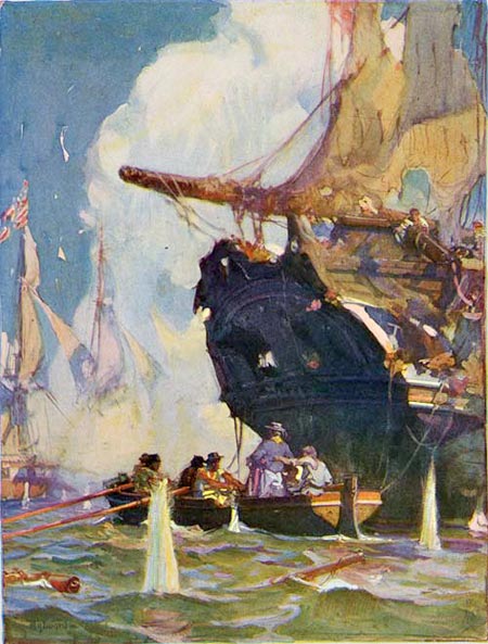
William James Aylward was a student of the great American illustrator Howard Pyle, and carried forth Pyles’ masterful control of tone, color and pictorial drama.Aylward was born in Milwaukee Wisconsin, son of a shipbuilder and Great Lakes ship captain, and had a lifelong fascination with ships and marine subjects, which Pyles’ wonderful pirate ships and sea stories furthered nicely.
Pyle used his influence to convince Theodore Roosevelt to allow Aylward to go on a supply ship that was part of the flotilla accompanying a floating dry dock that was being towed from Maryland to the Philippines. During the voyage he painted twenty illustrations for Schribner’s documenting the trip.
Aylward went on to illustrate many seafaring stories and ship related books, including Jules Verne’s Twenty Thousand Leagues Under the Sea, and sea stories by Joseph Conrad and Jack London.
He also illustrated numerous other subjects, and did advertising art as well.
Aylward was commissioned as an official war artist (see my post on combat artists, and here) in the Engineer Reserve Corps during World War I.
He was a member of the Salmagundi Club and the American Water Color Society, taught at the Pratt Industrial Art School (now Pratt Institute) and wrote a book called Ships and How to Draw Them.
There is a great article on Aylward on Paul Giambarba’s 100 Years of Illustration, from which I’ve borrowed the image above, that goes into more detail and has many images (see my post on 100 Years of Illustration and Design), and a nice post from David Apatoff on his blog Illlustration Art in which he perceptively points out the strength of Aylward’s mastery of value.
Golden Age Comic Stories has a nice series of articles, accompanied by large illustrations, of Aylward’s work for Twenty Thousand Leagues Under the Sea (even though some of the preview images are missing, click for large versions), as well as illustrations from Scribner’s and The Century Magazine.
[Suggestion and information courtesy of Jim Vadeboncoeur]
Categories:


Charley’s Picks
Bookshop.org
(Bookshop.org affilliate links; sales benefit independent bookshop owners; I get a small percentage to help support my work on Lines and Colors)

John Singer Sargent: Watercolors


Urban Sketching: Understanding Perspective


Charley’s Picks
Amazon
(Amazon.com affiliate links; sales go to a larger yacht for Jeff Bezos; but I get a small percentage to help support my work on Lines and Colors)
John Singer Sargent: Watercolors
Urban Sketching: Understanding Perspective