
Categories
- 3d CGI
- Amusements
- Animation
- Anime & Manga
- Art Materials
- Art Videos
- Blogroll
- Cartoons
- Color
- Comics
- Concept & Visual Dev.
- Creativity
- Digital Art
- Digital Painting
- Displaying Art on the Web
- Drawing
- Eye Candy for Today
- Gallery and Museum Art
- High-res Art Images
- Illustration
- Motion Graphics & Flash
- Museums
- Online Museums
- Outsider Art
- Painting
- Painting a Day
- Paleo Art
- Pastel, Conté & Chalk
- Pen & Ink
- Prints and Printmaking
- Reviews
- Sc-fi and Fantasy
- Sculpture & Dimensional
- Site Comments
- Sketching
- Storyboards
- Tools and Techniques
- Uncategorized
- Vector Art
- Videos & Podcasts
- Vision and Optics
- Watercolor and Gouache
- Webcomics
Archives
- April 2026
- March 2026
- February 2026
- January 2026
- December 2025
- November 2025
- October 2025
- September 2025
- August 2025
- July 2025
- June 2025
- May 2025
- January 2025
- December 2024
- November 2024
- October 2024
- September 2024
- August 2024
- June 2024
- April 2024
- March 2024
- February 2024
- January 2024
- December 2023
- November 2023
- October 2023
- September 2023
- August 2023
- July 2023
- May 2023
- April 2023
- March 2023
- February 2023
- January 2023
- December 2022
- November 2022
- September 2022
- August 2022
- July 2022
- June 2022
- May 2022
- April 2022
- March 2022
- February 2022
- January 2022
- December 2021
- November 2021
- October 2021
- September 2021
- August 2021
- July 2021
- June 2021
- May 2021
- April 2021
- March 2021
- February 2021
- January 2021
- December 2020
- November 2020
- October 2020
- September 2020
- August 2020
- July 2020
- June 2020
- May 2020
- April 2020
- March 2020
- February 2020
- January 2020
- December 2019
- November 2019
- October 2019
- September 2019
- August 2019
- July 2019
- June 2019
- May 2019
- April 2019
- March 2019
- February 2019
- January 2019
- December 2018
- November 2018
- October 2018
- September 2018
- August 2018
- July 2018
- June 2018
- May 2018
- April 2018
- March 2018
- February 2018
- January 2018
- December 2017
- November 2017
- October 2017
- September 2017
- August 2017
- July 2017
- June 2017
- May 2017
- April 2017
- March 2017
- February 2017
- January 2017
- December 2016
- November 2016
- October 2016
- September 2016
- August 2016
- July 2016
- June 2016
- May 2016
- April 2016
- March 2016
- February 2016
- January 2016
- December 2015
- November 2015
- October 2015
- September 2015
- August 2015
- July 2015
- June 2015
- May 2015
- April 2015
- March 2015
- February 2015
- January 2015
- December 2014
- November 2014
- October 2014
- September 2014
- August 2014
- July 2014
- June 2014
- May 2014
- April 2014
- March 2014
- February 2014
- January 2014
- December 2013
- November 2013
- October 2013
- September 2013
- August 2013
- July 2013
- June 2013
- May 2013
- April 2013
- March 2013
- February 2013
- January 2013
- December 2012
- November 2012
- October 2012
- September 2012
- August 2012
- July 2012
- June 2012
- May 2012
- April 2012
- March 2012
- February 2012
- January 2012
- December 2011
- November 2011
- October 2011
- September 2011
- August 2011
- July 2011
- June 2011
- May 2011
- April 2011
- March 2011
- February 2011
- January 2011
- December 2010
- November 2010
- October 2010
- September 2010
- August 2010
- July 2010
- June 2010
- May 2010
- April 2010
- March 2010
- February 2010
- January 2010
- December 2009
- November 2009
- October 2009
- September 2009
- August 2009
- July 2009
- June 2009
- May 2009
- April 2009
- March 2009
- February 2009
- January 2009
- December 2008
- November 2008
- October 2008
- September 2008
- August 2008
- July 2008
- June 2008
- May 2008
- April 2008
- March 2008
- February 2008
- January 2008
- December 2007
- November 2007
- October 2007
- September 2007
- August 2007
- July 2007
- June 2007
- May 2007
- April 2007
- March 2007
- February 2007
- January 2007
- December 2006
- November 2006
- October 2006
- September 2006
- August 2006
- July 2006
- June 2006
- May 2006
- April 2006
- March 2006
- February 2006
- January 2006
- December 2005
- November 2005
- October 2005
- September 2005
- August 2005
Relevant Blogs
Art, Painting & Sketch
- Gurney Journey
- Underpaintings
- Art and Influence
- Painting Perceptions
- Oil Painters of America
- Vasari Paint POV
- Flying Fox
- Urban Sketchers
- Bento (Smithsonian)
- Art Inconnu
- The Hidden Place
- Still Life
- Making a Mark
- The Art of the Landscape
- Exploring Color & Creativity
- Art Contrarian
- Artist A Day
- beinArt Surreal Art Collective
- Eye Level
- David Dunlop
- p.i.g.m.e.n.t.i.u.m
- CultureGrrl
- Joaquín Sorolla blog
- Artists in Pastel
“Painting a Day”
- A Painting a Day (Keiser)
- On Painting (Keiser)
- Julian Merrow-Smith
- Karen Jurick
- Jeffrey Hayes
- Carol Marine
- Abbey Ryan
- Daily Paintworks
Other Painting Blogs
- Virtual Gouache Land
- Neil Hollingsworth
- Marc Hanson
- Kevin Menck
- Marc Dalessio
- Larry Seiler
- Stapleton Kearns
- Colin Page
- Roos Schuring
- Hans Versfelt
- Titus Meeuws
- Régis Pettinari
- René Plein Air
- Belinda Del Pesco
- Robin Weiss
- Nathan Fowkes (Land Sketch)
- William Wray
- Frank Serrano
- Stephen Magsig
- Michael Chesley Johnson
- Twice a Week
- Sarah Wimperis
- Rob Adams
- Michael Cole Manley
- The Dirty Palette Club
- Mike Manley’s Draw!
Gallery Art & Illustration mix
Illustration
- Howard Pyle
- 100 Years of Illustration
- BibliOdyssey
- Illustration Art
- Today’s Inspiration
- Illustration Mundo
- Little Chimp Society
- Danny Gregory
- R D (John Martz
- Illustration Friday blog
- Monster Brains
- Illustrators & Illustrations (RU)
- Elwood H. Smith
- DaniDraws.com
- Designers Who Blog
- iSpot Blog
Sci-Fi & Fantasy
Illustration & Comics
Comics & Cartoons
- Comics Beat
- Robot 6
- Newsarama Blog
- Comic Vine
- Comics Alliance
- Forbidden Planet Int.
- Paolo Rivera
- Bolt City
- Flight
- Scott McCloud
- The Comics Journal
- Comixpedia
- Funnybook Babylon
- James Baker
- Middleton’s Sketchbook
- Boneville
- The Hotel Fred
- Paul Rivoche
- Daily Cartoonist
- Mad About Cartoons (William Wray)
- Digital Strips
Illustration & Concept
Animation & Concept
- Cartoon Brew
- Animation Blog
- Cold Hard Flash
- Concept Art World
- The CAB
- FY Concept Art
- Concept Ships
- Concept Robots
- John Nevarez
- Armand Serrano
- Marcos Mateu-Mestre
- all kinds of stuff (Kricfalusi)
- Yacin the faun (Man Arenas)
- Kelsey Mann
- Cre8tivemarks Blog
- Ice-Cream Monster Toon Cafe
- AAU Character & Creature Design
- AAU Animation Notes
- Articles and Texticles
Paleo & Scientific
Tools & Techniques
Other
Lists of Art Blogs
Art Image Resource Links
Historic Art Images
- Wikimedia Commons: Paintings
- Wikimedia Commons: Drawings
- The Athenaeum
- WikiArt (WikiPaintings)
- Google Art Project: Artists
- Google Art Project: Collections (Museums)
- ArtCyclopedia
- Web Gallery of Art
- Art Renewal Center
- Web Gallery of Impressionism
Auction Consolidation sites
Auction sites
- Sotheby’s
- Bonham’s
- Christies
- Heritage Auctions: Fine Art
- Heritage Auctions: Illustration
- Freeman’s Auctions
- Bukowskis
- Shannon’s
Image Search
Reverse Image Search (search by image)
- Tin Eye
- RevImg
- Google Image Search (camera icon)
- Bing Image Search (camera icon)
Promoting some friends and some clients of my website design business
- Twin Willows T’ai Chi studio in Wilmington DE. Taiji classes with Bryan Davis.
- Ray Hayward, Inspired Teacher of T’ai Chi ( Taiji ) in Minneapolis, Founder of Mindful Motion Tai Chi Academy
- OldHead Tattoo studio and Art Gallery in Wilmington DE. Tattoos and paintings by Bruce Gulick
- Sharon Domenico Art, pet portrait oil paintings
- Platinum Paperhanging, wallpaper hanging, Main Line and Philadelphia, PA
- Lisa Stone Design, interior designer, Main Line and Philadelphia, PA
- Studio12KPT, original art, prints, calendars and other custom printed items by Van Sickle & Rolleri
-
Dream Anatomy

The study of human anatomy has long been a juncture of art and science. The dissection of cadavers, at times forbidden by the church and state, has been of fascination to artists as much as to those endeavoring to figure out how this wondrous collection of bones, flesh and fluids works.Just as the scientific or medical examination of the body has been of interest to artists working to represent the human form, so artists have played a vital role in recording and making clear those discoveries, a tradition carried on today in the specialties of medical and scientific illustration.
Dream Anatomy is a special online feature from the U.S. National Library of Medicine, originally accompanying a physical exhibit at the National Library of Medicine, which explores this relationship and the history of anatomical representation, including a fascinating gallery of anatomical art.
Many of the pieces, like the image above, Anatomia per uso et intelligenza del disegno ricercata…, are collaborative works between anatomists and artists, in this case anatomist Bernardino Genga and artist Charles Errard.
The exhibit includes a broad range of images, both in the gallery and accompanying articles, from modern anatomical drawing, Renaissance, Baroque and Victorian artists, as well as Aboriginal “skeleton” drawings and contemporary gallery of children’s drawings of “Under Your Skin“.
They missed the chance, though, to include some of the representations of “spiritual” anatomy, as seen in the work of visionary painters like Alex Grey and Mati Klarwein.
In the image above, I love the foreground figure, apparently an angel, with wing bones connected to the scapulae.
[Link via BoingBoing]
Categories:
-
Chris Appelhans (update)

Chris Appelhans, who I profiled back in 2006, has added some new images to his site, Froghat Studios, along with a fun short Superman animation.The latter is more of a slide show than an actual animation, but it works quite well, timed to music and with nice touches (I love the scene of Superman doing the Boy Scout thing for an old lady toward the end — image above, top right).
There are additional updates to the site including additional concept art for Monster House, the enigmatic and fascinating “Alice in Underworld’ project (image above, bottom) and concept art for what is apparently a movie with a title, or working title, of Highmoon (top left).
Appelhans’ site is essentially just a list of links to images. Unfortunately there is still little or no information about the projects or Appelhans himself.
I found out about the Superman animation when Joe Gordon, writer for the Forbidden Planet International Blog Log in the UK, wrote to say he had found my previous post about Appelhans in his own search for information about him.
You will find an additional, and quite nice, selection of Appelhans’ work, both originals and prints for sale, at Gallery Nucleus.
Categories:
-
Luther Emerson van Gorder
 I discovered Luther van Gorder from a striking small painting of his that attracted my attention in the midst of some of the terrific French and American Impressionist work in the current Paths to Impressionism exhibit at the Newark Museum in New Jersey.
The piece is called In the Park, showing women strolling in New York’s Central Park around the turn of the 20th Century (left, top); and it’s one of those wonderful combinations of impressionist color and free, open brushwork with the traditional academic draftsmanship and geometric solidity that the French Impressionists rejected to great extent, that exemplifies why I love American Impressionism. The original is in the Worcester Art Museum (from which much of the current exhibit at the Newark Museum is drawn).
Van Gorder was from Ohio, studied with the brilliant American Impressionist William Merrit Chase at the Chase School of Art, and under Emile Carolus-Duran, the French painter and atelier master under whom several of the French Impressionists studied, and at the École des Beaux-Arts in Paris.
He painted scenes of rural France, urban Paris, particularly its colorful flower markets, and the banks of the New York Sound among other places; and exhibited at the National Academy of Design and The Pennsylvania Academy of the Fine Arts.
It’s interesting to compare his Japanese Lanterns (left, bottom) to Sargent’s beautiful Carnation, Lily, Lily, Rose which was likely its inspiration. Van Gorder also studied in London for a time, where he met Sargent and was exposed to the work of Whistler, the influence of which shows in the tonalist character of some of his work.
Categories:
-
Chris Rahn

I love the line in Christopher Rahn’s website bio that goes: “As the son of a hippie and a photographer, I was encouraged to pursue what I loved and see how far I could take it… look what happened.”Look what happened indeed. Rahn is an illustrator with an emphasis on the fantastic and otherworldly, who uses painterly textures, atmospheric effects, sharp contrasts of value and color and compositional tension to give his images drama and visual punch.
Unfortunately, his bio provides little in the way of actual biographical information, other than the fact that he lives in the San Fransisco Bay area, so I can’t tell you much about what he’s done or who his clients are.
I was able to glean a little from his news page — he has apparently done work for Wizards of the Coast, has been published in the Spectrum collections of contemporary fantastic art, and I saw at least one Village Voice cover and a book cover in his portfolio on Lindgren & Smith, so I know he works in those areas. His News section also mentions that he received a scholarship to the annual Illustration Academy in Sarasota in 2007 as part of an award from the NY Society of Illustrators.
Looking through his portfolio, you’ll find a variety of subjects, but always a bent for the strange and dramatic. Rahn works both in traditional media, oils and acrylic, and digital painting. His galleries on his own site and on the Lindgren & Smith sites are organized that way. There is also a portfolio of his work on Workbook that is divided, somewhat redundantly, into Fantasy/Sci-Fi and Oil/Acrylics; though it does contain some images not found on the other sites.
One of the best selections of his work, as is the case with many fantasy and science fiction artists, is in the Tor Books gallery. While I was on the Tor site, I jumped over to Art Director Irene Gallo’s blog, The Art Department, and sure enough, found an interview with Rahn, from which I learned that he received a BA in Illustration from the Academy of Art in San Francisco; and found mention by him of admiration for the work of Jon Foster (also here), whose influence I though I could see in Rahn’s work, particularly in his painterly approach and intriguingly textured backgrounds.
I found another article on Gallo’s blog with a mention of the Society of Illustrators Student Scholarship Exhibit at which Rahn won the Illustration Academy Award. (If you ever want to know what’s going on in fantasy, science fiction and fantastic art, check in on The Art Department.)
Categories:
-
Suzanne Duranceu
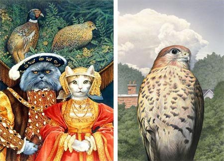
Suzanne Duranceu is a Canadian illustrator whose paintings evidence a strong sense of textural detail and a delicate refinement that give them a feeling of presence and gravity.In other hands images like her version of works by Holbein or Gainsborough as represented by cats might lapse into kitsch, but she handles it with such élan that it becomes a naturalistic extension of the painter’s style.
Her other work ranges from fanciful to serious, and often makes use of detail and value contrasts to give weight and solidity to otherwise whimsical scenes; like her Newlyweds, the Owl and the Pussycat, enjoying a seaside picnic (presumably with the client’s delightful foodstuffs) before embarking on a honeymoon cruise in their beautiful pea-green dingy.
She also has on her site some intricately detailed interpretations of ecosystems (unfortunately in small images), and a fascinating Escher-like series of world views called Trilogy.
The web site is apparently still in progress. I found the navigation throughout somewhat problematic, the individual image dots didn’t respond to my click (at least on the Mac), but the Next and Previous arrows seem to work OK. A couple of the sections are still unfinished, including the bio section. For that you can turn to her bio on ZAKS Illustrators Source.
Categories:
-
Wang Hui
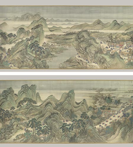
Wang Hui was a Chinese painter who gathered up influences from past masters and wove them into his own interpretation of their methods and techniques; and refreshed the traditions of Chinese painting in the process.Active during the early Qing period (17th Century), Wang was exposed at an early age to the influence of some of the most prominent orthodox painters of his time, two of whom, Wang Shimin and Wang Jian, were his direct teachers. Together with Wang Yuanqi, these painters are in retrospect referred to as “the four Wangs” and they formed the core of the “orthodox school” of traditional painting during the period.
Wang Hui revived the practice of painting reverential copies of paintings by masters from previous periods, notably from the Song (960-1279), Yua (1279-1368) and Ming (1368-1644) periods. The idea of copying and learning from previous masters is more familiar in Western painting tradition. Wang apparently gets downplayed as academic and derivative by some critics, but he reached such a high level of refinement in his own synthesis of those influences that he is highly regarded in the eyes of others.
Since my knowledge of traditional Chinese painting is exceedingly shallow, I’m not troubled by these concerns, and to my untrained Western eyes, his work is simply beautiful.
Whenever I think about traditional Chinese painting, the word “poetic” comes to mind, in the sense that written poetry is often a distillation, the employment of fewer words, carefully arranged, to tell a story or evoke a mood in a more immediate way than by extended prose.
Similarly, Chinese ink painting seems to be distilled, so that each stroke or tone is weighted with extra meaning, as if alluding to some hidden secret.
Wang Hui’s landscapes resonate with that feeling, his sweeping vistas of undulating curvilinear mountain ranges, mist ladled valleys, graceful trees and sinuous rivers seem transporting, at once etherial and immediate, hinting at the rewards to be found in extended contemplation of the scene.
The images above are two sections from a large scale scroll, 26 inches high and over 45 feet long (68cm x 14m); one of three such scrolls depicting the Kangxi Emporor’s tour of Southern China done by Wang Hui and his assistants. Though they are ostensibly the focus of the story being told, the tiny figures, characteristic of traditional Chinese landscape painting, emphasize the humble place of humankind within the grandeur of the natural world.
This scroll is in the collection of the Metropolitan Museum of Art in New York, which has a dedicated feature on it with several images: The Kangxi Emperor’s Southern Tour, Scroll Three: Ji’nan to Mount Tai.
The Met has mounted a special exhibit Landscapes Clear and Radiant: The Art of Wang Hui that extends from now until January 4, 2009 and features 27 works form several collections in China and the U.S., along with a selection of paintings from the Song, Yaun and Ming period masters who were Inspirational to Wang Hui.
Categories:


Charley’s Picks
Bookshop.org
(Bookshop.org affilliate links; sales benefit independent bookshop owners; I get a small percentage to help support my work on Lines and Colors)

John Singer Sargent: Watercolors


Urban Sketching: Understanding Perspective


Charley’s Picks
Amazon
(Amazon.com affiliate links; sales go to a larger yacht for Jeff Bezos; but I get a small percentage to help support my work on Lines and Colors)
John Singer Sargent: Watercolors
Urban Sketching: Understanding Perspective