
Categories
- 3d CGI
- Amusements
- Animation
- Anime & Manga
- Art Materials
- Art Videos
- Blogroll
- Cartoons
- Color
- Comics
- Concept & Visual Dev.
- Creativity
- Digital Art
- Digital Painting
- Displaying Art on the Web
- Drawing
- Eye Candy for Today
- Gallery and Museum Art
- High-res Art Images
- Illustration
- Motion Graphics & Flash
- Museums
- Online Museums
- Outsider Art
- Painting
- Painting a Day
- Paleo Art
- Pastel, Conté & Chalk
- Pen & Ink
- Prints and Printmaking
- Reviews
- Sc-fi and Fantasy
- Sculpture & Dimensional
- Site Comments
- Sketching
- Storyboards
- Tools and Techniques
- Uncategorized
- Vector Art
- Videos & Podcasts
- Vision and Optics
- Watercolor and Gouache
- Webcomics
Archives
- April 2026
- March 2026
- February 2026
- January 2026
- December 2025
- November 2025
- October 2025
- September 2025
- August 2025
- July 2025
- June 2025
- May 2025
- January 2025
- December 2024
- November 2024
- October 2024
- September 2024
- August 2024
- June 2024
- April 2024
- March 2024
- February 2024
- January 2024
- December 2023
- November 2023
- October 2023
- September 2023
- August 2023
- July 2023
- May 2023
- April 2023
- March 2023
- February 2023
- January 2023
- December 2022
- November 2022
- September 2022
- August 2022
- July 2022
- June 2022
- May 2022
- April 2022
- March 2022
- February 2022
- January 2022
- December 2021
- November 2021
- October 2021
- September 2021
- August 2021
- July 2021
- June 2021
- May 2021
- April 2021
- March 2021
- February 2021
- January 2021
- December 2020
- November 2020
- October 2020
- September 2020
- August 2020
- July 2020
- June 2020
- May 2020
- April 2020
- March 2020
- February 2020
- January 2020
- December 2019
- November 2019
- October 2019
- September 2019
- August 2019
- July 2019
- June 2019
- May 2019
- April 2019
- March 2019
- February 2019
- January 2019
- December 2018
- November 2018
- October 2018
- September 2018
- August 2018
- July 2018
- June 2018
- May 2018
- April 2018
- March 2018
- February 2018
- January 2018
- December 2017
- November 2017
- October 2017
- September 2017
- August 2017
- July 2017
- June 2017
- May 2017
- April 2017
- March 2017
- February 2017
- January 2017
- December 2016
- November 2016
- October 2016
- September 2016
- August 2016
- July 2016
- June 2016
- May 2016
- April 2016
- March 2016
- February 2016
- January 2016
- December 2015
- November 2015
- October 2015
- September 2015
- August 2015
- July 2015
- June 2015
- May 2015
- April 2015
- March 2015
- February 2015
- January 2015
- December 2014
- November 2014
- October 2014
- September 2014
- August 2014
- July 2014
- June 2014
- May 2014
- April 2014
- March 2014
- February 2014
- January 2014
- December 2013
- November 2013
- October 2013
- September 2013
- August 2013
- July 2013
- June 2013
- May 2013
- April 2013
- March 2013
- February 2013
- January 2013
- December 2012
- November 2012
- October 2012
- September 2012
- August 2012
- July 2012
- June 2012
- May 2012
- April 2012
- March 2012
- February 2012
- January 2012
- December 2011
- November 2011
- October 2011
- September 2011
- August 2011
- July 2011
- June 2011
- May 2011
- April 2011
- March 2011
- February 2011
- January 2011
- December 2010
- November 2010
- October 2010
- September 2010
- August 2010
- July 2010
- June 2010
- May 2010
- April 2010
- March 2010
- February 2010
- January 2010
- December 2009
- November 2009
- October 2009
- September 2009
- August 2009
- July 2009
- June 2009
- May 2009
- April 2009
- March 2009
- February 2009
- January 2009
- December 2008
- November 2008
- October 2008
- September 2008
- August 2008
- July 2008
- June 2008
- May 2008
- April 2008
- March 2008
- February 2008
- January 2008
- December 2007
- November 2007
- October 2007
- September 2007
- August 2007
- July 2007
- June 2007
- May 2007
- April 2007
- March 2007
- February 2007
- January 2007
- December 2006
- November 2006
- October 2006
- September 2006
- August 2006
- July 2006
- June 2006
- May 2006
- April 2006
- March 2006
- February 2006
- January 2006
- December 2005
- November 2005
- October 2005
- September 2005
- August 2005
Relevant Blogs
Art, Painting & Sketch
- Gurney Journey
- Underpaintings
- Art and Influence
- Painting Perceptions
- Oil Painters of America
- Vasari Paint POV
- Flying Fox
- Urban Sketchers
- Bento (Smithsonian)
- Art Inconnu
- The Hidden Place
- Still Life
- Making a Mark
- The Art of the Landscape
- Exploring Color & Creativity
- Art Contrarian
- Artist A Day
- beinArt Surreal Art Collective
- Eye Level
- David Dunlop
- p.i.g.m.e.n.t.i.u.m
- CultureGrrl
- Joaquín Sorolla blog
- Artists in Pastel
“Painting a Day”
- A Painting a Day (Keiser)
- On Painting (Keiser)
- Julian Merrow-Smith
- Karen Jurick
- Jeffrey Hayes
- Carol Marine
- Abbey Ryan
- Daily Paintworks
Other Painting Blogs
- Virtual Gouache Land
- Neil Hollingsworth
- Marc Hanson
- Kevin Menck
- Marc Dalessio
- Larry Seiler
- Stapleton Kearns
- Colin Page
- Roos Schuring
- Hans Versfelt
- Titus Meeuws
- Régis Pettinari
- René Plein Air
- Belinda Del Pesco
- Robin Weiss
- Nathan Fowkes (Land Sketch)
- William Wray
- Frank Serrano
- Stephen Magsig
- Michael Chesley Johnson
- Twice a Week
- Sarah Wimperis
- Rob Adams
- Michael Cole Manley
- The Dirty Palette Club
- Mike Manley’s Draw!
Gallery Art & Illustration mix
Illustration
- Howard Pyle
- 100 Years of Illustration
- BibliOdyssey
- Illustration Art
- Today’s Inspiration
- Illustration Mundo
- Little Chimp Society
- Danny Gregory
- R D (John Martz
- Illustration Friday blog
- Monster Brains
- Illustrators & Illustrations (RU)
- Elwood H. Smith
- DaniDraws.com
- Designers Who Blog
- iSpot Blog
Sci-Fi & Fantasy
Illustration & Comics
Comics & Cartoons
- Comics Beat
- Robot 6
- Newsarama Blog
- Comic Vine
- Comics Alliance
- Forbidden Planet Int.
- Paolo Rivera
- Bolt City
- Flight
- Scott McCloud
- The Comics Journal
- Comixpedia
- Funnybook Babylon
- James Baker
- Middleton’s Sketchbook
- Boneville
- The Hotel Fred
- Paul Rivoche
- Daily Cartoonist
- Mad About Cartoons (William Wray)
- Digital Strips
Illustration & Concept
Animation & Concept
- Cartoon Brew
- Animation Blog
- Cold Hard Flash
- Concept Art World
- The CAB
- FY Concept Art
- Concept Ships
- Concept Robots
- John Nevarez
- Armand Serrano
- Marcos Mateu-Mestre
- all kinds of stuff (Kricfalusi)
- Yacin the faun (Man Arenas)
- Kelsey Mann
- Cre8tivemarks Blog
- Ice-Cream Monster Toon Cafe
- AAU Character & Creature Design
- AAU Animation Notes
- Articles and Texticles
Paleo & Scientific
Tools & Techniques
Other
Lists of Art Blogs
Art Image Resource Links
Historic Art Images
- Wikimedia Commons: Paintings
- Wikimedia Commons: Drawings
- The Athenaeum
- WikiArt (WikiPaintings)
- Google Art Project: Artists
- Google Art Project: Collections (Museums)
- ArtCyclopedia
- Web Gallery of Art
- Art Renewal Center
- Web Gallery of Impressionism
Auction Consolidation sites
Auction sites
- Sotheby’s
- Bonham’s
- Christies
- Heritage Auctions: Fine Art
- Heritage Auctions: Illustration
- Freeman’s Auctions
- Bukowskis
- Shannon’s
Image Search
Reverse Image Search (search by image)
- Tin Eye
- RevImg
- Google Image Search (camera icon)
- Bing Image Search (camera icon)
Promoting some friends and some clients of my website design business
- Twin Willows T’ai Chi studio in Wilmington DE. Taiji classes with Bryan Davis.
- Ray Hayward, Inspired Teacher of T’ai Chi ( Taiji ) in Minneapolis, Founder of Mindful Motion Tai Chi Academy
- OldHead Tattoo studio and Art Gallery in Wilmington DE. Tattoos and paintings by Bruce Gulick
- Sharon Domenico Art, pet portrait oil paintings
- Platinum Paperhanging, wallpaper hanging, Main Line and Philadelphia, PA
- Lisa Stone Design, interior designer, Main Line and Philadelphia, PA
- Studio12KPT, original art, prints, calendars and other custom printed items by Van Sickle & Rolleri
-
Mary GrandPré
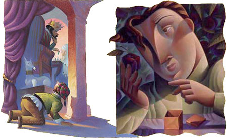
Mary GrandPré is another of those illustrators whose work you have undoubtedly seen, even if you don’t know her name.GrandPré is best known as the illustrator for the U.S. editions of the Harry Potter books; which was just another assignment at first, as the books were not yet the phenomenon they would become; an assignment her contact with the publisher had to talk her into fitting into her schedule.
She has brought her love of pastels and her “soft geometry” to numerous other projects, both editorial and commercial, including clients like Atlantic Monthly, The New Yorker, The Wall Street Journal, Time Magazine, Random House, Berkely, Penguin, Dell and Mcgraw Hill. She also worked on the Dreamworks film Antz as an environment and scenery visual development artist.
She studied at Pamona College and the Minneapolis College of Art and Design and has taught at the Ringling School of Art and Design wheer her husband is also a teacher. Her work has been recognized by the Society of Illustrators and featured in Communications Arts, Graphis, Print and Art Direction.
Her web site includes a short bio, as well as galleries of her work for picture books and for editorial and commercial clients. I can’t give you direct links because the site is in frames. I’ve taken the liberty of compositing two unrelated images together in the image sabove to reproduce them a little larger.
GrandPré infuses much of her work with a sort of warm cubism, breaking her whimsical forms into additional planes with edges of color and texture, playfully subdividing her compositions into both angular and curvilinear shapes.
She also uses strong value contrasts, with even her dark tones enriched by the strong, saturated colors often characteristic of pastel. Unfortunately the images on her site are a little small to get a feeling for the textural element of her work, but then, you probably have a book on your shelf with some of her illustrations.
Categories:
-
Alison Elizabeth Taylor
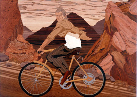
Starting from a sketchbook drawing, which is revised and refined as it is scaled up, sometimes to wall-size, Alison Elizabeth Taylor creates her images (which she calls “paintings”) out of wood veneer.Using different kinds of wood, sometimes 100 or more varieties in an image, she applies the sections in ways that allow the natural color and grain of the wood to contribute to the image, like a cross between brushstrokes and mosaic tiles.
The process is called wood marquetery, a form of decorative art that was developed to a high degree during the Renaissance, but hasn’t exactly been a household word or staple on art school curriculums since.
Taylor, a graduate of the Art Center College of Design in Pasadena, took her original inspiration from a whim to make a portrait out of cheap wood-grain contact paper.
After moving to New York to go to graduate school at Columbia University, she encountered the Studiolo from the Ducal Palace in Gubbino at the Metropolitan Museum of Art.
Studiolo means room or cabinet, and refers to small rooms that royals would use as studies or sitting rooms, that contain their books, papers and works of art. The piece in the Met is a wood marquetery version of the interior one such room, its faux cabinets and trompe l’oiel books and lutes arranged around the interior of a small room in life-size approximation of the actual room, in what is perhaps one of the earliest examples of virtual reality.
Taylor was immediately struck by the process and inspired to begin working earnestly in real wood, a painstaking process.
Taylor sets her pieces into position in her intricate representational images and holds them there temporarily with a tacky plastic film used in sign making, until they can be glued into place with a press.
For a new installation called “Room” that is her modern take on the Studiolo, the pieces were too large for her own studio and she had to enlist the facilities of a architectural woodworking firm with a commercial veneering press.
Unlike her Renaissance counterparts, but in keeping with her other work, Taylor’s images are not of nobles and their rich belongings, but of the everyday and mundane, even the ugly, but represented with captivating beauty of the grains, colors and textures of wood.
There is an article on the New York Times site, with a slide show of her work. She has a show currently at the James Cohan Gallery in Chelsea until June 21, 2008.
[Link via Kottke.org]
Categories:
-
Boris Artzybasheff

Illustrator Boris Artzybasheff was born in the Ukraine, emigrated to the the U.S. and was active during the mid 20th Century.“Unique” may be a mild word to describe Artzybasheff’s approach to illustration. maybe if I add adjectives like “idiosyncratic”, “eccentric”, “bizarre” and “off the wall”, I can get a little closer; oh yes, and throw in “wonderful”.
Artzybasheff is most noted for his graphic images in which he indulged in his fascination with anthropomorphized industrial machinery — glaring cauldrons pour bright molten metal into seeming surprised ingot molds, steel rollers feed the ingots through their “teeth” with conveyor belt hands, rods or wire ropes are extruded through the noses of forming machines, electro-mechanical calculators, heads full of vacuum tubes, use their intricately wired and gimbaled arms to perform calculations on themselves, and hydraulic presses, grommeted eyes bulging with exertion, slam down their plates with muscular arms (image above, left).
The always amazing ASIFA-Hollywood Animation Archive has posted another of their series on great illustrators with a feature on these images from the Machinalia section of Artzybasheff’s long out of print but newly reprinted book As I See: The Fantastic World of Boris Artzybasheff.
The above link is to the hardcover on Amazon, which lists a release date in October, but it looks as though you can order the softcover now through the site of publisher Ken Steacy. The Amazon link is worth exploring, though, because you can see some of the many other books he illustrated (and wrote) over the course of his career.
His most widely seen illustrations were for big magazines like Life, Fortune and Time, including over 200 covers for the latter. He also had a number of large commercial clients, including Parke-Davis, Parker Pens, Xerox, Pan Am, and Shell Oil, for whom he did some remarkably weird and wonderful illustrations (above, top right). You can see some of his advertising and commercial illustrations on the American Art Archives.
[AISFA article link via BoingBoing]
Categories:
-
Tang Wei Min

I’ve long been fascinated with the cross-pollination of ideas and styles between the artistic traditions of Asia and Europe. Even though they are technically on the same continent they were effectively separate worlds for much of the time their artistic methods and traditions were developing.Now, of course, the world is melting together, connected by strands of optic fiber and jet contrails, but the traditions are being maintained in some quarters and mixed in others
Tang Wei Min is an artist from Hunan Province in China who applies the painting styles and techniques of the European masters to subject matter drawn from the traditional costume and ceremonial dress of historic China.
In paintings that carry the feeling of Baroque era European painters, particularly Rembrandt, Tang Wei Min paints rich, incisive portraits of people in decorative robes and head dress (something Rembrandt himself was quite fond of), and at times, gives a nod to his inspirations by mimicing the composition of particular paintings by Rembrandt and others, including the pose from Vermeer’s Girl With a Pearl Earring (above).
I really enjoy his Rembrandtesque chiaroscuro and great chunks of impasto white highlights, combined with the fascinating clothing and intensely portrayed faces of his sitters.
I couldn’t find a dedicated web site for the artist; I came across his work on the Art Renewal Center, and with a little digging found that he is represented by a number of galleries in China and the U.S.
Categories:
-
Tim Warnock (update)

Matte paintings are paintings that produce the illusion of a background or part of a background in film. They can also form part of a foreground.Matte paintings are almost as old as movies themselves, and were originally painted on glass, and positioned in front of, and/or behind the actors (or stop motion creatures), creating the illusion in the camera of a complete scene.
Modern matte painting is composited, and usually created, digitally.
Tim Warnock is both a matte painter and a concept artist, and some time ago retired his paintbrushes in favor of a Wacom stylus.
I wrote a brief post about Tim Warnock back in 2005; since then his online portfolio has been redone and, of course, there is much new work.
His portfolio is divided between matte painting (image above, top and detail, bottom left) and concept art (above, middle and detail, bottom, right).
Warnock brings a talent for crisp realism, characteristic of matte painting, to his concept art. In both cases he uses sharp value contrasts and carefully controlled color relationships to give his scenes high definition and visual drama.
Categories:
-
Draw yourself as a teen
 Here’s a great idea, started as a simple notion by webcomics artist and blogger Dave Valeza, and now snowballed into something of an internet meme.
The suggestion was simple: “challenge: draw yourself as a teen“, supplemented with “if you are still a teen, draw your future post-teen self”.
Word has gotten around, as people have participated and posted the results on their own sites and blogs, and the list on Valeza’s blog is now of over 400 links and growing.
Some of the participants have done “then and now” versions, in which their teenage self is contrasted with their current identity, complete with notations on hairstyle, clothing choice and attendant paraphernalia like sketchbooks, music players and reading matter.
Some of the drawings are more accomplished than others, of course, but many are quite well done; and even the less sophisticated drawings are often enlivened with wry observations and remarkably self-confessional critiques of former (and present) selves.
The list is too long to explore all at once, but it makes a nice diversion to bookmark and revisit occasionally. It would be nice if there were a more formal arrangement with thumbnails and such, but that’s a lot to ask. Valeza has marked off the list at increments of 50, which can help you keep track.
On many of the images, you have to click through several links, and various interfaces (LiveJournal, Flickr, deviantARt, etc.), to get to the full size images.
Some of the drawings are essentially condensed tales of growth, angst and self-awareness, worthy of more filled out short stories. Others are simple drawings of a past self-image, but there is much food for thought here, both in terms of stories and artistically.
(Image at left, left to right, top to bottom: Kennon James, Jacob “Gil” Paul, “buttface makani”, Steve Wolfhard, “lokabrenna” ,Viki Nerino)
[Link via Drawn!]
Categories:


Charley’s Picks
Bookshop.org
(Bookshop.org affilliate links; sales benefit independent bookshop owners; I get a small percentage to help support my work on Lines and Colors)

John Singer Sargent: Watercolors


Urban Sketching: Understanding Perspective


Charley’s Picks
Amazon
(Amazon.com affiliate links; sales go to a larger yacht for Jeff Bezos; but I get a small percentage to help support my work on Lines and Colors)
John Singer Sargent: Watercolors
Urban Sketching: Understanding Perspective