
Categories
- 3d CGI
- Amusements
- Animation
- Anime & Manga
- Art Materials
- Art Videos
- Blogroll
- Cartoons
- Color
- Comics
- Concept & Visual Dev.
- Creativity
- Digital Art
- Digital Painting
- Displaying Art on the Web
- Drawing
- Eye Candy for Today
- Gallery and Museum Art
- High-res Art Images
- Illustration
- Motion Graphics & Flash
- Museums
- Online Museums
- Outsider Art
- Painting
- Painting a Day
- Paleo Art
- Pastel, Conté & Chalk
- Pen & Ink
- Prints and Printmaking
- Reviews
- Sc-fi and Fantasy
- Sculpture & Dimensional
- Site Comments
- Sketching
- Storyboards
- Tools and Techniques
- Uncategorized
- Vector Art
- Videos & Podcasts
- Vision and Optics
- Watercolor and Gouache
- Webcomics
Archives
- April 2026
- March 2026
- February 2026
- January 2026
- December 2025
- November 2025
- October 2025
- September 2025
- August 2025
- July 2025
- June 2025
- May 2025
- January 2025
- December 2024
- November 2024
- October 2024
- September 2024
- August 2024
- June 2024
- April 2024
- March 2024
- February 2024
- January 2024
- December 2023
- November 2023
- October 2023
- September 2023
- August 2023
- July 2023
- May 2023
- April 2023
- March 2023
- February 2023
- January 2023
- December 2022
- November 2022
- September 2022
- August 2022
- July 2022
- June 2022
- May 2022
- April 2022
- March 2022
- February 2022
- January 2022
- December 2021
- November 2021
- October 2021
- September 2021
- August 2021
- July 2021
- June 2021
- May 2021
- April 2021
- March 2021
- February 2021
- January 2021
- December 2020
- November 2020
- October 2020
- September 2020
- August 2020
- July 2020
- June 2020
- May 2020
- April 2020
- March 2020
- February 2020
- January 2020
- December 2019
- November 2019
- October 2019
- September 2019
- August 2019
- July 2019
- June 2019
- May 2019
- April 2019
- March 2019
- February 2019
- January 2019
- December 2018
- November 2018
- October 2018
- September 2018
- August 2018
- July 2018
- June 2018
- May 2018
- April 2018
- March 2018
- February 2018
- January 2018
- December 2017
- November 2017
- October 2017
- September 2017
- August 2017
- July 2017
- June 2017
- May 2017
- April 2017
- March 2017
- February 2017
- January 2017
- December 2016
- November 2016
- October 2016
- September 2016
- August 2016
- July 2016
- June 2016
- May 2016
- April 2016
- March 2016
- February 2016
- January 2016
- December 2015
- November 2015
- October 2015
- September 2015
- August 2015
- July 2015
- June 2015
- May 2015
- April 2015
- March 2015
- February 2015
- January 2015
- December 2014
- November 2014
- October 2014
- September 2014
- August 2014
- July 2014
- June 2014
- May 2014
- April 2014
- March 2014
- February 2014
- January 2014
- December 2013
- November 2013
- October 2013
- September 2013
- August 2013
- July 2013
- June 2013
- May 2013
- April 2013
- March 2013
- February 2013
- January 2013
- December 2012
- November 2012
- October 2012
- September 2012
- August 2012
- July 2012
- June 2012
- May 2012
- April 2012
- March 2012
- February 2012
- January 2012
- December 2011
- November 2011
- October 2011
- September 2011
- August 2011
- July 2011
- June 2011
- May 2011
- April 2011
- March 2011
- February 2011
- January 2011
- December 2010
- November 2010
- October 2010
- September 2010
- August 2010
- July 2010
- June 2010
- May 2010
- April 2010
- March 2010
- February 2010
- January 2010
- December 2009
- November 2009
- October 2009
- September 2009
- August 2009
- July 2009
- June 2009
- May 2009
- April 2009
- March 2009
- February 2009
- January 2009
- December 2008
- November 2008
- October 2008
- September 2008
- August 2008
- July 2008
- June 2008
- May 2008
- April 2008
- March 2008
- February 2008
- January 2008
- December 2007
- November 2007
- October 2007
- September 2007
- August 2007
- July 2007
- June 2007
- May 2007
- April 2007
- March 2007
- February 2007
- January 2007
- December 2006
- November 2006
- October 2006
- September 2006
- August 2006
- July 2006
- June 2006
- May 2006
- April 2006
- March 2006
- February 2006
- January 2006
- December 2005
- November 2005
- October 2005
- September 2005
- August 2005
Relevant Blogs
Art, Painting & Sketch
- Gurney Journey
- Underpaintings
- Art and Influence
- Painting Perceptions
- Oil Painters of America
- Vasari Paint POV
- Flying Fox
- Urban Sketchers
- Bento (Smithsonian)
- Art Inconnu
- The Hidden Place
- Still Life
- Making a Mark
- The Art of the Landscape
- Exploring Color & Creativity
- Art Contrarian
- Artist A Day
- beinArt Surreal Art Collective
- Eye Level
- David Dunlop
- p.i.g.m.e.n.t.i.u.m
- CultureGrrl
- Joaquín Sorolla blog
- Artists in Pastel
“Painting a Day”
- A Painting a Day (Keiser)
- On Painting (Keiser)
- Julian Merrow-Smith
- Karen Jurick
- Jeffrey Hayes
- Carol Marine
- Abbey Ryan
- Daily Paintworks
Other Painting Blogs
- Virtual Gouache Land
- Neil Hollingsworth
- Marc Hanson
- Kevin Menck
- Marc Dalessio
- Larry Seiler
- Stapleton Kearns
- Colin Page
- Roos Schuring
- Hans Versfelt
- Titus Meeuws
- Régis Pettinari
- René Plein Air
- Belinda Del Pesco
- Robin Weiss
- Nathan Fowkes (Land Sketch)
- William Wray
- Frank Serrano
- Stephen Magsig
- Michael Chesley Johnson
- Twice a Week
- Sarah Wimperis
- Rob Adams
- Michael Cole Manley
- The Dirty Palette Club
- Mike Manley’s Draw!
Gallery Art & Illustration mix
Illustration
- Howard Pyle
- 100 Years of Illustration
- BibliOdyssey
- Illustration Art
- Today’s Inspiration
- Illustration Mundo
- Little Chimp Society
- Danny Gregory
- R D (John Martz
- Illustration Friday blog
- Monster Brains
- Illustrators & Illustrations (RU)
- Elwood H. Smith
- DaniDraws.com
- Designers Who Blog
- iSpot Blog
Sci-Fi & Fantasy
Illustration & Comics
Comics & Cartoons
- Comics Beat
- Robot 6
- Newsarama Blog
- Comic Vine
- Comics Alliance
- Forbidden Planet Int.
- Paolo Rivera
- Bolt City
- Flight
- Scott McCloud
- The Comics Journal
- Comixpedia
- Funnybook Babylon
- James Baker
- Middleton’s Sketchbook
- Boneville
- The Hotel Fred
- Paul Rivoche
- Daily Cartoonist
- Mad About Cartoons (William Wray)
- Digital Strips
Illustration & Concept
Animation & Concept
- Cartoon Brew
- Animation Blog
- Cold Hard Flash
- Concept Art World
- The CAB
- FY Concept Art
- Concept Ships
- Concept Robots
- John Nevarez
- Armand Serrano
- Marcos Mateu-Mestre
- all kinds of stuff (Kricfalusi)
- Yacin the faun (Man Arenas)
- Kelsey Mann
- Cre8tivemarks Blog
- Ice-Cream Monster Toon Cafe
- AAU Character & Creature Design
- AAU Animation Notes
- Articles and Texticles
Paleo & Scientific
Tools & Techniques
Other
Lists of Art Blogs
Art Image Resource Links
Historic Art Images
- Wikimedia Commons: Paintings
- Wikimedia Commons: Drawings
- The Athenaeum
- WikiArt (WikiPaintings)
- Google Art Project: Artists
- Google Art Project: Collections (Museums)
- ArtCyclopedia
- Web Gallery of Art
- Art Renewal Center
- Web Gallery of Impressionism
Auction Consolidation sites
Auction sites
- Sotheby’s
- Bonham’s
- Christies
- Heritage Auctions: Fine Art
- Heritage Auctions: Illustration
- Freeman’s Auctions
- Bukowskis
- Shannon’s
Image Search
Reverse Image Search (search by image)
- Tin Eye
- RevImg
- Google Image Search (camera icon)
- Bing Image Search (camera icon)
Promoting some friends and some clients of my website design business
- Twin Willows T’ai Chi studio in Wilmington DE. Taiji classes with Bryan Davis.
- Ray Hayward, Inspired Teacher of T’ai Chi ( Taiji ) in Minneapolis, Founder of Mindful Motion Tai Chi Academy
- OldHead Tattoo studio and Art Gallery in Wilmington DE. Tattoos and paintings by Bruce Gulick
- Sharon Domenico Art, pet portrait oil paintings
- Platinum Paperhanging, wallpaper hanging, Main Line and Philadelphia, PA
- Lisa Stone Design, interior designer, Main Line and Philadelphia, PA
- Studio12KPT, original art, prints, calendars and other custom printed items by Van Sickle & Rolleri
-
Impressionist Giverny: American Painters in France, 1885-1915

Contrary to to the dreary picture that Hollywood and popular culture sometimes like to paint of tortured, misunderstood loners living lives of desperation “for the sake of their art”, artists are usually quite social, and often like to congregate with other artists, particularly those who share their viewpoints on artistic direction.This seems to have been particularly true about artists who paint en plein air (i.e. outdoors), whose commonality often calls them to live in the same communities, forming artist “colonies”. These were usually in rural areas that allowed the artists to paint the countryside and still have access to a major city to sell their work. You can see most of them developing as the result of one artist discovering a particularly good spot and spreading the word (“You must come and look! The light is wonderful and the tavern owner extends credit!”)
This practice of like minded artists leaving the city for village life was evident in Barbizon, not far from Paris, where the progenitors of French Impressionism gathered to paint in the Forest of Fontainbleau. One of them, Caude Monet, would later in his life settle in a small village on the other side of Paris called Giverny, along the banks of the Seine. The force of his personality and his remarkable skills as a painter would eventually form the nucleus of a colony there
The colony at Giverny was notable also for its transient residents, artists like John Singer Sargent who would come to see the great painter and his milieu. American artists in particular seemed attracted to Giverny, as the passion for painting in the Impressionist style spread through the East Coast art centers of Boston, New York and Philadelphia.
These artists would return impressed not only with the painting styles of their French counterparts, but with the idyllic situation of art colony village life outside the cities, and would soon form their own versions.
This happened across Europe; and in the U.S., Artists from Philadelphia and the Pennsylvania Academy of the Fine Arts bought farms in New Hope, on the edge of the Delaware River; those from Boston and New York found ideal settings in places like Shinnecock, New York and in Cos Cob and Old Lyme Connecticut. Eventually, a number of artists would travel west to the newly accessible territory of California, starting the California school of plein air painting in places like Carmel and Laguna Beach.
Old Lyme, Connecticut would retain strong ties to Giverny, with many artists, including Willard Metcalf, staying for long periods in both places. Old Lyme sometimes gets tagged as the “American Giverny” and the Florence Griswold boardinghouse there, where many of the artists congregated, is now a museum.
When I visited Giverny in 2002, both to see they beautiful countryside along the Seine, and the house and gardens of Monet, which have been restored to a beautiful approximation of their original state based on photographs and his own paintings, I was surprised to find a small museum devoted to American Art in the heart of French Impressioninst territory, the Musée d’art Américain (the link is to the English version of the site, French and other languages are accessible at the lower right of the page).
That museum, which is administered by the Terra Fondation for American Art, currently has an exhibition of over 50 of the works from its collection on exhibit at the Florence Griswold Museum in Old Lyme, Connecticut.
The exhibition features work by John Leslie Breck, Frederick MacMonnies, Theodore Robinson, Willard Leroy Metcalf, Lilla Cabot Perry, Frederick Carl Frieseke, Dawson-Dawson Watkins, and Will H. Low, and includes the painting above, The Wedding March, by Theodore Robinson, which shows the close ties of Old Lyme to Giverny in the wedding of American artist Theodore Butler to Monet’s stepdaughter Suzanne Hoschedé.
Unfortunately, the Florence Griswold Museum doesn’t have much in the way of images on their site (and the search feature for their own collection seems to be having problems), but the Terra Foundation has a nicely searchable collection online and features zoomable images. The Terra Collection includes a number of paintings on extended loan to the Art Institute of Chicago as well as other exhibitions.
The exhibit, Impressionist Giverny: American Painters in France, 1885-1915, runs until July 27, 2008, and will then move to Albany, New York to the Albany Institute of History and Art form August 23 to January 3, 2009.
[Link via Art Knowledge News]
Categories:
-
ZuneJourney.net
 I have never been a fan of Microsoft, their approach to software, their “squash the little guy” business practices or their design and interface choices.
Just a personal point of view, of course, but I think their years of market dominance in computer operating systems and their huge corporate bureaucracy have made them complacent and arrogant, leading to the “you’ll use it this way because we said so” approach to design; (and the joke: “Q: How many Microsoft engineers does it take to screw in a lightbulb? A: None; they just declare darkness the standard.”)
Granted, I have yet to check out Expression, their new graphics and design production suite, which is based on Creature House Expression, a vector based “Natural Media” drawing tool originally form Creature House and Fractal Design that I liked very much; but the fact that Microsoft’s Expression promotional page doesn’t even display correctly in Firefox for Mac doesn’t fill me with enthusiasm.
I do try to keep my eye out, though, and once in a while interesting things do come out of Redmond (Microsoft Surface, for example), and occasionally, they pull out a cool piece of design or animation.
ZuneJourney.net is an interactive promotional site for Microsoft’s Zune media player, which has received less than overwhelming acceptance in the market dominated by Apple’s iPod. The site is largely composed of a fun Flash based animation that you drill into by holding your mouse down in the center of the scene.
You thus appear to move through a tunnel-effect tour of a series of animated scenes, in a way quite reminiscent of The Zoomquilt (originality doesn’t seem to be one of Microsoft’s strong points either).
Original or not, the result is a fun visual amusement, lots of colorful screens and a nice bit of interaction. Moving your mouse away from the center of the screen reverses the process and you appear to move backward, with the images receding instead of advancing toward you.
This is the kind of animation that Flash does well, and points out one of the advantages of the scalability of vector graphics, an image format that still doesn’t have native support in the major browsers (they let the Flash plug-in handle it).
Unfortunately (for Microsoft), the informational component of the site, presumably its purpose, is minimal and not easily accessible; pointing out once again that good design is less about how things look than how they work.
Categories:
-
Bill Watterson
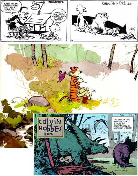
I’m not going to attempt to write an appreciation of Calvin and Hobbes here, I don’t have the time or the room.I’ll simply say that if, for some bizarre reason, you’re unfamiliar with the greatest comic strip of the last quarter of the 20th Century (and one of the best for that entire century, which which is to say the history of newspaper comics in general), run right out to the bookstore and restore this unbalance in your life by picking up a copy of The Essential Calvin and Hobbes, The Indispensable Calvin And Hobbes, The Authoritative Calvin And Hobbes or any of the other Calvin and Hobbes collections; and immersing yourself in the worlds within worlds inhabited by a young boy who fits nowhere and everywhere.
Barring the long-windied tome I have spared you about how wonderful Calvin and Hobbes is, I want to talk instead about Watterson’s drawings, which are also among the best in the history of newspaper comics.
Though you won’t find the grandeur of Winsor McCay, or the representational draftsmanship of Hal Foster or Alex Raymond, you will find a lineage to greats like Greorge Herriman, Walt Kelly and Charles Schulz.
Watterson’s drawings, like his writing, scintillate with whimsical charm, leading your eye around swooping calligraphic lines that are punctuated with the kinetic exclamation mark of his wonderfully out of control lead character.
His short, “Peanuts-headed” kids and lean, liquid-backboned tiger are rendered with a stylistic confidence and visual aplomb that would make his drawings a treat even if you were to delete the dialog and randomize the panels.
Look at something as simple at his trees, a couple of thick, wiggly lines delineating a trunk, some curved hatching for texture and form and a few light lines suggesting limbs, put together with that lively, casual feeling sometimes achieved by the most accomplishes political cartoonists in their line work.
Simplicity was more than a matter of choice, though. Unlike the great newspaper strips of the early 20th Century, which often had the full width of the newspaper sheet across which to unfold their pen and ink worlds, modern newspaper comics have been squeezed smaller and smaller over the last 50 years, to the point where they are more like icons tagged onto word balloons than visual stories.
(Hey, here’s a great idea for newspapers. Circulation is dropping, so let’s take the things people like most about newspapers, like comics and political cartoons, and shrink them down, reduce their number or leave them out entirely, so we can fill more space with ads and flyers and drive more people away and reduce circulation further and then eliminate more features that people like, and so on…, and then complain about how the internet is killing newspapers! Brilliant.)
Watterson bemoaned the stupid shrinking of the comics, but actually had enough clout to change that, even if only slightly and only for his strip, but it was a great change nonetheless. He managed to get his syndicate to offer the Sunday C&H as a solid block, not the collection of individual panels preferred by the editors so they could rearrange (and drop out) panels to fit them into their tiny spaces.
Watterson took advantage of this with marvelously imaginative and adventurous layouts. His colors for the Sunday strips were extraordinary as well. Not that he had any extra colors, he just used them better. At the time, I was convinced that newspapers had reduced the color available to Sunday comics artists, but when Watterson started doing his beautiful, subtle coloring for Calvin’s “Spacemann Spiff” and dinosaur adventures, I realized that the other cartoonists just weren’t taking the time, or trouble, or simply lacked the artistic skill, to take full advantage of what newspaper comic coloring could do.
Unfortunately, the real subtlety of some of this work doesn’t always come through in the reproductions in books. Much like the reprints of comic books from the 1960’s and 70’s, these strips were originally printed on newsprint, a rough, cheap paper that, particularly at the time, was off-white. When reproduced on bright white high-quality book paper, the strips lose some of their tonal subtlety, like a Baroque bistre pen drawing that was originally done on cream paper being reproduced in black and white (that’s right, I’m talking about things like tonal subtlety in reference to a late 20th Century newspaper comic strip).
His longer format strips, done specifically for publication in some of the books, fare better in reproduction and will give you an idea of what I mean about his subtle coloring.
Not to get too high-minded here, I’ll also mention that Watterson drew great dinosaurs, a subject I particularly enjoy; and there were rumors at one point of an actual dinosaur book from him. Though I don’t know if many paleontological artists would worry about him as competition, I do think that most of them would immediately buy a copy if it ever came out.
Watterson retired from Calvin and Hobbes after 10 years, and seems to have been largely quiet since, at least in terms of work available the public; but he left us a great legacy of not only a treasure of a comic strip, but 10 years worth of comic strip drawing at its best.
There are some nice online resources now for Watterson drawings, including much material outside his work on the strip, notably the extensive tribite site Calvin and Hobbes: Magic on Paper which includes a great section of Rare Bill Watterson Art and lots of links to other resources.
Wikipedia has a nice article on Calvin and Hobbes and a shorter one on Bill Watterson, that have links to other resources.
The Universal Press Syndicate’s Calvin and Hobbes official site is rerunning the original strip, just to make our daily routine a little brighter.
Categories:
-
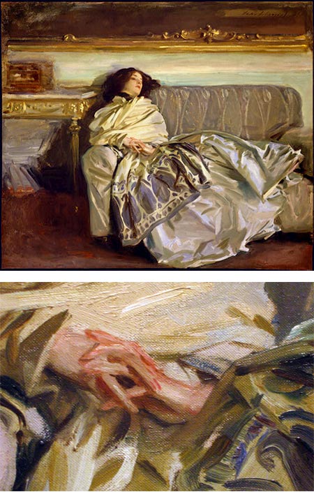
John Singer Sargent
Wow, that guy could paint!This was essentially my response when I first encountered the work of John Singer Sargent back in my art school days.
I was disappointed, though, to find that the art history books treated him with less regard than I expected. “Facile”, “highly skilled” and “renowned portrait painter”, seemed to be the best they could say of him. I would read the discussions of the great painters and constantly be frustrated to find him not on the list. “Oh yeah”, seemed to be the consensus, “one of those late 19th Century painters who was all technique and no substance — not important in the grand scheme of things”.
I eventually figured out that the late 20th Century art establishment had a bug up its collective ass about 19th Century Academic art in particular, and that in a world where “flatness” was a pinnacle of achievement, and white on white conceptual abstracts painted on 12 foot canvasses with paint rollers were trading for millions of dollars, “facile” was a bad word; and that “substance” and “important in the grand scheme of things” meant “leading up to modernism”.
As I gained the knowledge and confidence to form my own opinions, and understand that the “experts” were often idiots, I realized that my initial impression of Sargent was a true one.
Of all of the great painters I have come to admire over the years, two are at the top of my list of personal favorites, Vermeer and Sargent.
The more I learn about painting itself, the higher my regard for Sargent becomes, and I consider him one of greatest painters in the history of Western art.
The art snob intellectuals will still turn up their nose at this, of course, but as the froth of modernism has receded in recent years, and some semblance of balance has returned to the art establishment, Sargent’s star has risen again.
He also gets knocked because he was a society portrait painter, which of course is a crime similar to engaging in “commercial art” or (horrors!), illustration. Sargent himself eventually got tired of his parade of rich sitters and the limitations of pleasing the upper class with pictures of themselves, but in the course of painting portraits, he was painting the visual world.
I have to admit that his paintings on the surface are not infused with great emotion or drama, he seems as unconnected to his sitters as those he painted in groups seem to each other. By accounts Sargent apparently did not have strong ties outside his family, but it is not in the emotional character of his faces and figures that I find the passion in Sargent’s work, it is in the painting itself.
If you approach Sargent’s portraits as “living still lifes” or “interior landscapes”, you may begin to see what I mean. Look at the folds in a dress, the way soft interior light bounces off valleys of satin, glowing with subtle but intense colors, like a misty Impressionist garden in the rain. Look at the textures of cloth, hair and skin; the rose colors where blood vessels are close to the surface in noses and cheeks; the sweep of light through dark interiors and the interplay of varied-colored brushstrokes, swaying back and forth with the rhythm of some distant symphony…
Here is Sargent’s passion, not found in his bored dilettante subjects, but in spite of them, in the act of painting itself. Yes, there is romance and drama in Sargent’s work, but it is less in his images than in his brushstrokes. If you go to look at Sargent’s oil paintings, get up close.
The painting above, Nonchaloir (“nonchalance”, sometimes titled as “Repose” – larger reproduction here), is a non-commissioined portrait of Sargent’s niece, now in the National Gallery of Art in Washington, D.C.. Even as family, her individuality is lost in his exploration of splashing light, rich, subtle color and the dance of his brush.
Sargent was considered an American painter, though he was born in Florence to American parents and spent most of his working life in Paris and London. He studied in the Paris atelier of the well known portrait painter Emile Auguste Carolus-Duran, and took drawing classes at the Ecole des Beaux-Arts. (If you haven’t seen any of Sargent’s charcoal drawings, look them up. There is a nice inexpensive book of them from Dover Books, Sargent Portrait Drawings.)
Sargent took inspiration from Valázquez, the painter’s painter, and some of the wonderfully facile Baroque portrait painters like Anthony van Dyck and Thomas Gainsborough; looking back to the inspiration of the past when the art world was beginning it’s mad, blind dash for the future. Even critics of the time began dismissing him as irrelevant.
He became tremendously successful as a portrait painter, though he scandalized the conservative art establishment with his notorious portrait of “Madame X“, (Madame Gautreau), a famous painting that he gave to the Metropolitan Museum of Art in New York.
Sargent, like many of the so-called “American Impressionists” whose work I particularly enjoy, took influence form the French Impressionists. Sargent visited Monet at Giverny and associatied with others in the circle; but like the other “American Impressionists”, didn’t share the need the rebellious French painters felt to reject the traditional underpinnings of academic drawing and representational solidity, resulting in a wonderfully free blend of draftsmanship, color, and loose, painterly brushwork.
Sargent eventually abandoned his society portraits and devoted his later career to traveling and painting, largely in watercolor, a medium in which he was as stunningly accomplished and “facile’ as in oil. (See my previous post on Sargent in Venice.)
Happily, Sargent is in vogue these days and there are lots of great resources, both online and in print.
One of the best online resources for Sargent is the John Singer Sargent Virtual Gallery. Though the organization is not as convenient as you might like, there is a great deal of information and lots of wonderful art to be found here.
Sargent’s resurgence of popularity has resulted in a number of fine books over the past several years. Here are some of the ones on my shelves:
John Singer Sargent by Kate F. Jennings is a good place to start, it’s absurdly inexpensive ($10) and this slim but oversize book is filled with large scale reproductions.
John Singer Sargent by Carter Ratcliff is large and informative (you may be able to find it less expensively used), and has some nice details, though some of them are in black and white (which can be instructive in itself).
John Singer Sargent by Trevor Fairbrother has a nice cross section of oils, watercolors and drawings, and the text is a good overview of the painter and his work.
John Singer Sargent: The Sensualist, also by Trevor Fairbrother, is one of my favorites, and speaks, I think, to some of what I see in his passion for the visual world.
The Watercolors of John Singer Sargent by Carl Little is beautiful. No painter of representational watercolors should be unaware of it.
The best resource, though, if possible, is to see if there are works by Sargent in a museum near you, and put your nose up to one.
Whatever else you may say about John Singer Sargent, one thing is undeniable:
Wow, that guy could paint!
Addendum: Katherine Tyrell has assembled an amazing Squidoo lens of John Singer Sargent Resources.
It’s brimming with links to articles, bios, online galleries, Flickr photo sets, YouTube videos, Amazon book listings and descriptions, art galleries and museums, exhibition listings, portrait resources, geographical places associated with the artist, drawings and sketches, Del.icio.us bookmarks, and blog posts; including several on her own excellent art blog, Making a Mark, on which she initiated a John Singer Sargent Project to call on her extensive circle of internet contacts to help assemble the material in the course of a month long study of the artist.
Along with the John Singer Sargent Virtual Gallery, the most comprehensive resource on Sargent I’ve seen.
Categories:
-
Drawing Day 08 (June 7, 2008)

You may have heard the term “Web 2.0” bandied about in the last couple of years.Steming from an O’Reilly Publishing conference a few years ago, “Web 2.0” is a rather nebulous term referring not to actual changes in the technology, but to a shift in the way information is disseminated and accessed using the already existing technologies of the internet.
The idea encompasses “social media”, or networking sites, collaborative information resources like wikis, social tagging or “folksonomies”, online communities and, of course, blogs.
This aspect of the web has become most evident in relation to art in the creation of online artist communities, either broadly based, like deviantART, or more specifically focused, like the CGSociety.
Drawing Day is an event initiated by Mick Gow, a designer and artist who created the Rate My Drawings site, which uses a Flash based interface to allow users to draw online, view and rate others drawings and view the drawing process as a playback animation. Like many art community sites, it also includes a forum for discussions, one of the core features of social networking sites.
Gow has taken the ideas of social media and created an event meant to leverage the widespread dissemination of art across social networking sites into a focused, high profile happening with the simple theme of putting drawings by as many people as possible onto the web in a single day.
The stated goal is to get 1 million drawings posted onto social networking, art and image sites like Flickr, Facebook, YouTube, deviantART, MySpace, Amateur Illustrator an Rate My Drawings; and in the process raise awareness of art and illustration on the web.
It’s also, of course, another good excuse (and some of us need them) to put aside work and worries and devote some time to just drawing.
It sounds like great fun and costs noting to join in, just draw; and to actually participate, post your drawings somewhere (or use one of the online drawing tools if you have a graphics tablet hooked to your computer). Most of the community sites require that you create an account, but a lot of people already have one on Flickr or similar sites.
The Drawing Day site lists come of the community sites and describes how to upload drawings to each.
My current point of view, despite what my ninth grade math teacher thought of my activities in class, is that time spent drawing is never wasted.
Drawing Day is slated to be the first Saturday in June each year, and the initial event is this Saturday, June 7, 2008.
(Image above: Drawing Hands by M.C. Escher, see my previous post on M.C. Escher)
Categories:
-
Into the Woods

Gallery Nucleus is a gallery in Alhambra, California that places a particular emphasis on illustration, commercial art and graphic narrative (e.g. comics). I’ve mentioned them before in the course of posts about artists who were exhibiting there.The gallery has a new exhibit opening on June 14th called Into the Woods, with a group of artists, two of whom I have written about previously, whose oeuvre includes visual storytelling of one kind or another.
Catia Chien (image above, top left) is a free-lance illustrator who has illustrated a number of children’s books and contributed to the Flight comics anthologies.
Chris Appelhans (above,top right) is a concept artist for the film industry, whose credits include Monster House and a new urban/sci-fi version of Alice’s Adventures in Wonderland called Underworld. He has also contributed to the Flight anthologies and has a series of short webcomics called Frank and Frank that have recently been published in a wonderfully strange format book. (See my previous post on Chris Appelhans.)
Kazu Kibuishi (image above, center) is the editor of the Flight comics anthologies and creator of one of my favorite webcomics, copper, as well as the new graphic novel Amulet, which has recently been optioned as a feature film by Warner Brothers. (See my previous posts on Kazu Kibuishi, Amulet and Copper.)
Robert Kondo (above, lower right) is a concept artist with Pixar Animation, and has worked on films like Ratatouille. He is a contributor to the afterworks blog and part of E-Ville Press, a cooperative comics publishing enterprise with other Pixar artists.
Yoko Tanaka is an illustrator who has done several children’s books as well as editorial illustrations for clients like the Los Angeles Times. She is also a contributor to Flight.
Into the Woods runs at Gallery Nucleus from June 14 to June 30, 2008. Chien, Appelhans, Kibuishi and Kondo will be at the opening reception on June 14.
Categories:


Charley’s Picks
Bookshop.org
(Bookshop.org affilliate links; sales benefit independent bookshop owners; I get a small percentage to help support my work on Lines and Colors)

John Singer Sargent: Watercolors


Urban Sketching: Understanding Perspective


Charley’s Picks
Amazon
(Amazon.com affiliate links; sales go to a larger yacht for Jeff Bezos; but I get a small percentage to help support my work on Lines and Colors)
John Singer Sargent: Watercolors
Urban Sketching: Understanding Perspective