
Categories
- 3d CGI
- Amusements
- Animation
- Anime & Manga
- Art Materials
- Art Videos
- Blogroll
- Cartoons
- Color
- Comics
- Concept & Visual Dev.
- Creativity
- Digital Art
- Digital Painting
- Displaying Art on the Web
- Drawing
- Eye Candy for Today
- Gallery and Museum Art
- High-res Art Images
- Illustration
- Motion Graphics & Flash
- Museums
- Online Museums
- Outsider Art
- Painting
- Painting a Day
- Paleo Art
- Pastel, Conté & Chalk
- Pen & Ink
- Prints and Printmaking
- Reviews
- Sc-fi and Fantasy
- Sculpture & Dimensional
- Site Comments
- Sketching
- Storyboards
- Tools and Techniques
- Uncategorized
- Vector Art
- Videos & Podcasts
- Vision and Optics
- Watercolor and Gouache
- Webcomics
Archives
- April 2026
- March 2026
- February 2026
- January 2026
- December 2025
- November 2025
- October 2025
- September 2025
- August 2025
- July 2025
- June 2025
- May 2025
- January 2025
- December 2024
- November 2024
- October 2024
- September 2024
- August 2024
- June 2024
- April 2024
- March 2024
- February 2024
- January 2024
- December 2023
- November 2023
- October 2023
- September 2023
- August 2023
- July 2023
- May 2023
- April 2023
- March 2023
- February 2023
- January 2023
- December 2022
- November 2022
- September 2022
- August 2022
- July 2022
- June 2022
- May 2022
- April 2022
- March 2022
- February 2022
- January 2022
- December 2021
- November 2021
- October 2021
- September 2021
- August 2021
- July 2021
- June 2021
- May 2021
- April 2021
- March 2021
- February 2021
- January 2021
- December 2020
- November 2020
- October 2020
- September 2020
- August 2020
- July 2020
- June 2020
- May 2020
- April 2020
- March 2020
- February 2020
- January 2020
- December 2019
- November 2019
- October 2019
- September 2019
- August 2019
- July 2019
- June 2019
- May 2019
- April 2019
- March 2019
- February 2019
- January 2019
- December 2018
- November 2018
- October 2018
- September 2018
- August 2018
- July 2018
- June 2018
- May 2018
- April 2018
- March 2018
- February 2018
- January 2018
- December 2017
- November 2017
- October 2017
- September 2017
- August 2017
- July 2017
- June 2017
- May 2017
- April 2017
- March 2017
- February 2017
- January 2017
- December 2016
- November 2016
- October 2016
- September 2016
- August 2016
- July 2016
- June 2016
- May 2016
- April 2016
- March 2016
- February 2016
- January 2016
- December 2015
- November 2015
- October 2015
- September 2015
- August 2015
- July 2015
- June 2015
- May 2015
- April 2015
- March 2015
- February 2015
- January 2015
- December 2014
- November 2014
- October 2014
- September 2014
- August 2014
- July 2014
- June 2014
- May 2014
- April 2014
- March 2014
- February 2014
- January 2014
- December 2013
- November 2013
- October 2013
- September 2013
- August 2013
- July 2013
- June 2013
- May 2013
- April 2013
- March 2013
- February 2013
- January 2013
- December 2012
- November 2012
- October 2012
- September 2012
- August 2012
- July 2012
- June 2012
- May 2012
- April 2012
- March 2012
- February 2012
- January 2012
- December 2011
- November 2011
- October 2011
- September 2011
- August 2011
- July 2011
- June 2011
- May 2011
- April 2011
- March 2011
- February 2011
- January 2011
- December 2010
- November 2010
- October 2010
- September 2010
- August 2010
- July 2010
- June 2010
- May 2010
- April 2010
- March 2010
- February 2010
- January 2010
- December 2009
- November 2009
- October 2009
- September 2009
- August 2009
- July 2009
- June 2009
- May 2009
- April 2009
- March 2009
- February 2009
- January 2009
- December 2008
- November 2008
- October 2008
- September 2008
- August 2008
- July 2008
- June 2008
- May 2008
- April 2008
- March 2008
- February 2008
- January 2008
- December 2007
- November 2007
- October 2007
- September 2007
- August 2007
- July 2007
- June 2007
- May 2007
- April 2007
- March 2007
- February 2007
- January 2007
- December 2006
- November 2006
- October 2006
- September 2006
- August 2006
- July 2006
- June 2006
- May 2006
- April 2006
- March 2006
- February 2006
- January 2006
- December 2005
- November 2005
- October 2005
- September 2005
- August 2005
Relevant Blogs
Art, Painting & Sketch
- Gurney Journey
- Underpaintings
- Art and Influence
- Painting Perceptions
- Oil Painters of America
- Vasari Paint POV
- Flying Fox
- Urban Sketchers
- Bento (Smithsonian)
- Art Inconnu
- The Hidden Place
- Still Life
- Making a Mark
- The Art of the Landscape
- Exploring Color & Creativity
- Art Contrarian
- Artist A Day
- beinArt Surreal Art Collective
- Eye Level
- David Dunlop
- p.i.g.m.e.n.t.i.u.m
- CultureGrrl
- Joaquín Sorolla blog
- Artists in Pastel
“Painting a Day”
- A Painting a Day (Keiser)
- On Painting (Keiser)
- Julian Merrow-Smith
- Karen Jurick
- Jeffrey Hayes
- Carol Marine
- Abbey Ryan
- Daily Paintworks
Other Painting Blogs
- Virtual Gouache Land
- Neil Hollingsworth
- Marc Hanson
- Kevin Menck
- Marc Dalessio
- Larry Seiler
- Stapleton Kearns
- Colin Page
- Roos Schuring
- Hans Versfelt
- Titus Meeuws
- Régis Pettinari
- René Plein Air
- Belinda Del Pesco
- Robin Weiss
- Nathan Fowkes (Land Sketch)
- William Wray
- Frank Serrano
- Stephen Magsig
- Michael Chesley Johnson
- Twice a Week
- Sarah Wimperis
- Rob Adams
- Michael Cole Manley
- The Dirty Palette Club
- Mike Manley’s Draw!
Gallery Art & Illustration mix
Illustration
- Howard Pyle
- 100 Years of Illustration
- BibliOdyssey
- Illustration Art
- Today’s Inspiration
- Illustration Mundo
- Little Chimp Society
- Danny Gregory
- R D (John Martz
- Illustration Friday blog
- Monster Brains
- Illustrators & Illustrations (RU)
- Elwood H. Smith
- DaniDraws.com
- Designers Who Blog
- iSpot Blog
Sci-Fi & Fantasy
Illustration & Comics
Comics & Cartoons
- Comics Beat
- Robot 6
- Newsarama Blog
- Comic Vine
- Comics Alliance
- Forbidden Planet Int.
- Paolo Rivera
- Bolt City
- Flight
- Scott McCloud
- The Comics Journal
- Comixpedia
- Funnybook Babylon
- James Baker
- Middleton’s Sketchbook
- Boneville
- The Hotel Fred
- Paul Rivoche
- Daily Cartoonist
- Mad About Cartoons (William Wray)
- Digital Strips
Illustration & Concept
Animation & Concept
- Cartoon Brew
- Animation Blog
- Cold Hard Flash
- Concept Art World
- The CAB
- FY Concept Art
- Concept Ships
- Concept Robots
- John Nevarez
- Armand Serrano
- Marcos Mateu-Mestre
- all kinds of stuff (Kricfalusi)
- Yacin the faun (Man Arenas)
- Kelsey Mann
- Cre8tivemarks Blog
- Ice-Cream Monster Toon Cafe
- AAU Character & Creature Design
- AAU Animation Notes
- Articles and Texticles
Paleo & Scientific
Tools & Techniques
Other
Lists of Art Blogs
Art Image Resource Links
Historic Art Images
- Wikimedia Commons: Paintings
- Wikimedia Commons: Drawings
- The Athenaeum
- WikiArt (WikiPaintings)
- Google Art Project: Artists
- Google Art Project: Collections (Museums)
- ArtCyclopedia
- Web Gallery of Art
- Art Renewal Center
- Web Gallery of Impressionism
Auction Consolidation sites
Auction sites
- Sotheby’s
- Bonham’s
- Christies
- Heritage Auctions: Fine Art
- Heritage Auctions: Illustration
- Freeman’s Auctions
- Bukowskis
- Shannon’s
Image Search
Reverse Image Search (search by image)
- Tin Eye
- RevImg
- Google Image Search (camera icon)
- Bing Image Search (camera icon)
Promoting some friends and some clients of my website design business
- Twin Willows T’ai Chi studio in Wilmington DE. Taiji classes with Bryan Davis.
- Ray Hayward, Inspired Teacher of T’ai Chi ( Taiji ) in Minneapolis, Founder of Mindful Motion Tai Chi Academy
- OldHead Tattoo studio and Art Gallery in Wilmington DE. Tattoos and paintings by Bruce Gulick
- Sharon Domenico Art, pet portrait oil paintings
- Platinum Paperhanging, wallpaper hanging, Main Line and Philadelphia, PA
- Lisa Stone Design, interior designer, Main Line and Philadelphia, PA
- Studio12KPT, original art, prints, calendars and other custom printed items by Van Sickle & Rolleri
-
Raj Chaudhuri

After years of a successful career in information management, Raj Chaudhuri is concentrating on making his lifelong passion for painting and drawing into his full time focus. Chaudhuri credits his study at the Art Students League in Denver, particularly with Mark Daily and Quang Ho, as the deciding factor in enabling him to make the jump.Chaudhuri, who was born in India and studied in Bombay, had the opportunity to travel in Europe and the U.S. and now lives in Denver. His richly colored, painterly oils of landscapes, interiors and portraits are often drawn from his travels or his time in India.
He finds appealing subjects in richly colored cloth, whether traditional clothing in small villages, the bright spandex of a bicycle rider or the sharply lit green of a pool table surface.
Chaudhuri paints with bold, bright strokes, and his patches of color create their own feeling of texture in addition to the variations in tone and hue.
He is represented by the Abend Gallery in Denver.
Categories:
-
Kris Kuksi
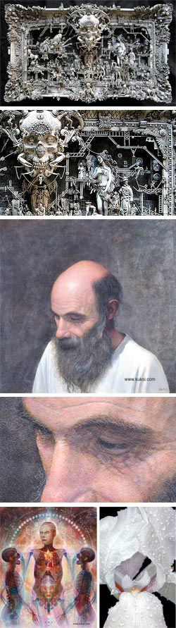 Kris Kuksi is an artist of seeming contradictions.
One moment he’ll be fascinating you with his grotesque, darkly themed “Mixed-media Assemblages”, or disconcerting you with his jarringly electric fantastic realist visions; and the next moment he’ll surprise you with classical portraiture, traditional figure drawing or a delicate, naturalistic rendering of a freshly opened orchid or a dew spattered iris.
I first encountered Kuski’s work at a gallery here in Philadelphia where one of his assemblages was attracting a lot of attention on a “First Friday” gallery walk in the Old City gallery district.
These sculptural objects (image at left top, with detail, below) are wonderfully intricate constructions of pop culture effluvia like plastic model kits, injection molded toys, dolls, plastic skulls, knick-knack figurines, miniature fencing, toy animals, mechanical parts and ornate frames or furniture parts; assembled into grotesque tableaux that look a bit like an explosion in Hieronymus Bosch’s attic or H.R. Giger’s dollar store.
These constructions are usually given a patina of light grey that pulls them together and gives them a nice fake antique look that makes them perfect for that alcove in the dark hallway in your Victorian mansion that leads to the Room that None Must Enter.
I can say from seeing these close up that the photos on Kuksi’s site (in the gallery section labeled “the grotesque”) don’t do them justice. There are better photos, with details, along with an interview, on Dark Roasted Blend. There is a short time-lapse video of the assembly of one of his constructions on MySpace.
When I looked up Kuksi’s web site on returning from the gallery walk, I found more of these assemblages, along with some of his “fantastic realism” paintings and drawings, that range from Art Nouveau meets H.P. Lovecraft to psychedelic visionary paintings that lean into Alex Grey territory (image at left, bottom left).
Continuing to the “portraiture” section, I was surprised to see a portrait that I had come across elsewhere and made mental note to look up, not realizing at all that it was by the same artist who did these constructions (Portrait of George Gillaume, image at left, middle with detail). I was further surprised to see, in Kuksi’s “naturalism” section, detailed, contemplative paintings of flowers and images of animals.
Kuksi paints in acrylic on Gessobord. Most of the images in his galleries are accompanied by highrer-resolution versions accessed from a link in the description text. Don’t miss the fact that many of his galleries have more than one page, accessed by small links at page bottom. There are numerous images from the many sides of this multi-faceted artist.
In my research I stumbled across this listing for a Drawing Workshop with Kuksi in Germany in the summer. Please note that I’m not certain if this is current.
On his deviantArt page, Kuksi lists some of his favorite artists as Alphonse Mucha, Ernst Fuchs, Robert Venosa, Alex Grey, and Andrew Gonzales. Hs also lists his “interests” as Art, Music, Science, Philosophy and Maritime Cannibalism.
Categories:
-
Daniel Dociu

Daniel Dociu is an art director, illustrator and concept artist working in the gaming industry. He was born and studied in Cluj, Romania, moved to Athens and then the U.S., and now lives in Seattle, Washington.He has worked for companies like Squaresoft, Zipper Interactive and Electronic Arts and is now Art Director at ArenaNet. His credits include Guildwars: Prophecies, Guildwars: Factions, SSX3, James Bond 007: Everything or Nothing, SOCOM: US Navy Seals, MechWarrior III, and many others.
Dociu’s images often have a sharp, angular feeling to them, which gives them a sense of energy and impending motion. He works often in what look like science fiction themes, and with environments that convey a sense of monumental scale. His color palette frequently contrasts rust colored oranges with electric blues or icy greens for dramatic effect.
Fortunately, his online galleries feature pop-up images of a decent size because much of what I find most appealing in his work reveals itself in the details, where he is able to simultaneously employ loose, gestural rendering and a remarkable suggestion of detail.
Unfortunately, both his site and a gallery on the Komotion site suffer from less than ideal interface designs. In the former, the thumbnails are too small to judge the image by, and the pop up window makes you wait while it calculates the image size with JavaScript and resizes itself. I actually find the other gallery a bit easier to browse, though I almost missed it at first. In a particularly bad piece of interface design, what appears to be a heading image for a credits page is actually a large button that calls up a pop-up window with a gallery of his work.
Dociu works digitally and there is a nice article about him on the CG Society.
His splintered geometry and whorls of angular forms give his concept paintings an unusual and fascinating feeling of continuity, while still ranging across a wide expanse of imaginative terrain.
Categories:
-
Simon Otto
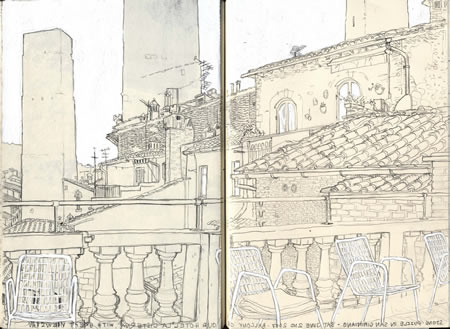
Though there aren’t many pieces available online, the variety of subject, medium and approach, and the high quality of each, make the sketchblog of Simon Otto well worth a visit.Otto’s blog is actually just excerpts from his contributions to insert name here, a group blog he shares with several other talented artists, who, like Otto, work in the film industry.
Otto himself is an animator at DreamWorks Animation. Though I couldn’t find any of his professional work online, you can see a list of his credits on IMDB.
His blog posts range from plein air oil paintings to digital sketches (apparently also painted on location with a laptop), to figure painting, to a series of wonderfully appealing sketchbook pages. The latter feature drawings apparently done in pencil and white body color on cream paper, and are my favorites of his posted work.
It’s an unusual approach; most toned sketchbook drawings tend toward ink and wash or monochrome watercolor. The combination of pencil against the cream and white areas, along with accents of textural tones created with lines, a technique more common to pen and ink, makes for nicely subtle and varied tonal range.
Occasionally, Otto will work with black body color or ink in place of the lighter tones, and he will sometimes punctuate his sketches with small areas of red or other colors. He’s not shy about tackling complex architectural subjects or cityscapes; rendering them in confident but sensitive lines and arranging them in interesting compositions.
Many of his sketchbook drawings are annotated with notes or dates, but for some reason they have been flopped in posting so that they read backwards, along with signs in the images. That does little to reduce their charm, however, and at the end of the available blog posts you’re left looking in vain for more.
Unfortunately, neither Otto’s blog, or the group blog from which it is extracted, have been updated since July. We’ll have to hope that Otto and his fellow artists get inspired soon to resume posting.
Categories:
-
Pieter de Hooch
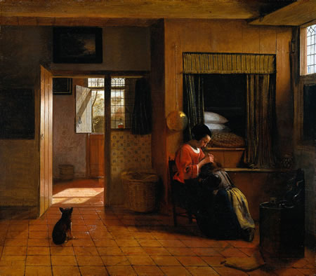
Pieter de Hooch (pronounced de HOOGH, with a hard “g”) is a fascinating painter, both for his own oeuvre and for the inevitable comparisons to his brilliant contemporary Johannes Vermeer.Like Vermeer, de Hooch is noted for his paintings of quiet, light-filled interiors, and occasional tranquil street or courtyard scenes. De hooch was for a time in Vermeer’s home town of Delft, where he painted many of his best known works, and was a member of the Painter’s Guild there.
Though little is actually know about either man, it’s a fair assumption that the two painters were influential on one another, if not in friendly competition, as many of their subjects and scenes are remarkably similar.
Many of the same themes are present in both painters’ scenes of domestic life within the tiled and wood beamed interiors of Delft homes: people reading a letter, sharing a drink or performing household chores (even, in the case of de Hooch’s painting above, de-lousing a child’s hair).
The two painters have different palettes, Vermeer choosing cooler backgrounds against which his brightly attired figures glow with the colors of rich fabrics, brilliant highlights and, yes, luminescent pearls; and De Hooch opting for warmer earth tones for his interiors, in which his more plainly clothed figures seem integral to their environment.
De Hooch’s depiction of the people in his scenes is warm and sensitive, but he doesn’t have the psychological insight of Vermeer’s intense personality studies, or the sense of mystery they invoke, and de Hooch’s figures are a bit stiff, almost as if they are portrayed as part of the rooms they inhabit, which are, I think, the real subject of his work.
De Hooch painted Dutch middle class life with a calm, steady eye and a remarkable skill for painting light and the texture of materials. He was a master of perspective, and the complex lines of his interiors are marvels of linear geometry.
Though he never achieved the transcendent mastery of time, space and light that made Vermeer so singular, (who did?), de Hooch was a master of light in a different way. Where Vermeer would bathe his serene interiors with a single golden source of light, that flowed in from windows on the observer’s left and spread through his compositions like atomized honey, de Hooch revels in multiple sources of light, bursting in though windows and doors, cascading through hallways and splashing on tiled floors in a complex dance of interior atmospherics.
De Hooch’s paintings are wonderfully layered; rooms give way to antechambers, which give way to other rooms, which lead through doors to courtyards; each with their own sense of atmosphere and light, worlds within worlds. This is what I love about de Hooch, and once I started reading about him, I discovered that many others do as well.
You will often hear reference to his “keyhole” paintings, compositions that offer glimpses of other scenes through open doors or windows. De Hooch, like Antonello da Messina in his amazing St. Jerome in his Study, invites us to walk into and through his paintings, beckoning us on a journey within a single image, and tantalizing us with glimpses of other vistas just beyond where we’re standing.
Categories:
-
Gez Fry

Gez Fry is a half British, half Japanese illustrator who has lived in France and England and is currently based in Tokyo.I think his multi-cultural background shows up nicely in his work, which is an interesting synthesis of influences from illustration, comics and animation from several continents.
Much of his work shows the influence of anime, and anime related concept design (hard to avoid when you’re living in Tokyo). This shows particularly his handling of color. You’ll notice, for example, the use of the “halo” effect, common to anime, where the suggestion of strong light from behind an object is given by softening the edge with a haze of lighter tone or even white, almost bleaching out objects in places. You will also see mecha-like influences in his designs for robots and mechanical devices.
Many of these images, however, have a feeling of three-dimensional solidity and realism that is more European in character, and he has a realist approach to the rendering of clothing and the modeling of faces that is uncharacteristic of anime and associated illustration styles, and gives his style a unique quality.
Some of his drawings, which are particularly appealing in their use of line, are reminiscent of European and American illustrators/comics artists like Jean Giraud or Geoff Darrow. Gez is, in fact, working on a graphic story called Roses & Skulls.
Some of his clients as an illustrator include Adidas, ILM, Nike, Evisu, Adobe, Nintendo, Harper Collins, McGraw-Hill, Marvel and Wizards of the Coast.
I’ve found a few interviews on the web, though very little in the way of additional artwork. The article on the CG Society is notable for having large images of his preliminary sketches, including a sketch for the image above, Winter.
Inerestingly, Gez’s mother is also an artist with a unique style; you can see her web site at mayko.net.
Unfortunately, I found the gallery of work on Gez’s site frustrating on three levels: it uses one of those tedious pop-up-and-close display paradigms, in addition to which you have to horizontally scroll the thumbnails in a tiny frame; and, most frustrating of all, it’s much too short. I would like to see a lot more of Gez’s terrific work.
[Link via Netdiver]
Categories:


Charley’s Picks
Bookshop.org
(Bookshop.org affilliate links; sales benefit independent bookshop owners; I get a small percentage to help support my work on Lines and Colors)

John Singer Sargent: Watercolors


Urban Sketching: Understanding Perspective


Charley’s Picks
Amazon
(Amazon.com affiliate links; sales go to a larger yacht for Jeff Bezos; but I get a small percentage to help support my work on Lines and Colors)
John Singer Sargent: Watercolors
Urban Sketching: Understanding Perspective