
Categories
- 3d CGI
- Amusements
- Animation
- Anime & Manga
- Art Materials
- Art Videos
- Blogroll
- Cartoons
- Color
- Comics
- Concept & Visual Dev.
- Creativity
- Digital Art
- Digital Painting
- Displaying Art on the Web
- Drawing
- Eye Candy for Today
- Gallery and Museum Art
- High-res Art Images
- Illustration
- Motion Graphics & Flash
- Museums
- Online Museums
- Outsider Art
- Painting
- Painting a Day
- Paleo Art
- Pastel, Conté & Chalk
- Pen & Ink
- Prints and Printmaking
- Reviews
- Sc-fi and Fantasy
- Sculpture & Dimensional
- Site Comments
- Sketching
- Storyboards
- Tools and Techniques
- Uncategorized
- Vector Art
- Videos & Podcasts
- Vision and Optics
- Watercolor and Gouache
- Webcomics
Archives
- April 2026
- March 2026
- February 2026
- January 2026
- December 2025
- November 2025
- October 2025
- September 2025
- August 2025
- July 2025
- June 2025
- May 2025
- January 2025
- December 2024
- November 2024
- October 2024
- September 2024
- August 2024
- June 2024
- April 2024
- March 2024
- February 2024
- January 2024
- December 2023
- November 2023
- October 2023
- September 2023
- August 2023
- July 2023
- May 2023
- April 2023
- March 2023
- February 2023
- January 2023
- December 2022
- November 2022
- September 2022
- August 2022
- July 2022
- June 2022
- May 2022
- April 2022
- March 2022
- February 2022
- January 2022
- December 2021
- November 2021
- October 2021
- September 2021
- August 2021
- July 2021
- June 2021
- May 2021
- April 2021
- March 2021
- February 2021
- January 2021
- December 2020
- November 2020
- October 2020
- September 2020
- August 2020
- July 2020
- June 2020
- May 2020
- April 2020
- March 2020
- February 2020
- January 2020
- December 2019
- November 2019
- October 2019
- September 2019
- August 2019
- July 2019
- June 2019
- May 2019
- April 2019
- March 2019
- February 2019
- January 2019
- December 2018
- November 2018
- October 2018
- September 2018
- August 2018
- July 2018
- June 2018
- May 2018
- April 2018
- March 2018
- February 2018
- January 2018
- December 2017
- November 2017
- October 2017
- September 2017
- August 2017
- July 2017
- June 2017
- May 2017
- April 2017
- March 2017
- February 2017
- January 2017
- December 2016
- November 2016
- October 2016
- September 2016
- August 2016
- July 2016
- June 2016
- May 2016
- April 2016
- March 2016
- February 2016
- January 2016
- December 2015
- November 2015
- October 2015
- September 2015
- August 2015
- July 2015
- June 2015
- May 2015
- April 2015
- March 2015
- February 2015
- January 2015
- December 2014
- November 2014
- October 2014
- September 2014
- August 2014
- July 2014
- June 2014
- May 2014
- April 2014
- March 2014
- February 2014
- January 2014
- December 2013
- November 2013
- October 2013
- September 2013
- August 2013
- July 2013
- June 2013
- May 2013
- April 2013
- March 2013
- February 2013
- January 2013
- December 2012
- November 2012
- October 2012
- September 2012
- August 2012
- July 2012
- June 2012
- May 2012
- April 2012
- March 2012
- February 2012
- January 2012
- December 2011
- November 2011
- October 2011
- September 2011
- August 2011
- July 2011
- June 2011
- May 2011
- April 2011
- March 2011
- February 2011
- January 2011
- December 2010
- November 2010
- October 2010
- September 2010
- August 2010
- July 2010
- June 2010
- May 2010
- April 2010
- March 2010
- February 2010
- January 2010
- December 2009
- November 2009
- October 2009
- September 2009
- August 2009
- July 2009
- June 2009
- May 2009
- April 2009
- March 2009
- February 2009
- January 2009
- December 2008
- November 2008
- October 2008
- September 2008
- August 2008
- July 2008
- June 2008
- May 2008
- April 2008
- March 2008
- February 2008
- January 2008
- December 2007
- November 2007
- October 2007
- September 2007
- August 2007
- July 2007
- June 2007
- May 2007
- April 2007
- March 2007
- February 2007
- January 2007
- December 2006
- November 2006
- October 2006
- September 2006
- August 2006
- July 2006
- June 2006
- May 2006
- April 2006
- March 2006
- February 2006
- January 2006
- December 2005
- November 2005
- October 2005
- September 2005
- August 2005
Relevant Blogs
Art, Painting & Sketch
- Gurney Journey
- Underpaintings
- Art and Influence
- Painting Perceptions
- Oil Painters of America
- Vasari Paint POV
- Flying Fox
- Urban Sketchers
- Bento (Smithsonian)
- Art Inconnu
- The Hidden Place
- Still Life
- Making a Mark
- The Art of the Landscape
- Exploring Color & Creativity
- Art Contrarian
- Artist A Day
- beinArt Surreal Art Collective
- Eye Level
- David Dunlop
- p.i.g.m.e.n.t.i.u.m
- CultureGrrl
- Joaquín Sorolla blog
- Artists in Pastel
“Painting a Day”
- A Painting a Day (Keiser)
- On Painting (Keiser)
- Julian Merrow-Smith
- Karen Jurick
- Jeffrey Hayes
- Carol Marine
- Abbey Ryan
- Daily Paintworks
Other Painting Blogs
- Virtual Gouache Land
- Neil Hollingsworth
- Marc Hanson
- Kevin Menck
- Marc Dalessio
- Larry Seiler
- Stapleton Kearns
- Colin Page
- Roos Schuring
- Hans Versfelt
- Titus Meeuws
- Régis Pettinari
- René Plein Air
- Belinda Del Pesco
- Robin Weiss
- Nathan Fowkes (Land Sketch)
- William Wray
- Frank Serrano
- Stephen Magsig
- Michael Chesley Johnson
- Twice a Week
- Sarah Wimperis
- Rob Adams
- Michael Cole Manley
- The Dirty Palette Club
- Mike Manley’s Draw!
Gallery Art & Illustration mix
Illustration
- Howard Pyle
- 100 Years of Illustration
- BibliOdyssey
- Illustration Art
- Today’s Inspiration
- Illustration Mundo
- Little Chimp Society
- Danny Gregory
- R D (John Martz
- Illustration Friday blog
- Monster Brains
- Illustrators & Illustrations (RU)
- Elwood H. Smith
- DaniDraws.com
- Designers Who Blog
- iSpot Blog
Sci-Fi & Fantasy
Illustration & Comics
Comics & Cartoons
- Comics Beat
- Robot 6
- Newsarama Blog
- Comic Vine
- Comics Alliance
- Forbidden Planet Int.
- Paolo Rivera
- Bolt City
- Flight
- Scott McCloud
- The Comics Journal
- Comixpedia
- Funnybook Babylon
- James Baker
- Middleton’s Sketchbook
- Boneville
- The Hotel Fred
- Paul Rivoche
- Daily Cartoonist
- Mad About Cartoons (William Wray)
- Digital Strips
Illustration & Concept
Animation & Concept
- Cartoon Brew
- Animation Blog
- Cold Hard Flash
- Concept Art World
- The CAB
- FY Concept Art
- Concept Ships
- Concept Robots
- John Nevarez
- Armand Serrano
- Marcos Mateu-Mestre
- all kinds of stuff (Kricfalusi)
- Yacin the faun (Man Arenas)
- Kelsey Mann
- Cre8tivemarks Blog
- Ice-Cream Monster Toon Cafe
- AAU Character & Creature Design
- AAU Animation Notes
- Articles and Texticles
Paleo & Scientific
Tools & Techniques
Other
Lists of Art Blogs
Art Image Resource Links
Historic Art Images
- Wikimedia Commons: Paintings
- Wikimedia Commons: Drawings
- The Athenaeum
- WikiArt (WikiPaintings)
- Google Art Project: Artists
- Google Art Project: Collections (Museums)
- ArtCyclopedia
- Web Gallery of Art
- Art Renewal Center
- Web Gallery of Impressionism
Auction Consolidation sites
Auction sites
- Sotheby’s
- Bonham’s
- Christies
- Heritage Auctions: Fine Art
- Heritage Auctions: Illustration
- Freeman’s Auctions
- Bukowskis
- Shannon’s
Image Search
Reverse Image Search (search by image)
- Tin Eye
- RevImg
- Google Image Search (camera icon)
- Bing Image Search (camera icon)
Promoting some friends and some clients of my website design business
- Twin Willows T’ai Chi studio in Wilmington DE. Taiji classes with Bryan Davis.
- Ray Hayward, Inspired Teacher of T’ai Chi ( Taiji ) in Minneapolis, Founder of Mindful Motion Tai Chi Academy
- OldHead Tattoo studio and Art Gallery in Wilmington DE. Tattoos and paintings by Bruce Gulick
- Sharon Domenico Art, pet portrait oil paintings
- Platinum Paperhanging, wallpaper hanging, Main Line and Philadelphia, PA
- Lisa Stone Design, interior designer, Main Line and Philadelphia, PA
- Studio12KPT, original art, prints, calendars and other custom printed items by Van Sickle & Rolleri
-
Boris Kulikov
There has been some debate among artists and illustrators (some of it on the comments pages of certain posts here on lines and colors) about the wisdom of placing relatively large, non-watermarked images on the web, where they can ostensibly be “stolen” and used for some nefarious purpose.Those who have read my posts on how to display your art on the web, and my rant on how not to display your art on the web, will know that I come down firmly on the side that holds that displaying your work to best advantage far outweighs the disadvantages of potentially having it “borrowed” (the aversion to which I think is often more a case of indignant territorial response than a practical concern).
As a case in point, if I hadn’t seen Boris Kulikov’s wonderful children’s book illustrations either in print or in relatively large digital versions, I wouldn’t have become an instant fan. As intriguing as his conceptually clever and wonderfully drawn illustrations may be at a smaller size, it’s the texture and detail revealed by higher-resolution images that really grabbed my attention.
Kulikov describes his work as “mixed media” which appears to be mainly pencil, pen, watercolor and gouache. The children’s book illustrations are mainly watercolor, but Kulikov works on a textured watercolor paper rather than smooth illustration board, and the reproductions show that texture in a way that makes his washes and blocks of color display a wonderful textural quality, and carries some of the feeling of “this image is made of paint” that is present in “painterly” oils.
Kulikov combines this with an imaginative and colorful approach to his subjects, sometimes dreamlike scenes, nicely stylized characters and a terrific knack for slightly offbeat compositions, to create a style that captures your eye.
He also does beautiful pen and ink illustrations, notably for the Giants of Science series by Kathleen Krull.
His site is a bit awkward to navigate, but the children’s book illustrations are divided into color and black and white, as are the “other” (editorial) illustrations. Though the latter are also imaginative, conceptually clever and nicely realized, they are drawn and painted with a different feeling and approach and don’t wow me like his children’s book work.
In either case, when looking through his online galleries, be sure to click on the individual images for the higher res versions, and you’ll see why I think it was very wise of him to make those images available. In the meanwhile, I’ve made a note to look for some of the books he’s illustrated the next time I’m at the bookstore.
Categories:
-
Stefan Nuetzel
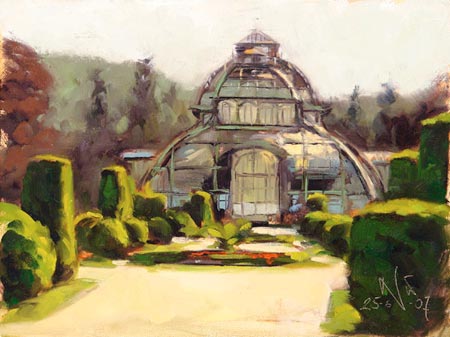
Stefan Nuetzel (or Nützel) is an German painter living and working working in Vienna (Wien), Austria.The galleries on his web site feature his paintings of a variety of subjects, including portraits, figures, interiors and landscapes.
The interiors are a short series of art museum views, but there is also a fascinating series of interiors from the Museum of Natural History in Vienna with their mounted animals and glass cases full of biological arcana, and a nicely bizarre series of views of the Baroque crypt under the Church of St. Michael, looking rather spooky in light of small spotlights.
There is an extensive gallery of figure painting, apparently quickly done, perhaps in a class setting, and a number of portraits. The portraits are supplemented by a separate series called “Konterfei”, featuring a series of quickly realized portraits of friends and family, mostly done in three hour sessions.
There is also a rather odd series of illustration-like paintings inspired by a book by Michel Butor called Portrait of the Artist as a Young Ape.
Nuetzel also has a blog in which he posts new paintings, works in progress, photos of shows and information about the workshops he teaches (also featured on the site). His blog posts are both in English and German (or Austrian German, I’m unable to differentiate between them).
The works I found most interesting from his online galleries were in his two sections of Plein Air paintings (2006 and 2007). These not only have that wonderful immediacy and freshness inherent in paintings quickly done on location, but are of a variety of interesting subjects, often urban scenes, parks and other locations that display some fascinating views from in and around the beautiful city of Vienna.
I particularly enjoy his paintings of the Art Nouveau steel and glass pavilions in the botanical gardens.
Categories:
-
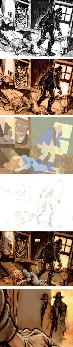
High Moon
 When I last wrote about Zuda Comics, DC Comics’ recent venture into webcomics, I pointed out two of the new webcomics that I thought were standouts, Bayou and High Moon. Both of them are now running as features, and are prominently promoted on the Zuda Comics home page.
High Moon is a horror/western by writer David Gallaher and artist Steve Ellis, with lettering by Scott O. Brown.
The High Moon team has been chronicling their work on the strip in a blog, from initial proposal to acceptance and production of the currently running strip.
It’s a loose, stream-of-consciousness kind of account, as blogs commonly are, but it covers many aspects of the process of creating a webcomic (or print comic, for that matter). You’ll find posts on initial concept designs and character sketches, photo reference, notes on writing and preparing the project for submission to DC Comics, plot breakdowns, page layouts, decisions about word balloon placement and, of course, preparation of the final art for the pages.
There is a recent post that starts to go into more detail about that process, in which artist Steve Ellis shows how he creates the unusual look of the comic.
He draws the pencils and inks in the traditional manner and scans the art into Photoshop. This is the most common method of working in the comics field today, though some comics artists, in particular some webcomics artists (like yours truly), do all of the drawing directly on the computer with a pressure sensitive tablet.
Ellis often adds to his drawing once it’s in digital form and then applies an unusual step in that he tones the final ink drawing with color adjustments in Photoshop, giving the entire work a sepia, old-photograph look particularly suited to the story and its setting. He further adds to the gritty texture of the images by leaving some of his pencil marks in place, eschewing the ultra-smooth look preferred in many mainstream comics.
Under the toned inks go a layer of color fields, that fill in color areas for the main forms, and on top of the ink layer goes another layer of detailed color highlights and final touches to make the finished image snap.
As I pointed out in my previous article on Zuda Comics, one of the things they have done brilliantly (in sharp contrast to the history of the “big two” publishers’ less than stellar forays into webcomics) is to utilize the medium to advantage in offering the option to view the pages at high-resolution. This enables you to not only get a cinematic feeling when reading the comics, but also a more detailed look at the artwork than afforded in normal printed comics or smaller-scale web comics.
When viewing the comic pages you have the option at the bottom right of the page frame to choose a full screen mode, and then read through the pages at that size. This is a wonderful feature, and particularly enjoyable with a comic as interesting and well-drawn as High Moon (see detail from the top-left panel of the final page in the image at left, bottom).
BTW, for those of you who may be too young to be aware of it, the title High Moon is a perfect take on the title of the 1952 Fred Zinnemann classic with Gary Cooper and Grace Kelly (not to mention Lon Chaney Jr.).
Categories:
-
Gorilla Artfare

Gorilla Artfare is a new collective art blog. According to their About page, the group was formed in 2006, and now counts more than 100 members from around the world.The collaborative blog was just launched early in January of 2008 and as of this writing shows posts from about 30 artists. The emphasis seems to be on concept art, environments, character design and illustration.
Judging from the month’s worth of initial posts, the level of ability among the artists so far represented is quite high and nicely diverse (shown above, left to right: Dave Palumbo, Tiffany Prothero, Brun Croes, Adam Paquette, Patri Balanovsky, Victoria Maderna, Simon Fellah, Alice Duke).
I’ve added Gorilla Artfare to the lines and colors blogroll and look forward to checking back as more posts are added.
[Link via LCSV4]
Categories:
-
Johnnie Scoutten

Johnnie Scoutten is a designer and creative director who also paints and draws in a variety of media.I’m not sure if she chooses the medium to suit her subject or whether she chooses the subject for how much fun it will be to render in the medium. I suspect it’s often the latter.
The image shown here, for example, is one of a series of similar close-ups of cat faces done in pastel and, in particular, in colored pencil on drafting film; a process she notes on her blog as particularly delightful.
I was just struck by the wonderful texture of the animals’ fur and the liquidly dimensional rendering of the cat eyes in the entire series. I was also amused by the close-up compositions; notably in that they are the kind of crops most often associated with portraits of people, and tend to emphasize the anthropomorphic character of the cats. The one above, in particular, looks like it could be a portrait of the CEO from the International Mousers Guild Annual Report.
Scoutten has a work in progress version of this image on her blog in which you can see the colored pencil lines going down over the gray background on the drafting film.
In addition to the blog, Scoutten has a web site with galleries of her work in pastel, oil, and acrylic; with subject matter ranging from still life, to florals, to landscape to renderings of vehicles. Some are quite painterly, others smoothly blended; but there always seems to be attention to achieving a textural quality that works to best advantage in matching the subject matter with the medium and approach.
Categories:
-
The Many Faces of Eustace Tilley

Had I been on the ball, I would have told you about this earlier, as well as probably entering myself for the fun of it.Every year The New Yorker holds a Eustace Tilley Contest, in which participants get to draw (or paint) their interpretation of the venerable magazine’s upper-crusty top-hatted and monocled iconic character.
The original Eustace Tilley was drawn by cartoonist Rea Irvin for the cover of the magazine’s first issue (above, top left) in 1925, and has reprised his appearance every year since on the anniversary issue. There is a history of Eustace Tilly here.
The New Yorker has a slide show of 17 past Eustace Tilleys (including Robert Crumb, Chris Ware, Charles Burns and Art Spiegelman).
The contest is open to anyone. This year’s contest just ended on January 24th. (I’ll try to tell you ahead of time next year.) The winners will be announced on February 4th.
Of more interest, however, is the Flickr gallery (thumbnails here) of 160 of this years entries, with all of their varied and imaginative takes on the character, his top hat, monocle, profile, stiff-necked pose and presumed disdainful butterfly fascination.
Categories:


Charley’s Picks
Bookshop.org
(Bookshop.org affilliate links; sales benefit independent bookshop owners; I get a small percentage to help support my work on Lines and Colors)

John Singer Sargent: Watercolors


Urban Sketching: Understanding Perspective


Charley’s Picks
Amazon
(Amazon.com affiliate links; sales go to a larger yacht for Jeff Bezos; but I get a small percentage to help support my work on Lines and Colors)
John Singer Sargent: Watercolors
Urban Sketching: Understanding Perspective